

Article Contents:
- First, define the role of NPU-191: the decor above the menu should not become a second menu
- What dimensions to take from the finished wall before fitting NPU-191
- Template 210 × 197 mm: how to try on the overlay without buying
- Which axis matters more: the menu, the smooth zone, or the entire wall
- Free space above the menu: why height alone is not enough
- The menu should be read first: how to check the information hierarchy
- Scale of NPU-191 relative to the menu itself
- Where to look at the result: entrance, queue, cash register, and seating areas give different assessments
- Slat panels already create a strong rhythm: NPU-191 should work on contrast, not repeat it
- How to check the side gap between NPU-191 and the first slat
- What the 12 mm relief provides with side and top lighting
- Paint NPU-191 in the wall color or make it contrasting
- Logo, coffee shop name, and NPU-191: who should occupy the top position
- Suspensions, track lights, and cameras: check not only the wall
- How NPU-191 will behave if the menu changes seasonally
- Installation after finished renovation: what to check on the base
- Why you can't glue NPU-191 directly to the slats just for proximity to the menu
- If the menu protrudes from the wall: compare the depth of the two objects
- Cleaning and maintenance: the decorative area is located in an operating coffee shop
- When one NPU-191 truly completes a menu wall
- When it's better not to buy NPU-191 above the menu
- What to choose instead of NPU-191 if it didn't pass the fitting
- Mistakes when placing NPU-191 above a finished menu
- Evaluating the wall only up close
- Centering on the entire wall instead of the menu
- Choosing color before checking the light
- Considering technical "fits" equal to compositional "suits"
- Sticking before final menu approval
- Use the overlay as a way to hide a defect or cable without checking
- Can NPU-191 be placed above a digital menu screen instead of above a printed tablet?
- What to do if the menu consists of two separate panels with a small gap?
- Can NPU-191 be placed not in the center, but closer to the slat panels?
- Is a molding frame needed around the menu along with NPU-191?
- Can NPU-191 be installed after several months of coffee shop operation?
- What to do if there is a fire detector above the menu?
- Should NPU-191 be duplicated on the second coffee shop wall for interior symmetry?
- Will NPU-191 be suitable for an outdoor sign at the entrance?
- Can NPU-191 be left white if the wall is already painted in color?
- How can you tell after a month that the decision was successful?
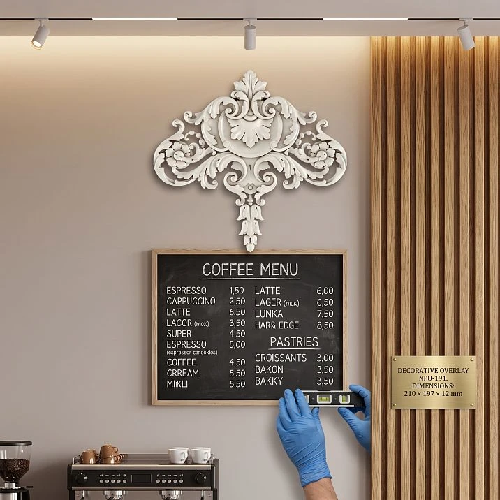
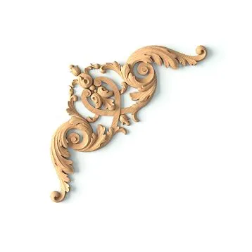
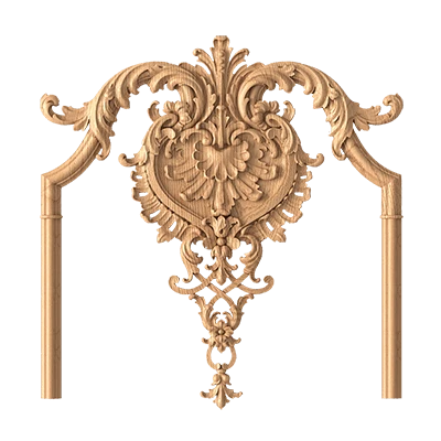
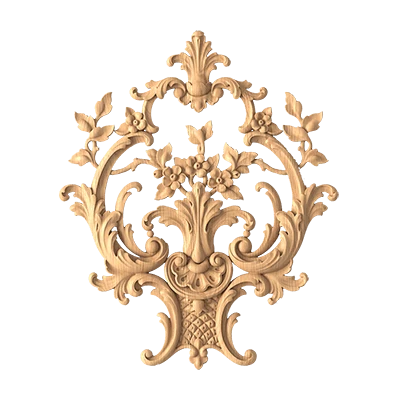
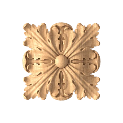
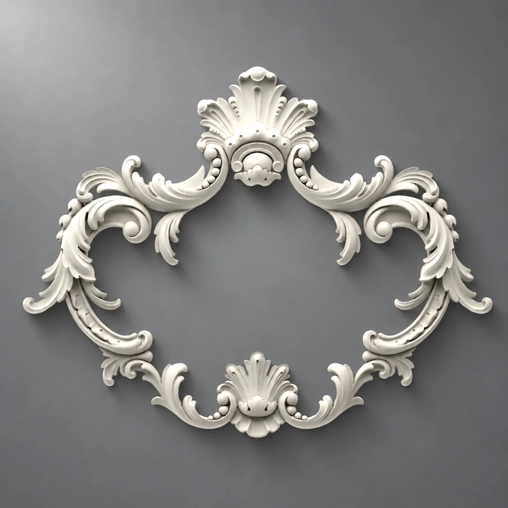
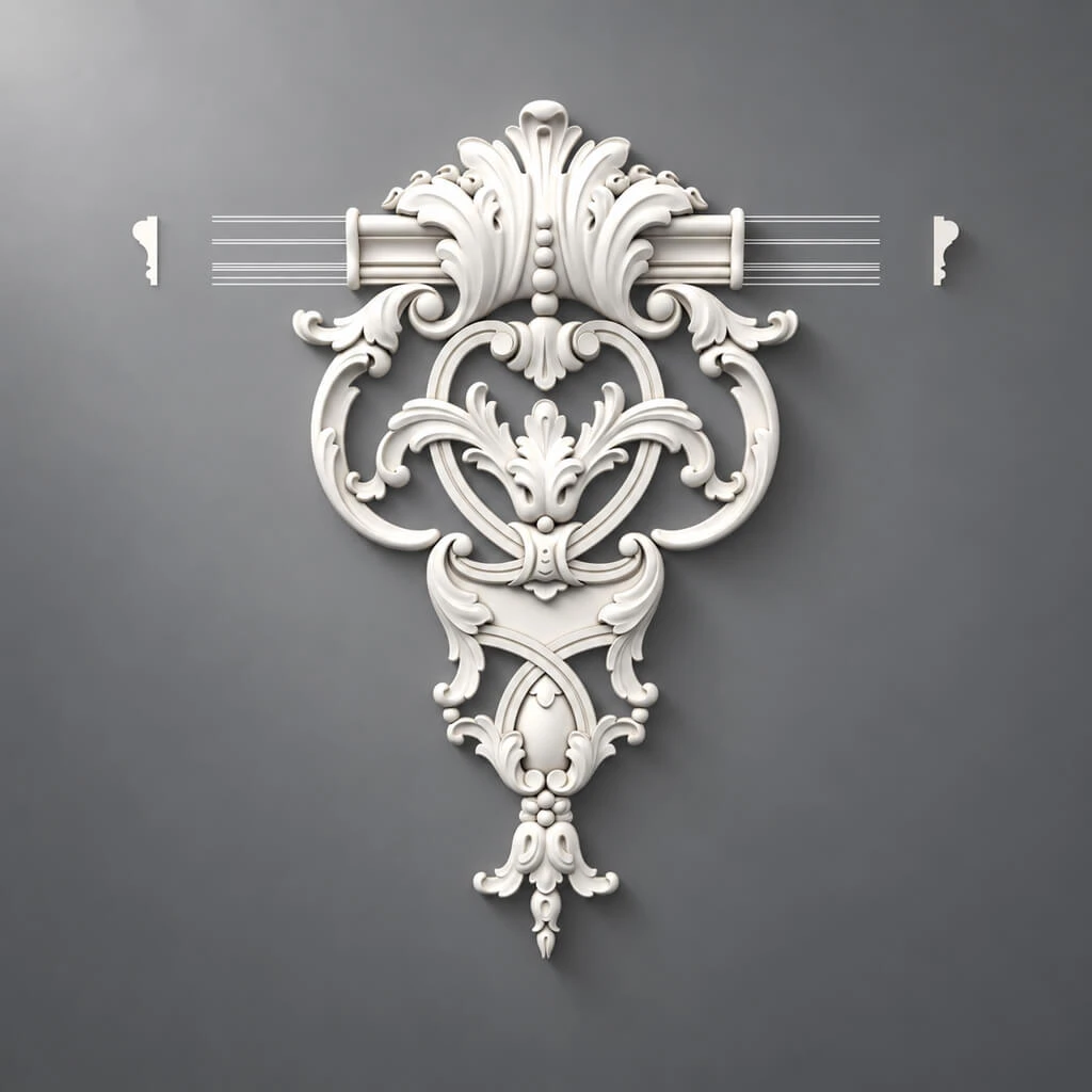
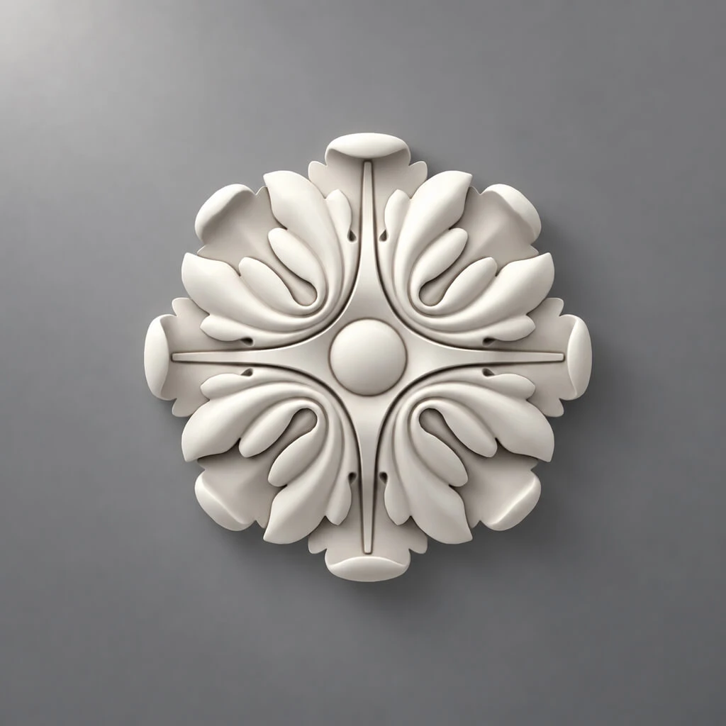
The menu is already hanging on a smooth wall, the slat zone nearby is assembled, the lighting is set, and there is free space left above the information block. It is at this stage that doubt most often arises: fill the empty field with a decorative element or leave the composition alone, where the menu already serves as the main object. For this scenario, one specific carved decorative overlay NPU-191 made of polyurethane is considered. On the current STAVROS product card, the size A × B × C is 210 × 197 × 12 mm and the price is 2,220 ₽ per piece. The item can be added to the cart; the manufacturer specifies adhesive mounting and the possibility of painting.
The main answer can be given right away: NPU-191 makes sense to buy only after a full-size trial over the actual menu. You cannot decide based on a photo of the product card here, because in a coffee shop the decorative element competes not with an empty wall, but with information that the visitor must quickly read: names, drinks, volumes, prices, logo, pictograms, and promotional blocks. If the overlay draws the eye upward, the decorative idea becomes a functional mistake. If the upper zone looks unfinished and the template maintains the menu's priority, one NPU-191 can work as a calm top point of the composition.
Before ordering, it is useful to make a rigid template according to the dimension 210 × 197 mm, preserving the orientation of the item as per the card or drawing. It is important not to turn the notation A × B × C into an unconfirmed claim that 210 mm is necessarily the horizontal width. In further examples where a horizontal size is mentioned, it is correct to consider only the condition "if in the chosen orientation the overlay occupies 210 mm horizontally." This protects against the error of taking the numerical order as the mounting orientation without verification.
With a successful trial buy the carved decorative overlay NPU-191 210 × 197 × 12 mm it is logical to use one piece. For this scenario, there is no need to create a series or a frame system from the item: the article addresses the question of exactly one upper accent above the finished menu.
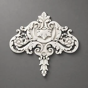
First, define the role of NPU-191: decor above the menu should not become a second menu.
In a commercial interior, it is useful to evaluate any wall element not just as "beautiful" or "ugly," but by its role. The menu has an informational role: the visitor should understand in a few seconds what is being sold and how much it costs. The logo has an identification role: it connects the interior with the brand. Slat panels have an architectural and background role: they create rhythm, texture, and sometimes hide technical zones. NPU-191 can only have a decorative role. If, after installation, the overlay starts competing with information, the roles are mixed up.
Therefore, the first decision is made before measurements. Answer the question: why exactly is an overlay needed above the menu? There are three normal reasons. First, a visually empty top field has formed above the menu, which seems random. Second, the interior already has a stucco decor motif, and this wall needs to be connected with the rest of the hall. Third, the menu itself is strict and geometric, and a small relief on top is needed as a soft artistic accent.
A bad reason sounds different: "there is free space on the wall, so it must be filled with something." Emptiness in a commercial interior can be functional: it separates information from the ceiling, light fixtures, slat texture, and other objects. If every free field is filled, the visitor gets a wall without visual hierarchy.
A useful test is simple. Take a photo of the wall from the usual entrance point of the coffee shop and mentally remove everything except the menu, slats, and large light fixtures. If the menu is already the obvious center, NPU-191 should be a subordinate element. If the upper part of the wall looks cut off and the composition visually "falls" downward, the overlay can complete the vertical. This conclusion cannot be made from the product card—only from your wall.

What measurements to take from the finished wall before fitting NPU-191
A complex design project is not needed for the decision, but several measurements are needed. They allow understanding whether there is an independent mounting zone above the menu or whether the free space only seems large in the photo.
Measure:
| What to measure | Why this is needed |
|---|---|
| Actual dimensions of the menu | To assess the relative scale of the overlay |
| Distance from the top edge of the menu to the ceiling, cornice, or suspended structure | To understand the vertical clearance |
| Distance from the menu edge to the start of the slat panels | To check the side margin and visual texture conflict |
| Position of the menu's central axis | To avoid centering decor on the wrong object |
| Position of the logo and top inscriptions | So the overlay doesn't conflict with branding |
| Lighting fixtures, track, sconces, cable trays, sensors | To avoid designing decor over the technical zone |
| The visitor's actual viewpoint | To evaluate the wall not up close, but in use |
Separately note where the boundary between the smooth wall and the slatted surface runs. If the NPU-191 is planned specifically on a smooth field, its mounting spot should remain within that plane. Don't try to "catch" part of the slats with the overlay's relief to connect two materials. A small molding element requires a stable base, and the transition between planes creates both a mounting and a visual problem.
The size of the NPU-191 itself on the card is 210 × 197 × 12 mm. For working with the template, it's enough to transfer the two front coordinates 210 × 197 mm, preserving the product's orientation. The 12 mm depth won't show on paper, so it's checked separately with a three-dimensional mockup or at least a strip of cardboard of the required thickness along the edge. It's the depth that affects the shadow under side lighting and the feeling of the element's "weight" on the wall.
It's better to record measurements in millimeters. This is especially useful if the menu is assembled from several tablets or light modules: visually they may be perceived as a single block, but actually have different offsets at the top and along the edges.
Our factory also produces:
Template 210 × 197 mm: how to try on the overlay without buying
A full-size mockup is the main tool of the article. It's cheaper than a mistaken purchase and, unlike a screen visualization, shows the real relationship with the menu, ceiling, slats, and light.
Take thick cardboard, foam board, or several layers of paper. Transfer the outer dimension of 210 × 197 mm and cut out a rectangle. If you have a 1:1 scale printout of the NPU-191's front image, glue it onto the template: the product's contour is more important than the rectangle, because the carved shape leaves more air around it than a solid plate of the same dimension.
Secure the template with painter's tape that doesn't damage the finish. First place it along the intended axis of the menu. Then do two more tests: slightly higher and slightly lower. The goal isn't to find "ideal 173 mm offset," but to see at which position the menu and decor are perceived as one system without sticking together.
You need to check from at least three points:
-
from the spot where the visitor first sees the menu;
-
from the queue or in front of the checkout;
-
on the side, if people approach the counter diagonally.
If the coffee shop is small and visitors stand close to the wall, add a check from a short distance. At a distance, a large format reads as a spot, but up close, the ornament itself and the shadow from the relief are visible. The same NPU-191 can be calm from five meters and too active from one and a half.
After a frontal fitting, it is useful to glue strips of foam board about 12 mm thick to the edges of the template. This does not replicate the actual relief, but shows that the object protrudes from the plane. It is especially important to do such a test if there is a directional spot or LED line nearby: the shadow from the real overlay can be more noticeable than the shape itself.
Do not photograph only in the smartphone's wide-angle mode. It stretches the edges of the frame and can make the distance to the slat panels seem greater than it is perceived by the eye. For the solution, a regular angle from the visitor's actual point is more important.
Get Consultation
Which axis is more important: the menu, the smooth area, or the entire wall
The most common compositional mistake is automatically centering the NPU-191 on the entire wall. In a real coffee shop, this wall already has a slat section, a menu, a counter, possibly a refrigerator, a display case, and lighting. The geometric center of the wall rarely coincides with the center of the information block.
If the overlay serves as a top accent specifically above the menu, the base axis becomes the axis of the menu itself. This means: first, the center of the finished information object is determined, and the template is placed relative to it. This alignment makes the composition stable even when the entire smooth part of the wall is asymmetrical.
There is an exception. If the menu is deliberately shifted to the side, and a large logo is nearby on the same smooth surface, the decorative element can work not on the menu alone, but on the overall group "logo + menu". Then the axis of the entire group is needed. But this is a different scenario that should be confirmed with a mockup: you cannot simply move the overlay to the center of the wall and hope it will "pull together" mismatched objects.
Slat panels also create a strong axis — especially if they run from floor to ceiling. However, the overlay does not have to repeat the rhythm of the slats. On the contrary, its task is often to mark a calm smooth surface next to an active texture. Trying to center the NPU-191 along the edge of the slats can make it look like a random joint element, although the product is not intended to cover the transition between materials.
A practical way to check: draw a vertical center line on the paper template. Use a chalk line or laser to mark the center of the menu. Align them and look at the wall. Then shift the template 20–30 mm to the left and right only as a sensitivity test. If even a small shift immediately looks like an error, the composition truly requires a strict axis. If the difference is barely noticeable, the overall mass matters more than mathematical symmetry.
Free space above the menu: why one height is not enough
The question "does 197 mm fit vertically" is too simple. Even if the overlay takes up about 197 mm vertically in the chosen orientation and technically fits, there must be space around it that visually separates the ornament from both the menu and the ceiling or cornice.
It is more useful to divide the upper zone into three parts:
-
the gap between the top edge of the menu and the overlay;
-
the overlay's own dimension;
-
the gap between the overlay and the upper limit—ceiling, cornice, track, shelf, or engineering structure.
There is no universal standard requiring each of the gaps to be, for example, 120 mm. In a coffee shop, the result depends on the menu size, ceiling height, wall contrast, and viewer distance. What is needed is not a normative number, but a visually independent field.
For an initial check, you can use the formula:
free height above the menu − vertical dimension of the template = total field above and below the overlay.
Suppose that after measuring, it turned out that from the menu to the lower edge of the ceiling structure is 520 mm. If in the selected orientation the NPU-191 occupies 197 mm vertically, 323 mm of total field remains. This does not automatically mean "it fits": 323 mm still needs to be distributed so that the lower interval does not tie the decor to the menu too tightly, and the upper one does not press it against the ceiling.
If the free height is 250 mm, after subtracting 197 mm only 53 mm remains. In such a field, the overlay will almost certainly be perceived as a squeezed object, even if it physically fits. This is already a useful signal to refuse the purchase or choose another decorative technique.
Such a calculation is performed once. There is no need to build a ladder of ten options 300/350/400/450 mm: it is better to check the real wall with a template after the formula.
The menu should be read first: how to check the information hierarchy
In a residential interior, a decorative element can be the main object of the wall. In a coffee shop above the menu, this is almost always wrong. The visitor comes not to look at the stucco, but to quickly make a decision about the order. Therefore, the main test of the NPU-191 is not decorative, but informational.
Take two photos from the same point: the first is the existing wall without the template, the second is with the NPU-191 template. Show them to a person who did not participate in the project for a few seconds. Ask where they looked first. If in the second option the gaze starts with the ornament and then looks for the menu, the overlay is too active in scale, color, or position.
The reason may not only be in size. A white NPU-191 on a dark wall creates strong contrast and will be more noticeable than an element of the same color as the background. Directional light increases shadows and emphasizes the relief. A high position on the axis can turn the overlay into something like a coat of arms or a sign that the viewer mistakenly perceives as part of the brand.
There is a simple principle: a decorative element can be considered successful if it is noticed on the second reading. First, the visitor sees that this is a menu and where the main information is; then notices the relief and perceives the wall as more refined.
If the menu consists of small lines and dense typography, this principle becomes even more important. On such a wall, it is better to reduce the contrast of the overlay or abandon it altogether. If the menu is large, concise, and has strong own graphics, a small upper accent can complete the composition without destroying reading.
Pay special attention to the top line of the menu. If there is already a logo, slogan, or category like "COFFEE / КОФЕ", the NPU-191 can become a third center in one vertical. In such a situation, an empty field is often more useful than additional decor.
Scale of NPU-191 relative to the menu itself
A size of 210 × 197 mm by itself says nothing about whether the overlay will appear large or small. A comparison object is needed. For this article, that object is the menu, not the entire wall.
If the menu is wide — for example, assembled from several panels in a line — a single NPU-191 may read as a small central detail. If the menu is compact, almost square, the same element can become visually equal to it. Therefore, it is worth assessing the ratio of the overlay's dimensions to the menu's dimensions.
With confirmed orientation, a simple approximate calculation can be made. If NPU-191 occupies 210 mm horizontally and the menu is 1200 mm wide, the share is about 17.5%. This is not an "ideal proportion" or a design standard; the number only helps to see the scale. If the menu is 500 mm wide, the same 210 mm dimension already corresponds to 42% of the width. The second situation clearly requires more careful fitting, because the decorative object ceases to be a small point.
Do not try to derive a universal threshold from these percentages, such as "up to 25% is fine, above is not." The ornament has an openwork outline, color, and relief, and the menu can be dark, backlit, text-based, or graphic. The percentage is needed as a tool for comparing several real options on the same wall.
It is also useful to compare NPU-191 not only with the outer frame of the menu, but also with the size of the logo. If the logo is visually smaller than the overlay and is located nearby along the vertical axis, an incorrect hierarchy may arise: the decorative carving appears more important than the brand identifier.
That is why a single NPU-191 is a sufficient maximum for this task. Multiplying small overlays around the menu already shifts the wall into a different interior scenario and increases the risk of competing with the information.
Where to check the result: entrance, queue, checkout, and seating areas give different assessments
A commercial wall has no single viewing point. The owner often evaluates the decor standing directly in front of the menu after installation, but the visitor sees it differently. They enter at an angle, move toward the counter, wait in line, step away with an order, and may look at the wall from a seating spot.
From the entrance point, the overall hierarchy matters. Here, NPU-191 reads as part of a larger composition: smooth wall, menu, slats, counter, lighting. If the overlay immediately captures attention, it is too contrasting or too isolated.
From the queue, the connection with the menu matters. The person is closer, and the 12 mm relief becomes more noticeable. At this distance, it is checked whether the decorative detail turns into visual noise above the text.
From the checkout, a low angle often occurs. If the overlay is installed high, the protruding relief can cast a pronounced bottom shadow. This is not visible on a flat paper mockup, so a volumetric test is useful here.
From the seating area, the wall is perceived over a long time. What seems striking in the first five seconds can become tiring during a twenty-minute stay. This especially applies to contrasting colors and directed light on the relief.
Minimal practical algorithm: secure the template for a day of work, if possible and safe for the finish. Take photos in the morning, afternoon, and evening under standard lighting. Ask the barista or an employee who constantly sees the wall to evaluate not "like / dislike," but three things: whether the menu remains the main element, whether the decor looks too high, and whether a strange shadow appears.
Such a test is more useful than a visualization in an empty space because it accounts for real people movement, light, and counter occupancy.
Slat panels already create a strong rhythm: NPU-191 should work on contrast, not repeat it.
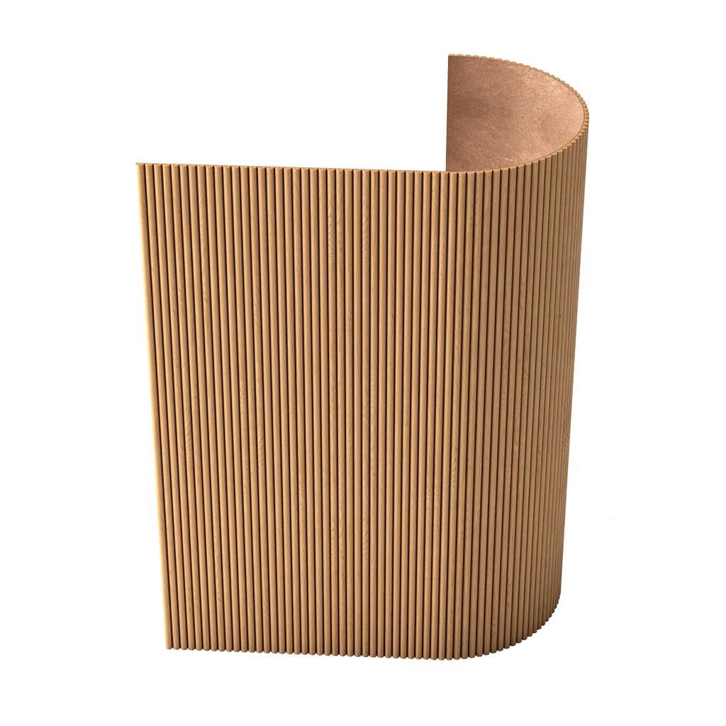
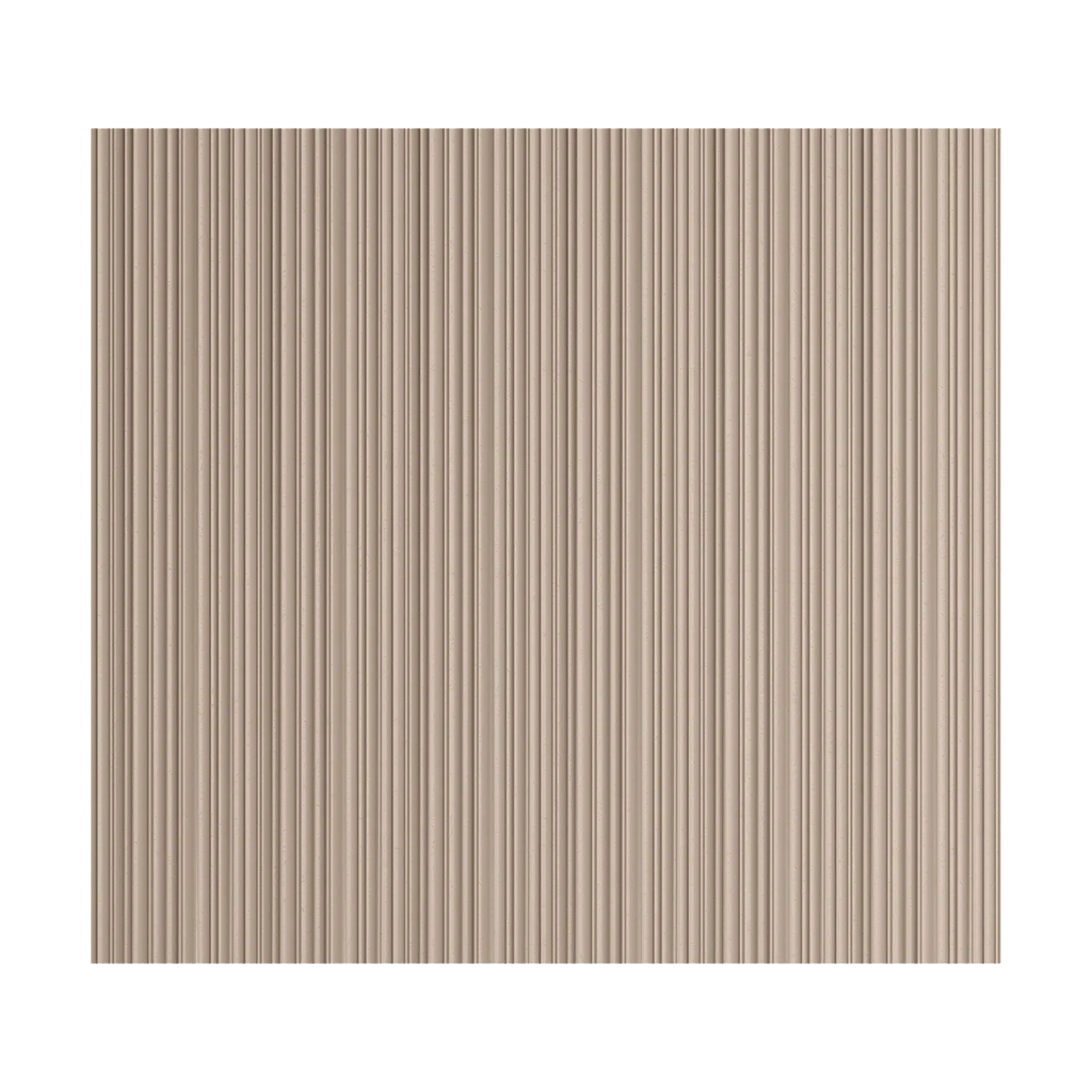
Slat panels give the wall a series of parallel lines and pronounced texture. If they are located next to a smooth menu area, the composition already has a contrast of "rhythmic surface — calm surface." NPU-191 appears precisely on the calm side and should not disrupt this principle.
A weak solution is to place the overlay so close to the slats that it begins to be perceived as an element of their edge. The carved contour and vertical lines conflict with each other, especially if the shadows from the slats and the overlay intersect.
A stronger approach is role separation: the slats remain an independent textured zone, while the menu and NPU-191 are objects on the smooth wall. A visible section of smooth background is preserved between the overlay and the start of the slat surface. Its size is not set by a universal number; it must be sufficient for the eye to see two separate systems.
If the slat area is already illuminated, the load increases. Then the decorative overlay may be appropriate only in the wall color and without separate accent lighting. If the slats are calm and dark, and the smooth part seems empty, the relief detail can balance the texture without copying it.
If slat panels are still being selected for other areas of the establishment, the commercially logical next step is — buy slat panels for walls for interior finishing already after agreeing on the overall wall architecture. In the scenario under consideration, they are considered existing finishing, so the article does not turn into a guide on selecting them.
How to check the side field between NPU-191 and the first slat
After vertical fitting, a second geometric question arises — the distance to the slat boundary. Here, too, one cannot invent a mandatory indentation.
First, measure the width of the smooth field where the menu is located. Then mark on it the actual position of the menu and the intended axis of NPU-191. If the overlay is centered on the menu, the side edge of the product is automatically determined relative to the first slat.
With the orientation confirmed, the remainder can be calculated as follows:
distance from the menu axis to the slat boundary − half the horizontal dimension of the overlay = free field from the overlay edge to the slat zone.
This formula is useful only when the menu axis and the product orientation are confirmed. It does not answer whether it looks nice, but it shows whether there is any room for a visual pause at all.
For example, if the distance from the menu axis to the first slat is 380 mm, and in the selected orientation the horizontal dimension of NPU-191 is 210 mm, half the dimension is 105 mm. The free field turns out to be 275 mm. This is a significant distance, and the overlay will definitely not be physically pressed against the slats. If the distance from the axis to the slats is only 150 mm, the free field after subtracting 105 mm is 45 mm; here especially careful fitting is required, because the carved edge and the vertical texture may visually interlock.
Do not repeat this calculation for ten wall sizes. Do it once for your actual geometry, and then check the result visually from working viewpoints.
If the free field looks too small, there are three honest solutions: leave the wall without NPU-191, shift the menu and the entire block if possible, or choose a different decorative element. Shifting only the overlay from the menu axis to increase the gap is usually worse: a new error appears — a violation of the connection with the informational object.
What the 12 mm relief provides under side and top lighting
The third coordinate of NPU-191 — 12 mm — is not a formality. On a smooth painted wall, the relief creates its own chiaroscuro, and it is this that can make the product either delicate or too active.
With soft, diffused frontal lighting, the protrusion reads calmly. The contour is visible, but the shadow is short and weak. In this mode, painting it the color of the wall often makes NPU-191 almost an architectural part of the surface.
With a side spotlight, the situation changes. Even a relatively small depth gives a shadow that repeats the carved pattern and visually enlarges the object. If the light comes almost parallel to the wall, shadows from individual parts of the relief can become longer and more complex than the element itself. Then a flat paper template underestimates the future activity.
With top lighting, a lower shadow appears under the overlay. It can be useful if you need to separate the ornament from the background, but in the area above the menu, there is a risk that the shadow will visually "lower" the decor closer to the informational block.
Therefore, the test is conducted under the coffee shop's standard lighting. Do not turn on an additional construction spotlight for the fitting — it does not reflect real operation. If there is dimming, check the typical working mode in the evening, when interior light is more noticeable than daylight.
Particularly careful work is needed with the backlighting of slatted panels. Two adjacent reliefs — the slats and the overlay — under different light angles can create too many shadows in a small area. In this case, abandoning separate light on NPU-191 often makes the composition calmer.
Paint NPU-191 the color of the wall or make it contrasting
Painting changes the visual weight more than a slight change in position. Therefore, you need to compare at least two scenarios: tone-on-tone and contrast.
In the color of the wall. This is the safest scheme if the menu is already graphically saturated, there are active slats nearby, or the coffee shop has a minimalist identity. The relief is read through light and shadow, but does not create a new color spot. This option is especially useful when the NPU-191 should complete the wall without becoming a sign.
Contrast coloring. It is justified if the interior is built on a small number of clear accents and the color of the overlay is already repeated in the logo, hardware, or furniture. However, contrast sharply increases visibility. A white overlay on a graphite wall or a golden one on a dark green wall will almost inevitably compete with the menu if the latter is done modestly.
Do not choose a color only based on the product sample in the catalog. Make two colored paper mockups. Even a primitive imitation will show the difference in mass better than a verbal description.
Also consider slat panels. If they are wooden, it is not necessary to paint the NPU-191 "to look like wood": imitation of another material can look artificial. It is much more logical to connect the stucco element with the smooth wall, and leave the wood as a separate texture.
If after trying it turns out that a different ornament or a different scale is needed, you can order decorative polyurethane overlays from the general category, rather than trying to force a specific NPU-191 to work where it is compositionally unsuitable.
Logo, coffee shop name, and NPU-191: who should occupy the top position
Many menus already contain a brand mark. Sometimes the logo is placed above the menu as separate three-dimensional letters. In such a case, the place planned for the NPU-191 may be occupied not physically, but semantically: the upper zone of the wall already belongs to the brand.
If the logo is directly above the menu, adding another decorative overlay above is often unnecessary. The result is a vertical sequence "overlay — logo — menu," where the visitor sees three levels of competing information. With a small distance between them, the system looks like a randomly assembled emblem.
If the logo is embedded inside the menu and does not visually stand out as a separate object, NPU-191 can work higher as an architectural detail. But its color and light should keep the logo as the main identifier.
A separate scenario is when a coffee shop uses heraldic, vintage, or classic branding. Here, a carved element can support the brand's character. But even in such a case, NPU-191 should not be presented as part of the official logo if it is not. The visitor should understand: the brand is the sign and name, the stucco is the interior.
Practical check: reduce a photo of the wall to the size of a phone screen. On a small image, relief details disappear, leaving only large spots. If NPU-191 turns into a second bright "logo" above the real logo, the contrast is too strong.
For a commercial space, this is more important than stylistic theory. Branding must remain recognizable regardless of how beautiful the decorative element is on its own.
Suspensions, track lights, and cameras: check not only the wall
Above the menu, there is often a technical zone: a track, pendant lights, a surveillance camera, a sensor, a ventilation grille, a cable outlet, a speaker. In a frontal photo, some of these objects may seem distant, but in perspective, they overlap with the decor.
Before installation, stand at the entry point and check whether the pendant visually passes through NPU-191. Even if there are dozens of centimeters in depth between them, they may intersect in one angle.
A track light creates another risk: its direction changes over time. Today it lights the counter, tomorrow an employee turns the spot, and the relief of the overlay gets a strong side shadow. Therefore, decor near adjustable light should be checked at several positions of the light head.
The surveillance camera is important not only visually. It must maintain a view, and the decorative element must not block the cable, service box, or access area. If the camera is mounted high and far from the wall, NPU-191 is unlikely to physically interfere, but a check is needed before adhesive installation, not after.
The same applies to ventilation. The overlay must not cover the grille or hinder maintenance of engineering equipment. The decorative function is always secondary to the safety and maintainability of a commercial space.
If technical objects already form the upper rhythm, the empty space above the menu may be the right solution. Not every free area has to become decorative.
How will NPU-191 behave if the menu changes seasonally
A coffee menu rarely remains unchanged for years. Prices, seasonal drinks, tablet formats, lighting, and sometimes the structure itself change. Therefore, the overlay should be attached not to a random current line of text, but to a more stable architecture of the area.
If the menu is a single permanent box or panel, the axis above it is fairly stable. NPU-191 can be considered part of the wall, not part of the replaceable content.
If the menu consists of separate sheets, posters, or screens, their number may change. Today three tablets create a center in one place, tomorrow four in another. A rigidly glued overlay will remain on the old axis and may look misaligned.
Before ordering, it is worth asking the owner or manager two questions: whether the menu width will change in the coming year and whether a transition to digital screens is planned. If the answer is "yes," it is better to attach NPU-191 to the unchanged axis of the wall or postpone installation until the final configuration.
There is also an operational factor: when updating the menu, staff may need a stepladder, access to the top edge, and removal of panels. The overlay should not fall into the path of hands and tools. The relief polyurethane element is not intended to be used as a support or handle.
Thus, the assessment of "beautiful today" is insufficient. For a commercial interior, good decor should survive several content updates without feeling like it is glued to a specific outdated version of the menu.
Installation after finished renovation: what to check on the base
The advantage of this scenario is that the wall is already ready: the location can be assessed in the real interior. But the finished finish increases the cost of a mistake. Before adhesive installation, the base needs to be checked.
The NPU-191 card indicates easy adhesive mounting. This does not mean that any finish is automatically suitable. The strength of the coating and the cleanliness of the surface are important. If paint peels off from putty, the adhesive may hold the overlay together with the top layer of paint, but the layer itself will tear off the wall. If the surface is covered with dust, grease, or cleaning product residues, adhesion decreases.
For a coffee shop, the area near the bar and kitchen is especially relevant, where aerosol film appears faster on surfaces. Even if the wall looks clean, the area under the overlay must be prepared according to the recommendations of the chosen adhesive system and finish coating.
Before final fixation, mark the axis with a pencil or painter's tape. Do not apply adhesive until the template has been checked from all points. Adhesive mounting should not be a way to "try on" the product.
In the related products section, the NPU-191 card shows KUDO HIGH TACK. If this composition is chosen for a specific base, Buy KUDO High Tack adhesive it can be as a separate related product. But the presence of adhesive in the "bought with this product" block does not negate the need to verify the adhesive instructions against the actual paint, plaster, or other base.
For general selection, available Materials for installing stucco molding. The article deliberately does not calculate adhesive consumption without a confirmed application pattern and base condition.
Why you cannot glue NPU-191 onto the slats themselves just for proximity to the menu
Sometimes after fitting, it turns out that there is too little space on the smooth part, while on adjacent slat panels there is a free area. There is a temptation to move NPU-191 onto the slats. For this article, this is a bad workaround.
First, the slat surface is not a continuous flat plane. The contact area of the decorative overlay may fall on protrusions and gaps, and the wall relief prevents even seating. A specific method of attachment to such a base requires a separate engineering check.
Secondly, the meaning changes. On a smooth wall, NPU-191 completes the menu. On slats, it becomes an independent decor on top of an already active texture. This is a different visual scenario that cannot be considered an automatic alternative.
Thirdly, a shadow problem arises. The slats themselves create an alternation of light and shadow; on top of them, a carved relief may lose readability or look restless.
If there is not enough smooth surface, the honest conclusion is that the specific location is not suitable for NPU-191, rather than "let's move it somewhere nearby." This is a commercially useful article: it helps to refuse an unsuitable purchase.
An exception is possible only in a specially designed insert or substrate that creates a flat mounting plane over the slat area. But then the entire new structure is evaluated, not just one overlay.
If the menu protrudes from the wall: compare the depth of the two objects
Not every menu is in the same plane as the painted wall. A light box, a tablet on remote holders, a metal frame, or a screen may protrude forward by several centimeters. In such a case, the depth of NPU-191 of 12 mm should be assessed not on its own, but relative to the existing volume.
If the menu protrudes significantly more than the overlay, NPU-191 may look like a thin wall relief behind it. This is not necessarily bad: such a hierarchy emphasizes that the menu is a functional foreground object, while the molding is an architectural background. But with a very massive light box, a small carved detail may get lost, especially if painted in the wall color.
The opposite situation occurs when the menu is almost flat—for example, sheets under transparent panels or thin tablets. Then the 12-millimeter relief becomes more noticeable in a side view and may be perceived as more voluminous than the menu itself. Here, checking from the queue side is especially important, not just from the front.
It is practically useful to make a side diagram. Measure how much the front plane of the menu protrudes from the wall, and compare this value with the 12 mm of NPU-191. This does not give a "correct coefficient," but it shows in advance which object is physically closer to the viewer. If the menu protrudes by 40 mm and the overlay by 12 mm, their depth roles differ obviously. If both objects protrude approximately equally, they are perceived more as elements of one layer and therefore require careful color and axial coordination.
Also consider the shadow. A thick light box already casts its own shadow on the wall. Adding a carved relief on top creates a second shadow pattern. With side lighting, two layers can enhance visual fragmentation. Then tone-on-tone or abandoning the overlay may be more reasonable than a contrasting solution.
Cleaning and maintenance: the decorative area is located in an operating coffee shop
The wall above the menu may seem inaccessible to everyday dirt, but a commercial space differs from a living room. Dust settles on horizontal sections of the relief, air flows from ventilation may pass nearby, and during menu service, staff work with a stepladder and tools. Therefore, operation must be considered before gluing.
A carved ornament requires more careful cleaning than a smooth painted surface. The more complex the relief, the more recesses where dust is visible under side light. This is not an argument against NPU-191, but a reason to check whether staff can safely reach the element without contact with the menu, lights, and wiring.
The position of the overlay relative to the top edge of the menu is especially important. If the gap between them is too narrow, it may be inconvenient for wiping: a hand or attachment cannot fit through, and dust is visible against a contrasting background. In this case, a visual pause is useful both compositionally and operationally.
Also think through the wall repainting scenario. The NPU-191 card allows painting, so the element can be included in a unified surface refresh. But if the menu cannot be quickly removed, access for a brush or roller around the relief may be limited. Before installation, it is worth understanding how the area will be maintained in a year, not just how it looks on opening day.
Do not use the decorative overlay as a place for temporary attachment of garlands, price tags, or seasonal signs. It is not a functional rail or holder. If the coffee shop regularly changes holiday decor, it is better to leave separate attachment points in advance, not related to NPU-191.
The operational test is simple: the employee who usually changes the menu and cleans the wall must confirm that
When one NPU-191 truly completes the wall with the menu
There are several signs under which purchasing one overlay looks logical.
First, there is an independent smooth field above the menu: the element is not squeezed between the menu and the ceiling and does not visually touch the slat boundary. Second, the menu has a strong hierarchy of its own and does not lose primacy after adding the pattern. Third, the interior already features a language of relief or classical details, so NPU-191 does not appear as the only random ornament.
A good scenario is a large, laconic menu on a calm wall, with a slat zone nearby, and the upper part of the smooth field truly looks unfinished. A single overlay along the menu's axis creates the composition's apex, without requiring a molding frame or additional paired elements.
Another suitable case is when the overlay's color matches the wall. Then the relief is only perceived with movement and changes in light, while the menu remains the main graphic object.
The commercial outcome here is specific: one piece is needed, not a set. At the time of verification, the STAVROS listing shows a price of 2,220 ₽ for NPU-191. Additional costs for adhesive, preparation, and painting depend on the chosen materials and the wall's condition, so they cannot be honestly added as a single universal sum.
If the broader task is decorating the entire establishment, it's useful to separately review the material "Stucco decor for restaurants and cafes". It addresses a different intent: selecting a decorative system for various zones. The current article remains narrow—one finished wall, one menu, one NPU-191.
When it's better not to buy NPU-191 above the menu
Declining the product is a valid outcome if it prevents an overloaded wall. For this scenario, NPU-191 is not needed when at least one of the following conditions is met.
There is effectively no free space. The template fits only technically, but almost touches the menu or the upper structure. In such a position, the decor looks cramped.
The logo already occupies the top position. Adding a carved overlay creates a third focal point between the branding and the menu.
Slat panels and backlighting are already the main accent. Another relief increases visual noise.
The menu is small. The overlay becomes equal to or larger than the informational object in scale and draws attention away.
The menu is temporary or will soon expand. Rigidly fixed decor may remain on the wrong axis after an update.
Technical equipment runs along the wall. A sensor, camera, ventilation, cable access, or service area is more important than decorative filling.
The template looks good only when the lights are off. Under working lighting, the relief becomes too contrasty or casts a heavy shadow.
The overlay is not connected to the interior language. If the entire coffee shop is minimalist and the only classical carving appears above the menu without support in other details, it may look random.
Empty space works better. Sometimes it is the free area that separates the menu from the ceiling and makes it easier to read. This is not an 'unfinished wall' but a useful visual pause.
If the decision remains doubtful after the template, it is more rational not to buy. A commercial article should not turn uncertainty into an automatic sale.
What to choose instead of NPU-191 if it did not pass the trial
Rejecting a specific overlay does not mean the wall must be left unchanged forever. But the alternative should address the reason for the rejection.
If the problem is too much visual weight, look for a smaller or more concise element. For this, a general category is useful polyurethane decorative overlays, where other shapes can be compared.
If the problem is ornament overload, the best alternative may be no molding at all: leave a smooth field, adjust the light, or change the menu spacing.
If you want to connect a smooth wall with the overall architecture of the establishment, but a separate overlay seems random, it is worth first looking at the entire polyurethane decor system and You can buy ready-made stucco matching the Baroque style. Calculate the quantity: linear meters of cornices and moldings, number of rosettes, pilasters, consoles, corner elements. Add a ten to fifteen percent allowance for trimming. already within the framework of an agreed project, rather than adding a single detail after the fact.
If the problem is only color, there is no need to change the SKU before checking tone-on-tone. Sometimes the same relief, after painting to match the background, stops competing with the menu.
If there is not enough vertical space, reducing the size of the decor is more logical than trying to reduce visual margins to zero. And if the smooth field is too narrow due to close slats, keeping the wall empty is better than shifting NPU-191 off the menu axis.
The main principle: the alternative should eliminate a specific constraint, not just replace one decorative purchase with another.
Mistakes when placing NPU-191 above a finished menu
Significant mistakes here differ by cause, so it is convenient to gather them in one section.
Evaluate the wall only up close
Why it happens: the owner holds the template nearby and sees a beautiful relief. Consequence: from the entrance, the element turns out to be either too small or too active. Check: three real viewing points. How to avoid: make the final decision based on the visitor's perception, not the installer's.
Center on the entire wall instead of the menu
Why it happens: it seems symmetry is always correct. Consequence: the decorative element visually detaches from the information block. Check: laser or the template's center line. How to avoid: first determine which object the overlay completes.
Choose color before checking light
Why it happens: the shade is looked at from a catalog or a paint sample. Consequence: the working spotlight turns the relief into an overly contrasting spot. Check: mockup under standard lighting. How to avoid: evaluate color and light together.
Consider technical "fits" equal to compositional "suits"
Why it happens: the size is compared only with the free height. Consequence: the decor is squeezed between the menu and the ceiling. Check: evaluate the residual margins around. How to avoid: consider not only the overlay's dimensions but also the air.
Glue before the final menu approval
Why it happens: the decor is wanted to be finished before the content. Consequence: after expanding the menu, the axis changes. Check: confirm the future menu format. How to avoid: attach the molding after fixing the stable geometry of the information block.
Use the overlay as a way to hide a defect or cable without checking
Why it occurs: the relief seems like a convenient disguise. Consequence: the service area is closed off, or the product sits on an uneven base. Check: determine the purpose of all hidden elements. How to avoid: a decorative object should not replace a technical solution.
Practical algorithm before ordering NPU-191
To avoid returning to the same doubts, it is convenient to go through one sequential cycle.
-
Record the current menu configuration. Make sure its dimensions and position will not change immediately after installing the decor.
-
Measure the free upper area. From the top edge of the menu to the ceiling, cornice, track, or another boundary.
-
Determine the axis of the menu. Not the wall or the slats, but specifically the object that the decor should complete.
-
Make a template of 210 × 197 mm. Maintain the product orientation according to the card or drawing; do not substitute A × B with an assumption about width and height.
-
Add a depth simulation of 12 mm. Especially with side lighting.
-
Try at least three height positions. Without searching for a universal standard offset.
-
Check the side field before the slats. If necessary, perform one calculation of the residual field.
-
Look from the entrance, from the queue, and from the checkout. Note what the eye notices first.
-
Compare two colors. In the tone of the wall and the proposed contrasting option.
-
Turn on the standard evening light. Assess shadows and competition with the slat backlighting.
-
Check the logo, light fixtures, and technical zones. Nothing should overlap visually or physically.
-
Think about updating the menu. Will the axis remain after a seasonal content change.
-
Check the base. The finish must be durable and suitable for the chosen adhesive system.
-
Compare two final options: with NPU-191 and without it. Do not add third decorative elements for the sake of "completeness."
-
Only after this, order one piece. If the option without the overlay is better, the purchase is not needed.
This algorithm is useful precisely because it turns a taste-based doubt into a series of testable decisions.
What to ultimately put in the cart
For a given scenario, there are only two main outcomes.
| Solution | When it fits | Cart |
| Leave the menu without NPU-191 | The top field already works, the logo/light/rails are active, the template overloads the wall | 0 × NPU-191 |
| Add one NPU-191 | There is an independent smooth field, the menu remains the first object, the axis is stable, the light does not overload the relief | 1 × NPU-191 |
At the time of verification, one NPU-191 costs 2,220 ₽. The price refers to the overlay itself; installation materials, preparation, and painting are calculated separately based on the actual conditions of the site.
If the decision to purchase is made, it is enough to order NPU-191 in the product card after the approved fitting. There is no point in repeating the link to the card in every section: it is more important for the reader to pass the check and get the correct result.
If the decision is made not to buy, it does not mean the project has "lost." The menu in a coffee shop is a functional object, and the empty space around it often makes information more noticeable and visually more expensive. Good interior design is not measured by the number of decorative details.
Conclusion: NPU-191 should complete the menu, not compete with it
The carved decorative overlay NPU-191, sized A × B × C 210 × 197 × 12 mm, can work above a finished menu as a single top accent if there is truly an independent space on a smooth wall. But the decision is not made based on a product card or abstract symmetry.
You need to check the full-size template, the menu axis, the vertical remainder, the distance to the slat panels, the logo, the working light, the 12 mm relief, future menu changes, and the condition of the base. The main condition is information hierarchy: the visitor should first see the menu and the brand, and notice the decorative overlay only on a second reading.
If this condition is met, a single NPU-191 is sufficient. If the template competes with the menu, presses against the ceiling, intersects with the logo, or enhances an already active slat wall, it is better to leave the smooth surface without additional molding.
Such a choice is more valuable than the automatic "decor always beautifies": it helps to buy a specific product only where it truly solves the task of a finished commercial interior.
FAQ
Can NPU-191 be placed above a digital menu screen instead of a printed tablet?
Such a scheme can be considered, but you need to account for the fact that a digital screen changes brightness and content. A dark static template next to a bright display can almost disappear during the day and become noticeable in the evening. Check the composition on several typical screens: light interface, dark interface, and an advertising video. Also leave access for display and cable maintenance.
What to do if the menu consists of two separate panels with a small gap?
First, determine whether they are perceived as a single information block. If yes, the axis for NPU-191 is defined by the overall group. If each panel is independent and there is already a pronounced separation between them, a single central overlay can artificially unite what is functionally divided. A full-size template will show this faster than any formula.
Can the NPU-191 be placed not in the center, but closer to the slat panels?
Only if the overlay is meant to work for a larger compositional group, rather than complete the menu itself. A simple shift to fill an empty corner usually weakens the connection with the menu and brings the ornament closer to the active texture of the slats. For the original scenario, central alignment with the menu is safer.
Is a molding frame around the menu needed along with the NPU-191?
Not necessarily. In this article, the NPU-191 is considered as an independent top accent above an already finished informational object. Adding a frame changes the wall architecture and requires separate fitting: it can enhance the classical character, but at the same time increase the decorative load and the risk of competing with the slats.
Can the NPU-191 be installed after several months of the coffee shop's operation?
Yes, the scenario itself is suitable for post-installation if the base has retained its strength and cleanliness. Before gluing, you need to remove dirt in a way compatible with the wall covering, check the paint for peeling, and re-fit the template: over the months, new lights, signs, or equipment may have appeared.
What to do if there is a fire detector above the menu?
Do not cover or move it for decoration without a design and regulatory basis. The detector and its required working zone take priority. If the NPU-191 template ends up near the equipment in a way that raises doubts about access or operation, it is better to move the decorative element to another scenario or abandon it.
Is it worth duplicating the NPU-191 on the second wall of the coffee shop for interior symmetry?
Not automatically. The second wall must have its own purpose and a comparable object—for example, a second menu or a similar architectural axis. Buying a second overlay just because the first exists is a weak reason. Repetition is justified if it supports a real interior system.
Will the NPU-191 be suitable for an outdoor sign at the entrance?
The current article and product fitting refer to an interior wall. Transferring to an outdoor sign requires separate verification of operating conditions, substrate, precipitation, temperatures, and mounting system. Do not automatically transfer an interior solution to a facade just because the shape is liked.
Can the NPU-191 be left white if the wall is already painted in a color?
Technically, the color solution depends on the project, but visually a white element on a colored wall will become significantly more active than tone-on-tone. For the area above the menu, this may disrupt the hierarchy. Make a white paper mockup and a wall-color mockup and compare under real lighting before final painting.
How can you tell after a month that the solution was successful?
Evaluate not only your own habituation. Ask employees whether the decor interferes with reading the menu from the queue, whether light reflects with strange shadows, or whether it complicates cleaning or menu replacement. If the element remains in the background and does not create operational problems, then its role was chosen correctly.