






Article Contents:
- First, assess what already draws attention
- Decorative density describes the perceived saturation
- Scale and density require different solutions
- Four levels for comparing options
- Style helps choose the pattern, but does not set the quantity
- First level: when a single profile is enough
- Second level: two profiles with different roles
- Third level: the ornament occupies the chosen zone
- The repeat affects the activity of the ornament
- Fourth level: a complex system needs order
- An empty field separates one decorative gesture from another
- Color changes the hierarchy without adding details
- The depth of the profile is considered together with light
- An accent wall changes the requirements for adjacent surfaces
- The ceiling is also part of the field of decorative saturation
- Density can be distributed across the entire space
- Before the catalog, assign a role to each element
- Real profiles allow you to verify the chosen hierarchy
- A decorative corner changes not only the joint but also the composition
- A ready-made collection helps compare the degree of saturation
- Compare three versions of one composition
- Example: how to keep the accent and reduce saturation
- The overall view matters more than an impressive close-up
- A sample checks the relief in real light
- Before the specification, check whether every type of decor is needed
- Approve the system composition and proceed to order
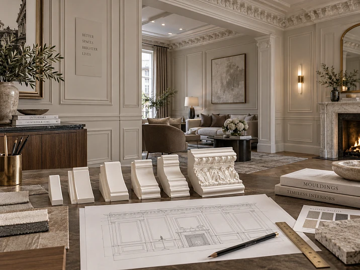
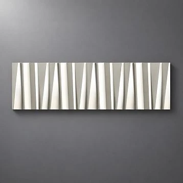
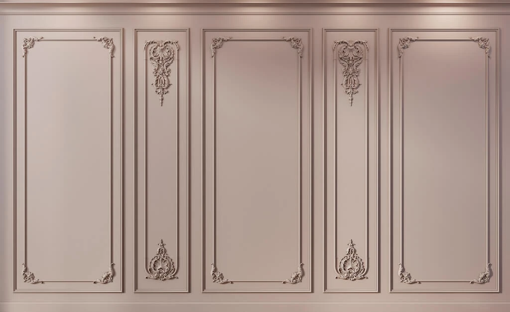
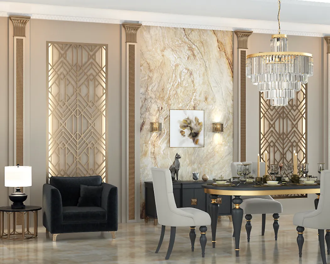
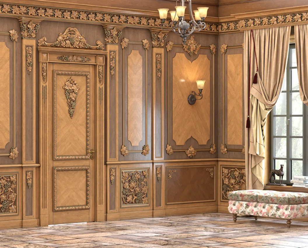
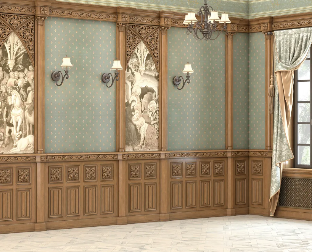
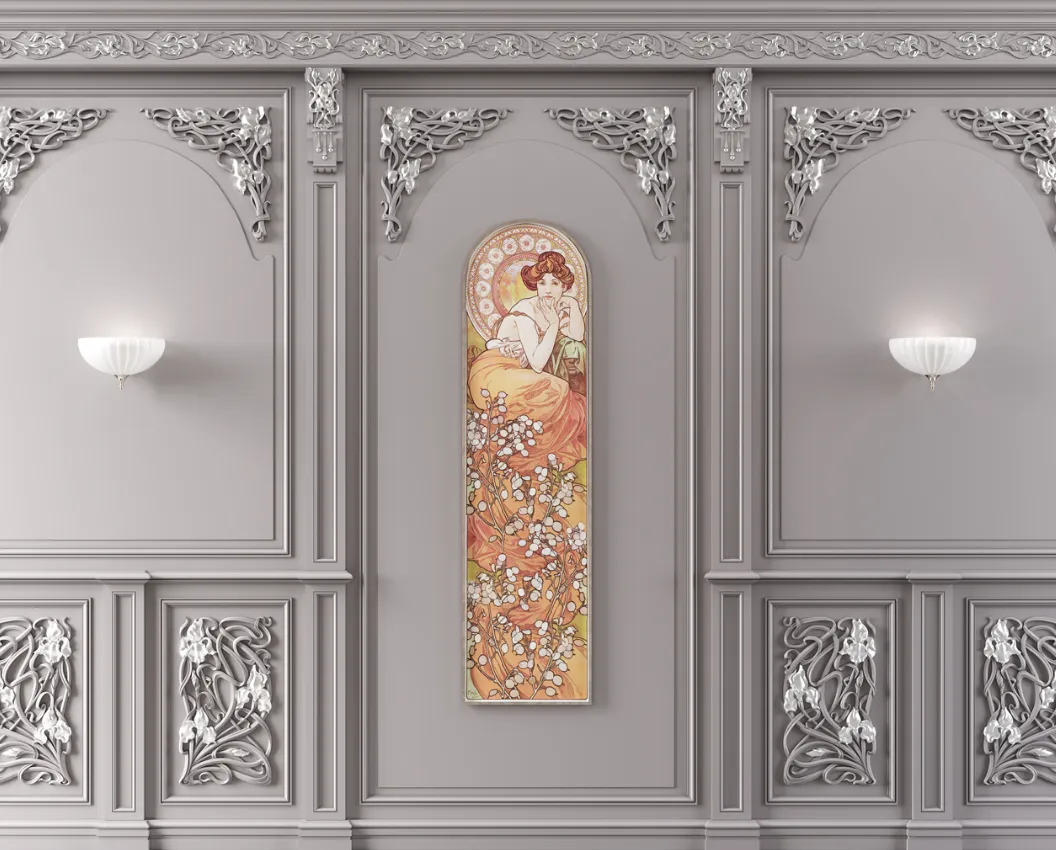
Four frames on a wall can almost dissolve into its color, or they can become the most noticeable object in the room. The quantity is the same, but in the second case the profiles have deep relief, contrasting paint, and ornamental inserts. If you place an expressive cabinet nearby and add a large chandelier, the initially calm composition will change once again.
Therefore, the question “how much stucco does an interior need” is decided together with architecture, furniture, and light. Designer stucco becomes part of a unified solution when it is clear which line organizes the space, which profile supports it, and where the main accent is located. The remaining elements are assigned a corresponding role.
It is useful to start with the overall composition. You move on to specific items after its main lines, dense areas, and open surfaces have been determined.
First assess what already draws attention
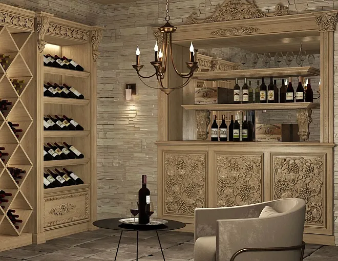
Look at the room without added molding. Tall doors, window frames, the pattern of the stone, open shelves, and large light fixtures already create a visual rhythm. Even a white wall can be in a very dense environment.
Mark the permanent elements on the elevations and general views: openings, built-in furniture, and large finishing surfaces. Then add the proposed curtains, paintings, and freestanding furniture. Only after that should you assess how much additional pattern the walls and ceiling require.
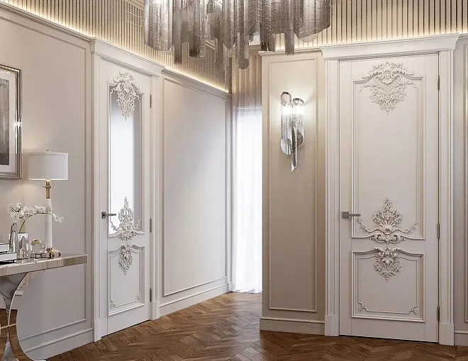
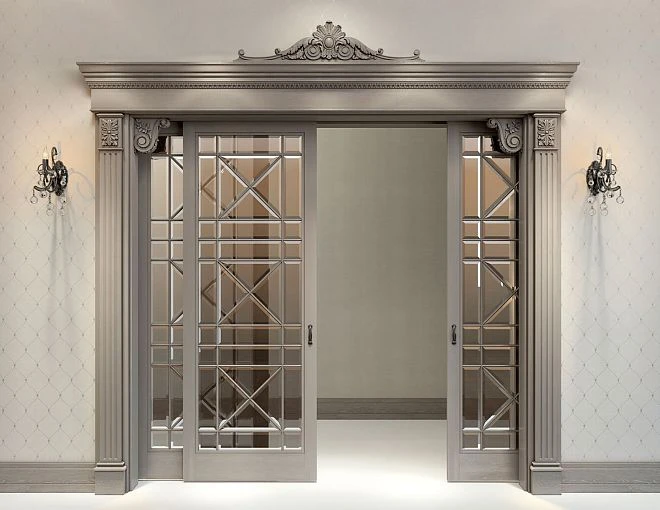
For example, an active stone surface and an expressive door surround can support the interior without a complex system of overlays. In another room, it is the molded contour that will become the main architectural theme. The same room area does not make these tasks the same.


Decorative density describes the perceived richness
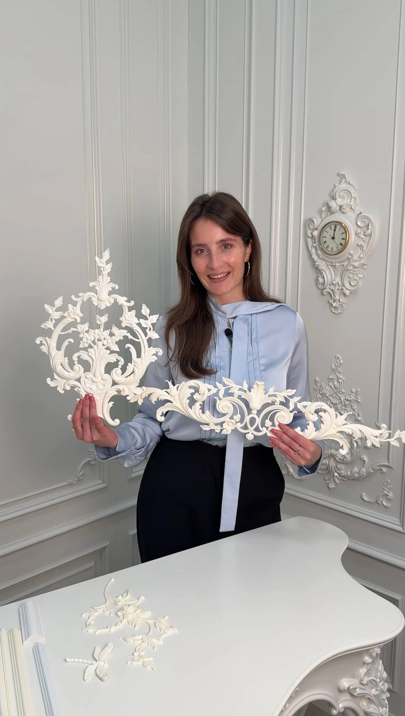
Here, by decorative density we will mean the richness of the visible fragment of the interior in lines, relief, and accents. This is a qualitative characteristic of the composition, not a physical quantity with a universal formula.
It is simultaneously influenced by the number of contours, the frequency of repetitions, the width of the profiles, the cross-section pattern, the depth of the relief, and the color contrast. Perception also changes with the lighting and the distance to the wall.
Therefore, it is useful to count decorative details for purchasing, but it is not enough to evaluate the result. One large overlay can gather attention at a specific point, while many small identical elements distribute it across the entire surface.
The practical question is this: which elements are read first, which support them, and does the composition retain a clear order? The answer is obtained by looking at the interior as a whole.
Our factory also produces:


Scale and density require different solutions
Scale shows how large an element is relative to its surroundings. Density characterizes the number and activity of visual events in the field of view.
A large, smooth profile can define a large wall with a single calm line. Many small ornamental details can produce a richer pattern. Therefore, the advice "a spacious room needs more molding" often leads to the wrong solution.
If the decor gets lost on a large surface, first check its scale. Perhaps it is enough to increase the width of the main profile or enlarge the frames while keeping their number the same. If the space feels fragmented, reducing all the details may intensify the small-scale rhythm. In that case, it is more useful to reduce the number of contours or merge compositional fields.
Get Consultation
Four levels for comparing options
For a working discussion, it is convenient to use four conventional levels of decor composition. This is an author's comparison model that can be adapted to the project. It does not set an allowable amount of molding and does not replace visual verification.
| Level | Composition of the solution | The main question to check |
|---|---|---|
| 1. Main line | One profile type, simple layout | Is the wall architecture sufficiently expressed? |
| 2. Two subordinate contours | Primary and secondary profiles | Is it clear which line is the main one? |
| 3. Local ornament or accent | Linear base with a highlighted band or a single detail | Does attention gather in the intended zone? |
| 4. Developed decorative system | Several levels of moulding, corners, overlays, large accents | Is order maintained between all elements? |
The level number describes the composition of the solution. A contrasting simple layout can be perceived as more active than a complex monochrome composition. Therefore, the level is always considered together with color, light, and surroundings.
Style helps choose the pattern, but does not set the quantity
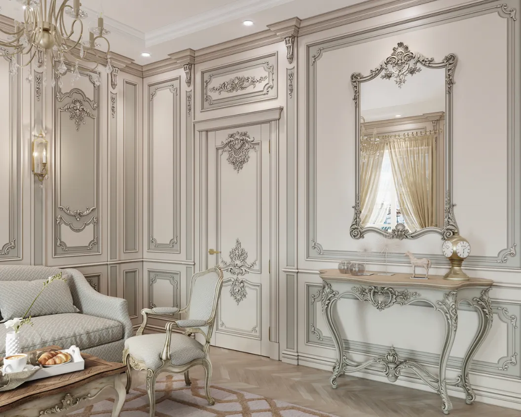
Plaster molding styles suggest the character of lines, motifs, and their combinations. However, within a single direction, different degrees of density are possible. A neoclassical composition may be limited to frames with a small accent or may develop into a complex system of surrounds.
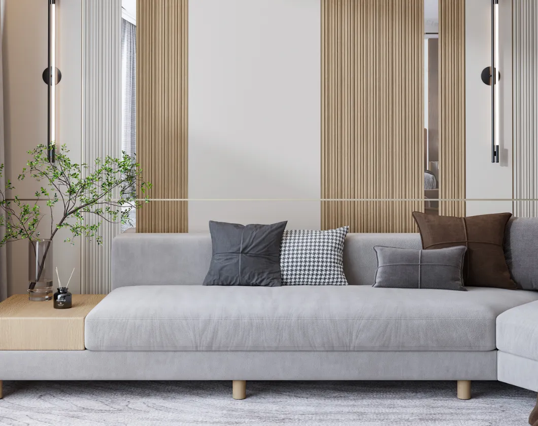
Modern plaster molding also does not necessarily mean a minimal number of lines: a dense geometric layout can be quite active. Therefore, it is useful to supplement the style name with a specific description: “a calm background for art,” “an expressive ceiling center,” “a rhythmic wall without individual appliqués.”
Such a concept is easier to verify in the project and explain to the client. It sets a criterion for every subsequent decision: does the new element help create the desired impression, or does it add yet another independent pattern?
First level: when one profile is enough
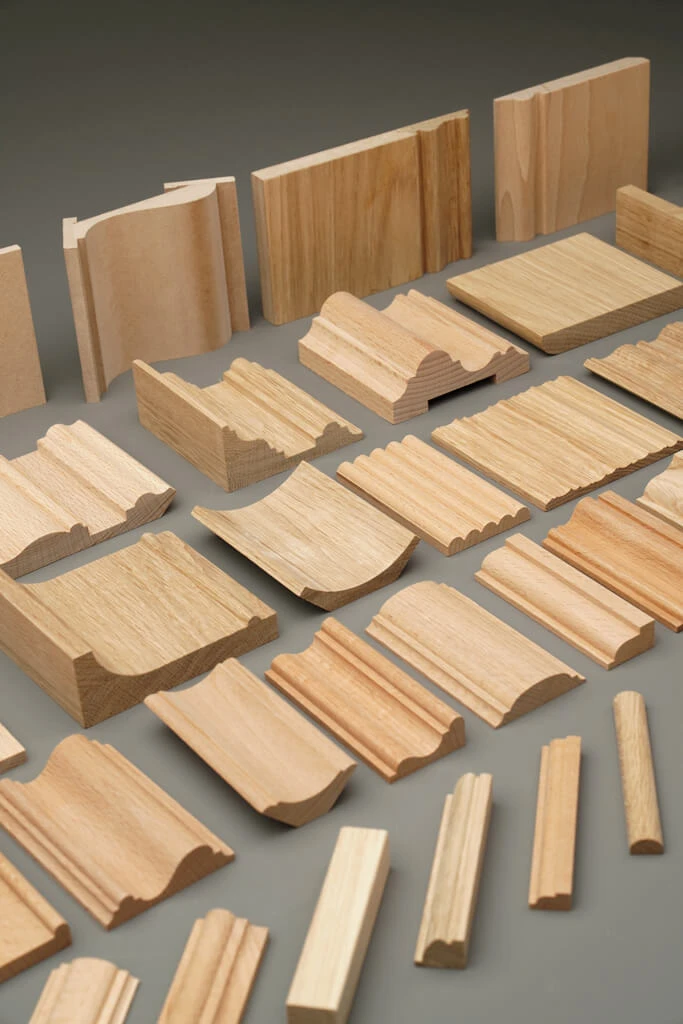
One main molding can connect openings, panels, and free sections of the wall. Its expressiveness is created not by the number of additional details, but by the proportions of the layout and the character of the section.
This approach is worth checking if the room already has complex furniture, a large stone pattern, or a noticeable ceiling structure. The line supports the existing architecture without adding yet another independent ornamental subject.
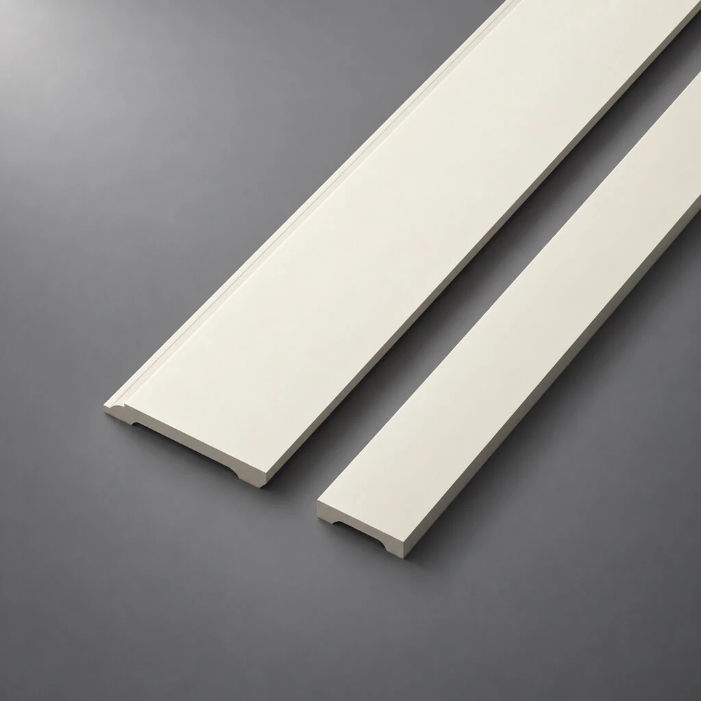
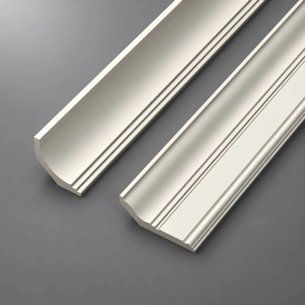
Choosing Moldings made of polyurethane, determine in advance the role of the profile: outline a panel, assemble frames, run a horizontal band. One type of product does not mean a single line in the room. It can be repeated while maintaining a clear rhythm.
If a simple solution seems insufficient, clarify the reason: weak scale, unsuccessful proportions, or lack of the needed accent. Each reason requires its own change.
Second level: two profiles with different roles
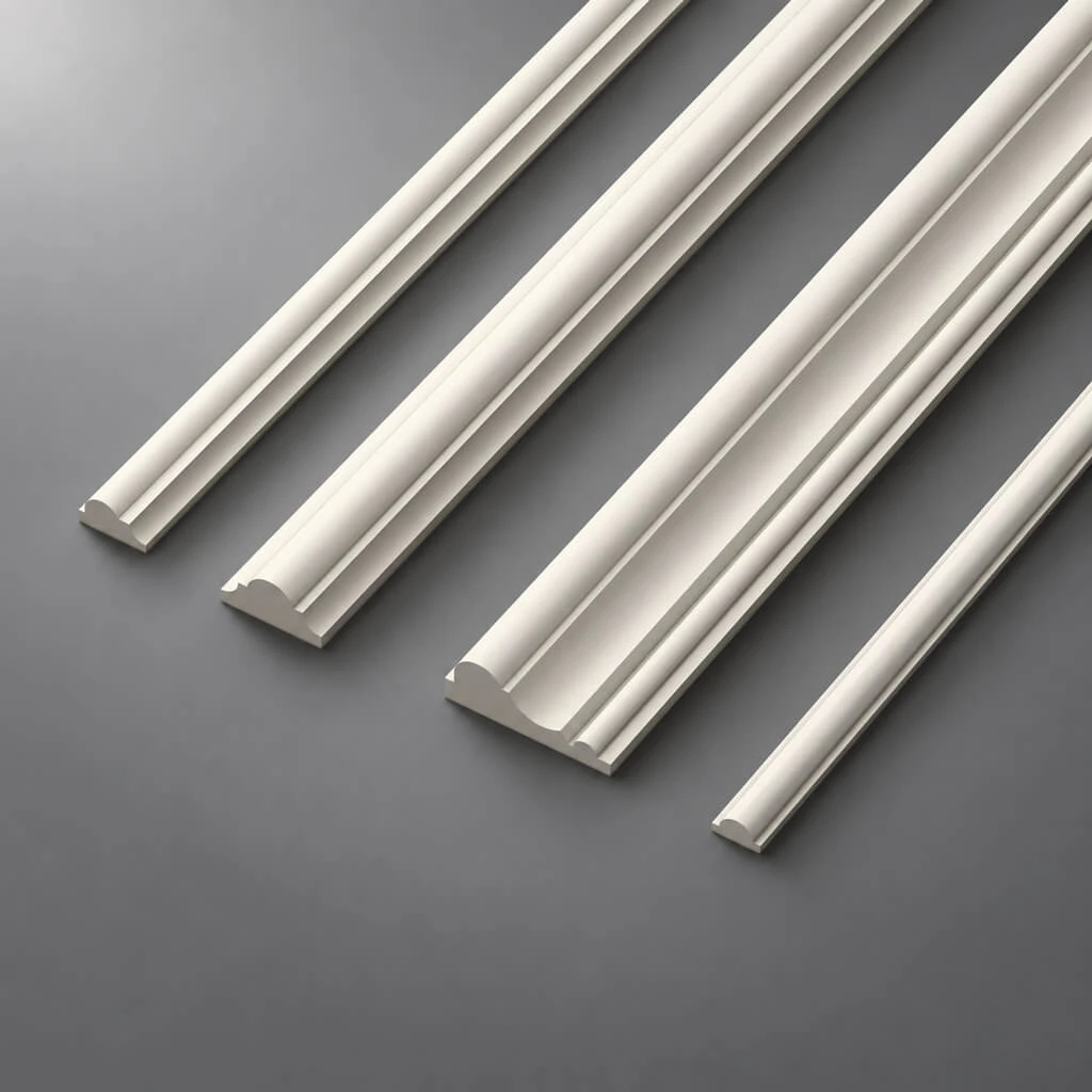
In a double frame, the outer contour can define the main shape, while the inner one refines it and connects it to the panel or decorative field. For the difference to read clearly, the profiles are compared by width, depth, pattern, and color.
A smaller width helps make the inner line calmer, but it does not guarantee this by itself. A narrow contrasting ornament can attract more attention than a wide smooth profile in the wall color.
Look at the composition from a normal viewing distance. If the two contours look like equally heavy framing, try simplifying the secondary section, reducing its contrast, or changing the spacing between the lines. A gap that is too tight may blend with shadows, while one that is too large can turn the contours into two independent patterns. The right spacing is found on the specific composition.
Third level: the ornament occupies the chosen zone
An ornamental band, a highlighted frame, or a local overlay adds a second character of pattern to the linear base. It is useful to define in advance the boundary of their application: above the opening, around the central panel, in a single frieze.
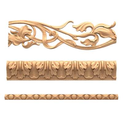
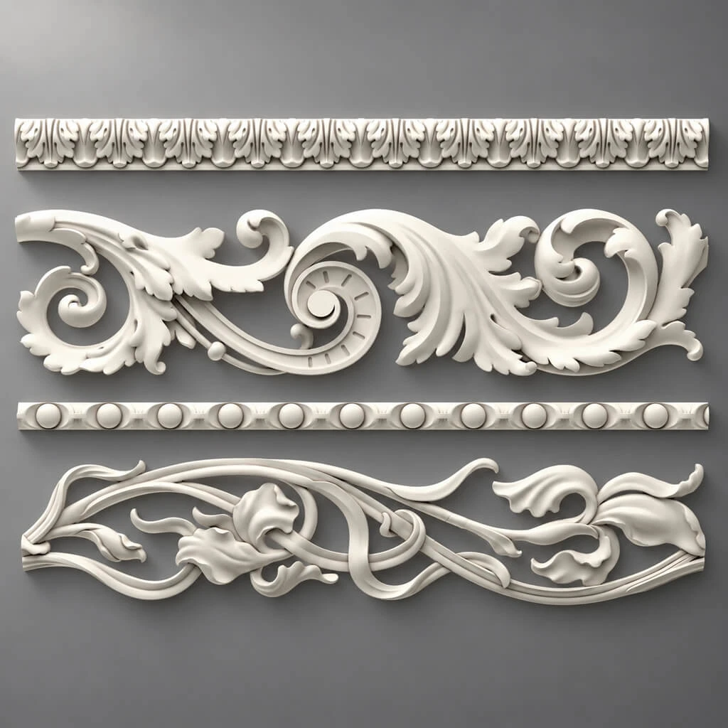
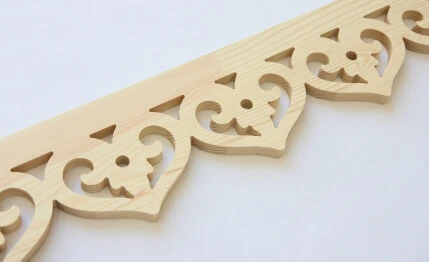
In the section polyurethane molding choose extended elements, and ornamental trim allows adding a repeating motif. The solution becomes more convincing when this motif has a specific place rather than repeating on all available borders.
For example, the ornament can be concentrated in the upper band while keeping the wall frames smooth. Another option is to highlight only the central frame and leave the neighboring ones as supporting elements. The choice depends on where the gaze should be directed when entering the room.
The repeat affects the activity of the ornament
A repeat is a recurring section of a pattern. Its frequency and character set the rhythm of an extended decorative element. Small beads, a braid, and a large floral motif read differently over the same length.
Narrow moulding with frequent repetition can make a surface more fragmented than a wide smooth profile. Therefore, width cannot be used as the sole indicator of visual significance.
Check the pattern along the full length of the band and near its ends. A close-up image of a single motif does not show how a long sequence will be perceived. If the rhythm conflicts with door panels, furniture fronts, or textile patterns, consider a calmer motif or reduce the area where it is used.
Fourth level: a complex system needs order
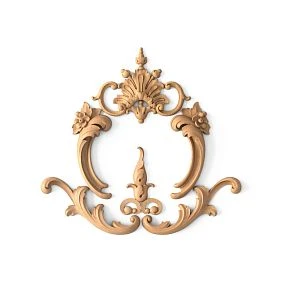
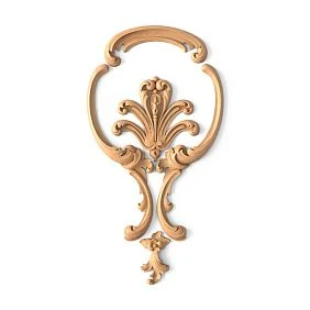
A rich composition may include corner elements, medallions, cartouches, overlays, and several types of moulding. Each element is given a role: to support the border, highlight the center, complete a vertical, or connect adjacent parts.
First check the linear base without individual decorative pieces. Then add accents one type at a time, observing what has changed in the overall appearance. If after another addition the compositional center is no longer readable, reconsider the placement and prominence of the new details.
High richness can be a deliberate artistic decision. For it, the repetition of motifs, the subordination of scales, and a predictable rhythm are especially important. A complex composition does not have to be restrained, but its internal connections must be clear.
An empty field separates one decorative gesture from another
Free surface helps to read the edge of the frame, the silhouette of the overlay, and the interval between adjacent elements. It participates in the composition on equal terms with the relief.
When choosing decorative inserts check the surrounding field by the outermost points of the ornament. It is not enough for a detail to formally fit within the rectangle: scrolls may almost touch the frame and create unwanted tightness.
Pay especially close attention to the gaps between several saturated zones. A small empty strip between an active frame and an ornamental band may look like a random leftover. A clearer pause helps separate their functions.
There is no universal share of empty wall for all interiors. Assess whether free space remains after placing furniture, pictures, and light fixtures, not only on an empty elevation.
Color changes the hierarchy without adding details
A profile in the wall color is more often read through relief and shadow. Contrasting paint adds an independent graphic line that remains noticeable even under more even lighting.
If contrast is needed only for the main contour, auxiliary elements can be kept closer to the background. When both profiles, the corners, and the central overlay are highlighted at the same time, the difference in roles has to be created by other means.
After changing the color, check the composition of the decor again. Perhaps some of the additional elements are no longer needed for expressiveness. But prescribing a mandatory reduction in quantity in advance is wrong: the result depends on contrast, the area of painted surfaces, and the overall task.
Also compare matte and more glossy finishes under the intended lighting. The same color does not guarantee the same perception of the surface.
Profile depth is considered together with light
Parameter C shows the thickness or depth of the item in the dimension system adopted for the card. It helps to imagine the projection and possible light-and-shadow effect, but does not describe it fully.
The result depends on the section itself, the direction of light, the size of the source, and the finish. A profile with several steps creates a different pattern of light and dark areas than a smooth convex section of similar depth.
Side lighting can strongly reveal relief that is almost invisible under soft front lighting. That is why daytime and evening scenarios are considered separately. You should not automatically choose the smallest C for the sake of calm or the largest for the sake of expressiveness: evaluate the specific "profile — light" pair in the context of the other elements.
An accent wall changes the requirements for adjacent surfaces
If one wall receives a rich composition of the third or fourth level, the adjacent ones can support it with a simpler layout. It is important to preserve the common features: the character of the main line, individual levels, color, or a repeating motif.
It is not necessary to copy all the overlays onto every wall. Sometimes it is enough to continue the main profile so that the interior feels connected. At the same time, the accent zone retains its position in the hierarchy.
Check corner views where two walls are visible at the same time. Individually, each may look balanced, but together they can create two competing centers. In that case, both compositions are reconsidered relative to the overall view, rather than trying to fix one by randomly removing details.
The ceiling is also part of the field of decorative richness
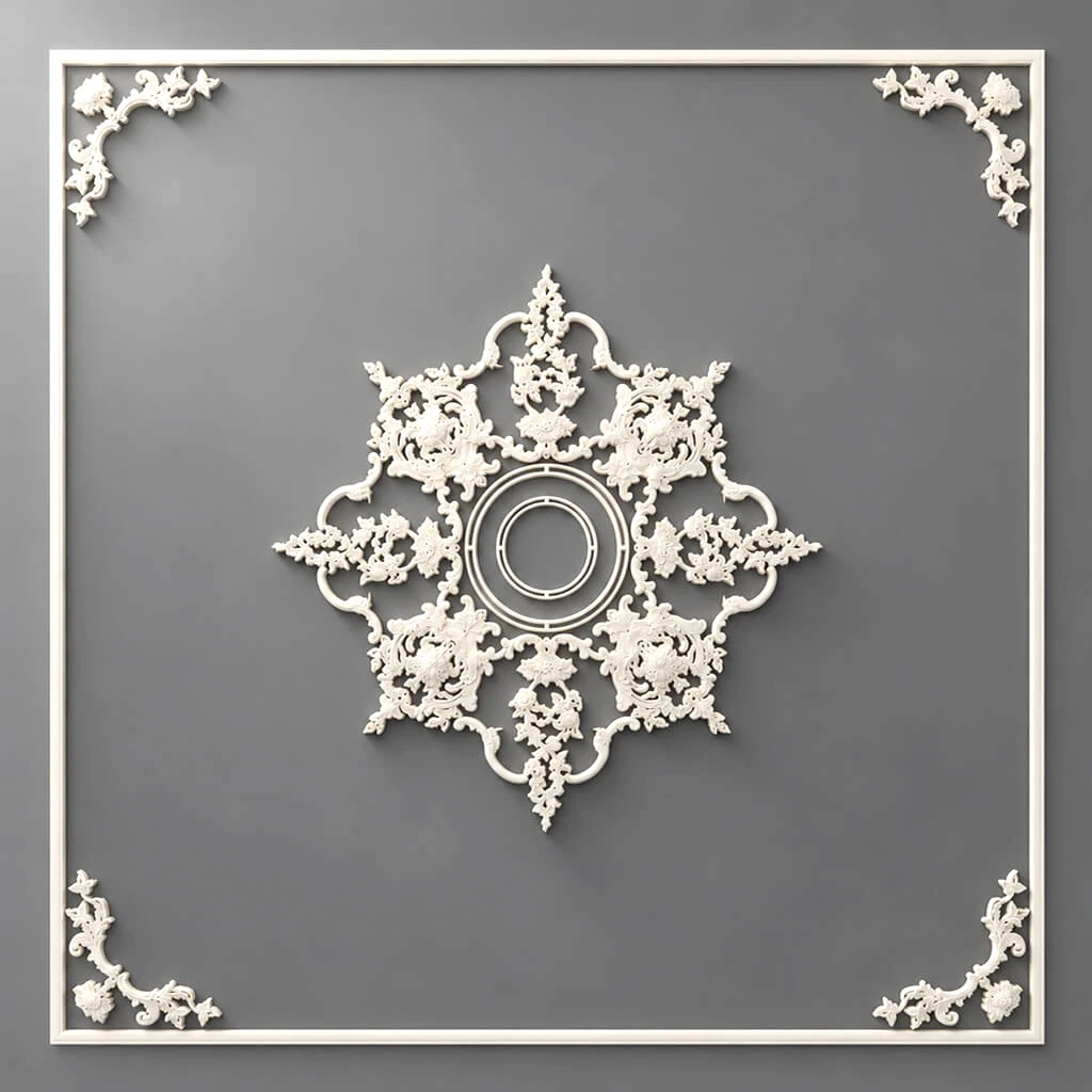
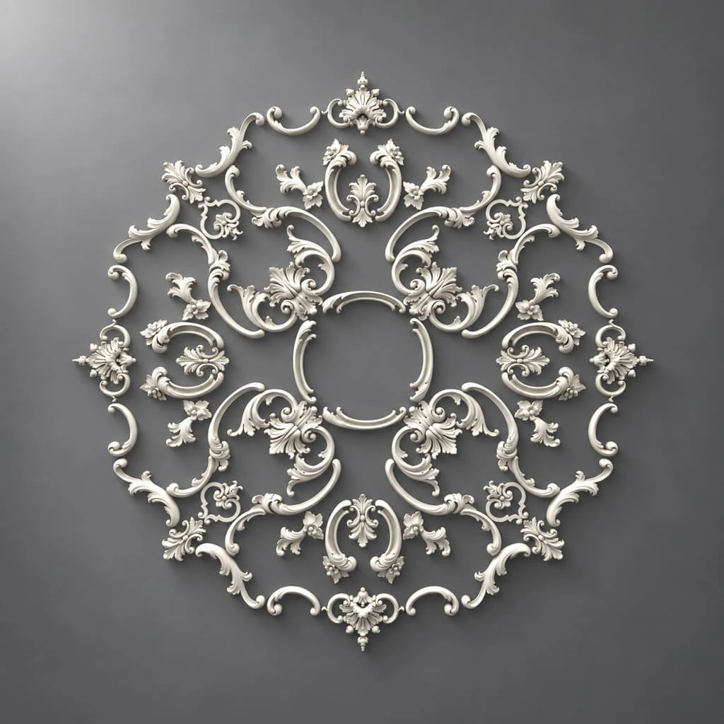
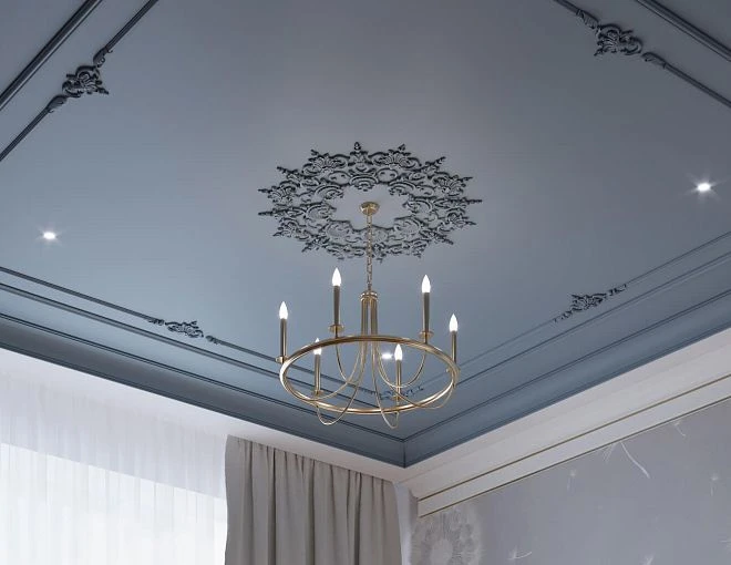
A large chandelier, cornice, ceiling contours and Ceiling rosette are perceived together with the wall decor. Therefore, the ceiling cannot be assessed only on a separate plan.
If the main accent should be a light fixture with a pronounced frame, see whether the upper parts of all the wall frames need to be equally active. If, however, attention is focused on a panel or fireplace, the ceiling solution can support them with a calmer pattern.
Rich walls and ceiling are acceptable in one composition. Then it is especially useful to coordinate the directions of the ornament, the centers, and the repetitions so that they form a common structure. The mere presence of a ceiling rose does not determine what level of decor the walls need.
Density can be distributed throughout the entire space
The overall character of the interior is supported by repeating solutions, but their number may vary. The hall, corridor, and bedroom solve different spatial tasks; the same number of frames will not necessarily help to connect them.
Below is a conditional scenario for discussion, not a rule for every home.
| Room | Possible decor composition | What connects it with the other zones |
|---|---|---|
| Hall | Main contour and local ornament, level 3 | Main profile and accent motif |
| Living room | Two subordinate contours, level 2 | Main profile and finish |
| Corridor | Simple repeating line, level 1 | Rhythm and individual height references |
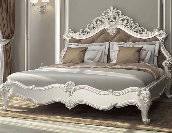
| Bedroom | Local composition at the headboard, level 2 | Character of the section and color relationship |
| Office | Accent panel or band, level 3 | Ornament from the shared system |
A formal room can be restrained, while a private one can be rich, if this matches the concept. It is also worth checking transitions: what is visible through an open doorway and how the impression changes as you move between rooms.
Before the catalog, assign a role to each element
A small table of functions is useful for selecting real products. It protects against the situation where every item you like gets a place in the project simply because you want to use it.
| Design designation | Role | What to check when choosing |
|---|---|---|
| M-01 | Main line | Section, width, depth, character of the shadow |
| M-02 | Auxiliary line | Difference from the main line and spacing between contours |
| P-01 | Ornamental belt | Motif, pattern repeat, direction, area of application |
| D-01 | Individual accent | Dimensions, center, surrounding free space |
These designations are conventional. Each of them is then assigned a specific article number, material, and finish. If the role of a new part cannot be explained, set it aside and first clarify the compositional task.
Real profiles allow you to verify the chosen hierarchy
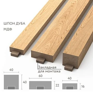
For comparison, two different types of cross-section can be considered. The MLDPU-003 dimensions are 35 × 12 × 2600 mm; the profile has several levels of relief. MLDPU-027 with a smooth convex cross-section is available in variants 14 × 9 × 2600 and 20 × 12 × 2600 mm.
The difference allows comparing not only the width but also the very character of the line. Designating one profile as the main one and the other as auxiliary remains a design decision: it is verified in the layout, with the specified distances and finish.
For the main trim, the commercial length L is also recorded. It does not determine the decorative role, but it will be needed for calculating the strips. For a piece accent, all dimensions are checked against the drawing; the designations A, B, and C are read together with the labels of the specific card.
A decorative corner changes not only the joint but also the composition
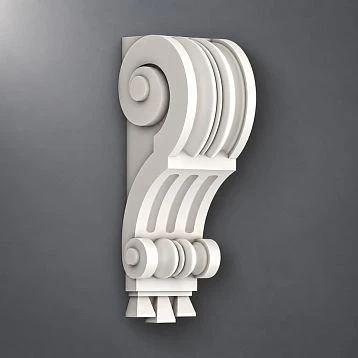
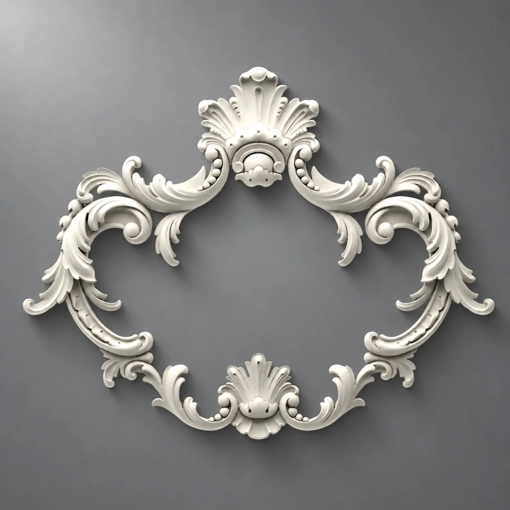
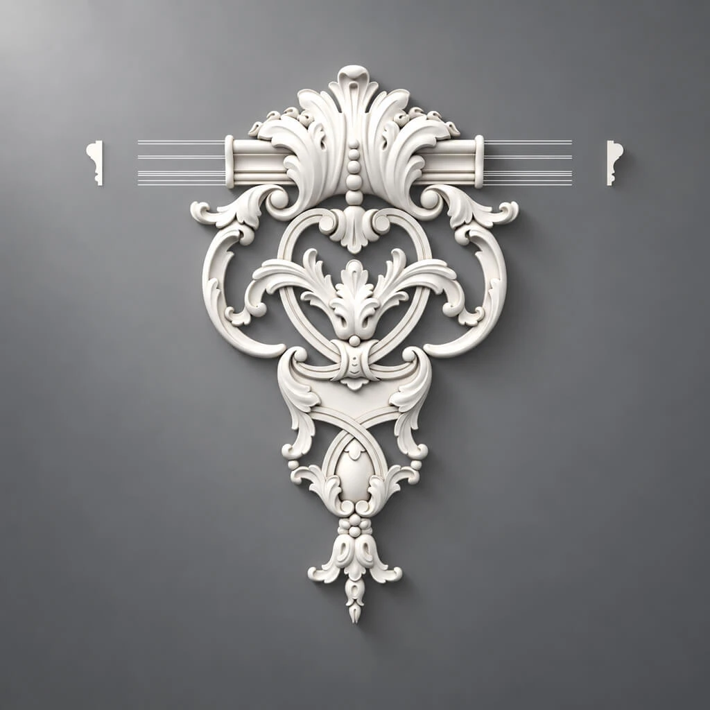
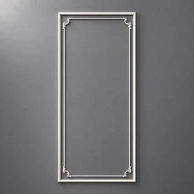
The selected Decor for Molding can turn a calm turn of the frame into a standalone accent. Therefore, after adding it, the entire frame is evaluated, especially if the ornament repeats in all corners.
Check compatibility with the specific molding and the space it occupies. A large corner piece changes the length of the straight sections and the free area inside the frame. Left and right versions are considered separately.
If the frame already surrounds an active panel, complex corners may be unnecessary for the chosen concept. If the frame itself is to become the main decorative object, such a solution, on the contrary, has a clear function.
A ready-made collection helps compare the degree of richness
In the section wall decor you can start with ready-made compositions. They are useful as initial options for combining linear and piece decor. It is convenient to select the overall character of the pattern through Decor collections.
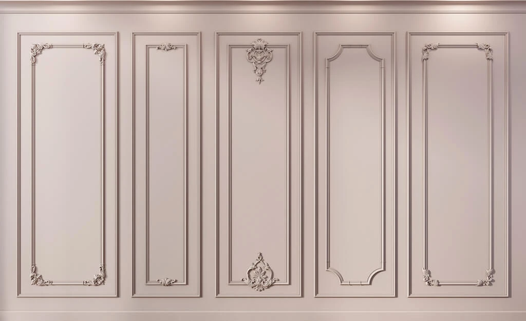
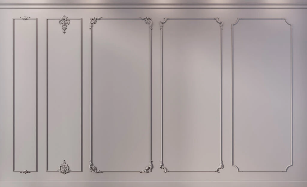
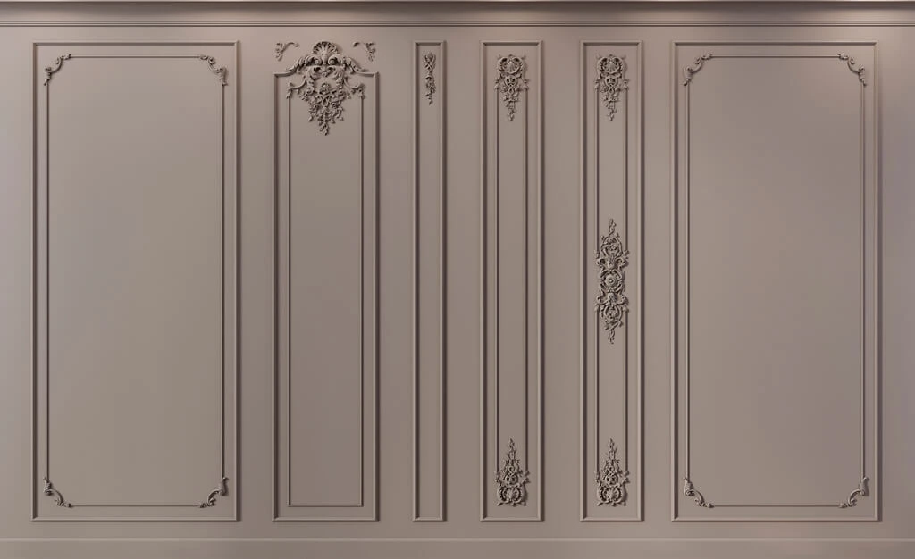
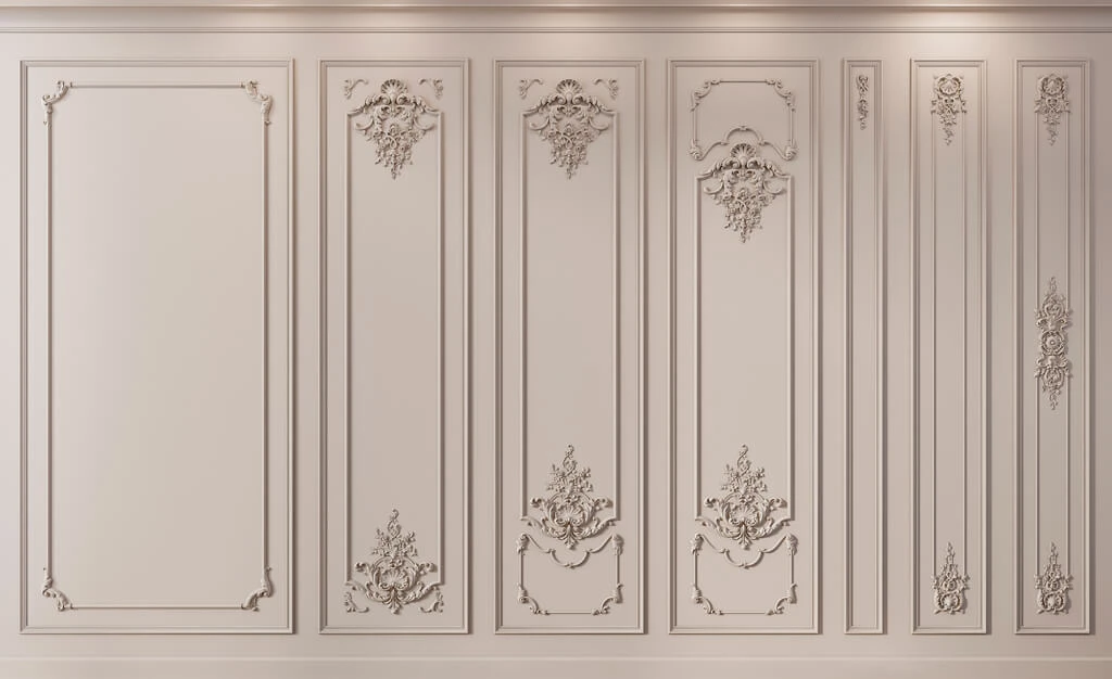
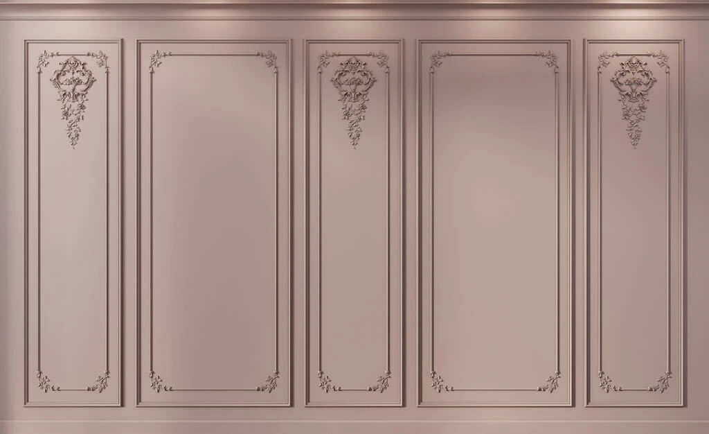
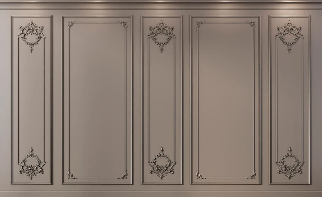
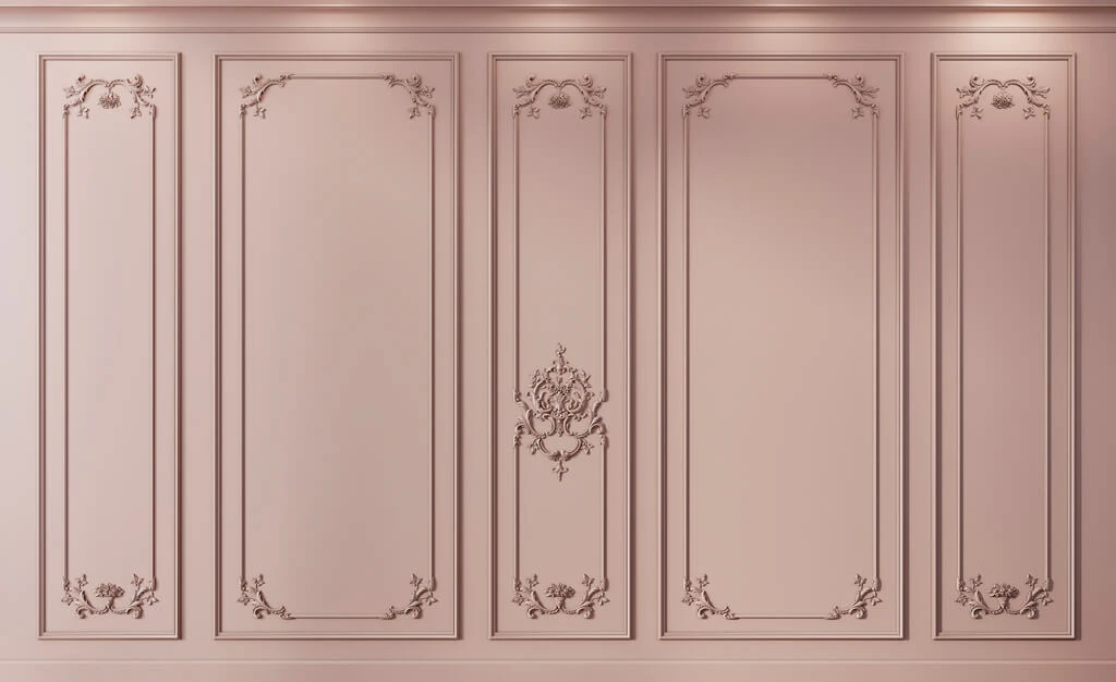
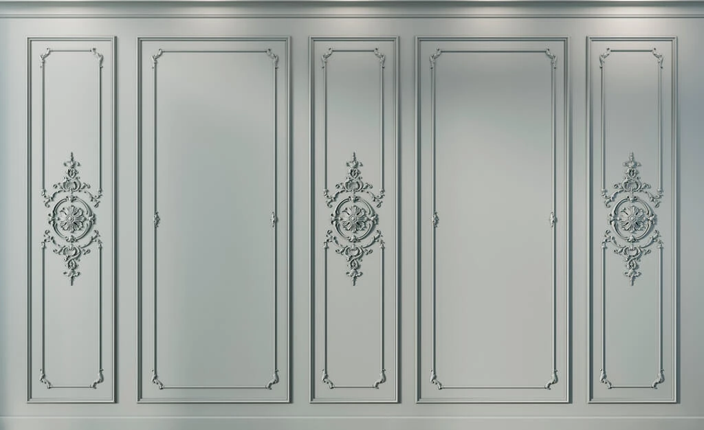
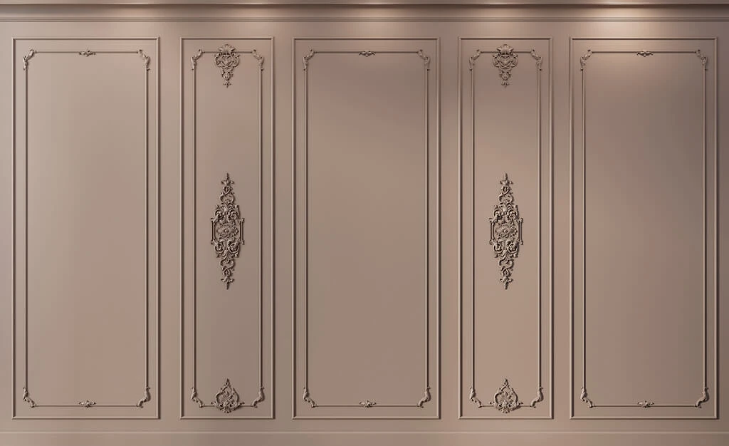
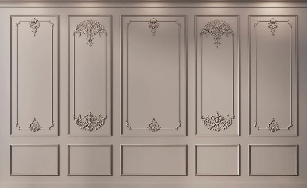
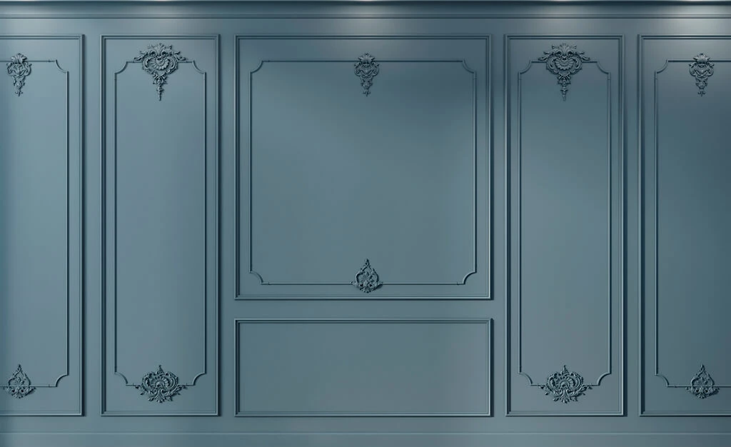
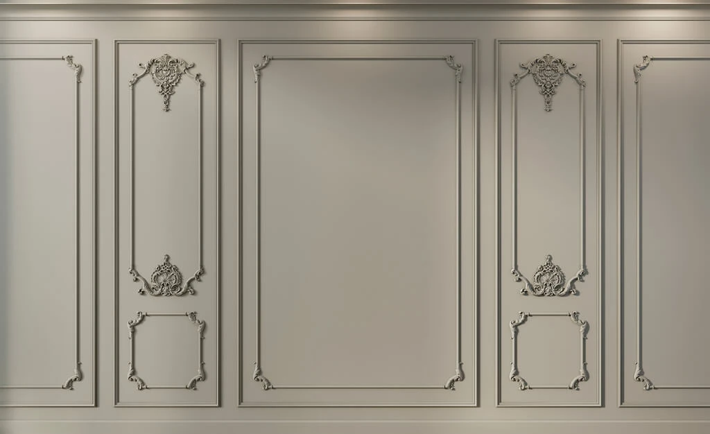
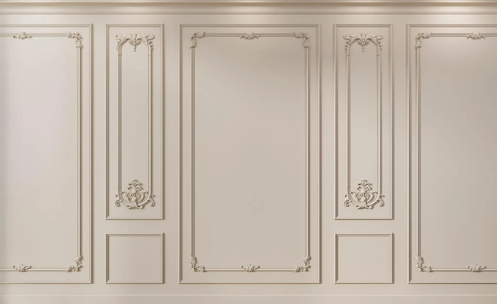
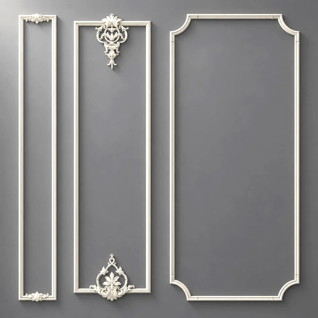
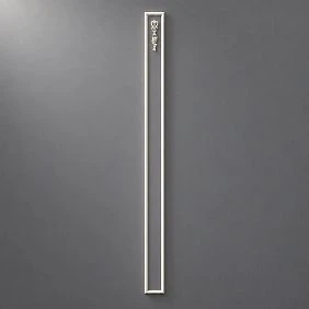
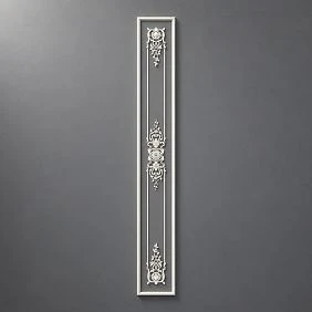
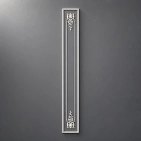
For example, in “Neoclassic” collection various wall panel sets are presented. In CPU-1-1 the vertical composition combines a moulding frame and a local ornamental insert. In CPU-1-2 large accents are located in the upper and lower parts.
When comparing, take into account the different dimensions of the sets: not only the set of ornament changes, but also the area occupied. Their composition includes polyurethane and primed MDF. Materials and composition are checked on the product card, even if the general section is dedicated to stucco decor.
The finished composition is compared with the actual room. Its approved pattern does not guarantee the desired richness in any environment.
Compare three versions of one composition
Prepare several variants on one architectural base. In the first, leave the main profile. In the second, add an auxiliary contour. In the third, introduce a local ornament or a single accent.
Keep the same furniture, color, camera position, and lighting. Then it will be clear what exactly the additional layer contributes. If, along with it, you replace the chandelier, finish, and angle, it is harder to determine the cause of the change in impression.
3D models and drawings by STAVROS help transition to the geometry of real products. Check that the files match the selected article numbers and dimensions. Arbitrarily reducing the overlay or stretching the profile will create a variant that cannot be reproduced by purchasing the specified product.
Example: how to preserve the accent and reduce saturation
Imagine a wall with three double frames. A painting is placed in the central one, the corners of all frames are complemented with ornament, and the upper band also has a repeating pattern. The project's task is to highlight the art and preserve the architectural framing.
In the first test version, remove the ornamental band while leaving everything else unchanged. Assess whether the top of the wall has become calmer and whether the central zone reads better. For the second test, return to the original composition and remove only the corner details of the side frames. The band remains as before. Now it is clear which layer was interfering with the subordination.
After comparing, you can assemble the final version from the suitable solutions. If the painting still competes with its own framing, separately check the smooth corners of the central frame. If the side fields have become too empty, first assess their proportions and relationship with the furniture before returning all the decor.
By changing one condition at a time, it is easier to explain the reason for the choice. The phrase "there is too much stucco here" turns into a concrete solution: preserve the main contour, simplify certain areas, and keep the needed accent.
The overall view is more important than a striking close-up
A close-up shot is needed to assess the relief and joints, but it is difficult to judge the room's saturation from it. Additionally, examine the interior from the entrance, from the main living area, and through the neighboring opening.
In each view, ask several questions. What attracts attention first? Does this match the intent? Is the role of the furniture and art preserved? Are the gaps between the decorative zones readable?
If the composition is convincing only from one specially chosen angle, check it again. Sometimes it is enough to remove the second ornamental strip or simplify the side frames so that the main accent becomes more noticeable in all important views.
The sample tests the relief in real light
After the preliminary selection, look at the physical products or a sample fragment of the composition. In the section samples and catalogs specify the available formats; the set contents must match the items being checked.
For a double contour, it is useful to see both profiles side by side, with the design spacing. For an overlay, its edge and the surrounding field. For a painted system, a sample coating on the relief, not just the color on a flat card.
Evaluate the sample under the intended light direction and from a normal distance. A small fragment will help check the surface and shadow, but it will not replace the overall view of the entire wall. These checks complement each other.
Before the specification, check whether each type of decor is needed
One by one, hide one type of profile or repeated overlays in the model. See whether an important function disappears: the boundary of the field, the rhythm, the center, or the connection with the neighboring zone.
If, after removal, the composition has become clearer and nothing essential has been lost, the element can be excluded. If the proportions or the connection between parts are disrupted, bring it back and clarify its role. The purpose of the check is to preserve the necessary details, not necessarily to reduce the project to the minimum number.
Reducing the number of types can simplify selection, purchasing, and coordination of units. The economic result depends on the specific products and quantity, so it is assessed after the specification is updated.
Approve the system composition and proceed to ordering
The specification records the item codes, dimensions, materials, finish, and application locations. Linear footage is converted into the number of strips according to the cutting plan; overlays, corners, and rosettes are counted per piece. Also save the approved views so that replacing a product does not destroy the chosen hierarchy.
To buy polyurethane stucco for your project, go to the Stavros catalog with defined product roles and proven characteristics. Buying polyurethane moldings and adding stucco decor to them is easier when it is already clear which elements form the foundation and which are responsible for accents.
Check the current delivery terms for the selected items. For professional collaboration, a dedicated section is available for designers and architects. Send the list of products along with the relevant project fragments: this way, the order discussion will be based on the approved composition and its specific details.