
















Article Contents:
- What to choose: stucco decor in wall color or contrasting
- When it's better to paint moldings in wall color
- If the interior is small
- If a calm premium background is needed
- If the walls already have an active shade
- If decor is used in the bedroom or children's room
- If you need to avoid overloading a modern interior
- When it's better to choose contrasting stucco decor
- If you need to highlight an accent wall
- If the interior is based on classic or neoclassical style
- If moldings are to become the main decorative element
- If the wall is dark and the decor is white or light
- If you need to emphasize frames, panels, or symmetry
- Which elements are suitable for painting
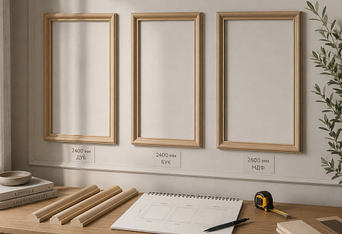
- Moldings for frames
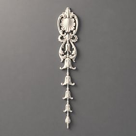
- Decorative appliqués
- Decor for moldings
- Ready-made sets of stucco decor
- Vertical elements and panels
- How to choose the color of moldings for the interior
- To match the wall color
- To match the baseboard and door color
- To match the furniture or kitchen set
- White decor on a colored wall
- Contrasting decor on a dark wall
- How to avoid mistakes with contrast
- Don't create contrast on every wall
- Don't mix too many shades
- Don't use large patterns on a small wall
- Don't forget about the baseboard, doors, and cornice
- Do not choose too thin molding for a contrast wall
- Which styles are best suited
- Neoclassical
- Neoclassic Light
- Jatoba
- Versailles Light
- Modern minimalism
- What to buy for a wall for painting or contrast decor
- Frequently asked questions
Almost everyone who decides to decorate a wall with moldings stops before this choice. The moldings are bought, the layout is planned, the tools are ready — and suddenly a question arises that seems simple but actually determines the entire character of the interior: paint in the wall color or leave it contrasting? White or tinted? Highlight the frame or blend it into the surface?Stucco decor in the wall colorand contrast decor are not just two color solutions. They are two fundamentally different architectural statements, and between them lies a whole design philosophy. In this article, we will analyze both approaches in detail, honestly, and with specific guidelines — so that you make a conscious choice, not by random experimentation.



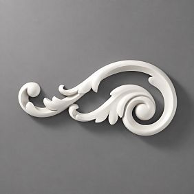


What to choose: stucco decor in the wall color or contrast
Let's start with the main point: both options are correct. This is not a question of 'good' and 'bad' — it's a question of the task. An error occurs when a person chooses the color solution for decor not based on interior logic, but out of habit, by chance, or by analogy with someone else's photo in a different context.
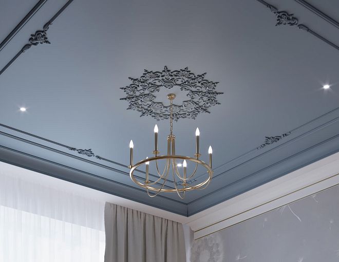
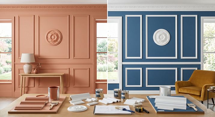
Moldings in the wall coloris an architectural relief. The decor is present but does not declare itself. The wall gains depth, structure, a sense of volume — without visible 'stripes' and 'frames'. This solution is perceived as 'expensively done' rather than 'heavily decorated'. It currently dominates modern interior design.
Contrasting stucco decor — moldings of a different tone, white on a colored wall or, conversely, dark on a light one — is a decorative statement. The frames are visible, the rhythm is emphasized, the symmetry is accentuated. This is a classic technique, rooted in the architecture of the 18th–19th centuries and still expressive today.
Both approaches are perfectly implemented through Polyurethane wall decor: polyurethane is equally well suited for painting in any shade — both to match the surface and in a contrasting color. This is a fundamental advantage of the material: you are not tied to the factory color of the product, you work with the surface as your space requires.
Key differences between the two approaches:
| Parameter | In wall color | Contrasting |
|---|---|---|
| Visual effect | Relief, depth, architecturality | Frame, line, ornament |
| Style | Modern, minimalism, japandi | Classic, neoclassical, empire |
| Accent | Wall as a surface | Decor as an element |
| Risks | Loss of detail in low light | Overload with scale errors |
| Versatility | High | Medium — depends on the interior |


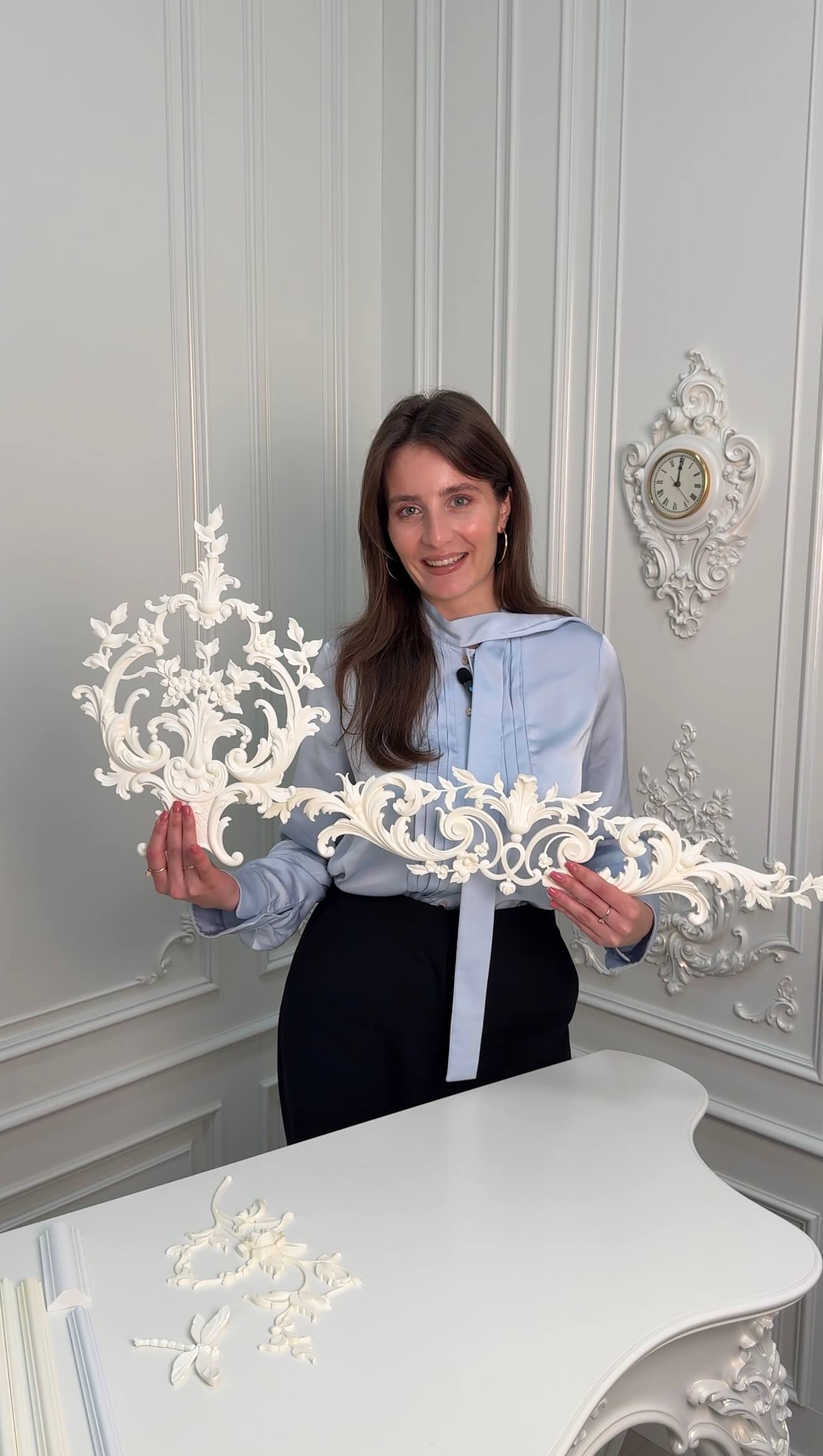
When it's better to paint moldings the color of the wall
This solution is not for those who "didn't dare to go for contrast." It is a conscious professional choice that occurs more often in modern interior design than classic white moldings on colored walls. Let's break down in which situations it works flawlessly.
Our factory also produces:


If the interior is small
Contrasting moldings in a small room work like a grid that fragments an already limited space. White lines on a gray wall create a feeling of a "cage." Decor in the color of the wall, on the contrary, unites the surface into a single field — and the room visually expands.
For small apartments, studios, compact bedrooms, and home officesmoldings for painting on wallsmatching the surface color is almost a mandatory technique. It allows achieving architectural expressiveness without losing the sense of space. More about working with compact spaces in the articlestucco decor for a small apartment.
Get Consultation
If you need a calm premium background
A high-class hotel, a conference room, a director's office, a showroom — anywhere the interior should speak of status quietly, not shout. Moldings in the color of the wall create that very 'invisible design' that experts call 'quality without demonstration.' The relief is felt but does not announce itself — and that is perceived as the highest class.
Decor in the surface color is the standard for photo zones, home offices with a business positioning, and living rooms with a 'quiet' interior. More about this in the articlestucco decor for a home photo zone.
If the walls already have an active shade
Deep dark blue, rich terracotta, expressive olive — these are colors that already create character on their own. Adding white moldings to them means creating a harsh contrast that will destroy the color unity. Moldings in the tone of such a wall are a continuation of the color image, not competition with it.
Black moldings on a black wall, blue on blue, green on green — this is a technique that, with proper lighting, gives a fantastic result: the wall lives, breathes, has dimension. The monochrome scheme 'wall + molding' is not a poverty of design, but its highest point.
If the decor is used in a bedroom or children's room
Peace is important in the bedroom and children's room. Contrasting moldings create visual activity — the wall "speaks", attracts the eye. Moldings in the tone of the wall give a feeling of a shell, a soft cocoon — something that psychologically supports rest. About working with children's spaces — in the articlestucco decor for a children's room.
If you need not to overload a modern interior
A modern interior is balance. Clean surfaces, minimal ornament, nothing extra.Buy stucco decor for paintingin the tone of the wall means adding an architectural detail without disturbing this balance. The molding is there, but it is part of the wall, not a separate "object" on it.
Moldings in Japandi in the color of the wall— an ideal example. Laconic profiles without ornament, painted together with the wall — this is geometry that you feel but do not see as "decor". This approach is now in demand in interiors oriented towards Japanese and Scandinavian aesthetics.
When it is better to choose contrasting stucco decor
Contrast is a powerful tool. Like any strong tool, it requires precision. But when the task is set correctly, contrasting moldings create one of the most expressive interior effects.
If you need to highlight an accent wall
An accent wall is one of the basic techniques of modern design. The wall behind the sofa in the living room, the wall behind the bed in the bedroom, the wall with a fireplace — they are already "designated" as the main ones.Contrasting moldings on the walldouble this accent: decor + color work together, creating an unambiguous center of attraction.
If the accent wall is painted in a dark color and the moldings are white or light — this is a classic technique that makes a strong impression both in the frame and in real life. The molding "draws" geometry on a dark background, the frames become visible, the symmetry is emphasized.
If the interior is built on classic or neoclassical style
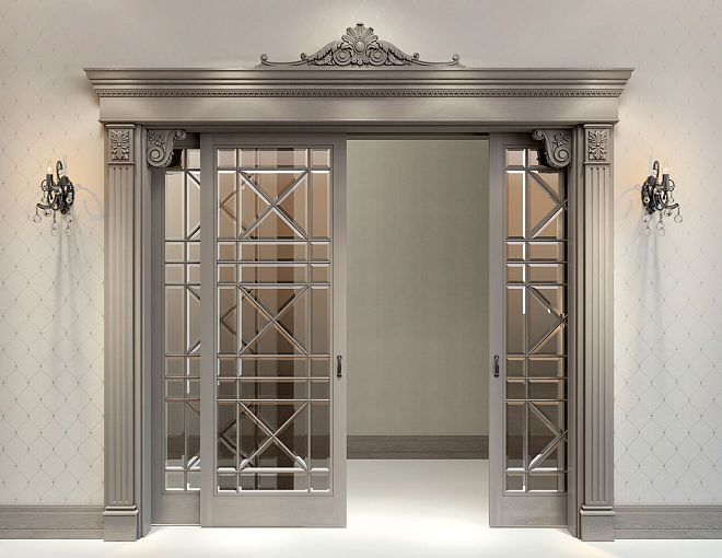
Moldings in neoclassical style in the color of the wallis a worthy option for calm neoclassical interiors. But "true" neoclassicism, with its symmetry, solemnity, and ornamental detailing, often requires contrast: white profiles on a colored wall, white overlays on a beige background, white cornices under the ceiling on a creamy surface.
Contrasting decor here is part of the style, its integral component. Removing contrast from a classic interior is like removing a tie from a business suit: formally nothing is lost, but something important disappears.
If moldings are to become the main decorative element
Sometimes a wall should be "considered" as a work of art. A large formal living room, a banquet hall, a restaurant — spaces where wall decor is not a background, but the main theme. Here contrast is mandatory: only through it do moldings become visible as an independent element.
Symmetrical frame systems, pilasters, large overlays, profiled cornices — all of this gains full power precisely in a contrasting color scheme. About the principles of symmetrical schemes — in the articlesymmetric polyurethane wall decor.
If the wall is dark and the decor is white or light
White moldings on a wallof a dark tone — this is an effect that never goes out of style. A dark green wall with white molding frames — a reference to an English country house. Deep blue with white profiles — a marine theme. Black with gold accents — Art Deco. In all these cases, contrast is not just a decorative technique — it carries stylistic identification.
If you need to emphasize frames, panels, or symmetry
Molding frames are geometry. In the tone of the wall, this geometry is quiet. In contrast, it is distinct and expressive. If the task is for the frames to be read as an architectural element — contrast is needed. If the task is to "add depth" — decor in the same tone is sufficient.
Which elements are suitable for painting
One of the main advantages of polyurethane decor is its complete readiness for painting. Any element from the catalog is painted with acrylic paint — both in the tone of the wall and in a contrasting color. Let's break down each type.
Frame moldings
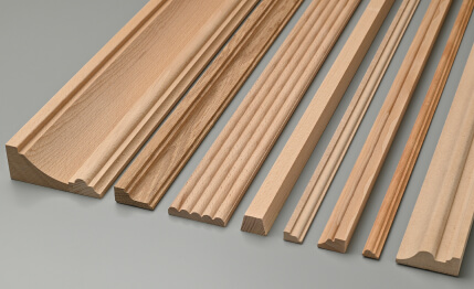
buy moldings for painting — means getting a profile that is painted with an acrylic compound in any color. Polyurethane has a smooth, dense surface — the paint lays evenly, without drips or gaps. One primer coat and two coats of acrylic paint are sufficient.
For painting to match the wall: paint the molding with the same paint as the wall. For a contrasting effect: use a different color. Technically, both options are equally simple. Details of the process are in the article installing polyurethane molding.
Polyurethane moldings do not deform, do not absorb moisture, do not crack — the paint adheres to them much longer than to plaster or gypsum. This is especially important when repainting: after a few years, you can simply refresh the color without dismantling.
Decorative appliqués
Decorative overlays for painting — rosettes, medallions, corner ornaments — are painted exactly the same as moldings. One technical nuance is important here: when painting to match the wall, overlays with fine, detailed ornamentation may "lose" their relief when applying several layers of paint. Solution: use liquid acrylic paint without thickeners, apply in thin layers.
With contrasting painting, the same problem is solved differently: the contrasting color emphasizes every detail of the relief. This is why complex ornamental overlays in classic interiors were traditionally painted in a contrasting color (white on a colored background) — it "brought out" the entire relief, making the ornament readable.
Decor for moldings
Decor for moldings for painting — corner inserts, decorative joints — are painted together with the moldings, in the same color. This is a mandatory condition: if the molding and the corner element are of different colors, the frame visually breaks apart. Color unity = unity of the frame as a whole object.
Ready-made sets of stucco decor
Ready-made decor kit for painting— the optimal choice for those who want to get a coordinated result right away. The kit includes moldings and overlays from one collection, all of the same scale — and everything is painted in a single color. No compatibility issues, no random combinations.
On the principles of choosing ready-made solutions — in the articleReady-made molding frames for the wall.
Vertical elements and panels
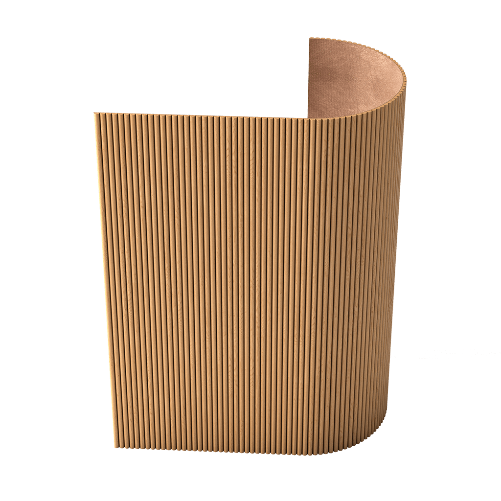
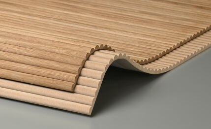
Vertical molding lines on the wall — from baseboard to cornice — work especially well when painted in the wall color. The vertical line "stretches" the room upward, creates a feeling of high ceilings, and structures the surface. In contrast, the same lines turn into "columns" — an architectural technique suitable for classic and neoclassical styles, but requiring a large room volume.
On working with low ceilings using vertical moldings — in the articlestucco decor for walls with low ceilings.
How to choose the color of moldings for the interior
This is a practical, specific section. Let's consider five key scenarios.
To match the wall color
The most modern and the safest choice.Stucco decor in the wall colorworks in any room, with any proportions, under any lighting. It is the "default" choice for those who are unsure: it almost always gives a good result.
Technically: take the same color you used to paint the wall and paint the moldings. If the wall is already painted but the paint is not preserved, match the color using a sample at any hardware store. Polyurethane holds both matte and semi-matte acrylic paint perfectly.
To match the baseboard and doors
This is a more "put-together," classic solution. Moldings, baseboards, and door trims of the same color — white, cream, gray — create a unified "wooden" or "architectural" system in the interior. The walls can be any color: the moldings act as part of the overall "framing" system of the room.
About the principles of a unified system — in the articlehow to combine stucco decor with baseboards and cornices. It details how moldings, baseboards, and cornices form a cohesive interior image.
To match furniture or kitchen cabinetry
A complex but very effective technique. Moldings in the color of furniture facades create a feeling of a "built-in" interior — furniture and walls are perceived as a single whole. This works especially well in the kitchen: moldings in the color of the cabinetry on the wall above the countertop or behind the work area create a sense of a unified design solution.
In the living room: moldings in the color of bookshelves or a modular storage system — the interior "comes together" without extra effort.
White decor on a colored wall
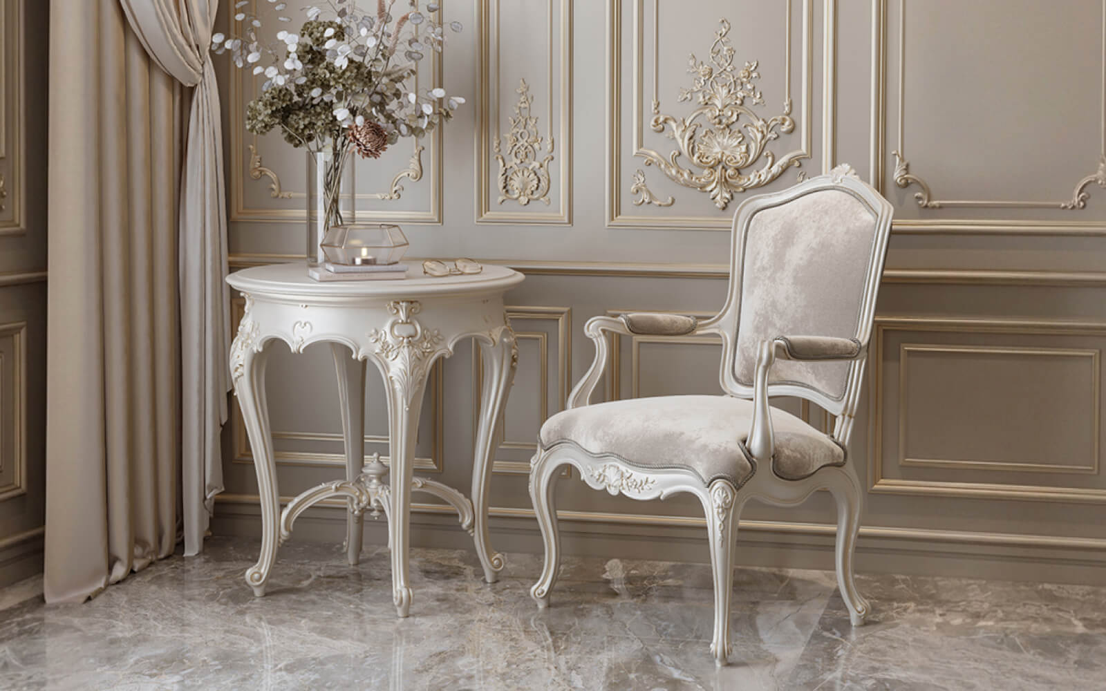
White moldings on the wallon a colored background — a classic contrast that needs no introduction. It worked in the Baroque era, works today, and will work in a hundred years. A white profile on a beige, gray, blue, green, or any other soft wall — it's purity, clarity, architecturality.
Classic white stucco on the wall— from the Versailles Light collection — produces exactly this effect in its most expressive form. For neoclassical and classical interiors, white decor on a colored wall is a canonical choice.
Important: the saturation of the wall and the tone of the white decor must have sufficient contrast. A white molding on a very light beige wall almost blends in — and you get an intermediate option of 'neither matching nor contrasting,' which looks unfinished. Either intensify the wall color or paint the moldings to match.
Contrasting decor on a dark wall
A dark wall with contrasting moldings is the most expressive solution of all. But it requires confidence and precision.
White profiles on a dark blue background — English classicism. White frames on deep green — French country style. Gold or cream overlays on anthracite — modern luxury. Each of these combinations has its own stylistic logic — and it cannot be violated.
For dark walls, the scale of the profile is especially important: a too thin molding gets 'lost' in the dark space. For contrasting decor on a dark wall, a profile width of at least 30–35 mm is recommended — sufficiently visible to create a pattern.
On the principles of working with moldings and color withinlight neoclassicism — a separate topic we'll cover below.
How to avoid mistakes with contrast
Contrast is not a synonym for chaos. It requires discipline. Here are five rules to protect you from typical mistakes.
Don't create contrast on every wall
Contrasting moldings on all four walls is not 'very beautiful.' It's visual overload. Contrast works precisely because it highlights something against a neutral background. If everything is highlighted, nothing is highlighted.
Rule: one contrasting accent wall + the rest in tone or neutral. Maximum — two walls with contrasting moldings if they are symmetrical and work as a single system.
Don't mix too many shades
Wall beige — moldings white — baseboard gray — door brown — ceiling cream. This is not 'richness of shades,' it's a color mess. For a contrasting solution, choose no more than two tones: wall and decor. The third tone — baseboard and trim — should match one of the two.
Don't use large patterns on a small wall
Large overlays (30–50 cm) on a wall 150–200 cm wide are a scale error. The ornament takes up most of the wall and creates a feeling of pressure. For compact walls —Decorative Insertswith a diameter of 12–18 cm. For wide walls (from 3 m) — you can afford 25–35 cm.
Don't forget about the baseboard, doors, and cornice
Contrasting moldings on the wall with neutral baseboards and doors look unfinished: as if the decor is 'suspended' in the middle of the wall without continuation. Think through the entire system: if the moldings are white, the baseboards and trims should also be white or compatible in tone. An interior is a system, not a set of individual elements.
Do not choose too thin molding for a contrasting wall
A thin profile (10–15 mm) in contrast looks like a drawn line — deliberate, technical, without volume. For contrasting decor, a profile with relief is needed: at least 25–30 mm wide and 8–12 mm high. Only then does the molding 'cast a shadow' and create a full spatial sensation.
Which styles are best suited
Interior style and the color scheme of moldings are inextricably linked. Let's consider five key style scenarios.
Neoclassical
Moldings in neoclassicism— these are wide profiles (40–55 mm), expressive relief, corner elements, decorative overlays. The color scheme here is bivalent: both 'matching the wall' and 'contrasting white' work equally well, but create different characters.
Neoclassical moldings matching the wall are 'quiet luxury': richness through restraint. White Neoclassical moldings on a colored background are 'open splendor': a classic formal image. The choice between them is a matter of the space's character and its function.
Neoclassic Light
Light neoclassical for painting — the most versatile collection. Profiles 18–30 mm wide, delicate relief, neutral character. This collection works equally well in the tone of the wall and in slight contrast — white on a pastel wall, cream on light gray.
Neoclassic Light is the choice for most residential interiors: bedroom, living room, children's room, study. It doesn't overload, doesn't become outdated, and adapts to any color scheme.
Japandi
Moldings in Japandi in the color of the wall — the canonical option. Straight lines without ornament, in the tone of the surface, create a geometric rhythm without decorative noise. This is a style that doesn't tolerate contrast: if you want Japandi — moldings in tone.
Exception: a very soft, almost imperceptible tonal shift — a molding half a tone lighter or darker than the wall. This adds depth without violating the minimalist principle.
Versailles Light
Classic white stucco on the wall — for formal, elegant spaces. Versailles Light assumes contrast as a basic position: the rich ornamental profile should be visible. White elements on a pale blue, soft green, powdery pink, or golden beige wall — this is the "Versailles" image in its modern, adapted form.
Versailles Light in the tone of the wall is a rare but possible technique. It is used in interiors with "monochrome luxury": everything white — walls, moldings, furniture. In this case, the relief of the ornament works through light and shadow, not through color contrast.
Modern minimalism
Stucco decor for walls for painting in the system of modern minimalism — these are moldings strictly in the tone of the wall. No ornament, no contrast, only geometry. Thin profile (15–20 mm), rectangular frames, perfectly straight corners, matte paint. This is minimalism that is not ascetic — it is architectural.
On the principles of combining wallpaper and moldings in a modern interior — in the articlemoldings and wallpaper on the wall.
What to buy for a wall for painting or contrasting decor
Practical section — what exactly to order and what to pay attention to.
moldings for painting on walls:
-
For decor in the tone of the wall — profile 18–30 mm, moderate relief.
-
For contrasting decor — profile 28–55 mm, expressive relief.
-
Standard slat length 2 m; with 15% allowance for trimming.
-
Collection: Neoclassic Light — for most interiors; Neoclassic — for formal spaces; Japandi — for minimalist solutions.
Decorative overlays for painting:
-
For decor in tone — minimal ornament, clear relief.
-
For contrasting decor — rich ornament, high relief.
-
Size: 12–20 cm for compact walls, 20–35 cm for wide ones.
-
Corner inserts from the same collection as the moldings.
-
Painted in the same color as the molding.
Ready-made decor kit for painting:
-
The optimal choice for the first project.
-
All elements are coordinated, nothing extra, guaranteed result.
Baseboards and cornices:
-
From the same collection as the moldings.
-
For a unified system: all elements in one tone.
-
About the principles —how to combine stucco decor with baseboards and cornices.
The entire assortmentpolyurethane products for interior— moldings, overlays, decor for moldings, ready-made sets — in the STAVROS catalog.
For an accurate calculation of the number of moldings — articlehow to calculate moldings and stucco decor for a wall: step-by-step algorithm for any scheme.
Installation of polyurethane moldings is described in detail in the articleinstallation of polyurethane molding — a practical guide considering angles, joints, and painting.
Frequently Asked Questions
Can polyurethane moldings be painted the color of the wall?
Yes, this is one of the most popular and professional techniques. Polyurethane is easily painted with acrylic paint in any color — the same paint used for the wall. The molding is primed beforehand. The result is a relief architectural structure where the decor is perceived as part of the wall, not a separate 'object'.
What is better: white moldings or moldings in the color of the wall?
Depends on the style and task. White moldings are a classic, suitable for neoclassicism, Empire style, and formal spaces. Moldings in the tone of the wall are a modern technique for all styles from minimalism to light neoclassicism. For those in doubt: moldings in tone always work.
Are contrasting moldings suitable for a small room?
Only with very precise application: one accent wall with one frame and neutral others. Contrast on all walls of a small room is a mistake that fragments the space. For small rooms, decor in the tone of the wall is preferable.
Which moldings to choose for a dark wall?
For a dark wall, choose a profile at least 30 mm wide with a pronounced relief. Color: white, cream, light gray — for a contrasting effect; the same dark tone — for a monochrome solution. The molding should be wide enough to create a readable shadow.
Can moldings be combined with colored wallpaper?
Yes, this is a productive technique. Moldings are installed along the perimeter of the wallpaper section, creating a "frame" for the wallpaper field. In this case, moldings are most often painted in a contrasting or neutral (white) color. More details in the article.moldings and wallpaper on the wall.
Should the decor be painted before or after installation?
Both options work. Before installation: convenient to apply several layers without risking staining the wall. After installation: the final layer is applied together with the wall — ideal for painting to match. Professional approach: priming and first layer — before installation, final layer — after. Detailed technology is described in the article.installing polyurethane molding.
What to choose: individual moldings or a ready-made set?
A ready-made set — for a first project, for standard tasks, for those who want a guaranteed result without independent design. Individual moldings — for non-standard sizes, for complex multi-section schemes, for experienced users. In both cases, all elements should be from the same collection.