







Article Contents:
- Why an empty wall behind the reception is a lost first contact
- What is an "expensive first screen" and how to build it
- Moldings behind the reception desk: how to assemble a wall into a neat system
- Central frame for the logo
- Vertical molding strips on the sides
- Horizontal belt under the ceiling
- Baseboard line at the bottom
- Decorative stucco for reception: precision as professionalism
- Where stucco works at the reception desk
- What to avoid when using stucco at the reception desk
- Logo and stucco: how to maintain brand zone balance
- The 'logo is primary' principle
- Area around the logo
- Stucco color relative to the logo
- Ceiling cornice above the reception desk: the final line
- Reception desk for different business types: five working schemes
- Beauty salon or beauty studio
- Medical clinic or dental clinic
- Showroom or furniture salon
- Office or business center
- Restaurant or hotel lobby
- Installation: professional sequence for commercial interior
- What to buy for the reception: a task-based kit
- Frequently Asked Questions
- STAVROS: partner for commercial interiors
A client decides to trust your business within the first seven seconds after entering. This is not a marketing metaphor — it's the mechanics of human perception. In those seven seconds, the eye reads: quality of finish, level of order, visual status of the space. And only then — the logo, the administrator, the price list.
This means one thing: the reception is not just a counter against the wall. It is the first screen of your brand. And if behind that counter there is an empty wall with just one logo on it, the brand reads as an unfinished project, not as an established business.
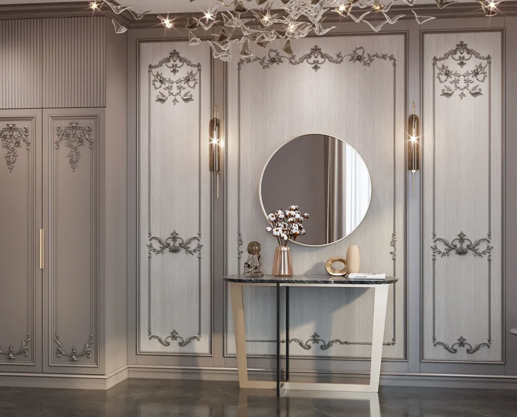
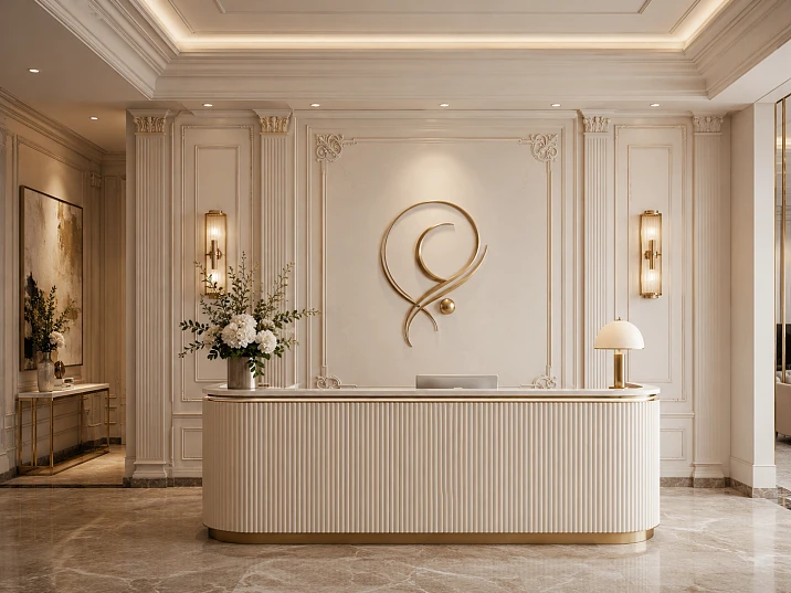
The reception looks expensive when the wall behind the counter works as the first screen of the brand: Moldings made of polyurethane assemble the composition, Decorative stucco adds status, decorative elements emphasize the logo, and the entire area immediately creates a sense of trust and quality.
Let's talk about how to do it right.
Why an empty wall behind the reception is a lost first contact
There is an interior law well known to set designers, directors, and experienced designers: any empty plane reads as incompleteness. Not as "minimalism." Not as "conceptual emptiness." But precisely as something that "hasn't been finished yet."
When a client enters a beauty salon, medical clinic, showroom, or office and sees a bare painted wall with a plastic logo stuck behind the reception desk, their brain concludes: they didn't think about the details here. And this immediately projects onto your product or service.
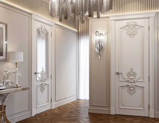
Now another scenario. The same wall — but behind the desk, an architectural frame is built from molding. The logo is placed in the center of this frame. On the sides — symmetrical Decorative stucco. The top of the wall is finished with ceiling cornice. Everything in a single color — cream, white, or a corporate tone. Brain's conclusion: details are thought out here. This is a serious organization.
The difference between these two scenarios is not in the rental price, not in the quality of equipment, not in the staff's competence. Only in the wall. Only in what hangs behind the administrator.


What is an "expensive first screen" and how to build it
In digital marketing, the "first screen" is what the user sees without scrolling. In physical space, the first screen is the wall directly behind the reception desk. That's where the gaze is directed from the threshold.
An expensive first screen is built on the principle of three layers.
The first layer is the background. This is the color and texture of the wall. A painted wall, a panel with relief, wallpaper imitating linen or stone. The background should not "scream" — it should create density and materiality.
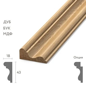
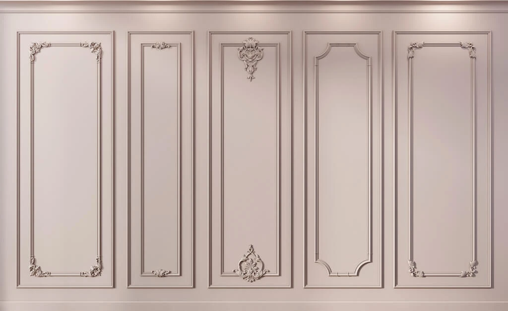
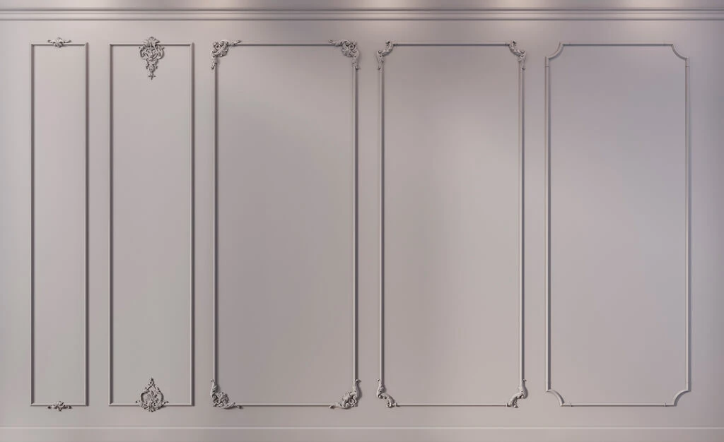
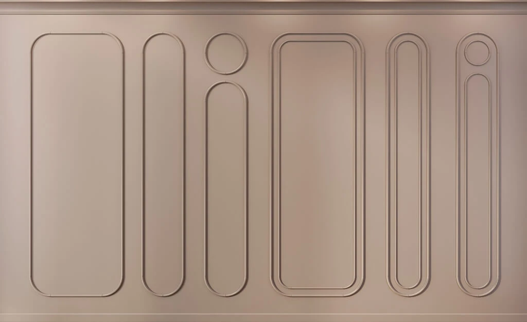
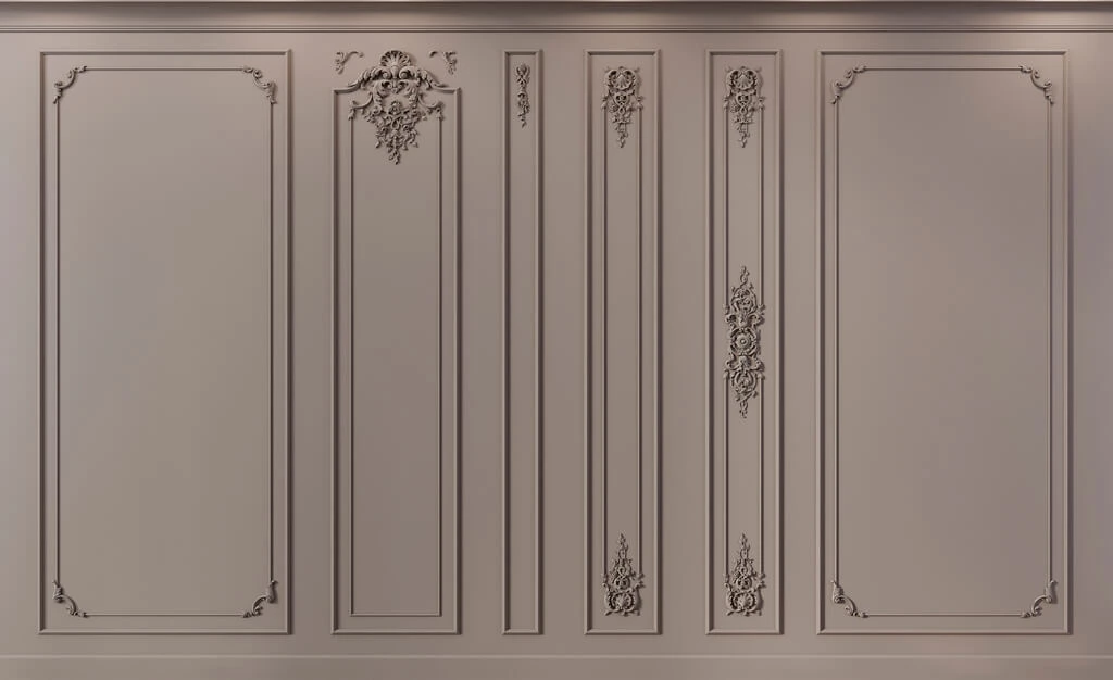
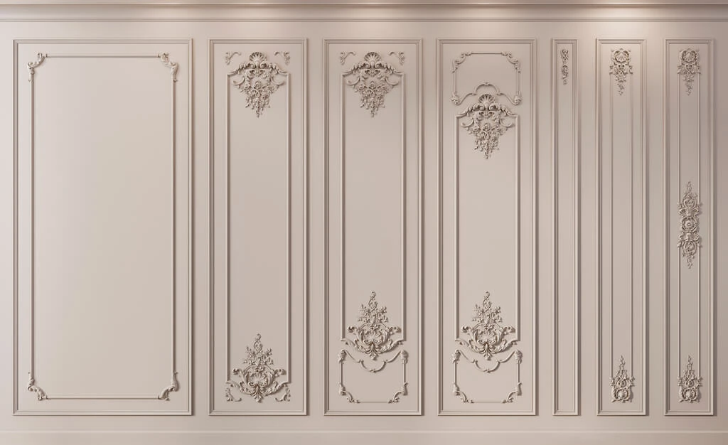
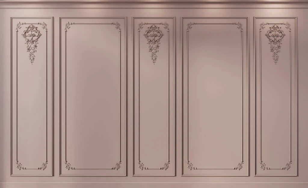
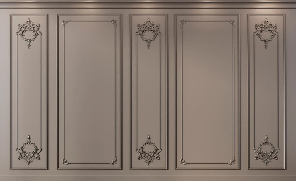
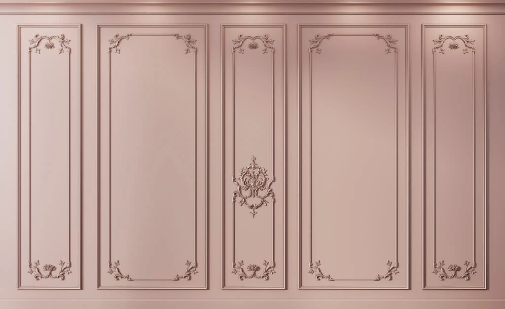
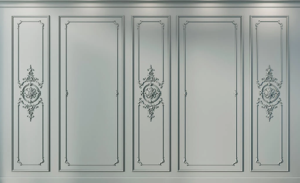
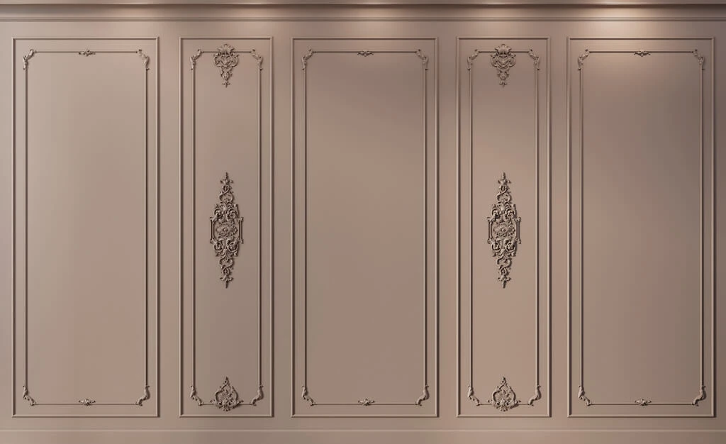
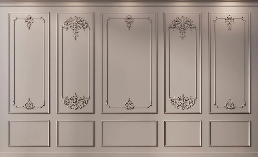
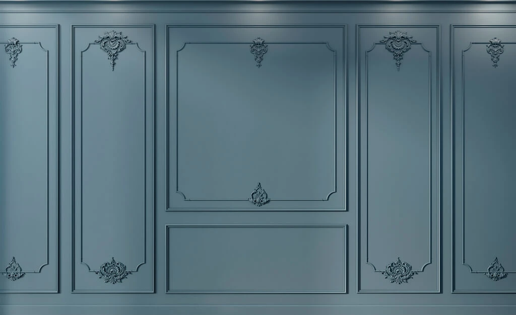
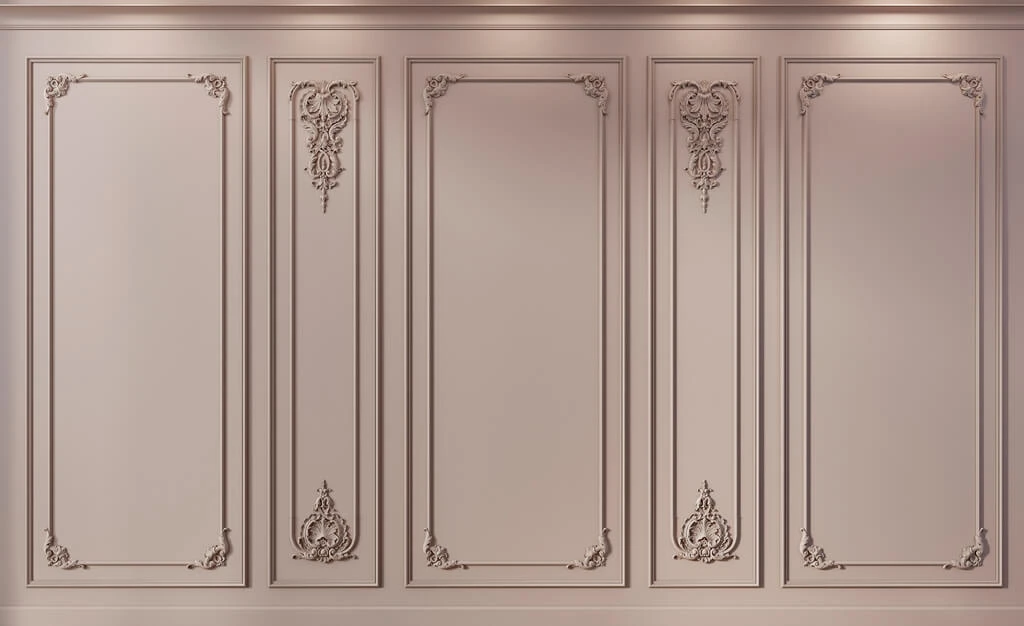
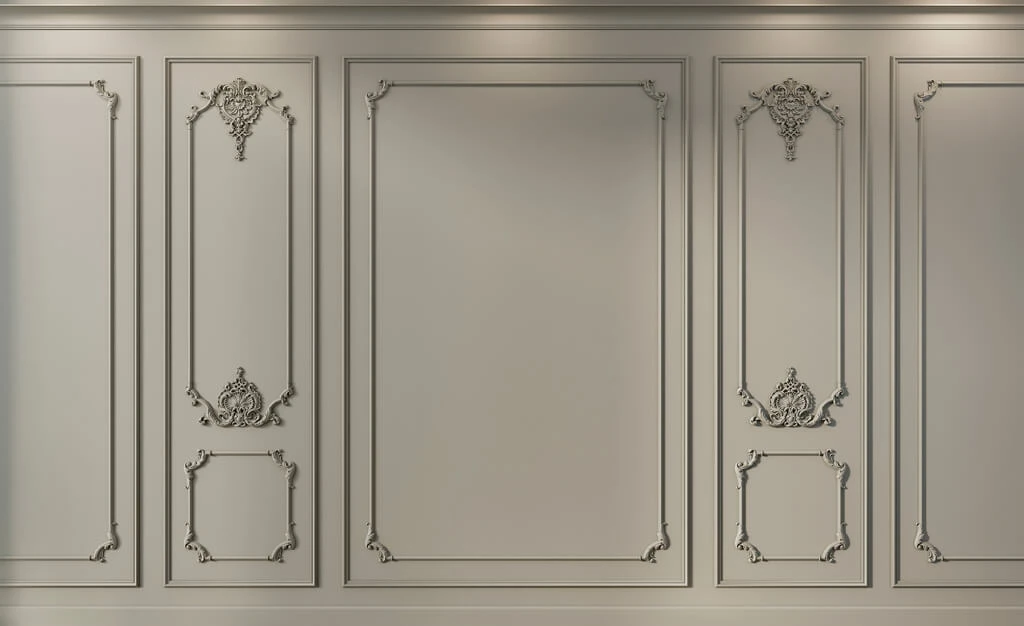
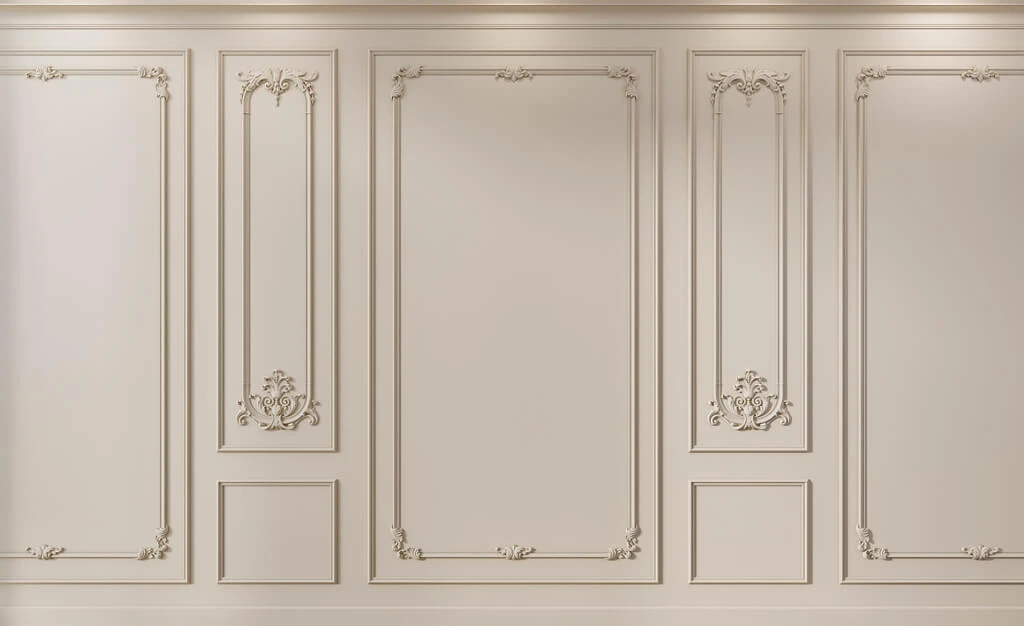
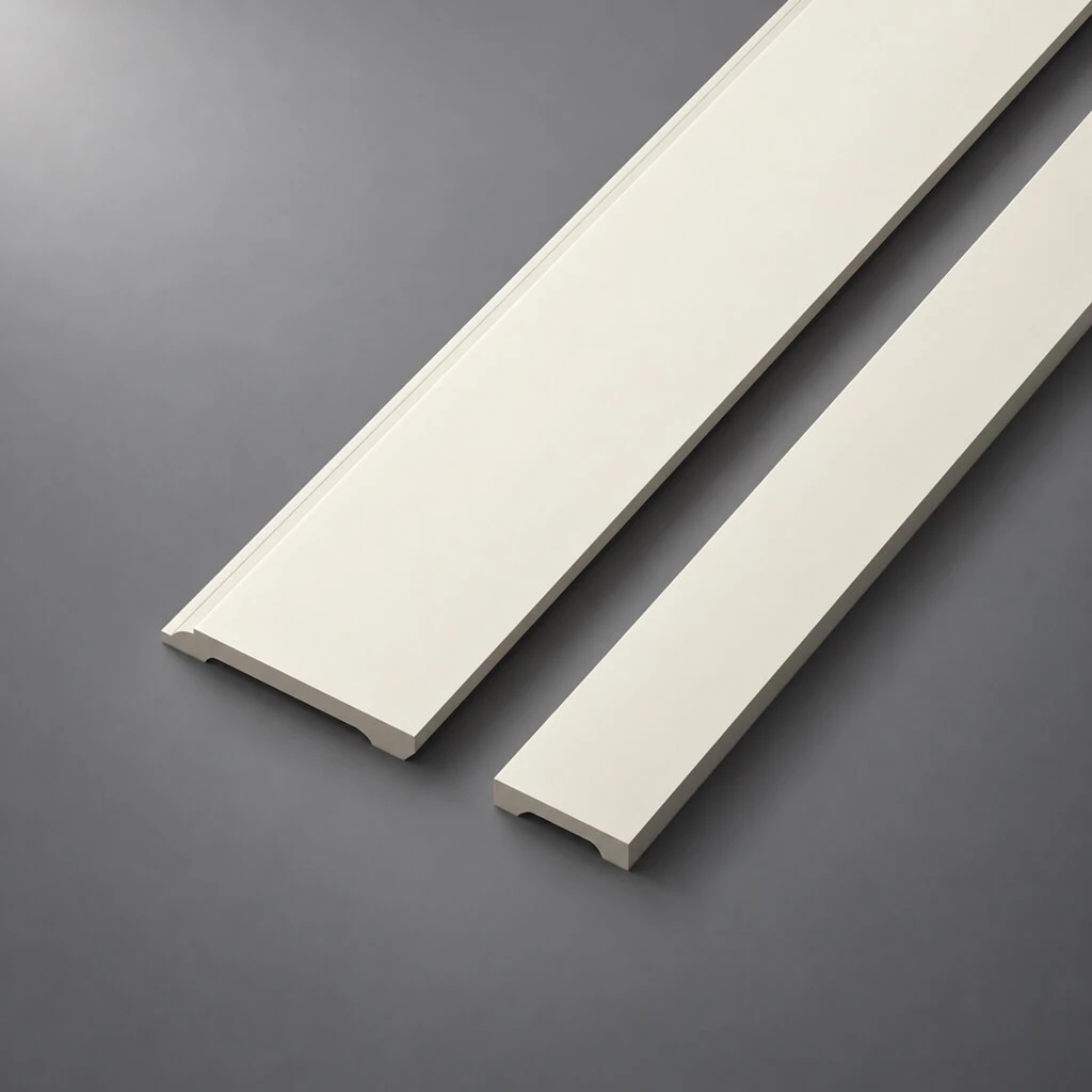
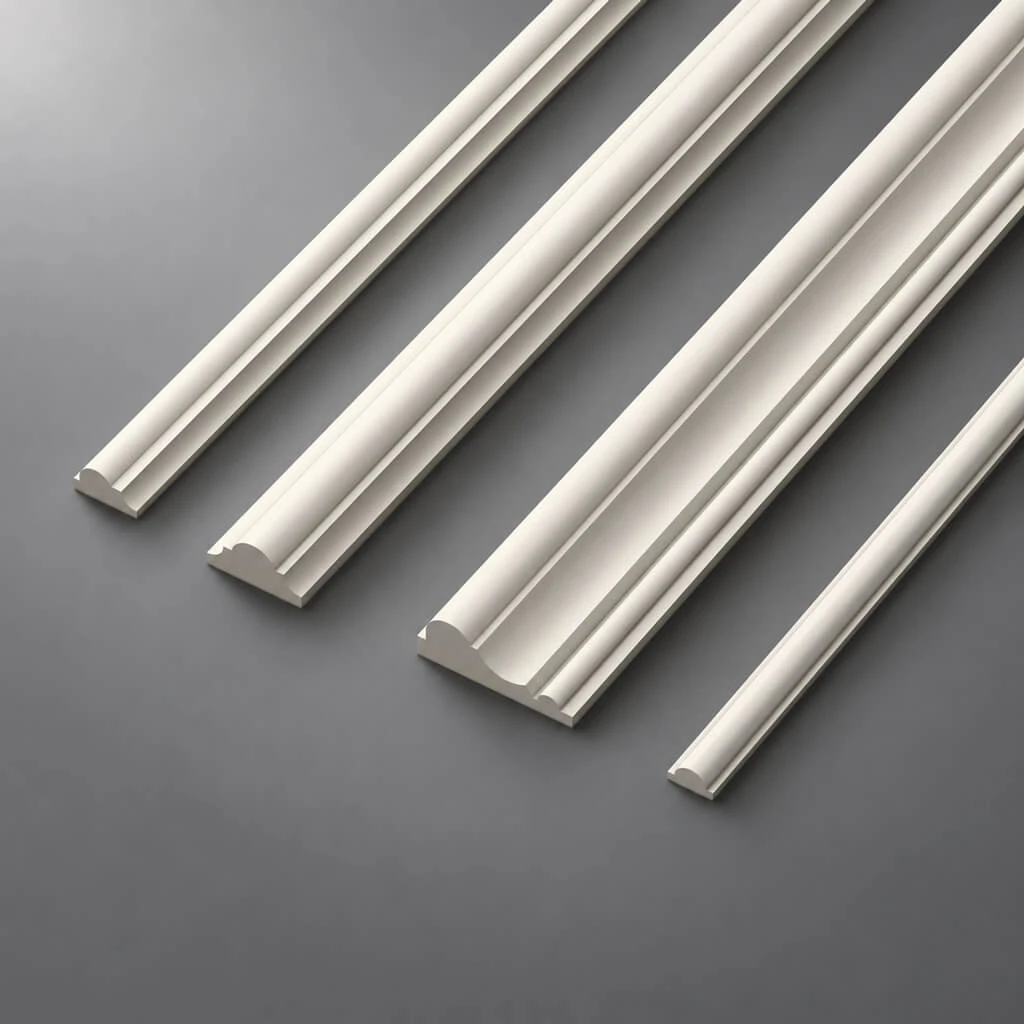
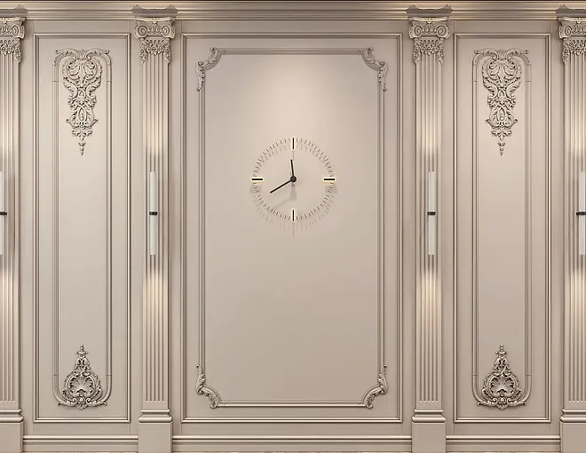
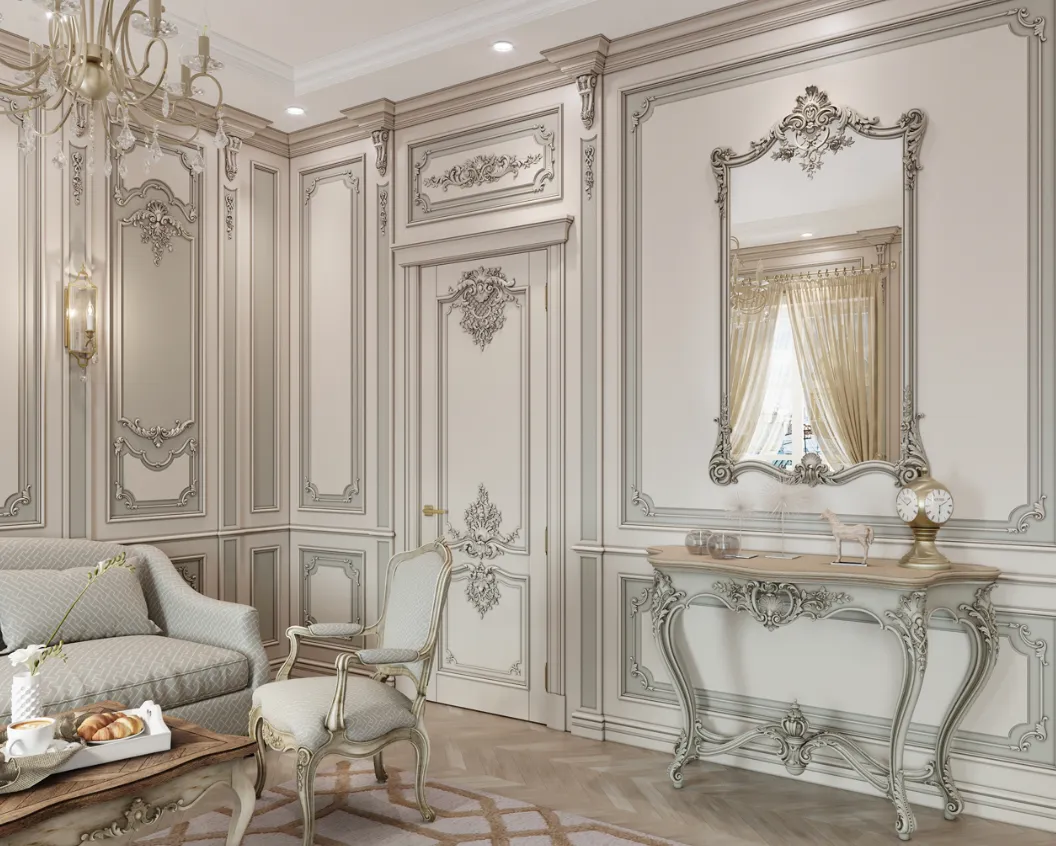
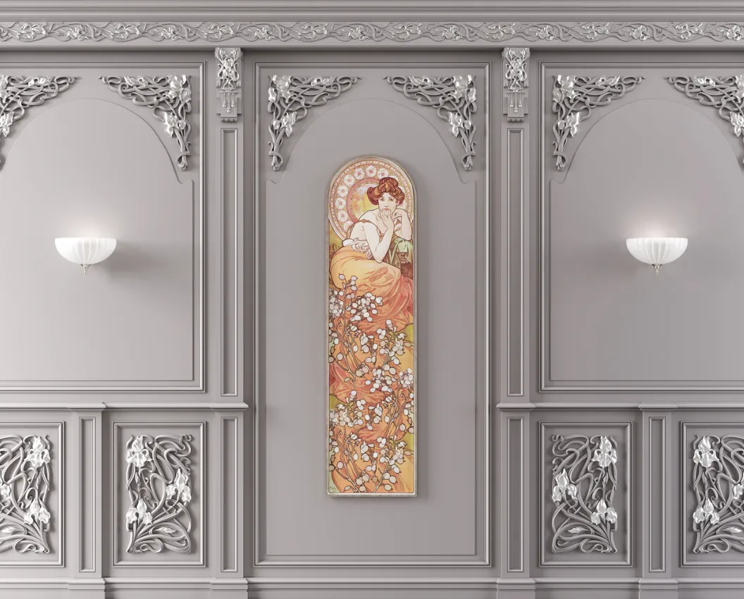
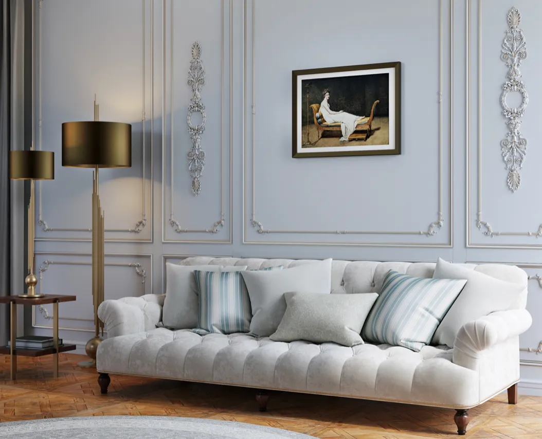
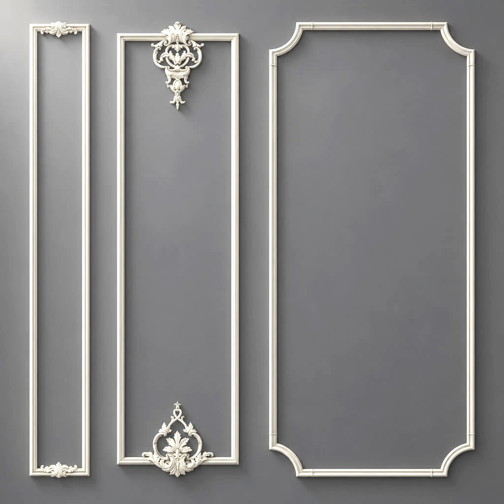
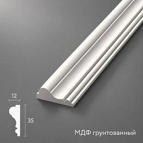
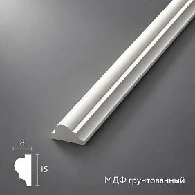
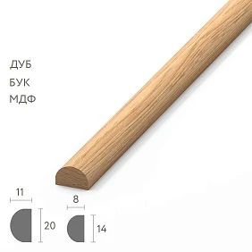
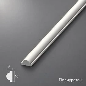
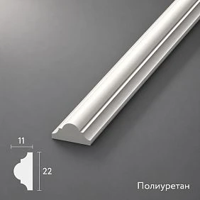
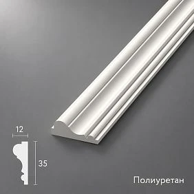
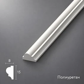
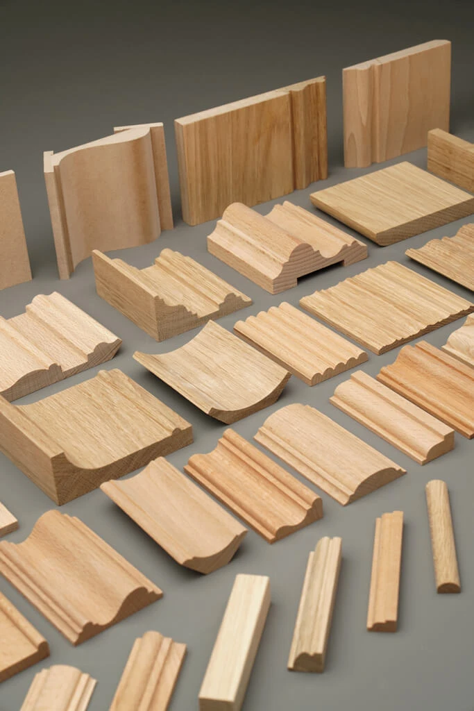
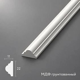
The second layer is the architectural frame. Moldings made of polyurethane They form the geometry: a central frame for the logo, side vertical strips, a horizontal belt under the ceiling. This is the "skeleton" of the first screen — without it, the background remains just a wall.
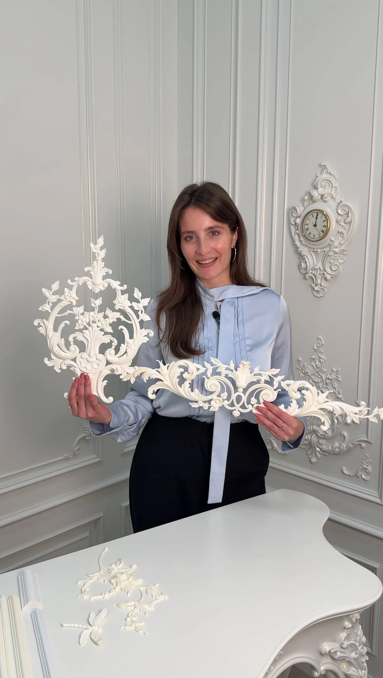
The third layer is accent decor. Relief Decoration In one or two spots: above the logo, on the sides of the central frame, in the corners. This is the final layer that adds status — a feeling of "expensive and intentional."
Three layers — three investments. But it is their combination that creates what the client reads as an "expensive place."
Our factory also produces:


Moldings behind the reception desk: how to assemble a wall into a neat system
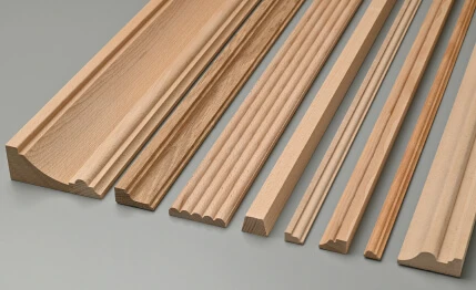
Moldings are a basic tool for designing the reception area. Not because it's customary, but because they solve a specific problem: they give an empty wall structure.
Get Consultation
Central frame for the logo
A logo on a wall without a frame is like a painting without a frame: formally present, but architecturally incomplete. A molding frame around the logo does the following:
-
Highlights the logo area from the general wall field.
-
Sets the scale: a frame 1.5–2 times larger than the logo itself is the correct proportion.
-
Creates a "field" around the logo — a "quiet" zone that allows the brand name to "breathe."
-
Adds architectural weight: a logo in a frame is perceived as a permanent element, not a temporary sticker.
The width of the molding for the logo frame is 25–40 mm. Enough for the frame to be readable, but not so massive as to overpower the logo itself.
Vertical molding strips on the sides
Two vertical moldings on the sides of the central frame — at equal distance from it and from the edges of the wall. This creates symmetry that the brain reads as "order" and "intention." They also visually raise the height of the wall — vertical lines always work to increase space.
Horizontal belt under the ceiling
A molding horizontal belt 15–20 cm below the ceiling or flush with the ceiling cornice is the "cap" of the entire composition. Without it, the wall looks "open at the top" — unfinished. With it, it looks closed and complete.
Baseboard line at the bottom
The wall behind the reception desk should be coordinated with the baseboard at the base. If the baseboard is active and profiled, the molding system above it should "pick up" its rhythm. If the baseboard is calm, the moldings can be slightly more expressive, compensating for the restraint of the lower line.
Decorative stucco for reception: precision as professionalism
A mistake made when designing commercial reception desks: they take decorative molding and "scatter" it across the entire wall. Everywhere there is free space. As a result, the wall looks busy but not organized. Fussy rather than prestigious.
Rule for a commercial reception desk: stucco is a point, not a field. One strong accent is better than five weak ones.
Where stucco works at the reception
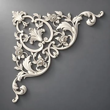
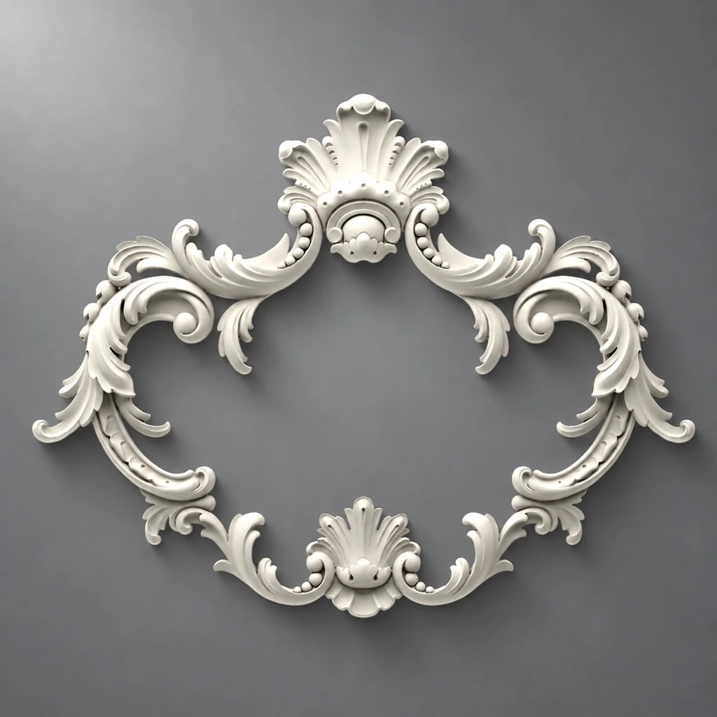
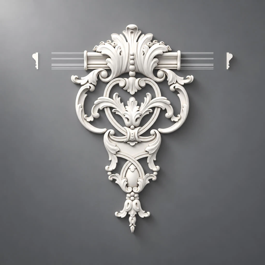
Above the logo — a crowning element. A central decorative overlay above the logo frame. A medallion, cartouche, acanthus wreath — something that "crowns" the brand zone and gives it completeness. Size: 20–30% of the frame width. No larger — otherwise the stucco will start competing with the logo.
On the sides symmetrically — paired elements. Two identical elements on both sides of the central frame — at the same height, at equal distance. This is the logo's "guard" — a pair of decorative sentinels that hold the gaze in the center.
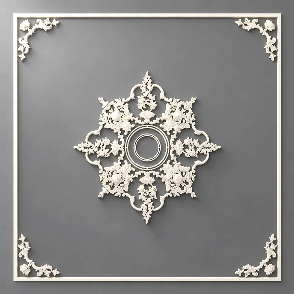
In the corners of molding frames. Corner decorative overlays at the intersection points of moldings add detail and an expensive look without overloading. This is the element that the guest does not notice immediately, but which creates the overall feeling of the interior being "finished."
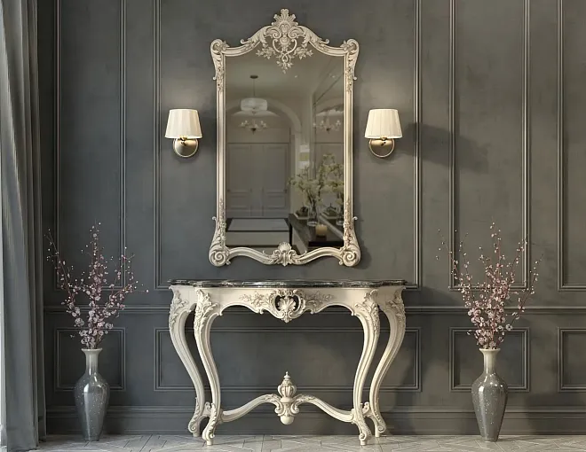
Next to the sconce. If wall lights are installed above the counter — a decorative element next to the sconce integrates it into the wall, making the light fixture part of the architectural system, rather than just a "device stuck into the wall."
What to avoid when using stucco molding at the reception
-
Do not place a voluminous relief overlay directly behind a small or thin logo. The relief "eats" the logo, making it unreadable.
-
Do not mix ornamental vocabularies. Acanthus leaves + geometric ornament + floral garland on one wall — these are three different eras and three different characters. Choose one language and stick to it.
-
Do not paint the stucco molding in a contrasting color if the logo is already contrasting. Two contrasts on one wall create visual noise.
Logo and stucco molding: how to maintain the balance of the brand zone
This is the most delicate moment of the entire topic. Because it's easy to make a mistake here even with good materials and the right intentions.
The "logo is the main" principle
Everything on the wall behind the reception is subordinated to one goal: to make the logo readable and prestigious. Moldings are the frame for the logo. Stucco is the crowning of the logo. The cornice is the architectural context of the logo. But not the other way around.
If there is more decor than the logo itself, the system works against you. The client examines the wall but does not remember the brand.
Field around the logo
There should be an empty field between the logo and the molding frame — at least 15–20 cm around the perimeter. This is "air" that gives the logo scale and readability. Do not squeeze the frame close to the letters — this is a common mistake.
Color of stucco relative to the logo
Three options that work:
Monochrome. Stucco, moldings, and wall are in one color. The logo is in another (or in metal, or three-dimensional). This is the most winning approach: the entire architectural system is a single field, and the logo is the only contrast.
Tinting. Stucco and moldings are slightly darker or slightly lighter than the wall in the same tone. The logo is in a more saturated or contrasting color. This is "semi-contrast," which gives the architectural system a bit more visibility while keeping the logo a priority.
Patina. Stucco in "bronze," "gold," or "silver" color — provided that the reception style allows this luxury. Suitable for premium-class clinics, luxury beauty salons, jewelry showrooms. In this case, the logo is glossy metal or three-dimensional chrome letters.
Ceiling cornice above the reception: the final line
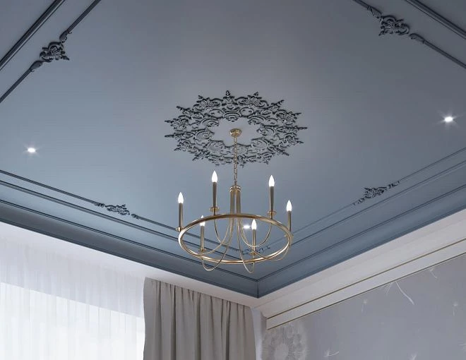
Reception design without of the ceiling cornice It's like a suit without a jacket. It looks decent, but something is missing.
The ceiling cornice above the reception area serves several functions:
-
It covers the wall-to-ceiling transition, which in any commercial space with an economy-class renovation looks untidy.
-
It creates a horizontal perimeter around the entire area — visually framing the reception space.
-
It serves as a base for LED lighting if contour lighting above the counter is planned.
-
It adds an architectural cap to the entire wall molding system — without the cornice, the moldings hit the ceiling and break off.
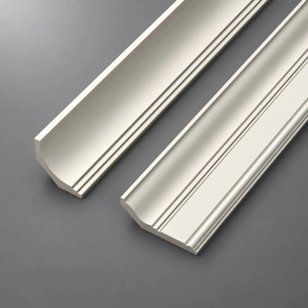
STAVROS polyurethane ceiling cornices — from minimalist 40–50 mm profiles for modern interiors to the monumental A130V1 (100 × 83 mm) for grand classical spaces. For a standard commercial reception area with a ceiling height of 2.7–2.9 m, a 50–70 mm cornice with a moderate profile is optimal.
Reception for different types of business: five working schemes
Beauty salon or beauty studio
Style: modern classic or neoclassical with a feminine accent.
Wall decoration scheme behind the counter:
-
Background: a neutral panel with a fine geometric relief — cream, dusty pink, or deep green.
-
Moldings — a frame around the logo + two side vertical moldings.
-
Stucco — a floral overlay above the logo, a pair of small leaf elements on the sides.
-
Cornice — light, 50–60 mm, matching the wall color.
-
Everything in monochrome: cream on cream — relief through shadow.
Medical clinic or dentistry
Style: strict neoclassicism. The logic of trust through order and precision.
Scheme:
-
Background: a white or light gray painted wall. No active texture — the clinic requires cleanliness.
-
Moldings — a central rectangular frame + a horizontal upper band.
-
Stucco — corner overlays in a frame (delicate, without lavish ornamentation), a small medallion above the logo.
-
Cornice — 50–60 mm, white.
-
Color: all white — only the logo in the brand color.
Showroom or furniture store
Style: high modern classic. Logic: "our taste is as good as our product."
Scheme:
-
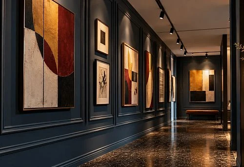
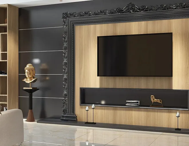
Background: dark rich wall (anthracite, dark green, deep blue).
-
Moldings in cream or champagne — central frame + vertical stripes. Contrast "dark background + light moldings" — maximally expressive.
-
Stucco in the color of the moldings — corner overlays inside the frame, central element above the logo.
-
Cornice — expressive, 70–80 mm, matching the moldings.
-
Logo — three-dimensional letters in gold or chrome.
Office or business center
Style: business neoclassicism. Laconic, without excessive decor.
Scheme:
-
Background: light gray or light beige wall.
-
Moldings — thin, 20–25 mm, matching the wall color. Frame around the logo + upper horizontal band.
-
Stucco — corner overlays only at the intersection points of the frame moldings. No additional stucco.
-
Cornice — 40–50 mm, laconic profile.
-
Monochrome: wall, moldings, stucco — in one tone. Logo — corporate color of the company.
Restaurant or hotel lobby
Style: full classical program. Everything is allowed here.
Scheme:
-
Background: decorative panel with relief or noble fabric-like wallpaper.
-
Moldings — an expanded system: central frame, side frames, horizontal belts, vertical dividers.
-
Decorative stucco — full set: corner overlays, central medallion, paired side elements.
-
Cornice — monumental, 80–100 mm, with an ornamental profile.
-
Color: two-tone scheme — dark background + cream decor.
Installation: professional sequence for commercial interior
In a residential interior, an installation error will be noticed by the apartment owner. In a commercial reception — by every client. Therefore, the requirements for installation here are higher.
Step 1: marking the axis of symmetry. The central vertical axis of the wall is the "backbone" of the entire composition. The logo, central frame, overlays above the logo — everything is centered along this axis. Laser level, fixing the axis with a pencil.
Step 2: marking horizontals. The height of the center of the logo frame from the floor is 155–165 cm. This is the eye level of a standing person of average height. At this height, the logo is read most naturally.
Step 3: installation of the cornice. The ceiling cornice is installed first. It sets the top line of the entire system.
Step 4: frame moldings. Acrylic glue, 45° corner cuts, temporary fixation with masking tape. All joints — acrylic putty.
Step 5: decorative overlays. Installed last — strictly according to the symmetry axis markings.
Step 6: final painting. Primer + two coats of matte acrylic paint. After drying — logo installation.
What to buy for the reception: a task-based kit
| Task | What to purchase |
|---|---|
| Create a background for the logo | Moldings made of polyurethane |
| Add status to the brand zone | Buy decorative stucco |
| Finish the top of the wall | Ceiling cornice |
| Emphasize the central zone | Frame of moldings |
| Do not overload the brand | Monochrome scheme, thin moldings |
| Assemble a complete set | Buy molding + moldings + cornice + glue + paint + spare |
Frequently asked questions
Which stucco molding to choose for the reception desk?
For the reception desk, optimal Decorative stucco is polyurethane with moderate relief — not too ornate a shape that would compete with the logo, but expressive enough to add status to the area. Corner overlays, central medallions 100–200 mm, delicate paired side elements — an optimal set.
What to buy for the wall behind the reception desk?
Buy polyurethane moldings for the frame and vertical strips, Buy Moldings for point accents, Ceiling cornice for the top finish. Plus mounting adhesive, acrylic putty, primer, and finish paint. Molding reserve — 15%, adhesive reserve — 20%.
Can stucco molding be used in a beauty salon or clinic?
Yes. Stucco molding for the reception desk made of polyurethane works well in commercial spaces of any type. It is important to align it with brand identity: the decor style should emphasize, not contradict, the company's character. For a clinic — strict neoclassicism. For a salon — floral motifs or concise geometry.
How to make the reception desk look expensive without a full renovation?
Design only the wall behind the counter: add Moldings with a frame around the logo, buy decorative moldings for one or two accent points, install a ceiling cornice, repaint the wall in a monochrome scheme. The cost of these works is many times less than a full renovation — and the visual effect surpasses most 'capital' investments.
Is professional installation necessary for a commercial reception desk?
It is recommended. In a commercial space, installation precision is critical: any deviation from symmetry, any unsealed joint, any horizontal misalignment immediately catches the eye of hundreds of clients per day. For a residential interior, DIY installation is acceptable. For a reception desk, it is better to trust a professional.
How to tie the reception desk design to the rest of the interior?
Through a unified decorative language: the same molding profile used behind the counter should be repeated on the walls of the waiting area. The same stucco — on the accent wall with a mirror. The same cornice — around the perimeter of the entire room. Polyurethane Items STAVROS products are manufactured in unified collections, allowing you to assemble a coordinated system for the entire interior.
STAVROS: partner for commercial interiors
The difference between a residential and a commercial project lies in the requirements. A residential interior is made once for one person. A commercial reception desk works every day, is seen by hundreds of clients, and carries the reputational burden of the brand.
STAVROS is a manufacturer that understands this difference. Buy molding from polyurethane for a commercial reception desk at STAVROS means getting a material with a precisely reproduced relief, 100% moisture resistance, readiness for painting with any composition, and an operational lifespan not limited by the warranty period.
Wide selection of profiles molding, over 100 models decorative inserts, full range ceiling cornices — everything needed to create a reception desk that sells trust at first glance, in one catalog.
Delivery across all of Russia. Pickup in Moscow and St. Petersburg. Order placement — from one item.
Because the first screen must work. And you will have it.