

Article Contents:
- Why furniture color determines everything else
- Color temperature: warm and cool white are not the same
- Contrast, nuance, or monochrome: three strategies
- White classic furniture: how to avoid a sterile interior
- Walls for white furniture: not pure white
- Moldings for white furniture
- Cornice and baseboard for white classic furniture
- Decorative elements for white furniture
- Beige and cream furniture: a warm interior with character
- Walls for beige furniture
- Moldings for beige furniture: when lighter is better
- Decor for beige furniture: don't argue with warmth
- Walnut-colored furniture: wood requires delicate neighbors
- Why walnut 'competes' with stucco
- Walls for walnut-colored furniture
- Moldings for walnut-colored furniture
- Baseboard for walnut-colored furniture
- Decorative elements for walnut furniture
- Gray classic furniture: strictness and modernity
- Gray is not one: warm and cool gray
- Walls for gray furniture
- Moldings for gray furniture
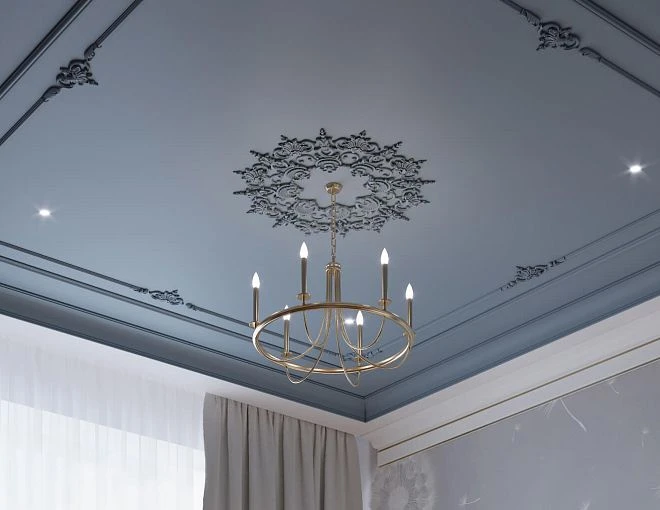
- Ceiling rosette in a gray interior
- Dark furniture: less is more
- The main rule: do not add heaviness to heaviness
- Moldings for dark furniture: white and calm
- Wall color for dark furniture: not too contrasting
- Color schemes: practical scenarios
- Scheme 1: White furniture — warm walls — warm moldings
- Scheme 2: Beige furniture — neutral walls — slightly lighter moldings
- Scheme 3: Walnut — light neutral walls — warm white moldings
- Scheme 4: Gray furniture — white walls — neutral moldings
- Choosing moldings to match furniture color: what to check before buying
- Test in daylight
- Test in evening lighting
- Molding scale and color
- Complete shopping list for an interior with classic furniture
- Mistakes when choosing the color of moldings and stucco
- Only look at photos in the catalog
- Choose white 'in general'
- Paint moldings and furniture in different stores without coordinating shades
- Not consider the floor color when choosing baseboards
- Overload a warm wooden interior with ornament
- Not take paint samples
- Forget about installing polyurethane molding and consider color the only parameter
- FAQ: questions about furniture and stucco color
- About the Company STAVROS
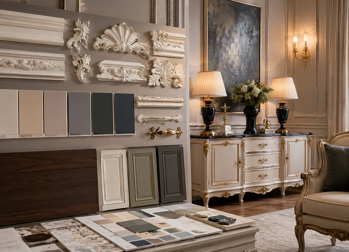
Color is the language through which an interior speaks to a person. And if in this conversation furniture, walls, moldings, baseboards, and cornices speak different languages — a person feels it, even without understanding why. The dissonance exists not in the head, it exists in the room. White furniture with cold bluish moldings and warm ochre walls is an interior that gets tired of looking at itself.
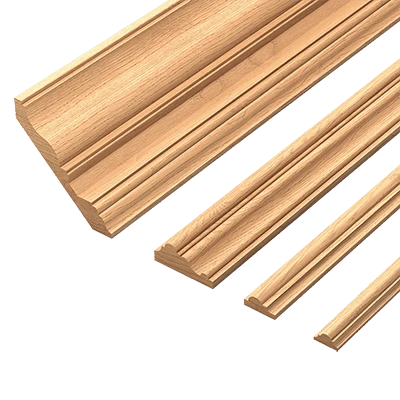
Selection moldings from polyurethane To match colors of classic furniture — the task is subtle but solvable. It requires not a design education, but a systematic understanding of several principles: how color temperature works, why the same white can be different, how the scale of stucco changes the perception of furniture color, and why baseboards affect how a cabinet looks next to a wall.
This article is a detailed breakdown of all the main scenarios: white furniture, beige, gray, walnut-colored furniture, dark-toned furniture. For each — specific recommendations for choosing moldings, cornices, baseboards, decorative elements, and a color system where everything works as a single set.


Why the color of furniture determines everything else
Before talking about specific scenarios, you need to understand the mechanics. Why the color collection of furniture in classic style influences the choice of moldings, and not vice versa?
Because furniture is the largest color object in the room. It occupies 30 to 50% of the visual field of a person standing in the doorway. Walls are larger in area, but they are perceived as a background. Furniture is perceived as a figure. And it is the 'figure' that sets the tone — and the 'background' (walls, moldings, cornice, baseboard) should support it.
If Moldings made of polyurethane compete in color with furniture — a dual center arises. The eye doesn't know where to look. If the moldings are too close to the wall color and simultaneously contrast with the furniture — the space 'falls apart' into two independent parts: the wall with decor and the furniture on its own.
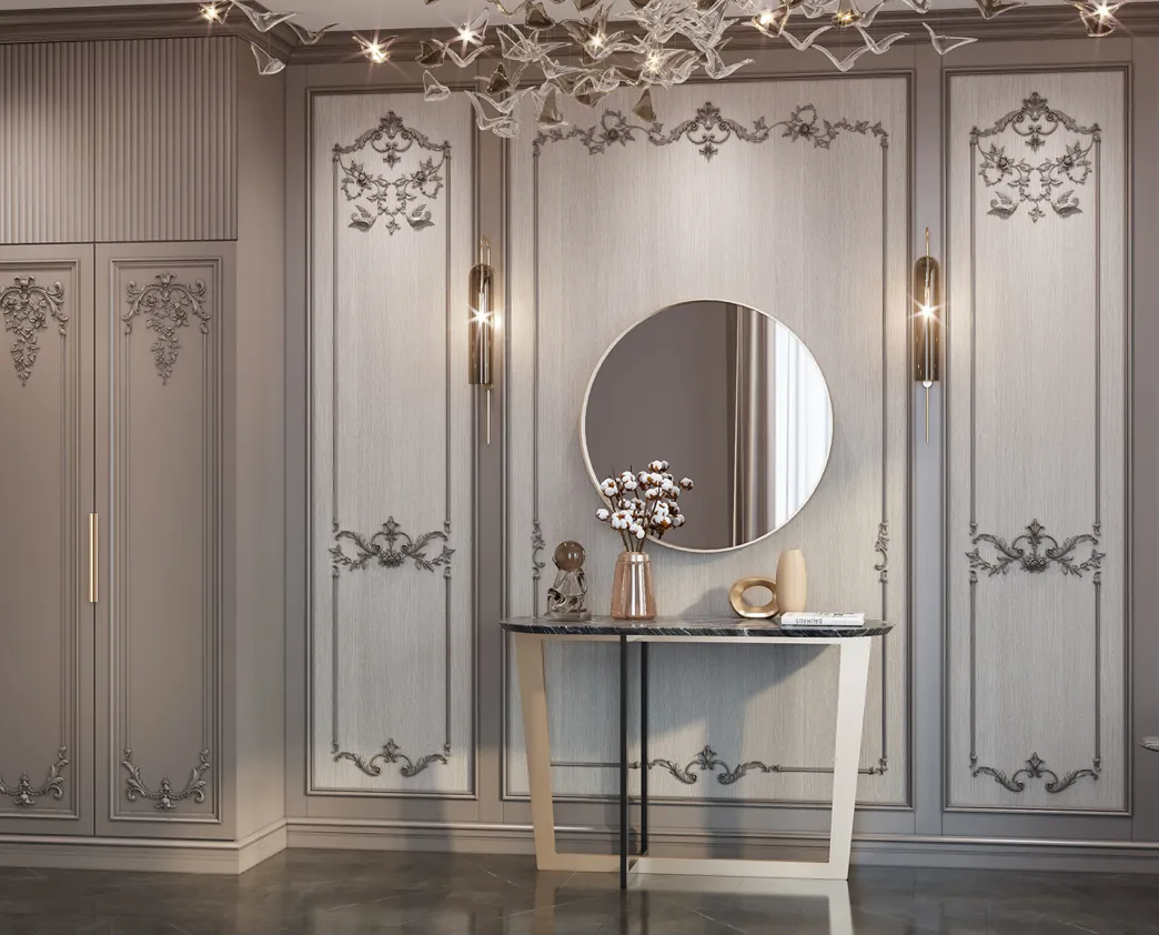
Correctly, when moldings, cornices, and baseboards create an architectural background against which furniture reads as the main object. This doesn't mean the stucco should be 'invisible' — it should be proportionate and color-coordinated.
Color temperature: warm and cool white are not the same thing
A key concept without which any discussion of combining furniture and stucco would be incomplete. White color can be:
-
Warm (with a yellow, cream, or pinkish undertone) — RAL 9001, 9010, NCS S 0502-Y. This is 'classic' white, ivory, milk.
-
Neutral — RAL 9003, pure white without undertone.
-
Cool (with bluish or greenish undertone) — RAL 9016, many modern "arctic" whites.
If the furniture is ivory (warm white) and the moldings are painted cool white, the difference will be obvious in daylight. The moldings will "jump out" from the furniture, creating an unpleasant visual dissonance. Conversely, warm moldings next to cool white furniture look yellowish.
This is the most common mistake when buying polyurethane decor for a classic living room. Stores sell moldings in "standard white," but no standard exists. Always take a sample and check it next to a furniture sample in daylight.
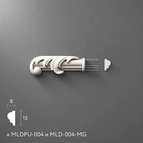
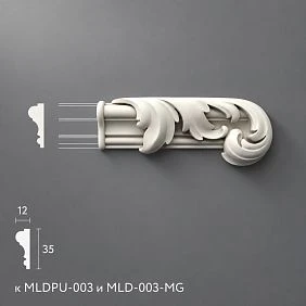
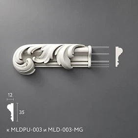
Our factory also produces:



Contrast, nuance, or monochrome: three strategies
Before choosing the color of the stucco, you need to decide on a strategy:
Monochrome strategy. Furniture, moldings, walls — all in the same color family. The only difference is in nuances: walls slightly darker, moldings slightly lighter, furniture matching the moldings. This is the most refined solution, creating a sense of wholeness.
Nuance contrast strategy. Moldings are 2–3 shades lighter than the walls. For example, walls — powder beige, moldings — warm white. Furniture — matching the moldings or slightly warmer. This is a classic, well-working solution for most apartments.
Contrast strategy. Dark walls and white moldings with furniture in a neutral tone. Or light walls with dark molding frames. This is a complex strategy requiring precision: incorrectly chosen contrast creates tension, not elegance.
Get Consultation
White classic furniture: how not to make the interior sterile
White classic furniture is the most popular choice. Light, airy, versatile. But it creates the greatest risk of error when selecting moldings.
The danger of white furniture is not that it is 'empty.' The danger is that with the wrong choice of surroundings, it becomes either sterile (clinically cold) or 'dissolves' into the walls and moldings, losing its silhouette.
Walls for white furniture: not pure white
The first temptation is to paint the walls the same white. Result: furniture 'drowns' in the walls, moldings are also white — and the entire space turns into a medical office. Even if different shades of white are used, monochrome without a tonal nuance removes structure.
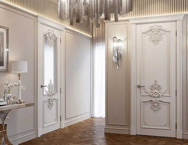
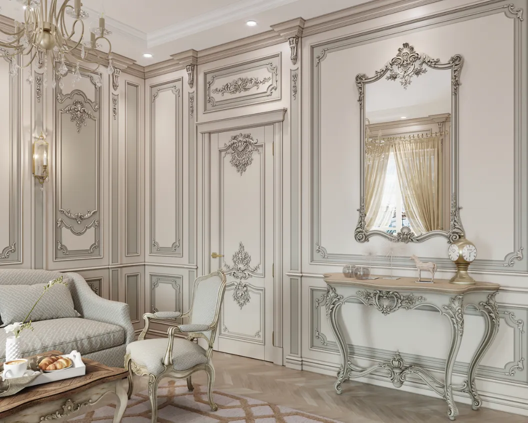
For white classic furniture, it is better to make walls in a neutral or light warm tone: soft cashmere, linen, light gray-beige. This creates a background against which white furniture reads as a separate object.
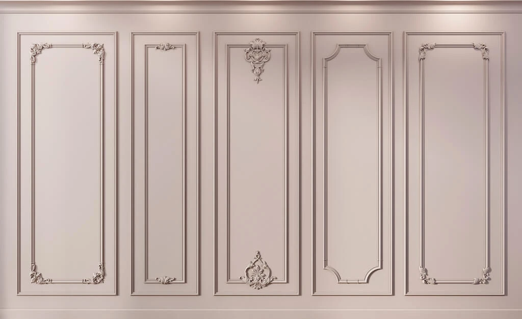
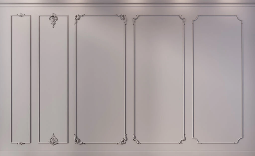
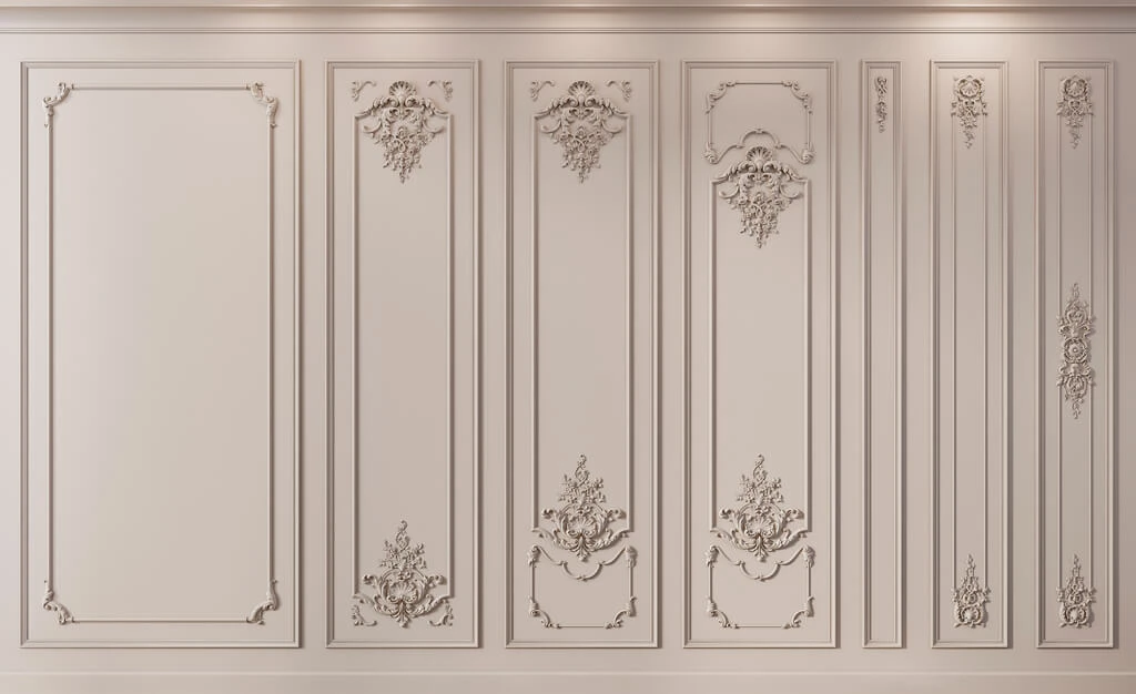
Moldings for white furniture
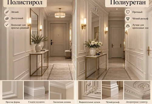
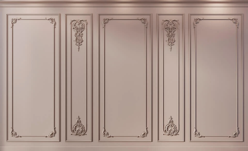
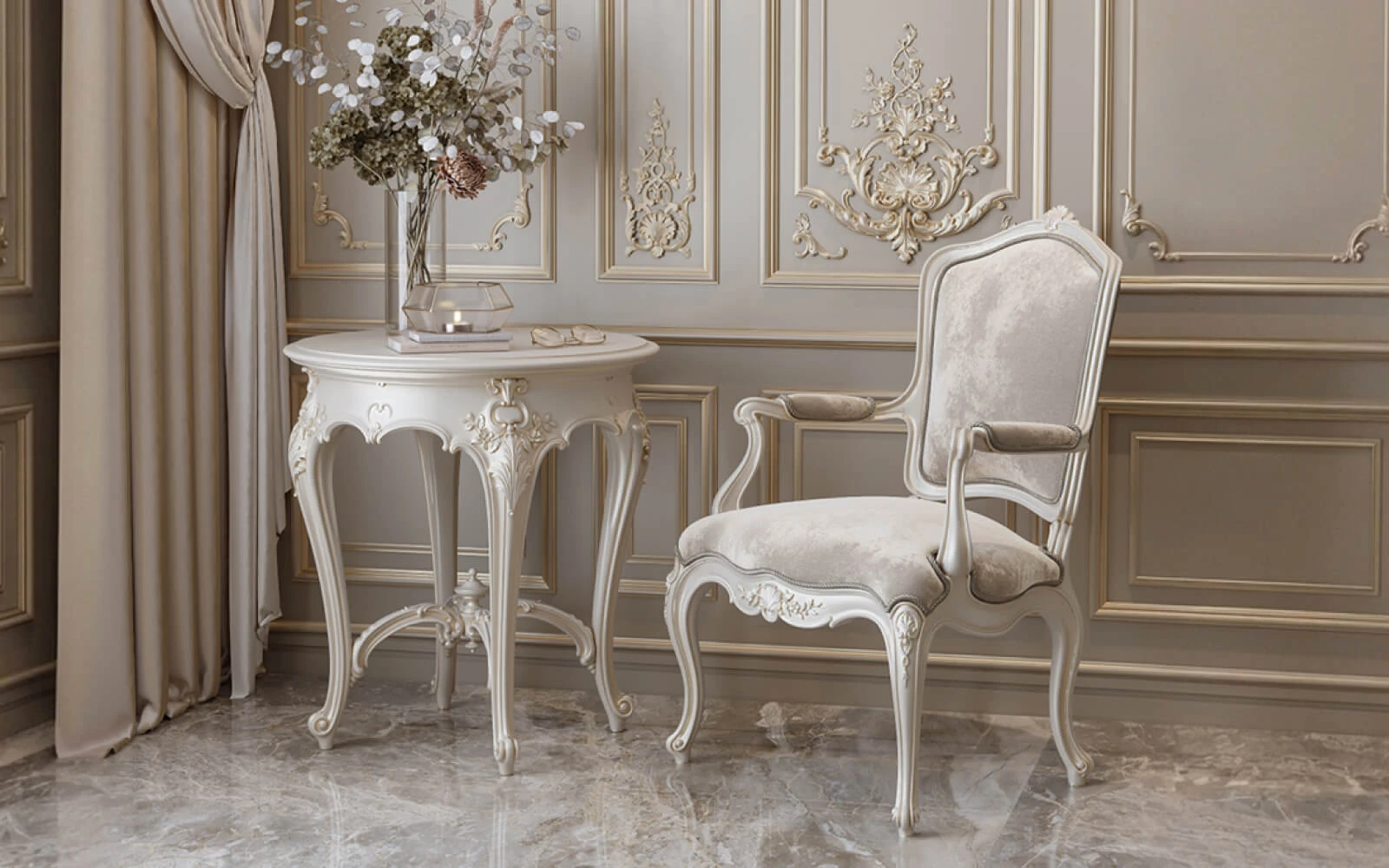
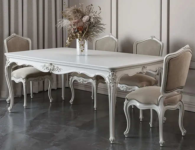
Moldings made of polyurethane for an interior with white furniture — in a warm white shade matching the furniture tone. If the furniture is RAL 9001 (ivory) — moldings in the same RAL 9001. If the furniture is RAL 9010 — moldings in the same shade.
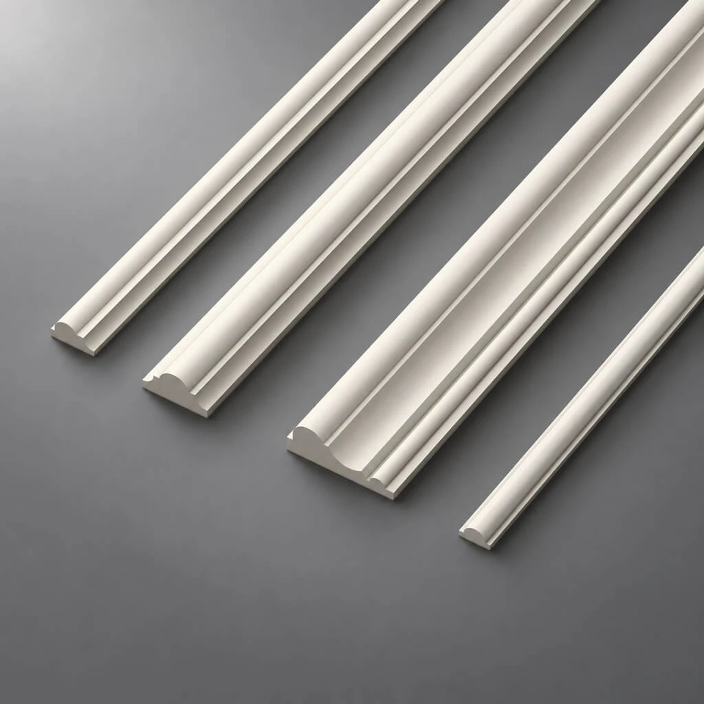
Molding width: 20–30 mm for a calm modern classic solution. White furniture does not require a 'powerful' molding — a delicate profile supports its lightness.
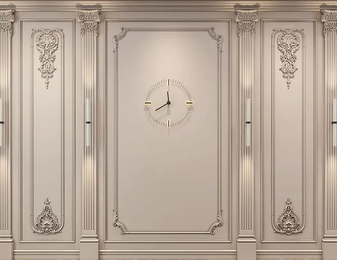
On warm walls, white moldings create a nuanced contrast — well-readable, elegant. This is the very 'architecture of shadow': the molding creates relief, the shadow from which is read against the background of warmer walls.
Cornice and baseboard for white classic furniture
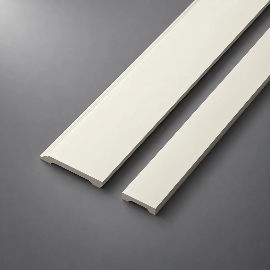
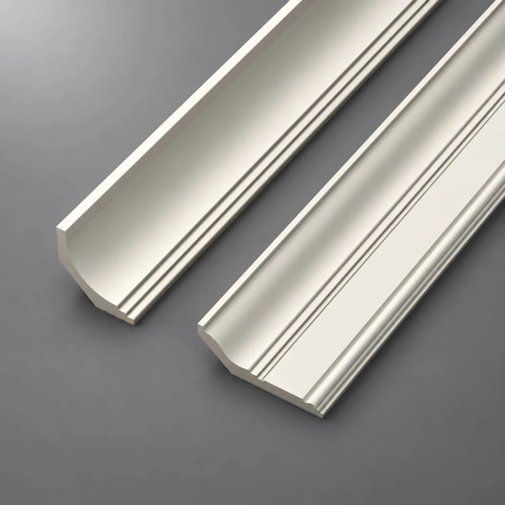
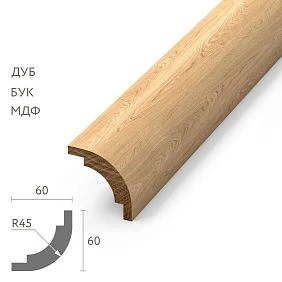
Cornice — matching the moldings, i.e., matching the furniture. Cornice height for a standard apartment with white furniture: 70–85 mm. Moderate profile. A too massive cornice overloads the light space.
Baseboard: two options are possible. First — matching the furniture and moldings (white). Creates a unified horizontal system. Second — matching the doors, if the doors are wooden with an open texture. In this case, the baseboard becomes a wooden transition between the floor and the white architecture of the walls.
Decorative elements for white furniture
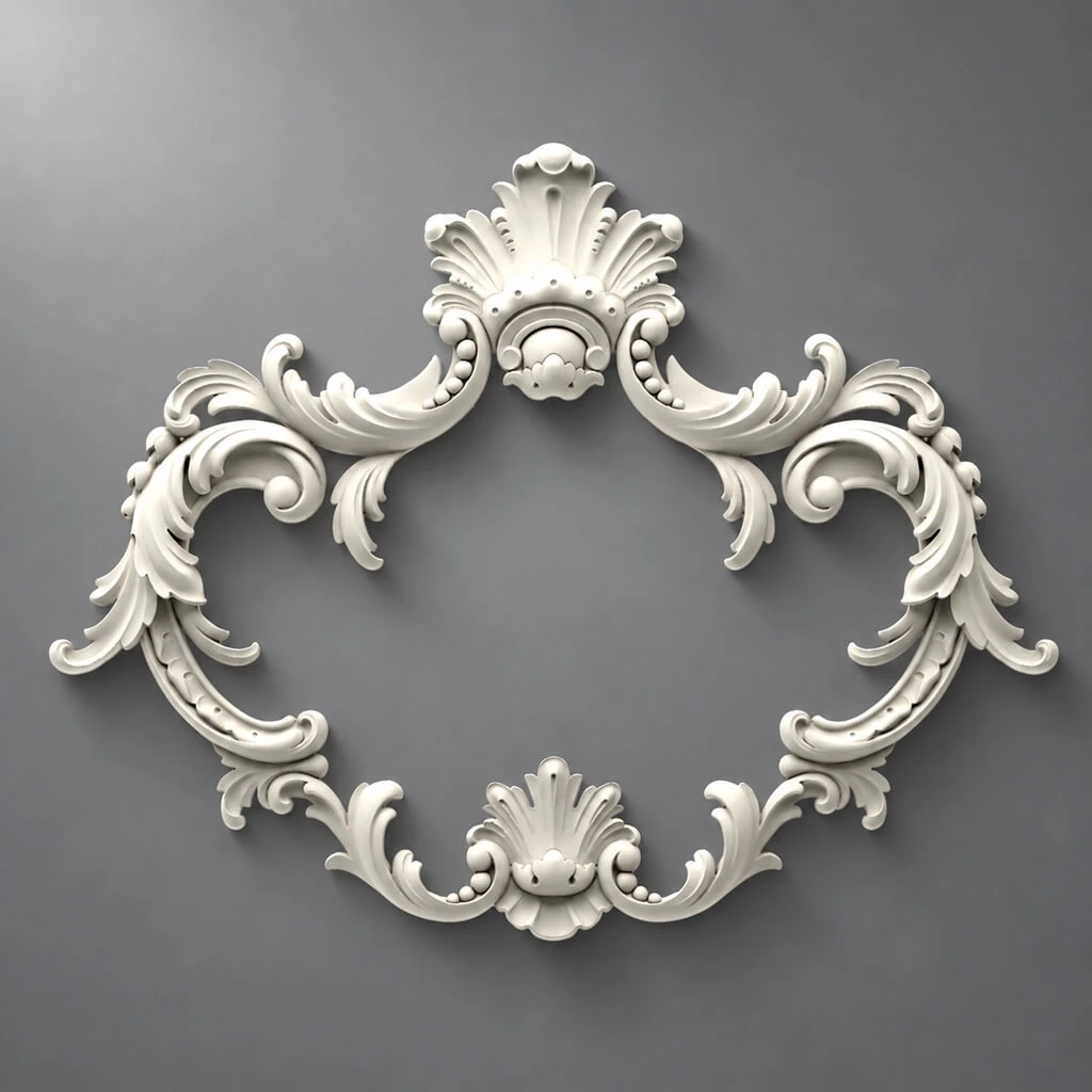
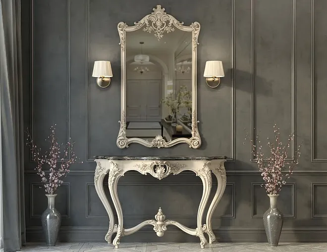
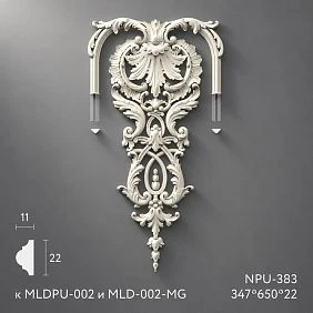
Decorative stucco for an interior with white furniture — moderate. Point accents: corner inserts in molding frames, small ceiling rose made of polyurethane if there is a chandelier, one decorative medallion above the mirror or console.
Not needed: large overlays with floral ornament, wide cornices with a developed overhang, multi-tiered rosettes. In a light interior with white furniture, an overload of stucco creates a feeling of cheapness, not wealth.
Beige and cream furniture: a warm interior with character
Beige classic furniture is one of the most advantageous choices. It carries warmth, creates coziness, and pairs well with wooden details and natural textiles. Selection polyurethane decor for beige furniture — a more flexible task than for white.
Walls for beige furniture
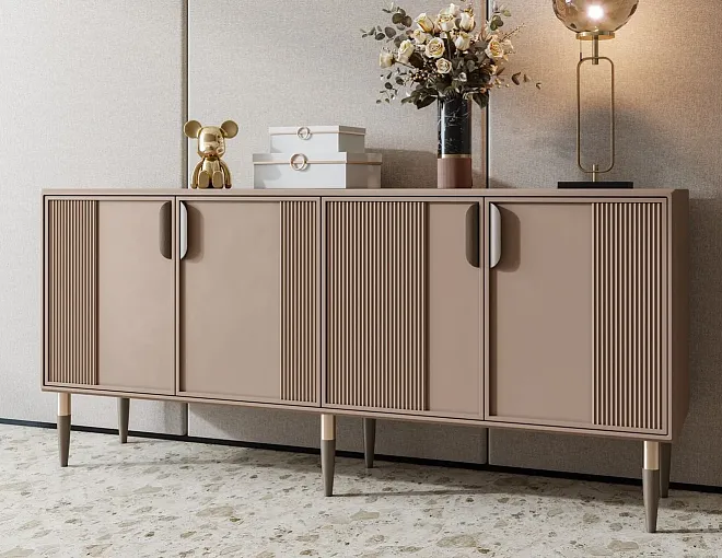
Beige furniture works well with walls in a warm palette: cream, linen, warm gray with a beige undertone, soft taupe. Avoid cold walls next to warm beige furniture — they create a color dissonance that feels like "something is off," although it's hard to explain.
If you want a slightly more "airy" space — use walls slightly lighter than the furniture in the same warm family. The furniture becomes slightly darker than the walls and reads as an object on a light background — softly, without contrast.
Moldings for beige furniture: when lighter is better
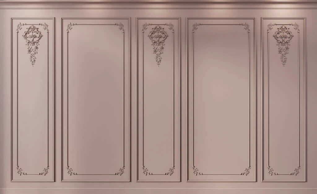
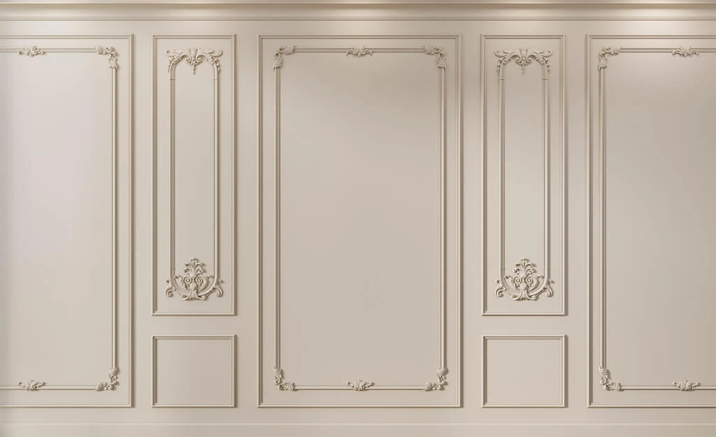
Moldings made of polyurethane for beige furniture — in warm white or a slightly cream shade, lighter than the walls. This creates a nuanced contrast: the moldings "emerge" from the wall as a light architectural line, without competing with the furniture in color.
If the walls and moldings are in the same shade, the moldings can be made slightly lighter by choosing a different value on the brightness scale. For example, walls — NCS S 1510-Y20R, moldings — NCS S 0510-Y20R. Both are warm, but the moldings are lighter — and they read as a relief structure on the wall.
Decor for beige furniture: don't argue with warmth
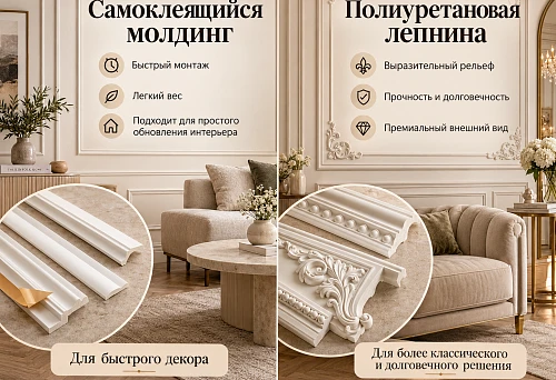
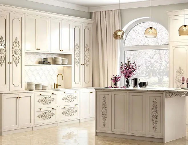
decor for furniture и Polyurethane wall decor for a beige interior — without heavy ornamentation. Moderate molding profiles, small corner inserts, Decor for polyurethane moldings with a geometric or light floral pattern.
In a beige interior, wooden details work well: a wooden baseboard matching the doors, wooden handles on furniture, wooden decor in the form of overlays. Natural wood supports the warm beige palette and adds tactility.
| Interior element | Recommendation for beige furniture |
|---|---|
| Walls | Warm cream, linen, taupe |
| Moldings | Warm white, lighter than walls |
| Cornice | Same shade as moldings |
| Baseboard | Matching doors or matching moldings |
| Decorative elements | Moderate, geometric |
| Ceiling rosette | Warm, small diameter |
Walnut-colored furniture: wood requires delicate surroundings
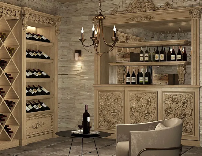
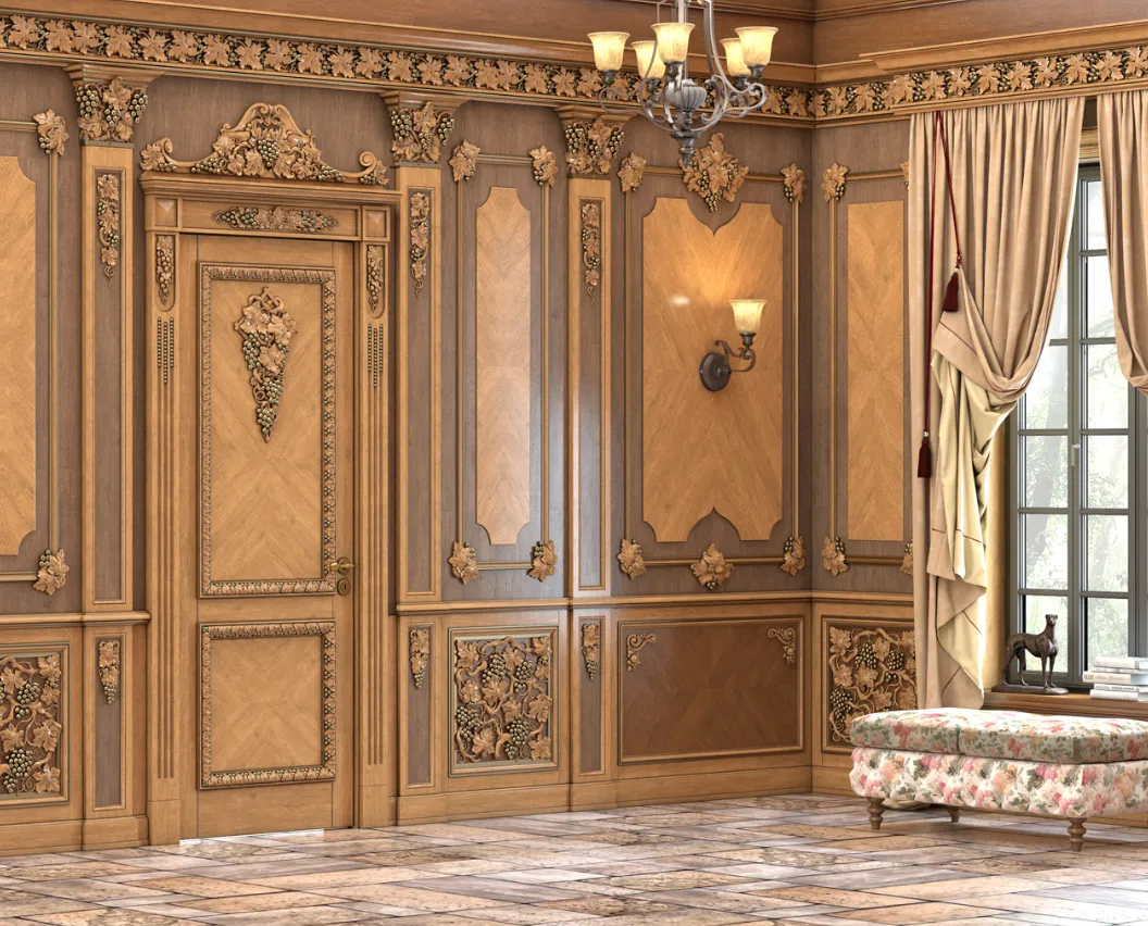
colors of classic furniture Walnut tone is one of the most expressive. Warm brown with a golden or reddish undertone, visible wood texture, rich character. And that is why walnut-colored furniture requires special care in choosing moldings: the decor should not compete with the wood.
Why walnut "competes" with stucco
Walnut-colored furniture carries a powerful visual signal: natural texture, rich tone, depth. If you place large stucco with deep ornamentation next to it, a competition between two complex textures arises. Neither the furniture nor the stucco can "win" in this contest — both lose because each interferes with the other.
Rule for walnut-colored furniture: Polyurethane moldings should be calm. Clean profiles without deep ornamentation. Frame moldings with moderate relief. Cornice without active ornamentation.
Walls for walnut-colored furniture
Walls should be neutral — not competing with either the wood or the moldings. The following work well:
-
warm light beige without a brown undertone (otherwise it blends with the furniture);
-
light gray-beige (taupe) — neutral but warm;
-
soft white with a slight warm undertone.
Avoid: walls in colors from the same brown-walnut spectrum (furniture gets lost against the background), and walls with a pronounced cool undertone (they conflict with the warm wood).
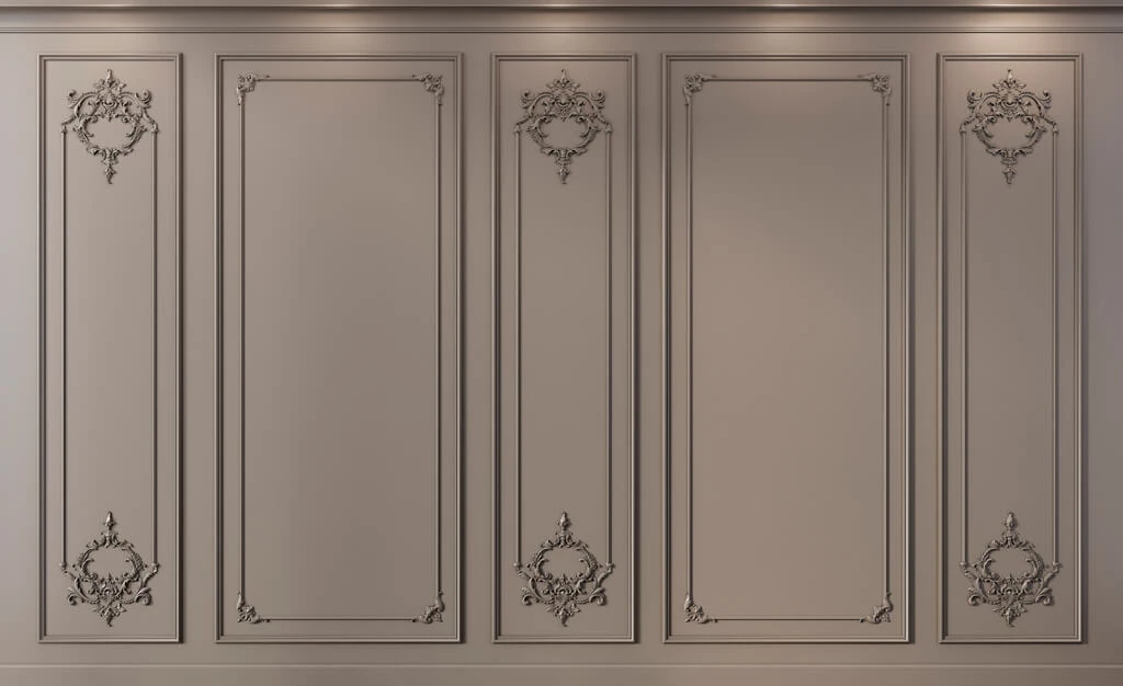
Moldings for walnut-colored furniture
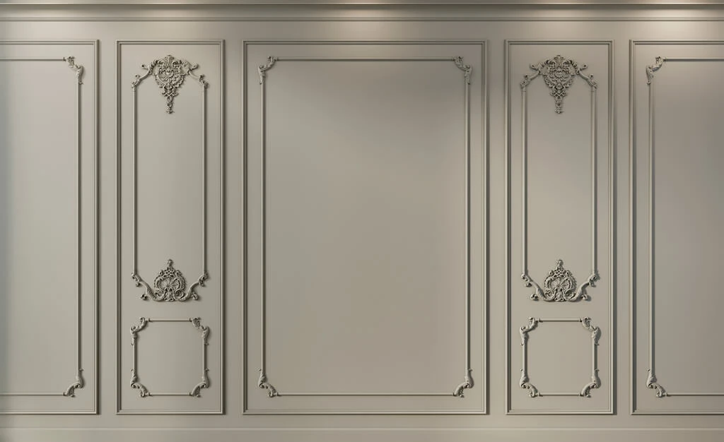
Moldings for classic furniture Walnut color — white or in a warm white shade. Width: 20–35 mm, profile — clean, without elaborate ornamentation. Frame panels on walls create a neutral architectural structure that highlights the furniture rather than competing with it.
The contrast of white moldings and warm walnut furniture is intentional but delicate. The moldings should be warm white, not cold — otherwise the contrast will become harsh.
Baseboard for walnut-colored furniture
The baseboard is a crucial detail for an interior with walnut furniture. Two strong solutions are possible here. The first is a wooden baseboard matching the furniture: it ties the floor, furniture, and bottom line into a single warm horizontal. The second is a white baseboard matching the moldings: it creates a clean architectural frame around the warm furniture.
The choice depends on the floor. If the floor is wooden matching the furniture — a wooden baseboard creates a natural transition. If the floor is neutral (light stone, light tile) — a white baseboard is more appropriate.
Decorative elements for walnut furniture
decorative elements for furniture made of natural wood — wooden overlays, medallions, frame details — should be used carefully in an interior with walnut furniture. They can add an extra layer of wood texture, but only if the scale is precisely calibrated and they are integrated into the furniture, not added on top of it.
On the walls — only polyurethane decor: decorative polyurethane elements in the form of corner inserts for molding frames. No large floral wall appliques next to walnut furniture — this is a guaranteed overload.
Gray classic furniture: strictness and modernity
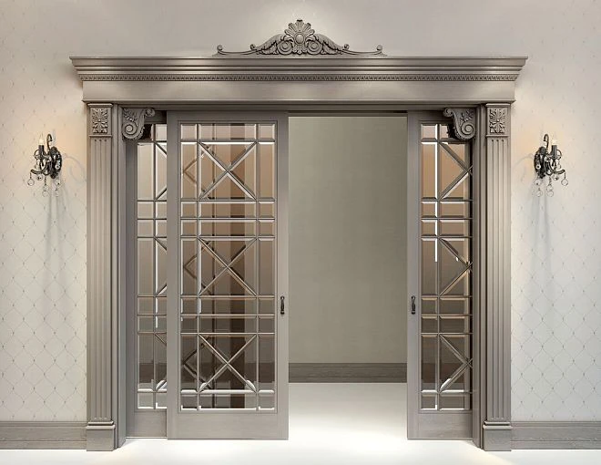
Gray furniture in a classic style is an interior choice that is becoming increasingly popular. Gray allows you to preserve the classic shape of furniture while moving away from the feeling of a "historical" interior. This is modern classic in a strict execution.
Gray is not one: warm and cool gray
Gray furniture can be warm (with a beige or brown undertone) and cool (with a bluish, greenish, or neutral undertone). This difference is fundamental for choosing moldings.
For warm gray furniture — moldings in a warm white or cream shade. For cool gray — moldings in a neutral or slightly cool white.
Mixing warm furniture and cool moldings is a classic mistake that creates tension in the interior.
Walls for gray furniture
For gray classic furniture, the walls should create the right contrast. Two good options:
Lighter than the furniture, the same tone. Furniture is warm gray NCS S 3010-Y80R — walls are NCS S 1010-Y80R. A soft nuanced contrast in the same tonality. The furniture reads as a darker object against a light background.
Contrasting yet cohesive. Walls in warm white or cream, furniture in rich warm gray. The contrast between the light wall and gray furniture works like black-and-white graphics — clean, strict, elegant.
Moldings for gray furniture
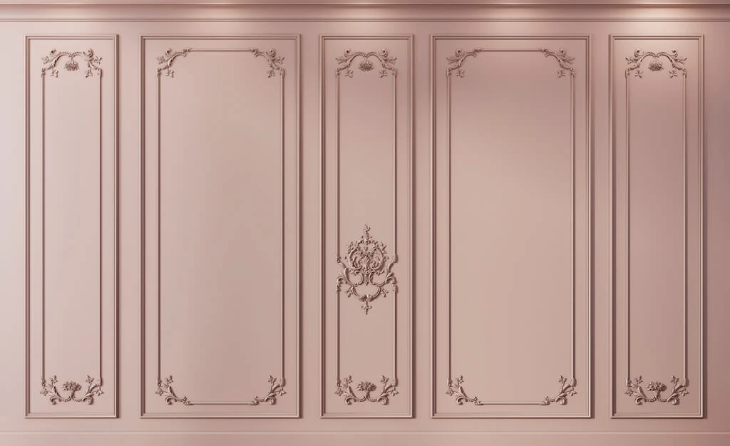
Moldings made of polyurethane For a gray interior — warm white or neutral white depending on the temperature of the gray. The profile should be strict: stepped or a clean geometric ogee. No ornamental floral elements. Gray furniture in a classic style already speaks the language of modernity — the stucco should support this language, not shift into baroque ornament.
Molding width for gray furniture: 25–35 mm. This is enough for a visible architectural line, but not too much for a modern classic interior.
Ceiling rosette in a gray interior
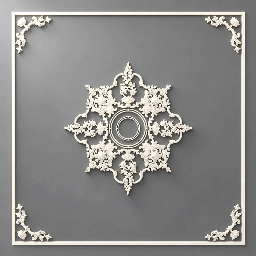
ceiling rose made of polyurethane In a gray interior — only geometric, small diameter (35–45 cm). A floral rosette with classic baroque ornament in a modern gray interior looks like a quote from another era that no one ordered. A geometric rosette is part of the overall strict language.
Dark furniture: less is more
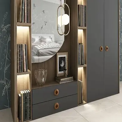
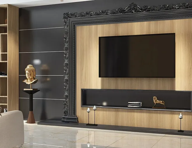
Dark classic furniture — cherry, wenge, black, dark walnut, ebony — carries maximum visual weight. It creates a sense of richness, depth, and solidity. And that is precisely why it requires a minimum of surrounding decor.
The main rule: do not add weight to weight
If the furniture is dark, the stucco should be light. Thin moldings (20–25 mm), a moderate cornice profile, light walls. Adding large dark or overly ornate stucco to dark furniture creates an oppressive interior. Dark furniture already carries weight — the task of the decor around it is not to add to this weight, but to create 'air'.
Light walls (warm white, cream, light beige) next to dark furniture are a necessity. They create space "around" the furniture, visually expanding the room.
Moldings for dark furniture: white and calm
White Moldings made of polyurethane on light walls next to dark furniture — this is a contrasting but balanced solution. Moldings in a warm white shade, width 20–25 mm, frame panels on the wall behind the main piece of furniture — a sofa or bed.
Cornice — moderate, without a developed overhang. Baseboard — matching the moldings (white) or wooden. Decorative overlays — minimal.
Wall color for dark furniture: not too contrasting
The paradox of dark furniture: too white walls create excessive contrast, which tires you faster than walls of neutral shades. The best choice is warm white or light cream, which softens the boundary between dark furniture and the wall.
Color schemes: practical scenarios
Scheme 1: White furniture — warm walls — warm moldings
-
Furniture: RAL 9001 (ivory)
-
Walls: NCS S 1510-Y (warm cream)
-
Moldings: RAL 9001 (matches furniture)
-
Cornice: RAL 9001
-
Baseboard: RAL 9001 or wooden to match doors
This is the safest and most winning solution for white classic furniture.
Scheme 2: Beige furniture — neutral walls — slightly lighter moldings
-
Furniture: NCS S 2010-Y30R (warm beige)
-
Walls: NCS S 1510-Y20R (light warm neutral)
-
Moldings: RAL 9010 (warm white)
-
Cornice: RAL 9010
-
Baseboard: wooden or RAL 9010
Scheme 3: Walnut — light neutral walls — warm white moldings
-
Furniture: warm dark brown with walnut undertone
-
Walls: NCS S 1005-Y20R (very light warm neutral)
-
Moldings: RAL 9001 (warm white)
-
Cornice: RAL 9001
-
Baseboard: wooden matching furniture or RAL 9001
Scheme 4: Gray furniture — white walls — neutral moldings
-
Furniture: NCS S 3010-Y80R (warm gray)
-
Walls: NCS S 0510-Y10R (very light warm)
-
Moldings: RAL 9010 (warm white)
-
Cornice: RAL 9010
-
Baseboard: RAL 9010 or matching walls
Choosing moldings to match furniture color: what to check before buying
Test in daylight
The paint sample you plan to use for moldings should be viewed next to the furniture sample in daylight — not under lamps. It is daylight that reveals the difference in color temperature that artificial light masks.
Test in evening lighting
Evening lighting often "warms up" the entire space. If your interior will be used primarily in the evening (living room, bedroom) — check the color combination under the type of lighting you live in.
Molding scale and color
The wider the molding and the deeper its relief — the more space it occupies in the room's color system. A wide ornamental molding is an active color object. A thin geometric profile is an almost invisible architectural stroke. When choosing a color, consider the scale: the more active the stucco in scale, the more important the accuracy of the color match.
Complete shopping list for an interior with classic furniture
Polyurethane decoration:
-
Moldings made of polyurethane — frame panels + 15% spare;
-
polyurethane cornice — around the perimeter;
-
polyurethane baseboard — around the perimeter or wooden;
-
decorative polyurethane elements — corner inserts;
-
Decor for polyurethane moldings — according to the scheme;
-
ceiling rose made of polyurethane — if there is a chandelier;
-
Polyurethane wall decor — additional architectural details.
Wooden decor:
-
decor for furniture — wooden overlays if necessary;
-
Wooden decoration — for furniture parts and junctions.
Consumables:
-
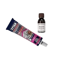
assembly adhesive for polyurethane (parts — what to glue polyurethane molding with);
-
acrylic sealant;
-
adhesion primer for polyurethane;
-
paint samples — at least 3–4 options for testing;
-
finish paint in the selected shade;
-
spare of all elements 10–15%.
Mistakes when choosing the color of moldings and stucco
Only looking at photos in the catalog
Photos of stucco in the catalog show a conditional color that depends on lighting during shooting, the monitor, and color correction. The actual color of the product may differ significantly. Always request a sample or check the color when purchasing.
Choosing white 'in general'
'White molding' is not a color. It is a category with dozens of shades. Choose a specific code: RAL 9001, 9010, 9003, 9016. And compare it with the furniture.
Painting moldings and furniture in different stores without coordinating shades
Paint brand A in the shade 'ivory' and paint brand B in the same name are different colors. If the furniture is painted in one place and the moldings will be painted with paint from another manufacturer, use tinting by NCS or RAL code — the only way to ensure a match.
Not considering the floor color when choosing a baseboard
The baseboard is a transition between the floor and the wall. If the color of the baseboard is not coordinated with either the floor or the moldings, it will look like a foreign element. The baseboard should 'belong' either to the wall and molding system or to the floor and door system.
Overloading a warm wooden interior with ornament
An interior with walnut-colored furniture, wooden floors, and wooden doors already contains rich textural information. Adding large ornamental stucco creates information overload. Calm moldings, minimal overlays — the only correct tactic.
Do not take paint samples
A 5 × 5 cm sample on white paper and the actual color on a 15 sq m wall are different things. Buy a trial amount of paint, paint a 50 × 50 cm section of the wall, and observe it for 24 hours under different lighting.
Forget about installing polyurethane molding and consider color the only parameter
Even a perfectly matched color won't save a molding installed with uneven joints, unsanded corners, and unsealed gaps. Installation quality is an equal partner to the right color.
FAQ: Questions about furniture and stucco color
What color of stucco should I choose for classic furniture?
It depends on the furniture color and strategy. For a monochrome solution — moldings in the same tone as the furniture. For a nuanced contrast — moldings lighter than the walls. The key: matching color temperature. Warm furniture — warm moldings. Cold — neutral.
Which moldings suit walnut-colored furniture?
Calm Moldings made of polyurethane in a warm white shade, width 20–35 mm, without deep ornament. Profile — heel or scotia. The goal is an architectural wall structure that does not compete with the wood texture.
Can white furniture and white molding be combined?
Yes. The main thing is a single shade of white. Warm furniture and warm moldings. Plus walls in a neutral or slightly warmer tone, so the furniture does not 'dissolve' into the background.
What to buy for an interior with classic furniture?
Moldings made of polyurethane, cornice, baseboard, decorative polyurethane elements, Decor for Molding, ceiling outlet if necessary, glue, sealant, primer, paint samples, and spare profile.
Should molding be contrasting or the same color as the wall?
For modern classic — the color of the walls or slightly lighter. For formal classic — nuanced contrast: moldings 2–3 tones lighter than the walls. Sharp contrast — only if it is a deliberate design decision in a precisely calibrated palette.
How to choose a baseboard for classic furniture?
The baseboard should 'belong' either to the molding system (same shade) or to the floor and door system (wooden, matching the doors). The choice depends on the floor and the overall color concept. The main thing is that the baseboard should not be a 'random' third color.
How to check the compatibility of furniture and molding colors?
Place a furniture sample (or furniture paint sample) next to a molding sample (or paint sample you will use for the moldings). View them in daylight from a window. If both elements have the same color temperature, they are compatible. If one appears yellowish and the other bluish, they are not.
About the company STAVROS
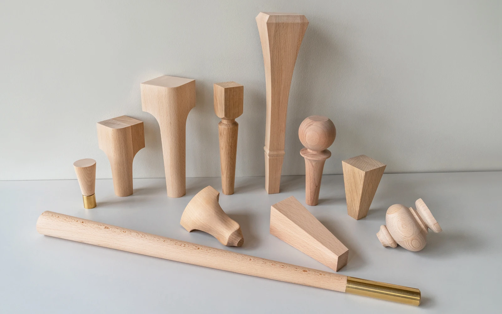
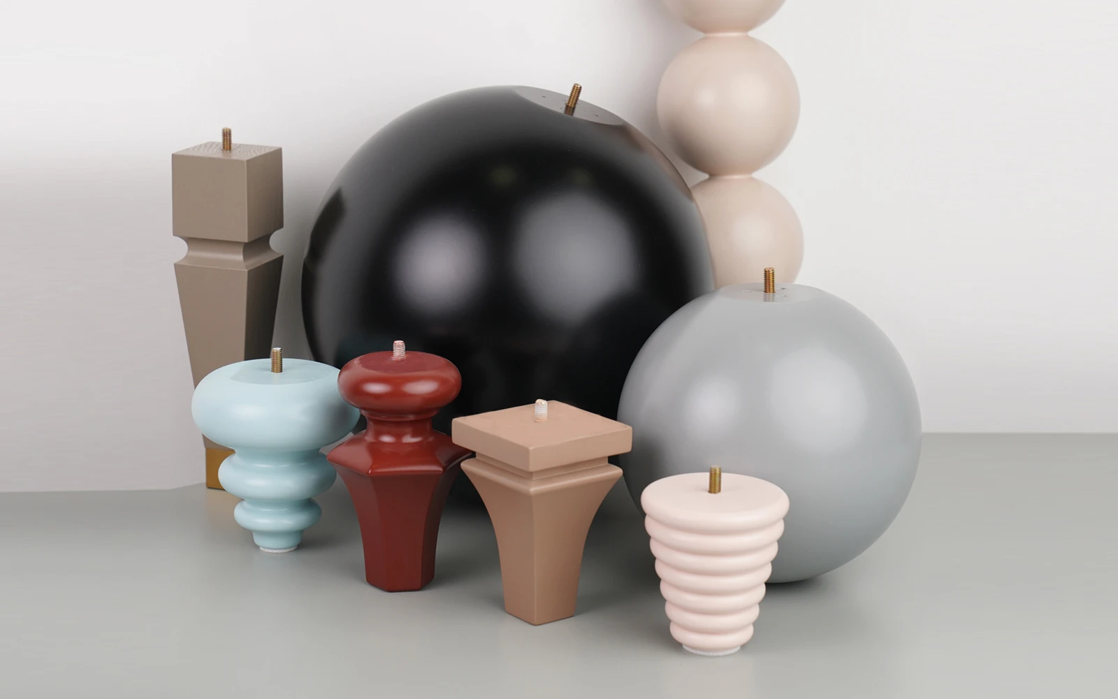
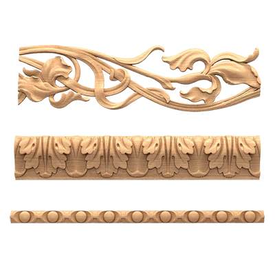
The entire range for creating the correct color system of a classic interior — Moldings made of polyurethanecornices, baseboards, decorative polyurethane elements, ceiling rosettes, Decor for Solid Wood Furniture — is manufactured and supplied by STAVROS.
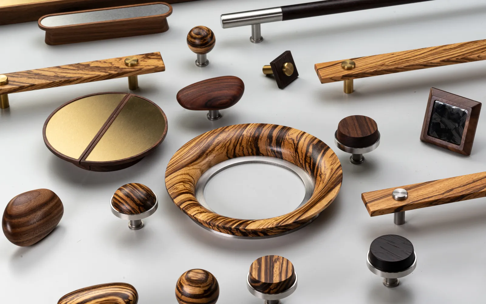
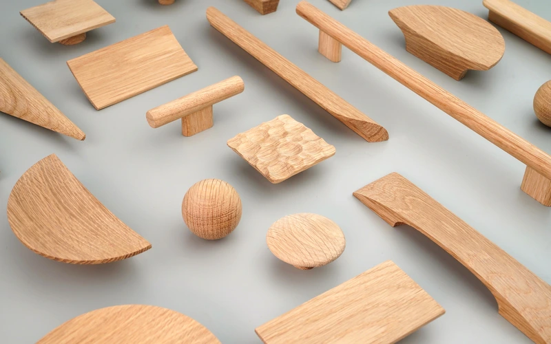
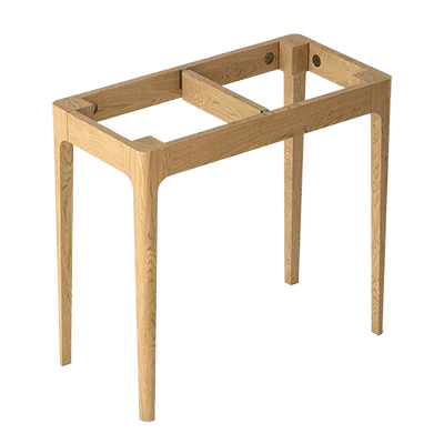
STAVROS is a Russian manufacturer of products made from natural wood and polyurethane for architectural finishing and furniture decor. The assortment includes the full spectrum moldings from polyurethane — from thin molding profiles to cornices, rosettes, and overlays, as well as wooden decor, handles, supports, and other elements of classic furniture design.
Founded in St. Petersburg in 2002. Completed projects include the Hermitage, Konstantinovsky Palace, Alexander Palace, and Trinity-Izmailovsky Cathedral. Understanding historical interiors is not just the company's biography: it is a professional standard for profile accuracy, surface quality, and color correctness of products.
Order moldings, cornices, and baseboards in a specific color of classic furniture, get advice on palette selection and decor scale — on the STAVROS website. Contact us to confirm shipping to your destination., order from one unit, assistance in choosing a color solution for your interior.