


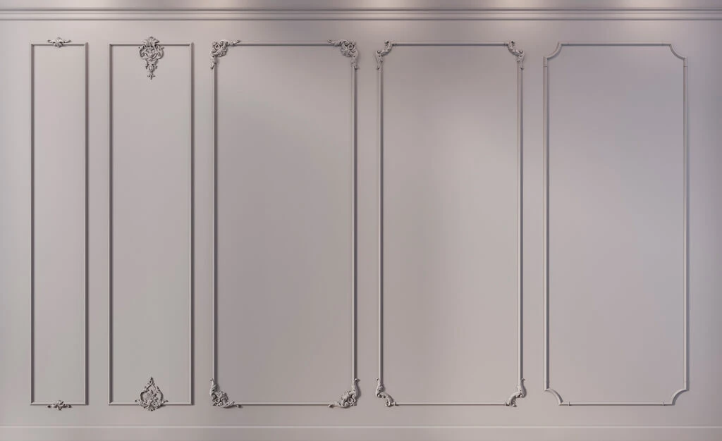
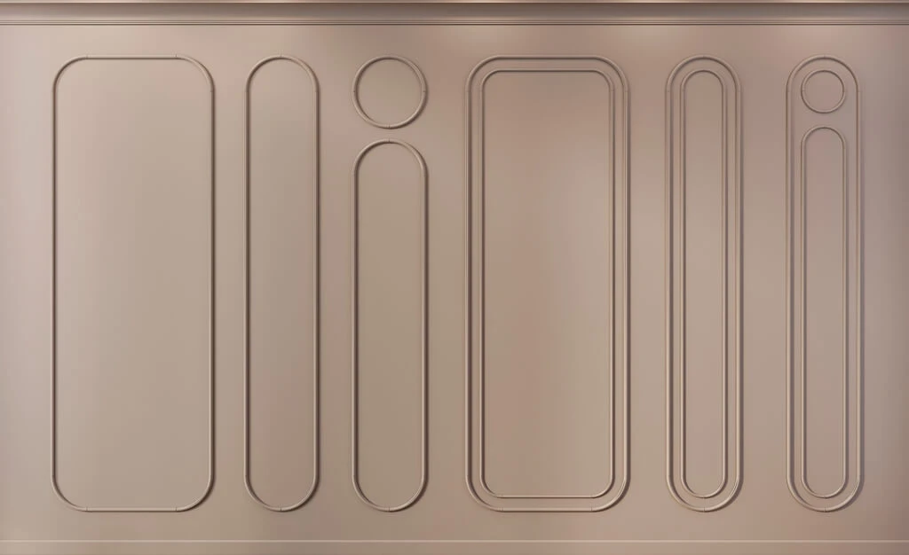
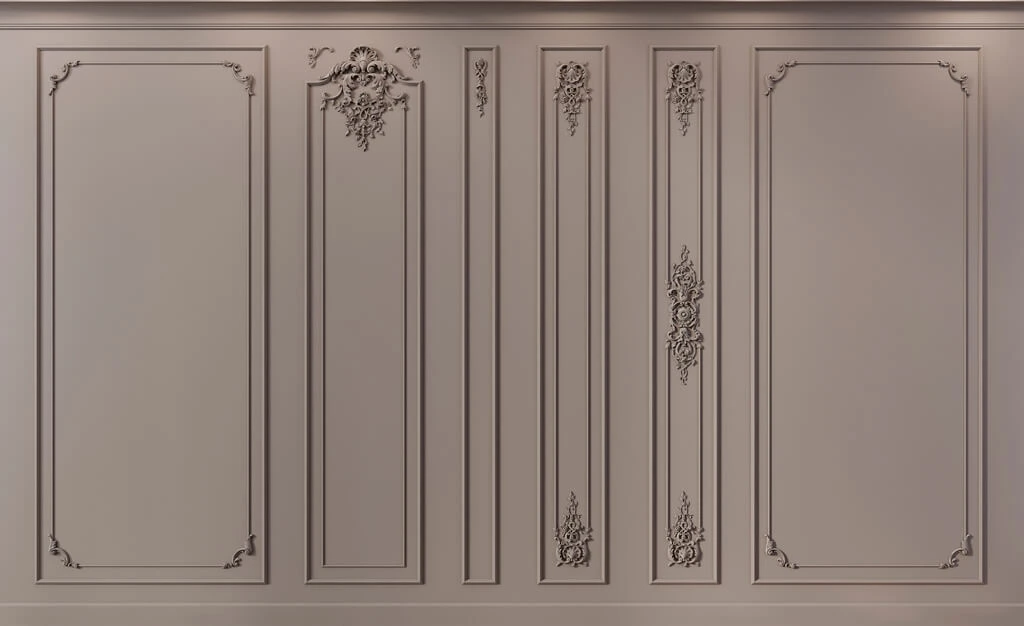
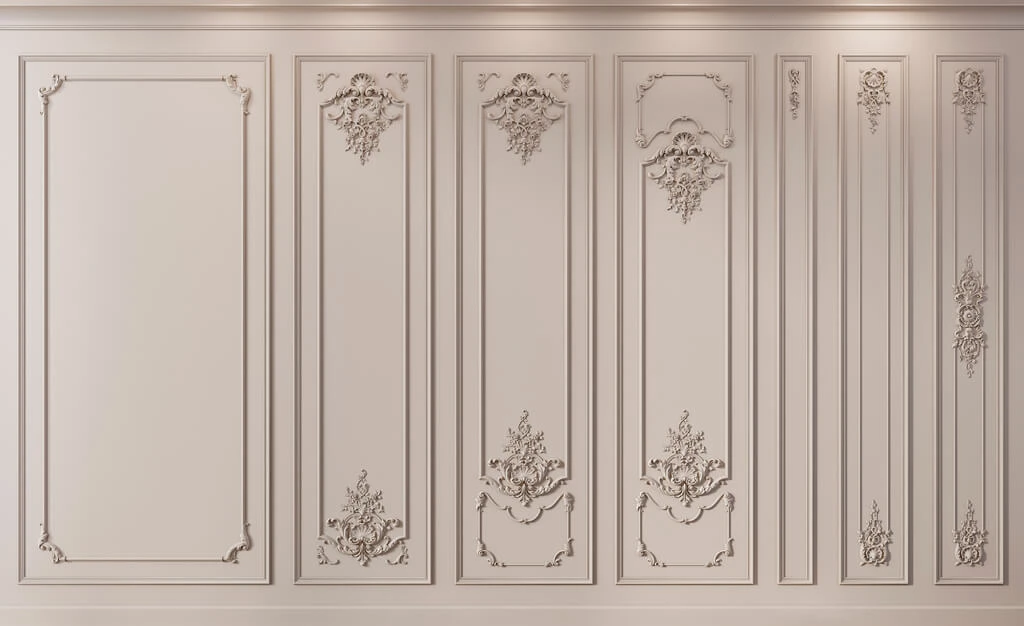

Article Contents:
- Selecting decor by style is not about finding an ornament that "looks like the picture"
- Why you shouldn't start your selection with the word "classic"
- First, determine the level of decorative richness
- LOW
- MEDIUM
- HIGH
- Polyurethane
- Wood
- MDF
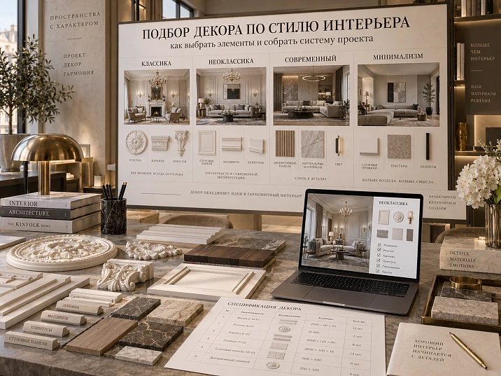
An interior can look "classic" on a moodboard and yet fall apart into separate decorative quotations once real products are selected. One molding is taken from a strict geometric series, the cornice has a pronounced floral ornament, the rosette is almost baroque, and the pilasters are scaled to an entirely different architectural system. Each element is beautiful on its own. Together they do not speak the same language.
Therefore, selecting decor by interior style cannot be reduced to searching for an ornament that resembles a picture.
First, the style needs to be translated into clear design attributes: the character of the lines, the degree of relief, symmetry, scale, decor density, material, and the relationships between elements. Only after that should you open the catalog and choose real items.
The working chain looks like this:
project style → visual language → scale → element types → material → shortlist → real SKUs → sample / 3D / DWG → specification → purchase.
This way, style stops being an abstract mood and becomes a system that can be implemented.


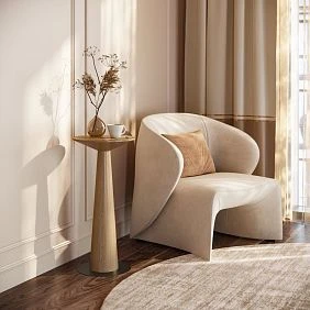
Selecting decor by style is not about finding an ornament that "looks like the picture"
Interior style is not defined by a single decorative detail.
It sets the rules.
For example:
- lines can be straight or flowing;
- relief can be almost flat or deep;
- composition can be symmetrical or more free;
- decorative density can be minimal or high;
- material can be neutral for painting or a standalone visual accent;
- scale — intimate or formal.
If these parameters are not defined, the catalog begins to impose random decisions on the project.
The designer sees a beautiful overlay and tries to "integrate" it into the interior.
Then notices a suitable cornice.
Then another molding.
As a result, the system is born not from a concept, but from a sequence of random finds.
The professional approach works the opposite way:
first the decorative language — then the products.
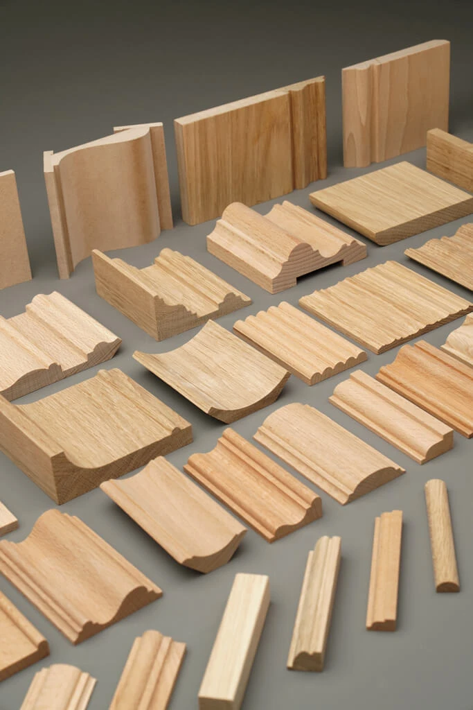


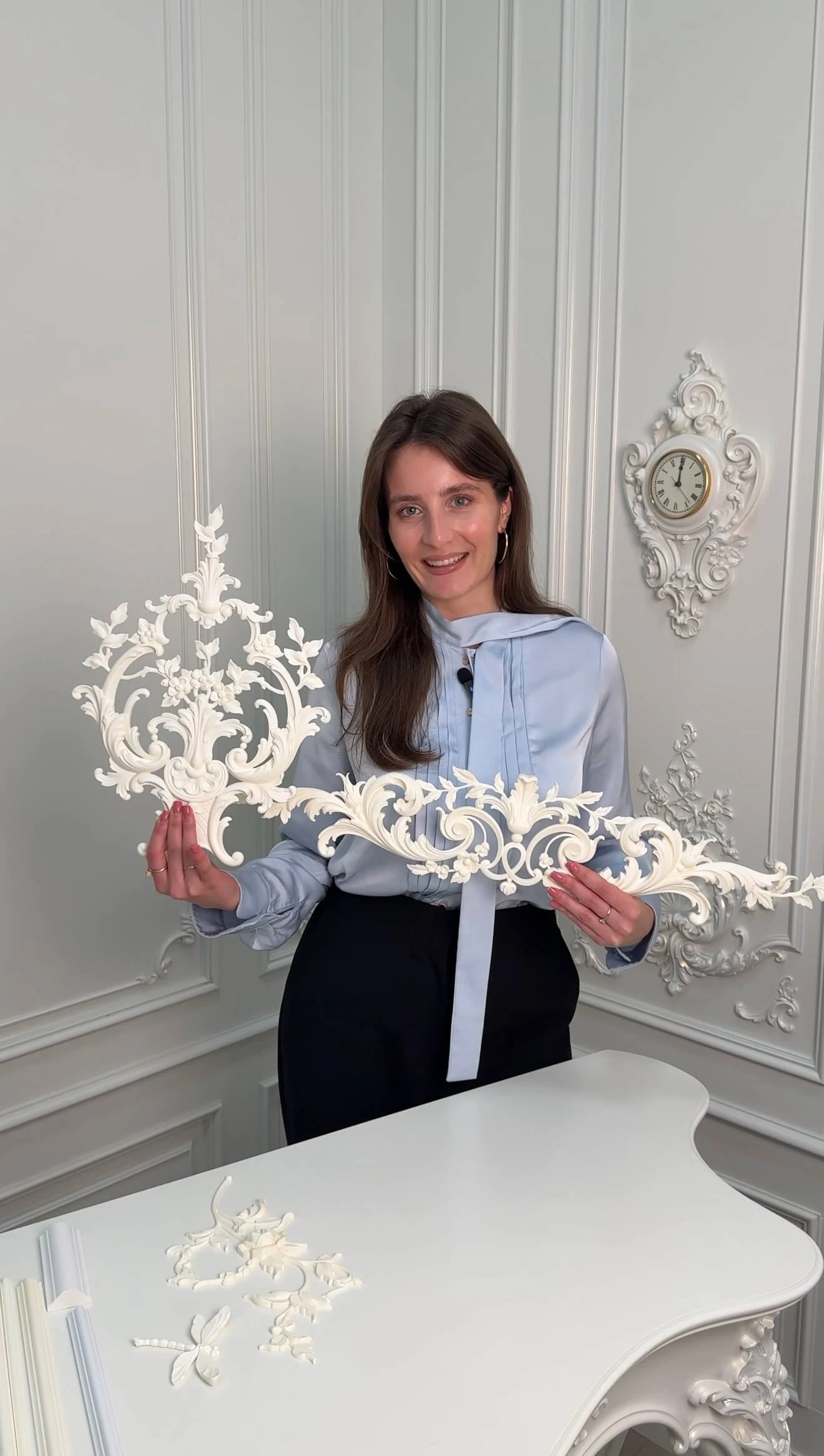
Why you shouldn't start selection with the word "classic"
The phrase "classic decor is needed" is too broad.
The word "classic" can refer to:
- Classicism;
- neoclassicism;
- Baroque;
- Empire;
- art deco;
- modern interpretation of classics.
Even closely related styles use different proportions and different intensities of ornament.
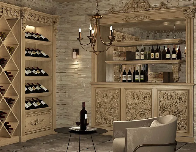
For example, an elaborate floral pattern may be appropriate in a formal classical system and excessive in a calm neoclassical one.
Therefore, it is useful to refine the style brief down to the level of visual characteristics.
Not:
"a classic moulding is needed".
But:
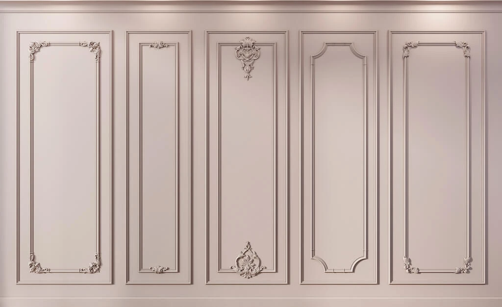
"a calm symmetrical profile of medium width is needed, without active plant ornament, for geometric wall frames".
After such a formulation, the shortlist becomes much more precise.
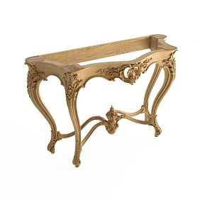
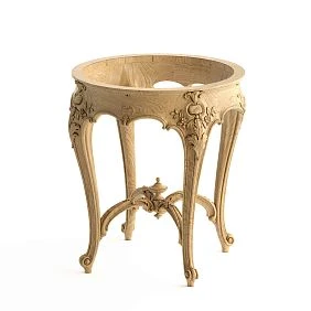
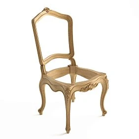
Our factory also produces:
First determine the level of decorative richness
Even within a single style, interiors can differ greatly in the amount of decor.
It is convenient to determine the conventional level of saturation in advance.
Get Consultation
LOW
The foundation is formed by lines and smooth profiles.
Typical set:
- molding;
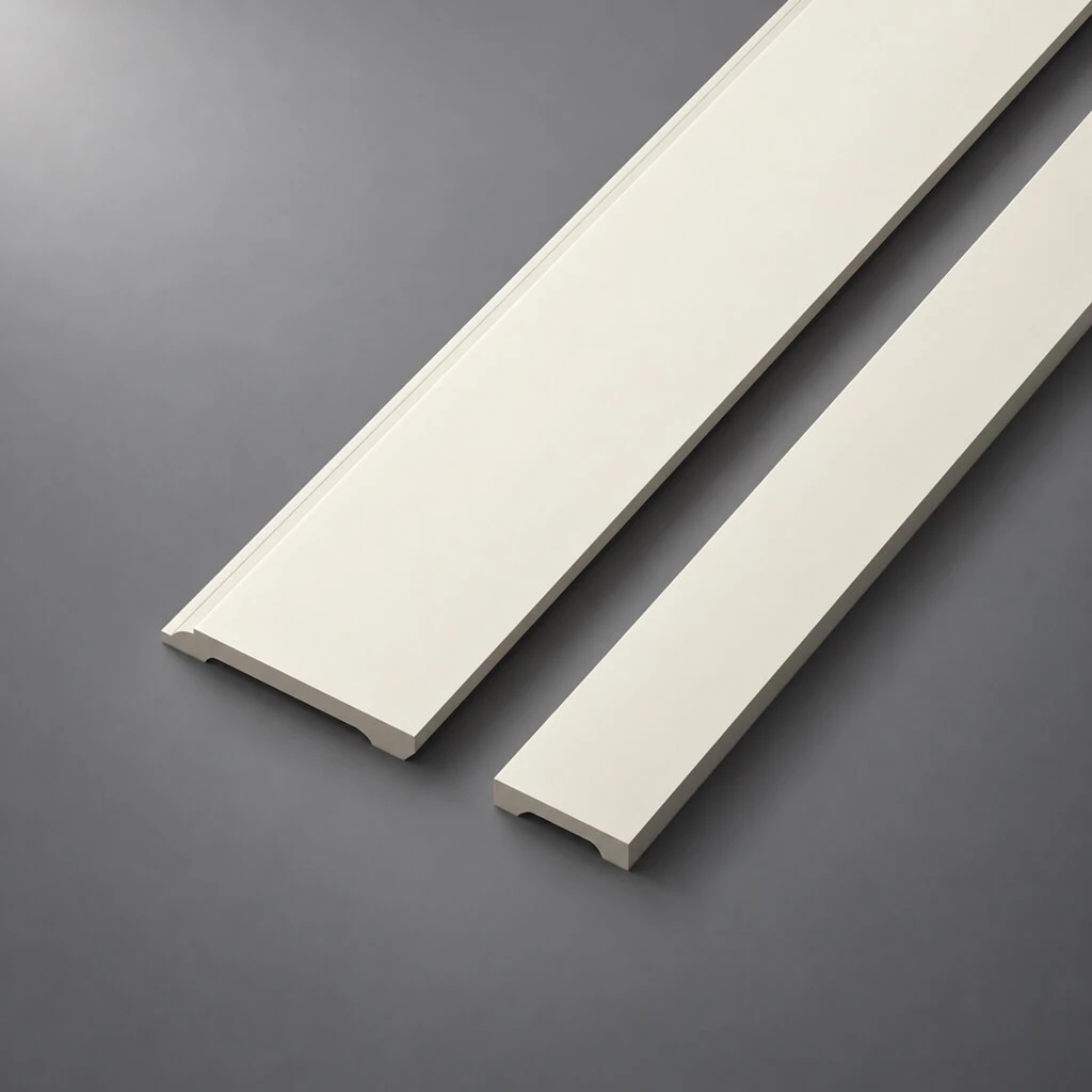
- plinth;
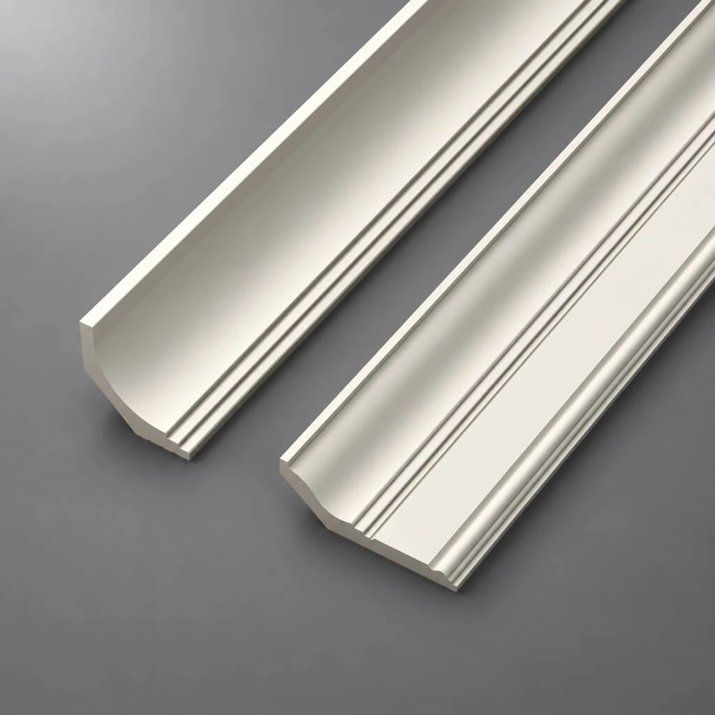
- a laconic cornice.
Here geometry is more important than ornament.
MEDIUM
Individual accents are added.
For example:
- Moldings;
- a more elaborate cornice;
- one ceiling rose;
- individual decorative overlays.
HIGH
The decor becomes a full-fledged architectural system.
can be used:
- elaborate cornices;
- pilasters;
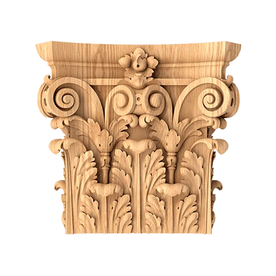
- capitals;
- Plates;
- ceiling compositions;
- multiple frame levels;
- decorative portals.
Such a scale is more useful than a simple 'classic / modern' division because it immediately defines the scope of the system.
How to translate style into specific product characteristics
For each candidate, it is better to evaluate observable properties rather than the collection name.
Minimum set:
- geometric or ornamental;
- smooth or textured;
- symmetric or asymmetric;
- width;
- depth;
- pattern repeat frequency;
- the material;
- edge character;
- degree of visual activity.
Then the selection becomes reproducible.
For example, if the project requires:
- high symmetry;
- calm relief;
- medium width;
- minimal ornamentation;
- coloring to match the wall,
then the choice automatically shifts toward certain groups of items and excludes others.
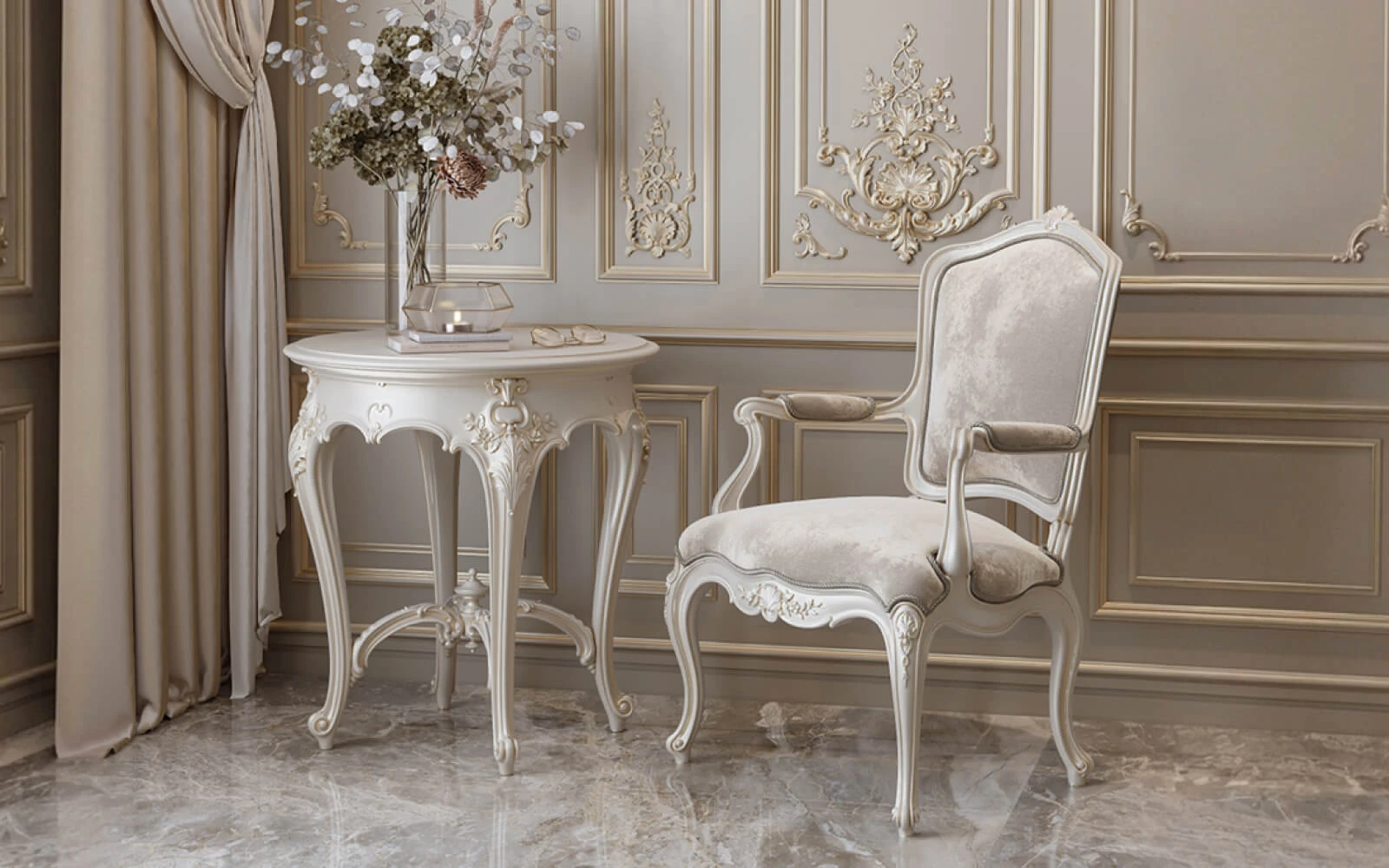
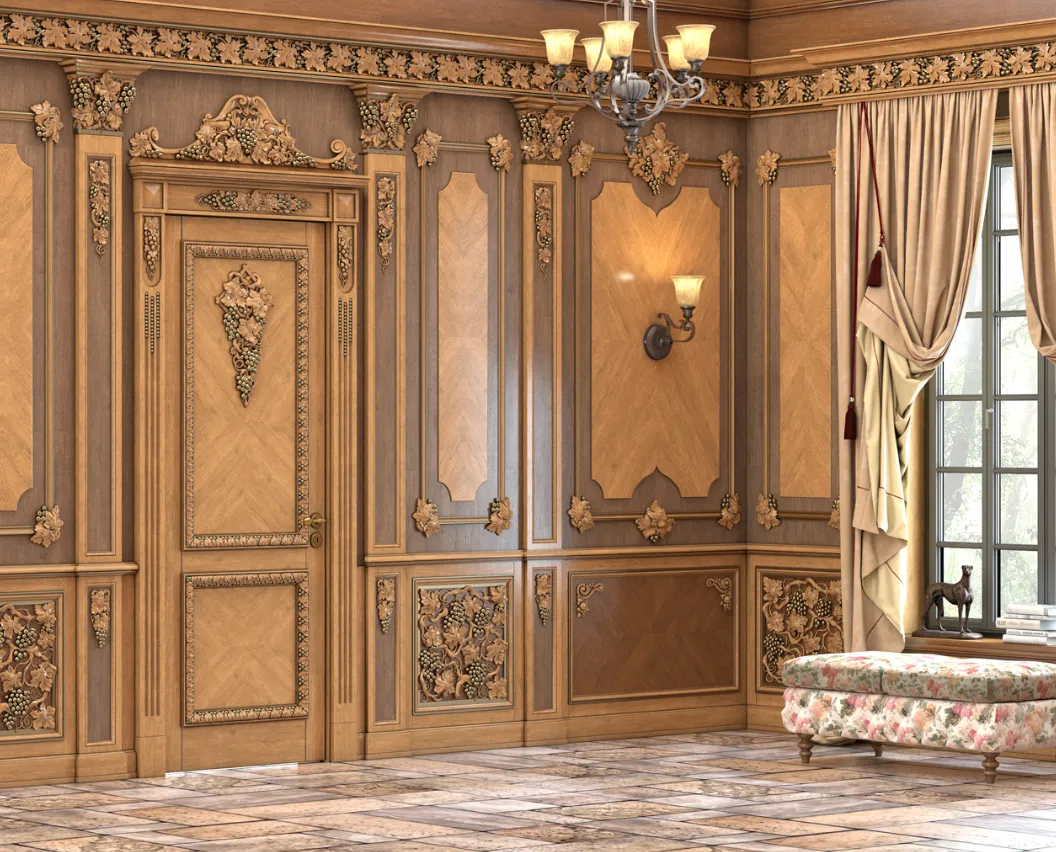
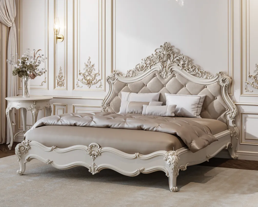
Classic interior
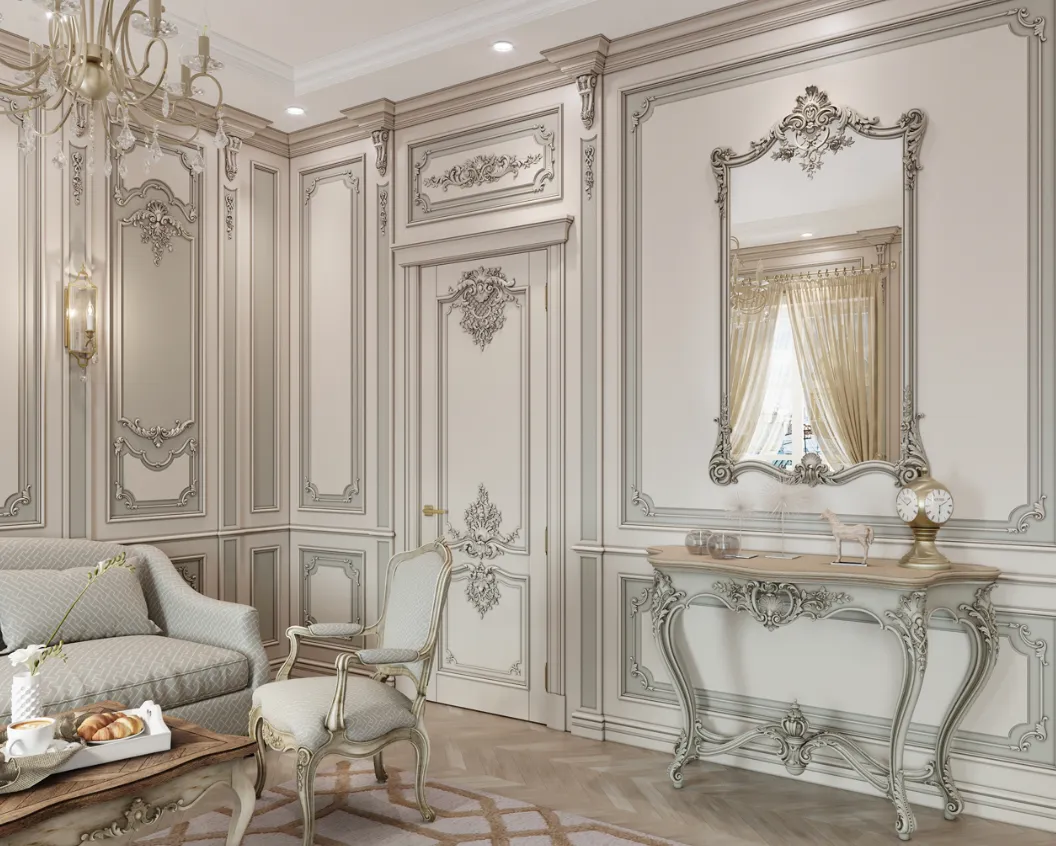
In the classical system, the following are usually important:
- symmetry;
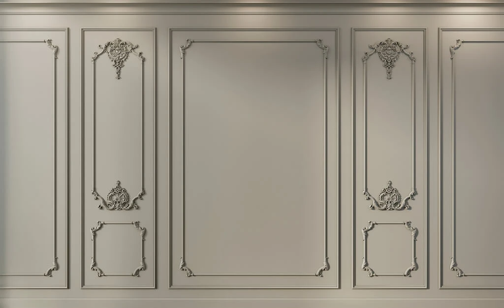
- a pronounced architectural framework;
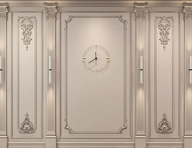
- a developed profile;
- ceiling cornice;
- plant or order ornament;
- vertical elements.
The following may be used for selection:
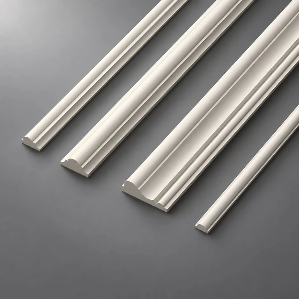
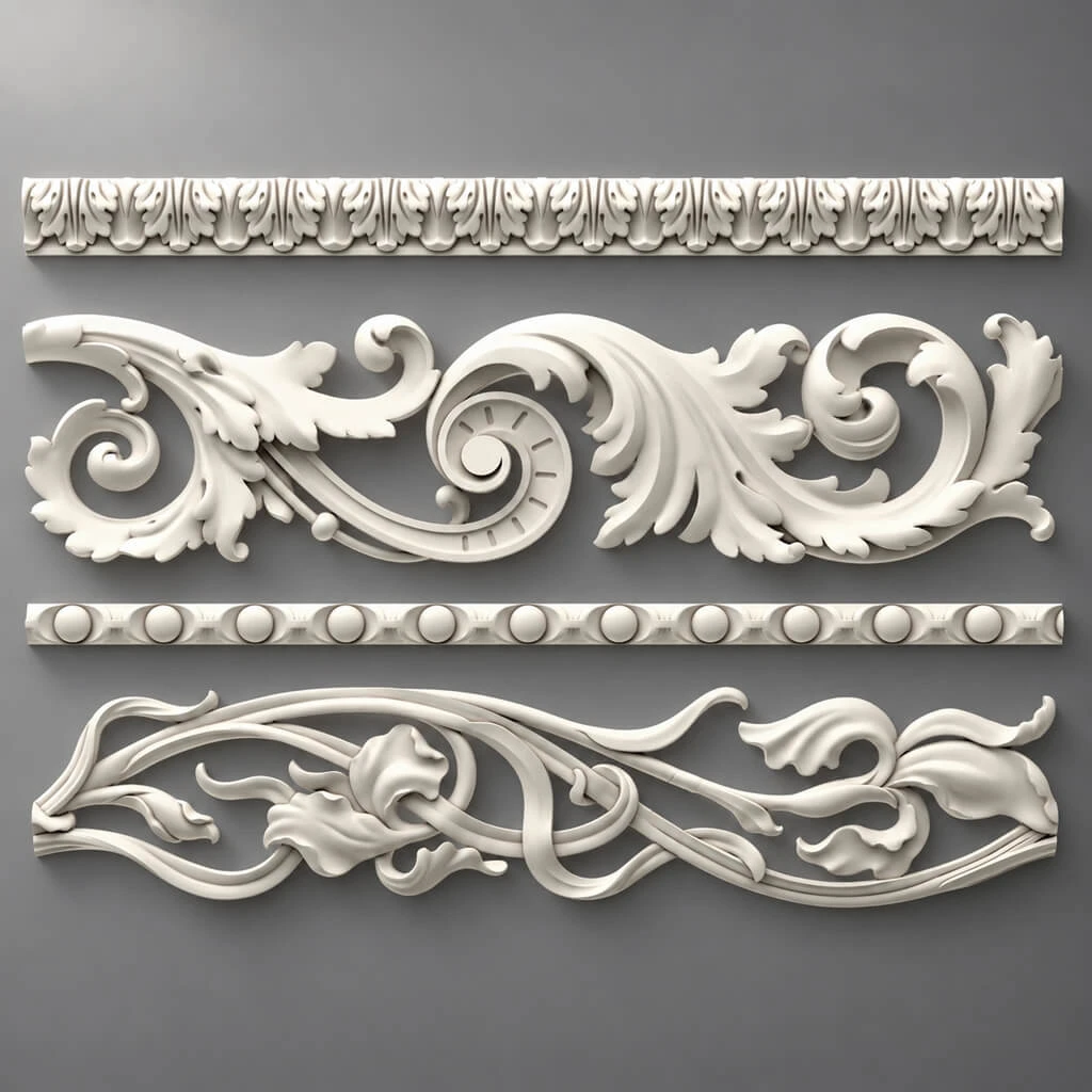
- Moldings;
- cornices;
- skirting boards;
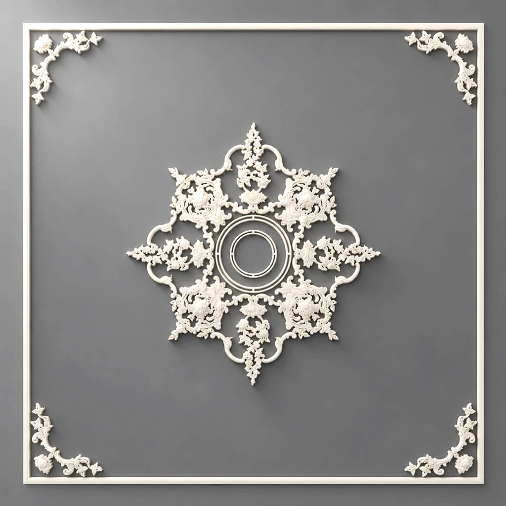
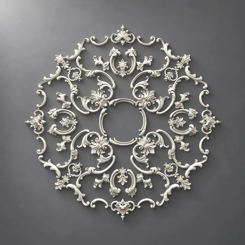
- ceiling medallions;
- pilasters;
- capitals;
- overlays.
But a classical interior does not require using everything at once.
It is precisely an excess of elements that most often makes a composition weaker.
How not to overload the classics
The main principle is hierarchy.
A project should have one primary profile, one main cornice, and a limited number of accent motifs.
For example:
- one main molding;
- one type of overlay;
- one cornice;
- one pilaster system.
If several different floral ornaments, different types of capitals, and three similar moldings appear in the same room at once, the architecture begins to fragment.
A classical system reads better when it has repetition.
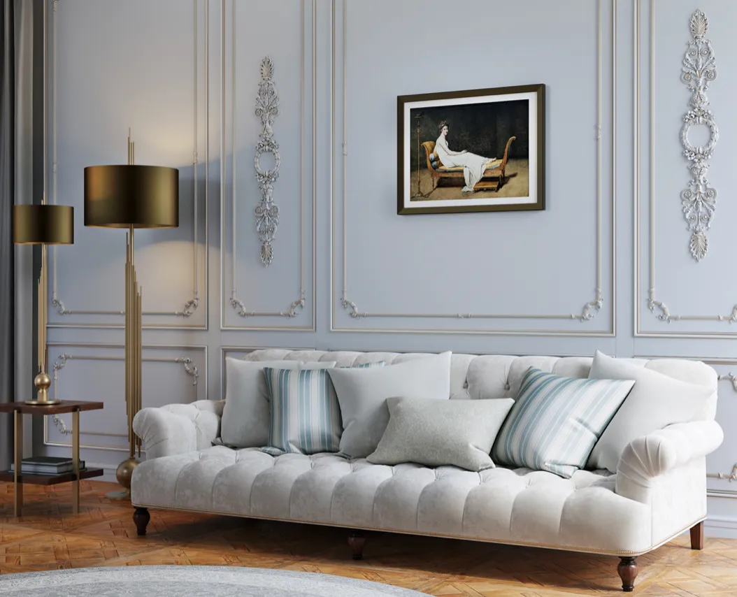
Neoclassicism
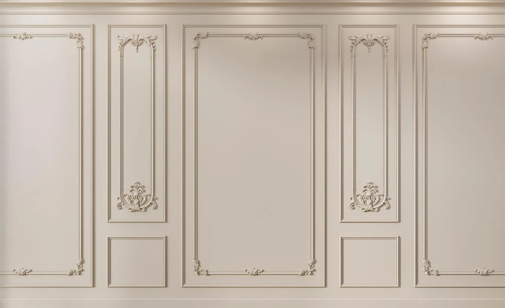
Neoclassicism usually works more calmly.
Characteristic features:
- geometric composition;
- moderate profile width;
- less ornamentation;
- more free surface;
- a lighter architectural vertical.
Balance is especially important for such a project.
If the profile is too ornate, the interior easily shifts into a heavier classical system.
If it is too thin, architectural expressiveness is lost.
Neoclassicism: which elements to use
Most often, it is enough to use:
- smooth or restrained moldings;
- a laconic cornice;
- a tall skirting board;
- a geometric ceiling rose;
- a limited number of overlays;
- panels, if they support the overall grid.
Neoclassicism handles monochrome painting well, where the decor is read not by color but by shadow.
That is why the actual depth of the profile is especially important.
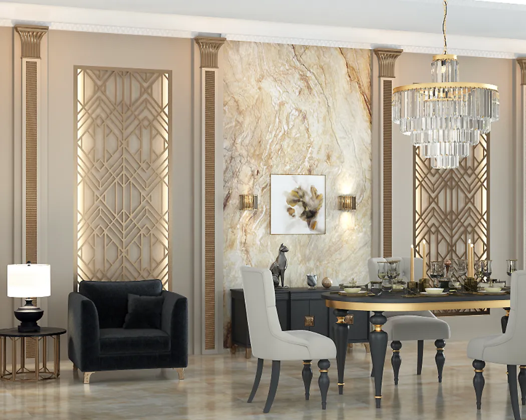
Art Deco
Art Deco cannot be reduced to “rich decor.”
Here, what matters is:
- geometry;
- stepping;
- rhythm;
- repeatability;
- clear axes;
- contrast of materials;
- graphic quality.
Ornament can be active, but more often it works differently from a classical floral motif.
Therefore, Art Deco should not be assembled from random classical stucco molding just because it looks decorative.
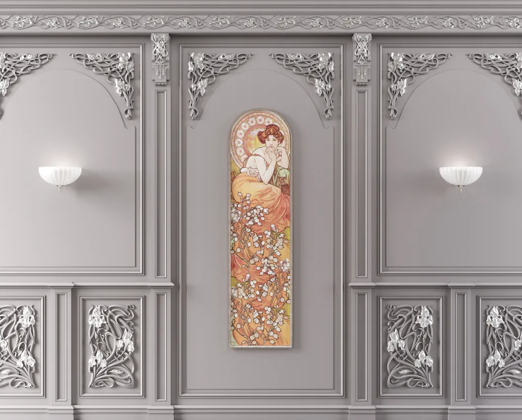
Modern
For Art Nouveau, plasticity is more important.
Look for:
- a flowing line;
- floral motifs;
- asymmetry;
- freer movement of the composition;
- soft junctions.
Here, a rectangular grid of rigid frames may look alien, even if an individual molding is beautiful in itself.
The project must support the very principle of line movement.
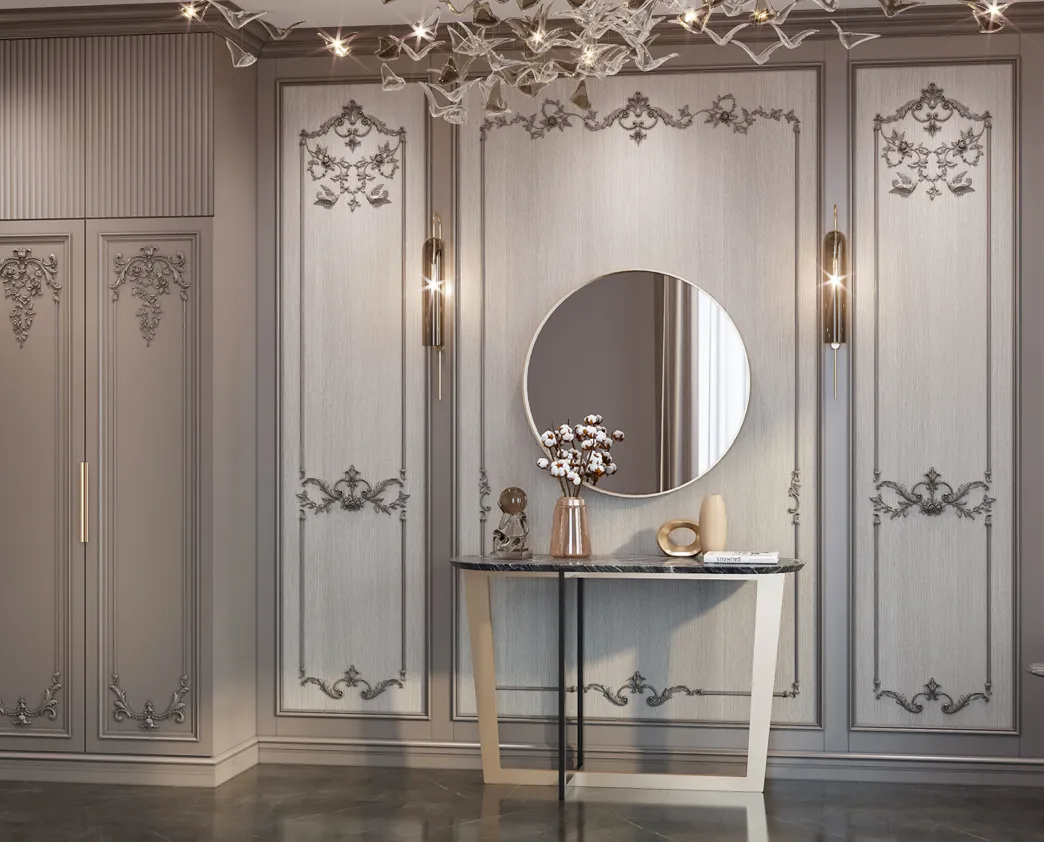
Modern interior
A modern interior does not mean a ban on decor.
Decor simply changes its function.
It becomes more architectural.
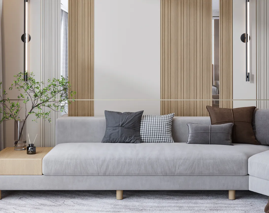
More often used:
- thin profiles;
- large geometry;
- minimal ornamentation;
- monochrome painting;
- emphasis on light and shadow;
- repeating grid.
One precise molding can give more than a set of small decorative details.
Minimalism and decorative profile
In minimalism, molding should work as a line.
It should not compete with furniture or finishes.
It is useful to choose a profile that:
- is not too deep;
- has no active ornament;
- supports the geometry of the wall;
- works in the same color as the surface;
- does not create unnecessary small shadows.
Minimalism does not exclude molding.
It increases the requirements for profile precision.
How to choose a material to match the style
Style itself does not determine the material.
But it influences how the material should perform.
Polyurethane
Suitable for:
- painted decor;
- complex profiles;
- relief elements;
- ceiling cornices;
- wall frames.
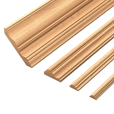
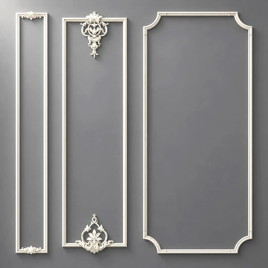
For selection, you can use polyurethane molding.
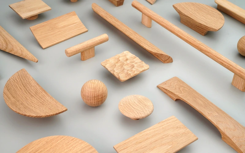
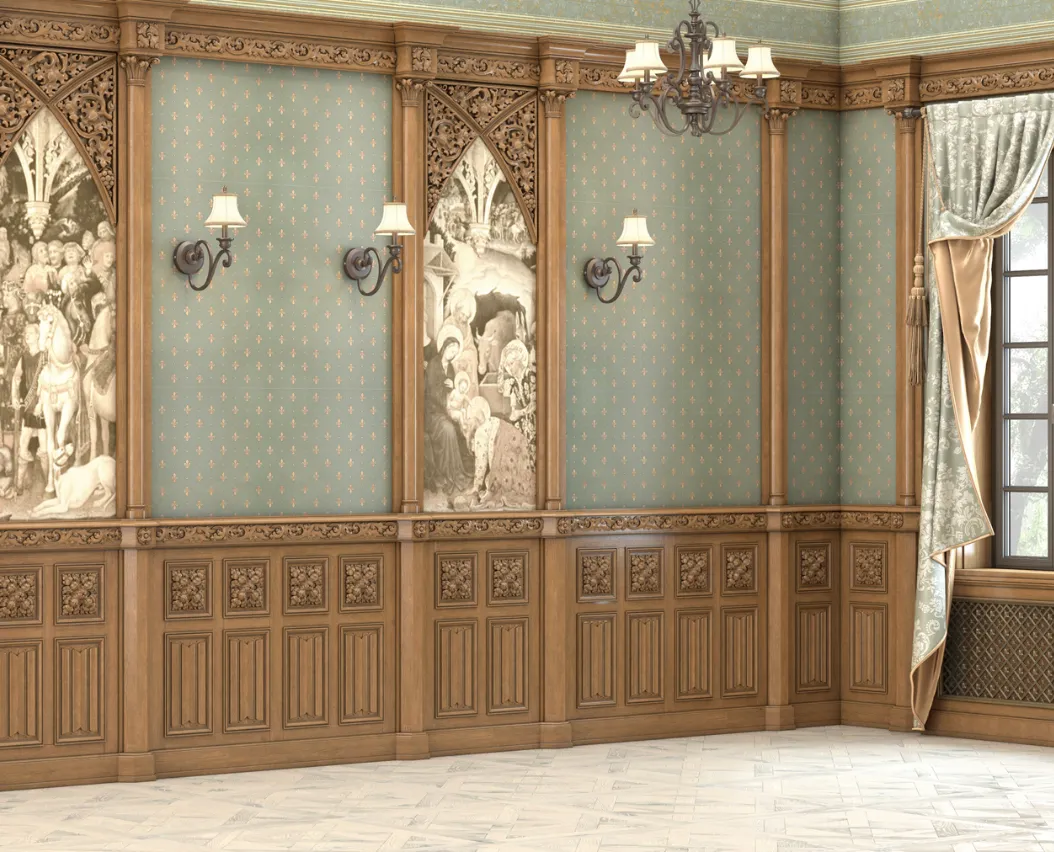
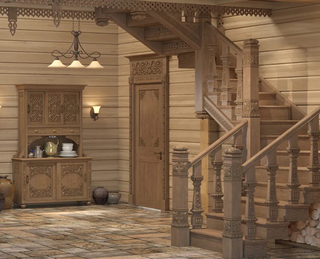
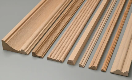
Wood
Needed when natural materiality matters.
Especially next to:
- furniture;
- doors;
- wooden panels;
- portals;
- molding.
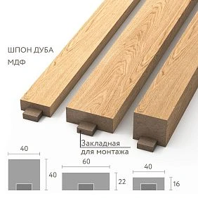
MDF (740–760 kg/m³, emission class E1/E0) provides ideal geometry, uniformity, and better base for enamel: high adhesion, smooth surface, absence of knots and cracks.
Suitable for:
- geometric panel systems;
- surfaces to be painted;
- large repeatable modules;
- architectural work with the wall.
The material is selected after the role of the element is clear.
Polyurethane molding in style selection
Polyurethane cannot be considered a material only for classics.
It can be used in:
- classics;
- neoclassicism;
- art deco;
- modern interior;
- geometric compositions.
The result is determined not by the material itself, but by the shape of the product.
A smooth profile and intricate ornamental molding can be made from the same material, yet create completely different stylistic impressions.
Moldings as the most versatile stylistic tool
Molding is especially convenient because its character depends heavily on the composition.
The same type of product can work differently due to:
- width;
- depth;
- frame shapes;
- distances;
- colors;
- adjacent elements.
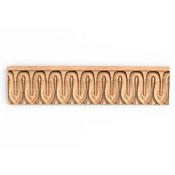
For professional selection, it is convenient to use Moldings made of polyurethane and compare profiles not only by appearance, but also by cross-section.
A ceiling cornice sets the stylistic scale
A cornice often affects the feel of a room more strongly than molding.
It forms the upper boundary.
Check:
- height along the wall;
- ceiling projection;
- relief;
- relationship with the ceiling;
- the overall scale of the room.
A large cornice can make a room look more formal.
A thin one — keeps the architecture light.
That's why a cornice can't be chosen separately from the overall level of decorative richness.
Ceiling medallion and light fixture style
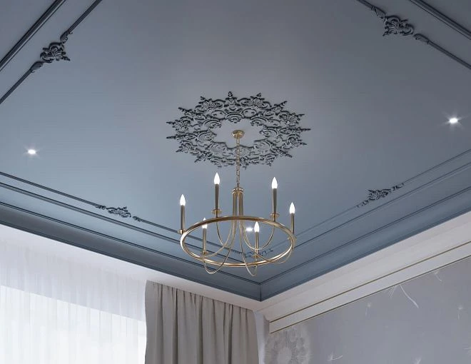
The medallion should work together with the light fixture.
Compare:
- size;
- relief;
- geometry;
- axis;
- the character of the chandelier.
A classic ornate medallion next to a minimalist light fixture can break the system — unless such a contrast is intentional.
For selection, you can look at ceiling rosettes.
Baseboard also contributes to the style
A baseboard doesn't just cover the lower joint of the wall.
It forms the base of the entire vertical composition.
A high profile makes the wall more architectural.
A low one feels lighter.
A textured one is more expressive.
A smooth one is calmer.
That is why the baseboard should be chosen together with the molding and cornice.
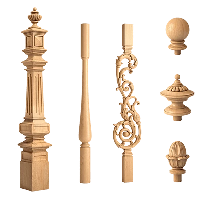
Pilasters and capitals: when a style truly calls for architectural verticality
A pilaster is appropriate not because the interior is called classical.
It is needed when the composition implies:
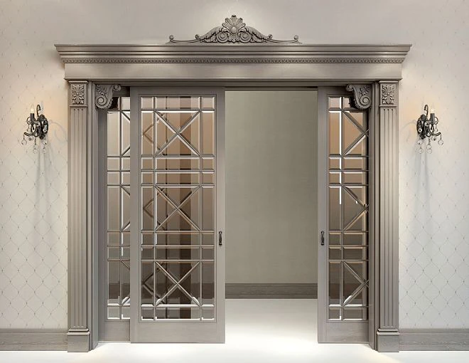
- portal;
- an axial system;
- vertical division;
- formal architecture;
- logical completion with a capital.
If there is no vertical structure, a pilaster may look like a glued-on decorative object.
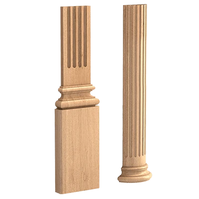
For verification, you can use pilasters and columns и Capitals.
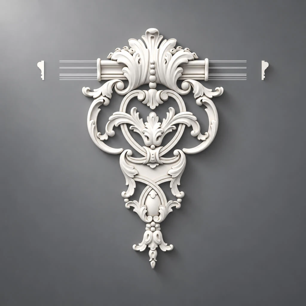
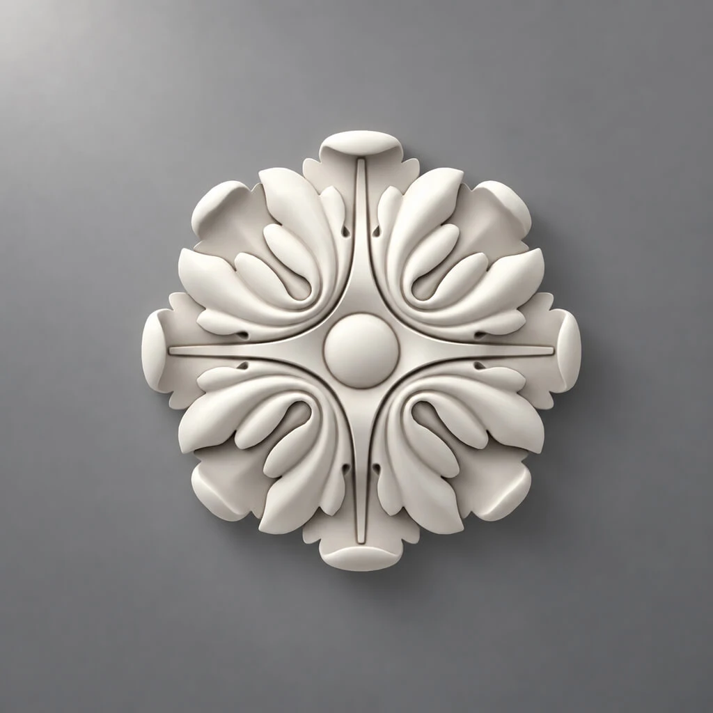
Decorative appliqués
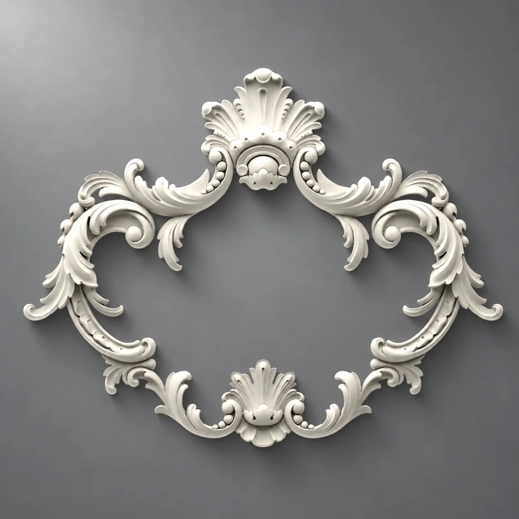
The overlay can become:
- the main accent;
- the center of a molding frame;
- part of a portal;
- part of furniture;
- a transition point between several elements.
But an ornament cannot be repeated automatically everywhere.
A single motif at the compositional center works as an accent.
The same motif, repeated on every free surface, quickly loses its meaning.
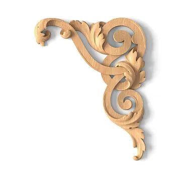
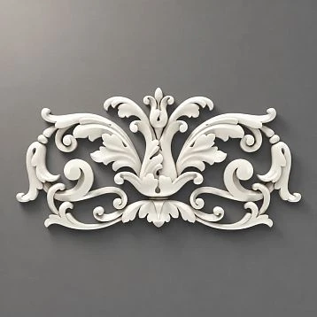
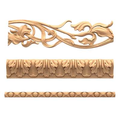
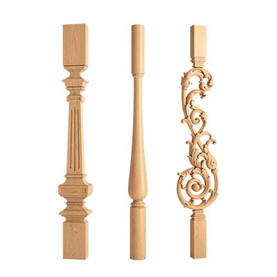
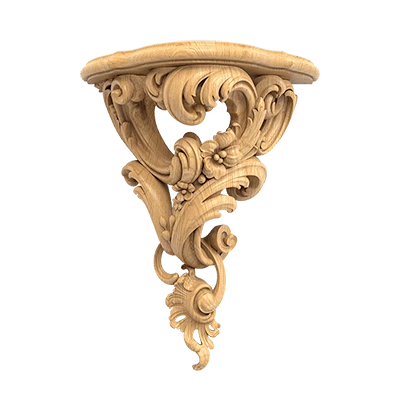
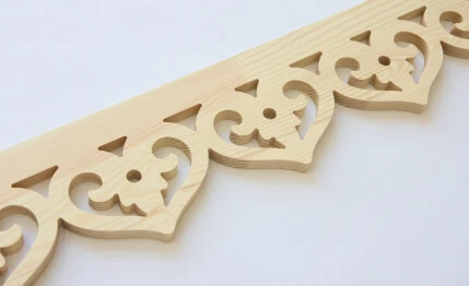
For selection there is molded decoration made of polyurethane и wooden decorative elements.
How to combine several types of decor
Practical scheme:
main profile + auxiliary profile + one accent motif.
For example:
- ML-01 — main molding;
- ML-02 — thinner inner profile;
- D-01 — central overlay.
Such a system looks cohesive.
If every element has its own character, the interior begins to feel like a catalog.
What is a project's style dictionary
Before choosing SKUs, it's useful to create a short table.
For example:
| Parameter | Solution |
|---|---|
| Line | Geometric |
| Ornament | Minimal |
| Symmetry | High |
| Material | PU + MDF |
| Main profile | ML-01 |
| Accent | D-01 |
| Saturation | MEDIUM |
This table does not replace the specification.
It records the selection rules.
If a new overlay appears later, it can be evaluated not subjectively as "like / dislike," but by its alignment with the dictionary.
How to build a shortlist of SKUs for a style
There's no need to give the client the entire catalog.
For each category, it is enough to select a few strong candidates.
For example:
ML-01A
ML-01B
ML-01C
Then compare:
- size;
- the depth;
- profile;
- ornament;
- nodes;
- 3D;
- sample.
After review, one option gets the status APPROVED.
This is how the stylistic solution becomes concrete.
Style should not override scale
Even an element that is perfectly suited in style can be too large for the room.
A baroque cornice may match the reference perfectly, but visually lower the ceiling.
A thin modern molding may be too weak on a large wall.
Therefore, after the style filter always comes:
the scale filter.
Check the decor next to:
- a door;
- furniture;
- ceiling height;
- person;
- adjacent profiles.
Style must not override architectural junctions
Molding may match perfectly in pattern and at the same time:
- conflict with the casing;
- land on a switch;
- not match the panel;
- interfere with built-in furniture;
- create an awkward external corner.
Therefore:
style → geometry → junction → SKU.
Technical questions should not be left for later.
How to use visualization after style selection
Order matters here.
First, a shortlist of real products is selected.
Then these exact items are inserted into the 3D.
This way, visualization verifies the reality of the project.
If done the other way around — first drawing conditional decor, and then looking for a similar product — there is a high risk of geometry substitution.
3D should answer the question:
what will a specific SKU look like?
How to use DWG
After selecting a profile, DWG helps verify:
- actual cross-section;
- the depth;
- the mounting plane;
- interfaces.
Especially useful for:
- moldings;
- cornices;
- baseboards;
- pilaster.
For such tasks, you can use the section DWG and 3D models of STAVROS.
When a physical sample is needed
The sample is especially useful for:
- deep relief;
- wood;
- panels;
- disputed scale;
- complex painting.
A screen does not show real texture and scale as accurately as a physical element.
For verification, you can use Product samples.
How to avoid stylistic mismatch
Typical mistakes:
- a heavy ornamental cornice next to a minimalist molding;
- five different plant motifs in one room;
- elaborate molding next to very light geometric furniture;
- wooden decor and a polyurethane system in different scales;
- each element from a separate collection with no common logic.
The problem is not the mixing itself.
The problem is the absence of a dominant language.
How to work with mixed style
Eclecticism is acceptable.
But it is better to determine in advance:
dominant language + accent language.
For example:
- 80% — neoclassical geometry;
- 20% — Art Deco accents.
Then the contrast becomes manageable.
If five directions are represented equally actively, the interior loses hierarchy.
How to assign real SKUs to the system
After stylistic approval, each element is assigned a project code.
For example:
ML-01 — specific molding
CR-01 — specific cornice
PL-01 — baseboard
ROS-01 — rosette
D-01 — overlay
Then style turns into a procurement system.
Each code has:
- manufacturer;
- SKU;
- size;
- the material;
- URL;
- the status.
How to move from a style system to a specification
For each item, record:
- project code;
- SKU;
- size;
- the material;
- quantity;
- URL;
- Status
APPROVED.
If there are technical files, add:
- DWG;
- 3D;
- sample;
- revision.
After that, the moodboard is no longer the main document.
The specification becomes the main one.
How to buy decor after style selection
The commercial stage begins after the system has already been defined.
For the polyurethane part, you can go to polyurethane relief, polyurethane moldings, decor for moldings и wall decor.
For the wooden system — to carved wood decor, wooden moldings, cornices, and baseboards and other solid wood elements.
For the initial style selection, it is useful the STAVROS catalog and section decor collections.
But the final choice should still be made at the level of the actual SKU.
Working algorithm for selecting decor by style
- determine the style direction;
- refine the decorative language;
- set the saturation level LOW / MEDIUM / HIGH;
- determine the character of the lines;
- set the allowed ornament type;
- select materials;
- determine product categories;
- build a shortlist;
- compare dimensions;
- check the scale;
- check architectural details;
- insert real SKUs into 3D;
- check DWG;
- order samples if needed;
- assign
APPROVED; - add items to the specification;
- calculate the quantity;
- proceed to purchase.
As a result, selecting decor by interior style stops being a search for "similar beautiful details."
It becomes a consistent design process:
style → decorative language → scale → real elements → SKU → verification → specification → purchase.