













Article Contents:
- Why Wall-Molding Inspiration Photos Are Useful—And Why They Can Mislead You
- How to Read a Good Wall-Molding Photo
- Picture-Frame Molding on Walls: The Basic Idea
- The Five Layout Families You Should Know
- Layout 1: One Large Frame
- When One Large Frame Works Best
- Layout 2: Wide Center Panel With Narrow Side Panels
- Why the Three-Panel Layout Feels So Stable
- Layout 3: Equal Repeated Frames
- Layout 4: Two-Tier Grid
- Layout 5: Lower-Wall Panel System
- Wall Molding Ideas for the Living Room
- Behind the sofa
- Around a fireplace
- TV wall
- One large frame behind the bed
- Three tall panels behind the bed
- Full-wall repeated frames
- Molding plus wallpaper
- Same color as the wall
- White molding on colored walls
- Dark molding on dark walls
- Two-tone panels
- What is picture frame molding on walls?
- Is picture-frame molding the same as wall paneling?
- What are the most popular wall molding ideas?
- How many molding frames should I put on one wall?
- Should wall molding be symmetrical?
- Should molding match the wall color?
- Can I use wall molding behind a TV?
- Can I use molding behind a bed?
- Can wall molding go in a bathroom?
- Can I put wallpaper inside molding frames?
- Can I put mirrors inside molding frames?
- What is the best molding for a modern wall?
- What is the best molding for a Neoclassical wall?
- Can I combine molding with appliques?
- How do I make wall molding look expensive?
- How do I avoid making wall molding look dated?
- How far should wall molding be from the baseboard?
- How far should frames be from each other?
- How do I plan wall molding around sconces?
- What polyurethane profile should I use?
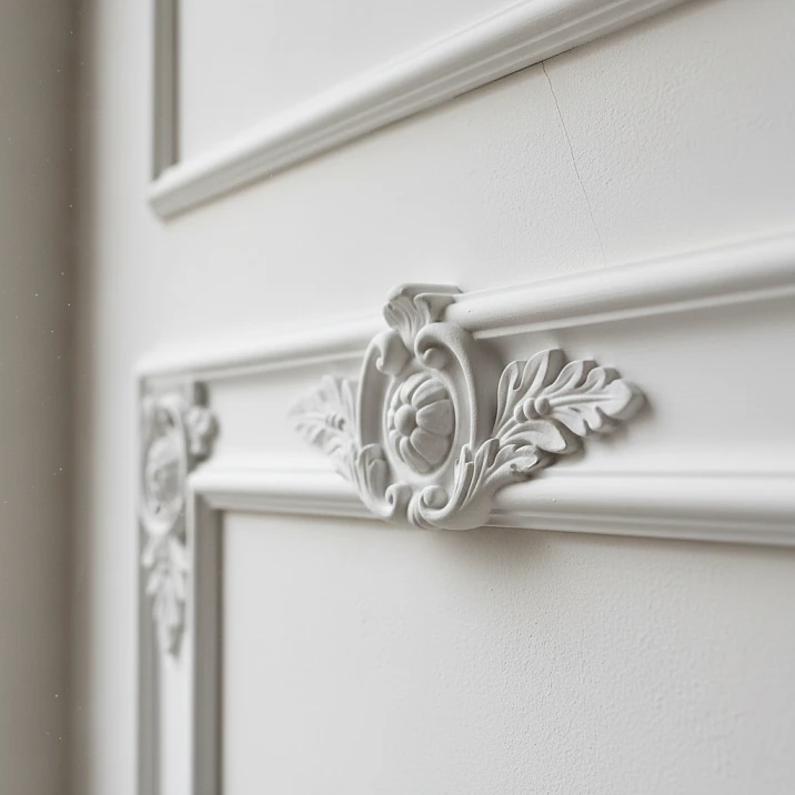
Wall molding is one of the rare decorative tools that can change the architecture of a room without changing the walls themselves. A flat drywall surface can become a sequence of panels. A bedroom can gain a visual headboard without adding another piece of furniture. A long hallway can feel measured instead of endless. A dining room can acquire the rhythm of a paneled interior without being rebuilt in wood. The material matters, but the layout matters more.
That is why the most useful way to study wall molding is not to look at isolated product samples. It is to study complete walls: where the frames begin and end, how they relate to doors, windows, furniture, sconces, baseboards, crown molding, and artwork, and how much empty wall remains around them.
For U.S. homeowners and designers, the strongest search language around this topic includes picture frame molding on walls, wall molding ideas, wall molding designs, wall trim ideas, wall moldings and panels, and picture-frame wall molding. This article uses those terms in the way American interior design actually uses them: as a planning system rather than as a catalog of decorative pieces.
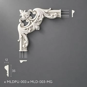
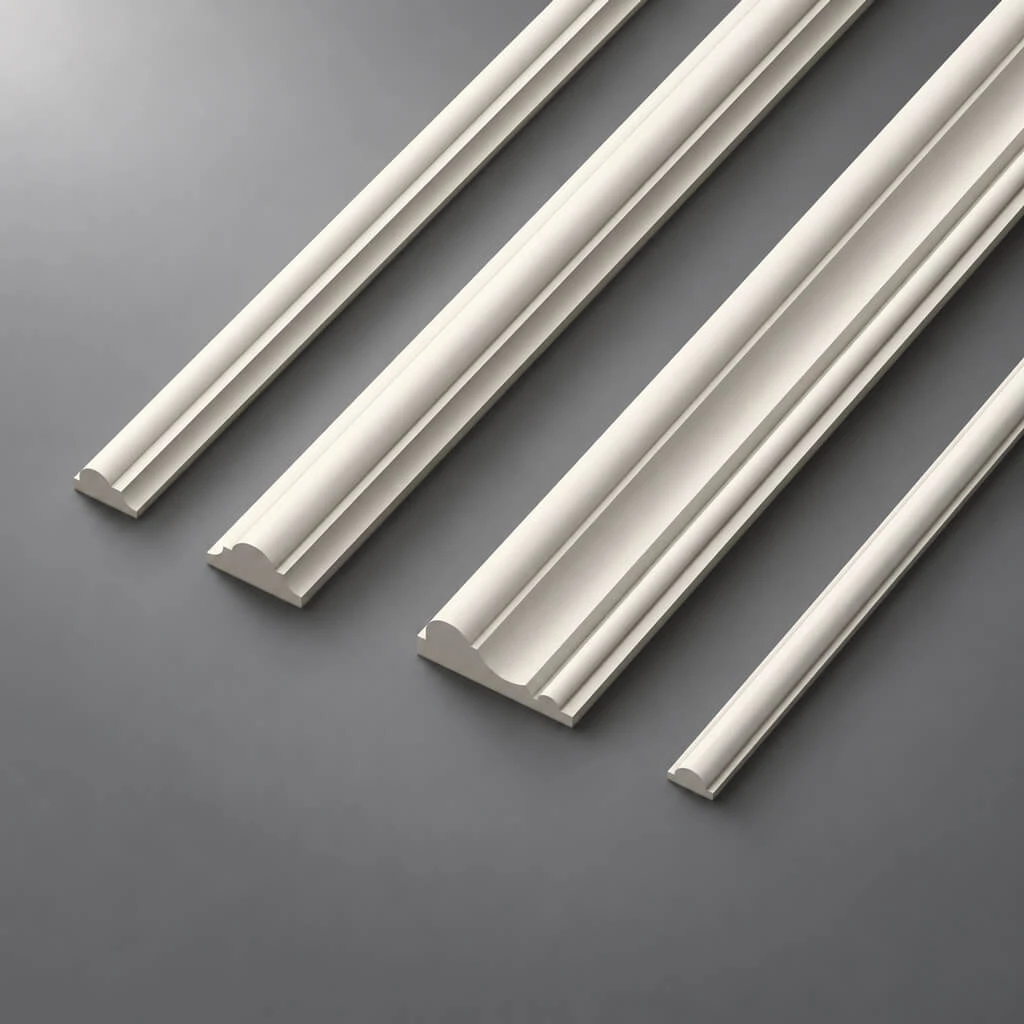
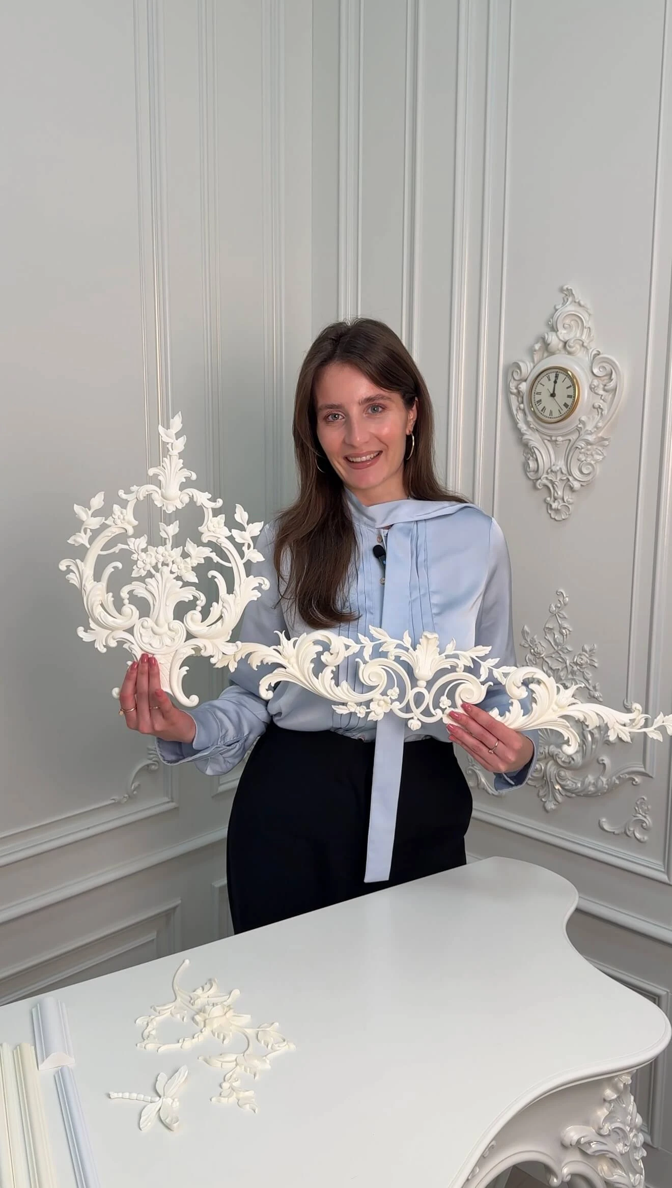
Where the design calls for paint-grade polyurethane profiles, STAVROS offers verified polyurethane wall molding in the MLDPU family. Decorative relief can be added through polyurethane trim molding and polyurethane appliques and onlays. The article will show how those product families can be used without turning the room into a showroom.

Why Wall-Molding Inspiration Photos Are Useful—And Why They Can Mislead You
Inspiration photography is valuable because it shows scale. A product drawing tells you that a profile is 22 mm wide; a finished room tells you whether that width feels delicate or heavy beside an eight-foot door, a nine-foot ceiling, a 90-inch sofa, or a pair of large windows.
Photography also reveals shadow. Molding is three-dimensional, and its appearance changes dramatically with light direction. A profile that looks almost invisible in flat daylight may become the dominant feature of a wall when a sconce throws light across it at night.
But photographs can also mislead. Wide-angle lenses exaggerate room size. Edited images may hide imperfect corners. Furniture may have been moved for the shoot. Ceiling height can look taller than it is. A layout that works on a twelve-foot wall may feel crowded on an eight-foot wall.
Use photographs to understand principles, not to copy dimensions blindly.


How to Read a Good Wall-Molding Photo
When you save an inspiration image, do not ask only, “Do I like this?” Ask how many frames are on the wall, whether the frames are equal, where the visual center sits, how much space is left between molding and baseboard, whether vertical lines align with furniture, whether sconces sit inside frames or between them, whether artwork is centered, and whether the molding is plain or ornamental.
Once you learn to read a wall this way, inspiration becomes transferable. You can recreate the logic at a different scale rather than reproducing the exact picture.
Наша фабрика также производит:

Смотреть весь Каталог продукции
Picture-Frame Molding on Walls: The Basic Idea
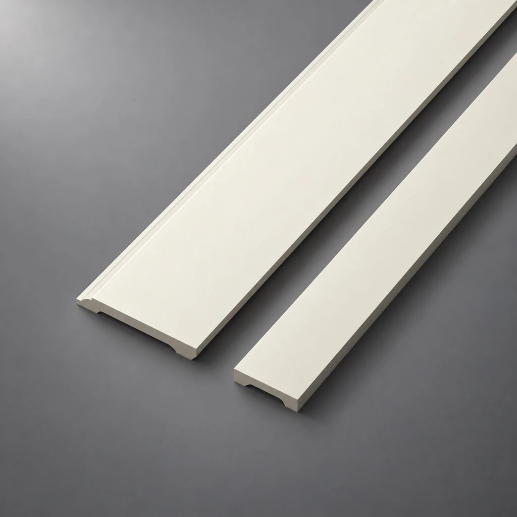
Picture frame molding on walls means applying linear molding directly to a wall to create rectangular or square frames. The frames can be empty, painted, wallpapered, mirrored, or used as visual boundaries for art and lighting.
The name comes from the resemblance to picture frames, but the function is architectural. The molding divides a large flat wall into smaller fields. It creates rhythm and hierarchy.
For polyurethane-specific projects, STAVROS has verified polyurethane picture frame moulding options within the MLDPU family. The exact profile should be selected by width, projection, and room scale rather than by keyword alone.
Получить консультацию
The Five Layout Families You Should Know
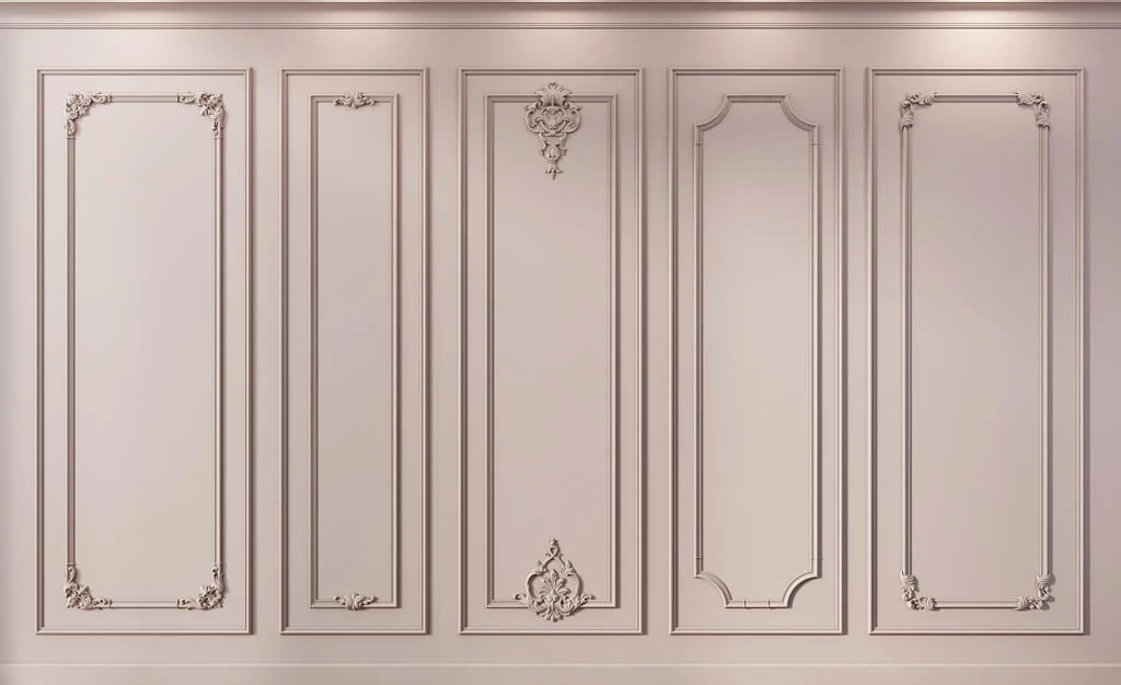
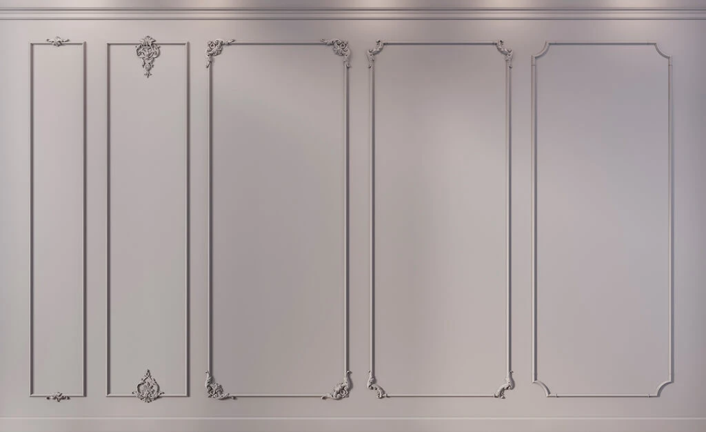
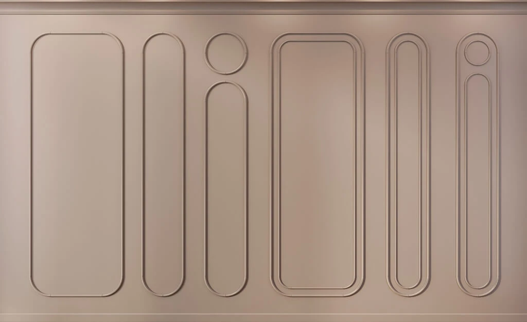
Most successful wall-molding designs are variations of five basic layouts: one large frame; a three-panel composition; repeated equal frames; a two-tier or grid layout; and a lower-wall panel system.
Layout 1: One Large Frame
One oversized rectangle is the calmest possible molding design. It works well behind a bed, sofa, console table, large painting, mirror, or TV wall when the screen sits within a larger architectural field.
The frame should be large enough to read as architecture rather than as a small decorative border. If it sits behind furniture, relate its width to the furniture below. A frame slightly wider than a headboard or sofa often feels more intentional than a small frame floating above it.
When One Large Frame Works Best
Choose one frame when the room already has a clear focal point. A bed does not need three competing centers. A large painting does not need several narrow rectangles around it. The molding should reinforce what is already important.
This layout is especially effective in contemporary, transitional, and soft-neoclassical interiors because it adds architecture without visual noise.
Layout 2: Wide Center Panel With Narrow Side Panels
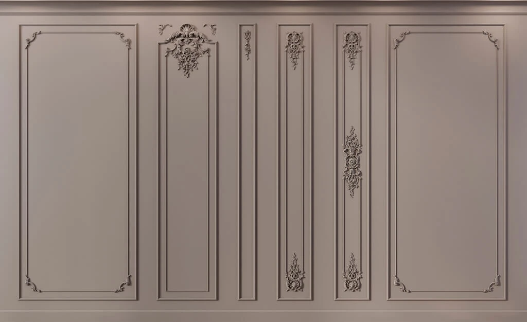
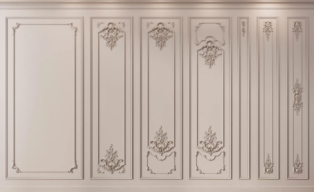
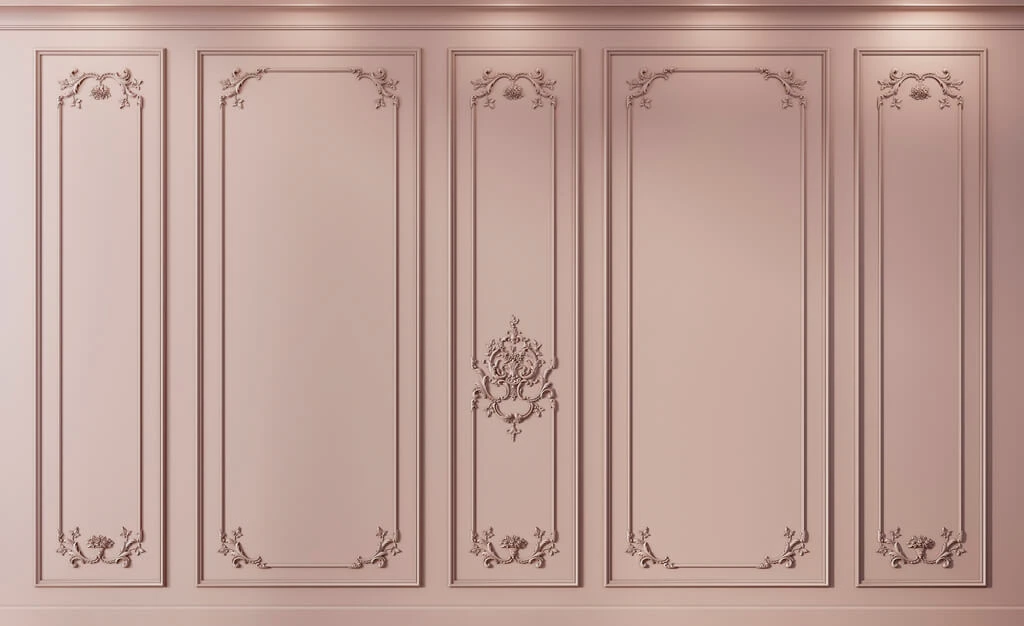
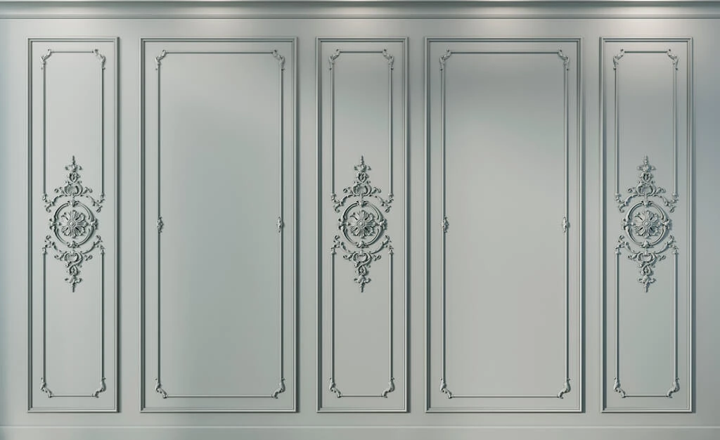
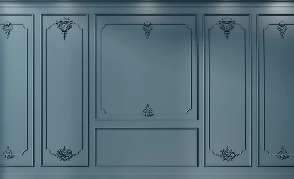
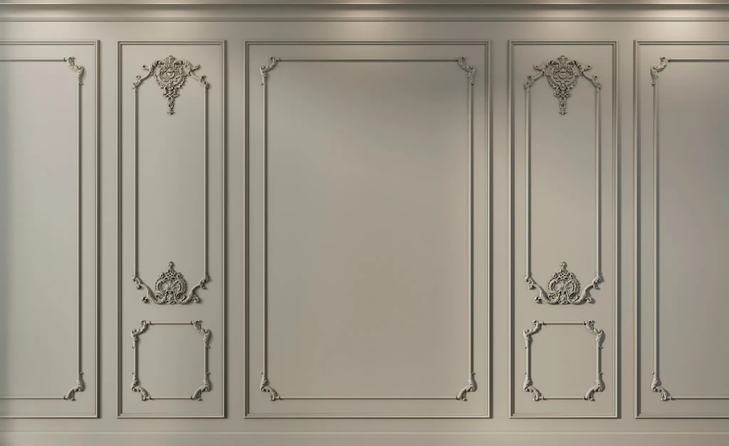
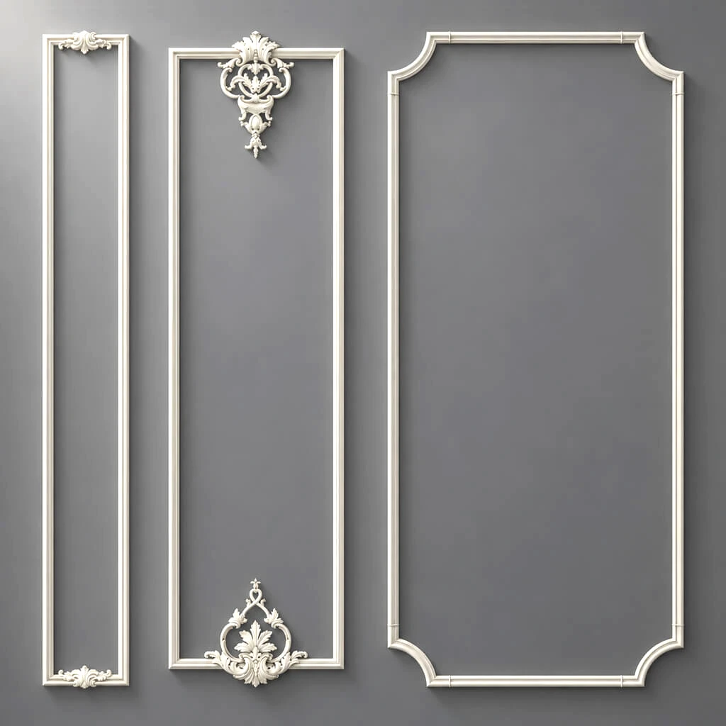
This is one of the strongest traditional compositions and one of the most useful modern wall molding designs. A large central frame creates hierarchy, while smaller side frames balance the composition.
Use it behind a sofa with side tables, a bed with nightstands, a dining-room sideboard, a fireplace, a large mirror, or a console centered on the wall.
The center frame does not need to follow a fixed ratio. The correct proportion comes from the wall width and the object being centered.
Why the Three-Panel Layout Feels So Stable
Human vision reads a center-and-sides composition immediately. The central field becomes dominant, while the side panels create balance. That is why this arrangement works in both classical and contemporary rooms.
Layout 3: Equal Repeated Frames
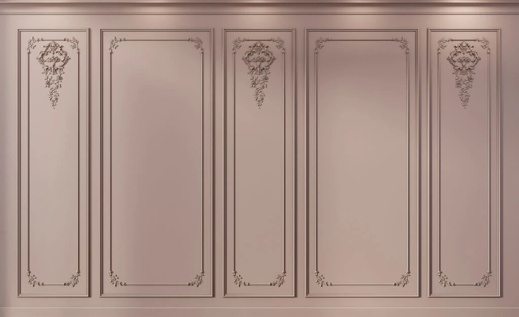
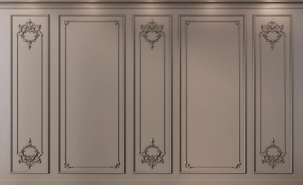
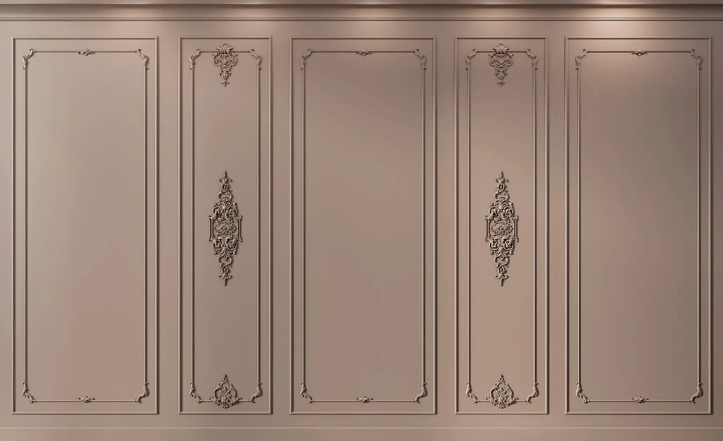
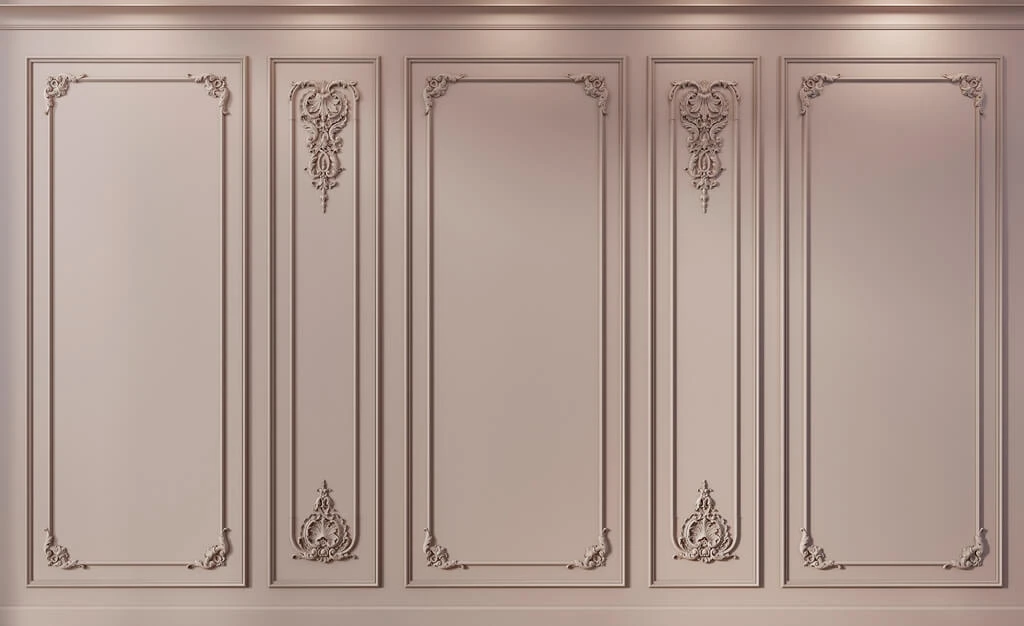
Equal repeated frames create rhythm rather than hierarchy. This works well on long dining-room walls, hallways, stair halls, large living-room side walls, home offices, libraries, and commercial corridors.
Equal spacing is critical. If the gaps between frames drift by an inch or two, the entire wall starts to feel improvised.
Layout 4: Two-Tier Grid
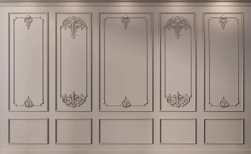
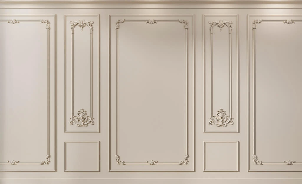
A two-tier grid divides the wall into upper and lower rows of framed panels. It is more formal and visually active than a single row and works best on large walls with generous height.
Use the upper row for height and the lower row for grounding. Avoid making both rows equally dominant.
Layout 5: Lower-Wall Panel System
Lower-wall molding creates the visual effect of wainscoting without necessarily adding full panel boards. A horizontal line establishes the top of the lower zone, and rectangular frames sit beneath it. The upper wall remains open for artwork, wallpaper, or paint.
Wall Molding Ideas for the Living Room
The living room is often the most difficult room because it contains several visual centers at once: sofa, TV, fireplace, windows, art, and lighting. Do not begin by decorating every wall. Start with the wall that establishes the room’s main orientation.
Behind the sofa
A sofa wall works well with one large frame, three vertical frames, or a repeated set of equal frames. The molding should relate to sofa width rather than to the total wall in isolation.
If the sofa is centered, symmetrical frames work naturally. If the sofa is intentionally offset because of circulation or an adjacent doorway, forcing symmetrical molding around the wall center can create conflict.
Around a fireplace
The fireplace already provides architecture. Wall molding should frame the surrounding field, not compete with the firebox and mantel. A strong solution is a wide center panel aligned with the fireplace plus narrower side panels for sconces or art.
TV wall
Do not trace the TV with molding as if the screen itself were a framed artwork. Build a larger architectural field around it. The media console, speaker placement, outlets, and cable paths should be included in the elevation before the molding is designed.
Wall Molding Ideas for the Bedroom
Bedrooms are ideal for molding because the bed provides a clear center.
One large frame behind the bed
This is the simplest solution. The frame can be wider than the headboard and tall enough to create a strong vertical field.
Three tall panels behind the bed
A wide center panel can align with the headboard, with narrower side panels aligned to the nightstands. Sconces can sit inside the side panels.
Full-wall repeated frames
Use this only when the room has enough width. Too many narrow frames behind a large bed can feel busy.
Molding plus wallpaper
Wallpaper inside the central panel creates a focal field without papering the entire room. This is particularly effective when the side frames remain painted.
Wall Molding Ideas for the Dining Room
Dining rooms can tolerate more rhythm and formality than many other residential spaces. Repeated wall frames work well because the dining table establishes a stable center and the room is often viewed for long periods from a seated position.
Possible layouts include three large vertical frames behind a sideboard; lower-wall frames with wallpaper above; full-height frames on all four walls; a center mirror framed by molding; wall frames coordinated with a ceiling medallion; or a decorative upper frieze over simpler wall panels.
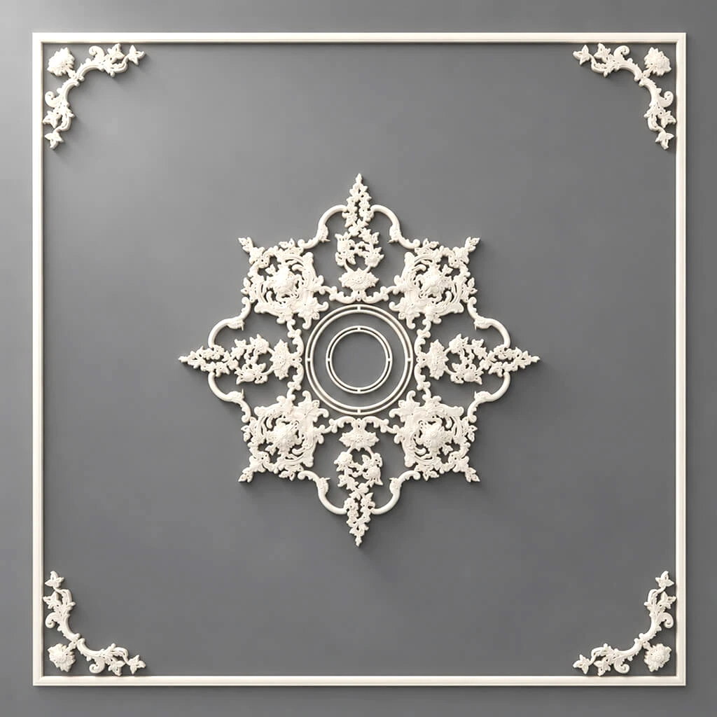
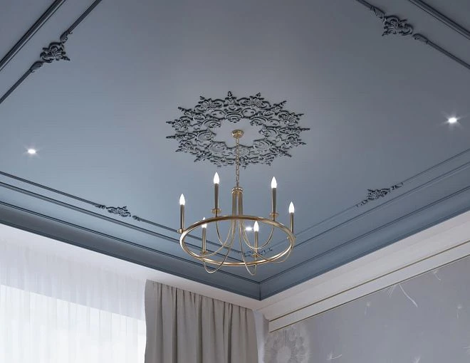
For rooms that also use ceiling ornament, STAVROS polyurethane ceiling medallions can provide the ceiling center while wall molding controls the vertical surfaces.
Wall Molding Ideas for Open-Plan Spaces
Open-plan rooms often feel visually disconnected because kitchen, dining, and living areas share one ceiling and one continuous wall line.
Molding can create zones without adding partitions. Use a consistent profile throughout the space, then vary the layout by zone: simple frames in the living area, three formal panels in the dining zone, no molding in the kitchen work zone, and one continuous upper line if the architecture needs unification.
Wall Molding Ideas for Hallways
Hallways are long, repetitive spaces, so rhythm matters more than focal ornament. Equal repeated frames can break the wall into readable intervals. Lower-wall panels can visually widen a narrow corridor by emphasizing horizontal structure.
Do not use deep projecting profiles where circulation is tight.
Wall Molding Ideas for Stair Walls
Stair walls introduce a slope, which makes layout more complicated. You can keep frames vertical and level while stepping them with the stair, use lower panels that follow the stair rake, or create a large composition on the landing wall instead of decorating the entire stair run.
Wall Molding Ideas for the Home Office
Home offices benefit from molding because architectural structure helps the room feel permanent rather than temporary. Use molding behind the desk, around built-in shelving, or as a full-wall panel system behind bookcases.
Dark monochromatic paint works especially well in offices because the relief remains visible while the color feels sophisticated.
Wall Molding Ideas for the Entry
An entry wall usually needs one clear composition, not many small decorative moments. A console, mirror, and two sconces can sit inside one large architectural frame. A series of narrow frames can emphasize verticality in a tall foyer.
If several doors open from the entry, align molding with door heads or maintain generous separation from casing. Avoid a top rail that sits almost—but not quite—at the same height as nearby trim.
Wall Molding Ideas for a Powder Room
Small rooms can support bold design because the total wall area is limited. Try dark monochromatic picture-frame molding, lower-wall frames with dramatic wallpaper above, one ornate mirror inside a simple molded frame, or decorative appliques used sparingly at the center of one panel.
Because powder rooms are compact, precise spacing matters even more than in large rooms.
Wall Molding Around Mirrors
A mirror can sit inside a molding frame without the molding touching it. This creates a layered composition: architecture first, object second.
Leave enough reveal for fabrication tolerance and installation. A mirror that nearly touches the molding on one side but not the other will make the whole wall look mismeasured.
Wall Molding Around Artwork
Artwork does not have to be centered inside every molded frame. In formal symmetrical rooms, centered art works well. In contemporary rooms, art can overlap the visual logic of the panel system while still remaining balanced within the wall.
The molding is architecture; the artwork is content. They can relate without becoming one object.
Wall Molding With Wallpaper
Molding frames are one of the best ways to control wallpaper. Instead of committing an entire room to pattern, you can confine wallpaper to selected fields.
That gives you several useful strategies:
- wallpaper only in the central frame;
- wallpaper above a lower-wall molding system;
- wallpaper in alternating panels;
- textured wallpaper inside frames with monochromatic molding outside;
- one mural-like wallpaper panel framed architecturally.
For large-repeat wallpaper, design the frame dimensions around the pattern repeat so important motifs are not cut awkwardly.
Wall Molding With Paint
Paint strategy changes the character of the molding more than almost any other decision.
Same color as the wall
This is the most versatile contemporary treatment. The molding is defined by shadow rather than contrast. It works especially well with warm whites, taupes, muted greens, dusty blues, charcoal, and deep brown.
White molding on colored walls
This creates a stronger traditional or graphic effect. Every line becomes more visible, so the layout must be especially precise.
Dark molding on dark walls
This is one of the strongest modern treatments. Charcoal, navy, forest green, oxblood, and deep brown all work well when the trim and wall share the same finish family.
Two-tone panels
Use a different color inside the frame to make selected panels focal points. This is more decorative and should be used selectively.
Wall Molding With Sconces
Sconces should be designed into the frame system from the beginning.
A sconce can sit centered inside a side frame, between two frames, on the vertical centerline of a large panel, or above a console inside one architectural field.
A fixture canopy that lands partly on the molding usually looks accidental.
Wall Molding With a TV
TV walls need restraint. The screen already creates a dominant dark rectangle. Adding many small molding frames around it can create visual clutter.
A better strategy is to establish one larger field that includes the TV and media console, then use smaller side frames if the wall needs balance.
Plan power outlets, low-voltage boxes, cable paths, wall mounts, soundbars, and future access before finalizing the molding.
Wall Molding With Built-Ins
Built-ins and wall molding can work together as one architectural system.
Align molding with cabinet door widths, shelf bays, bookcase centerlines, top cornice lines, and base cabinet heights. Small polyurethane trim molding can also be used on paint-grade built-ins when the product and adhesive are appropriate.
Wall Molding With Fireplace Mantels
A mantel already has strong horizontal and vertical edges. Molding should support those lines, not create a second unrelated grid.
Side panels can align with mantel width, sconces, or art. If decorative brackets are part of the composition, STAVROS polyurethane corbels can provide ornamental forms. Treat them as decorative unless a specific product has documented structural capacity.
Modern Wall Molding Ideas
Modern wall molding is usually about geometry rather than ornament.
Use large rectangles, thin or medium profiles, monochromatic paint, generous negative space, few frames, and minimal decorative appliques.
Modern rooms do not need to reject classical geometry. They simply reduce its ornament density and visual hierarchy.
Neoclassical Wall Molding
Neoclassical wall design works through symmetry, vertical proportion, and controlled relief.
A three-panel composition, repeated tall frames, and a restrained profile are enough. Avoid filling every frame with ornament.
The source article correctly recognizes that monochromatic paint is one of the strongest ways to modernize classical molding. Keep the wall and profile the same color, and let light reveal the geometry.
Parisian-Inspired Wall Molding
Parisian-style interiors typically use tall frames, generous negative space, ceiling trim, and carefully placed ornament.
The look depends on verticality. Short, wide frames can make the wall feel squat. Use tall proportions, narrow profiles, and strong alignment with doors and windows.
Parisian inspiration also depends on restraint. Not every panel needs an applique, mirror, or artwork. Empty framed fields are part of the visual rhythm.
Art Deco Wall Molding
Art Deco layouts rely on geometry: stepped frames, strong vertical lines, symmetry, nested rectangles, and repeated proportions.
Choose simple profiles and let the composition carry the style. Metallic paint can be used as an accent, not necessarily across the whole wall.
Traditional Wall Molding
Traditional American interiors can support stronger profiles, more repeated frames, lower-wall panel systems, crown molding, and coordinated casing.
The key is hierarchy. Baseboard, wall frames, casing, and crown should not all compete at the same visual strength.
Transitional Wall Molding
Transitional interiors sit between traditional architecture and contemporary furniture. Wall molding is especially effective here because it can give the room structure without dictating a historical style.
Use simple profiles, larger frames, a monochromatic finish, and modern furniture. Avoid overly elaborate center ornaments unless the rest of the room supports them.
Minimalist Wall Molding
Minimalism can use molding when the molding behaves like a line rather than an ornament.
One or two large frames, shallow projection, one wall color, and no decorative appliques can be enough.
How Many Panels Should Be on a Wall?
There is no universal number.
Start with the width of the wall and the number of architectural events already present: doors, windows, furniture groups, sconces, fireplace, television.
A twelve-foot wall with one sofa may need one large frame or three frames. A twenty-foot dining wall may support four or five repeated bays.
Do not add panels merely because there is empty wall.
How Wide Should Picture-Frame Molding Be?
Profile width should relate to frame size and viewing distance.
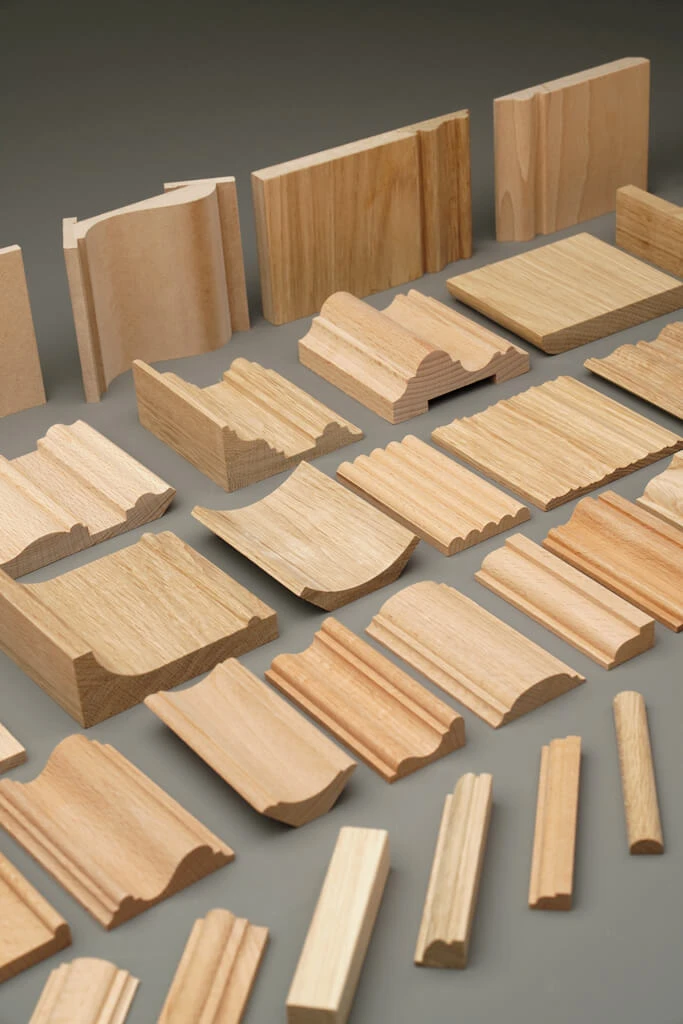
A narrow profile is effective for small frames and modern interiors. A medium profile is more architectural on large walls. A highly ornamental or wide profile needs enough negative space to breathe.
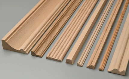
Within the STAVROS MLDPU range, available profiles vary enough in width and projection to create very different visual weight. Review the profile drawing rather than choosing by front image alone.
Why Projection Matters as Much as Width
Projection is how far the molding stands away from the wall. A narrow profile with deeper projection may cast a stronger shadow than a wider but flatter profile.
This matters in rooms with side light. It also matters around furniture, doors, and tight circulation zones where a deep profile can physically interfere with adjacent elements.
How Much Space Should Be Between Frames?
Consistency matters more than one exact dimension.
The spacing between frames should relate to outside wall margins, distance to casing, distance to baseboard, distance to crown, furniture width, and profile thickness.
If you use a 5-inch gap between two frames and a 2-inch gap somewhere else without a clear reason, the wall will feel unstable.
How Far Should Molding Be From the Baseboard?
Leave a visible margin. The frame should not appear to sit directly on the baseboard unless the design intentionally creates a full paneling system.
The margin should feel proportional to the room and to the side margins of the frame.
How Far Should Molding Be From Crown Molding?
Establish the crown lower edge first. Then leave enough open wall above the top frame for the crown and frame to remain visually separate.
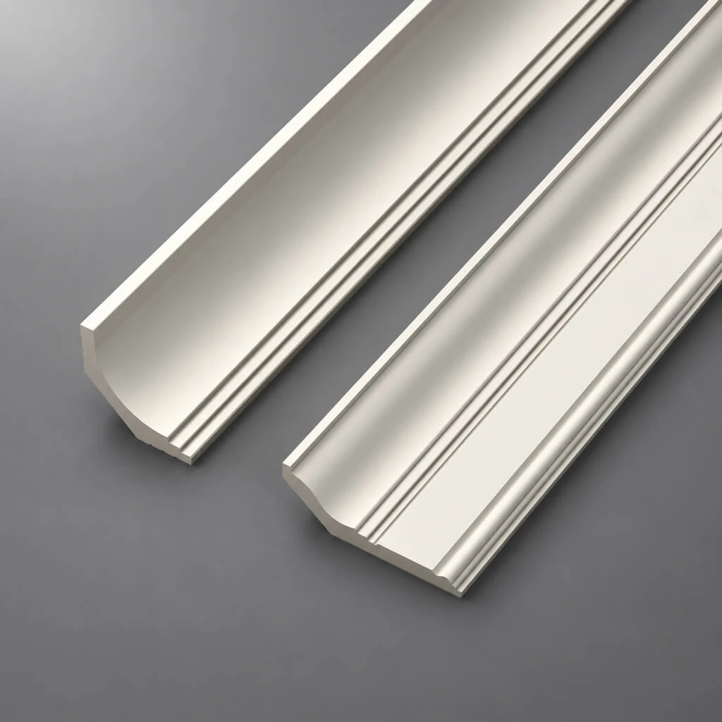
For ceiling-perimeter products, browse the STAVROS crown molding category, which currently contains HI WOOD polystyrene profiles.
How Far Should Molding Be From Door Casing?
Do not crowd the casing. The molding and casing should either align intentionally or remain clearly separate.
A narrow two-inch leftover strip of wall between two unrelated trim systems often looks accidental. If space is tight, simplify the frame or omit it.
How to Use Polyurethane Appliques Inside Wall Frames
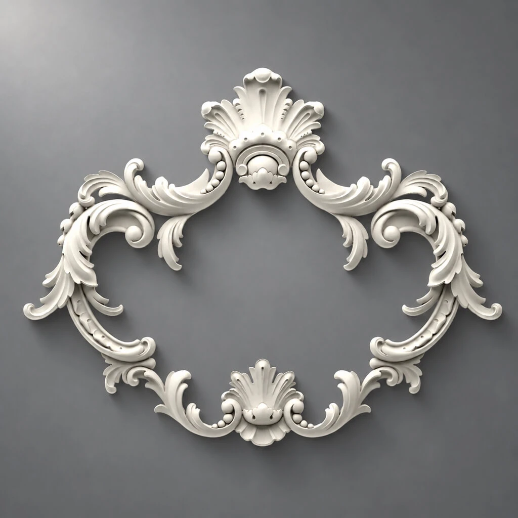
Appliques can turn a simple panel into a focal composition, but they should be secondary to the frame unless they are intentionally the main ornament.
Use polyurethane appliques and onlays in center panels, over-door compositions, mirror surrounds, classical furniture panels, paired side panels, and decorative corners.
Leave generous negative space around the ornament.
Corner Ornaments vs. Mitered Corners
A simple molding profile usually looks cleanest with mitered corners. Ornamental corners can be useful when the design specifically calls for them.
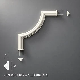
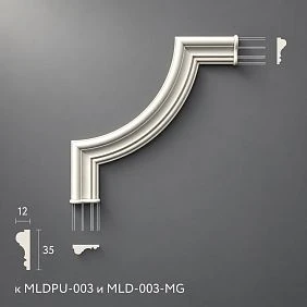
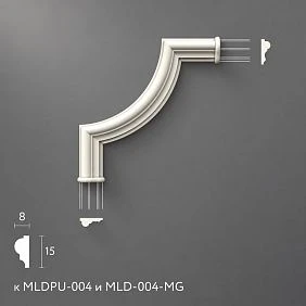
STAVROS has polyurethane corner moulding and related decorative accents for certain systems. Compatibility should be checked by profile family.
Lighting: The Hidden Variable in Wall Molding Design
Molding creates shadow. Without light, there is almost no relief.
Side light is the most revealing. Window light, wall sconces, and grazing ceiling light create shadows that make the profile appear deeper.
Flat frontal lighting reduces contrast and makes subtle molding feel calmer.
Designers should therefore review molding under the lighting conditions the room will use at night, not only in daylight.
Why Monochromatic Molding Looks Expensive
When molding and wall share one color, the design is perceived as architecture rather than added decoration.
The effect comes from relief, not contrast. This makes even relatively simple profiles feel intentional. It also hides small dimensional differences better than high-contrast paint.
How to Use Dark Paint With Wall Molding
Dark paint increases the sculptural effect because highlights and shadows become more noticeable.
Use fewer frames when the color is strong. The wall already has visual weight.
Dark molding works especially well in dining rooms, libraries, offices, powder rooms, and bedrooms.
How to Use White Molding on Colored Walls
This treatment is more graphic and traditional.
It works best when the wall layout is symmetrical, the room has coordinated white casing and crown, the profile is crisp, and the frame margins are consistent.
Every mistake becomes more visible because of the contrast.
What Makes Wall Molding Look Cheap?
Usually not the material.
Common causes are frames too small for the wall, random spacing, molding that collides with switches or sconces, poorly fitted miters, too many profile types, ornament in every available space, frames unrelated to furniture, profiles too heavy for the ceiling height, obvious filler at outside corners, and inconsistent paint sheen.
What Makes Wall Molding Look Architectural?
Architectural molding has hierarchy. The wall has a dominant center, secondary fields, consistent spacing, deliberate margins, and a relationship to the rest of the room.
Good molding looks as if the wall was designed with it from the beginning.
Scenario: Living Room With a 9-Foot Ceiling
Imagine a 14-foot sofa wall in a new home. The sofa is 96 inches wide, centered, with side tables and sconces.
A strong solution is a three-panel layout. The center panel aligns roughly with the sofa and is wider than the side panels. The side frames align with the sconces and side tables. The molding is painted the wall color.
The important design decision is not the exact inches. It is the alignment: furniture and molding share the same axis.
Scenario: Minimal Bedroom With an 8-Foot Ceiling
A compact bedroom does not need a large classical grid.
Use one large rectangular frame behind the bed with a narrow profile. Keep generous space above the headboard and below the ceiling. Paint everything one color.
The frame becomes an architectural headboard without visually lowering the room.
Scenario: Open Dining-Living Room
Use the same molding profile throughout the shared space but vary the pattern by zone.
The dining wall receives three formal panels. The living wall receives one large frame behind the sofa. The kitchen receives no wall molding.
The repeated profile creates continuity while the different layouts create zoning.
Scenario: Long Hallway
Use equal vertical frames with a consistent rhythm. Avoid very deep profiles. If the hallway is tall and narrow, consider a lower-wall system to introduce a stronger horizontal line.
Scenario: Small Powder Room
Use lower-wall frames painted in a dark color, with wallpaper above. Keep the molding simple so the wallpaper remains the decorative focus.
Scenario: TV Wall With Built-In Cabinetry
Align wall molding with the built-in cabinet widths. Use one large central field for the TV and smaller side fields for shelving or sconces.
Avoid molding lines that run behind the screen edge or intersect outlets.
Scenario: Fireplace Wall
Let the fireplace be the main architecture. Use side frames to balance the wall rather than adding heavy molding directly around the firebox.
Scenario: Dining Room With Ceiling Medallion
A ceiling medallion and wall frames can create a complete room composition when the centerlines are coordinated.
Center the medallion on the dining table or chandelier axis. Align the primary wall panel with the sideboard or main artwork. The room then has both a ceiling center and a wall center.
Scenario: Bedroom With Wallpaper Inside the Center Panel
Create a wide center panel behind the bed and narrower painted side panels. Place wallpaper only inside the center field.
This creates a strong focal point without turning the entire room into a patterned surface.
Scenario: Home Office in a Deep Color
Use three or four equal frames behind the desk and bookshelves. Paint wall and molding the same dark green, blue, or brown.
The wall reads as tailored architecture rather than decorative contrast.
Scenario: Entry With Mirror and Sconces
Use one tall center frame for the mirror and two narrow side frames for sconces. Align the console with the center panel. Keep the bottom of all frames above the console or clearly below it—avoid arbitrary intersections.
Scenario: Stair Landing
Instead of forcing frames along the entire sloped stair wall, create one strong composition on the landing. A large framed mirror or artwork can become the architectural destination of the stair.
How to Create a Wall-Molding Layout From Scratch
- Measure the wall. Record full width and height.
- Mark all interruptions. Include doors, windows, switches, outlets, thermostats, vents, sconces, radiators, built-ins, and fixed furniture.
- Identify the visual center. It may be the wall center, but it may also be a sofa, bed, fireplace, sideboard, or television.
- Choose one layout family. One frame, three panels, repeated frames, a grid, or a lower-wall system.
- Choose one primary profile. Do not solve the wall with five different moldings.
- Set outside margins. Decide how much wall remains at the left and right edges.
- Set vertical margins. Define the clear space above the baseboard and below crown or ceiling.
- Set inter-frame spacing. Repeat it consistently.
- Check furniture alignment. Confirm centerlines and side edges.
- Mock up with painter’s tape. Review the wall from normal viewing positions.
- Photograph the mockup straight-on. Photos reveal spacing problems quickly.
- Only then calculate material.
Painter’s Tape Is More Useful Than Another Inspiration Board
Once you have saved enough inspiration photos, stop searching and tape the design on your actual wall.
This is where scale becomes real. A frame that looked elegant online may feel too narrow. A four-inch gap may feel crowded. A wide center panel may need to be wider. The top margin may feel too close to the ceiling.
Tape lets you correct all of that before cutting anything.
How to Calculate Molding Quantity
For each rectangular frame:
2 × width + 2 × height = linear footage per frame.
Add every frame, then add straight bands and other runs. Compare the total with the actual stock length of the selected product. Waste depends on the number of corners and the way cuts can be nested into stock lengths.
Do not rely only on a blanket 10 or 15 percent waste rule. A cut list is more accurate.
Why a Cut List Matters
A cut list turns an idea into an installation plan.
For every piece, record:
- wall or room;
- frame number;
- finished length;
- left cut;
- right cut;
- profile SKU;
- orientation if the profile is asymmetrical.
This is especially useful when several frames look similar but are not exactly the same size.
Installation Should Support the Design, Not Dominate the Article
This article is about ideas and layouts, so installation should remain a separate technical topic.
For cutting, mitered corners, adhesive, joints, and paint preparation, use the detailed STAVROS guide to install polyurethane molding.
Do Not Assume Every Corner Is 90 Degrees
Even the best layout fails if the corners do not close.
Flat picture-frame molding uses 45-degree miters when the frame corner is a true 90 degrees. Room corners should be measured because actual construction may vary.
Do Not Install Over a Weak Surface
The molding is only as secure as the substrate beneath it.
Loose paint, lifting wallpaper, dust, grease, or weak repairs can compromise the bond. Follow the adhesive manufacturer’s preparation requirements.
Do Not Assume All Polyurethane Is Flexible
Flexible polyurethane molding exists, but standard rigid MLDPU profiles should not be forced around arches unless the exact product is designed for that radius.
How to Use Wall Molding With Existing Baseboards
Most decorative wall frames should stop above the baseboard with a consistent margin.
This creates a clean visual separation and avoids awkward attempts to carve the vertical molding into the baseboard profile.
How to Use Wall Molding With Existing Crown
Leave enough space between the top of the frame and the bottom of the crown for both systems to read independently.
If the crown is very large, reduce the visual strength of the wall molding. If the crown is minimal, the wall frames can carry more of the room’s architecture.
How to Mix Molding With Other Materials
Polyurethane wall molding can coexist with wood baseboards, MDF cabinetry, plaster ceilings, wallpaper, stone fireplaces, and painted drywall.
The room does not need one material everywhere. It needs one coherent design language.
Wall Moldings and Panels: Know the Difference
The search term wall moldings and panels can describe several different assemblies.
Applied molding on a flat wall creates the visual effect of paneling but does not automatically create a physical panel. True paneling may include MDF, wood, plywood, or other sheet materials behind the trim.
This distinction affects depth, budget, installation, and durability. If you only want architectural lines, molding may be enough. If the lower wall needs greater impact resistance or a different material surface, true panel construction may be appropriate.
Picture-Frame Molding vs. Wainscoting
Picture-frame molding can be installed anywhere on the wall, including full-height layouts. Wainscoting usually refers to treatment of the lower portion of the wall.
Many interiors combine the two: a chair-rail-like top line with picture-frame molding beneath it.
Wall Trim Ideas vs. Wall Molding Ideas
American search behavior uses “trim” and “molding” interchangeably in many contexts, but “wall molding” is generally clearer for decorative applied frames.
Wall trim ideas can also include casing, chair rail, baseboard, battens, and other finish carpentry. This article focuses specifically on decorative wall-frame layouts.
How to Choose Between Plain and Ornamental Profiles
Choose plain or lightly profiled molding when the layout itself is complex. Choose more ornamental trim when the layout is simple and the profile is intended to carry visual interest.
A common mistake is to combine a complicated grid with a highly ornamental molding. The eye then has to process both the geometry and the pattern.
How to Use Decorative Trim as a Secondary Layer
A restrained wall frame can be paired with an ornamental horizontal band higher on the wall or inside one focal panel.
That is where decorative polyurethane moulding can be more effective than using ornate trim for every frame.
When to Add a Center Applique
Add a center applique when the panel has a clear axis and enough empty space around the ornament.
Good locations include above a console, above a mirror, in the center of a large dining-room panel, over a door, or in a furniture panel.
If the ornament nearly touches the molding on all sides, the composition is usually too crowded.
When to Leave a Frame Empty
Often.
An empty frame allows the architecture to breathe. It also gives you flexibility to change artwork, furniture, or lighting later without redesigning the wall.
How to Use Molding With a Gallery Wall
A gallery wall already contains many rectangles. Adding many molding frames behind it can create visual competition.
Use one large outer frame around the entire gallery, or keep the molding system very simple.
How to Use Molding With Large Art
One large artwork often needs only one architectural field.
Center the frame on the wall or furniture, then place the artwork independently inside it. Leave enough breathing room so the molding does not behave like a second picture frame around the artwork.
How to Use Molding With a Large Mirror
A mirror is visually stronger than a painted wall panel because it reflects the room.
Keep the surrounding molding simpler. If the mirror itself has an ornate frame, avoid adding equally ornate wall trim immediately around it.
How to Use Molding With Curtains
Drapery can hide side sections of the wall, so do not design a narrow molding frame that disappears behind curtains.
Either keep the frames inside the clear wall area between drapery stacks or allow the curtain composition to define the outer boundary of the wall design.
How to Use Molding With Windows
Windows already create strong vertical openings.
Align wall frames with window centers or edges when practical. Avoid creating a frame that almost aligns but misses by a small amount.
How to Use Molding With Doors
Door casing is already a trim system. Decorative wall molding should either align with it or remain clearly separate.
Do not confuse applied wall molding with structural door casing. A flat decorative profile does not automatically replace casing designed to cover a jamb-to-wall joint.
How to Use Molding in Rooms With Low Ceilings
Low ceilings favor verticality and restraint.
Use taller frames, narrower profiles, monochromatic paint, and fewer horizontal divisions. Avoid heavy upper-wall bands that consume visual height.
How to Use Molding in Rooms With High Ceilings
High ceilings can support larger profiles, taller frames, and stronger upper-wall architecture.
But do not automatically add more ornament. Scale up the frames before you scale up the decorative complexity.
How to Use Molding in Narrow Rooms
In narrow rooms, avoid deep projecting profiles and dense grids.
Horizontal lower-wall divisions can help reduce the “tunnel” effect, while long repeated frames can create measured rhythm.
How to Use Molding on Very Wide Walls
Very wide walls often need hierarchy.
Rather than making six identical frames, consider a wider center section with paired side frames or separate zones aligned to furniture groupings.
How to Use Molding in Asymmetrical Rooms
Asymmetry is not a defect that must always be corrected.
If a room has one off-center door, one large window, and furniture that cannot be centered, a perfectly symmetrical molding grid may create more tension than balance.
Let the wall respond to the actual architecture.
Symmetry vs. Asymmetry
Symmetry is calm, formal, and easy to read. Asymmetry is more dynamic and can feel contemporary.
Use symmetry when the room already has a central axis. Use asymmetry when furniture or openings create a legitimate offset condition.
How to Judge a Layout From the Doorway
Stand where you first see the room.
The most important wall-molding composition should make sense from that point. A wall that looks perfect straight-on but awkward from the room entrance may need adjustment.
How to Judge a Layout From Seated Eye Level
Dining rooms and living rooms are experienced while seated.
Check how the frames align with chair backs, sofa height, sideboards, and artwork from that lower viewpoint.
How to Judge a Layout at Night
Turn on the actual sconces, lamps, and ceiling lights.
Look for strong joint shadows, uneven wall waves, and molding lines that disappear under flat light.
How to Avoid SEO Cannibalization Between Molding Articles
This article should own the inspiration and layout intent: wall molding ideas, picture frame molding on walls, and wall molding designs.
The separate STAVROS technical article on polyurethane wall molding should continue to own profile selection, material, spacing logic, and technical specification. The installation article should own cutting, corners, adhesive, joints, and painting.
That separation gives each page a clear job instead of making three articles repeat the same information.
What to Keep From Inspiration—and What to Ignore
Keep the proportion, hierarchy, number of frames, relationship to furniture, paint strategy, and lighting logic.
Ignore exact dimensions from another room, camera-distorted ceiling height, furniture placement that does not match your plan, decorative elements that do not fit your architecture, and claims that one layout “works everywhere.”
Frequently Asked Questions
What is picture frame molding on walls?
It is linear molding applied directly to a wall in rectangular or square frames to create architectural panel-like divisions.
Is picture-frame molding the same as wall paneling?
No. Picture-frame molding can be installed on a flat wall without adding full wood or MDF panels.
What are the most popular wall molding ideas?
Common layouts include one large frame, a wide center frame with narrow side frames, repeated equal frames, two-tier grids, and lower-wall panel systems.
How many molding frames should I put on one wall?
Use the number that supports the wall’s architecture and furniture. Fewer large frames usually feel calmer than many small ones.
Should wall molding be symmetrical?
Symmetry is effective in classical and Neoclassical interiors, but controlled asymmetry can work in contemporary rooms when it responds to furniture or openings.
Should molding match the wall color?
It often should if you want a subtle architectural effect. Contrast makes the layout more graphic and traditional.
Can I use wall molding behind a TV?
Yes. Create a larger architectural field around the TV instead of tracing the screen too closely.
Can I use molding behind a bed?
Yes. One large frame or three tall frames are both effective bedroom layouts.
Can wall molding go in a bathroom?
It can be appropriate when the material, substrate, adhesive, caulk, paint, and ventilation are suitable for the environment.
Can I put wallpaper inside molding frames?
Yes. This is an effective way to use pattern selectively rather than covering the entire room.
Can I put mirrors inside molding frames?
Yes. Leave a deliberate reveal and account for mirror installation tolerance.
What is the best molding for a modern wall?
Usually a simple narrow-to-medium profile painted the same color as the wall, arranged in large clean rectangles.
What is the best molding for a Neoclassical wall?
A restrained profiled molding with symmetrical frames, generous spacing, and limited ornament.
Can I combine molding with appliques?
Yes. Use molding for structure and appliques for focal ornament. Keep enough empty space around the applique.
How do I make wall molding look expensive?
Use correct scale, consistent margins, accurate corners, controlled ornament, and paint that integrates the molding with the wall.
How do I avoid making wall molding look dated?
Use fewer frames, simpler profiles, monochromatic paint, and layouts based on furniture rather than purely historical formulas.
How far should wall molding be from the baseboard?
There is no universal number. The margin should be consistent and proportional to the frame and room.
How far should frames be from each other?
Keep spacing consistent unless the layout intentionally creates hierarchy.
How do I plan wall molding around sconces?
Include the electrical boxes in the elevation before designing the frames. Center fixtures inside panels or clearly between them.
What polyurethane profile should I use?
Choose by actual width, projection, relief, and application. For verified linear PU options, review the STAVROS polyurethane wall molding assortment.
Final Design Principle: Start With the Wall, Not the Ornament
The strongest wall molding ideas do not begin with a decorative profile. They begin with the wall.
Where is the center? What furniture belongs there? What openings interrupt the surface? What is the ceiling height? Where are the sconces? How much negative space does the wall need? Which line should dominate?
Once those questions are answered, the molding becomes easier to choose. A narrow profile may be enough. Three frames may become one. An applique may become unnecessary. A large empty area may turn out to be exactly what the composition needs.
Use picture frame molding on walls when the wall needs structure. Use wall molding ideas as inspiration, not as fixed templates. Use wall molding designs to understand proportion and rhythm. Then translate those ideas into the actual architecture of your room.
For polyurethane projects, keep the internal system precise: polyurethane wall molding for linear frames, polyurethane trim molding for ornamental bands, polyurethane decorative elements for appliques and accents, and polyurethane ceiling medallions when the ceiling needs a focal center.
The goal is not to make a wall look decorated. The goal is to make it look designed.