





Article Contents:
- What exactly is confirmed about NPU-474
- Why this article does not duplicate general materials about stucco molding and slatted panels
- Why the commercial conflict here is stronger than it seems
- The main feature of NPU-474 is asymmetry
- The logo is already the center of the wall: why shift NPU-474 to the side at all
- The logo's protective field is more important than the size of the overlay
- Size 105 × 115 mm: is it small or sufficient for a brand zone
- A paper template 105 × 115 mm is mandatory even for an inexpensive SKU
- Paper silhouette and real NPU-474 answer different questions
- Which side of the NPU-474 logo usually works better
- Option A — NPU-474 to the left of the logo
- Option B — NPU-474 to the right of the logo
- In the color of the wall
- In the logo color
- In the color of the slats
- In a natural floral palette
- Mistake 1. Assuming that a store's floral theme automatically justifies floral decor
- Mistake 2. Placing NPU-474 too close to the logo
- Mistake 3. Checking only one side of placement
- Mistake 4. Choosing a bright color without a mockup
- Mistake 5. Assuming that two overlays are always richer than one
- Mistake 6. Evaluating the overlay only up close
- Mistake 7. Ignoring light and shadow from the 20 mm relief
- Mistake 8. Not accounting for live merchandise in front of the wall
- Can NPU-474 be placed directly under the logo in the center?
- Is it mandatory to install two NPU-474 units to "balance" the wall?
- What matters more — the size of the wall or the size of the logo?
- Will an NPU-474 measuring 105 × 115 mm get lost?
- What color is best to paint NPU-474?
- Can NPU-474 be used in a store on furniture rather than on a wall?
- Is a molding frame needed around NPU-474?
- What to do if NPU-474 is liked but doesn't look good next to the logo?
- Is NPU-474 suitable for a minimalist brand?
- Where can I see other asymmetric options?

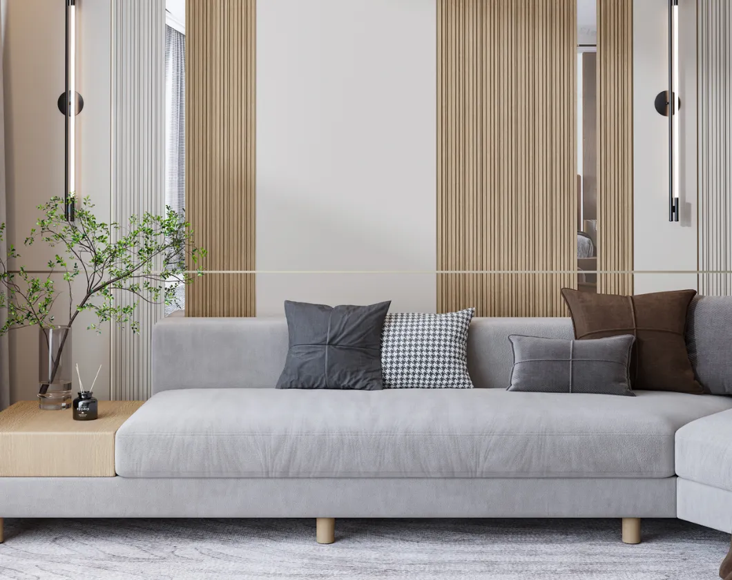
In a finished brand zone of a flower shop, a very understandable problem often arises. The central smooth wall is already highlighted between two fields of decorative slat panels. A logo hangs in the center. The architecture is assembled, materials are selected, and the color scheme is already working. But sometimes the composition seems too dry: the logo remains the only accent, and the smooth surface around it looks a bit too strict for a flower business.
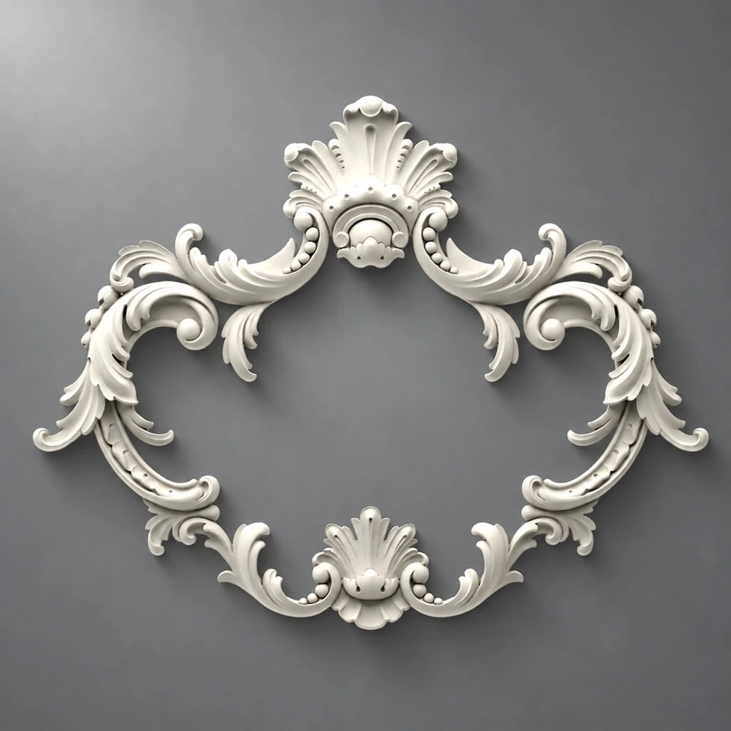
It is precisely in such a situation that the question about one asymmetric carved decorative overlay NPU-474 arises.
The point here is not about "decorating the wall with molding in general." The buyer is not choosing between a dozen ornaments or assembling a complex composition. He is solving a very specific task:
there is a logo, there are slats, there is a smooth field between them — is one small floral overlay NPU-474 needed nearby, or is it better to leave the brand zone clean.
This is what makes the topic commercial.
According to the current STAVROS product card, the following are confirmed:
-
article NPU-474;
-
product type — carved decorative overlay;
-
material — polyurethane;
-
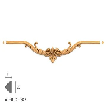
size — 105 × 115 × 20 mm;
-
current price — 1,530 ₽ per piece.
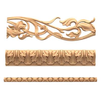
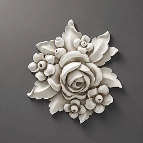
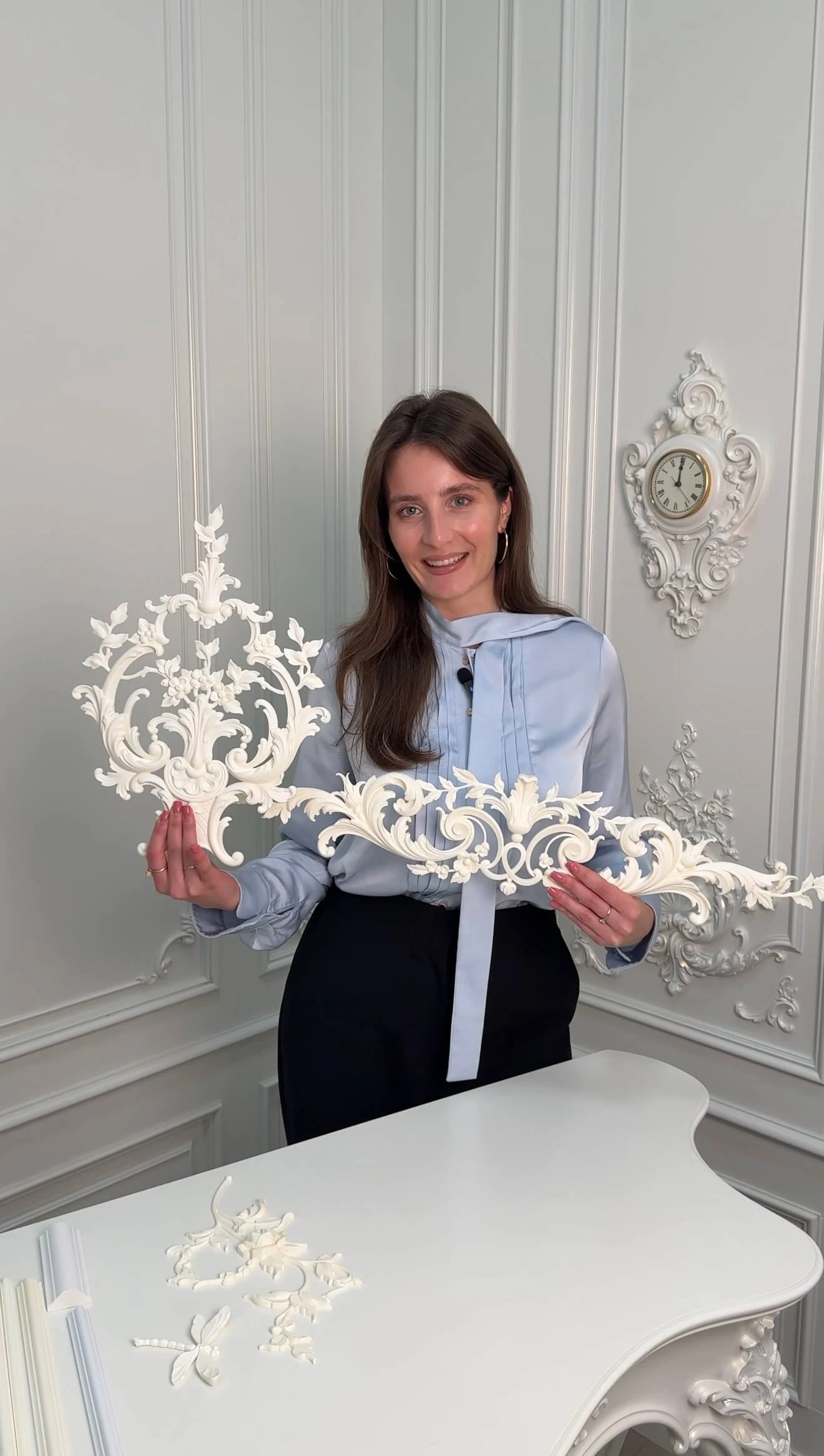
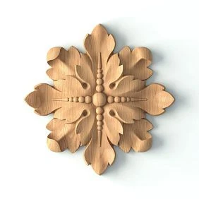
The card describes NPU-474 as an asymmetric overlay with a voluminous floral composition of flowers and leaves and allows application on walls, furniture, and other surfaces. This means that the wall scenario next to the logo is not invented and does not contradict the product's purpose.
If after checking the composition the decision turns out to be positive, you can buy the asymmetric carved decorative overlay NPU-474 made of polyurethane.
But the key conclusion of the article from the very beginning should be honest:
NPU-474 is bought not because a flower shop “always suits floral stucco molding,” but only when one small asymmetric detail really helps the logo and does not turn the brand zone into an overloaded display window.
What exactly is confirmed for NPU-474
| Parameter | Value |
|---|---|
| Article number | NPU-474 |
| Product type | asymmetric carved decorative overlay |
| Material | Polyurethane |
| Width | 105 мм |
| Height | 115 мм |
| Relief / thickness | 20 мм |
| Current price | 1,530 ₽/pcs. |
| Quantity in the original scenario | 1 pc. |
| Drawing | floral composition with leaves |
| Base article object | smooth wall field with logo between slat panels |
It is important to immediately establish two things.
First: the article specifically examines one NPU-474, not a paired scheme, not a symmetrical set, and not a "composition of 3–5 elements." This allows avoiding another typical topic about quantity and focusing on the solution: buying one piece or zero.
Second: the article deliberately does not make NPU-474 the main center of the composition. The main center already exists — it is the store logo. NPU-474 can only be a secondary, supporting accent.

Why this article does not duplicate general materials about molding and slat panels
STAVROS already has materials about decorative slat panels, about combining slats and polyurethane molding, about decorative overlays, and general ways to use wall decor. NPU-474 itself also appears in cards and catalogs.
But this is not the same as a separate product question:
on a finished brand zone of a flower shop next to the logo, should one use a single asymmetrical NPU-474 as an additional accent, or is it better to refuse it.
There is no furniture selection here, no designing an entire wall from scratch, no frames, no multi-component panel, and no set of different products. There is one specific SKU and a specific point of application.
That is why the article should not be about the beauty of molding, but about the hierarchy of the brand zone.
For a general study of material combinations, you can use the STAVROS article how to combine decorative slat panels and polyurethane molding, and for selecting other products — the category of decorative polyurethane overlays. But the specific solution for NPU-474 is covered by this page.
Our factory also produces:

Why the commercial conflict here is stronger than it seems
At first glance, the amount is small: 1,530 ₽ for an overlay is not the price that usually warrants a long expert article.
But the commercial meaning here is not in the budget, but in the risk of error.
If the overlay turns out to be unnecessary:
-
it will disrupt the cleanliness of the brand zone;
-
the logo will lose visual leadership;
-
the plant decor will start to clash with the slats;
-
the interior will start to look "overdressed";
-
fixing it will require dismantling and repainting.
In other words, the article helps avoid not just an unnecessary purchase, but a wrong decision in the most visible area of the store.
In the brand zone, a mistake is always more noticeable than on a secondary wall.
Therefore, even an inexpensive SKU requires professional verification.
Get Consultation
The main feature of NPU-474 is asymmetry
The most important characteristic in this topic is not the price or the material, but precisely the asymmetric shape.
If the overlay were symmetrical, it could be relatively calmly placed on the axis next to the logo or below it, and the composition would remain predictable.
NPU-474 is arranged differently.
It has a direction of ornament. Flowers and leaves form not a strict geometric center, but a lively, shifted silhouette. This means that NPU-474:
-
does not have to be in the center;
-
does not have to have a pair;
-
does not have to work mirror-like;
-
does not have to be perceived as part of the frame.
But precisely for this reason, it requires a more careful fitting.
In the brand zone, asymmetry can become an advantage:
-
soften the geometry of the slats;
-
support the "live" character of the flower shop;
-
add a botanical mood;
-
make the wall less formal.
And it can also become a drawback:
-
distract attention from the logo;
-
create a feeling of a randomly attached ornament;
-
conflict with the symmetrical layout of the slats;
-
make the brand zone less strict than the brand needs.
Therefore, the question here is formulated as follows:
does the brand zone need a bit of "live" asymmetry, or is it more advantageous for the logo to remain the only center on a calm architectural wall.
The logo is already the center of the wall: why shift NPU-474 to the side at all
This is the basic compositional logic of the article.
If the logo hangs on a smooth field between slat panels, then the central axis is already occupied. The logo is both the semantic and visual focus.
This leads to a direct rule:
NPU-474 cannot be considered a second center of the same strength.
It can only be:
-
a secondary accent detail;
-
a soft supporting motif;
-
a delicate asymmetric continuation of the brand theme.
Therefore, in most cases, NPU-474 is not placed directly under the logo on the axis and is not positioned strictly in the center of the wall. It is much more logical to test it:
-
to the left of the logo;
-
to the right of the logo;
-
slightly lower;
-
less often — higher, if the composition allows it.
The meaning of such a shift is not a decorative whim, but the distribution of roles.
The logo is the leader. NPU-474 is the satellite.
If these roles are confused, the small floral overlay starts to interfere with branding.
The logo's protective field is more important than the size of the overlay
In brand design, a logo almost always has the concept of a protective field — space that cannot be invaded by extraneous graphic or decorative elements.
For an interior wall, this rule works exactly the same way.
Before purchasing the NPU-474, you need to determine not only the width and height of the wall, but also the zone where the logo should remain "alone".
A practically useful algorithm is as follows:
-
measure the logo's dimensions;
-
determine its visual protective field;
-
mark the boundaries of this field on the wall;
-
only beyond its limits start trying on the NPU-474.
Why is this critical?
Because the overlay is small — only 105 × 115 mm — and that's why a false sense of security arises: they say, the element is small, so it will fit anywhere.
In reality, a small detail that falls into the logo's protective field can ruin the composition more than a large object at the correct distance.
Especially if the logo itself is built on thin graphics, handwritten typography, or a floral symbol.
Size 105 × 115 mm: is it small or sufficient for a brand zone
On paper, NPU-474 looks small.
But in a real interior, its size is perceived only in comparison:
-
with the logo;
-
with a smooth field;
-
with the width of the slats;
-
with the viewing distance;
-
with the hanging height.
Therefore, the question 'is it too small' should be checked on a real object.
Below is only a scale reference.
| Comparison object | How NPU-474 may be perceived |
| Large logo 1200–1600 mm | as a secondary accent, easily lost |
| Medium logo 700–1000 mm | as a noticeable supporting detail |
| Small logo 400–600 mm | as an element that can already compete for attention |
| Very wide smooth field 1800–2400 mm | as a small decorative insert |
| Narrow smooth field 700–1000 mm | as an active participant in the composition |
These are not norms. This is logic.
With a large brand word on a wide wall, a single NPU-474 may indeed prove too modest, and then the correct conclusion of the article is not to buy it for that area, rather than to seek justification for any decorative gesture.
If the logo is compact and the brand is built on a floral image, NPU-474 may just provide the needed living accent.
A paper template of 105 × 115 mm is mandatory even for an inexpensive SKU
Because of the price of 1,530 ₽, there is often a temptation to 'just order it and try it on site.'
But for a brand zone, even such an inexpensive item should first be checked with a template.
You need to do the following:
-
cut out a rectangle of 105 × 115 mm;
-
preferably print the NPU-474 silhouette at 1:1 scale;
-
temporarily place to the left of the logo;
-
take a photo;
-
move to the right;
-
check the position slightly lower;
-
compare the options from the store entrance distance.
Such a test solves several questions at once:
-
is the overlay too small;
-
is it too close to the logo;
-
from which side does the composition read better;
-
does it get lost against the slats background;
-
does it turn into a random decorative "leaflet".
The template is needed precisely because NPU-474 is asymmetrical. It is much harder to visualize it by numbers than a square or symmetrical ornament.
The paper silhouette and the real NPU-474 answer different questions.
The template has one task — to check the geometry and the role.
The physical overlay is to check:
-
the plasticity of the pattern;
-
the actual 20 mm relief;
-
shadow;
-
the quality of the floral silhouette;
-
painting;
-
the interaction with side light.
Therefore, a reasonable purchase scheme here is as follows:
first the paper silhouette → then the decision to buy 1 piece → then a live fitting as a final element.
In most cases, a separate "sample" is not needed, because the project initially assumes only one overlay. If it passes all checks, it is the one that stays on the wall.
Which side of the NPU-474 logo usually works better
Due to asymmetry, NPU-474 has no universal "correct side." But there is a principle.
You need to look at where the ornament is moving.
If the composition of flowers and leaves seems to "open" inward toward the wall and is visually directed at the logo, it is often perceived as natural. If it seems to "run away" from the logo outward, the connection between them weakens.
In practice, you need to test at least two scenarios:
Option A — NPU-474 to the left of the logo
Suitable if the pattern gently guides the eye to the center or if the left part of the wall is visually poorer than the right.
Option B — NPU-474 to the right of the logo
Suitable if the brand zone reads from left to right, if there is more breathing room on the right, or if the logo graphics are logically better supported from this side.
At the same time, there is no need to strive for mathematical symmetry.
The task of an asymmetric overlay is not to balance the wall with a ruler, but to create a lively, balanced shift.
The left and right options should be compared not by eye at the wall, but in photos.
When a person stands close to the wall, they see the final composition poorly. Especially in a store, where the brand zone is usually perceived:
-
from the entrance;
-
from the sales floor;
-
from the checkout point;
-
in photographs.
Therefore, after each placement option of the NPU-474, it is useful to take the same set of shots:
-
frontally;
-
at a slight angle;
-
from the entrance distance;
-
with a person in the frame;
-
under working light.
Often, a variant that seems convincing against a wall gets lost at a distance.
And vice versa: a modest element in its place in the frame creates the right botanical mood.
For a flower shop, this is especially important because the brand zone often appears:
-
in stories;
-
in photos of bouquets;
-
in reviews;
-
in advertising shoots;
-
in geoservice listings.
Why one NPU-474 is often enough, while two are already redundant
Intuitively, many think: if one decorative detail is good, two will be even better.
But in this scenario, that is not the case.
If you place two NPU-474s, the brand zone changes dramatically according to the logic:
-
pairing appears;
-
decorativeness is enhanced;
-
the logo may end up in a "wreath";
-
the wall loses its cleanliness;
-
the composition becomes less modern.
One NPU-474 works as a hint.
Two — as an explicit ornamental technique.
For a flower shop, this may be justified in a very theatrical or romantic style. But for most modern brand zones, one asymmetrical detail is stronger precisely because of its moderation.
Therefore, the article should honestly promote not "more decor," but a minimally sufficient accent.
That is why the original commercial question sounds like this:
1 × NPU-474 or 0 × NPU-474.
Vertical slats already create an active rhythm: the plant motif should soften it, not duplicate it.
Slat panels are primarily geometry and repetition.
NPU-474 is a flexible floral pattern.
Their combination is interesting precisely because of the contrast:
-
vertical structure + living form;
-
rhythm + organicity;
-
Strict architecture + floral motif.
If the NPU-474 is placed successfully, it softens the geometry of the brand zone and makes the interior more characteristic of a floral business.
If placed unsuccessfully, it simply becomes an extra "leaf" on an already busy wall.
This means that when trying it on, you need to check not only its connection to the logo, but also its connection to the nearest slats:
-
is it too close to their ends;
-
does it visually overlap with the rhythm;
-
does it create accidental touches;
-
is there enough smooth pause around it.
The stronger the relief and contrast of the slats, the more important it is to give the NPU-474 breathing room.
The overlay should not look like part of the logo itself.
This is a very common mistake in brand zones.
If a decorative element is too close to the logo, the visitor begins to read the entire composition as a single sign. For a letter logo, this can be especially dangerous.
The problems can be as follows:
-
the ornament is perceived as an unclear corporate symbol;
-
it creates the impression that the logo is "unfinished" without the decor;
-
the asymmetry looks not like an interior technique, but like a graphic error;
-
the brand system becomes less clean.
Therefore, NPU-474 should be placed so that it remains a separate interior layer, not part of the corporate sign.
In practice, this means:
-
maintain a visual gap;
-
do not place it flush against the letters;
-
do not place it under the logo;
-
do not make its color identical to the logo without checking;
-
do not allow it to intersect with the lines of fasteners or sign lighting.
Color NPU-474: matching the wall, logo, or natural floral palette
For a flower shop, the temptation is obvious: since the overlay is floral, it should be highlighted with color.
But for a brand zone, this is not always correct.
Matching the wall color
The most delicate scenario.
NPU-474 becomes a relief but not a loud accent. It works especially well if the logo is already colored and the slat panels have their own texture.
In the logo color
Possible if the brand palette is laconic and sufficiently neutral. But there is a risk that the overlay will start to seem like part of the corporate graphics.
In the color of the slats
Sometimes this helps to visually connect the side fields and the center. But polyurethane does not replicate natural wood texture, so this technique requires careful cutting.
In a natural floral palette
The most dangerous option. Multi-color painting can quickly make the brand zone too decorative, almost like a storefront. In modern stores, this is rarely justified.
For most commercial interiors, it is safer to start with a monochrome test: paint NPU-474 in the color of the wall or a shade close to it.
The 20 mm relief should be evaluated with lighting, not just from a frontal photo
NPU-474 already has a noticeable depth — 20 mm. For a small overlay, this is a fairly active relief.
What this means in a real store:
-
with soft diffused light, it reads delicately;
-
with directed side light, it creates an expressive shadow;
-
next to a backlit logo, it may become more noticeable than expected;
-
in the evening light, it may appear much more active than during the day.
Therefore, a physical fitting is needed not only for the shape, but also for the volume.
It is especially important to check:
-
light from track lights;
-
light from the display window;
-
logo backlighting;
-
evening mode;
-
photo on the phone.
If the shadow from the NPU-474 is too dramatic, the overlay may look heavier than its actual size.
A flower shop is not always romance; sometimes the brand needs architectural purity.
The mistake of many decorative solutions is substituting the brand with generic associations.
Yes, a flower shop is associated with plants, bouquets, petals, and organic lines. But that doesn't mean any floral pattern automatically improves the interior.
The brand can be:
-
minimalist;
-
premium;
-
modern;
-
Scandinavian;
-
strict and graphic;
-
almost gallery-like.
In that case, even a beautiful NPU-474 might be unnecessary.
Therefore, before buying, you need to honestly answer the question:
does the brand zone really need an additional floral gesture — or would a clean surface with a logo better emphasize the brand's strength.
This is one of the most important points of the expert article: the ability not only to advise buying decor, but also to explain when refusing decor is stronger.
When one NPU-474 is especially appropriate
A purchase scenario is usually justified if several conditions are met simultaneously:
-
the logo is not too small and not too busy;
-
the logo has a free field;
-
a smooth wall between the slats does not look finished without a second accent;
-
the brand allows a soft floral motif;
-
the slats are too strict and ask for softening;
-
NPU-474 is readable at a distance and does not get lost;
-
the 20 mm relief does not become aggressive in light;
-
the overlay does not interfere with the lighting and maintenance of the logo;
-
The color is resolved calmly;
-
One detail looks sufficient, while the second is clearly redundant.
Then the purchase is clear and simple:
1 × NPU-474 = 1 530 ₽.
When it's better not to buy NPU-474
A refusal is not a weak conclusion, but a normal professional result.
NPU-474 is not worth buying if:
-
the logo already fully fills the wall;
-
the brand requires strict graphic cleanliness;
-
the smooth field is too small;
-
NPU-474 gets lost next to a very large logo;
-
the element is too close to the letters;
-
the floral motif visually cheapens the brand zone;
-
the 20 mm relief adds unnecessary heaviness;
-
the slats are already active enough;
-
the logo backlighting conflicts with the shadow of the overlay;
-
after the mockup, neither the left nor the right option looks natural.
In this case, the correct configuration is 0 pcs.
If the brand zone is regularly removed for social media, NPU-474 should be checked as a photocell
This is very relevant for a flower shop.
The wall with the logo often becomes a background for:
-
bouquet shoots;
-
client photos;
-
short videos;
-
promo clips;
-
seasonal compositions.
This means that the NPU-474 must work not only in a static interior, but also in the frame.
In the photo, you need to check:
-
whether the overlay turns into extra spotty patterns;
-
whether it clashes with the bouquet;
-
whether it ends up too close to a person's head;
-
doesn't it complicate the background;
-
doesn't it look like a random dark spot in the shadow.
It also happens that the NPU-474 looks good in person, but in a photo it spoils the clean background for the product. For a store, this is a serious argument against buying.
The position relative to bouquets and the window display composition is also important
In a flower shop, near the logo, there are often:
-
a stand with bouquets;
-
a tall vase;
-
seasonal decor;
-
a stand with packaging;
-
the checkout point;
-
Floral arch for holidays.
Before purchasing, you need to understand whether NPU-474 will be constantly covered by live goods.
If a tall bouquet is regularly placed nearby, the small overlay may simply disappear from the composition. Then it works neither as an interior accent nor as a brand gesture.
Therefore, when trying it out, it is useful to check the wall in a working state, not only in an empty showroom after cleaning.
The mounting surface and the logo must be serviced independently.
NPU-474 is a decorative overlay. The logo is a separate brand object. Their maintenance must remain independent.
What is important to check:
-
whether the logo can be wiped without touching the overlay;
-
whether NPU-474 interferes with access to the sign's fasteners;
-
whether it falls into the lighting wiring zone;
-
will future logo removal require removal of the decor;
-
is the wall surface strong enough.
If the logo is illuminated and periodically serviced, being too close to the overlay can become not only an aesthetic but also a technical mistake.
Categories and internal linking for this article
If after checking NPU-474 is suitable, the logical main transition is to the product card:
If the same logic is needed but with a different pattern or scale, the following sections are useful:
To support the slat cluster within the article, the following links are also appropriate:
Quick algorithm: how to decide the fate of NPU-474 in one site visit
-
take a frontal photo of the wall with the logo;
-
measure the logo dimensions;
-
mark the logo's clear space;
-
measure the smooth zone between the slats;
-
cut out a 105 × 115 mm template;
-
test the left option;
-
test the right option;
-
view both options from the entrance;
-
view both options in the photo;
-
turn on the work light and logo backlight;
-
check that the overlay is not covered by bouquets;
-
decide: whether one NPU-474 enhances the brand zone or not.
If the answer is confident, you can order one piece. If doubts remain, it's better not to rush the purchase.
Mistakes that most often make NPU-474 unnecessary
Mistake 1. Assuming that the store's floral theme automatically justifies floral decor
It doesn't. The brand can be minimalist.
Mistake 2. Placing NPU-474 too close to the logo
Then the overlay starts to look like part of the sign.
Mistake 3. Checking only one side of placement
Asymmetry requires at least two tests — left and right.
Mistake 4. Choosing a bright color without a mockup
Contrast can kill the purity of a brand zone.
Mistake 5. Thinking that two overlays are always richer than one
In most modern brand zones, one NPU-474 is more convincing than a pair.
Mistake 6. Evaluating the overlay only up close
The buyer and client see the wall from a distance.
Mistake 7. Ignoring light and shadow from a 20 mm relief
In evening lighting, the overlay can become too active.
Mistake 8. Not accounting for live merchandise in front of the wall
Bouquets and the display case can completely hide the overlay effect.
Practical decision matrix
| Condition | Solution |
| The logo is graphic and strict | first check the variant without NPU |
| The logo is compact, the brand is soft and floral | NPU-474 should be mocked up |
| The smooth field is large, the logo is lonely | NPU-474 can add a lively accent |
| The smooth field is narrow | High risk of overload |
| The slats are very contrasting | the overlay should be made calm in color |
| There is active logo backlighting | be sure to check the 20 mm relief in the evening |
| Buffers and bouquets often stand against the wall | checking whether the overlay is being lost |
| The left and right variants are equally unconvincing | decline |
| NPU-474 looks like part of the sign | decline or move aside |
| One NPU enhances the composition without taking the center | buy 1 pc. |
Bottom line: whether to buy one NPU-474 next to the logo between slat panels
For this article, the product is fixed: NPU-474 105 × 115 × 20 mm, polyurethane, current price 1,530 ₽.
Its strength lies not in scale or quantity, but in delicate asymmetry. It is this that allows the overlay to become a small living accent next to the logo, rather than yet another focal point of the composition.
But this only works under one condition: the brand zone truly needs a soft additional floral gesture.
If the logo already anchors the wall, if the store's style is minimalist, if the slats are already active, if NPU-474 does not find a natural position on the left or right, the right decision is not to buy it.
If, after the template and photo, it becomes clear that one asymmetrical overlay:
-
supports the floral identity,
-
does not violate the logo's clear space,
-
softens the geometry of the slats,
-
looks natural on one side,
-
does not require a pair,
-
does not overload the background for photos,
then the solution is simple:
1 × NPU-474 = 1 530 ₽.
And this is exactly the case when a small detail does not compete with the brand, but enhances it.
FAQ
Can the NPU-474 be placed directly under the logo in the center?
Technically, you can try it on, but within the scope of this article, it is usually not the best scenario. The logo already occupies the central axis, and the NPU-474 works better as a side asymmetric accent.
Is it mandatory to install two NPU-474s to "balance" the wall?
No. For most brand zones, a single overlay is actually more appropriate. Two quickly shift the composition into a more decorative and less modern mode.
What matters more — the size of the wall or the size of the logo?
In this context, the size of the logo and its protective field matter more. The wall can be large, but if the logo is already strong, the secondary decor should yield to it.
Will the NPU-474 measuring 105 × 115 mm get lost?
It can get lost — especially next to a very large logo or on a wide wall. That is why a template try-on is mandatory.
What color is best to paint NPU-474?
The safest approach is to start with the wall color or a tone close to it. A contrasting or multicolored floral finish requires separate testing and can easily overload the brand zone.
Can NPU-474 be used in a store on furniture rather than on a wall?
Yes, the STAVROS card allows use on furniture and other surfaces. However, this article only covers the wall scenario next to the logo.
Is a molding frame needed around NPU-474?
No, a frame is not required for the original task. The overlay is tested as an independent small accent.
What to do if NPU-474 is liked but doesn't look good next to the logo?
Then there's no need to force it into the brand zone. You can look at other surfaces in the store or choose a different scenario for using asymmetric decor.
Is NPU-474 suitable for a minimalist brand?
Sometimes yes, but only in a very delicate presentation. If after the mockup the detail makes the wall more 'salon-like' than brand-like, it's better to skip it.
Where can I see other asymmetric options?
In the category asymmetric polyurethane overlays STAVROS you can choose a different pattern or character of the ornament.