































































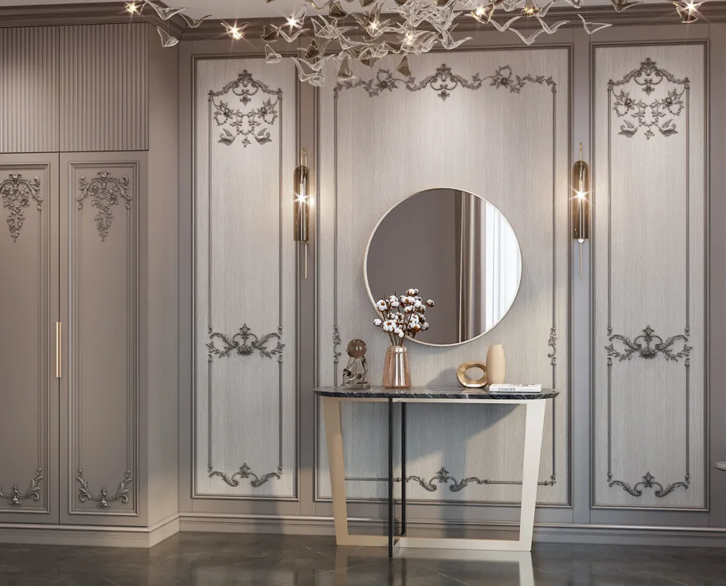






Article Contents:
- Why a verbal color description is not enough for serial factory finishing
- Why "white matte" is not enough for a large order
- Why one color code does not guarantee the same result
- Profile geometry changes the perception of the same coating
- What a control sample is and why it is needed
- A physical sample is more reliable than a photo and correspondence
- What to specify in the factory finish specification
- Why color and gloss level must be approved together
- Opaque and transparent finishes are different tasks
- Surface preparation affects the result no less than the topcoat
- How many color samples to prepare
- Sample versions: how not to confuse a rejected option with an approved one
- Who should approve the control color sample
- Where to view the sample before approval
- Comparison with the wall: what “matching the wall color” means
- Comparison with the door and door casing
- Comparison with furniture and wall panels
- One SKU in several colors means several finishing positions
- The control paint sample must survive several project phases
- The first production piece: inspection before a large volume
- If the first production piece differs from the approved sample
- Lighting is a mandatory part of visual comparison
- A color change after approval is a new finish version
- The same coating on multiple profiles also needs to be checked
- Two-tone and combined finishes require a separate sample
- Ends and installation cuts must be agreed upon before the batch starts
- Labeling is needed only to preserve the link "SKU → finish → zone"
- Phased delivery: the reference must outlast the first batch
- Network sites: physical color sample becomes part of the corporate standard
- Renovation of an existing interior: the new color is compared with the old actual surface
- When the control color sample can be simplified
- When the control color sample is mandatory based on the project's common sense
- Practical example: a white skirting board should visually blend with the wall
- Practical example: the molding and the door should look like one system
- Practical example: cornice under directional lighting
- Practical example: one profile in two finishes was mixed up between rooms
- Why the control color sample is economically more important for large volumes
- When the lowest offer price does not show the full cost
- How to give the supplier a final brief without ambiguity
- How to accept a large batch against the approved reference sample
- What to do if part of the batch looks visually different
- A gloss meter is useful when the project needs a reproducible degree of gloss
- But a single measured value does not describe the entire appearance
- A colorimeter or spectral measurement is also an auxiliary tool
- When instrumental control is excessive
- When it is especially useful
- The reference may eventually cease to be reliable
- What needs to be kept together with the color swatch
- The sample is stored in a secure place
- Before a repeat batch, the reference itself needs to be inspected
- For networked sites, a master reference and a working copy can be stored
- Not every interior element has to have an absolutely identical coating system
- The main question is what matters more for the project: literal coating identity or consistent perception
- The decision is made on the physical set of samples
- This difference needs to be documented
- 15 mistakes when approving factory finishes
- Checklist before launching the main batch
- A finish matrix for a large project helps reveal hidden duplicates and conflicts
- When a single finish reference cannot be automatically applied to the entire range
- How to handle finishes across multiple deliveries for a single project
- How to tell that a sample is ready for approval and does not need another round
- Decision tree before launching a production finish
- What the reader should specify in the order instead of “white matte molding”
- What control to keep after launching a production run

The specification for a large project states: “wooden molding, white color, matte.” The client envisions the future interior as a calm warm white without noticeable sheen. Production interprets the task as a different white shade and a different level of matte. Formally, both parties read the same words, but they expect different surfaces.
The problem is discovered only after hundreds of meters have been manufactured. On the wall, the profile looks cooler than the door, reflects light more noticeably under side lighting, and on complex relief the same color and finish are perceived differently than on a flat paper fan deck. No one made a literal mistake: the original brief was too general.
Therefore building materials wholesalers and the client must approve, before the production batch is launched, not only the color name or its code, but also the actual appearance of the finished product. For a responsible project, the working point of approval becomes a physical control sample: a real profile or a representative sample with the intended finishing system, color, gloss level, and surface character.
SKU → MATERIAL → FINISH TYPE → COLOR → GLOSS / SURFACE CHARACTER → CONTROL SAMPLE → CHECK NEXT TO WALL / DOOR / FURNITURE → REVIEW UNDER WORKING LIGHTING → APPROVAL OF REFERENCE STANDARD → PRODUCTION BATCH
The central principle is simple: the color of wooden trim cannot be reliably ordered with a single phrase like “white matte” or even a single color code if the project requires an exact visual result. The code is needed to identify the shade, but the physical sample shows the combination of color, gloss, profile, substrate, preparation, and lighting.
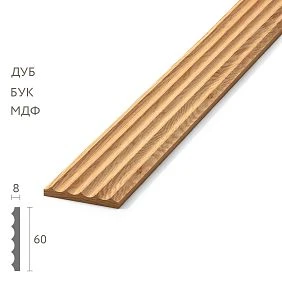
Why verbal color is not enough for production factory finishing




Why “matte white” is not enough for a large order
Color is only one parameter of the finished surface
The appearance of painted trim is made up of several things at once:
- the shade itself;
- lightness and saturation;
- opacity of the coating;
- gloss level;
- surface texture;
- preparation of the wood or MDF;
- primer;
- application method;
- profile geometry;
- indoor lighting.
Two parts may be painted in a similar or identically designated color, yet be perceived visually differently due to the surface and light reflection.
White is especially sensitive to its surroundings
"White" is almost never perceived in a vacuum. Nearby are a painted wall, a door leaf, a casing, a ceiling, furniture, textiles, and lighting. If one white is slightly warmer, another cooler, and a third surface noticeably glossier, the difference is read immediately precisely because the viewer expects a unified system.
Matte is also not a single visual state
In professional practice, the degree of gloss can be specified instrumentally or by categories of a specific coating system. But the word "matte" in conversation is too broad. One client expects an almost completely dead surface, another a soft silky sheen.
Therefore, what matters to the project is not the term itself, but an approved real sample.
Our factory also produces:





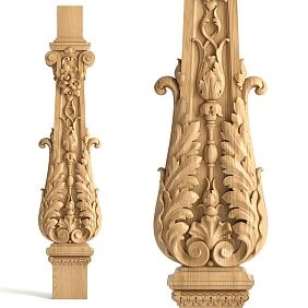

Why one color code does not guarantee the same result
A color code sets a reference point, but does not describe the entire surface
If the project adopts RAL, NCS, or another standard, the code helps to unambiguously name the shade. But it does not automatically communicate:
- what substrate the finish is applied to;
- what primer was used;
- how matte or glossy the surface is;
- whether the wood texture is visible;
- how light reflects off the relief;
- what textured effect the coating has.
The same shade on different materials may be perceived differently
Painted plaster, MDF, solid wood, and a door leaf have different structures and surface preparation. Even when aiming for a single color standard, the final visual surface does not necessarily look absolutely identical.
Therefore, the color code is part of the specification, not a replacement for a control sample
A work order for a large batch should not look like:
White, matte.
But rather:
Item code ___ / material ___ / color per approved code ___ / finish ___ / gloss level per approved reference sample VK-03 / physical sample approved.
Get Consultation
Profile geometry changes the perception of the same coating
A flat board and a deep cornice reflect light differently
On a flat surface, the color reads relatively evenly. A relief molding or cornice simultaneously has:
- face surfaces;
- sloped chamfers;
- concave areas;
- convex radii;
- deep shadows;
- areas where light falls at different angles.
Because of this, the same finish can look "deeper," lighter, or more contrasting on different areas of the profile.
Directional lighting enhances the difference
A cornice under hidden lighting and the same sample under even workshop lighting are perceived differently. Side light emphasizes the relief and reflections of the surface. Therefore, it is useful to view a sample for a critical decorative profile in a scenario close to the future one.
That is why it is better to make a control color sample on the actual profile
If a project is critical to the finish, a flat board shows only the color of the coating. A real molding or cornice shows the color together with the relief, light and shadow, and the character of the gloss.
Control color sample: a physical reference instead of a photo and correspondence
What a control color sample is and why it is needed
When wholesale building materials companies work with custom finishes, the control sample becomes a simple agreement between architectural expectation and production.
The control sample is a physical reference of the future result
This is a real sample of the product or a representative material, prepared as closely as possible to the future production technology. It is used to approve:
- shade;
- the character of the finish;
- gloss level;
- the visibility of the wood grain;
- the visual surface after preparation;
- the interaction with the product's relief.
The reference turns subjective expectation into a reproducible point of comparison
Before it appears, the parties discuss words: "warmer," "a bit more matte," "not so milky," "closer to the wall." After approval, you can simply place the production part next to it and compare.
The control sample must not be a random piece
It must be linked to a specific product code, material, project, and finish version. Only then does it become a working reference standard, rather than "some white sample from the office."
A physical sample is more reliable than a photo or a chat message
The camera alters the original image
The phone automatically adjusts exposure, white balance, saturation, and contrast. Then the image is displayed on another screen with its own brightness and color rendering. For general discussion, this is sufficient; for approving a complex neutral shade, it is not.
A messenger is good for communication, but not for the final reference standard
A photo can help formulate a direction: "this option is warmer," "that one is too glossy." But the final large batch must reference a physical sample or another unambiguously approved material reference standard.
Close neutral shades are especially risky
Milky, gray-beige, complex whites, muted grays, and green tones on a screen are easily perceived differently than on a real surface.
What should be in a factory finish specification
What to specify in a factory finish specification
Before finishing material suppliers receive the main request; it is useful to separate the finishing part
| Field | What to fix |
|---|---|
| Article number | Exact profile |
| Material | Oak, beech, MDF, or other finish |
| Finish type | Opaque / transparent / semi-transparent / other |
| Color | Code and/or link to the approved reference sample |
| Gloss | According to the approved sample or the project system |
| Wood grain | Must be visible / must be maximally covered |
| Surface character | Approved result after preparation |
| Reference sample | Version code and storage location |
| Zone | Where a specific finish option is used |
If a single SKU has multiple colors, these are already multiple finish positions
Geometrically, the molding remains the same SKU, but in the finish schedule it appears as separate line items: white for the lobby, dark for the restaurant, "wall color" for the guest rooms.
They cannot be combined into a single line "molding — 600 m"
Otherwise, production, procurement, and the warehouse lose information about the purpose of each group.
Why color and gloss level must be approved together
Gloss changes the character of reflected light
A more matte surface diffuses reflections more strongly. A glossier one produces noticeable highlights. Because of this, the same shade may appear lighter, deeper, cooler, or more contrasting depending on the surface and viewing angle.
The category name is not always enough
"Matte," "semi-matte," and "satin" are convenient words, but different coating systems and manufacturers may use them slightly differently. For a critical project, it is better to link the name to a specific approved sample.
If the project uses an instrumental gloss value, it is recorded together with the sample
Professional systems can measure gloss in conventional units using a standardized method. But it is not necessary to universally declare that "matte always equals a specific range" for any coating and product. In a project, either a specific technical system is used, or the actual control sample becomes the main visual reference.
Gloss cannot be changed after color approval as a "small adjustment"
If the shade was approved on one finish and then it was decided to make the surface noticeably more matte or glossy, the visual result changes. This means a new sample is needed.
Opaque, transparent, and combined finishes
Opaque and transparent finishes are different tasks
Opaque finish
The main visual result is determined by the coating. The wood grain should be hidden as much as possible or play a minimal role, depending on the chosen technology. During approval, color, surface character, gloss, and quality of substrate preparation are especially important.
Transparent finish
Here the wood remains part of the visual result. The overall appearance is influenced by:
- wood species;
- natural wood tone;
- grain pattern;
- tinting compound;
- lacquer, oil, or another finishing system;
- Degree of gloss.
Semi-transparent tinting occupies an intermediate position
It simultaneously changes the color and preserves part of the natural pattern. Therefore, a sample on a different species or a different workpiece can mislead the customer.
For a transparent finish, a sample is needed specifically on the selected species
If the project uses oak, approving a tint on beech or MDF is pointless. The substrate becomes part of the final color.
Surface preparation affects the result no less than the finishing layer
The same composition on two differently prepared parts may look different
Sanding, priming, intermediate treatment, and surface cleanliness affect how the coating lays down and how it reflects light. Therefore, the physical color sample must be made using a process close to the future production one.
An untreated blank does not show the final result
On "bare" wood, it is impossible to reliably assess:
- the final shade;
- coverage;
- gloss;
- the depth of the relief after coating;
- the contrast of pores and fibers with a clear finish.
A flat test piece is also not always representative
For a simple flat baseboard, it may be acceptable. For a deep cornice, a molding with several radii, or a strip with a pronounced chamfer, it is better to use the actual profile.
How many color samples to prepare
There is no universal number
If the customer already knows exactly which finish is needed, it is enough to confirm a specific option. If a choice is being made between several similar solutions, you can make several meaningfully different samples.
Dozens of nearly identical options only complicate the decision
Participants start getting confused, remembering "the one that was a bit warmer," and then procurement doesn't understand which option was actually approved.
Each sample should differ by a clear parameter
For example:
- option A — cooler;
- option B — warmer;
- option C — same color, but more matte.
If the difference cannot be articulated, perhaps that many samples aren't needed.
Sample versions: how not to confuse a rejected option with an approved one
The phrase "sample #1" quickly loses meaning
A month later, the team no longer remembers how it differed from #2. After a change of manager, the situation gets even worse.
Better to use a clear card:
| Code | What has been changed | Status |
|---|---|---|
| VK-01 | Original white, soft matte finish | Rejected |
| VK-02 | Warmer in tone | Rejected |
| VK-03 | VK-02 shade, more subdued sheen | Approved |
There should be only one approved sample
If multiple finishes are used, each has its own final reference. But within a single finish item, participants must understand which sample is currently in effect.
Rejected samples are not stored nearby without a status
Otherwise, after a few months, someone might accidentally send the old version into production.
Who should approve the control color sample
The decision must belong to a pre-defined party
This could be the client, architect, designer, technical client, or another responsible person. What matters is not the title, but the authority.
The purchaser should not choose between two similar shades on their own
If building materials supplier sent two samples, procurement organizes the approval, but does not make the architectural decision "this one is prettier" on their own.
Production should receive the result, not the history of the discussion
Final package:
Item code ___ / finish VK-03 / approved ___ / date ___.
All previous correspondence and comments remain history only.
How to view a sample: lighting and real interior context
Where to view a sample before approval
For a standard area, comparable conditions are sufficient
The sample does not have to be taken to every room. But it should be evaluated under normal lighting, without an extremely dark room or a random bright lamp right up close.
For key areas, it is useful to look at the real scenario
The main hall, restaurant, store, executive office — there the color of the trim is read next to the wall, door, and furniture. It is useful to bring the sample directly into the interior or to the approved mockup.
Workshop lighting is not the only criterion
What looks neutral in a production room can change noticeably in perception under warm interior light.
If the profile is visible both during the day and in the evening, check both lighting conditions
This is especially important near stained glass, decorative lighting, and spotlights.
Coordination with walls, doors, furniture, and panels
Comparison with the wall: what does "matching the wall color" mean
When construction materials suppliers receive the task "molding to match the wall color," and it needs to be interpreted.
First, the wall itself is approved
If the wall has not yet been painted, two independent teams should not receive the same instruction "make it white" and then hope for a match. There must be a single reference set.
The trim is compared next to the actual surface
Evaluate:
- shade;
- lightness;
- gloss level;
- the texture;
- reaction under side lighting.
The same color code does not have to look identical on plaster and on a textured profile
Therefore, the architectural solution can be of two types:
- maximum visual match;
- a deliberately different finish with a close shade.
Both options are acceptable if approved in advance.
Comparison with the door and casing
Color and sheen must be evaluated simultaneously
A white wooden skirting board next to a white casing may look like the "wrong white" only because one element is matte and the other is satin or more reflective.
It is better to compare physical samples
Not a PDF of the door or a photo of the facade, but a real sample of the door unit finish or a confirmed paint swatch.
If an exact match is not required, this is also recorded
For example, the door is intentionally slightly warmer than the walls, and the baseboard is closer to the wall. Then the future inspector should not consider this difference an error.
Comparison with furniture and wall panels
When Wholesale building material suppliers when furnishing a hotel, restaurant, or office, the same color often needs to tie the trim to furniture fronts and panel systems.
It is necessary to determine the role of the trim
It can:
- match the furniture exactly;
- match the wall;
- serve as an intermediate neutral tone;
- work as a deliberate contrast.
The phrase "beige like the furniture" is too imprecise
A furniture facade can have its own texture, sheen, and color from different angles. That is why physically placing samples side by side gives the best answer.
One SKU in several colors means several finish positions
The geometry stays the same, the appearance does not
A single molding can be used in a white lobby, a dark restaurant, and matched to the wall color of hotel rooms. In the product nomenclature, it may remain one SKU, but for the finish schedule it is three separate configurations.
The schedule must link profile, finish, and zone
| Article | Zone | Finish | Reference | Quantity |
|---|---|---|---|---|
| Profile A | Hall | White, matte per sample | VK-03 | ___ |
| Profile A | Restaurant | Dark, semi-matte per sample | VK-07 | ___ |
| Profile A | Numbers | Wall color | VK-11 | ___ |
Total meterage without breakdown is risky
If a purchase order states "Profile A — 900 m", production and warehouse cannot see how many meters belong to each color. During order picking, identical geometry begins to mix.
Phased deliveries, a network of sites, and renovation of an existing interior
The control color sample must survive several project phases
When wholesale building material suppliers work with the site in phases; the first batch may be produced in spring, the second in summer, the third in winter. The color name in an old order is not a sufficient reference for reproduction.
A physical sample preserves the actual result of the first phase
It shows:
- the actual shade;
- actual gloss;
- surface character;
- the coating's reaction to a specific profile;
- visibility of the wood grain.
The reference is kept as a control object, not as an installation leftover
It is signed off and protected from scratches, water, strong light, and accidental use. If the installer takes the sample for a short section, the second shift will lose the original point of comparison.
If one sample shows both the geometry and the finish, that is fine
It is not necessary to keep two separate fragments. It is only important to understand which properties are checked against it. In a geometric comparison, the profile is assessed; in a visual one, the color, finish, and gloss.
The first production part and the control check before a large volume
The first production part — the control check before a large volume
An approved color sample does not yet prove that the production batch looks the same
After launching the actual production process, it is useful to compare the first production part or a representative element with the final reference.
Checked:
- color;
- surface character;
- gloss level;
- coverage;
- the visibility of the wood grain;
- overall appearance of the relief.
If the issue is found on a single part, the solution space is wider
You can stop, compare the source data, understand the cause, and adjust the process before hundreds of meters are produced.
If the discrepancy is found after the entire batch, the cost of the solution is higher
Then packaging, delivery, storage, the installation schedule, and commercial relationships are affected. That is why Building materials suppliers wholesale and the customer benefit from a checkpoint before serial production.
If the first serial part differs from the approved sample
We do not start mass use automatically
First, the physical sample and the serial part are compared side by side under comparable conditions.
We check four groups of causes
- Documentation. Was the correct finish version transferred to production?
- Substrate. Was the correct material and preparation used?
- Finish. Have the coating system or process conditions changed?
- Lighting. Is a fundamentally different comparison environment creating the difference?
State the difference specifically
Not:
the profile is different.
But:
the production part appears visually glossier compared to the VK-03 reference under the same lighting.
Or:
the shade of the production part shifts cooler than the approved sample next to the control wall panel.
Lighting is an essential part of visual comparison
Comparison must be made under comparable conditions
One sample under bright cold light, the other in a dark room — a poor basis for a conclusion. For a fair comparison, they are placed side by side.
Natural and artificial light can create different impressions
If a space is actively used both during the day and in the evening, it is useful to view the key sample in both modes. This is especially relevant for hotel lobbies, restaurants, shops, and representative interiors.
Directional light emphasizes gloss and texture
With a cornice or deep molding, local lighting can more strongly reveal:
- reflection;
- difference in matte level;
- minor preparation defects;
- surface unevenness.
If the project includes such lighting, it is better to evaluate a sample before placing a serial order.
Finish versions and changes after approval
A color change after approval is a new finish version
You cannot simply correct the name in the table
If the architect chooses a different shade after VK-03, the old physical sample no longer matches the documentation.
The correct sequence is:
new color → new control drawdown → new approval → new active version → production.
The old sample receives the status “rejected”
It may be kept as history, but it must not be stored in the same place as the active reference without labeling.
Versioning is especially important when there are several responsible parties
The architect may see the new version, procurement may continue working with the old one, and production may receive a third photo. A single code for the approved sample breaks this chain of confusion.
One finish on different profiles: when one reference sample is not enough
The same coating on multiple profiles also needs to be checked
When a building materials supplier wholesale receives an order for a skirting board, moulding, cornice and architrave in one finish, it is not enough to check only the flattest element.
One color, different geometry
A flat architrave and a deep cornice with the same coating may be perceived slightly differently due to light and shadow. This is not necessarily an error — the question is whether the effect is acceptable for the specific interior.
Critical geometry types are best shown together
If in one room the following are visible at the same time:
- plinth;
- door casing;
- molding;
- cornice,
it is useful to place four finished samples side by side and check whether the finish looks like a unified system.
You don't have to make dozens of reference samples
If the technology and material are the same, one primary reference can define the color and gloss, while additional profiles confirm how this finish looks on a different geometry.
Two-tone and combined finishes require a separate sample
A verbal description is not enough
The phrase "the main part is white, the groove is golden" does not show:
- the exact boundary of the colors;
- the width of the accent area;
- the nature of the transition;
- the gloss of each section;
- how the pattern behaves on corners and joints.
A real profile is needed
Only it shows how the finish sits on the relief and how neatly the boundary reads.
Serial production capability is verified separately
For complex handcrafted or combined finishing, it is important not only to approve a beautiful single sample, but also to understand whether the production process can reproduce it at the required volume.
End faces and installation cuts must be agreed upon before the batch is launched
If materials supplier supplies moulding with a finished factory coating; part of the finish will be compromised during cutting.
A visible factory end face and an installation cut are different situations
If the end face remains exposed in the finished interior, its finishing must be part of the architectural design. If the end face is concealed within a joint, the requirements are different.
It is necessary to understand the system for local touch-up
Before installation, determine:
- who processes the exposed cut areas;
- what material is used;
- which physical reference sample is considered correct;
- how the shade and gloss of a local touch-up are checked.
A local touch-up must not create spots
If the factory surface is matte and the cut area is covered with a noticeably glossier compound, even a close color will read as different.
Labeling and separation of multiple finishes on a project
Labeling is needed only to preserve the link “SKU → finish → zone”
This is not an article about warehouse accounting
But with several colors of the same profile, identification cannot be completely ignored.
Minimal labeling
Profile A / VK-03 / Hall / 24 pcs.
Or:
Profile A / VK-11 / Rooms 301–320.
So identical geometry does not get mixed up
After the outer transport packaging is removed, the groups remain recognizable.
Phased delivery: the reference sample must outlast the first batch
When Material suppliers they work on the project across several queues, the approved physical color sample is retained until the project is completed.
The next batch is checked against the same reference sample
Not just against the color name from the previous invoice.
If a new batch must match an old one, the check becomes stricter
Especially if the elements are visible next to each other. Then, in addition to color and sheen, a comparison with the actual installed surface may be needed, because use and lighting have already changed how it is perceived.
If the new queue is in a separate building
The criticality of adjacency is lower, but the corporate finish standard is still confirmed against the reference sample.
Network objects: physical color becomes part of the corporate standard
Each new restaurant should not choose its "own white" again
If a chain wants a consistent interior look, the approved profile and its finish become part of a repeatable standard. The next location receives not the phrase "like in the previous restaurant," but a reference to the current reference standard.
What to store in the corporate finish card
| Field | Content |
|---|---|
| Article number | Which profile is used |
| Material | Product base |
| Finish code | Internal chain / project code |
| Color | Approved code or designation |
| Gloss | By physical reference standard |
| Physical sample | where it is stored |
| Related reference standards | Wall, door, furniture if necessary |
| Status | Active / archived |
A corporate standard must have a version
If the network design has been updated, the old paint color is not destroyed without a trace. It becomes archived, and the new finish receives its own code. This helps repair old sites while not confusing them with new ones.
Repair of an existing interior: the new color is also compared with the old actual surface
The original reference and the installed profile may not look exactly the same after years
The following affect a finish in use:
- light;
- ultraviolet;
- regular cleaning;
- mechanical wear;
- local repairs;
- natural aging of the coating.
A repeat order solves a different problem than a new build
It is necessary to determine what the new element should match: the original physical reference, the neighboring profile that has actually aged, or a new group of parts that will be replaced entirely.
Exact local matching is not always possible
If the old coating has changed noticeably, the project chooses an architecturally acceptable scenario:
- replace only one part and accept a small difference;
- replace a group of elements in one composition;
- use the natural boundary of the room;
- coordinate a new finish for a larger area.
There is no universal answer. The main thing is not to promise a perfect match just because the color name was preserved in an old document.
When the control spray-out can be simplified, and when it is especially needed
When the control spray-out can be simplified
The standard color has already been applied many times on the same product and project
If the finish is consistently used on a repeat batch, the physical reference is preserved, and the material and technology have not changed, there is no need to run a new design cycle each time. A serial comparison with the current sample is sufficient.
The profile is completely hidden after installation
If the area is not visible and the appearance truly does not affect the interior, strict visual control may be excessive. But the technical quality of the finish must still meet the order requirements.
The trim will be painted after installation as part of the same system as the wall
Then the factory color is not the final architectural result. The task shifts toward surface preparation and compatibility with the subsequent finish. In such a scenario, a separate factory control spray-out may not be needed.
Simplification is permissible only when it does not destroy an important criterion
If the color must precisely match the skirting board to the door, skipping the sample to save a few days is a poor compromise.
When a control paint sample is essential for the project's common sense
When delivery of finishing materials with custom factory finishing, a physical reference is especially justified if:
- the volume is large;
- the shade is complex and neutral;
- the profile must match the wall or door;
- multiple contractors are used for adjacent finishes;
- the project is repeated across a network of sites;
- the finish is transparent or semi-transparent;
- the texture is deep and interacts strongly with light;
- delivery is made in several batches;
- the cost of rework is high.
The more expensive a serial error is, the cheaper the sample stage looks
For a single skirting board, you can afford on-site adjustments. For thousands of linear meters, the wrong finish becomes a separate project problem.
Practical example: a white skirting board should visually blend with the wall
Initial task
The designer wants a tall wooden skirting board to read as a continuation of the wall and not create a contrasting lower contour.
Insufficient scenario
The order specifies one color code for the wall and the skirting board. The wall is painted with matte architectural paint, while the skirting board is painted with a more durable enamel with a different surface character. After installation, the shade is close, but the profile reflects noticeably more light.
Working scenario
- the actual wall finish is approved;
- a control paint sample is applied on the baseboard;
- the samples are placed side by side;
- they are viewed under daylight and primary artificial light;
- if necessary, the shade or finish character is adjusted;
- the physical reference standard is approved;
- the production batch is checked against it.
The main result
The project approves not a "matching color number," but the actual visual adjacency of two different materials.
Practical example: molding and door should look like one system
When finishing materials wholesale for a hotel, white doors, casings, baseboards, and moldings are often perceived as a single architectural set.
Risk
The door finish has a soft satin sheen, while the molding was ordered in a matte finish. The color code is close, but under side lighting the elements look like they come from different sets.
Check
A physical molding sample is placed next to the actual door casing. Evaluate:
- shade;
- gloss;
- surface character;
- the overall effect under working lighting.
Solution
Either the molding finish is adjusted, or the designer deliberately approves the difference. The main thing is to confirm it before placing a bulk order.
Practical example: cornice under directional lighting
In normal light, the sample looks suitable
The white cornice appears calm and even.
After the concealed lighting is turned on, the surface begins to glare more strongly
The relief creates bright bands of light on the raised areas. As a result, the cornice looks noticeably glossier than the architect expected.
The decision is made based on the sample
to buy finishing materials wholesale with an individual finish, it is worth checking the control profile in the intended lighting scenario. Adjusting the matte level before the series is cheaper than after installing the entire perimeter.
Practical example: one profile in two finishes was mixed up between rooms
Initial situation
Profile A is used in 60 rooms in the wall color and in the common corridor in a contrasting white color.
Bill of materials error
The order has the total linear meters, but no breakdown by finish. After delivery, the packages are distributed across floors, and part of the white
Why a control sample is economically more important for large volumes
The error scales proportionally to the batch
One incorrectly painted skirting board can be replaced locally. If the same finish is applied to 1,500 m, the issue affects the entire delivery.
The cost of a sample is incomparable to the cost of mass rework
There is no need to invent a universal cost for control. The economic principle is obvious even without figures: a small test fragment is cheaper than reprocessing or replacing a large batch.
The risk is especially high with custom finishing
A standard stock color can be replaced with a ready-made option. An individually matched shade, complex matte finish, or combined finishing require a new production cycle.
When the lowest offer price does not show the full cost
When wholesale supplies of building materials two offers may include different amounts of preparatory work.
| Parameter | Offer A | Offer B |
|---|---|---|
| Profile | Identical | Identical |
| Custom color | Yes | Yes |
| Control spray-out on the actual profile | Enabled | No |
| First production part check | Provided | No |
| Marking of multiple finishes | Provided | Clarify |
| Price | ___ | ___ |
You need to compare the same scope of service
If one supplier simply paints by code, while another includes samples, versions, production verification, and zoning, the final prices describe different processes.
How to hand over the final task to the supplier without ambiguity
The package should be short but sufficient
for materials in bulk with factory finish, it is useful to provide:
- article number;
- the material;
- volume;
- finish type;
- color code, if used;
- code of the approved stain;
- required sheen level;
- whether the wood grain should be visible;
- breakdown by zones for multiple options;
- requirements for visible edges;
- contact of the person responsible for final approval.
There is no need to provide the entire discussion history
Production needs the current version. Ten old files and thirty messages saying "this one is slightly warmer" only increase the risk of error.
The physical reference is linked to the document
For example:
Finish: VK-03. The physical reference VK-03 is kept by the customer and confirmed by both parties.
How to accept a large batch against an approved reference
Acceptance begins with identification
First, check that the batch belongs to the correct article and finish. Then serial parts are compared with the control sample.
Evaluation is carried out under comparable lighting
There is no need to set up a laboratory in the warehouse, but comparing one part under a spotlight and another in shadow is incorrect.
Do not check only the first plank
For a large batch, a reasonable sample from several packages is useful. There is no need to invent a universal quantity: the depth of control depends on the volume, complexity of the finish, number of batches, and criticality of the project.
If the overall range appears stable, the batch proceeds to the standard installation process
If a systematic visual difference is detected, the material is not thoughtlessly mixed with already accepted finishes; instead, the cause is investigated first.
What to do if part of the batch differs visually
We do not declare the entire volume problematic based on one item
First, the scale is determined:
- one package;
- one production group;
- several random items;
- a systematic difference across the entire batch.
Compare with the physical reference sample
It is this that shows whether there is a real deviation from the approved result.
We separate color, gloss, and surface defect
The phrase "looks different" can mean:
- a different shade;
- a different level of matte;
- uneven coating;
- a scratch;
- a preparation defect;
- the effect of different lighting.
The decision is made after diagnostics
Depending on the contract and the cause, this may be additional inspection, redistribution, adjustment, replacement, or another agreed action. A universal commercial procedure cannot be invented.
Instrumental measurements help with series consistency, but do not replace a physical reference standard
A gloss meter is useful when a project needs a reproducible degree of gloss
The degree of gloss can be measured with an instrument according to the methodology established for a specific system. This is convenient if a large batch is produced in several series and the customer wants not only to visually compare samples, but also to monitor the stability of the production parameter.
The instrument is especially useful when:
- the project is sensitive to gloss;
- the same finish is repeated across several batches;
- several profiles must be perceived as one system;
- there is a need to discuss the deviation between the reference standard and the series surface more objectively.
But a single measured value does not describe the entire appearance
Even with a close gloss value, two surfaces can be perceived differently due to texture, relief, color, and the direction of light. Moreover, a deep cornice cannot be reduced to a single flat reflection zone: different sections of the profile work at different angles.
Therefore, the instrument answers a narrow question — "how close is the reflection parameter in the selected zone" — while a physical reference answers a broader one: "does the finished profile look the way the project approved."
A colorimeter or spectral measurement is also an auxiliary tool
Instrumental color comparison can help production control repeatability. But surface measurement depends on the methodology, the type of instrument, the measurement geometry, and the surface itself. Glossy, rough, and textured surfaces create different measurement conditions.
For an architectural project, the safe logic is as follows:
- a physical control sample defines the approved visual result;
- instrumental values, when necessary, help production and quality reproduce it;
- visual comparison is carried out under comparable lighting;
- in a dispute, the difference in color is separated from the difference in gloss and texture.
When instrumental control is excessive
For a small order in a standard color, where the trim does not need to match other materials exactly, a full measurement system may not provide practical benefit. An approved sample and a routine production check are sufficient.
When it is especially useful
For a network standard, multiple production batches, complex neutral shades, and a large number of identical profiles, an additional numerical control point can reduce subjectivity. But it must always be tied to the same physical reference, not exist separately from it.
The control sample also needs to be stored properly and checked periodically
The reference may eventually cease to be reliable
If it is stored by a window, in a dusty workshop, near heating, or used as a working piece, the surface gradually becomes damaged. Then a new batch is compared not with the originally approved result, but with a changed sample.
What needs to be kept together with the color sample
- version code;
- profile SKU;
- the material;
- approval date;
- object and area;
- photo for identification;
- if necessary — the technical parameters of the finishing system.
Store the sample in a protected place
It should not regularly come into contact with construction dirt, solvents, abrasives, or water. For a long project, a simple rigid case or a closed technical archive is sufficient — what matters is preserving the surface in the condition in which it was approved.
Before a repeat batch, the reference standard itself must be inspected
If scratches, darkening, noticeable fading, or contamination have appeared on it, the new material cannot be assessed based only on the damaged fragment. Archival data and related samples are brought in, and if necessary an updated control reference standard is approved.
For networked sites, a master reference standard and a working copy can be stored
The master sample remains in the central archive, while the working duplicate is used at the specific site. This approach reduces the risk of losing the only control surface during travel and on the construction site.
If visual matching conflicts with operational requirements
Not every interior element has to have an absolutely identical coating system
Sometimes a door, wall, and skirting board must look like a single color block, but they operate under different conditions. The skirting board regularly takes hits from footwear and cleaning equipment, the door casing is touched by hands, and the painted wall experiences a completely different type of load. A project may use coatings with different compositions while aiming for a visually coordinated result.
The main question is what matters more for the project: literal identity of the coating or a coordinated perception
If a more durable system gives a slightly different sheen, there are several options: choose another finish, adjust the adjacent material, accept a small deliberate difference, or change the architectural role of the profile. One must not automatically sacrifice performance suitability for a formal match of the coating name.
The decision is made on a physical set of samples
Place side by side the wall, skirting board, and door in the finishes that are actually planned for use. If the system works visually and each material meets its performance requirements, the project gets a more robust solution than trying to cover all elements with a single composition just for the sake of the same word in the specification.
Such a difference must be documented
Otherwise, during acceptance, the new team will see different levels of sheen and decide that a mistake was made. A short note in the schedule is enough: “the color group is unified, the coatings differ by technology, the visual result is approved based on the sample set.”
Mistakes and control before batch launch
15 mistakes when coordinating factory finishing
- Writing only “white.” White has many visually distinguishable variants.
- Considering the color name sufficient. Gloss and surface are not described.
- Choose color and sheen separately. The final result changes when the nature of the reflection changes.
- Approve over the phone. There is no physical reference.
- Approve from a photo only. The camera and screen distort perception.
- Make a transparent test patch on a different wood species. The substrate affects the result.
- Use a flat sample board for a complex cornice. The coating behavior on the relief is not visible.
- Do not label the samples. Versions quickly get mixed up.
- Store the approved and rejected test patches next to each other without status. The old version goes back into use.
- Change the shade without a new sample. The document and the physical reference diverge.
- Compare surfaces under different lighting. A false difference appears.
- Do not look at the sample next to the wall, door, and furniture. Compatibility is checked too late.
- Forgetting about visible edges and cut points. Factory finishing ends unexpectedly during installation.
- Not keeping the reference sample until the next batch. The repeat batch is checked from memory.
- Mixing the same profile in different colors. The error occurs already at the project assembly stage.
Checklist before launching the main batch
| Question | What must be confirmed |
|---|---|
| Has the item code been selected? | Exact profile |
| Material defined? | Product base |
| Has the finish type been selected? | Opaque / transparent / other |
| Has the color been approved? | Code + physical reference sample if needed |
| Is the sheen approved? | According to the sample or project system |
| Should the wood grain be visible? | Yes / no / to what extent |
| Was the stain applied to a representative profile? | Especially for complex relief |
| Has the lighting been checked? | For the key area |
| Have adjacent materials been compared? | Wall, doors, furniture, panels |
| Has the final reference been signed off? | Code and status are present |
| Have rejected versions been excluded from work? | Yes |
| Are visible edges resolved? | Yes |
| Are multiple colors separated by zones? | Yes |
| Will the reference be kept until the end of the project? | Yes |
A finish matrix for a large project helps reveal hidden duplicates and conflicts
The same verbal name can hide different requirements
The project contains three lines:
- “white matte” — doors;
- “matte white” — skirting board;
- “matte white” — wall panels.
If these lines appeared from different contractors independently, they do not yet form a single finishing system. Before ordering, it is necessary to find out whether the surfaces should really match visually.
The matrix links adjacent materials through a common reference
| Element | SKU / system | Color | Sheen | Reference | Role |
|---|---|---|---|---|---|
| Baseboard | Profile A | Per VK-03 | Per VK-03 | VK-03 | Match the wall |
| Molding | Profile B | Per VK-03 | Per VK-03 | VK-03-B | Match the skirting board |
| Door | System D-1 | Adjacent reference | Comparable | D-ET | Single white group |
| Furniture | Facade M-1 | Close but not identical | Matte | M-ET | Deliberate difference |
The matrix shows where a match is actually required
Not all white surfaces have to be identical. If the furniture is intentionally different, this is recorded as a decision and does not turn into a complaint after installation.
When one finish reference cannot be automatically applied to the entire range
Different base material
If one profile is made of solid wood and another of MDF, surface preparation may differ even with the same coating system. The physical result must be confirmed on at least representative samples.
Significantly different geometry
A flat architrave and a deep cornice interact with light differently. One shared color code remains the base, but visual control on the cornice is still useful.
Transparent finish
Here the base material is part of the color. One oak reference cannot be transferred to beech as proof of an identical result.
Different operating conditions
For certain rooms, the project may intentionally choose a more durable or differently looking coating system. If it changes the gloss, the difference must be coordinated architecturally.
How to handle finishing across multiple deliveries for one project
The first batch sets the approved standard, but it does not remove the need to check the second
A repeat delivery is checked against the same physical reference. If the serial result matches visually, the new batch continues the project standard.
If the reference is lost, the color name does not become a full replacement
Control must be restored using the available data:
- saved fragment;
- installed element;
- archived sample of the wall or door;
- technical finish record;
- old batch, if any remainder has been preserved.
After restoration, the reference is saved anew
A multi-stage project must not again fall into a situation where each new batch matches color from an old photograph.
How to tell that a color sample is ready for approval and does not need another round
Parameters must be closed simultaneously
A sample is ready for the final decision when:
- the correct profile and material are selected;
- the color meets the architectural objective;
- the sheen is perceived correctly;
- the surface matches the expected character;
- with a transparent finish, the visibility of the wood is satisfactory;
- the sample has been compared with critical adjacent materials;
- it has been reviewed under relevant lighting;
- the responsible person is ready to lock in this exact version.
There is no need to continue the selection endlessly
If each subsequent change becomes less and less noticeable, and the project has no objective criterion, dozens of additional color samples only increase the risk of confusion and push back the schedule.
Approval must complete the selection
After the “APPROVED” status, any new changes are treated as a new version, not as a verbal clarification of the old one.
Decision tree and control after series launch
Decision tree before launching serial finishing
PROFILE AND MATERIAL APPROVED?
No → FIRST CLOSE THE PRODUCT CONFIGURATION
Yes → FINISH TYPE DETERMINED?
No → SELECT OPAQUE / TRANSPARENT / OTHER SYSTEM
Yes → PHYSICAL COLOR SAMPLE DONE?
No → PREPARE A REPRESENTATIVE SAMPLE
Yes → COLOR AND GLOSS CHECKED WITH ADJACENT MATERIALS?
No → CHECK IN REAL CONTEXT
Yes → SAMPLE UNAMBIGUOUSLY APPROVED AND SIGNED?
No → CLOSE VERSIONING
Yes → DOES THE FIRST PRODUCTION PART MATCH THE REFERENCE?
No → STOP AND INVESTIGATE THE CAUSE
Yes → SERIAL FINISHING CAN BE LAUNCHED
What the reader should specify in the order instead of “white matte molding”
For a large item, the wording can be concise:
Item code ___ / material ___ / volume ___ / opaque finish / color according to ___ / gloss level and surface character per approved sample VK-03 / application area ___ / visible edges per accepted system / sample VK-03 is the current reference standard.
If several colors are used, each combination gets a separate line with quantity and area.
If the project purchases construction materials wholesale in several batches, a reference to the same retained sample is added to the repeat request.
What control to keep after launching the series
The reference standard is not moved to the archive immediately after the first shipment
It is needed for:
- acceptance of the main batch;
- of the next production queue;
- of a repair reorder;
- of a dispute about the actual finish;
- of a local adjustment after installation.
The object must retain one active point of comparison
If the sample has faded, been damaged, or become soiled, it cannot be considered an accurate reference indefinitely. The condition of the control fragment must also be maintained.
Conclusion: the color of wooden trim is approved by a physical result, not by a word
The phrase "white matte" is too weak for ordering hundreds of meters of wooden skirting, molding, casing, or cornice with a factory finish. It does not describe the shade precisely enough, does not fix the degree of gloss, does not show the surface after preparation, and does not account for how the relief interacts with light.
The correct sequence looks different: choose the profile → determine the material and type of finish → prepare a real control sample → check color and gloss → compare with the wall, door, furniture, and panel → view under working lighting → approve the physical reference → record its version → verify the first production piece → only then start the main volume.
For a transparent finish, the sample is made on the required wood species. For a complex relief, it is made on the actual profile. If one SKU is used in several colors, each combination becomes a separate finishing item. If the designer changes the decision, a new version of the sample is created.
The reference sample is retained until the project and subsequent batches are completed. It is not a spare piece for installation. On multi-stage and networked projects, it becomes part of the standard, making it possible after several months to reproduce not an abstract color name, but the agreed visual result.
So building materials wholesalers they supply a large batch only after the customer has confirmed exactly what they consider the correct color and gloss. The error is resolved on a single sample before production, rather than on hundreds or thousands of meters of finished trim after delivery.