
Article Contents:
- What exactly we are designing: not the entire menu, but the node 'slat wall + smooth removable panel + permanent decorative accent'
- Why NPU-160 is suitable for this task
- 1. Fixed horizontal format 450 × 75 mm
- 2. Moderate height of 75 mm
- 3. Relief of 15 mm
- 4. Possibility of painting
- 5. Function of an overlay, not a linear element
- Reason 1. Each menu change turns into the creation of a new decorative object
- Reason 2. The decor begins to limit the menu format
- Reason 3. There is a risk of mechanical damage
- Reason 4. A menu is a functional carrier, not an architectural detail
- 1. The slats fragment the background
- 2. Small text on an active background is harder to read
- 3. The structure of a seasonal menu may change
- 4. A smooth panel allows faster content updates
- Option 1. The overlay is mounted directly onto a smooth stationary insert in the wall
- Option 2. The NPU-160 is placed on a stationary back panel, and the replaceable board is mounted on top or below
- Option 3. The overlay is placed higher on the wall, and the menu panel hangs below as an independent element
- If the menu is 600 mm wide
- If the menu is 800 mm wide
- If the menu is 1000 mm wide
- If the menu is 1200 mm wide or more
- Centering relative to the menu itself
- Centering relative to the entire smooth architectural insert
- NPU-160 is needed if:
- NPU-160 is not needed if:
- Step 1. Make a paper template 450 × 75 mm
- Step 2. Separately mark out the actual size of the future menu
- Step 3. Place both contours on the wall
- Step 4. Check from the main angles
- Step 5. Add the proposed logo and title
- Step 6. Check menu interchangeability
- 1. Match the smooth insert color
- 2. Match the slats color
- 3. Use a separate accent color
- Rule 1. Maintain one main architectural axis
- Rule 2. Do not make the menu wider or narrower to the point where the NPU-160 starts to look random.
- Can the NPU-160 be glued directly onto a removable menu board?
- Does the NPU-160 have to match the menu in width?
- Can two NPU-160 units be placed side by side if the menu is very wide?
- Is the NPU-160 suitable for a chalkboard?
- Is it better to paint NPU-160 in the color of the wall or in the color of the slats?
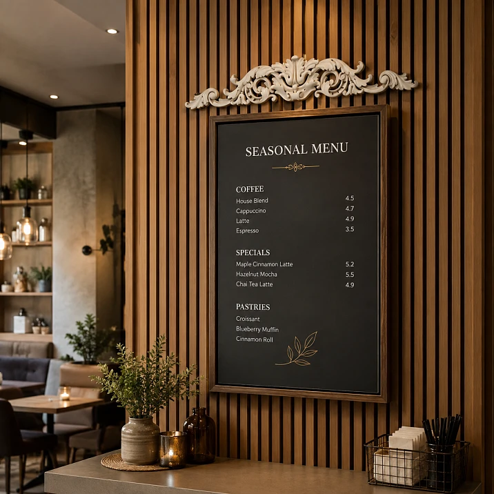
Seasonal menus in cafes almost never stay the same for years. Prices, drinks, desserts, breakfasts, and summer and winter items change. But the interior must remain cohesive. This is where a clear commercial task arises: how to combine permanent wall finishes with a replaceable information medium without turning every seasonal change into a decor overhaul.
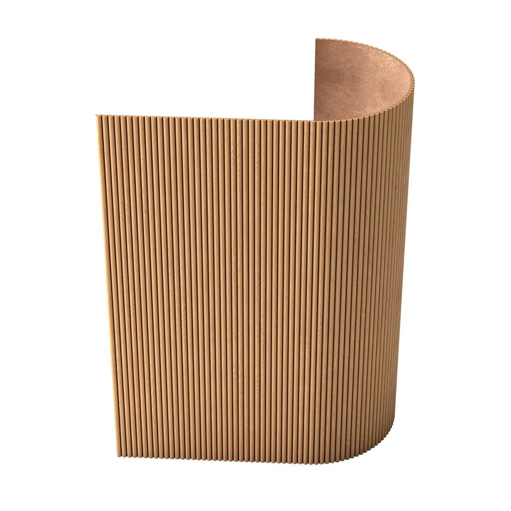
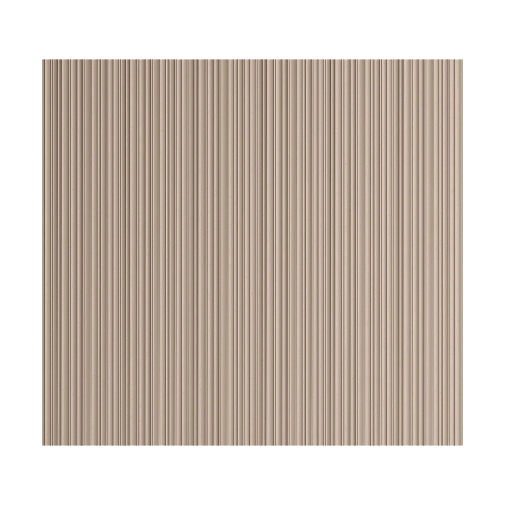
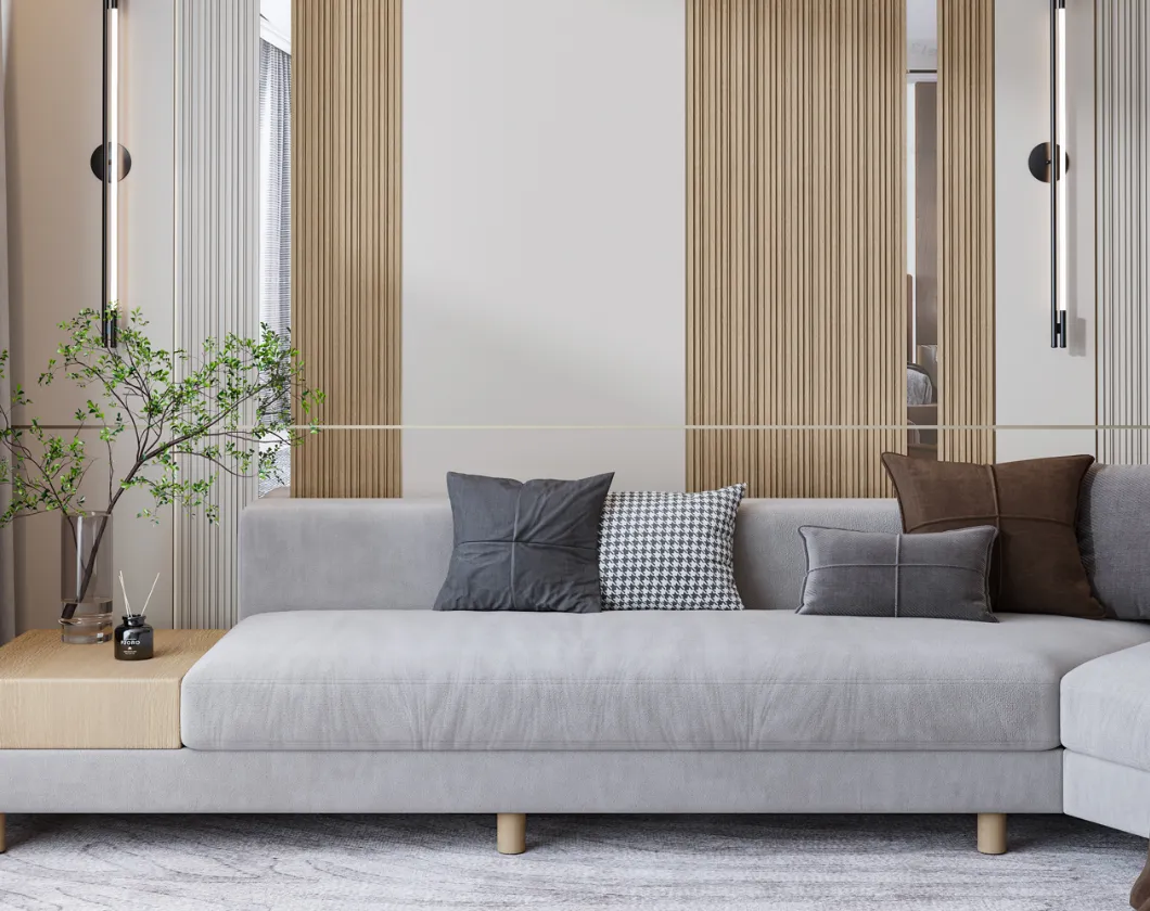
If the space already has a slat wall, the task becomes more complex. The slats create a beautiful rhythm and architectural backdrop, but they are not a convenient surface for reading text. Prices, dish names, small fonts, and ingredient blocks are harder to read on an active texture. Therefore, the cafe owner or designer usually has to create a separate smooth board, tablet, or wall-mounted information panel.
Then a second question arises: how to integrate this smooth board into the interior so it doesn't look like a random "sheet on the wall"? One calm option is not to build a complex permanent frame around the menu, but to use a single fixed decorative accent above the menu area. This is exactly the scenario that fits the theme of this article.
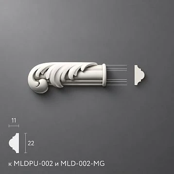
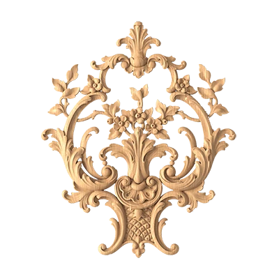
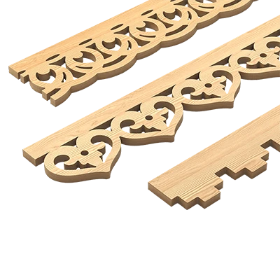
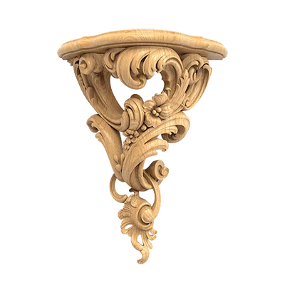
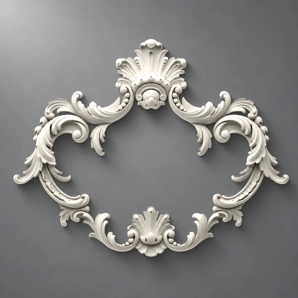
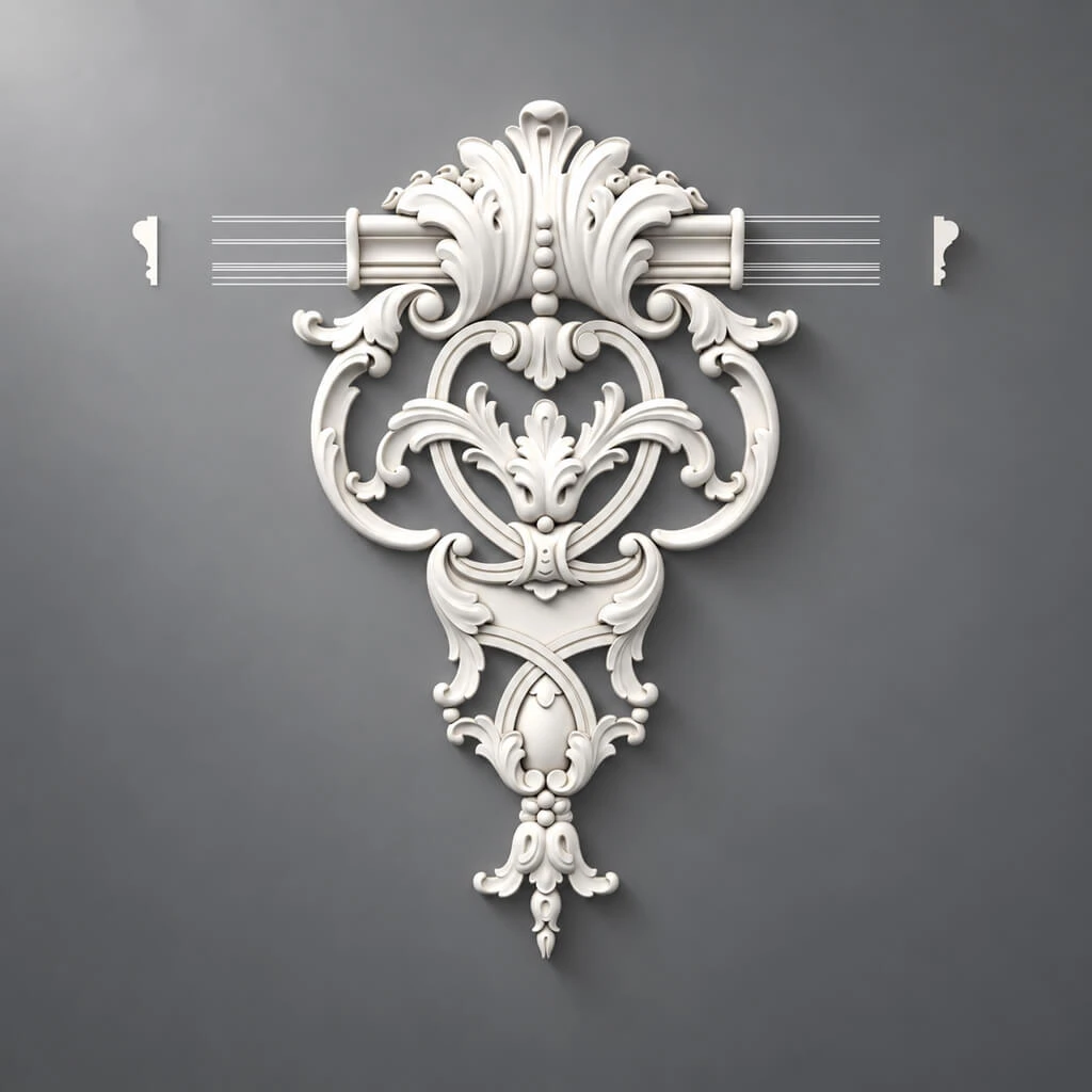
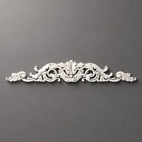
We are looking at a specific product: the NPU-160 carved decorative overlay made of polyurethane, measuring 450 × 75 × 15 mm. According to the current STAVROS product card, it costs 2,240 ₽, allows painting, and belongs to decorative overlays for walls, doors, furniture, and interior compositions.
In this article, we are not discussing the abstract "beautiful or not," but a practical question before ordering:
-
can one NPU-160 be used as a permanent top accent above the menu;
-
where the overlay itself should be located;
-
why it should not be glued to a removable board;
-
how to maintain quick menu replacement;
-
how to correlate a width of 450 mm with different panel widths;
-
when one horizontal overlay works well;
-
when it gets in the way;
-
and what exactly needs to be checked before purchasing.
An important point right away: NPU-160 is not a frame or a menu holder. It is a decorative overlay that helps architecturally style the joint if the information panel itself remains a separate, replaceable element.
If after reading you understand that this exact format suits you, you can go to the product page and buy the NPU-160 450 × 75 mm molding decor. But first, let's figure out when this product really works in a cafe, and when it's better to choose another solution.
What exactly are we styling: not the entire menu, but the "slat wall + smooth removable panel + permanent decorative accent" joint
Mistake #1 in such situations is thinking that the decor needs to be glued directly onto the board that will be regularly replaced.
If the menu:
-
is removed entirely;
-
is replaced every season;
-
is reprinted on a new base;
-
is transferred to a panel of a different color or format;
-
is sent to print again for a new menu or brand campaign,
then making a rigid decorative system on the replaceable base itself is inconvenient. Any such decor will either have to be constantly removed and transferred, or it will start dictating the panel format, although the business needs flexibility.
Therefore, the correct scheme in most cases looks like this:
-
A calm, smooth zone is highlighted on the slat wall.
-
A removable board or information panel is placed in this zone.
-
Space is left above it for a permanent decorative accent.
-
This accent is the NPU-160.
That is, the NPU-160 should function as part of a permanent interior composition, not as part of replaceable printed materials.
This is a very important distinction. Then the logic of the unit becomes clear:
-
the slats provide an architectural background;
-
the smooth panel ensures readability;
-
the NPU-160 ties everything together into a finished interior unit;
-
the menu itself can be replaced without dismantling the molding.
It is precisely in this scenario that a single horizontal overlay makes sense.

Why the NPU-160 suits this task
The NPU-160 has several qualities that make it convenient specifically for a node with a changeable menu.
Our factory also produces:
1. Fixed horizontal format 450 × 75 mm
450 mm is a noticeable length. The overlay is already read as a separate accent above the menu, not as a tiny detail that gets lost against the slats.
But at the same time, 450 mm is not an excessive length. It is not a huge central decor that will start to compete with the heading, cafe logo, font menu, and decorative lighting.
Get Consultation
2. Moderate height of 75 mm
The overlay remains horizontal, elongated, and visually "light" compared to large central decors or complex furniture overlays.
This is useful for cafes where text will still be read next to the decor.
3. Relief of 15 mm
The relief is noticeable enough for the accent to be read even when painted in the color of the wall or a smooth insert. But it is not deep enough to automatically turn a small menu area into a heavy stucco composition.
4. Possibility of painting
This is critical for commercial interiors. The NPU-160 can be adjusted:
-
to match the color of the smooth insert;
-
to match the tone of the bar area facade;
-
to match the color of the slats;
-
to match the cafe's brand palette;
-
to match a calm, solid background.
5. It functions as an overlay, not a linear element
The NPU-160 doesn't require you to assemble a permanent frame around the panel, calculate four sides, four corners, or rigidly tie the board format to the perimeter. This is why it suits scenarios where the informational part changes.
If the goal were to build a stationary decorative field, moldings or linear elements would be more appropriate. But in our case, the value lies elsewhere: we need one permanent sign, not a rigid system that every new menu version would have to be fitted to.
If this type of solution suits you, you can not only buy the NPU-160 450 × 75 mm molding decorbut also to view the entire section in advance to compare by mood Polyurethane decorative appliques.
Why you shouldn't glue NPU-160 onto the removable board itself
This is the main practical question of the entire article.
At first glance, the solution seems convenient: take a menu panel, glue NPU-160 on top, and with each change simply make the same board anew. But for cafes, this is often worse than a separate permanent decor.
Reason 1. Each menu change turns into creating a new decorative object
If the board itself is replaceable, then the entire decorative top will also be replaced along with it.
This means:
-
repainting;
-
repositioning;
-
reinstallation;
-
risk of differences between batches;
-
additional costs;
-
unnecessary dependence of the printed medium on interior stucco molding.
Reason 2. The decor starts to limit the menu format
While the menu is one size, everything looks fine. But as soon as the business needs:
-
make the menu narrower;
-
make it wider;
-
add a seasonal block;
-
switch from a vertical board to a horizontal one;
-
replace the rigid panel with a chalk, magnetic, or printed surface,
the overlay starts to get in the way. It ceases to be decor and becomes a limiter.
Reason 3. There is a risk of mechanical damage
If the removable board is regularly taken off, carried, wiped, and updated, the decorative overlay receives more operational load.
NPU-160 works better as a stationary interior accent that is not removed along with the menu every few months.
Reason 4. A menu is a functional medium, not an architectural detail
A good menu should be easy to update. Good interior decor should work for a long time and remain stable. When both functions are mixed into one object, the business loses flexibility.
Therefore, for the topic of this article, the rule is very simple:
NPU-160 is left on a permanent smooth wall area, while the menu itself is mounted lower on a separate replaceable board or information panel.
It is in this case that one decorative overlay becomes a useful purchase.
Why text and prices are better placed on a smooth panel rather than directly on the slats
This seems obvious, but it is here that the temptation to "save surface area" and place the menu directly on the slatted wall often arises.
This solution has several problems.
1. Slats break up the background
Even if the slats are beautiful and high-quality, they create a repetitive rhythm. This is not always good for text, especially if the menu contains:
-
many lines;
-
small prices;
-
category blocks;
-
descriptions;
-
QR code;
-
captions for drinks;
-
graphic dividers.
2. Small text on an active background is harder to read
Especially with side lighting, contrasting wood texture, dark gaps between slats, or glossy coating.
3. The structure of the seasonal menu may change
Today it's desserts, tomorrow it's breakfasts, the day after tomorrow it's summer drinks. The interchangeable medium must be as versatile as possible. The slat wall background hinders this.
4. A smooth panel allows for faster content updates
The removable board can be:
-
replaced entirely;
-
repainted;
-
reprinted;
-
updated with magnetic elements;
-
recovered with graphics;
-
adapted for a promotion.
That is why the correct sequence for a cafe looks like this:
architectural background → slat wall
working field for information → smooth removable panel
decorative interior accent → NPU-160
This approach provides both readability, flexibility, and a cohesive look.
If the slat wall is only being selected for the project, it makes sense to separately look at slatted panels for walls and already at the design stage to allocate space for a future smooth insert with the menu.
Which scheme is considered correct: overlay above the menu, not around it
For our topic, the basic composition looks like this:
-
slat field;
-
in it or against its background, a smooth area is highlighted;
-
At the top of this place, above the menu, there is an NPU-160;
-
below is a removable menu board;
-
even lower, there may be seasonal inserts, pockets, small service data, or logos.
That is, the NPU-160 should not:
-
frame all four sides of the menu;
-
repeat the width of the panel exactly;
-
turn into a holder;
-
press the board;
-
move onto the movable panel.
It plays a more subdued role — it sets the upper decorative accent and makes the menu area part of the interior.
Where should the NPU-160 be located: on a wall, on a fixed smooth substrate, or above a fixed zone
There are three working options.
Option 1. The overlay is attached directly to a smooth fixed insert in the wall
This is the best scenario if the slat wall is already designed with a smooth architectural field for the menu.
Advantages:
-
neat integration;
-
visual integrity;
-
simple logic: the overlay and the menu zone live on the same surface;
-
the removable board itself can be mounted below without conflict.
Option 2. The NPU-160 is placed on a fixed back panel, and the replaceable board is attached on top or below
This is useful if the "menu zone" itself is not just a replaceable board, but a permanent smooth panel on which various information sheets, signs, or panels can be mounted.
Advantages:
-
the interior part does not change;
-
the content part changes;
-
you can keep the same style across different seasons.
Option 3. The overlay is mounted higher on the wall, and the menu panel hangs lower as an independent element
This is a more flexible option when there is no desire to rigidly attach the overlay to the shape of the board. It is useful if:
-
the menu panel periodically changes format;
-
the board may be slightly narrower or wider in different seasons;
-
flexibility needs to be maintained;
-
the decorative accent itself should live separately.
In all three cases, the rule is the same: the NPU-160 must be on a fixed base.
How to correlate the NPU-160 width of 450 mm with the actual menu width
This is one of the most useful practical sections. Because the buyer often tries to solve the problem too literally: "If the menu is 900 mm wide, then the decor should be almost 900 mm." For NPU-160, there is no such logic.
The overlay does not have to match the menu width. It can be:
-
narrower than the menu;
-
significantly narrower than the menu;
-
centered on the overall panel;
-
centered only on the information block.
If the menu is 600 mm wide
450 mm next to a 600 mm panel is already a fairly large horizontal element. This option usually looks good if:
-
the overlay is not pressed against the top edge of the board;
-
there is air on the left and right;
-
a readable menu title remains below it.
If the menu is 800 mm wide
This is one of the most convenient options. The NPU-160 remains the center of the composition but does not look too large.
This ratio is often perceived as especially successful for cafes:
-
there is air at the edges;
-
the decor does not compete with the text;
-
the composition looks cohesive.
If the menu is 1000 mm wide
450 mm begins to play the role of a central accent on a wider information field. This is also acceptable if the task is not to "frame the entire menu" but simply to mark the top of the zone.
If the menu is 1200 mm wide or more
On a very wide NPU-160 panel, it does not lose its right to exist, but its role changes. It is no longer perceived as a "horizontal line above the entire menu," but as a local decorative center.
Hence an important practical conclusion:
NPU-160 is not selected by the formula "the length of the overlay should match the length of the menu." It is evaluated as a central top decorative accent.
Center the overlay relative to the menu or to the entire smooth insert
There are two correct approaches here.
Centering relative to the menu itself
This is the best option if:
-
the menu is the main visual object of the area;
-
the smooth backing is only slightly larger than the information field;
-
The overlay must explicitly "sign" the menu itself.
Centering across the entire smooth architectural insert
This is better if:
-
the insert itself is a large interior field;
-
the menu changes and its width can potentially fluctuate slightly;
-
it is important to maintain a single axis of the wall;
-
the area should read not as a "board with decor," but as a cohesive interior module.
In a cafe with changing content, the second option is often more practical. It gives more freedom: the menu can be replaced, its proportions slightly altered, and the NPU-160 will remain in the correct architectural spot.
What vertical gap should be left between the NPU-160 and the top of the menu
The article should not invent a non-existent manufacturer standard, but the general principle here is clear:
-
the overlay should not stick to the text;
-
there should be a visual pause between the decor and the menu heading;
-
this pause should be sufficient so that the ornament is not perceived as part of the text set.
What not to do:
-
place the NPU-160 flush against the top edge of the menu;
-
push the heading directly under the relief;
-
try to use the overlay as a nameplate holder.
What to do correctly:
-
make a template of 450 × 75 mm;
-
lay it out on the wall;
-
temporarily print the menu at full size;
-
check the distance between them from the main viewing point.
When one NPU-160 is truly needed, and not just 'decoration for decoration's sake'
The purchase is justified if you have at least a few of the following conditions.
NPU-160 is needed if:
-
the slat wall is already active, but a smooth menu board looks too utilitarian;
-
you need to add a calm interior accent without a full stationary frame;
-
the menu changes, but the area should remain styled;
-
you want to connect the bar, seating, or slat area with the menu;
-
you need a decorative center without overload;
-
there is a stationary smooth substrate or architectural field;
-
the brand style allows classic or mixed decor.
NPU-160 is not needed if:
-
the menu board itself already has an expressive frame;
-
the menu is fully digital and looks like a screen;
-
the interior is strictly minimalist and stucco molding would be alien;
-
the menu area is very small and even 450 mm would look heavy;
-
the slat wall is already overloaded with logos, lighting, shelves, sconces, and navigation;
-
the cafe uses a very active branded graphic style that itself forms the decorative top.
When one overlay works better than a molding frame around the board
A permanent frame around the board is good when:
-
the panel format does not change;
-
the board itself is stationary;
-
the interior is built around permanent rectangular fields;
-
the menu does not require regular replacement of the medium;
-
a classic architectural frame is needed.
But if the menu changes every season, the frame begins to limit flexibility. At this point, one horizontal NPU-160 is often smarter than a full molding perimeter.
Why:
-
it does not rigidly fix the board format;
-
it leaves more freedom when changing content;
-
it is cheaper and simpler to install;
-
it visually lightens the zone;
-
it does not require calculating the full perimeter;
-
it does not force you to redo the entire system when replacing a panel.
If the project still requires a more architectural solution, you can additionally look at polyurethane molding and based on the overall catalog, choose a full system of moldings and overlays.
How to check the NPU-160 in advance without the risk of error: first a template, then an order
For this topic, the template is especially important.
Step 1. Make a paper template 450 × 75 mm
It is better to make it at full scale right away.
Step 2. Separately mark out the actual size of the future menu
For example:
-
600 × 900 mm;
-
800 × 1000 mm;
-
1000 × 1200 mm.
Step 3. Place both outlines on the wall
This way you will see:
-
is there enough air;
-
is the overlay too large;
-
does it seem too small;
-
how it works against the slats.
Step 4. Check from the main angles
Not only from the front, but also:
-
from the entrance;
-
from the checkout side;
-
from the tables;
-
Under side lighting.
Step 5. You add the proposed logo and title
Sometimes it is the logo that makes the NPU-160 unnecessary. And sometimes the opposite — the overlay beautifully completes it from the top.
Step 6. You check the menu interchangeability
Is the board removable?
Can it be taken out without contact with the decor?
Can the panel be replaced with a slightly narrower or wider one if necessary?
If after this check the NPU-160 really adds value, the decision can be considered justified.
What color to choose for the NPU-160
The decorative overlay above the menu has three main color strategies.
1. In the color of the smooth insert
The calmest option.
Advantages:
-
the ornament is read through light and shadow;
-
the decor does not compete with the text;
-
the zone remains elegant;
-
well suited for cafes where the menu should remain the main focus.
2. In the color of the slats
This option ties the menu to the slatted wall more strongly. But there is a risk that NPU-160 becomes too active, especially if the slats are dark or contrasting.
3. In a separate accent color
For example:
-
in the color of the logo;
-
in warm bronze;
-
in deep graphite;
-
into a noble milky contrast.
This is already a bolder strategy.
The general rule is this:
If the goal is to highlight the interior but not overshadow the menu, the best solution is often the NPU-160 in the color of the smooth panel or a tone close to it.
What to do if the menu periodically changes width
This is a typical real-world scenario. For example:
-
in summer the menu is wider because there are more seasonal drinks;
-
in winter it's narrower;
-
sometimes there is a separate board with breakfasts;
-
sometimes a block with "special offer of the week" appears nearby.
This is where the main advantage of the single NPU-160 scheme becomes apparent.
If the overlay does not create a rigid perimeter, then a moderate change in menu width does not break the composition. However, it is better to follow two rules:
Rule 1. Maintain one main architectural axis
The NPU-160 should be centered on a permanent zone, not moved along with each new menu variant.
Rule 2. Do not make the menu wider or narrower to the point where the NPU-160 starts to look random
When it is better not to place the NPU-160 at all
Do not place the NPU-160 if:
-
the menu is already styled with strong brand typography, and additional ornamentation overloads the composition;
-
the zone already has a logo, sconces, shelves, table numbers, signs, and lighting;
-
the cafe format is very minimalist and oriented toward a strictly graphic language;
-
The slat wall itself is very busy, and no additional top decor is needed;
-
the panel is removed too often, and people are constantly working nearby with their hands, moving equipment, and placing promo materials;
-
in the future, the menu area may be fully converted to a digital screen.
How to calculate the number of NPU-160: one or more
Within this article, the main scenario is one NPU-160 above one menu area.
But a cafe may have several repeating information nodes:
-
main menu;
-
drinks block;
-
separate dessert area;
-
seasonal board at the checkout;
-
second identical hall.
For one item, the cost is currently as follows:
1 × NPU-160 = 2 240 ₽
If there are two zones:
2 × NPU-160 = 4 480 ₽
If there are three:
3 × NPU-160 = 6 720 ₽
Practical scenario: what a successful composition could look like
Let's imagine a real situation.
You have:
-
slat wall in the order zone;
-
between the slats or against their background, a smooth field is provided;
-
on this field, a removable menu panel 800 mm wide is placed;
-
the heading "Seasonal Menu" is located at the top;
-
The panel changes 4 times a year.
What we do:
-
We allocate a stationary smooth substrate of sufficient width.
-
Along its axis, we place the NPU-160 above the menu zone.
-
Below, we attach a removable panel.
-
We leave a visual pause between the decor and the heading.
-
We paint the NPU-160 to match the substrate or in a soft coordinated shade.
-
During seasonal replacement, we remove only the panel or information carrier, without touching the overlay.
What we get:
-
the menu is easy to read;
-
the interior looks complete;
-
the decor does not interfere with changeability;
-
the zone does not look random;
-
the business retains flexibility.
Checklist before purchasing NPU-160 for a cafe
Before buy the NPU-160 450 × 75 mm molding decor, check the following list.
-
Will the menu really change?
-
Is there a smooth surface under the menu?
-
Will the NPU-160 be placed on a stationary base?
-
Does the menu remain removable without dismantling the overlay?
-
Are the menu width and NPU-160 width checked with a template?
-
Is the zone free of logo overload, lighting, shelves, and signs?
-
Is the NPU-160 color coordinated with the background?
-
Won't there be a screen nearby that will ruin the whole composition in six months?
Bottom line: when the NPU-160 is the right purchase for the menu zone
For the topic "Menu in a cafe changes every season: how to design a removable board on a slat wall with the NPU-160 450 × 75 mm overlay," the conclusion is:
The NPU-160 is justified if you are designing a permanent interior zone above a changeable menu, not the removable panel itself. In this case, one decorative overlay helps assemble the composition, connect the smooth board to the slat wall, and add an interior accent without a rigid stationary frame around the information.
It is especially appropriate if:
-
the menu is periodically updated;
-
flexibility is needed;
-
the text should be readable from the smooth panel;
-
The slat wall is already in place;
-
The menu zone itself looks too utilitarian;
-
I want to add a permanent decorative sign without overloading it.
The NPU-160 is not worth buying if you expect it to function as a frame, holder, or rigid outline for a changing panel. It should not restrict menu removal and does not have to match the board's width.
The most rational logic is this:
-
the slatted wall remains the architectural background;
-
The menu is placed on a smooth removable panel;
-
The NPU-160 is mounted above it as a permanent decorative accent;
-
When the season changes, only the informational part is replaced.
If you see your situation exactly this way, moving to the product is logical: you can buy the NPU-160 450 × 75 mm molding decor, and if necessary, compare other options as well Polyurethane decorative appliques or think in advance about the adjacent wall contour through slatted panels for walls.
FAQ
Can NPU-160 be glued directly onto a removable menu board?
Technically, mounting on a movable panel may be possible, but for the task of seasonal menu replacement, this is usually not the best scenario. Then, together with the panel, you would have to constantly move or recreate the decorative element. For a cafe, it is more rational to place NPU-160 on a permanent stationary base, and change the menu itself separately.
Is NPU-160 required to match the width of the menu?
No. NPU-160 is not a frame. It is a top decorative accent. Therefore, its width of 450 mm can be less than the width of the menu, and that is normal if the composition looks balanced.
Can two NPU-160 units be placed side by side if the menu is very wide?
Sometimes it is possible, but that is a different compositional scenario. For the topic of this article, the basic solution is one NPU-160. If the menu is very wide and one overlay seems too small, first it is better to check whether you need a different type of decor, rather than mechanically doubling the quantity.
Is NPU-160 suitable for a chalkboard?
Yes, if the chalkboard is a removable information panel, and NPU-160 is placed on a stationary smooth area above it and does not interfere with its removal or maintenance.
Should NPU-160 be painted the color of the wall or the color of the slats?
Most often, for the menu area, a calm color matching the smooth insert or a very close shade works best. This way, the decor supports the interior but does not interfere with reading the text. Painting it in the color of the slats creates a stronger accent and requires careful checking.