


Article Contents:
- The color of stucco molding is not a decorative trifle; it's an architectural decision
- What determines the choice of stucco molding color
- Stucco molding in wall color: modern, delicate, mistake-free
- Why this works best in modern apartments
- In which rooms does stucco molding in tone work best
- How to properly paint moldings to match the wall
- Frames in tone: the rule of minimal profile relief
- White stucco molding: when it's beautiful, and when it's an outdated cliché
- When white molding works flawlessly
- When white molding doesn't work
- White molding: shade matters
- Contrast molding: when boldness is justified
- What is contrast molding
- Where contrast works
- Where contrast ruins the interior
- Gold and metallic molding: a separate conversation
- Decorative molding and stucco decor: color changes everything
- Decorative molding in wall tone: light and shadow play
- White decorative stucco: relief as sculpture
- Contrast decor: one point — maximum accent
- How the color of a decorative element relates to the color of moldings
- Ceiling stucco: color defines the vertical
- Cornice in ceiling color: calm and neat
- Cornice in wall color: connecting the top of the room
- White ceiling cornice with colored walls
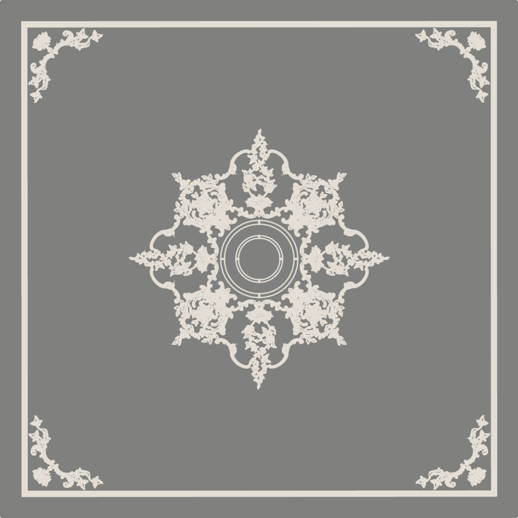
- Ceiling rosette: color to match the chandelier and ceiling
- How to choose stucco color for specific situations
- First situation: white walls, minimalist interior
- Situation two: rich colored walls, modern interior
- Situation three: light walls (beige, powder), classic doors
- Situation four: bright accent wall in the living room
- Situation five: study with dark wooden accents
- Painting practice: what to buy together with stucco
- What to buy together with moldings for final painting
- How many coats of paint are needed
- Is primer needed
- Table: which stucco color to choose for different situations
- FAQ: answers to main questions before purchase
- About the Company STAVROS
I liked the moldings. The decorative overlay too. The profile is selected, the size is coordinated with the ceiling height. And here is the final question, which often stumps more than all the previous ones: what color should it be?
White? That's what everyone does. But what if it looks old-fashioned? The color of the wall? Beautiful in photos, but isn't it too subtle? Contrasting — a dark molding on a light wall? Bold, but won't it be overwhelming?
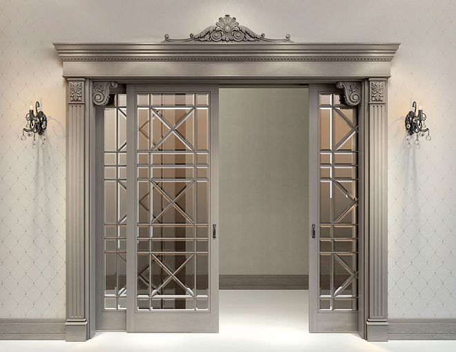
This is not a trivial question. The color of the stucco radically changes the character of the interior. The same frame of moldings in white says "classic," in the tone of the wall — "modern design," in dark contrast — "bold accent." Three different color schemes — three different interiors. And that's why before Buy molding painting it out of habit, it's worth figuring out which option works in your specific case.


The color of the stucco is not a decorative trifle, it's an architectural decision
Let's start with a principle that changes the perspective on the whole issue. Stucco is a relief. Its three main states — white, matching the wall, contrasting — differ not just in color. They differ in how the relief interacts with light, with the wall, and with the perception of space as a whole.
White stucco on a colored wall — the relief reads graphically. A clear boundary between the molding and the wall. The eye instantly highlights the frame. This is a declaration: "There is decor here."
Stucco in the tone of the wall — the relief reads through light and shadow. The boundary between the molding and the wall is soft. The eye perceives the structure, not the form. This is a hint: "There is depth here."
Contrasting stucco (dark on a light wall or light on a dark wall) — the relief reads as an independent object. The molding or decorative element becomes the main accent of the surface. This is a statement: "Here is the accent."
Understanding which of these three states is needed — that means making the right choice.


What determines the choice of stucco color
Five factors to evaluate before making a decision:
1. Interior style. Classic, neoclassical — white stucco. Modern style, Scandinavian, minimalism — matching tone. Art Deco, eclectic, bold accent — contrast.
2. Ceiling height. With a 2.5 m ceiling, white molding on a colored wall works neatly — visually 'lifts' the ceiling. With a ceiling of 2.7 m and above, all options are possible.
3. Wall color and saturation. Dark, saturated walls — white molding creates a strong contrast, possibly too strong. Light neutral walls — tone-on-tone is preferable for a modern interior.
4. Amount of decor in the room. Lots of furniture, textiles, decor — molding in tone, without extra noise. Minimalist room — contrast or white molding can work expressively.
5. What already exists: doors, baseboards, trim. White doors — white stucco is logical. Dark doors — stucco in the wall tone, not white.
Our factory also produces:


Stucco in wall color: modern, delicate, mistake-free
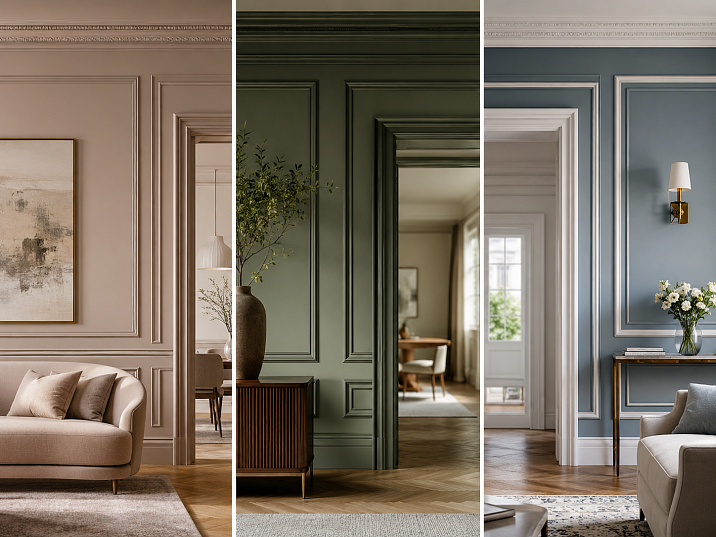
Tone-on-tone is the safest and most relevant option of all three. It dominates modern interiors today.
The principle is simple: walls are painted — say, in a warm gray-beige. Molding is installed and painted the same color. The frames exist, but they don't create graphic contrast. They create volume, relief, structure. It's like embossing on thick paper: the form is visible but doesn't shout.
Get Consultation
Why it works best in modern apartments
The main advantage of painting to match the tone is versatility. This technique works everywhere: in a small bedroom, in a living room with high ceilings, in a hallway, in a study. It doesn't require a perfect match between furniture and door styles — the moldings simply blend into the wall, adding structure to it.
The second advantage is scalability. Moldings made of polyurethane Moldings in the same tone as the wall can be used wider in width — because they don't create a "pressing" graphic element. A 40–50 mm molding in the same tone as the wall with a 2.5 m ceiling won't create a feeling of tightness — the same molding in white on a colored wall could.
Third is modernity. Tone-on-tone is not a saving on color, it's a conscious design choice. It's precisely these solutions that are published in interior magazines today, and they show "expensive renovation" — not due to expensive materials, but due to color precision.
In which rooms does tone-on-tone stucco work best
Bedroom. The bedroom is a space of rest. Contrast in it is unnecessary tension. Frames made of moldings in the same tone as the wall behind the headboard create a relaxation zone without visual noise. A bedroom with such frames looks like a room in a good hotel.
Hallway. The hallway often has a small area and many "talkative" elements: a mirror, a coat rack, a console. Moldings in the same tone as the wall structure the space without additional noise.
Study. In a study, concentration is needed. Frames in the same tone as the wall — there is relief, but it doesn't distract. Concentration is maintained.
Apartment with dark accent walls. A dark gray, anthracite, deep blue wall — when painting the moldings in the same dark color, a voluminous monochrome effect is created. This is very modern and not heavy at all: the frames are read through light and shadow.
How to properly paint moldings to match the wall color
Technically: first paint the wall, then install the moldings, then apply a final coat of the same paint over everything. This guarantees a perfect match — even with slight shade differences between batches.
Important nuance: for relief moldings, use a brush, not a roller. A roller won't paint the recesses of the relief — they remain white, creating an undesirable two-tone effect. A thin brush works every detail of the ornament.
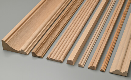
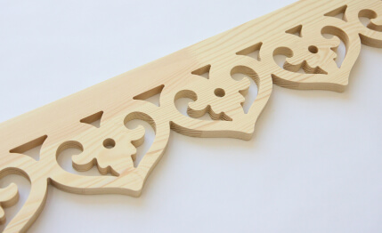
buy polyurethane moldings To paint to match the wall means choosing a profile with a clear relief that 'reads' through light and shadow. A profile that is too flat or too smooth will almost disappear after painting to match. The optimum is a molding with moderate relief: a cyma profile, stepped profile, or egg-and-dart with a slight projection.
Frames to match: the rule of minimal profile relief
If you paint a smooth rectangular molding to match the wall, it will be barely visible. That's too subtle. For an embossing effect, you need a molding with minimal but clear relief. Here's what works well:
-
Cyma profile (S-shaped curve) — creates a double shadow: top and bottom. The frame reads even without contrast.
-
Stepped profile — horizontal ledges provide clear light and shadow.
-
Egg-and-dart profile — small ornament with periodic light accents.
-
Bead and reel — small spherical elements, each catching light.
White stucco: when it's beautiful and when it's an outdated cliché
White stucco is the first thing that comes to mind. A classic. White ceiling, white moldings, white baseboard — everything in white. Beautiful? Yes, in the right context. But not universal.
When white stucco works flawlessly
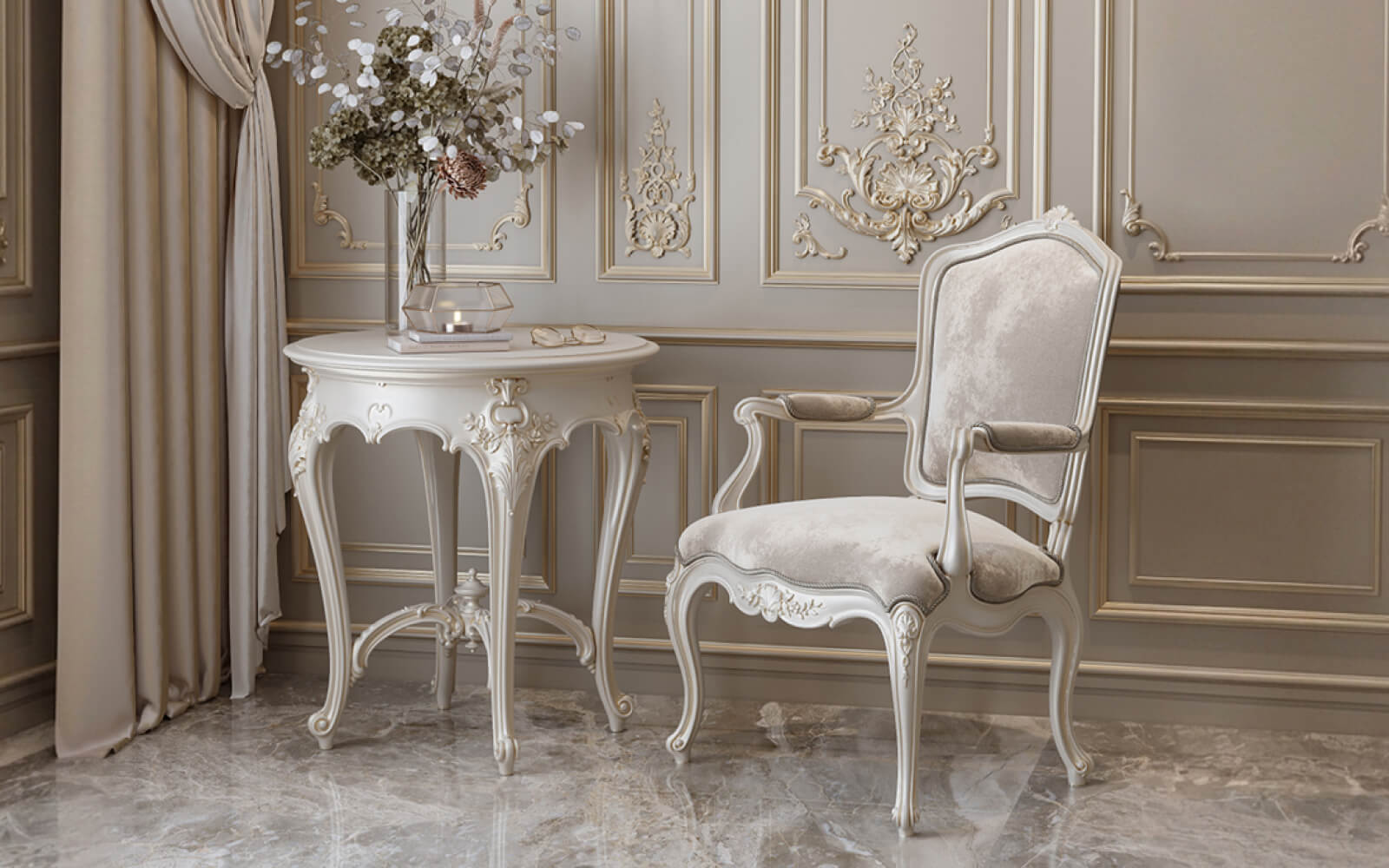
Colored walls + white stucco. This is a strong, proven solution. Blue wall — white frames. Green wall — white moldings. Terracotta wall — white cornice and white baseboard. The contrast is clean, graphic, expressive. The frames are clearly visible, the interior is structured.
This works in classic, neoclassical, and modern interiors under one condition: white doors and a white ceiling. Then the white stucco fits into the "white accents" system and doesn't look random.
A classic interior with white doors and baseboard. Here, the white Ceiling molding and white moldings are an organic part of the system. White cornice, white baseboard, white trim — everything follows the unified logic of the room's "white outline."
Neutral light walls with white stucco. Beige, cream, light gray wall — white moldings. This works if the white molding is only a couple of shades lighter than the wall. Too sharp a contrast between a warm beige wall and cold white molding creates discomfort — the tones conflict.
When you need to emphasize the relief. White brings out the ornament well. If the molding is ornamental — with acanthus, pearl string, or Ionic band — white makes it as readable as possible. All relief details become expressive in the light.
When white stucco doesn't work
A modern interior with a warm neutral palette. Warm gray, beige, and powder walls — with white molding. With an unsaturated wall color, white molding looks too cold, too "protruding." Embossing in the same tone would be more accurate.
Dark walls with warm wood. A dark brown wall with wooden furniture — white molding here will create a cold spot that conflicts with the warm palette. Better to use ivory or warm cream.
Low ceiling and saturated wall color. With a 2.5 m ceiling and dark walls, medium-width white molding visually narrows the space between the wall and ceiling. Tone-on-tone or a cornice in the ceiling color is better.
White molding: the shade matters
One of the subtle mistakes: "white" is not one color. Warm white (with a yellow or beige undertone), cool white (with a blue undertone), pure white, satin white. With warm walls, molding in cool white will conflict. With cool gray walls, warm white molding will give an undesirable yellowish tint.
Rule: the shade of white molding should match the shade of all "white" in the room — doors, baseboards, trim. Only then does the system of white accents work as a cohesive whole.
Buy polyurethane moldings Paintable means getting complete freedom of shade. Polyurethane can be painted with any acrylic paint, accurately conveying the chosen tone. This is an advantage over pre-painted products: you exactly match the color of doors and baseboards.
Contrast molding: when boldness is justified
Contrast is not a mistake. It is a tool. Powerful, but requiring precise application. Used correctly, contrast creates a strong decorative effect. Used incorrectly, it overwhelms and tires.
What is contrast molding
Contrast molding is when the molding or decorative element significantly differs in color from the wall on which it is installed. Options:
-
White wall — dark molding (gray, black, dark blue, graphite)
-
Dark wall — white or light molding
-
Neutral wall — bright molding (gold, ochre, deep green)
-
Colored wall — molding in a contrasting color (blue wall — white or gold molding)
In all cases, the frame becomes an independent decorative object that attracts attention.
Where contrast works
Study. Black or dark gray moldings on light walls — this is a modern, strong, very masculine aesthetic. The frames acquire monumentality. This is not a palace — this is architecture.
Hall and entryway. The first thing a guest sees — it should make an impression. Contrast moldings in the entryway create this impression instantly. Especially good — dark molding on a light wall with a mirror and console.
Living room with one accent wall. Choose one wall — behind the sofa. Paint it a rich color. Add moldings in white or contrasting dark. The result — a strong, expensive accent zone without overload (because the other walls are calm).
Restaurant, hotel, showroom. Commercial spaces that work with an image of luxury or a distinctive style use contrast deliberately. A gold ornament on a dark wall is the language of a high-end restaurant. White moldings on an anthracite wall are the language of a boutique or an expensive salon.
Where contrast ruins the interior
On all walls of the room. Contrasting frames around the perimeter of the entire room are visual noise. The eye doesn't know where to stop. The interior feels restless. Rule: contrast on one wall, maximum two. The rest should be calm.
In a small room with a low ceiling. Contrast visually reduces the space. In a small room, this is critical.
In a room with active furniture. Active furniture already creates decorative noise. Adding contrasting moldings to it means creating a conflict between two 'loud' objects.
Gold and metal stucco: a separate discussion
Gold is not just a color. It's a statement. Gold moldings, a gold ceiling rosette, gold decorative overlays are a classic Baroque and Empire style technique. In the right context, gold works magnificently. The wrong context turns it into bad taste.
Gold stucco is appropriate when:
-
Classic or Baroque interior style
-
High ceilings from 3 m
-
Coordinated gold accessories (handles, lamps, mirror frames)
-
Dark or saturated walls (burgundy, dark green, blue)
Gold stucco is inappropriate when:
-
In a modern minimalist interior
-
Light neutral walls without a bright palette
-
Metal accents in the interior that are not coordinated with it
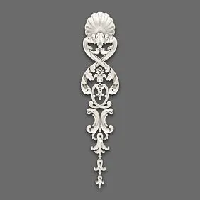
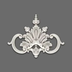
Decorative stucco and stucco decor: color changes everything
Individual decorative elements — medallions, cartouches, overlays — react to color differently than linear moldings. A molding is an extension, a line. A decorative element is a point. And for a point, the color solution is even more important.
Decorative stucco in the color of the wall: chiaroscuro play
Decorative stucco in the color of the wall — this is the most refined option. A medallion or cartouche is monochromatically integrated into the surface and is perceived through the relief. With side lighting (from a sconce, floor lamp, or directional spot), the ornament comes to life — every protrusion catches the light, every recess gives a shadow. This is a living, plastic, constantly changing object.
This solution works in the bedroom (sconces on either side of the headboard), in the living room (a floor lamp next to the accent wall), and in the study (a directional light above the work area).
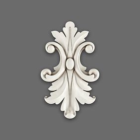
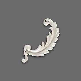
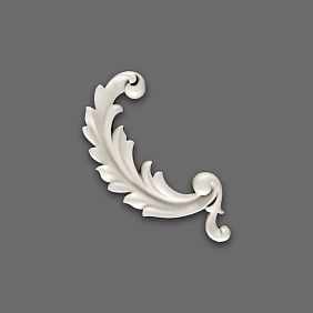
White decorative stucco: relief as sculpture
A white decorative element on a colored wall is a sculpture against a colored background. A medallion above the mirror, a cartouche above the console, corner overlays within frames — when white, each becomes an independent object.
This requires high-quality relief with a clear pattern. A weak, indistinct relief in white on a colored wall looks flat and "cheap" — details are not visible, only the shape is readable.
buy decorative moldings With good, deep relief — this is the key to making the white color work. A clear pattern in white on a saturated background looks expensive and beautiful. A blurred pattern does not.
Contrasting decor: one point — maximum accent
If you need one strong accent on the wall — a contrasting decorative element at a precise point. This is the most expressive and at the same time the most economical technique: one element, one place, one powerful effect.
Buy Moldings For contrasting application — choose a sufficiently large element (a small contrasting accent on a large wall gets lost) and place it at an architecturally justified point: along the axis of symmetry, above a significant object, in the upper part of the frame.
How the color of the decorative element relates to the color of the moldings
Moldings and decorative overlays in the same space should work within the same color logic. Three options:
Monochrome system. Moldings and decorative elements are the same color. Either all match the wall, all are white, or all are contrasting. This is a clean, systematic solution.
Accent system. Moldings match the wall, the decorative element is white or contrasting. The frames are delicate, the accent is expressive. A good solution for those who want a restrained system with one bright detail.
Hierarchy. Moldings are white, the decorative element is gold. This is a classic technique for neoclassical and baroque interiors.
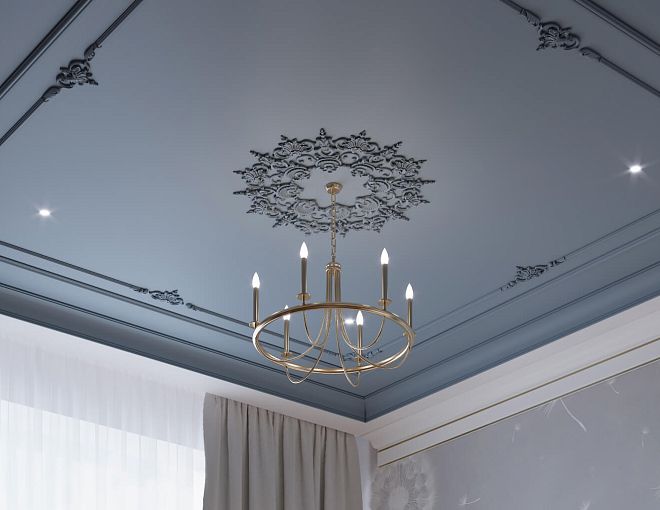
Ceiling stucco: color defines the vertical
Ceiling molding — the cornice around the perimeter and the ceiling rosette form the upper tier of the decorative system. Its color affects how the ceiling height and the connection between walls and ceiling are perceived.
Cornice matching the ceiling: calm and neat
The most common option. White ceiling — white cornice. The cornice "blends" with the ceiling, creating a clean transition. The wall remains colored, the cornice is neutral. It's neat, it's safe, it works well in most situations.
Especially good with a 2.5 m ceiling: a cornice matching the ceiling does not "lower" it, but on the contrary, visually extends the white plane downward.
Cornice matching the wall: connecting the top of the room
If the walls are a rich color — deep blue, dark green, graphite — a cornice matching the wall creates the feeling that the colored surface "wraps" onto the ceiling. This is a bold and modern technique. It visually raises the ceiling, making the color more voluminous.
Important condition: when the cornice matches the wall color, the ceiling must remain white. If both the cornice and the ceiling are colored — it's heavy. White ceiling + colored walls + cornice matching the wall color — that's balance.
White ceiling cornice with colored walls
A white cornice at the transition between a dark wall and a white ceiling is a clear graphic line separating two planes. This is a classic technique, especially effective with high ceilings.
With a 2.5 m ceiling and dark walls, use a white cornice with caution. It can draw attention to the transition that you might want to make less noticeable.
Ceiling rosette: color to match the chandelier and ceiling
Buy ceiling molding — means choosing the rosette as well. Its color is most often determined by the ceiling color. White ceiling — white rosette. That's the standard.
But there are options. If the ceiling is colored (which happens in designer interiors) — the rosette is painted the same color. If you want to emphasize the rosette as a decorative element — it's painted in a color contrasting with the ceiling.
A gold rosette on a white ceiling is a classic Baroque technique for a corresponding interior.
How to choose the color of molding for specific situations
Now — very specifically. Let's break down typical situations and what works in each of them.
Situation one: white walls, minimalist interior
Walls are white or very light gray. Furniture is simple, without ornament. Ceiling is white.
Best option: moldings matching the wall color. The frames are read through the relief, without creating contrast with the white background. With contrasting moldings, the minimalist interior will lose its main quality — space.
Situation two: rich colored walls, modern interior
Walls are dark blue, deep green, graphite. Furniture is neutral. Ceiling is white.
Best option: moldings matching the wall color. The monochrome effect works especially strongly on rich dark colors. You can add one white decorative element — as the only contrasting accent.
Situation three: light walls (beige, powder), classic doors
Walls are warm neutral. Doors are white with panels. Baseboard is white.
Best option: moldings white or matching the wall color. White moldings fit into the system of white doors and baseboards. Moldings matching the wall color create a more modern option while preserving classic doors.
Situation four: bright accent wall in the living room
One wall is a saturated color, the rest are neutral.
Best option: moldings on the accent wall in the same tone as that wall (embossing), moldings on the other walls — white or in the tone of the neutral walls. This creates hierarchy without overload.
Situation five: an office with dark wooden accents
Dark wood, leather furniture, saturated colors.
Best option: moldings in a warm neutral tone (ivory, cream) or in the tone of the dark walls. White molding next to dark wood is cold and inappropriate.
Painting practice: what to buy along with stucco molding
Once the color scheme is decided, you need to prepare the right set. Stucco molding for painting is not just the molding itself.
What to buy along with moldings for final painting
-
Moldings made of polyurethane with a 15–20% margin
-
Mounting acrylic adhesive
-
Acrylic sealant for joints
-
Acrylic paint — in the desired shade, with a small margin
-
Painter's tape
-
Thin brush for relief profiles
-
Small foam roller for smooth moldings
-
Finish acrylic paint for walls (if you need to refresh the color after installation)
If painting to match the wall — use the same paint as for the walls. If white — acrylic white paint of the desired shade. If contrasting — a separately selected color.
How many coats of paint are needed
For polyurethane molding — two coats of paint. The first coat reveals the surface and shows possible joint defects. The second is the finish coat, evening out the color. Between coats — complete drying (2–4 hours for acrylic paint).
If the molding is painted to match a dark wall — a third coat may be needed. Dark saturated colors often require additional application.
Is primer needed
Primer for the molding itself is not necessary. Polyurethane accepts acrylic paint well without prior priming. But if the wall after molding installation has traces of glue or sealant — these areas are better to prime or seal before final painting.
Table: which stucco color to choose for different situations
| Situation | Recommended color |
|---|---|
| Modern interior, neutral walls | Matching the wall |
| Classic, white doors and baseboard | White molding |
| Accent wall in the living room | Matching the accent wall or white |
| Dark saturated walls | Matching the wall — monochrome |
| Study with dark wood | Ivory, warm cream |
| One accent above the mirror | White or contrasting element |
| Ceiling cornice — low ceiling | In the color of the ceiling |
| Ceiling rosette — white ceiling | White |
| Restaurant, hall, grand space | Contrast or gold |
| Bedroom, space of rest | Matching the wall |
FAQ: answers to key questions before purchasing
Can molding be painted the same color as the walls?
Yes. This is a conscious modern technique, not a compromise. Moldings in the color of the wall create relief through light and shadow and look relevant in any modern interior.
Does white stucco always look good?
No. White stucco on a warm neutral wall (beige, powder) can create an undesirable contrast. In this case, it is better to choose a molding in a warm neutral tone or paint it in the color of the wall.
Which moldings should I choose for painting to match the tone?
Moldings with a moderate but distinct relief: cyma, stepped, Ionic profile. A profile that is too smooth will be invisible against the wall tone.
Won't contrasting stucco overload the room?
It will overload if you use contrast on all walls. Contrast works on one accent wall. The rest should be calm, without moldings or with delicate tone-on-tone.
What should I buy together with stucco for painting?
Moldings for painting, mounting glue, acrylic sealant, acrylic paint in the desired shade, 15–20% extra molding, a brush for final painting.
How to paint a relief molding to match the wall tone without leaving marks?
With a thin brush, in two coats. First coat — paint all recesses. Second coat — a final, even layer over the entire surface. Tape will protect the wall when applying the second coat.
Do I need to paint the ceiling rosette to match the ceiling color?
As a rule — yes. A rosette in the color of a white ceiling is standard. But the rosette can be painted in a contrasting color or gold, if the interior supports it.
Which one buy decorative moldings for painting to match the tone?
Choose elements with deep, well-developed relief. A clear ornament in monochrome coloring is read through light and shadow — this is what creates a decorative effect without color contrast.
About the company STAVROS
The right color solution for stucco is half the result. The other half is the quality of the product itself. If the ornament is blurred, if the profile is unclear, if the surface is uneven — no painting will fix this. That is why choosing the manufacturer is as important as choosing the color.
STAVROS is a Russian manufacturer of decorative polyurethane products for residential and commercial interiors. The STAVROS catalog includes: Moldings made of polyurethane with clear relief and precise geometric parameters, Decorative stucco with detailed ornamentation for accent areas, Ceiling molding for cornices and rosettes, a full range moldings from polyurethane at any scale.
All STAVROS products are ready for final painting in any color — tone-on-tone, white, contrasting, gold. Polyurethane holds its shape, does not crack, does not deform with temperature changes, and lasts for decades with proper installation. Delivery — throughout Russia. If you haven't decided on a color scheme yet, STAVROS specialists will help you choose a set that will work specifically in your interior.