


Article Contents:
- Features of white textured surfaces: why white is not just a color
- Texture as a source of information
- The difference between 'white' and 'white'
- White slatted wall as the foundation of an interior
- MDF for painting — a choice for white interiors
- Vertical and horizontal slats: different visual effects
- Slat dimensions and spacing: how to choose correctly
- How decorative molding adds relief and depth to white space
- Cornices as the boundary between wall and ceiling
- Moldings as plane segmentation
- Rosettes and medallions in a white interior
- Light, shadows, and halftones in a white space
- Directional lighting and relief
- Integrated lighting in slatted panels
- Lighting scenarios: morning, day, evening
- Combination with warm wood, stone, and metal
- White slats and warm wood
- Molding and stone: a dialogue of textures
- Metal as a point accent
- Textiles and soft surfaces
- Mistakes of all-white compositions
- First mistake: different shades of white without a system
- Second mistake: too much stucco
- Third mistake: poor surface quality
- Fourth mistake: ignoring the ceiling
- Fifth mistake: lack of material contrast
- Step-by-step guide: creating a white textured wall
- Step one: choosing a shade of white
- Step two: selecting battens and moldings
- Step three: installation in the correct sequence
- Step four: lighting solution
- White batten interior in different rooms
- Bedroom: purity as the main principle
- Living room: balance of structure and airiness
- Hallway: length as a resource
- Study: strictness as style
- FAQ: most common questions
- About the Company STAVROS

A white interior is not about emptiness. It's about light, air, and architectural precision. But this is exactly where the main pitfall lies: if you don't think it through enough, instead of an elegant Scandinavian space, you get a hospital corridor — flat, cold, faceless. Two tools that work perfectly together can save the situation:white wall slat panelandDecorative stuccoBoth are white. Both are textured. But each speaks its own language, and together they create something that cannot be achieved with paint or wallpaper: depth without color, richness without variegation, life in an absolutely white space.
This article is about thinking of a white interior not as an absence of solutions, but as the most demanding design challenge. And how exactly textured surfaces — wooden slats and molded relief — transform sterility into sophistication.


Features of white textured surfaces: why white is not just a color
The color white in interiors is an optical phenomenon. It does not absorb light but reflects it, distributing it evenly throughout the space. This makes white rooms appear visually more spacious, brighter, and 'lighter'. But this property has a downside: in a uniformly white space, shadows disappear. And shadows are what give objects volume, surfaces depth, and an interior a sense of presence.
A flat white wall under direct artificial lighting is a surface without information. The eye has nothing to latch onto, nothing to read, nowhere to direct its gaze. This is precisely why white interiors without texture are perceived as unfinished: technically correct, but emotionally empty.


Texture as a source of information
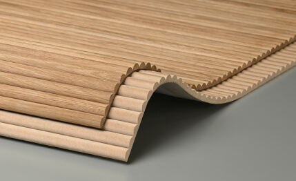
A textured surface is a surface with relief. Relief creates shadows. Shadows create contrast. Contrast creates visual information that the brain reads as 'richness' and 'quality'. This is precisely why whitewhite slatted wall panellooks incomparably richer than a simply painted white wall of the same shade. The color is the same — but one material 'lives', while the other 'remains silent'.
The linear rhythm of slats creates an ordered shadow — thin horizontal or vertical stripes that change with the angle of lighting. In the morning, when the sun enters from the side, the shadows from the slats are sharp and contrasting. In the evening, under diffused artificial light, they are soft and barely noticeable. The wall lives throughout the day — and this is a fundamental difference from a painted plane.
Our factory also produces:


The difference between 'white' and 'white'
Another nuance that an experienced designer understands immediately, but a beginner only after their first failure: white comes in different shades. Cool white (with a bluish or gray undertone), warm white (with a creamy or yellowish tint), neutral white (RAL 9003, RAL 9010) – each creates a fundamentally different atmosphere.
Cool white is strict, architectural, slightly tense. It works well in modern minimalist interiors with metal accents. Warm white is soft, cozy, inviting. Ideal for classic and Scandinavian spaces, especially when combined with wood. Neutral white is a universal background that doesn't 'steal' the palette and allows other colors to speak in full force.
When working withwhite slatted panelIt's important that the paint shade on the MDF matches the shade of the walls and ceiling molding. Mismatched white on different surfaces is one of the most common mistakes that ruins the unity of a white interior. A wall in warm white, slats in cool white, a cornice in neutral white – and the space looks disjointed, even though formally all elements are 'white'.
Get Consultation
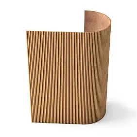
White slatted wall as the foundation of an interior
white wall slat panelThis is perhaps the most in-demand product in modern residential interiors. And the reason for this popularity is not fashion, but functionality: slats simultaneously structure the space, create texture, and remain neutral in color. They don't argue with furniture, don't compete with textiles, don't draw excessive attention – yet they turn the wall into an architectural object, not just a background.
MDF for painting – the choice for a white interior
In the context of a white interior, MDF panels for painting have an undeniable advantage over solid wood: they provide a perfectly smooth surface that accepts paint uniformly across the entire area without visible tonal differences. Wood, even well puttied, when painted white can show the grain pattern through the paint – especially under side lighting. MDF is free from this effect.
White slatted MDF panels on a wall create a uniform, even rhythm without unnecessary nuances. This is exactly what a white interior needs: the cleanest possible result where form works, not color.
Vertical and horizontal slats: different visual effects
Vertical slats are a classic choice for a white wall. They stretch the space upward, visually increase the height of the room, and create a sense of solemnity. In the bedroom, vertical white slats behind the headboard of the bed work as an architectural background—smooth, clean, and expensive-looking. In the living room, a vertical slatted panel on an accent wall gives that very 'plane-without-information' rhythm and structure.
Horizontal slats expand the space horizontally and create a calmer, more down-to-earth rhythm. They work well in corridors—visually expanding elongated spaces. In low-ceilinged rooms, horizontal slats neutralize the feeling of being cramped by the ceiling, redirecting the gaze along the wall, not upward.
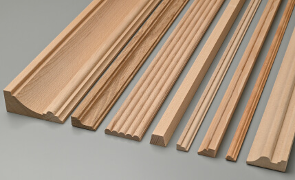
Slat dimensions and spacing: how to choose correctly
For a white interior, it is especially important not to make a mistake with the proportions. Slats that are too wide with narrow gaps create a heavy, dense surface—this is not white lightness, but a white wall. Spacing that is too sparse with large gaps makes the wall look unfinished, as if the slats 'got lost' on the surface.
Optimal proportions for a white slatted wall:
-
Slat width 40–60 mm, gap 15–25 mm — light, airy rhythm
-
Slat width 60–80 mm, gap 20–30 mm — balanced classic rhythm
-
Slat width 80–100 mm, gap 25–40 mm — more saturated, structural rhythm
For minimalist interiors — the first option. For modern classics — the second. For rooms with high ceilings from 3 meters — the third.
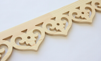
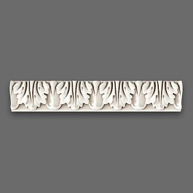
How decorative molding adds texture and depth to white spaces
If slatted panels work through rhythm — the repetition of verticals or horizontals — thenDecorative stuccoworks through plasticity. These are two different languages of relief, and it is their combination that gives a white interior its completeness.
Molding in a white interior is relief dissolved into the surface. A cornice of the same white tone as the ceiling does not stand out as a separate color element — it exists as an architectural detail that you notice only because it casts a shadow. That shadow is the value. It says: 'There is form here.' It gives the space depth without a single color accent.
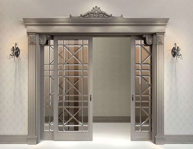
Cornices as the boundary between wall and ceiling
In a white interior, the wall/ceiling boundary is a critical zone. Without a cornice, it's just a right angle, which makes the space resemble a geometry problem rather than a living place.Decorative polyurethane moldingin the form of a cornice creates an architectural detail at this transition: a projection, a shadow, a profile — and the space immediately gains completeness.
For a white interior, a cornice works best in the same white tone as the ceiling. Then it is not perceived as a separate element — it seems like part of the architecture itself, a natural projection that 'has always been there.' This is the highest achievement of working with white molding: when the decor is unnoticeable as a separate thing, but very noticeable as an architectural quality of the space.
For a white interior, cornices with a clear geometric profile are suitable: a simple cove, an ovolo, a smooth S-shaped profile. Complex Baroque ornamentation can work in a purely white room — but only with sufficient ceiling height (from 3 meters) and a pronounced classical interior concept. In Scandinavian minimalism or modern classicism, rich ornamentation looks excessive.
Moldings as plane segmentation
Moldings in a white interior are a tool for structuring planes. Rectangular wall division with moldings creates a paneling effect—the very one associated with expensive classic interiors: English club rooms, French boudoirs, Italian villas.
Interestingly, in white, this effect works even in a contemporary interior. White geometric moldings on a white wall are not 'old-fashioned'; they are architectural. The relief rectangles dividing the wall into fields create a visual rhythm that reads as thoughtfulness and quality.
Combining white moldings on the lower part of the wall with a white slatted panel on the upper part is an exquisite solution found in modern neoclassicism. The moldings act as an 'armored field' up to half the wall height, the slats from the middle to the ceiling. A horizontal molding along the dividing line fixes the transition. Everything is white—but each zone has its own character.
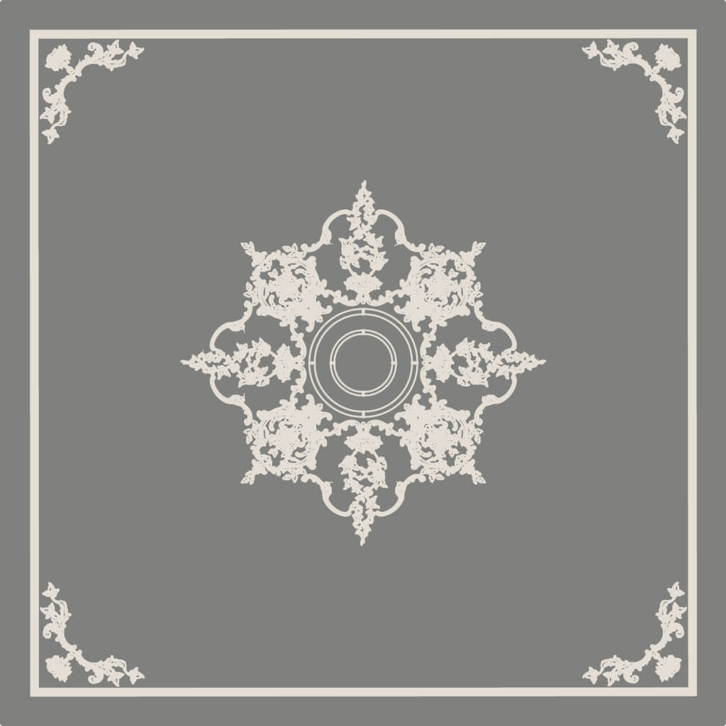
Rosettes and medallions in a white interior
A ceiling rosette in a white interior is an element often underestimated. Yet, it is precisely what sets the center of the ceiling composition and creates a focal point around which the upper plane is built.
The choice of rosette for a white interior is determined by the style and scale of the room. A small geometric rosette 200–300 mm in diameter—for Scandinavian or minimalist spaces. A classic rosette with acanthus ornament 350–500 mm in diameter—for neoclassicism. A geometric Art Deco rosette—for a contemporary interior with historical references.
Important: in a white interior, the rosette is not highlighted with color. It works through relief—and only relief. A gold or silver rosette is a different story, a different concept, requiring appropriate surroundings.
Light, shadows, and halftones in a white space
A white interior is a space where light is the main tool. It determines how slats and moldings look at different times of day, under different lighting scenarios.
Directional light and relief
Direct directional light is the best friend of a textured surface. A track light directed at a 30–45 degree angle to a slatted wall creates pronounced shadows in the gaps between the slats. The surface 'comes to life': depth, volume, and a play of light and shadow appear. The same wall under frontal lighting looks almost flat—the slats are barely discernible.
For white molding, the principle is the same: side directional light emphasizes the relief of the cornice and moldings, making every protrusion and recess visible. Without directional light, even a richly profiled cornice appears as a flat strip.
Integrated lighting in slatted panels
If an LED strip is placed behind white slats with a gap, the wall begins to glow from within. This is one of the most spectacular lighting solutions for a white interior: soft, even light seeping through the gaps between the slats creates a floating plane effect and turns the wall into a source of atmospheric lighting.
For this solution, it is important:
-
Use a strip with neutral white light (3000–4000K)—cold white (6000K and above) will ruin the warm feeling
-
Ensure the strip's uniformity—without bright spots in individual sections
-
Paint the supporting plane behind the slats white or light gray—for maximum light reflection
The effect of backlighting through white slats is literally 'light through white.' It adds airiness and lightness to the space while creating a warm evening lighting scenario.
Lighting scenarios: morning, day, evening
In a white interior with textured surfaces, it makes sense to plan several lighting scenarios:
Morning and day. Diffused daylight plus neutral general lighting. The battens cast subtle shadows, the molding is barely perceptible—the space is clean and calm.
Evening—work mode. Bright, uniform lighting. The battens and molding are neutral, the space is functional.
Evening—ambient mode. Directed accent lights plus backlighting behind the battens. The texture is maximally expressed, shadows are deep, the space is warm and expressive.
It is the third scenario that reveals the full potential of a textured white interior.
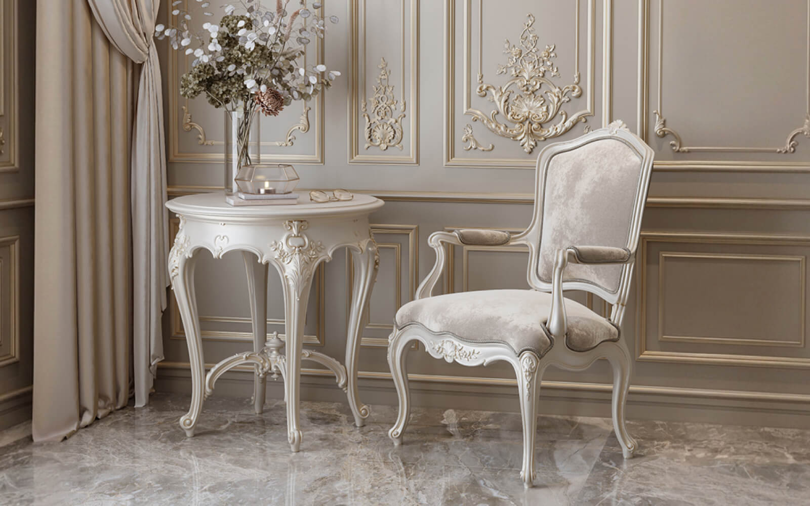
Combination with warm wood, stone, and metal
A completely white interior without a single color or material accent is not about coziness. It's about a hospital. White battens and white molding create texture but do not provide warmth. For the space to feel alive, material contrasts are necessary.
White battens and warm wood
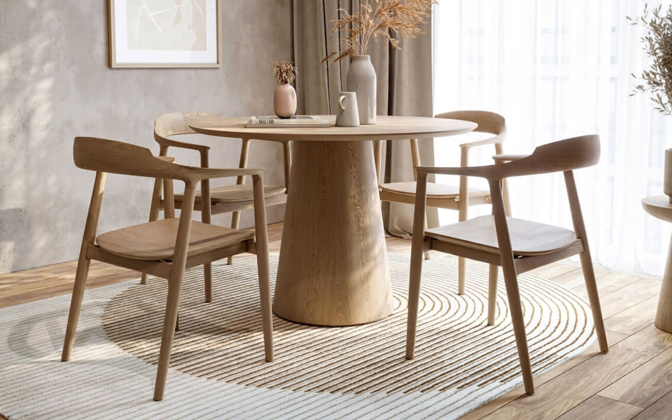
One of the most harmonious contrasts in modern interiors is white batten panels combined with wood in a natural tone. Light oak, ash, birch—a soft creamy or golden wood tone works perfectly alongside white. Wood brings warmth, naturalness, an organic note that whiteness lacks.
Scheme: white battens on one or two walls—wooden floor—wooden furniture with thin metal details. White serves as a clean architectural background, wood as a living, warm detail. Molding in white—as an architectural boundary and structure.
Molding and Stone: A Dialogue of Textures
Natural stone or its high-quality imitator next to white molding creates an expressive dialogue between two white textures. White marble with thin veining on a countertop or in a fireplace niche—and a white cornice above it—is an example of how two different 'whites' create volume through differences in texture: one matte, the other glossy; one natural, the other architectural.
Metal as a Point Accent
Brass, matte gold, black metal, stainless steel—metallic details in a white interior work like punctuation in text. They don't take up much space, but they place accents and create a sense of completeness.
Brass handles on white built-in furniture next to white slats—a classic Scandinavian solution. Thin black window frames against a white slatted wall—modern minimalism with character. Chrome-plated light fixtures against white molding—cold, strict elegance.
Textiles and Soft Surfaces
It's important not to forget that a white interior needs soft furnishings just as much as hard textures. Textiles—rugs, curtains, pillows—in neutral or tonal shades (cream, gray, beige, dusty pink) add warmth and a sense of livability to the space. White slats and white molding form the architecture—textiles form the coziness.
Mistakes in All-White Compositions
A white interior is one of the most demanding in terms of precision. Mistakes are more visible here than in any other color scheme. Let's examine the most common ones.
First Mistake: Different Shades of White Without a System
As mentioned earlier, 'white' is not a single color. If the battens are painted in warm white (RAL 9010), the molding in pure white (RAL 9003), and the walls in cool white with a gray undertone, the space will look disjointed. In daylight, this is not as noticeable. But under evening artificial lighting, the tonal differences become fully apparent—and the interior looks random, not thoughtfully designed.
Solution: define one 'white' for the entire space and strictly adhere to it. All elements—battens, molding, walls, ceiling—should be the same shade or as close as possible.
Second mistake: too much molding
In a white interior, an excess of decor is not hidden by color—it is exposed. Every outlet, every molding, every ornament is in focus. If there is too much decor, the space feels overloaded—even though everything is white.
Rule for a white interior: minimum decorative elements, maximum quality. One rich cornice is better than three mediocre moldings. One expressive rosette is better than five small overlays. White does not forgive mediocrity and overload.
Third mistake: poor surface quality
In a white interior, any surface defect is a visual scar. An uneven cornice seam, a gap in the batten joint, a brush mark on the molding, a glue stain—all are visible at first glance. Because white does not hide—it reveals.
That is why, when working with white surfaces, the requirements for installation and finishing quality are maximum. All joints—perfectly puttied and sanded. Painting—in two full coats with intermediate sanding. Batten geometry—checked with a level and a taut string.
Fourth mistake: ignoring the ceiling
In a white interior, the ceiling is an equal surface. If the walls and floor are well thought out, but the ceiling is simply painted without any decor, the space loses its vertical dimension. A cornice around the perimeter is the minimum requirement. Even the thinnest smooth molding at the wall/ceiling transition makes a striking difference.
Mistake five: lack of material contrast
An entirely white interior without a single warm or contrasting material detail is not minimalism, it's emptiness. Wood, stone, metal, live plants — at least one of these materials should be present. Otherwise, the whiteness functions not as purity, but as incompleteness.
Step-by-step guide: creating a white textured wall
We offer a practical algorithm for those who want to implement a white slatted interior with molding themselves or correctly set the task for craftsmen.
Step one: choosing a white shade
Before purchasing materials, determine a single shade for the entire room. Use paint manufacturers' color charts: apply several shades to the wall, evaluate them under daylight and artificial lighting. Only then finalize your choice.
Step two: selecting slats and molding
For a white interior, the following are optimal:
-
MDF Plank PanelsFor painting — perfectly smooth surface, precise slat spacing, readiness for any white shade
-
Cornice with a clear geometric or moderate classical profile
-
Moldings for wall or ceiling division (optional)
-
Ceiling outlet (optional, if a central light fixture is present)
Step three: installation in the correct sequence
-
Wall marking: axis of symmetry, frame lines, slatted zone boundaries
-
Frame installation
-
Electrical wiring (if lighting is provided)
-
Installation of slatted panels
-
Installation of the cornice around the perimeter of the ceiling
-
Installation of moldings (if provided)
-
Outlet Installation
-
Puttying all joints
-
Sanding
-
Priming all surfaces
-
Painting in two coats
Step four: lighting solution
Before completing installation, decide on the placement of directional light fixtures. A track system with adjustable heads is the optimal solution for a white textured interior: it allows directing light onto the slats and moldings at the desired angle, changing the visual effect depending on the scenario.
White slatted interior in different rooms
Bedroom: purity as the main principle
In the bedroom, white slats behind the headboard create an architectural backdrop that is both functional (acoustic absorption) and aesthetically flawless. Vertical slats 40–50 mm wide with a 15–20 mm gap create a light, airy rhythm that doesn't feel oppressive at night. A thin white cornice along the ceiling perimeter completes the space from above.
What to add for warmth: wooden flooring or wooden furniture details, linen or cotton textiles in ecru and light grey shades, live plants in white or natural-toned ceramic pots.
Living room: balance of structure and airiness
In the living room, a white slatted wall works as the main architectural accent. The wall behind the sofa or the wall with the TV are optimal places for the panel. A cornice along the perimeter, possibly with moldings forming two or three fields on the ceiling. A rosette above the chandelier.
Hallway: length as a resource
In the hallway, white horizontal slats visually expand the space and guide the eye along it. A thin white molding along the ceiling perimeter adds completeness to the hallway. In a narrow space, this is especially important: details that seem insignificant in a large room create a decisive impression here.
Study: strictness as style
In the study, white slats combined with classic moldings create restrained elegance. The slats provide a quiet acoustic backdrop, the moldings add architectural character. If ceiling height allows, a cornice with a moderate profile. No bright accents: a white study is about concentration and clarity.
FAQ: Most Common Questions
How to keep white slats clean?
MDF with a high-quality lacquer coating is easily cleaned with a damp cloth. For matte paint, a soft sponge without abrasive is recommended. Gaps between slats are cleaned with a narrow soft brush or a vacuum cleaner with a brush attachment.
What gap between slats is best for a white interior?
For a white interior, a gap of 15–25 mm is optimal. A wider gap makes the supporting plane behind the slats noticeable—this will require careful painting in the same shade. A narrower gap reduces the chiaroscuro effect and makes the slats less expressive.
Can colored light be used behind white slats?
Yes, this is a popular solution. Soft warm light (2700–3000K) behind white slats creates a cozy evening effect. Colored RGB light is for those who prefer dynamic lighting scenarios. In a white interior, colored backlighting works especially expressively because white surfaces reflect light well.
Does MDF need to be primed before painting white?
Absolutely necessary. MDF has a porous structure on its edges, which actively absorbs paint. Without primer, significantly more coats of paint will be required, and the edges will still be darker than the face surface. One coat of deep-penetration primer completely solves this problem.
How to choose molding for white slats?
Focus on scale: the width of the molding should not exceed the width of the slat. For slats 40–60 mm — molding up to 50 mm. Molding style: for minimalism — simple straight or S-shaped profile without ornament. For neoclassicism — profile with geometric ornament or meander.
How long will painted MDF slats last?
With high-quality paint coating (primer + 2 layers of paint + finishing varnish) — 10–15 years without the need for repainting. Local damage is restored by spot application of paint without complete repainting.
Are white slats suitable for the kitchen?
Yes, when using moisture-resistant MDF and high-quality varnish coating — kitchen areas not near the stove or sink. Areas of active steam and splashes are better finished with other materials.
About the company STAVROS
A white interior is a test for materials. There is no room for mediocrity here: every surface defect, every geometric discrepancy, every joint is visible at first glance. That is why for a white interior, only materials that are fully trusted are chosen.
The company STAVROS manufacturesRafter panelsmade of MDF and solid wood with precise geometry, stable parameters, and impeccable surface ready for painting.Decorative polyurethane molding— cornices, moldings, rosettes,Relief Decorationin a wide assortment range: from laconic minimalist profiles to detailed classical elements.
All STAVROS products are ready for use in a white interior: smooth surfaces, clear edges, stable geometry. You get a material that does not require additional refinement and gives a predictable result — exactly what is needed for a white space where mistakes are not allowed.
STAVROS is the choice for those who understand: a white interior forgives only quality.


