Article Contents:
- Why wall molding is returning to modern interiors
- Polyurethane as the material of the future
- Layout schemes: from simple to complex
- Classical panel division
- Rectangular frame system
- Asymmetrical compositions
- Accent wall with a single frame
- Moldings: profile selection and its influence on style
- Simple rectangular profiles
- Classical shaped profiles
- Combined Solutions
- Proportions and the mathematics of harmony
- Golden ratio in action
- Rule of thirds
- Modular grid
- Wall preparation: the foundation of quality results
- Leveling
- Cleaning and priming
- Marking
- Installation: from theory to practice
- Adhesive Selection
- Cutting and corner joints
- Adhesive Application
- Sealing joints and painting
- Usage scenarios: where and how to apply wall molding
- Living room: formality and hospitality
- Bedroom: privacy and coziness
- Entryway: First Impression
- Children's room: fantasy and growth
- Kitchen and dining room: practicality and style
- Interior styles and corresponding layout schemes
- Neoclassic: Reserved Elegance
- Classic Style: Luxury of Traditions
- Modern minimalism: structure without ornamentation
- Scandinavian Style: Coziness and Simplicity
- Mistakes to avoid
- Violation of Proportions
- Curved lines and non-right angles
- Incorrect choice of moldings
- Neglecting preparation
- Poor painting
- Lighting: how to highlight molding
- Side lighting
- Hidden Lighting
- Directional spotlights
- Combination with other finishing materials
- Molding and wallpaper
- Moldings and decorative plaster
- Moldings and wood
- Moldings and mirrors
- Maintenance and operation
- Regular Cleaning
- Local repair
- Repainting
- Frequently asked questions about wall moldings
- Conclusion: create your architectural masterpiece

When it comes to transforming a space, we often think of radical changes—new furniture, changing wallpaper, major renovations. But what if there's a way to breathe life into an interior without resorting to massive investments and construction chaos? What if you can turn a bland wall into an architectural work of art using only elegant frames, precise proportions, and the play of light? That's exactly what we'll talk about today—wall moldings, layout patterns, and the art of creating paintable 'panels.'
Wall moldings are not just a tribute to tradition or an attempt to revive palace luxury. It's the language of architecture that speaks of taste, attention to detail, and an understanding of spatial harmony. Modern materials, particularly polyurethane, have made this language accessible to everyone who strives for perfection in decorating their home.


Why wall moldings are making a comeback in modern interiors
Fashion is cyclical, but there are things that never go out of style. Among them isWall molding—an element that has adorned palaces, estates, and mansions for centuries. Today, it's experiencing a true revival, and here's why.
First, modern minimalism has started to feel stale. People are tired of sterile white boxes lacking character and soul. They crave depth, texture, interplay of lines—something that turns a dwelling into a home. Wall moldings provide exactly that: volume, relief, visual complexity that makes an interior lively and expressive.
Second, technology has advanced. If moldings used to be made from heavy plaster, required skilled craftsmen, and cost a lot of money, todayPolyurethane moldingsoffers the same aesthetic possibilities with significantly less cost, weight, and installation complexity. It's a revolution in the world of decor.
Third, a wall with moldings is a way to zone space without building partitions. Molding frames visually divide large areas into logical zones, create focal points, and guide the eye. This is especially valuable in studios and open-plan apartments where space needs structuring without cluttering it.


Polyurethane as the material of the future
Why has polyurethane become the material of choice for modern wall moldings? The answer lies in its unique properties. This synthetic polymer combines the lightness of foam with the strength of plastic, the moisture resistance of rubber with the workability of wood. Polyurethane wall moldings are not afraid of temperature fluctuations, do not absorb moisture, and do not deform over time.
Moreover, polyurethane elements are ideal for painting. Their smooth surface doesn't require complex preparation—just apply primer and two or three coats of paint in any shade. Want snow-white classic? Easy. Prefer deep graphite? No problem. Dream of gilded luxury? That's achievable too.Moldings made of polyurethaneturn into what you need, taking on any color and retaining it for decades.
An important point: polyurethane is eco-friendly. High-quality products do not emit harmful substances, are safe for children and allergy sufferers, and do not accumulate dust. This makes them ideal for living spaces where family health is a priority.
Our factory also produces:


Layout patterns: from simple to complex
Now let's move on to the most interesting part—layout patterns. How do you turn a set of moldings into a harmonious composition? How do you avoid chaos and create a system that pleases the eye? Let's explore the main approaches, from the simplest to complex multi-level solutions.
Get Consultation
Classical panel division
The most traditional and time-tested pattern is horizontal division of the wall into two parts. Imagine: at a height of about one-third from the floor (usually 90-120 cm), a horizontal molding line runs. Below is the panel zone; above is the main wall plane.
This pattern comes to us from an era when the lower part of walls was finished with wooden panels for protection from damage and cold. Today, such division serves a purely decorative function, but how effective it is! The horizontal line visually expands the room, making it more squat and cozy—perfect for rooms with high ceilings.
The lower panel can be painted in a darker shade or covered with contrasting wallpaper. Leave the upper part light. This technique creates visual support, stability, a sense of 'groundedness.'decorative moldingsat the boundary of the two zones become a logical transition, an elegant frame that emphasizes the intentionality of the design.
Variations of this pattern are endless. You can add vertical divisions within the lower panel, creating rectangular sections. You can place decorative overlays in the center of each section. You can use wider moldings with ornamentation or, conversely, minimalist-profile strips.
System of rectangular frames
If classical panel division seems too predictable to you, try creating a system of rectangular frames across the entire wall plane. This is a more modern and dynamic approach that allows you to play with rhythm and scale.
The standard pattern involves placing 6-12 rectangles on one wall, organized into 2-3 horizontal rows and 3-4 vertical rows. The key to success is proportions. Use the golden ratio: the ratio of the frame's width to its height should be approximately 1:1.6. This creates that very harmony that the human eye perceives as 'correct' and pleasant.
The spacing between frames is also important. Placing them too close together creates a feeling of tightness and restlessness. Placing them too far apart causes the composition to break down into separate elements without unity. The optimal gap is 10-15 cm between frames and 15-20 cm from the frames to the wall boundaries (ceiling, floor, corners).
Inside the frames, you can use contrasting finishes. For example, the wall is painted light gray, while inside the frames is a deep blue or textured plaster. You can do the opposite: the main wall is dark, the frames are highlighted with light molding, and inside them is white. Playing with contrasts enhances architectural expressiveness.
Asymmetric compositions
For those not afraid to experiment, I suggest considering asymmetrical layout schemes. There is no strict grid or repeating rhythm here. Instead, there is a free composition where frames of different sizes create a dynamic, visually interesting picture.
Imagine: one large frame is offset from the center of the wall, balanced by a group of three small ones on the opposite side. Or a stepped composition where frames of different heights create a staircase effect. Or even intersecting frames at different angles—for the boldest interiors.
Asymmetry requires a sense of composition. It's important that even in the absence of mirror symmetry, visual balance is maintained. A large frame on the left should be balanced by several small ones on the right. Vertical elements should combine with horizontal ones. Dark accents should be paired with light pauses.
Such compositions are ideal fordecorating walls in the living room, where molding becomes not just decoration, but an artistic statement, a reflection of the homeowners' individuality.
Accent wall with a single frame
Sometimes less is indeed more. Instead of many frames, create one—large, expressive, dominant. It can occupy the central part of the wall behind a sofa, bed, or dining table, becoming an architectural portal that draws attention and organizes the entire space around it.
Such a frame should be truly large—one meter by one and a half or even two by three, depending on the room's dimensions. Choose expressive molding for it: with ornamentation, a complex profile, possibly with decorative corner elements. Inside the frame, you can place a contrasting finish, an artistic panel, a mirror, or even a television.
This technique is especially good for bedrooms, where molding on the wall behind the headboard creates a luxurious focal center. Paint the frame and the interior space in deep, saturated tones—emerald, sapphire, burgundy—and achieve the effect of a precious jewelry box.
Moldings: choosing a profile and its influence on style
Not all moldings are the same. The profile—the shape of the strip's cross-section—radically influences the final perception of the interior. Let's figure out which profile suits which style and how not to make a mistake in the choice.
Simple rectangular profiles
Laconic, minimalist, with clear edges—suchInterior moldingsare ideal for modern interiors. They create a geometric structure without drawing attention to themselves, working for the overall composition rather than their own decorative quality.
Rectangular moldings 3-5 cm wide are excellent for zoning and creating frames. They can be painted the same color as the wall for the effect of a single plane with relief or, conversely, in a contrasting shade for a clear graphic accent.
Such profiles are universal. They are equally good in Scandinavian interiors, industrial lofts, and modern neoclassicism. Their restraint is their strength.
Classical shaped profiles
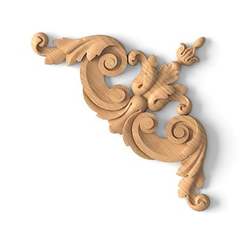
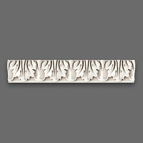
If your goal is a traditional interior with references to palace architecture, choose moldings with a shaped profile. Rolls, flutes, complex curves, ornamental inserts—all this creates a sense of historical continuity and handcrafted luxury.
Shaped moldings are wider—usually 7-12 cm, and sometimes more. Their relief creates a play of light and shadow that changes throughout the day depending on the lighting. In the morning, the frames may appear soft and barely noticeable, while in the evening, with side lighting, they become expressive and dramatic.
It's important not to overdo it. In small spaces, overly massive and ornate moldings will look cumbersome. Reserve them for spacious living rooms, halls, and dining rooms where there is room for an architectural gesture.
Combined Solutions
Who said you have to choose one type of molding? Combine different profiles to create complex, multi-layered compositions. For example, the main frame is formed from a wide shaped molding, and inside it is a second contour made of a thin rectangular one. Such a 'frame within a frame' adds depth and sophistication.
Or another option: a system of rectangular frames made from laconic moldings is created on the wall, and at key points—in the corners or at the center of the composition—decorative overlays with ornamentation are placed. This combination of strictness and decorativeness creates a balanced and intellectual impression.
Proportions and the mathematics of harmony
Let's talk about what distinguishes a professionally designed layout from the random placement of elements. It's about proportions—the mathematical basis of visual harmony.
The golden ratio in action
The golden ratio (approximately 1:1.618) is a proportion that the human eye perceives as most harmonious. It is found in nature—from the spirals of seashells to the structure of galaxies—and has been used by architects for millennia.
Applied to molding layout, this means the following: if a frame has a width of 100 cm, its height should be about 161.8 cm. If the ceiling height is 270 cm, the horizontal molding for panel division should be placed at a height of about 167 cm from the floor (270 : 1.618 ≈ 167).
Of course, it's not necessary to follow this rule literally. But keep it in mind as a guideline. Even approximate adherence to the golden ratio will make the composition more pleasant to perceive.
Rule of Thirds
Another useful tool from the arsenal of artists and photographers. Mentally divide the wall into nine equal parts with two horizontal and two vertical lines. The intersection points of these lines are the zones of greatest visual attention.
By placing key composition elements—large frames, decorative overlays, accent colors—at these points or along these lines, you create a natural, balanced composition. This works for asymmetric layout schemes when there is no strict grid but visual logic is needed.
Modular grid
For those who prefer a structured approach, I recommend using a modular grid. Define a base module—for example, 30 cm—and build the entire composition as multiples of this module. A frame can be 60×90 cm (2×3 modules), the distance between frames—30 cm (1 module), the ceiling offset—60 cm (2 modules).
Such a system creates mathematical precision and visual order. Even with complex asymmetric compositions, the modular grid provides a hidden structure that prevents the composition from falling apart.
Wall Preparation: The Foundation of Quality Results
Before starting the installation of moldings, you need to prepare the base. This is not the most inspiring part of the process, but it determines 80% of the final quality.
Leveling
Perfectly smooth walls are rare. Usually, there are irregularities, waves, local depressions, and bumps. Moldings will not fit tightly on them, creating gaps, and frames will turn out crooked, with non-parallel sides.
Assess the condition of the walls. If deviations exceed 3-5 mm per meter, leveling is necessary. This can be done with plaster or drywall—depending on the scale of the problem and your capabilities. Yes, this means additional costs and time, but the alternative is poorly secured moldings that will start to fall off over time.
Use a laser level or a long straightedge to check the plane. Mark problem areas and fix them. Remember: a wall with moldings will be under close scrutiny—any defects will become more noticeable, not less.
Cleaning and Priming
The surface must be clean: no dust, grease stains, or remnants of old coatings. Dust reduces adhesive adhesion. Grease makes gluing impossible. Peeling paint will come off along with the glued molding.
Use a vacuum to remove dust, then wipe the wall with a damp cloth. If the wall is painted with glossy paint, lightly sand it with fine sandpaper—this will improve adhesion. Remove grease stains with a degreaser.
After cleaning, apply a deep-penetration primer. It will strengthen the surface layer, improve adhesion, and reduce absorbency. For loose substrates, two coats of primer may be required. Wait for complete drying—usually 4-6 hours—before proceeding to the next stage.
Marking
This is the most critical moment of preparation. Precise marking is half the success. Even the highest quality moldings won't save you if frames are placed crookedly or asymmetrically.
Use a laser level to create horizontal and vertical lines. For complex layout schemes, draw a scaled plan on paper, calculate all dimensions, and then transfer them to the wall. Mark not only the placement lines for moldings but also the centers of frames, distances between elements, and control points for checking symmetry.
Don't rush. Spend as much time on marking as needed. Fixing mistakes after gluing will be much more difficult and expensive.
Installation: from theory to practice
Now that the walls are prepared and the marking is done, you can proceed with installation. Let's consider the process step by step.
Adhesive selection
For polyurethane moldings, specialized polymer-based adhesive is suitable. It provides strong bonding, is elastic (compensates for thermal expansion), and dries quickly. Popular brands are "Moment Montazh," "Titan," "Quelyd Mastifix."
An alternative is white acrylic sealant. It is cheaper but requires longer fixation (you'll need to hold the element for 5-10 minutes). For lightweight moldings with small cross-sections, it is quite suitable.
Do not use universal construction adhesives like PVA or water-based "liquid nails." They shrink when drying, which can lead to deformation of moldings. Also, avoid aggressive solvent-based compounds—they can dissolve polyurethane.
Cutting and corner joints
Moldings need to be cut at a 45° angle to create neat corner joints. For this, use a miter box and a fine-toothed hacksaw for metal or a miter saw.
Here's an important point: cutting must be perfectly precise. Even a deviation of 1-2 degrees will lead to visible gaps in the corners. If you lack experience, practice on scraps. It's better to ruin a couple of practice pieces than the front elements.
When joining straight sections, make a bevel cut—not at 90°, but at a slight angle (about 30°). This way, the joint will be less noticeable after puttying and painting.
Adhesion
Apply adhesive to the back of the molding in a zigzag or dots—depending on the profile width. For narrow moldings (up to 5 cm), one line along the center is enough. For wide ones (over 7 cm)—two lines along the edges.
Do not apply too much adhesive. Excess will squeeze out when pressed, staining the wall and the front side of the molding. It's better to underapply than overapply.
Place the molding against the wall along the marking line, press it. Hold for 2-3 minutes (the setting time is indicated on the adhesive packaging). Check the horizontality or verticality with a level. Adjust the position if necessary—you have 5-10 minutes before the adhesive sets completely.
For long moldings, you can use temporary fixation with painter's tape or thin nails (in inconspicuous places). After the adhesive has completely dried (24 hours), remove the fasteners.
Joint sealing and painting
After installing all elements, inspect the joints. Even with the most careful cutting, micro-gaps will remain. They need to be filled with acrylic putty (not gypsum—it cracks on polyurethane).
Apply putty with a rubber spatula, filling the gaps. Remove excess immediately with a damp sponge. After drying (2-4 hours), lightly sand with fine sandpaper. Wipe off dust.
Now you can paint. First apply primer — it will improve paint adhesion and even out absorbency. Then apply two to three coats of paint with intermediate drying. Use a brush for detailed painting of the relief and a roller for large flat surfaces.
Paint selection depends on the room. For dry rooms, matte acrylic or latex paint is suitable. For wet areas (kitchen, bathroom) — washable semi-gloss. Color is up to your taste, but remember the proportions: dark moldings on a light wall visually protrude forward, light ones on a dark wall create depth.
Usage scenarios: where and how to apply wall molding
Theory and technology are good, but where exactly in the house should wall molding be applied? Let's look at specific scenarios for different rooms.
Living room: formality and hospitality
The living room is the face of the house, the place where you receive guests and spend family evenings. HereWall moldingit can fully unfold.
An accent wall behind the sofa is a classic technique. Create a system of frames or one large frame with contrasting interior finish on it. This will become the visual center of the room, organizing the entire space. Complement the composition with symmetrical wall sconces on the sides — and you'll achieve a gallery wall effect.
Another option is decorating the wall with the TV. Instead of hanging the screen on a bare wall, create an architectural frame around it using moldings. The TV integrates into the interior, ceases to be a foreign technological element, and becomes part of the overall design.
Don't forget the fireplace, if you have one.Molding on the WallMolding around the fireplace portal is a tradition that never goes out of style. Pilasters on the sides, shaped molding around the perimeter, a decorative overlay above the mantel — and your fireplace transforms into a true architectural monument.
Bedroom: privacy and coziness
In the bedroom, wall molding works to create an atmosphere of privacy and luxury. The main focus is the wall behind the headboard.
Create a large frame here, defining the sleeping area. Inside the frame, you can use soft wall panels with tufting, wallpaper with fabric texture, or simply a deep, rich color. Choose expressive moldings with a classic profile. Add symmetrical bedside lamps, and the bedroom will turn into a boudoir.
An alternative is panel division with emphasis on the lower part. Paint the panel in a warm, calming shade — gray-beige, dusty pink, soft olive. Leave the upper part light. This technique creates a sense of security and comfort.
Entryway: first impression
The hallway is the first thing guests see when entering your home. It's important to make an impression here without overloading the already small space.
If the hallway is narrow, use vertical divisions — frames with elongated proportions, vertical moldings. They will visually raise the ceiling and make the room feel airier. If the hallway is long — horizontal panel division will visually shorten it and make it more proportional.
An interesting solution is creating a gallery wall using molding frames. Inside each frame, place a photograph, poster, or mirror. This creates a dynamic, personalized composition that tells about the hosts' tastes and interests.
Children's room: imagination and growth
In a child's room, wall molding can be not only decorative but also functional. Create frames on the walls, inside which the child can draw with whiteboard markers (if the surface is coated with special paint) or place constantly changing posters and drawings.
Moldings can be painted in bright colors matching children's preferences. Blue and orange for a boy. Pink and mint for a girl. Or neutral white and gray for a universal solution that will 'grow' with the child.
Important: use only eco-friendly materials and paints. Polyurethane molding from reliable manufacturers is safe, but ensure certificates are available.
Kitchen and dining room: practicality and style
In the kitchen, wall molding is a less common solution, but very effective with the right approach. The main thing is to avoid placing moldings in areas of active soiling (backsplash, area above the stove).
But in the dining area, if it is designated,Moldingsthey will create the atmosphere of an elegant dining room. Decorate the wall behind the dining table with a system of frames, inside place wallpaper with a classic print or decorative plaster. This will turn everyday meals into small ceremonies.
Polyurethane molding in the kitchen should be coated with washable paint. This way it can be wiped with a damp cloth, removing inevitable splashes and stains.
Interior styles and corresponding layout schemes
Wall molding is universal, but each style has its own nuances of application. Let's go through the main directions.
Neoclassicism: Reserved Elegance
Neoclassical interior — these are classical forms, cleansed of excessive decoration, adapted to modern life. Symmetrical compositions of rectangular frames, laconic moldings with minimal ornamentation, clear proportions are appropriate here.
Color palette — neutral: white, gray, beige, possibly with accents of deep blue or emerald. Frames are created to match the walls or with slight contrast. Inside the frames — solid color paint or subtle wallpaper with a geometric print.
Complete the compositioncorniceson the ceiling andpilastersat key points — and you'll get a holistic architectural ensemble, elegant and refined.
Classic style: luxury of traditions
If neoclassicism is restrained, then the classical style is full-fledged luxury. Here you can (and should) use moldings with rich relief, decorative overlays with ornamentation, multi-level compositions.
Create panel division with additional vertical subdivisions within the panel. Place a carved overlay in the center of each section. Choose wide moldings with a classic profile — beads, flutes, egg-and-dart ornament.
Colors — noble and deep. Moldings can be painted white or cream, and walls — in rich shades: burgundy, emerald, sapphire. Or vice versa: walls light, and moldings with gilding or patina.
Don't forget about balance. Even in the classical style, an excess of decor can turn the interior into a museum exhibition. Let it be luxurious, but not overloaded.
Contemporary minimalism: structure without ornamentation
It might seem that minimalism and molding are incompatible. But that's not the case. Properly used moldings can enhance a minimalist interior, adding structure and architectural expressiveness without unnecessary decor.
The key is extreme conciseness. Use thin (2-3 cm) rectangular moldings without ornamentation. Paint them the same color as the wall — the effect will be based solely on relief and the play of light and shadow. Layout schemes — geometrically strict: a grid of rectangles of the same size or large single frames dividing the wall into functional zones.
Minimalism values functionality. Frames can denote a storage area, a workspace, a relaxation zone. This is not just decor — it's architectural zoning, the visual logic of space.
Scandinavian style: comfort and simplicity
Scandinavian interior — these are light spaces, natural materials, functionality and coziness. Wall molding here is used delicately, as an additional layer of texture, not as the main accent.
Choose moldings with a small cross-section (3-5 cm), simple profile. Paint them white or light gray — to match the walls. Create not too complex compositions: one or two frames on the wall, panel division at one-third height, vertical subdivision in the window area.
Inside the frames, you can use natural materials: wooden panels, cork covering, textiles. This will add tactility and warmth, which are so valued in Scandinavian design.
First mistake - unstructured mixing. A classic chair, loft table, Scandinavian chest, and minimalist cabinet in one room is not eclecticism, but visual chaos. Each item draws attention to itself, not creating cohesion. A system, logic, unifying idea is needed. Choose one dominant style, add a second as an addition, and possibly a third as an accent. But no more than three, and all should have something in common - color, material, era, or functionality.
Even with quality materials and correct technology, you can get an unsatisfactory result by making typical mistakes. Let's look at the most common ones.
Violation of proportions
This is perhaps the main mistake. Too small frames on a large wall will get lost and look ridiculous. Too large ones in a small room will overwhelm the space. Too tight placement will create a feeling of restlessness. Too scattered — the composition will fall apart.
Before starting installation, make a scaled sketch. Print a photo of the wall, draw frames on it to scale. Or use a graphics editor. Or even stick painter's tape on the wall, outlining the contours of future frames, and evaluate how it looks in reality.
Crooked lines and non-right angles
The human eye is incredibly sensitive to deviations from vertical and horizontal. Even a deviation of 1-2 degrees is noticeable and jarring. If a molding is not strictly horizontal, if a corner joint does not form exactly 90°, if frames are asymmetrical — the entire composition will look sloppy.
Use a laser level. Check each element before fixing. Don't rely on your eye — it's deceptive. Mathematical precision is critical here.
Incorrect choice of moldings
Too massive moldings in a small room will make it even smaller. Too thin ones on a large wall will get lost. Ornamented moldings in a minimalist interior will clash. Simple rectangular ones in luxurious classicism — will look cheap.
Moldings must correspond to the scale of the room and the style of the interior. If in doubt — choose something medium, universal. Moldings 5-7 cm wide with a moderate figured profile will suit most situations.
Neglecting preparation
Attempting to glue moldings onto an uneven, dusty, or greasy wall is doomed to failure. Elements will hold poorly, will peel off over time. Joints will turn out crooked, with gaps.
Preparation is 50% of success. Spend as much time on it as needed. Level, clean, prime. It's boring, but critical.
Poor painting
Even perfectly installed molding will look cheap if painted carelessly. Unpainted spots, drips, runs, unfilled joints — all of this kills the impression.
Use quality paint, apply it in two or three coats with intermediate drying. Fill all joints with putty before painting. Paint the relief with a brush, large planes — with a roller. Work carefully, without rushing.
Lighting: how to highlight molding
Wall molding lives in the play of light and shadow. Relief that is barely noticeable under frontal lighting becomes expressive and dramatic with side lighting. Proper lighting can enhance the effect of molding many times over.
Side lighting
Wall sconces installed on the sides of frames or above them create directed side lighting that emphasizes the relief of moldings. Shadows become deep, the form becomes expressive.
Place light fixtures symmetrically to emphasize the architectural logic of the composition. Choose sconces in a style that matches the interior: classic with shades for traditional interiors, minimalist with directed light for modern ones.
Hidden lighting
An even more effective solution is an LED strip hidden behind moldings. It provides soft diffused light that seems to highlight frames from within, creating a glowing effect.
For this, the molding is mounted with a small offset from the wall (1-2 cm), and an LED strip is placed in the resulting niche. The effect is stunning, especially in the evening when the main lighting is dimmed.
Such lighting requires planning at the design stage. It is necessary to consider the electrical wiring, placement of power supply units, and the possibility of brightness control.
Directed spotlights
Ceiling light fixtures with adjustable light direction (spotlights) allow directing a beam onto the molding, illuminating it from below or above. This creates a theatrical effect, turning the wall into an independent work of art.
Use warm light (2700-3000K) for cozy living spaces and neutral light (4000K) for modern minimalist interiors.
Combination with other finishing materials
Wall molding rarely exists in isolation. It is usually combined with other finishing materials, creating complex multi-layered compositions.
Molding and wallpaper
A classic combination: moldings form frames, inside which wallpaper is pasted. The main wall can be painted, and the wallpaper can be contrasting, with a pattern or texture.
Choose wallpaper that matches the style. For classic interiors: damask, monograms, floral prints. For modern ones: geometry, abstraction, solid colors with texture. For eclectic: anything you like, from ethnic motifs to botanical illustrations.
Important: first paste the wallpaper, then mount the moldings on top of them. This way the joints will be neater, and when replacing wallpaper, you won't have to remove the molding.
Molding and decorative plaster
Textured plaster inside frames creates an interesting tactile effect. Smooth moldings contrast with the rough, relief surface, adding visual complexity.
You can use Venetian plaster with a marble effect, silk plaster with shimmer, rough textured plaster imitating concrete or stone. It all depends on the desired effect.
Technology: first apply the plaster, let it dry completely and gain strength (usually 1-2 weeks), then mount the moldings. This will avoid deformations and cracks.
Molding and wood
Wooden panelsWood in combination with polyurethane moldings is luxury and nobility. The lower part of the wall is finished with wooden panels (boiserie), and the molding forms a transition to the painted upper part.
Wood adds warmth, naturalness, and tactile pleasure. Polyurethane moldings, when properly painted (for example, with wood imitation or in a neutral color that matches the wood), integrate into the composition, creating a cohesive impression.
Such a solution is ideal for studies, libraries, dining rooms — spaces where tradition and solidity are valued.
Molding and mirrors
Mirrors framed by moldings are a classic technique that visually expands space and adds light. You can create a frame from moldings, inside which a mirror is placed. Or several frames with mirrors of different sizes for a dynamic composition.
Mirrors reflect light, making the room brighter and more spacious. They also reflect interior elements, creating visual repetitions and enhancing the sense of depth.
This is especially effective in narrow hallways and small bathrooms, where every space-expanding technique is worth its weight in gold.
Care and Maintenance
Polyurethane molding is low-maintenance, but minimal care will preserve its flawless appearance for decades.
Regular cleaning
Dust is the main enemy of any decor. It accumulates in the relief, making the molding dull and untidy. Regularly (once every 1-2 months) wipe the moldings with a dry soft cloth or use a vacuum cleaner with a brush attachment.
For more thorough cleaning, you can use a slightly damp cloth. Avoid excess moisture — polyurethane is not afraid of water, but the adhesive holding it may soften with prolonged exposure.
Local repair
If the molding is damaged (chip, scratch), it's easy to fix. Small chips are filled with acrylic putty, sanded after drying, and touched up. Scratches are simply painted over.
If an element has come unglued, remove it, clean off the old adhesive, apply fresh adhesive, and reattach it. After drying, conceal the joint with putty and paint.
Repainting
Over time, you may want to change the color of the molding. This is not a problem. Polyurethane can be repainted multiple times. Clean the surface of dust and grease, apply primer (if changing from a light to a dark color), and paint in the desired shade.
Repainting is a simple way to update the interior without dismantling and replacing elements. Tired of white? Paint it gray. Want an accent? Make the moldings contrasting. The possibilities are endless.
Frequently asked questions about wall molding
In conclusion, we will answer the questions most frequently asked by those planning to use wall molding.
Can molding be used in small rooms?
Yes, but with caveats. Choose moldings with a small cross-section, avoid complex multi-level compositions. One or two concise frames or panel division will not overload the space but will add structure to it. Paint the molding the same color as the walls for a unified plane with relief effect.
How much do materials and labor cost?
The cost of polyurethane moldings ranges from 200 to 2000 rubles per linear meter, depending on the width and complexity of the profile. For a standard room of 15-20 sq.m, approximately 20-30 linear meters of moldings are needed (depending on the layout scheme), totaling 4000-60000 rubles for materials. Adhesive, putty, paint — another 2000-5000 rubles.
The cost of hiring professionals will be approximately the same as the materials, but you can save money by doing everything yourself — installing polyurethane molding does not require special skills.
How long does polyurethane molding last?
With proper installation and care — decades. Polyurethane is not prone to rotting, is not afraid of insects, and does not crack over time. The only thing that may be required is periodic repainting to refresh the appearance.
Can molding be used in humid rooms?
Yes. Polyurethane is moisture-resistant, but it is important to use moisture-resistant adhesive and washable paint. In the bathroom or kitchen, the molding will feel excellent, without losing its appearance or deforming.
How to choose the right layout scheme?
Focus on the size of the room, ceiling height, and interior style. For small rooms — simple schemes with a minimum of elements. For large ones — you can afford complex multi-level compositions. For classic interiors — symmetrical schemes; for modern ones — asymmetry is possible. Make a sketch before starting work.
Is professional help needed?
Not necessarily. If you know how to use a level, miter box, and adhesive, you can manage on your own. Installing polyurethane molding is easier than it seems. But if you are unsure or the project is complex — it's better to turn to professionals to avoid costly mistakes.
How to combine molding on walls and ceilings?
Use moldings of similar profile and style. If the walls have classic shaped moldings, the ceiling should also have a classic cornice. If the walls have minimalist rectangular strips, the ceiling cornice should also be concise. Unity of style creates harmony.
What to do if the walls are uneven?
Level them before installation. Moldings on uneven walls will adhere poorly and look crooked. This is critical. Use plaster or drywall — depending on the degree of unevenness.
Conclusion: Create Your Architectural Masterpiece
Wall molding is not just a decorative technique; it is a way to transform space, create architectural expressiveness, and turn bland walls into works of art. Layout schemes for frames and panels for painting open up limitless possibilities for creativity, allowing the realization of any design ideas — from strict classics to bold avant-garde.
Modern materials, particularly polyurethane, have made molding accessible, practical, and durable. Huge budgets and armies of craftsmen are no longer needed. All that is required is an understanding of composition principles, care in work, and quality materials.
If you are ready to start your interior transformation project, pay attention to the products of STAVROS company. For over two decades, STAVROS has offered the widest rangedecorative elements made of polyurethane— moldings, cornices, pilasters, decorative overlays — everything needed to create elegant interiors.
The quality of STAVROS products has been verified by thousands of completed projects across Russia. Precise dimensions, perfect surface finish, material durability — these are the standards the company strictly adheres to. Professional consultations will help correctly calculate material quantities, select optimal profiles and sizes, and receive recommendations for installation and finishing.
STAVROS is not just about selling materials; it is a partnership in creating interiors that will delight for decades. By choosing STAVROS, you choose quality traditions tested by time. Our products adorn private homes and public buildings, create atmosphere in restaurants and offices, and turn ordinary apartments into works of architectural art.
Turn your walls into a canvas for architectural creativity. Use wall molding, create expressive compositions, play with form, light, and color. And your home will become not just a place to live, but a space that inspires, surrounds with beauty, and cares for details every day.