Article Contents:
- Moldings as the basis of architectural space logic
- Horizontal moldings: creating layering
- Vertical accents: managing perception of height
- Appliqués: decorative overlay over architecture
- Types of appliqués and their application
- Materiality and texture
- Principles of proportioning: mathematics of beauty
- Rule of two-thirds
- Rule of intervals
- Rule of scaling
- Stylistic strategies: from classicism to avant-garde
- Classicism: strictness and symmetry
- Baroque: abundance and dynamism
- Neoclassicism: refined restraint
- Modernism: fluidity and asymmetry
- Minimalism: reduction to essence
- Color solutions: contrast or nuance
- Monochromatic harmony
- Contrasting opposition
- Accent polychromy
- Technical aspects of installation: from theory to practice
- Surface Preparation
- Composition marking
- Molding mounting
- Appliqué installation
- Finishing
- Compositional techniques for different spaces
- Living room: formal composition
- Bedroom: intimacy and symmetry
- Dining room: rhythmic structure
- Office: Respectable Rigor
- Entryway: First Impression
- Mistakes and How to Avoid Them
- Imbalance of Elements
- Over-decorating
- Stylistic Eclecticism
- Incorrect Color Scheme
- Technical Errors
- FAQ: Addressing Common Concerns
- Conclusion: Composition as Thought
The world of architectural decoration is full of subtleties, where every detail becomes part of a unified concept. Moldings and appliqués are not merely ornaments, but a language of space capable of telling a house's story, highlighting its character, or completely transforming a room's appearance. The correct combination of these elements creates visual harmony, felt intuitively, turning a living space into a work of art.
The question arises: how to avoid chaos when working with a variety of forms, sizes, textures? Where lies the boundary between elegant restraint and excessive ornamentation? This article will reveal fundamental principles of composition, teach you to understand the logic of architectural details, and create spaces in which every element has its proper place.


Moldings as the Foundation of Architectural Logic of Space
Let's start by understanding the role of molding in interior design. This is not merely a strip on the wall — it is a tool for structuring, setting rhythm and proportions.Moldings on the Wallserve as separators, frames, and accents. They divide the plane into zones, create vertical and horizontal axes, and form a visual framework of the room.
Imagine the wall as a canvas. Moldings are the frame within which the composition of color, texture, and light and shadow unfolds. Without a frame, the painting loses its completeness and dissolves into its surroundings. Similarly, a wall without moldings often appears flat and devoid of architectural expressiveness.


Horizontal Moldings: Creating Layers
Horizontal division of the wall through moldings is a classic technique inherited from palace architecture. The cornice crowns the wall, separating it from the ceiling, the baseboard marks the foundation, and intermediate moldings create additional layers. This system is not random — it reflects tectonic logic: foundation, body, crown.
In modern interpretation, horizontal moldings are used more freely, but the principle remains: the upper element should visually be lighter than the lower one, intermediate ones should be more delicate than the outer ones.Ceiling moldingsThose with rich profiles require a massive baseboard for balance, while a delicate cornice harmonizes with an elegant floor trim.
Our factory also produces:


Vertical Accents: Managing Perception of Height
Vertical moldings work differently — they direct the gaze upward, emphasize the height of the room, and create a rhythmic structure. Pilasters, corner elements, vertical frames add dynamism and break the monotony of long walls.
It is important to understand: an excess of verticals fragments space, making it restless. The optimal rhythm is determined by the size of the room — in spacious halls, frequent divisions every 80-100 cm are permissible, while in compact rooms, it is sufficient to accentuate corners and doorways.
Get Consultation
Appliqués: Decorative Overlay over Architecture
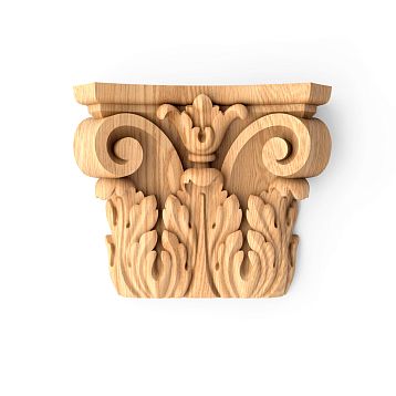
If moldings are the skeleton of composition, then appliqués are its ornaments, accents, details that attract attention.Inlays for furnitureThey can be carved, smooth, geometric, or botanical — their task is not structuring, but expressiveness.
Appliqués are always secondary in relation to moldings. They complement, refine, and decorate, but do not replace the main frame. This is a key rule of composition: first, build the structure using moldings, then place accents through appliqués.
Types of Appliqués and Their Application
Corner appliqués solve the problem of molding joints, transforming a technical node into a decorative element.Decorative corner elementsThey are especially important in classical interiors, where every corner of the frame requires completion. They can be minimalist or richly decorated — the choice depends on the overall style.
Central appliqués are placed in the geometric center of the panel created by moldings. This may be a rosette, cartouche, heraldic element. The central appliqué acts as a focal point, unifying the composition.
Linear appliqués are placed along the molding, enhancing its decorative quality. Carved ornament, beads, ribbon patterns transform a simple molding into a luxurious frame.
Frieze appliqués create a horizontal decorative band, often under the ceiling. These may be repeating botanical motifs, geometric elements that create a rhythmic structure.
Materiality and Texture
The overlays must match the moldings in material or at least in visual density. Woodencarved appliquésharmonize with wooden moldings, polyurethane with polyurethane. Mixing materials is possible, but requires a delicate sense of balance: a gilded plaster overlay on a wooden molding works, but a plastic one on carved wood does not.
Texture also plays a role. Smooth moldings require delicate overlays with shallow relief; profiled moldings with complex cross-sections allow more volumetric decorative elements.
Principles of proportioning: the mathematics of beauty
Harmony in combining moldings and overlays is built on proportions. Random selection of sizes creates visual dissonance, while a system of relationships generates beauty.
The Rule of Two-Thirds
Classic rule: the width of the main molding relates to the width of the accent overlay as 3:2. If the molding is 9 cm wide, the overlay should not exceed 6 cm. This creates visual dominance of the frame over the ornament, which is structurally correct.
The Rule of Intervals
There must be a distance of at least half the width of the molding between the edge of the molding and the overlay. This prevents merging of elements and preserves the readability of the composition. On an 8 cm wide frame, the overlay is placed with a minimum 4 cm offset from the inner edge.
The Rule of Scaling
The larger the panel area created by moldings, the larger the overlay should be. On a 60×90 cm panel, a central overlay of 15–20 cm diameter is appropriate; on a 120×180 cm panel — 30–40 cm. A small overlay in a large frame disappears, while a large one in a small frame overwhelms.
Stylistic Strategies: from Classicism to Avant-Garde
Each style offers its own logic for combining moldings and overlays. Understanding these differences allows creating authentic interiors or intentionally playing with eclecticism.
Classicism: strictness and symmetry
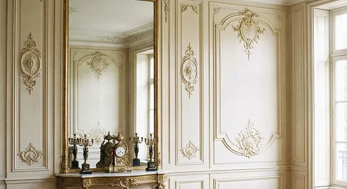
In a classical interior, moldings form strictly symmetrical compositions — rectangular panels arranged with mathematical precision.Framing Doorway OpeningsThey repeat window frames, vertical elements correspond to horizontal ones.
Overlays in classicism follow the same logic: symmetry, repetition, proportionality. Corner overlays are identical in all frame corners, the central overlay is strictly on the axis, side elements are mirror-symmetrical relative to the center. Ornaments are used sparingly — acanthus leaves, Ionic capitals, palmettes in traditional interpretation.
Baroque: abundance and dynamism
Baroque composition is built on an abundance of decoration, but this is a controlled, rhythmically organized excess. Moldings here are complex-profiled, with multiple curves. Overlays are abundant — friezes under ceilings, cartouches above doors, rosettes in panels, corner scrolls.
The key difference of baroque is the dynamism of overlays. A static classical palmette is replaced by a climbing plant ornament, a geometric pattern by a curving rocaille. Asymmetry is allowed in details while maintaining overall symmetry of the composition.
Neoclassicism: refined restraint
A neoclassical interior takes structure from classicism and conciseness from modernity. Moldings are thinner than classical ones, profiles simpler, overlays more delicate. Instead of carved acanthus leaves — stylized flat ornament, instead of lush rosettes — geometric circles with minimal relief.
Composition is built on large panels — one or two per wall instead of multiple small panels. Overlays are used point-wise: corner elements and possibly a central insert, but not friezes or side bands.
Modern: fluidity and asymmetry
Modernism rejects right angles and rigid geometry. Moldings here are curved, following organic lines. Overlays imitate natural forms — flowers, stems, waves.Decorative wall inlaysIn the style of modernism, overlays are asymmetrical, flowing into one another, creating a sense of continuous movement.
Combination is built not on proportions, but on rhythm: smooth accelerations and decelerations, denser and sparser decoration, play of mass and void.
Minimalism: reduction to essence
Minimalist interpretation of moldings and overlays is radical: minimum number of elements, maximum expressiveness of each. One wide molding instead of a system of narrow ones, one concise overlay instead of multiple small ones.
Profiles are extremely simple — rectangular section or a single rounded bead. Overlays are geometric — circle, square, line — without ornamentation. Composition is asymmetrical or, conversely, emphatically centered, but always sparse, with abundant empty space.
Color Solutions: Contrast or Nuance
The color of moldings and appliqués significantly affects the perception of the composition. The same set of elements creates different effects depending on the color scheme.
Monochromatic Harmony
Moldings and appliqués in wall color create a relief composition, perceived through the play of light and shadow. This refined solution suits minimalism and neoclassicism, where tactility, texture, and volume are important, but not color contrast.
Contrasting Contrast
Contrasting Contrast
White moldings on a colored wall — a genre classic, clearly structuring space. Contrast emphasizes geometry, making the composition graphic and clearly readable. This is a universal solution that works in rooms of any size.
Appliqués in a contrasting scheme can be painted either in molding color (creating a unified frame) or in wall color (blending into the background and revealing only through relief). The first option emphasizes decorative quality, the second — architectural composition.
Accent Polychromy
A third color is introduced to highlight key appliqués. Gilding central elements against white moldings and beige walls creates hierarchy: wall — background, molding — structure, appliqué — accent. This solution suits interiors leaning toward luxury — neoclassicism, art deco, eclecticism.
It is important not to overload the space — gilding should be applied only to central appliqués and possibly corner ones, but not the entire decor. Excess gold turns refinement into vulgarity.
Technical Aspects of Installation: From Theory to Practice
A beautiful theoretical composition must be properly implemented. Installing moldings and appliqués requires precision, understanding of materials, and correct sequence of operations.
Surface preparation
The wall must be perfectly flat — height variations exceeding 2-3 mm per meter will prevent moldings from fitting tightly. Spackling, sanding, and priming are mandatory steps. Skipping preparation will result in gaps between the molding and wall, ruining the entire composition.
Composition Marking
Use a laser level for horizontal and vertical lines. Mark not only the position of moldings but also the locations of appliqués — this allows you to evaluate the composition before installation and make adjustments. Mark symmetric elements from the central axis, avoiding accumulation of errors when marking from the edges.
Molding Installation
Light polyurethane moldings are fixed with special adhesive; heavy wooden moldings require combined mounting: adhesive plus self-tapping screws with subsequent hole concealment. Joints in corners are made at 45 degrees using a miter box — this ensures neat connections.
Wooden moldings must acclimate in the room for 48–72 hours before installation — wood adapts to humidity, minimizing subsequent deformation.
Appliqué Installation
Appliqués are installed after the molding adhesive has fully dried and wall finishing is complete. Lightweight appliqués are glued; heavy ones are additionally secured with hidden fasteners. Centering the appliqué is critically important — a deviation of 1–2 mm is noticeable to the eye and disrupts symmetry.
Final finishing
Joints and fastener locations are spackled, sanded, and primed. Painting is done with quality materials — moldings and appliqués are at eye level, so any coating defects will be visible. Use rollers for flat surfaces, brushes for profiles and relief.
If gilding is planned, use special compounds — gold leaf, electroplated gold, metallic paints. Cheap imitations look unconvincing and ruin the overall impression of the composition.
Compositional Techniques for Different Spaces
There are no universal recipes — each room requires an individual approach, taking into account proportions, function, lighting, and style.
Living Room: Grand Composition
The living room allows for maximum decorative effect. Here, large molding panels on an accent wall, fireplace or TV zone framing, and ceiling compositions with central sockets are appropriate.and frames create a home atmosphere, making it truly cozy and individual. This is an investment in beauty, which pays off every day through aesthetic pleasure from admiring the beautiful.Used generously, but thoughtfully.
Typical scheme: horizontal division of the wall into three zones (plinth, main field, frieze), vertical division of the main field into 3–5 panels, corner appliqués in all panels, central ones in key areas. This creates a rich yet orderly composition.
Bedroom: Privacy and Symmetry
The bedroom requires a more restrained approach. The accent is the wall behind the bed, decorated with moldings and appliqués. Other walls are either neutral or have minimal decoration.
The composition is strictly symmetrical relative to the bed's axis. One large panel behind the headboard or three vertical panels — classic options. Appliqués are delicate, not overwhelming the resting space.
Dining room: rhythmic structure
In the dining room, rhythm is important, supporting the social function of the space. Repeating vertical panels with appliqués create order without monotony. A panel molding at 90-100 cm height divides the wall, protecting the lower zone from damage.
Appliqués may have a theme related to dining — botanical motifs, stylized fruits. This is a subtle way to enhance the functional identity of the room.
Office: respectable strictness
The office requires seriousness. Moldings form library panels — tall vertical sections traditionally filled with wood or leather. Appliqués are minimal — corner elements, possibly central inserts with heraldry or monograms.
The color palette is restrained — dark wood, muted tones. Gilding is used sparingly, if at all.
Entryway: first impression
The hallway is the face of the house; here, the composition must make an immediate impression. With limited space, use vertical moldings to visually raise the ceiling. Appliqués above the entrance door create an accent, welcoming visitors.
A panel molding at 80-90 cm height is practical — it protects walls from dirt, creates a baseboard zone that can be painted a darker color or finished with durable materials.
Mistakes and how to avoid them
Even understanding the principles, it's easy to make mistakes that ruin the composition. Let's examine typical errors.
Disproportion of elements
A delicate molding with a large appliqué looks ridiculous — the decoration overwhelms the frame. The reverse situation — a heavy molding with a small appliqué — creates a sense of incompleteness, as if the decoration was forgotten to finish.
Solution: use the two-thirds rule, check proportions on a sketch before purchasing materials.
Excessive decoration
The desire to decorate every centimeter leads to visual clutter. Appliqués on every panel, friezes on all walls, corner elements everywhere — this is overload, fatiguing the eye.
Solution: designate one or two accent zones, leave the rest of the space neutral. Empty space is not the enemy of composition, but part of it.
Stylistic eclecticism
Baroque appliqués on minimalist moldings, classical rosettes in a loft — such combinations work only in the hands of an experienced designer who understands how to manage contrast. Random mixing of styles creates tastelessness.
Solution: determine the style before selecting elements, adhere to its logic, or consciously create a thoughtfully designed eclecticism, but do not mix randomly.
Incorrect color scheme
Moldings in wall color, but contrasting appliqués — a solution requiring caution. Often, it creates the impression that appliqués float in the air, disconnected from architecture. The reverse error — contrasting moldings and appliqués in wall color — makes appliqués invisible, turning them into meaningless elements.
Solution: unify moldings and appliqués in color (both contrasting the wall or both matching it) or use a three-color scheme where the appliqué is an accent on a contrasting molding.
Technical errors
Uneven molding joints, visible appliqué fasteners, sloppy painting — technical errors nullify any compositional idea. Beauty lies in details; carelessness destroys them.
Solution: don't skimp on preparation, use quality tools, allocate sufficient time for finishing touches.
Questions and Answers: Addressing Common Doubts
Can wooden moldings be combined with polyurethane appliqués?
Technically possible, but visually challenging. Wood and polyurethane have different textures and react differently to light. If planning to paint with opaque color, the difference is smoothed out, but under transparent finish, it will be noticeable. Better to stick to one material or use MDF for painting as a universal option.
Are appliqués needed in a minimalist interior?
Not mandatory, but possible. Minimalism does not reject decoration; it demands its conscious use. One concise applique as a focal point works better than the complete absence of accents, which may make the interior lifeless.
How to determine the optimal number of panels on a wall?
It depends on the wall size and style. A 4-meter-long wall in a classical interior allows 4-5 vertical panels, in neoclassicism — 2-3, in minimalism — 1. Guideline: the panel width should be comparable to its height, avoid overly elongated or squat proportions.
Can panels be used without moldings?
Possible, but rarely justified. A panel without a molding frame appears as an applique lacking context. Exception — large standalone panels that are self-contained compositions.
Are panels necessarily gilded in a classical interior?
No, it's a matter of interpreting classicism. The traditional approach implies gilding, but modern classicism often omits it, using monochromatic or contrasting schemes. Gilding adds luxury but requires a suitable environment — expensive fabrics, quality furniture. In a modest interior, gilded panels appear inappropriate.
How to combine moldings of different widths?
Observe hierarchy: the cornice is wider than the baseboard, intermediate moldings are narrower than the outer ones. If using multiple horizontal levels, each should differ from its neighbor by at least 15-20% in width; otherwise, the difference appears as an error rather than an intentional design.
Are corner panels needed in all panels?
In classicism — desirable, as it completes the composition. In modern styles, selective use is acceptable: corner panels only in key panels, others with clean corners. Asymmetric distribution of panels — a technique for experienced designers requiring a refined sense of balance.
How to care for moldings and panels?
Painted surfaces are wiped with a damp cloth; relief surfaces are cleaned with a soft brush to remove dust. Lacquered wooden elements require polishing once a year. Gilded panels are cleaned with special solutions; avoid abrasives and aggressive chemicals.
Can moldings be installed on wallpaper?
Not recommended. Wallpaper is not a sufficiently strong base; moldings will eventually detach. Correct sequence: install moldings on a prepared wall, then paint or wallpaper the zones between moldings. If wallpaper is already applied, moldings must be mounted on the wall, with wallpaper cut out at mounting points.
How much does implementing a composition of moldings and panels cost?
The range is vast — from several thousand rubles for a simple polyurethane scheme to hundreds of thousands for carved decorations from precious wood. Rough estimate: decorating one 12 m² wall in a mid-range style costs 20-40 thousand rubles including materials and labor.
Conclusion: composition as thinking
Combining moldings and panels — not a set of rules for mechanical application, but a way of thinking through space. Understanding the logic of proportions, rhythm, hierarchy, you gain a tool for creating interiors of any complexity and style.
Start with a sketch, plan the composition as a whole, don’t be afraid to remove excess. Beauty often lies not in adding decoration, but in the precise placement of elements. One correctly positioned element works stronger than ten random ones.
Study classical examples — palace interiors, historical buildings. In them, composition has been refined over centuries, every detail is justified. But don’t copy blindly — adapt principles to modernity, your space, your taste.
Work with quality materials. Cheap moldings with rough finishes, poorly cast panels will ruin any idea. Beauty requires not only talent, but also means to realize it properly.
Trust professionals. Installing moldings and panels — not a job where you should cut corners on labor. Misaligned joints, inaccurate centering, sloppy painting are always visible; correcting them costs more than doing it right the first time.
For more than two decades, STAVROS has created architectural details that become the foundation of compositions in thousands of interiors. Our collection includes moldings and panels of all styles — from strict classicism to modern minimalism. We produce elements from natural wood, MDF, polyurethane, and offer custom manufacturing based on client sketches.
STAVROS specialists consult on element selection, help compose the design, calculate required material quantities. We know: a successful interior begins with the right choice of details, and we’re ready to make that choice with you.
Visit our showroom or website, explore possibilities, feel the quality of materials. A composition of moldings and panels — an investment in the beauty of your home, which will delight you for decades. Start creating your ideal composition today — with STAVROS, every detail becomes part of harmony.