


Article Contents:
- Why painting-ready solutions give more control over the interior
- MDF as the base material for painting-ready slatted panels
- Polyurethane as the perfect partner for painting
- Where to use painting-ready slatted panels: zones and scenarios
- Living room: the wall as an architectural gesture
- Bedroom: the calmness of relief
- Entryway: First Impression
- Study: relief as concentration
- Children's room: relief and color play
- Which polyurethane decorative elements make sense to paint along with the wall
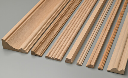
- Moldings and Cornices
- Overlay ornamental panels
- Pilasters and vertical profiles
- When it's better to leave decor contrasting
- Monochromatic interior: philosophy, advantages, and pitfalls
- Why monochrome creates a sense of expensive interior
- Risks of the monochrome approach
- How to work with light and shadows on relief
- Angle of light incidence: the main parameter
- Natural light and wall orientation
- Shadow in the groove: how to calculate depth
- Color temperature of light source
- Painting technology for slatted panels and polyurethane: how to achieve unity
- Preparing MDF panels for painting
- Preparing polyurethane decor for painting
- Painting sequence during installation
- Painting tools
- Number of coats and coverage
- Typical painting mistakes for slatted panels and decor
- First mistake: paint accumulates in grooves
- Second mistake: different sheen on battens and decor
- Third mistake: unspackled joints
- Fourth mistake: unsuitable paint for high-humidity areas
- Fifth mistake: paint with insufficient opacity on a dark background
- Specific combinations: what works with what
- Batten panels on the lower third of the wall + divider molding + smooth upper part
- Full wall height in vertical battens + cornice at the ceiling
- Niche or arch with batten panels and polyurethane framing
- Color solutions: which shade to choose for a monochrome batten interior
- White and its variations
- Green Spectrum
- Blue and Gray
- Batten Panels and Polyurethane in Projects of Various Scales: From Apartment to House
- Small Apartment: Texture as an Illusion of Space
- Country House: Order and Architecture
- Frequently Asked Questions (FAQ)
- STAVROS: Texture That Will Outlast Any Trend

A monochrome interior is not a lack of a solution. It is the most demanding of all possible solutions. When everything is the same color, there is nowhere to hide: every inaccuracy, every seam, every change in texture is visible. And at the same time — it is precisely here, under conditions of color unity, that the texture begins to speak in full voice. The shadow from a batten, the depth of a groove between moldings, the clarity of an ornamental profile — all this becomes the main content of the wall.
Exactly thereforePaintable lath panelsandpolyurethane decorative elements— the perfect pair for a monochrome interior. Both materials are made for painting. Both carry texture. Both work not with color, but with light and shadow. Together they create that very depth which flat painted walls so lack — architectural, tactile, living depth.
This article is about how to assemble an interior in a single color so that it does not seem boring, empty, or unfinished. About technology, about logic, about the details that decide everything.


Why Paint-Ready Solutions Give More Control Over the Interior
When choosing finishing materials, most people take the path of least resistance: they buy panels with a ready-made texture, factory coating, and a specific color. It's convenient. But it lacks flexibility. The color is fixed by the manufacturer—and if tastes change in two years or the walls are repainted, the panels will remain a foreign element.
Paintable materials are a different story. You determine their color. Today—white. In a year—dusty blue. Another year later—deep green. The base remains, only the paint layer changes. This is a fundamental long-term advantage that professional designers value above any ready-made solution.


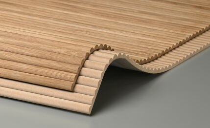
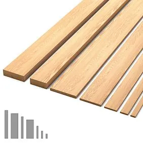
MDF as a base material for paintable slatted panels
slatted panels for paintingare primarily made from MDF—medium-density fiberboard with a homogeneous structure, free of pores, knots, and resin pockets. The MDF surface accepts paint perfectly: it is even, smooth, and stable. After basic priming, the paint applies evenly, without stains or streaks, with perfect coverage even in small grooves.
The second advantage of MDF is geometric stability. Unlike solid wood, MDF slats do not deform with changes in humidity, do not warp, and do not crack at the seams. This is critical for a monochrome interior: any deformation is immediately visible when there is no color pattern to distract attention.
Our factory also produces:


Polyurethane as the ideal partner for painting
Polyurethane and paint are natural allies. The smooth, non-porous surface of polyurethane accepts acrylic paint without priming (although primer is still recommended for better adhesion). The ornamental relief of a polyurethane element gains depth after painting that is unattainable on a flat surface: the paint is slightly darker in the recesses and slightly lighter on the protrusions due to light and shadow. This creates a visual volume that cannot be imitated by wallpaper or prints.
Decorative polyurethane elementsare supplied in basic white—ready for installation and subsequent painting along with the entire wall or ceiling surface.
Get Consultation
Where to use paintable slatted panels: zones and scenarios
Answering "everywhere" is not an answer. Each room has its own logic, its own height, its own function.Wall slatted panels for paintingThey work differently depending on the context — and understanding this context determines the outcome.
Living room: the wall as an architectural gesture
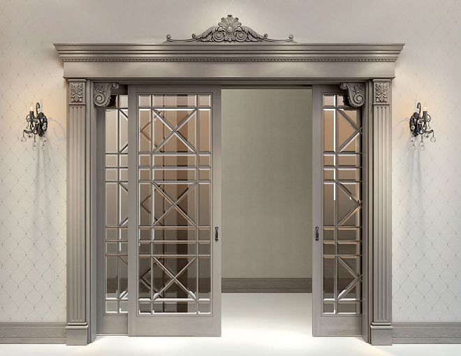
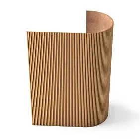
The living room is the main representative space of the house. Here, paintable slatted panels most often occupy an accent wall — behind the sofa, behind the TV, or in the fireplace area. When the entire wall (from the baseboard to the ceiling or to a specially designated horizontal line) is covered with slatted panels in the same color as the wall — it creates the effect of an "architectural panel": there is texture, but it doesn't shout. It exists as texture, as depth, as surface quality.
For the living room, the combination of vertical slats on the lower part of the wall with a horizontal molding-divider and a smooth (or with complex stucco) upper part is especially expressive. This is a classic technique that works in neoclassical, modern classic, and eclectic styles.
Bedroom: the calmness of texture
In the bedroom, a monochrome slatted interior creates a cocoon-like atmosphere — enveloping, quiet, devoid of unnecessary visual stimuli. A headboard wall with paintable slatted panels in a calm color (deep blue, warm gray, soft green) is a solution that is both functional (visually highlights the sleeping area) and aesthetically perfect.
An important detail: in the bedroom, slats can be combined with polyurethane overlays — small ornamental elements along the upper border of the slatted area. Painted in the same color, they create a sense of completeness, a "frame" around the headboard area.
Entryway: first impression
The hallway is the first thing a guest sees. Paintable slatted panels in the hallway instantly create a feeling of a high-quality, well-thought-out interior. The small area of the hallway allows for the use of richer, darker colors without the risk of "overwhelming" the space. A dark blue, emerald, charcoal hallway with slatted walls — bold, status-worthy, and memorable.
Study: texture as concentration
The study is a space that requires concentration.Batten panel for paintingIn the study, on the walls around the work area, it creates a calm background with a pronounced texture—a surface that doesn't distract but isn't boring either. The color is deep but not alarming: forest green, dark tobacco, concrete gray.
Children's room: texture and color play
In a children's room, batten panels for painting are especially valuable because they allow the color to be changed as the child grows. First—soft yellow or mint. After five years—blue or khaki. The base remains, only the color changes. And each time—a new room.
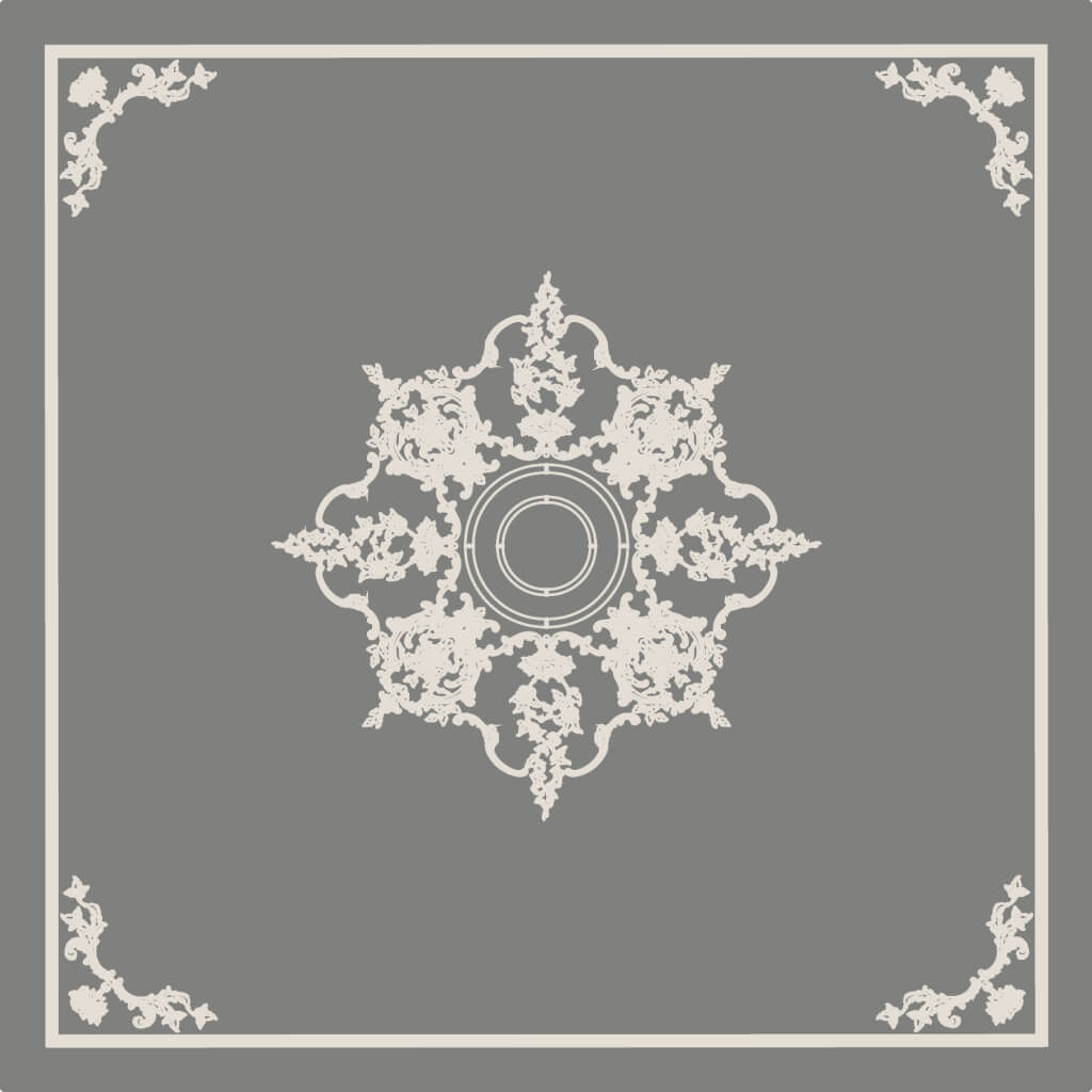
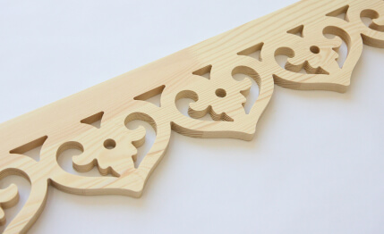
Which polyurethane decorative elements make sense to paint along with the wall
This is where professional design work begins. Not allpolyurethane decorative elementsare equally good for monochrome painting. Some benefit from being painted in the same tone—their relief becomes more expressive. Others lose their character when they are 'hidden' under a layer of uniform color. Let's break it down by type.
Moldings and cornices
Trim profiles—polyurethane moldings and cornices—absolutely benefit from being painted to match the wall. Their function is to create a horizontal rhythm, divide the wall into zones, and frame the transition from wall to ceiling. Painted the same color as the wall, they become architectural details—they are visible, but they don't jump out of the space. This is subtle work, high-level design mastery.
Decorative polyurethane elementsin the form of cornices along the top edge of batten panels is a classic solution. The cornice completes the batten zone, creating a clear horizontal dividing line between the panels and the smooth upper part of the wall or ceiling. Painted the same color—it is a detail, not a separate element.
Overlay ornamental panels
Overlay polyurethane panels with ornament — large flat products with a relief pattern (geometric, floral, historical) — when painted to match the wall color, create a 'hidden stucco' effect. The pattern is present but does not dominate. This is a very subtle technique for bedrooms and studies where depth is needed without ostentation.
Pilasters and vertical profiles
Polyurethane pilasters — vertical decorative elements imitating columns — when monochromatically painted, function as architectural rhythm on the wall. They divide a large plane into equal parts, creating a sense of an order system without the weight of real columns. Especially good in living rooms with high ceilings.
When it's better to leave decor contrasting
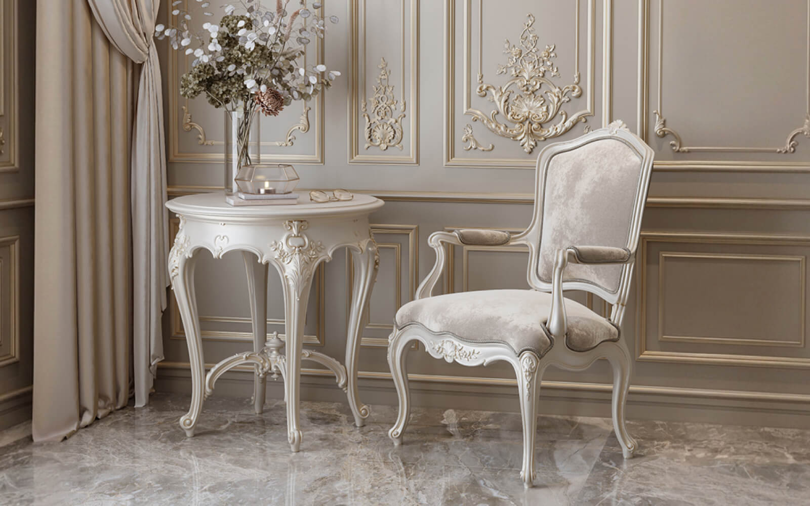
There are situations where a single color is not the best solution for polyurethane decor. If the ornament is very small and intricate — painting it to match the wall color will make it invisible. Small details of the ornament will 'blend' when the color is the same. In such cases, it's better to leave the decor slightly lighter than the wall or lightly patinate it — this preserves the readability of the pattern.
Also: in a classic interior with dark walls, white polyurethane decor (cornice, rosette, molding) often looks better than decor matching the wall color. A white element on a dark background is a classic architectural contrast that has worked for centuries.
Monochromatic interior: philosophy, advantages, and pitfalls
Monochromatic interior is not a trend of recent years. It is an architectural principle that is several centuries old. Abbeys, classic palaces, Scandinavian houses — all of them at one time or another used a single color code as a way to create a sense of integrity and tranquility.
Why monochrome creates a sense of an expensive interior
The human brain perceives color unity as a sign of intention. When everything is coordinated—walls, moldings, slats, ceiling—it signals that a person with a clear concept worked on the space. An accidentally monochrome interior doesn't happen. It requires decision, discipline, and an understanding of how relief works without color diversity.
Risks of a Monochrome Approach
The first risk is monotony. If the relief is not sufficiently pronounced, a monochrome room is perceived as empty and boring. This is why slatted panels and polyurethane decor are so important in a monochrome interior: they create the visual complexity that replaces color diversity.
The second risk is the wrong color choice. Not all colors work equally well in a monochrome interior. Pure white without a tint is merciless: it shows every unevenness, every joint, every speck of dust. Pure black is heavy and requires a lot of natural light. The best colors for a monochrome slatted interior are complex, with nuances: warm white with a yellow undertone, dusty pink, gray-green, warm gray, deep blue with a gray undertone.
The third risk is ignoring texture. Two identically colored materials can look inorganic if one is matte and the other is glossy. In a monochrome interior, the degree of surface shine must be coordinated. The wall—matte. The slats—matte or satin. Polyurethane decor—matte or satin. Mixing matte and glossy creates disharmony even with a perfect color match.
How to work with light and shadows on relief
Relief in a monochrome interior lives only thanks to light. Without proper lighting, slats and polyurethane decor in a single color turn into a shapeless plane. Understanding this is the key to successful monochrome design.
Angle of light incidence: the main parameter
Light falling at a right angle to the surface (perpendicular to the wall) neutralizes relief—shadows do not form. Light falling at an acute angle (along the wall, grazing) creates shadows in grooves and recesses, making each slat and each ornamental element three-dimensional.
Practical conclusion: directional light fixtures—spotlights, track lights, wall sconces with directional flow—are positioned so that light grazes the wall with slatted panels at an angle of 20–40 degrees to its plane. It is this angle that gives the maximum play of light and shadow.
Natural light and wall orientation
A wall perpendicular to the window receives grazing light in the morning and evening hours. It is on this wall that the battens 'come to life'—shadows are dynamic, changing throughout the day. The wall opposite the window is illuminated by direct light, and the relief on it is less pronounced. This is important to consider when choosing a wall for batten panels: place them where the light will be grazing, not direct.
Shadow in the groove: how to calculate depth
The depth of the groove between battens directly affects shadow intensity. A narrow, shallow groove (5–8 mm deep) produces a light, barely noticeable shadow. A deep groove (15–20 mm or more) creates a pronounced, contrasting shadow visible even under diffused lighting. For a monochrome interior, a groove depth of at least 10 mm is recommended—this is the minimum to create a readable relief under uniform lighting.
Light source color temperature
Warm light (2700–3000 K) emphasizes warm shades in a monochrome interior—cream, beige, golden. Cool light (5000–6000 K) works with neutral and cool colors—gray, blue, green. A mismatch between color temperature and interior color creates an uncomfortable feeling—walls appear to be the 'wrong' color. This is a common mistake when selecting lighting for monochrome spaces.
Painting technology for batten panels and polyurethane: how to achieve unity
A uniform color on different materials is a technically demanding task requiring precision. MDF and polyurethane accept paint differently, hold color differently, and respond differently to processing. To achieve a truly uniform surface, you need to know the nuances of each stage.
Preparing MDF panels for painting
When MDF is cut and the edges are milled, its porous structure is exposed, which accepts paint differently than the smooth surface. MDF edges are absorbent: they absorb more paint, darkening compared to the main plane. Therefore, the edges are treated with a special edge primer or filler before the main priming.
The main MDF surface is sanded with 150–180 grit sandpaper. Then — 1–2 coats of acrylic primer with intermediate sanding (220 grit between coats). After priming, the surface is ready for the application of the final paint.
Preparation of polyurethane decor for painting
Polyurethane surface is smooth and non-porous. For better paint adhesion, it is recommended to lightly matte it with 180–220 grit sandpaper (not deep sanding, only creating micro-roughness). Then — a thin coat of acrylic primer. Polyurethane accepts acrylic paints well: they do not dissolve the material and provide an even coating.
Painting order during installation
There are two approaches:
First approach — paint the slats and decor before installation, then install and touch up the joints and seams. Advantage: easier to paint horizontal surfaces. Disadvantage: joints and seams still require touch-up after installation, and achieving a perfect match is more difficult.
Second approach — install, putty all joints and seams, then paint the entire surface as a whole. This is the only way to achieve an absolutely uniform surface without visible joints. Disadvantage: painting installed vertical slats on the wall is more difficult, especially in the grooves.
For a monochrome interior, the second approach is recommended — only it provides a truly uniform surface without seams.
Painting tools
Brush — for grooves between slats and for small ornamental decor elements. Use a brush with natural bristles or synthetic fibers of medium stiffness. The brush width for grooves should be equal to or slightly narrower than the gap width.
Roller - for smooth surfaces of slats and the main plane. A velour or foam roller provides a smooth, texture-free coating.
Spray gun (airbrush or HVLP spray gun) - the ideal tool for monochrome painting of slatted walls. Even spraying penetrates grooves without paint buildup on the edges of the slats. The result is a professional, tool-mark-free surface.
Number of Coats and Coverage
The first coat of paint is a primer, diluted with 10-15% water. It penetrates the surface, creating a base. After drying (2-4 hours) - sanding with 280-320 grit. The second coat is the working coat, without dilution. The third coat is the finishing coat, if necessary (if the coverage is not sufficiently even).
Important: between coats - complete drying. Applying the next coat over a previous one that is not dry is the cause of peeling and the formation of 'wrinkles' on the surface.
Typical mistakes when painting slatted panels and decor
Painting mistakes are not just an aesthetic problem. They can ruin the entire effect of a monochrome interior, which is backed by serious preparatory work. Let's list the most systemic ones.
First mistake: paint accumulates in the grooves
This happens when painting with a brush with excess paint. 'Drips' form in the grooves between the slats - glossy accumulations of paint, noticeable in oblique lighting. Solution: paint in the grooves is applied in a thin layer, excess paint is immediately removed with a brush or cotton swab. The ideal tool for grooves is a spray gun.
Second mistake: different gloss on slats and decor
Matte paint on battens and satin on polyurethane trim create a noticeable difference in sheen, especially in oblique lighting. Buy paint from the same series and the same finish type for all surfaces in a monochrome interior. Matte everywhere. Satin everywhere. No mixing.
Mistake three: unputtied joints
Joints between batten panels, between panels and the wall, between trim and the surface—all must be filled with putty and sanded before painting. Even a thin 0.5 mm gap looks like a rough seam after painting. In a monochrome interior without color 'noise,' this is a disaster.
Mistake four: unsuitable paint for high-humidity areas
Batten panels for painting in a bathroom or kitchen require paint with increased moisture resistance and a washable surface. Regular interior acrylic paint peels and darkens under humid conditions. Use 'kitchen-bathroom' class paints with added antifungal components.
Mistake five: paint without sufficient opacity on a dark background
When repainting dark-colored surfaces to a light color without an intermediate primer—the dark shade 'shows through' the light paint. This is especially critical for white: it is transparent and requires 3–4 coats on a dark base. The solution is a high-hiding primer-sealer before applying light paint.
Specific combinations: what works with what
Let's consider several of the most convincing designer pairings in monochrome logic.
Batten panels on the lower third of the wall + dividing molding + smooth upper part
Classic three-part wall division: a lower slat belt 90–110 cm high, a horizontal polyurethane molding along the dividing line, a smooth upper part with a stucco cornice near the ceiling. All elements are in a single color. The lower belt is heavier in relief, the upper part is lighter. This is the classic hierarchy of 'base – field – entablature' applied to a wall.
Suitable for: living room, dining room, study, hallway.
Colors: white, cream, dusty green, warm gray.
Full wall height in vertical slats + ceiling cornice
Slats from baseboard to ceiling, completely covering the wall. Baseboard — same color. Ceiling cornice — same color. Effect — the wall turns into an architectural canvas, the space gains solemnity and height.
Suitable for: bedroom (headboard wall), living room (main wall), study.
Colors: deep blue, dark green, anthracite (with good lighting), white (for a sense of spaciousness).
Niche or arch with slatted panels and polyurethane framing
A niche in the wall is a separate architectural event. Its inner surface, lined with paintable slatted panels, and framing made of polyurethane molding — a monochrome solution creating a deep, almost scenographic effect. A niche with lighting and a slatted inner surface becomes the main accent of the room.
Suitable for: living room (TV niche or decorative niche), bedroom (headboard in a niche), corridor.
Color solutions: which shade to choose for a monochrome slatted interior
Color is the last decision made, but the first one the eye sees. In a monochrome slatted interior, color carries all the emotional weight.
White and its variations
Pure white (NCS S 0500-N) — aggressive, unforgiving to imperfections. Works only with perfect execution and good lighting.
Warm white (with yellow or pink undertones) — soft, cozy, forgives minor imperfections. Ideal for bedrooms and living rooms in Scandinavian aesthetics.
Cool white (with blue undertones) — modern, clean. Good for home offices and minimalist-style spaces.
Green spectrum
Dusty sage (NCS S 3010-G10Y) — soft, natural, calming. One of the most popular colors for monochrome slatted walls.
Bottle green (NCS S 6020-G) — deep, rich, prestigious. Requires good natural lighting and a light ceiling.
Blue and gray
Dusty Blue (NCS S 3020-B10G) — calm, elegant, timeless. Pairs beautifully with natural wood accents.
Concrete Gray (NCS S 4000-N) — neutral, modern, versatile. The best backdrop for furniture of any shade.
Slatted Panels and Polyurethane in Projects of Different Scales: From Apartment to House
Monochromatic slatted interior — a solution that works equally well in a small apartment and a country house. But the scale sets different conditions.
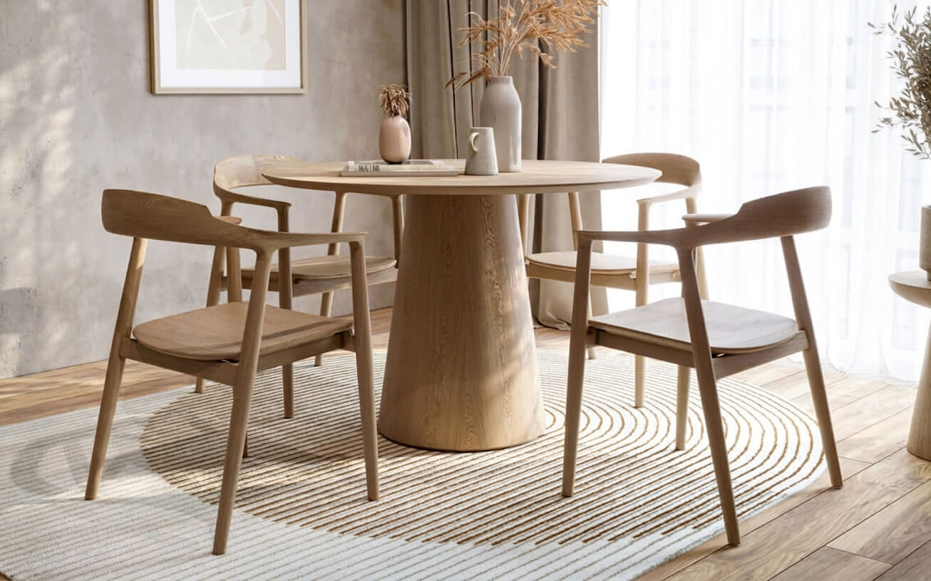
Small apartment: texture as an illusion of space
In an apartment with low ceilings (2.5–2.7 m), vertical slats painted in the same color as the wall and ceiling visually raise the space. This is not a metaphor — it's an optical phenomenon. Vertical lines increase the perceived height. Especially effective if the ceiling color matches the wall color.
Polyurethane cornices at the wall-ceiling junction in a single color — do not separate the planes, but smooth the transition, making the room visually taller.
Country house: order and architecture
In a country house with high ceilings (3 m and more), paintable slatted panels and polyurethane decorative elements provide an opportunity to create a true order system: baseboard — slatted belt — molding — smooth field — cornice — ceiling rosette. Painted in a single color, this solution creates a sense of architectural interior, characteristic of noble estates or Italian villas — but implemented with modern materials and without colossal costs.
Frequently Asked Questions (FAQ)
Can MDF slatted panels be painted with water-based paint?
Yes. Acrylic water-based paint is the best choice for MDF panels. It is eco-friendly, dries quickly, and is easy to apply. For rooms with humidity (kitchen, bathroom), choose paint labeled 'for kitchens and bathrooms' or with water-resistant additives.
Should polyurethane decor be primed before painting?
Recommended. Light sanding with sandpaper (grit 220) and a thin layer of acrylic primer ensure better paint adhesion and a more even coating.
How to paint narrow grooves between slats?
Use a narrow brush with a width equal to the gap. Paint is applied in a thin layer; excess is immediately removed. The ideal option is a paint sprayer: it penetrates the grooves evenly without drips.
What level of paint sheen is better for a monochrome slatted interior?
Matte or satin — depending on the room. Matte absorbs light, hides imperfections, and creates a calm, deep look. Satin is slightly more practical and easier to wipe. Glossy is only for accent elements (baseboard, cornice), not for the entire surface.
How often should slatted MDF panels be repainted?
Under normal conditions and with a quality initial coating — once every 7–10 years. Under intensive mechanical stress (hallways, children's rooms) — once every 4–5 years.
Can slatted panels and polyurethane decor be painted in different colors on the same wall?
Yes, if it fits the design concept. For example: the slatted belt — dark, the upper part of the wall with moldings — white. This is not monochrome, but a classic two-tone technique, characteristic of neoclassicism.
What's better: to paint slats before installation or after?
After installation — for perfect surface unity. Before installation — for ease of working with horizontal surfaces. Compromise: paint the slats before installation, after installation fill the joints and apply a finishing coat over the entire surface.
STAVROS: relief that will outlive any trend
Trends come and go. Monochrome slatted interior is not a trend. It's an architectural principle that's several centuries old and will never become outdated. Because it's built not on fashion, but on physics: light, shadow, relief, proportion.
STAVROS creates materials that work precisely according to this principle.Wall slatted panels for paintingmade from high-quality MDF — with precise geometry, perfect surface, ready to accept any paint.polyurethane decorative elements for interior finishingwith clear ornament detailing, dense material resistant to deformation and perfectly compatible with acrylic coatings.Polyurethane moldingcornices, moldings, profiles — in a rich assortment of shapes and sizes for any style and scale.
STAVROS understands monochrome interior as a statement — demanding, precise, worthy of respect. And creates materials for it that make this statement possible.
The relief remains. The paint changes. The interior lives.


