Article Contents:
- Portals: Transition Between Worlds
- Friezes: Horizontal Accents
- Cornices: Completing the Vertical
- Borders: Frames and Boundaries
- Symmetry: Foundation of Classical Composition
- Composition: Rules and Freedom
- Zoning Space with Molding
- Materials and Technologies
- Styles and Applications
- Conclusion: architecture in details

A wall is not merely a vertical plane dividing space. It is an architectural form with the potential for transformation. A flat painted surface is one-dimensional, static, lacking depth. Molding on the wall transforms it into a volumetric composition, where relief creates play of light and shadow, where moldings structure the plane, where portals organize entrances into new spatial dimensions. Architectural plasticity of molding is the language through which interiors speak, a tool for creating hierarchy, a means of controlling perception.
When it comes to zoning, molding offers solutions impossible with other materials. A frieze divides the wall into upper and lower parts, creating a classical three-part structure. A cornice marks the boundary between wall and ceiling, can be minimalist or elaborately decorated. Borders create frames within which wallpaper, paint, textiles — any other material — can be placed. Symmetry of molded elements calms, creates order, organizes chaos. Composition of moldings, rosettes, and appliqués transforms a neutral wall into an architectural artwork.


Portals: Transition Between Worlds
In architectural terms, a portal is the framing of an opening, transforming it from a technical necessity into a decorative element. A door portal creates the solemnity of entry, distinguishes it from the wall plane, and makes it significant. A window portal frames the view, turning the window into a picture enclosed in a frame. A fireplace portal — a genre classic — where molding creates an architectural composition around the hearth.
A classical door portal consists of vertical pilasters or columns on either side of the opening and a horizontal entablature above. Pilasters are flat vertical projections, imitating columns but not bearing load. They are divided into base, shaft, and capital. The base is the lower expanded part, the shaft is the main vertical, and the capital is the upper ornament. Proportions are borrowed from classical orders — Doric, Ionic, Corinthian. The entablature above the opening includes architrave, frieze, and cornice, repeating the structure of classical buildings in miniature.
Arched portals create a softer, more dynamic form. A semicircular arch — classic, tracing back to Roman architecture. A pointed arch — Gothic motif, reaching upward. A shallow arch — Renaissance elegance. The arch is framed by an archivolt — a curved molding repeating the contour. At the apex of the arch — the keystone — a decorative element visually fixing the structure.
Fireplace portals are the most expressive, as the fireplace traditionally was the center of the home. The portal creates a frame for the fire, elevating it. Side pilasters or columns support the mantel — a horizontal slab on which clocks, vases, photographs are placed. Above the mantel — frieze, mirror, or panel. The entire portal may reach the ceiling, creating a monumental vertical. Even a false fireplace without a functional hearth, with a quality molded portal, looks convincing, creating a focal point in the living room.
Niche in the wall framed by molding creates depth, three-dimensionality. An arched niche with molded decoration transforms into an exhibition space for sculpture, vases, collections. Interior lighting enhances the effect — the object in the niche is illuminated, highlighted, becoming an exhibit. Several niches arranged symmetrically create rhythm, dividing a long wall.Polyurethane moldingsAllows creating portals of any complexity — from minimalist modern to ornate baroque.
Mirror portals — a specific application of molding. A mirror framed by a molded portal transforms into a window to another dimension. A classic technique — a mirror in the space between windows, framed similarly to the windows. This creates an illusion of an additional window, expanding space. A mirror above a fireplace in a molded frame — a tradition stemming from palace interiors, where mirrors were a luxury and display of wealth.


Friezes: Horizontal Accents
A frieze is a horizontal decorative band encircling a room or running along one wall. In classical architecture, a frieze is the middle section of the entablature between the architrave and cornice. In interiors, a frieze acts as a divider, creating a horizontal structure. Placement height determines the effect — a frieze in the upper third of the wall under the ceiling creates a classical proportion, a frieze at chair-back height divides the wall in half.
A smooth frieze is a simple horizontal plank with profiled edges. It creates a clear line dividing different types of finishes. Below the frieze — wall panels, above — wallpaper or paint. This is a classic scheme of English and French interiors from the 18th to 19th centuries. A smooth frieze is versatile, suitable for both classical and modern interiors.
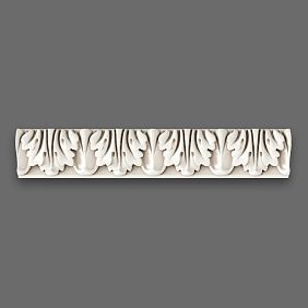
An ornamented frieze carries decoration — plant motifs, geometric patterns, repeating elements. Greek meander — a broken line forming a continuous pattern. Palmettes — stylized fan-shaped leaves. Ionic — egg-shaped elements alternating with arrows. Acanthus leaves, grapevines, rosettes — all these are traditional motifs of frieze carving and molding.
Narrative friezes depict scenes — mythological, historical, everyday. This is characteristic of Empire and Neoclassicism, where friezes depicted triumphal processions, battles, allegorical figures. In modern interiors, narrative friezes are used less frequently, but can create a unique accent, especially in thematic spaces — libraries, offices, museum rooms.
Lighting friezes — a modern application where a lighting strip is hidden behind the molding element. Light emanating from under the frieze illuminates the ceiling or upper part of the wall, creating soft diffused lighting. This is both functional and decorative — the frieze remains a classical element, but acquires a modern function.Moldings and cornicesIdeal for creating lighting friezes.
Combined friezes combine several elements — moldings of different widths, ornamented and smooth parts, protruding and recessed elements. This creates a complex relief, rich play of light and shadow. A combined frieze can be from ten to thirty centimeters high, becoming a significant architectural element organizing the upper part of the wall.
Corner solutions for friezes require attention. On internal corners, the frieze meets at a 45-degree angle or buttresses using a corner element. On external corners, special corner appliqués or careful 45-degree trimming are used. Quality joining is critical — a careless corner destroys the impression of the entire composition.
Our factory also produces:


Cornices: Completing the Vertical
A ceiling cornice is an element that conceals the junction between the wall and the ceiling, creating architectural completeness. Even in a minimalist interior, a slender cornice adds elegance. In classical interiors, a cornice may be a complex multi-level element, 20–30 cm high.Ceiling MoldingPolyurethane cornices are lightweight, easy to install, and look like plaster molding.
A simple cornice consists of one or two profiles — rounded edges and protrusions that create a transition from the vertical wall to the horizontal ceiling. This is a minimalist solution suitable for modern and neoclassical interiors. The projection width — the distance from the wall to the edge of the cornice — is usually 5–10 cm. The height — the distance from the ceiling to the lower edge — is 5–15 cm.
A complex cornice includes several tiers, each with its own profile. This creates a stepped structure rich in light and shadow. A classical cornice, from bottom to top, includes a cyma, modillions, or denticles, and a crowning profile. A cyma is the lower projecting element. Modillions are brackets that imitate support for the cornice. Denticles are rows of rectangular teeth that create rhythm. The crowning profile is the upper part that abuts the ceiling.
Cornices with ornamentation include decorative elements — plant motifs, rosettes, meanders. The ornament may be continuous, running along the entire length, or segmented, where decorative inserts alternate with smooth sections. An ornamented cornice creates opulence and luxury, suitable for baroque, neoclassical, and Victorian interiors.
Flexible cornices solve the problem of curved walls, arches, and bay windows. Polyurethane cornices have a certain flexibility, allowing them to wrap around small radii. For complex curves, there are special flexible cornices that can be bent along any contour. This opens up possibilities for decorating non-standard spaces.
Light cornices with built-in LED backlighting create a floating ceiling effect. The cornice is mounted with a gap from the ceiling, behind which an LED strip is placed. The light is directed upward, illuminating the ceiling and creating soft, diffused lighting around the room's perimeter. This is a modern solution combining classical form with technological function.
Colored cornices — a trend of recent years. Traditionally, cornices are white or match the ceiling color. But painting in a contrasting color — dark on a light background or vice versa — creates graphic effect, emphasizing the shape. Gilding, silvering, or patination adds luxury.Decorative stuccoIt can be painted in any color, offering freedom to create unique solutions.
Get Consultation
Borders: frames and boundaries
A border is a narrow decorative strip that creates a frame or separates zones. On a wall, a border acts as a frame for panels, highlights areas with different finishes, and creates visual boundaries. The width of a border is usually 3–10 cm, less than a frieze, but sufficient for visibility.
Rectangular frames on walls using borders — a classic boucherie technique. The wall is divided into rectangular panels usingmolding, creating frames. Inside the frames — contrasting wallpaper, another tone paint, textiles, wood. This creates rhythm, structure, and visually enriches the surface. Frame sizes vary — from small 30x50 cm to large 1x2 meters.
Vertical borders visually raise the ceiling, creating an upward movement. Several vertical stripes dividing the wall into sections create a colonnade without volumetric columns. This works well in narrow spaces — corridors, entryways, where verticals compensate for lack of width.
Horizontal borders expand space, creating calm. A border at one meter from the floor divides the wall into a lower dark and upper light section — a traditional scheme protecting the lower part from dirt and creating coziness. A border at two meters creates a frieze at the upper part of the wall.
Corner borders solve the problem of junctions at room corners. Special corner elements — internal and external — allow creating a continuous frame around the perimeter, neatly wrapping around corners. An alternative — a 45-degree joint, creating a classic mitre angle.
Borders for zoning divide open space into functional zones without physical partitions. A living room-dining room can be visually divided by a vertical border on the wall or ceiling, marking the boundary. A bedroom-office, kitchen-dining room — everywhere where zoning without walls is needed, borders offer a visual solution.
Combinations of borders of different widths and profiles create complex compositions. A narrow border inside a wide one, double and triple frames, combinations of smooth and ornamented elements — all are tools for creating unique solutions.Decorative InsertsThey complement molded borders, creating accents at corners, centers, and intersections.
Symmetry: the foundation of classical composition
Symmetry is a fundamental principle of classical architecture and decoration. Mirror reflection of elements relative to a central axis creates order, harmony, and a sense of stability. A symmetrical molding composition on a wall is perceived as complete, correct, and calm. Asymmetry can be interesting, but requires special artistic sensitivity to avoid appearing random.
The central axis of symmetry usually runs vertically through the middle of the wall. Elements mirror each other to the right and left. This may be a centralRosettewith symmetrical overlays on both sides, a portal with identical pilasters, a frame with a central panel. The eye intuitively seeks symmetry and finds it calming.
Horizontal symmetry — reflection relative to a horizontal axis — is used less often but creates interesting effects. The upper half of the wall repeats the lower half — the frieze at the top reflects the frieze at the bottom, frames are distributed symmetrically. This disrupts the usual hierarchy, where the upper part is lighter than the lower, creating tension and dynamism.
Radial symmetry — repetition of elements around a central point, like flower petals.Ceiling rosette— a classic example of radial symmetry. On a wall, a radial composition can be created around a central element — a mirror, panel, or window — with radiating rays or rings of molding.
Breaking symmetry as a technique — intentional deviation from mirror repetition to create dynamism. One element is slightly shifted, one differs in size, one is absent. This creates tension, attracts attention, and encourages closer inspection. But balance must be preserved — the visual weight of an asymmetrical composition must be balanced.
Symmetry in zoning helps create structure in open space. Two identical arches, two identical niches, two symmetrical frames denote two equal zones. The central element between them — fireplace, window, door — becomes an axis organizing space around itself.
Scaletic symmetry — repetition of principle rather than form at different levels. Small symmetrical overlays within a large symmetrical frame, symmetrical frames on a wall divided symmetrically. This creates fractality, self-similarity, complexity based on a simple principle.
Composition: rules and freedom
The composition of stucco on a wall is the art of arranging elements in space so that they form a harmonious whole. There are proven rules, but there is also freedom for creativity. A professional knows the rules and understands when they can be broken.
Hierarchy of elements — the main rule of composition. There must be a dominant element — a portal, a large frame, a central panel — around which subordinate elements are arranged. Not everything can be equally significant; this creates visual noise. Clear hierarchy directs the gaze, creates a story that is read sequentially.
Rhythm — repetition of elements at a certain interval. A row of identical frames, alternating rosettes and moldings, repeating pilasters create rhythm. Rhythm can be monotonic — identical elements at equal distances — or progressive — elements increase or decrease in size, distances change. Rhythm creates predictability, but also dynamism.
Proportions — the relationship of sizes of elements to each other and to the size of the wall. Classical proportions are based on the golden section, square, simple fractions — half, third, two-thirds. An element occupying one-third of the wall height is perceived as harmonious. An element occupying seven-tenths is considered excessive. The sense of proportion develops with experience, but is based on mathematical laws.
Balance — visual equilibrium of elements. A symmetrical composition is automatically balanced. An asymmetrical composition requires balancing — a large element on the left is compensated by several small ones on the right, a dark element by a larger light one. Balance creates comfort in perception; its disruption causes tension.
Contrast — difference between elements. Contrast of size — large and small. Contrast of shape — rectangular and round. Contrast of color — light and dark. Contrast of texture — smooth and ornamented. Contrast creates interest; without it, the composition becomes monotonous. But excessive contrast destroys unity, turning the composition into a set of unrelated elements.
Unity — the feeling that elements belong to one system. Unity of style — all elements in one style, classical, baroque, modern. Unity of scale — all elements are proportionate to each other. Unity of color — all elements in one color palette. Unity is created by repeating motifs, using elements from one collection, following a common concept.
Focal point — the place where the gaze is directed, where attention is concentrated. This may be the center of the composition, the brightest element, the area of greatest detail. The focal point does not necessarily have to be the geometric center, but must be visually obvious. Everything else in the composition directs toward or away from it, creating a visual path for the gaze.
Zoning of space with stucco
Open floor plan — a trend in modern architecture, where the living room, dining room, and kitchen are combined into one space. But psychologically, humans need boundaries, zones with specific functions. Physical partitions destroy openness. Stucco offers visual zoning without losing space.
Vertical elements — pilasters, columns, vertical frames — indicate the boundary between zones. A pair of pilasters on a wall or freestanding columns create a portal, a passage from one zone to another. Visually, space is divided, but physically remains unified. Lighting directed at pilasters enhances the effect of boundaries.
Ceiling elements — cornices, beams, coffers — zone from above. A lowered ceiling with a cornice above the dining area highlights it from the general space, creating a sense of intimacy. Beams running in one direction above the living room and in another above the kitchen visually divide the space.Decorative bracketsOn the ceiling, they imitate structural elements, creating rhythm and structure.
Floor elements — borders,Baseboards, transitions between materials — zone from below. A stucco border on the floor, separating the carpet area from the rest of the floor, acts as a boundary. Changing materials — tiles in the kitchen zone, parquet in the living room — is enhanced by stucco transitions, decorative thresholds.
Combined zoning uses elements at all levels — floor, walls, ceiling. This creates a clear, multi-layered boundary. A zone is defined by vertical pilasters, a cornice above, and a border below. Such zoning works well in large spaces where a clear structure is needed.
Color zoning is enhanced by stucco. Different zones are painted in different colors, stucco frames the boundaries, creating frames. A dark dining area with a stucco portal contrasts with a light living room. Color transitions occur sharply, along the line of stucco.
Light zoning is created using stucco with built-in lighting. A cornice with LED strip above the living room, another cornice above the dining area, creates different light zones. The intensity and color temperature of the light can vary, enhancing the separation. Lighting control allows changing zoning — brightly illuminating the dining area during meals, dimming afterward to integrate it into the living room.
Materials and technologies
Gypsum stucco — a traditional material used for centuries. Gypsum is eco-friendly, non-combustible, and has good detail. Drawbacks — weight, fragility, complex installation. Gypsum stucco is cast in molds, each element is unique. Installation requires professionalism — elements are heavy, mounted on gypsum mortar, reinforced. But the result is impressive — gypsum has a noble matte surface and detail difficult to replicate in other materials.
Polyurethane stucco — a modern alternative.Polyurethane moldingsLightweight, strong, resistant to moisture, easy to install. High detail, shapes precisely replicate gypsum samples. Installation is simple — on adhesive, additionally can use self-tapping screws. Polyurethane can be painted, it takes any color. The only drawback — artificial material, but quality painting makes it visually indistinguishable from gypsum.
Wooden stucco — carved elements from solid wood, traditional for wooden architecture.Wooden moldings, Crown Molding, appliqueAdd warmth, tactile quality, naturalness. Wood combines well with wooden furniture, parquet, creating material continuity. Limitation — wood is heavier than polyurethane, more expensive, requires moisture protection.
Combining materials yields the best results. Polyurethane cornices and moldings on walls and ceilings, wooden appliqués and portals as accents. This optimizes budget — mass elements from polyurethane, unique ones from wood. Different textures enrich the interior, creating layers and depth.
Installation technologies determine longevity. Proper surface preparation — leveling, priming — is the foundation. Quality adhesive — polyurethane, acrylic — ensures reliability. Additional mechanical fastening for heavy elements safeguards against detachment. Sealing joints, spackling, sanding before painting creates a seamless surface. Professional painting — primer, two to three coats of paint — yields an ideal appearance.
Styles and applications
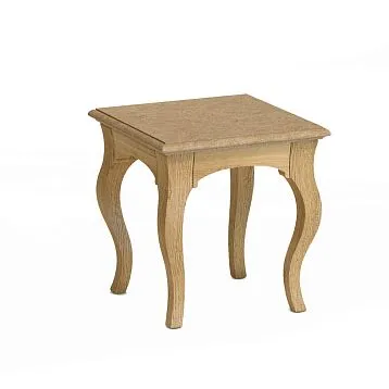
Classic style requires abundant stucco. Portals, friezes, cornices, frames, rosettes create opulence characteristic of palace interiors. Symmetry is strict, proportions canonical, ornaments traditional — acanthus, laurel, rosettes. Color — white, ivory, possible gilding.Classic FurnitureComplements stucco, creating an ensemble.
Neoclassicism — a lighter version of classicism for modern spaces. Stucco is present, but more restrained. Simple profiles, minimal ornamentation, emphasis on lines and proportions. Symmetry is preserved, but compositions are simpler. Colors — white, gray, pastel tones. Neoclassicism works well in standard apartments where there are no high palace ceilings.
Minimalism uses stucco sparingly. One or two elements — a thin cornice, minimalist frames — add structure without ornamentation. Profiles are simple, geometric, without ornamentation. Color — in tone with walls or ceiling, without contrast. Stucco in minimalism — a tool for creating volume and depth, not decoration.
Loft combines rough industrial surfaces with classical stucco. Concrete walls with white cornices, brickwork with stucco portals. Contrast of cold and warm, rough and refined creates tension characteristic of loft. Stucco can be deliberately sloppy, with scratches imitating age.
Modern style uses moldings as an architectural element, not just decoration. Geometric frames, clean lines, rhythmic compositions. Bold color solutions are possible — black cornices on white ceilings, colored moldings on neutral walls.Wooden wall decorcombines with polyurethane molding, creating multi-layered depth.
Conclusion: Architecture in Details
Molding on walls is not just decoration — it is architectural plasticity, a tool for creating space. Portals organize entrances and exits, creating the grandeur of openings. Friezes structure walls, dividing them into manageable sections. Cornices complete verticals, creating transitions. Borders frame, zone, and create boundaries for other materials.
Symmetry calms, organizes, and creates order from chaos. Composition directs the gaze, tells stories, transforms a flat surface into a multi-layered narrative. Zoning open spaces without physical partitions preserves freedom but provides structure.
Company STAVROS offers a wide rangemoldings from polyurethane — Crown Molding, Moldings, pilasters, Outletsdecorative panels. Twenty-three years on the market, thousands of completed projects, professional consultations, delivery across Russia. Quality products without complaints, adherence to deadlines, reliability of partnership — the principles of operation of STAVROS.
Molding transforms a wall from a flat surface into an architectural element. It creates depth where there was flatness, structure where there was chaos, beauty where there was utility. Invest in details — it is precisely they that create a space worthy of life.