


Article Contents:
- Why classic furniture doesn't have to live in a heavy interior
- A new look at classics: form without extra weight
- How slatted panels update a classic living room
- Rhythm versus static
- Naturalness versus decorativeness
- Scale and visual balance
- Which wood tones and finishes work best
- Warm oak tones: an organic union
- Light panels with dark furniture: classic contrast
- MDF for painting: monochrome system with a classic accent
- Tone combination table
- How to combine panels with showcases, cabinets, portals
- Showcase: dialogue of closed and open
- Console: natural pedestal
- Fireplace portal: central axis
- TV zone: slats as a natural background
- When stucco and moldings are appropriate
- Cornice as a boundary of worlds
- Molding Frames: Boiserie in a Modern Interpretation
- Pilasters and Their Appropriateness
- Five Working Schemes for Combining Battens and Classic Furniture
- Scheme One: 'Warm Classic'
- Scheme Two: 'Modern Classic with Contrast'
- Scheme Three: 'Lightened Neoclassicism'
- Scheme Four: 'Dark Study'
- Scheme Five: 'Scandinavian Classic'
- Lighting: How Light Works in a Classic Living Room with Battens
- Main Light: Chandelier as a Classic Accent
- Accent lighting: rails in theatrical illumination
- LED behind the cornice: perimeter halo
- Visual conflict errors between furniture and wall
- First error: different 'weight categories'
- Second error: tone temperature conflict
- Third error: too much classic on a rail background
- Fourth error: uncoordinated cornice
- Fifth error: rails in the wrong part of the wall
- Technical parameters for a classic living room
- FAQ: Answers to Popular Questions
- About the Company STAVROS

There are interiors that amaze at first glance. Not with their colorfulness or clutter of expensive items, but with something else—an internal logic where every element has its place and contributes to the overall image. In such living rooms, you'll always find a pair that looks unexpected: the modern rhythm of wooden rails—and strict, status furniture with carved armrests and turned legs. This combination confuses those accustomed to dividing interiors into 'classic' and 'modern' as two irreconcilable camps.
ActuallySlatted panels in the living room interiorandClassic Furniturenot only coexist — they create one of the most compelling interior unions that exist today. Wood slats provide naturalness and rhythm. Classic-style furniture — status, proportion, and historical depth. Together they form a space that has both liveliness and weight.
This article is a detailed discussion of how exactly this union is built, which solutions work and which disrupt the balance, and why classic style today looks most convincing precisely next to the wooden rhythm of a slatted wall.


Why classic furniture doesn't have to live in a heavy interior
There is a persistent stereotype: classic living room furniture requires heavy velvet curtains, dark patterned wallpaper, gilded baseboards, and overall — that museum-like clutter that suffocates a space. This stereotype was born from a misinterpretation of historical interiors and has long been outdated.
Classic style is not about the quantity of details or obligatory baroque. Classic style is about proportion, about quality of execution, about respect for form. An armchair with carved legs and upholstery in noble fabric absolutely does not need a dark burgundy background to look dignified. It looks dignified on its own — precisely because it is made correctly.
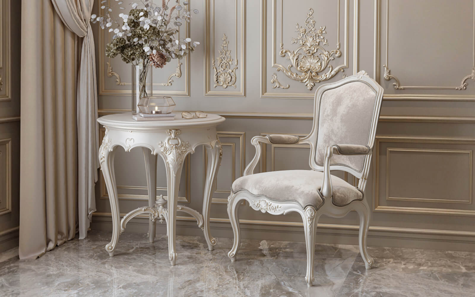
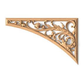
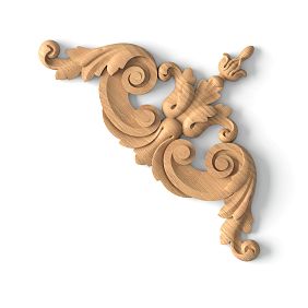
Classic furniture for the living roomfrom the Versailles collection — armchairs, consoles, mirrors in carved frames, coffee tables — are items with precise proportions and hand carving that themselves create a status presentation without any 'heavy' surroundings. That is precisely why they can be placed in a space with modern finishes — including slatted walls — and they do not lose their power. They multiply it.


A new look at classic style: form without unnecessary burden
The modern approach to a classic living room is 'lightened' classic style: light wall tones, minimal textiles, clean floor surfaces. Against this neutral background, classically shaped furniture reads clearly and expressively. Every detail — every curl, every leg profile — is clearly visible, not lost in a generally heavy background.
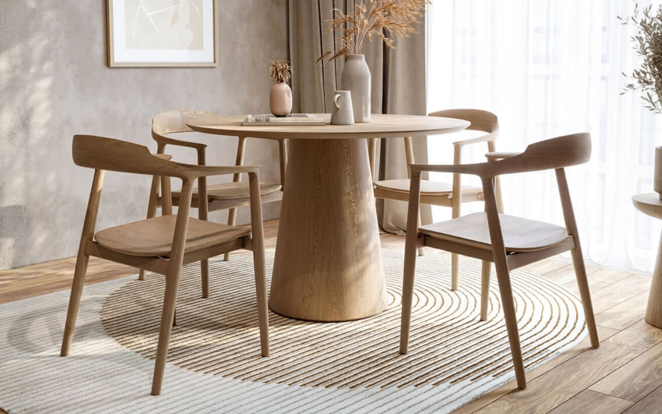
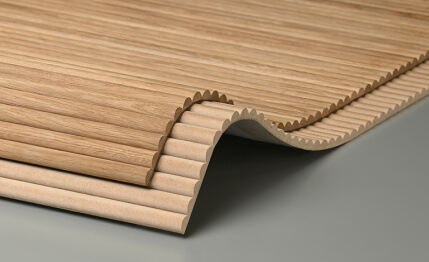
It is precisely such a background that a wooden slatted wall creates. The warm rhythm of vertical slats — not loud, not cold, natural and calm — becomes the perfect neutral backdrop for classic furniture. It does not overload the space but fills it with liveliness and texture. The difference between a characterless wall and a slatted wall is the same as between silence and soft music.
Our factory also produces:


How Slatted Panels Refresh a Classic Living Room
Let's break this down specifically. What exactly does a slatted wall do to a classic living room? Why does the mere presence of a wooden rhythm on an accent plane change the entire perception of the space?
Get Consultation
Rhythm vs. Static
A classic interior is traditionally static — symmetry, stability, balance. This is a virtue. But without disrupting this static quality, the space risks becoming boring, cold, formal. A slatted wall introduces rhythm — repeating, lively, slightly hypnotic. The eye moves along the slats, rests in the gaps, returns. The classic furniture remains the anchor: stable, weighty, formal. Rhythm and static balance each other — and the living room becomes both dynamic and substantial.
Naturalness vs. Decorativeness
Classical furniture in interior designClassic furniture is predominantly a cultural, man-made, decorative object. Carving, gilding, fabric — traces of human craftsmanship, history, and craft. An oak slatted wall is a natural object. The grain pattern, tonal transitions, living texture — this is not the skill of a carver, it is the time and growth of the tree. Two different types of beauty that, when they meet, create a rare balance: the man-made and the natural, the cultural and the elemental.
Scale and Visual Balance
Classic furniture is often large: high chair backs, massive display cabinets and consoles, a bed with a carved headboard. A living room with such furniture requires a visually strong background — otherwise, the furniture 'hangs' in space without support. A slatted wall with a pronounced vertical structure creates precisely this support: a strong background, sufficiently saturated to hold a large classic form, and sufficiently delicate not to compete with it.
Which Wood Tones and Finishes Work Best
Choosing the tone of the slatted panels is one of the key decisions that determines whether the connection between the wall and the furniture will be organic or accidental. This is no place for haphazard experiments: the color of the wood slats and the finish of the furniture must be intentionally coordinated.
Warm oak tones: an organic union
Tints like 'cognac', 'tobacco', and 'amber'—rich, warm, golden-brown—are ideal for a living room with classic furniture in warm finishes. IfBuy Classic Furniturein the color of natural oak, dark walnut, or golden beech, slatted panels in a similar tint will create a monolithic, organic picture. Not an identical tone (that would be boring), but one temperature register—warm, amber, natural.
Light panels with dark furniture: a classic contrast
The opposite approach: slatted panels made of ash or birch with whitewashed oil or a light tint—andClassic Furniture for the Living Roomin dark chocolate or dark walnut color. This is a strong, expressive contrast—a light textured background and dark monumental furniture.
This scheme requires boldness, but the reward is great: the living room gains that very 'depth' which cannot be achieved with a single color. Dark furniture against a light slatted background stands out, becomes sculptural. Each piece is a separate accent.
MDF for painting: a monochrome system with a classic accent
The third option—paintable slatted wall panelsmade of MDF in a monochrome system. A white or neutral painted wall with slats in the same tone—and classic wooden furniture as the sole color accent. This is the most modern approach to a classic theme: an extremely clean background on which furniture with carving and hand-finishing 'pops' with full force.
Tone combination table
| Slat panel tone | Furniture finishing | Combination character |
|---|---|---|
| Warm oak (cognac, tobacco) | Natural oak, light walnut | Natural solidity, coziness |
| Warm oak (cognac) | Dark walnut, wenge | Tone contrast, status |
| Light ash, bleached oil | Dark chocolate, espresso | Classic contrast |
| MDF for painting (white) | Any classic in wood | Pure neutral background |
| Anthracite, graphite (tinting) | White or cream classic | Modern classic, boldness |
How to combine panels with showcases, cabinets, portals
A classic living room is not just a sofa and armchairs. It includes display cabinets, sideboards, consoles, fireplace surrounds, and mirrors in carved frames. Each of these pieces is positioned relative to the slatted wall and requires a thoughtful decision.
Display Cabinet: A Dialogue of Closed and Open
A cabinet display case with glass-fronted doors is one of the most 'classic' pieces of living room furniture. Against a slatted wall, the display case looks especially striking: its closed plane contrasts with the open rhythm of the slats, and through the glass, shelves with books or collectibles are visible.
Placement rule: it's better to place the display cabinet not on the slatted accent wall, but on an adjacent one. This creates a 'framing' for the living room: one wall is the slatted rhythm, the other is the furniture volume. Between them is free space where there is air and it's comfortable to move.
If the layout forces you to place the display cabinet on the slatted wall, leave space of the slatted surface visible on the sides without furniture. The slats should be visible as a background for 40–50% of the wall's width. Otherwise, the slatted finish simply hides behind the furniture.
Console: A Natural Pedestal
Console VersaillesA narrow table on carved legs is one of the best 'partners' for a slatted wall. The console presses against the slatted background and occupies minimal area. The slats behind it serve as a lively, natural backdrop, against which the carving on the legs reads clearly and expressively. A mirror in a carved frame above the console completes this 'scene': three elements—slats, console, mirror—form a finished vertical composition.
Important nuance: the tone of the console and the tone of the slatted panels should either be close (organic monolithicity) or contrasting (expressive accent). An intermediate option—where the tones 'almost match, but not quite'—looks accidental and sloppy.
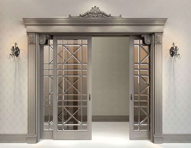
Fireplace Surround: The Central Axis
The fireplace surround is the undeniable center of a classic living room. Paired with slatted panels, it works as a point where the eye stops against the backdrop of the rhythmic movement of the slats. The slats surround the portal on both sides—and this 'frame' of natural wood emphasizes the monumentality of the fireplace.
For a living room with a fireplace portal made of plaster or MDF for painting — scheme: portal in white or cream, slatted panels on both sides in a warm oak tone. Natural material frames the cultural object — and both components benefit from this proximity.
TV zone: slats as a natural background
A TV in a classic living room is an inevitable problem. A black rectangle looks alien on any background. On a slatted wall — especially. Solution: dark slats (anthracite, graphite) behind a dark screen. The slats and screen merge into a dark plane, the TV ceases to be a 'stain'. On the sides — decorative elements: sconces with classic shades, small wall consoles with decor.
When molding and moldings are appropriate
Molding in a classic living room with slatted panels is not a mandatory attribute or random decor. It is a tool for completing the architectural system. To understand if molding is needed in a specific project, one question helps: does the space have architectural landmarks — cornice, moldings, trims? If yes — molding continues this theme. If no — it can create it.
Cornice as a boundary of worlds
Ceiling cornice made ofpolyurethane— an element that separates the slatted wall field from the ceiling and gives the entire system completeness. Without a cornice, slatted panels 'break off' at the ceiling in an awkward transition. With a cornice — the wall gains architectural completeness.
The height and profile of the cornice are selected to match the furniture style:
-
For modern classic (Versailles in light finish): cornice 70–90 mm with a soft ogee profile;
-
For a more formal presentation (dark walnut, rich upholstery): cornice 100–130 mm with a classic multi-part profile;
-
For lightweight classic with slatted battens: cornice 50–70 mm with a simple profile — sufficient structure without overload.
The cornice is painted to match the wall or ceiling — depending on the concept. In a monochrome system (white cornice, white wall between battens, white battens) — the cornice dissolves into the system and works as an architectural line, not a decorative object.
Molding frames: boiserie in a modern interpretation
Polyurethane molding frames over slatted panels (or on smooth wall sections) create a boiserie system — historical wall panels divided into rectangular fields. In a classic living room, this is a powerful architectural technique that elevates the space from the category of 'expensive renovation' to 'architectural project'.
When used in a living room withclassical furniture in the interiormolding frames create a common visual 'language' between the wall and the furniture: the framed fronts of a display cabinet or the decor on the legs of an armchair echo the molding frames on the wall. This unity of forms is perceived subconsciously but makes a strong impression.
Pilasters and their appropriateness
Pilasters — decorative vertical columns — are appropriate where slatted panels meet a doorway or room corner. A polyurethane pilaster architecturally frames this transition, making it an event, not just a material joint. Classical furniture next to a pilaster looks organic — both elements belong to the same architectural vocabulary.
Five working schemes for combining slatted panels and classic furniture
Practice is more important than theory. Let's examine specific, proven schemes.
Scheme one: 'warm classic'
Slatted panels: oak, 'cognac' tint, slat width 40–50 mm, vertical orientation, height from floor to 2/3 of the wall, finished with a horizontal polyurethane molding.
Furniture: Versailles or Marseilles collection in natural oak or light walnut, upholstery in ochre or terracotta.
Walls above the molding: warm white or powdery beige.
Ceiling: 70–90 mm polyurethane cornice matching the wall color, ceiling — white.
Character: cozy, natural, warm classic. Works in living rooms 20–35 sq.m.
Scheme two: 'modern classic with contrast'
Slatted panels: MDF for painting in dark green (RAL 6028) or deep blue (RAL 5011) — accent wall from floor to ceiling.
Furniture:Classic Furniture for the Living RoomIn a light color — white enamel or ivory, upholstery in neutral linen or velvet.
Molding: white polyurethane cornice 90–110 mm on a dark slatted wall — maximum contrast.
Character: bold modern classic. For those who are not afraid of bold decisions.
Scheme three: "lightened neoclassicism"
Slatted panels: vertical ash slats with white oil in the lower wall area, height 100–120 cm.
Above: neutral light gray or warm cream wall.
At the boundary: horizontal polyurethane molding in the tone of the slats or slightly darker.
Furniture: Marseilles in light beech, upholstery in pastel tones.
Ceiling: light cornice 60 mm, ceiling rosette.
Character: airy neoclassicism. For small living rooms where lightness is important.
Scheme four: "dark study"
Slatted panels: "anthracite" or "graphite" tint, slat width 50–60 mm, vertical, three walls.
Furniture: dark walnut or wenge,Buy Classic Furniture in the most saturated color.
Molding: polyurethane cornice in the same dark tone — a monochrome system.
Accent: golden handles, sconces with gold shades, gilded mirror in a carved frame.
Character: brutal, status, masculine living room. For large spaces from 30 sq.m.
Scheme five: "Scandinavian classic"
Slatted panels: narrow slats 20–25 mm with whitewashed oil, tight spacing, floor to ceiling.
Furniture:Classic furniture for the living room with white or cream enamel, upholstery in neutral white linen.
Walls: white.
Cornice: minimalist rectangular 40–50 mm in white.
Character: light, airy, 'white classic'. For bright spaces with an abundance of natural light.
Lighting: how light works in a classic living room with slats
Lighting in a classic living room with slatted walls requires special attention. At least three sources or types of light are involved here, each performing its own function.
Main light: chandelier as a classic accent
In a classic living room, a chandelier is a mandatory element, not an option. It is not just a light source, but an architectural accent of the ceiling, corresponding with classic furniture. A crystal chandelier over a floor with classic furniture is a historically impeccable choice. A modern interpretation: a chandelier with brass or matte gold shades over a coffee table is more delicate but no less convincing.
Accent light: slats in theatrical lighting
Track spotlights or spots directed at the slatted wall at an angle of 30–45° are what transform the slatted wall from a daytime to an evening element. Shadows in the gaps between the slats become deep and sharp under directed light. The oak grain pattern 'opens up' in side lighting. Classic furniture in front of such a wall acquires theatricality.
LED behind the cornice: halo around the perimeter
Hidden LED strip behind a polyurethane ceiling cornice, directed upward at the ceiling — soft diffused light along the entire perimeter of the room. With a warm color temperature (2700 K), this light creates a golden halo above the room. A classic living room in such lighting acquires a formal, ceremonial solemnity without a single ceiling fixture.
Visual conflict errors between furniture and the wall
An uncoordinated union of slats and classic furniture destroys an interior with the same force with which a proper union creates it. Here are the most common mistakes.
First mistake: different 'weight categories'
Thin, narrow slats with a fine pitch — and massive dark furniture with large carvings. Or vice versa: wide, coarse slats with a large pitch — and elegant, light classic furniture with thin legs. The scale of the slatted panels must correspond to the scale of the furniture. Light Marseilles furniture — narrow slats 20–35 mm. Monumental Versailles furniture — slats 40–60 mm with a corresponding pitch.
Second mistake: conflict in tone temperature
Cold gray slats (MDF under matte cold paint) next to warm furniture in amber oak — this is a temperature conflict. The eye feels discomfort, not always realizing the cause. Rule: warm-toned slats — warm furniture. Cold-toned slats — neutral or cold furniture. Mixing temperatures is permissible only with an intentional, strong contrast — when that is precisely the design idea.
Third mistake: too much classic furniture against a slatted background
A slatted wall is occupied by classic furniture across its entire width — a display cabinet, console, armchairs along the wall. The panels are not visible. Why were they needed then? A slatted wall must breathe: 40–60% of its width remains free — it is precisely this that creates the background.
Fourth mistake: uncoordinated cornice
Classical furniture with a rich profile — and a polyurethane cornice 30–40 mm in size, barely noticeable at the ceiling. The mismatch in scale of architectural details disrupts the system. For a living room with classical furniture, the cornice should be full-fledged: 70–130 mm with a pronounced profile. Only then does it create a unified whole with the furniture.
Mistake five: slats in the wrong part of the wall
Slatted panels — only in the upper zone of the wall (above furniture level), and the lower part is smooth. This is inorganic: the slats 'hang' in space without support. Correctly — slats either from floor to ceiling, or in the lower part with a molding at the boundary. These two scenarios work. Intermediate options do not.
Technical parameters for a classical living room
Several practical guidelines for those who have already made a decision and are planning implementation:
| Parameter | Recommendation for a classical living room |
|---|---|
| Slat width | 35–60 mm (depending on the scale of the room) |
| Slat spacing | 20–35 mm gap |
| Orientation | Vertical (raises the ceiling) |
| Finish | Oil or matte lacquer (not gloss) |
| Height of the slatted field | Full (from floor to ceiling) or lower zone up to 120 cm |
| Cornice | 70–130 mm, classic profile |
| Baseboard | 70–90 mm solid wood matching the slats |
FAQ: Answers to popular questions
Can oak slatted panels be combined with white classic furniture?
Yes, this is one of the most compelling contrast combinations. Warm amber oak and white furniture create a clear natural-cultural contrast, where each element reads with maximum expressiveness. Important: the white should be warm (cream, ivory), not cool — otherwise a temperature conflict arises with the warm oak.
Which wall is best for placing classic furniture in a living room with slats?
If there is one accent wall (slatted)—place classic furniture so that it 'faces' the slatted wall or partially adjoins it. A sofa or armchairs with their backs to the slatted wall is incorrect: you deprive them of their main background. Classic furniture should be 'in front of' the slatted wall, using it as a backdrop.
Which style of classic furniture works best with slatted panels?
Most organic are neoclassical and contemporary classic. Heavy Baroque with gilded scrolls requires a more 'historical' background—dark tones and rich textiles. Slatted panels work best with furniture featuring clean proportions and moderate ornamentation—exactly like the Versailles and Marseilles collections from STAVROS.
Is a polyurethane cornice needed if the furniture is already classic?
Yes, definitely. The cornice completes the architectural system from above: slatted panels, furniture with classic form, and the ceiling cornice form a vertical 'dialogue'—from floor to ceiling—in which each element confirms the overall style. Without the cornice, the ceiling remains neutral and does not support the system.
How to properly choose lighting for such a living room?
Three-level: a chandelier with a classic shade as the main light, directional spots or a track with projectors for accent lighting of the slatted wall and furniture, hidden LED lighting behind the cornice to create atmospheric evening light. Three levels in the right proportion—and the living room works at any time of day.
Can horizontal slats be used with classic furniture?
Yes, but carefully. The horizontal rhythm creates a different mood in the living room—more expansive, laconic, 'reclining.' Classic furniture with vertical proportions (high back, slender legs) against a background of horizontal slats works as an interesting contrast of directions. But in small living rooms, such a combination can visually compress the space: horizontal slats lower the ceiling. Optimal—only in large rooms from 30 sq.m.
About the company STAVROS
The living room discussed in this article—with slatted walls, ceiling cornice, moldings, and status classic furniture—is not an abstraction or an 'ideal magazine project.' This is a realistically implementable solution, all elements of which are produced under one roof.
STAVROS is a Russian manufacturer of the full interior cycle:Solid oak slat panelswith professional tinting and coatings,Wall and ceiling moldingMade of polyurethane — cornices, moldings, pilasters, rosettes — andClassic FurnitureOur own production from selected wood species with hand carving.
The Versailles and Marseilles collections are not imported products with certificates, but items from our own workshops. Each piece — from a coffee table to a console with carved legs — is created with consideration for the proportions of classical furniture art and designed to work specifically in the systems produced by STAVROS: next to wooden slats, under a polyurethane cornice, surrounded by molding frames.
This means that when ordering from STAVROS, you receive not a set of random materials, but an architectural system with coordinated tones, proportions, and stylistic unity. Consultation on system selection is free. The catalog is openly available online. Production and delivery — throughout Russia.