


Article Contents:
- Why Material Texture Matters More Than It Seems in the Preview
- Why Lighting in Photos Changes Everything
- How to Read the Texture of Slat Panels in Photos
- Step 1: Determine the Slat Material by How It Interacts with Light
- Step 2: Assess the Width of the Slats and Gaps
- Step 3: Check for Batch Uniformity
- Step 4: Evaluate the Slat Profile from a 'Top-Down' Angle
- How to Read Photos of Molded Decor
- What to look for in photos of cornices and moldings
- How to evaluate polyurethane molding in photos
- What makes a 'good' photo of polyurethane decorative elements
- How to analyze the combination of slat textures and molded decor in a single photo
- Current texture combinations for 2025–2026
- How to avoid buying a pretty picture instead of good material
- Signal 1: only studio photos without real interiors
- Signal 2: all photos are taken with direct frontal lighting
- Signal 3: excessive retouching
- Signal 4: slats of different shades in a 'demonstration' photo
- Signal 5: plaster molding joints "not visible in photo"
- Signal 6: "glossy" natural wood slats
- Professional checklist for analyzing finishing photos
- Real interior scenarios: how to "read" photos of completed projects
- Scenario A: living room with slatted accent wall
- Scenario B: ceiling with cornice and rosette
- Scenario C: molding frames on walls
- Materials under the microscope: technical parameters that matter in practice
- FAQ: Answers to Popular Questions
- How to distinguish natural wood from veneer in photos?
- Can you determine the quality of a polyurethane cornice from a photo?
- Why does the same slatted panel look different in different photos?
- Should you trust 3D renders when choosing finishes?
- How to check if the real material matches the photo on the website?
- Conclusion

You found the perfect picture. Beautiful, atmospheric, exactly what you dreamed of. Saved it as a reference, sent it to the designer, ordered the material — and got something completely different. The slats are 'not the same', the molding is 'not it', the lighting 'doesn't work'. A familiar story? Unfortunately, it happens more often than we'd like to admit.
The problem is not with the material or the manufacturer. The problem is that most people don't know how to read a photo of a finish. They see 'beautiful' or 'ugly' — and that's where the analysis ends. Meanwhile, a professional look at the same photo extracts dozens of pieces of information: texture type, relief character, geometry quality, coating accuracy, material behavior under side and frontal lighting.
Slatted panels with natural wood textureandmolding decor in a photo— two types of finishes that look absolutely different depending on the photographer, lighting, shooting angle, and post-processing. Learning to read these images means making purchase decisions consciously, not intuitively. This is exactly what this article is dedicated to.


Why material texture is more important than it seems in the preview
Most decisions about purchasing finishing materials are made based on a preview — a small picture in a catalog or the first photo in search results. This is a tiny 200×200 pixel image, compressed to the point where details are indistinguishable. You can see the 'color' and 'approximate shape'. Textures — no.
And texture is precisely what determines how a material will behave in your specific space. Under specific lighting. With specific furniture. At a specific distance from the observer.
What is texture in relation to finishing materials? It is the combination of three components:
Surface texture — the micro-relief: smooth, rough, matte, semi-gloss, oiled, lacquered. It is the texture that determines how a surface reacts to light: absorbs, scatters, or reflects it.
Pattern — the design visible under normal lighting: wood grain, the width and spacing of slats, the ornament of molding, the geometry of a profile.
Depth of relief — how three-dimensional the surface is. For a slatted panel, it is the height difference between the slat and the gap. For molded decor, it is the difference between the protruding profile and the background plane.
It is precisely these three components that 'disappear' in previews — and it is precisely these that one must be able to reconstruct from high-quality, detailed photographs.


Why lighting in photos changes everything
Let's look at two photos of the sameoak-textured slatted panel. The first — under direct frontal light: the surface appears even, light, almost 'flat'. The relief of the slats is barely discernible. The second — under side grazing light: each slat casts a distinct shadow, the gaps 'recede' into darkness, the wood grain 'emerges' in sharp relief. It is the same material — and an entirely different visual result.
Professional photographers shooting architectural interiors always work with side lighting—it's what 'reveals' the material. When you see a photo of a slatted wall in an advertising catalog under direct light, the material is intentionally 'simplified,' with the play of shadows removed. This is a dishonest presentation, but a common one.
Conclusion: look for photos with side or grazing light. Only they show the material truthfully.
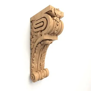
Our factory also produces:


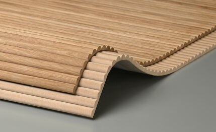
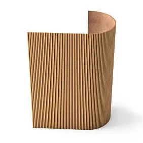
How to read the texture of slatted panels in a photo
Let's break it down methodically. Before you is a photo of a slatted panel. What exactly needs to be analyzed?
Get Consultation
Step 1: determine the slat material by how it reacts to light
Natural wood, paintable MDF, and veneered MDF behave completely differently in photos—and they can be distinguished without a caption.
Natural wood (solid oak, ash, pine):
-
Fibers have variable density—light earlywood zones and dark latewood zones of the annual ring
-
The surface reflects light unevenly—different zones of the same slat look different
-
With an oil-wax finish—a matte 'velvety' sheen, without mirror reflections
-
With lacquer coating — a clear glossy 'layer' over the texture, the boundary between wood and lacquer is visually discernible
-
Ends of the slats (if visible in the photo) — no 'empty' uniform zones, fibers 'converge' toward the end
MDF for painting:
-
Uniform matte surface without visible fiber pattern
-
Even light diffusion across the entire slat — no 'hot' or 'cold' zones
-
Shadow from the slat and gap — sharp, geometrically correct
-
Slat profile (chamfers, roundings) — maximally precise, without natural 'randomness'
-
Paint tone — strictly uniform along the entire length of the slat
Laminated MDF:
-
A fine, delicate texture is visible — fibers are present, but they are 'finer' and 'more regular' than in solid wood
-
Veneer color — more uniform, without sharp contrasts between individual slats
-
Light reflects softly — like wood, but without 'hot spots'
-
Joints between slats — all of the same shade (veneer color variation is minimal within one batch)
Thermowood:
-
Dark, chocolate-brown or black color — without dyes
-
Fiber texture — more 'closed', pores 'sealed' by heat treatment
-
Matte surface with a characteristic 'charcoal' tint
-
With oil coating — warm deep shine 'from within'
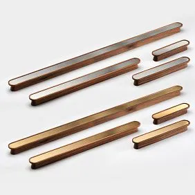
Step 2: evaluate the width of slats and gap
Texture of slatted panelis perceived by the eye as the sum of slat width and gap. This is the 'rhythm' of the surface — and its character directly depends on the slat/gap proportion.
How to estimate scale in a photo without a scale marker? Look for familiar marker objects in the frame: a power outlet, a door handle, a standard baseboard (60–80 mm), a light switch, standard-sized tiles (200×600 mm). They provide scale.
Proportions of gap to slat and their visual effect:
| Gap/slat proportion | Surface character |
|---|---|
| 1:5 and less (gap is very small) | «Monolithic» surface, subtle shadow, relief is almost imperceptible |
| 1:3 (standard) | Balanced rhythm, shadow is clear, slats are «readable» |
| 1:2 | Pronounced rhythm, gap is «active», surface «breathes» |
| 1:1 and more | Graphic contrast, «hatching» effect, maximum dynamism |
When analyzing a photo: the larger the gap relative to the slat, the more 'airy' and 'open' the surface will appear in reality.
Step 3: check the batch uniformity
This is a critical point that 90% of buyers ignore when viewing photos.
If the photo shows a slatted surface area of 2–3 m², look: are all slats the same color and texture? For MDF for painting, the answer is always 'yes' (uniform material). For natural wood, the question is serious.
Natural wood has a natural variation in shades within the same species. A well-selected batch consists of slats with close tones and similar grain patterns. A random batch has one slat amber, the next gray, another with a large knot.
In professional photos from a good manufacturer, slats from the same batch demonstrate controlled variation—natural variability is present but within a narrow range. In photos of low-quality products, it's a 'patchwork quilt' of differently toned slats.
Warning signal: in the photo, one slat is noticeably lighter or darker than its neighbors without an obvious reason. This indicates poor batch selection control.
Step 4: evaluate the slat profile from a 'top-down' angle
The most informative angle for evaluating a slat's profile is looking along the surface at a sharp angle (approximately 30–45° to the wall plane). In such a photo, you can see:
-
How sharp the chamfers or roundings of the slat are
-
Is the gap depth uniform along the entire length?
-
Are there any 'protruding' slats that disrupt the overall plane?
-
How precisely is the gap spacing maintained?
If a manufacturer only shows photos strictly 'head-on' and never at an angle, that in itself is a signal: the profile and plane may not withstand scrutiny.
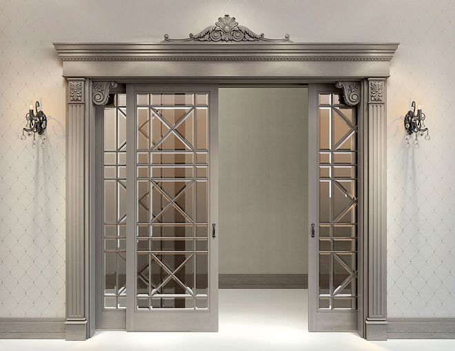
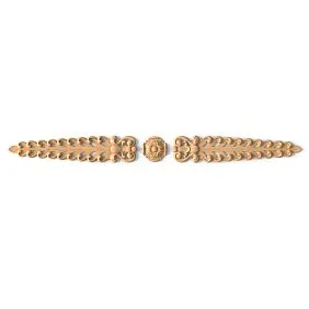
How to read photos of stucco decor
molding decor in a photo— this is a separate analytical skill. Stucco 'speaks' through shadow: the deeper and more precise the profile, the more expressive the shadow and the 'richer' the decor looks. But a bad photo can both ruin a good element and 'paint' volume where there is none.
What to look for in photos of cornices and moldings
Profile clarity in shadow. Look at the internal corners of the profile — where two planes meet. A quality polyurethane element has a sharp and clean internal corner, with a rich and clear shadow. An item with a poor mold or insufficient density has a 'blurred' corner, with a fuzzy shadow lacking a clear boundary.
Why is this important? It is precisely the sharp internal corners that create the 'expensive' look of stucco. They are what distinguish an 'architectural' cornice from a 'plastic corner from a hardware store'.
Profile parallelism to the wall plane. The photo should show that the cornice is mounted strictly parallel to the horizon. Any 'tilt' — even 2–3 mm along the entire wall length — reads as carelessness in a photo. In reality, it's a gross installation error or a crooked wall.
Joint quality. In the photo, look for corner joints of the cornice. A proper 45° corner joint 'disappears': the seam line is invisible, the profile 'flows' without interruption. A poor joint shows a gap, a step, or a 'ladder' pattern.
Paint coverage uniformity. If the decor in the photo is painted (which is most often the case—white or cream polyurethane), check: are there 'spots' of uneven color density, 'missed' areas on the inner edges of the profile, or paint drip marks? Uneven painting indicates either a single coat without primer or a poor-quality surface of the element.
How to evaluatepolyurethane molding in a photo
Polyurethane molding in a photois truly good when the photographer worked with side lighting. Then each 'ledge' of the profile casts its own shadow—and is 'read' separately. Look for:
Number of 'layers' in the shadow. A developed classical cornice has 4–7 planes with different slopes. With side lighting, each plane has its own shade of gray: lighter or darker depending on the angle. A 'rich' cornice means a 'rich' play of shadows. In a photo with proper lighting, this appears as several gradations of gray in the profile.
In a poor photo with frontal lighting—all planes are equally bright, the profile looks 'flat'. The material might be excellent, but the photo 'kills' it. Conversely, aggressive retouching can 'draw' shadows where there are none.
Look for retouching 'errors'. Professional photos undergo post-processing. Sometimes it's excessive: contrast is boosted so much that the profile looks 'sharper' than in reality. Signs of over-retouched photos: harsh 'black' shadows without midtones, 'unrealistic' contrast between white and dark. In reality, the material will be softer.
Scale of the ornament. If the cornice or molding is ornamental—with acanthus, dentils, 'egg' motifs—it's important to understand the actual size of the ornament. Look for a scale marker in the frame. An overly small ornament gets 'lost' in reality—it's only visible up close. An overly large one 'shouts' in a small room.
What does a "good" photo meandecorative elements made of polyurethane
decorative polyurethane elements— cornices, moldings, baseboards, belts — are best shown in a photo that meets the following criteria:
-
Shot indoors with a real interior, not on a white background "in the air"
-
Presence of side natural or artificial light that reveals the relief
-
Corner joints are visible — this is an honest "test" of installation quality
-
There are at least two scale photos: a general shot (context) + a detailed one (relief)
-
No excessive retouching: midtones are preserved, shadows are not "burned" to black
If a manufacturer only shows photos on a white background under direct studio lighting — this is fine for initial acquaintance. But it is not enough to make a purchase decision.
How to analyze the combination of slat textures and stucco decor in one photo
More and more often in interior photography, there is a combination of slat panels and stucco decor in one shot. This is a complex composition that needs to be able to be "taken apart".
When you see such a shot — don't look at it 'as a whole'. Mentally break it down into components:
The slatted surface area: what texture? Wood or MDF? What is the rhythm (slat/gap)? How does the shadow behave? Is the batch uniform?
The molded decor area: what is the cornice profile? How sharp are the internal corners? Are the joints clearly visible?
The point of interaction between two elements: where do the slats end and the cornice or molding begin? How clean is the transition? Are the colors of the slats and molding the same or different?
Lighting scenario: where is the light coming from? Is it uniform across the entire surface or directional? How does the shadow from the slats relate to the shadow from the cornice profile?
By answering these questions for a specific photo — you don't just 'see beautifully', you understand what achieves the result. And this allows you to reproduce it in your own space — with the same or similar materials.
Relevant texture combinations in 2025–2026
A professional look at trendy interiors notes several stable material combinations that are currently most common in the best projects.
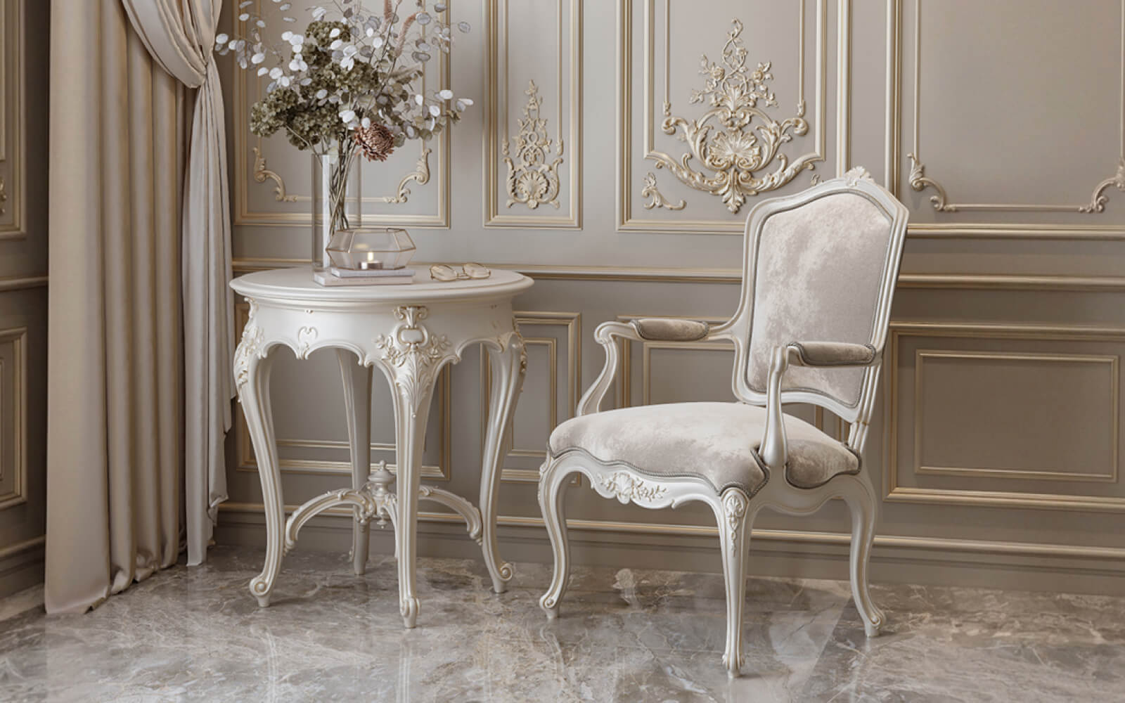
Natural oak + white polyurethane cornice
Warm amber texture of oak slats + snow-white cornice with one or two setbacks. Contrast of warm and cold, natural and architectural. One of the most photogenic duos: in the shot — the depth of wood versus the 'pure' white profile.
In the photo, this combination is instantly recognizable: the warm glow of oak fibers 'below' and the cold clarity of the white cornice 'above'. Morning and evening light shifts this balance—precisely why such interiors feel 'alive'.
Monochromatic white MDF slats + ceiling molding-cornice in the same tone
Everything in one color: walls, slats, cornice—RAL 9010 or RAL 9001. The shadow from the slats and cornice profile is the only 'color information' on the surface. This is an ascetic yet expressive option. In photos, it looks 'architectural'—without loud accents, only geometry and light.
Thermowood 'dark walnut' + cornice RAL 9010 white
A stark contrast of dark and white. In the photo—maximum graphic impact: black shadows from the slats, the white cornice 'cuts' the dark wall with a horizontal line. Very photogenic with side lighting. Requires precise installation: any imperfection is immediately visible with such contrast.
MDF for painting in a dark color + ornamental white cornice
Dark slatted wall—anthracite, dark blue, deep green—and a white ornamental cornice along the top. In the photo: the dark 'velvet' of the slatted surface and the white 'lace-like' cornice profile. A very 'rich' combination when executed skillfully.
Veneered slats 'bleached ash' + molding frames in the same tone
Delicate texture of bleached ash + flat molding frames of the same color on the walls. 'Invisible' architecture: the frames are discernible only through the subtle shadow of the profile. In the photo—the surface appears 'shimmering,' constantly changing depending on the viewing angle.
How to avoid buying a pretty picture instead of good material
The most honest part of this article. Because the finishing materials market is full of beautiful photos hiding mediocre products.
Let's examine six warning signs to look for when analyzing photos.
Signal 1: only studio photos without real interiors
If a manufacturer shows only photos of individual elements on a white background—without the context of real spaces—that's a reason to ask questions. Good material "works" in an interior—and the manufacturer knows it. If there are no real interiors, there may be few completed implementations, or they can't compare to the photos on a white background.
Signal 2: all photos are taken with direct frontal lighting
Direct frontal lighting "kills" texture—it makes a three-dimensional surface look flat. If all photos of slatted panels are taken with such lighting, you cannot assess the depth of the gap, the quality of the slat profile, or the play of shadows. The manufacturer either doesn't know how to photograph properly or is intentionally hiding flaws in the texture.
Signal 3: excessive retouching
Aggressively increased contrast, "added" shadows, unrealistically deep "black" gaps—all of this is retouching. The real material in your space will be softer. Under normal room lighting without post-processing—it will look less "dramatic."
How to recognize it? Shadows without midtones—sharp transitions from white to "black" without intermediate grays—are a sign of excessive editing.
Signal 4: slats of different shades in a "demonstration" photo
If the manufacturer's 'exemplary' photo of natural wood slats shows clearly different tones—amber next to gray next to almost white—this indicates poor batch selection control. Your order will have the same variation or worse.
Signal 5: molding joints 'not in the photo'
Photo of the cornice — only a straight section of the wall, never a corner joint. This is a warning sign. A 45° corner joint is the most 'honest' spot: it shows the precision of the cut, the quality of the finishing, and the clarity of the pattern alignment. A manufacturer that hides joints in photos is likely hiding problems with them.
Signal 6: 'glossy' natural wood slats
Natural wood with an oil-wax finish has a matte, 'velvety' sheen. A glossy varnish coating on wood is a different choice, but it completely changes the perception: varnish creates a 'mirror' over the texture, and the wood 'disappears' under the film. In photos, a glossy oak slat looks 'plastic-like'—precisely because the mirror-like sheen flattens the natural depth.
If you want 'warm, living wood'—look for photos with a matte or satin finish.
Professional checklist for analyzing finish photos
Use this checklist every time you analyze photos of slatted panels or molding decor before purchasing.
For slatted panels:
-
Is there at least one photo with side (grazing) lighting?
-
Is the relief of the gap and its depth visible?
-
Is the party uniform in tone (for natural wood)?
-
Are chamfers or the profile of the slat visible in the angled photo?
-
Is there a scale marker in the frame to understand the actual dimensions?
-
Are the corner joints of the slatted field shown?
-
Are there any signs of excessive retouching (unrealistic shadows, overexposed areas)?
-
Are there photos of actual implemented interiors (not just studio ones)?
For stucco decoration:
-
Are the internal corners of the profile visible (clarity and shadow saturation)?
-
Are the 45° corner joints shown?
-
Is the coloring uniform across all planes of the profile?
-
Is there a scale marker to understand the actual size of the element?
-
Are there any signs of overexposure (shadows 'burned out')?
-
Is the surface of the ornament visible in detail?
-
Is the element shown installed in a real room?
Real interior scenarios: how to 'read' photos of finished projects
Let's consider several typical scenarios—how exactly to 'read' a specific interior photo.
Scenario A: living room with a slatted accent wall
The photo shows a wall behind a sofa, covered with vertical wooden slats. The light is daylight, from a side window.
What to analyze:
-
The shadow from the sofa back on the slats—indicates the actual depth of the structure (how much the slats protrude from the wall)
-
The color of the gap behind the slats—dark (the back wall is painted dark) or light (the wall matches the slats' color)?
-
Uniformity of battens in height — is the tone of the batten consistent from floor to ceiling? If the battens are made of wood — a slight variation is acceptable and natural.
If the sofa is moved and light enters the gaps — how will this change the appearance? This is exactly what you will get in the apartment when rearranging the furniture. A dark gap 'enhances' the relief. A light one makes the surface more 'airy'.
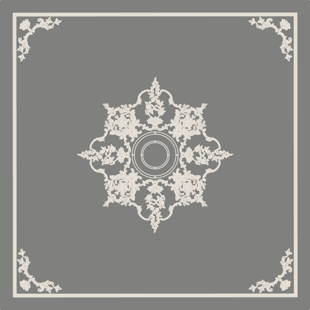
Scenario B: ceiling with cornice and rosette
In the photo — a white ceiling with a cornice around the perimeter and a rosette in the center. Chandelier.
What to analyze:
-
Ratio of rosette size to ceiling area — the rosette should occupy 1/8–1/12 of the room's width
-
Cornice profile — one step / two / with ornament? Does it match the style of the entire room?
-
Quality of the cornice-to-wall joint at the bottom — is there any gap, 'step'?
-
Shadow under the cornice — how much does the cornice 'protrude' from the wall? This is the visible 'power' of the stucco decoration
If the shadow under the cornice in the photo is very wide and saturated — it is either a large cornice (80–120 mm) or directed side lighting. Clarify the actual size before making a choice.
Scenario C: molding frames on the walls
The photo shows a wall with molding frames creating a 'panel' pattern.
What to analyze:
-
Frame proportions — width to height. A 'correct' frame has a proportion close to the golden ratio (1:1.618) or the 'classical' rectangular proportion of 3:5.
-
The distance from the frame to the ceiling equals the distance from the frame to the floor — a sign of competent design.
-
Molding width relative to frame size — thin molding 20–25 mm for a delicate solution, wide 40–60 mm for a classic look.
-
Molding and wall color — matching (invisible frame), nuanced (frame is 'readable'), contrasting (graphic accent).
Frames occupying a 'non-multiple' area of the wall without an obvious arrangement system are a sign of poor design. A beautiful frame system is always a 'multiple' of the wall width and has equal margins.
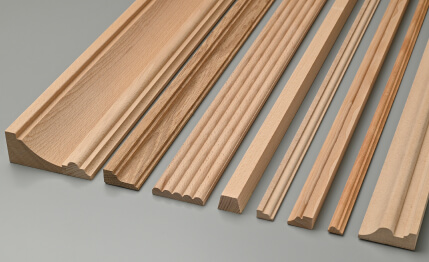
Materials under the microscope: technical parameters that matter in practice.
A professional analyzes not only photos but also technical specifications. Here’s what should be in the material data sheet — and how it correlates with what is seen in the photo.
MDF slat panels:
-
MDF density: 750–850 kg/m³ — the higher, the more precise the geometry and stronger the edges.
-
Batten thickness: 12–18 mm — a thicker batten provides more pronounced 'volume'.
-
Factory primer: acrylic in 1–2 coats — essential for quality painting.
-
Batten width tolerance: ±0.3–0.5 mm — guarantees uniform spacing.
Polyurethane decorative elements:
-
Density: 120–250 kg/m³ — higher density = sharper relief, less fragility.
-
Polyurethane type: high-density foam (HDF PU) — better reproduces ornament.
-
Mold precision: ≤0.5 mm — determines sharpness of internal ornament corners.
-
Surface: primed or 'raw' — primed requires only finish painting.
FAQ: Answers to popular questions
How to distinguish solid wood from veneer in a photo?
Veneer has a more uniform tone within a single batten and a very delicate fiber texture. Solid wood is more 'lively': variations of light and dark areas within a single batten are more pronounced, fibers are 'larger' and less regular. Batten ends: for veneered MDF they are a uniform color (MDF base), for solid wood — fibers 'converge' at the end.
Can you determine the quality of a polyurethane cornice from a photo?
Yes — through shadow analysis. Look at the inner corners of the profile: a quality element has a rich and clear shadow there, without 'blurriness'. The straight section of the cornice is even — without 'waviness' or sagging. The surface is uniform — without bubbles, stains, or signs of poor casting.
Why does the same slatted panel look different in different photos?
Because lighting changes everything. Frontal light 'flattens' the surface. Side light 'reveals' the relief. Morning soft light gives warm shadows. Evening LED light gives harsh, contrasting shadows. The same material in different lighting conditions is visually a 'different' material. Therefore, always request photos under several types of lighting.
Should you trust 3D renders when choosing finishes?
With caution. A good render shows the 'concept', but does not show the real texture of the material. In a render, wood texture is a picture. In reality, it's a living surface with variable sheen and natural 'randomness'. A render is useful for checking proportions and color, but not for assessing texture.
How to check if the real material matches the photo on the website?
Request samples. Any serious manufacturer sends material samples — a slat 15–20 cm long or a piece of cornice. Compare with the photo under similar lighting. The sample is the only 'honest' tool for verifying compliance.
Conclusion
Looking at photos of finishes is a skill. It can and should be developed. A professional look atslatted panels with wood textureandmolding decor in a photo— it's not mysticism or years of study. It's a system of questions to ask every time: where is the light source? what is the depth of the relief? is the batch uniform? are the joints clean?
Learning to read photos correctly, you will stop buying a 'pretty picture' and start buying the material that recreates this beauty in your specific space.Solid oak slat panelswith a living natural texture,polyurethane moldingswith clear profiles and corner joints without gaps,decorative trim elementswith precise geometry — all of this is real, accessible, and works exactly as shown in a good photo.
The full range of slatted panels made from natural wood and MDF, decorative elements made from polyurethane — cornices, moldings, overlays, baseboards, and trim — is presented in the STAVROS company catalog.
STAVROS is a Russian manufacturer of architectural finishing systems with a full production cycle. Slatted panels with factory primer and the natural texture of wood, polyurethane molded decor with precise molds and high-density composition, professional consultation on material selection and lighting scenarios. For those who know how to read not just pretty pictures, but real materials — by touch, in light, in space.