


Article Contents:
- Why painting-ready solutions offer more freedom
- MDF for painting: technical specifications
- Why polyurethane is ideal for monochrome systems
- Which painting schemes work best
- First scheme: total monochrome
- Second scheme: dual tone — wall and relief
- Third scheme: three-tone (background — relief — accent)
- How to combine slats and molding in one tone
- The 'Single Surface' Principle
- Matte vs. Satin: What to Choose
- Painting Sequence for a Monochrome System
- When Contrast is Needed
- Contrast as a Zoning Tool
- Contrast as an Accent Frame
- When Contrast Doesn't Work
- Architectural Systems: Boiserie, Frame Decor, and Slat Rhythm
- Boiserie: Wooden Panels with Molded Frame
- Frame Decor Without Slats
- Slat rhythm with cornice framing
- Color programs for different styles
- Neoclassicism: strictness through monochrome
- Modern classic: color as the main statement
- Scandinavian minimalism: white as absolute
- Loft: dark monochrome and industrial relief
- Art Deco: geometry and metal
- Which paints and preparation are important
- Choosing paint: what matters
- Priming: don't skimp
- Sealing joints: acrylic, not putty
- Main mistakes in painting and geometry
- First mistake: different tones on battens and moldings
- Second mistake: ignoring MDF edges
- Third mistake: painting before complete installation
- Fourth mistake: mismatched levels and verticals
- Fifth mistake: too much relief in a small space
- Batten panels on the ceiling paired with ceiling molding
- Application specifics in different rooms
- Living room: accent or system
- Bedroom: silence through monochrome
- Study and library: dark monochrome as a working tool
- Corridor and hallway: speed of perception
- Technical Specifications and Selection Parameters
- MDF slatted panels for painting: what to check when ordering
- Polyurethane products: quality parameters
- FAQ: answers to common questions
- About the Company STAVROS

Color in interior design is not just paint on a wall. It is a decision that either emphasizes the architecture of the space or erases it. When a wall is uniform and smooth, color simply fills it, like water fills a vessel. But when a wall has relief, rhythm, frames, and profiles, color comes to life. It glides along the edges of slats, settles in the shadows of moldings, and flashes on the protruding shelves of cornices. The wall ceases to be a flat surface and becomes a volume.
This is precisely what makespaintable slatted wall panelsMDF paired withwall moldingmade of polyurethane so valuable. These two elements together provide something impossible to achieve with either one alone: a surface with architectural depth that fully submits to your color concept. Neither wood grain nor the natural tone of the material interferes with the color scheme—only form, only relief, only geometry. This is absolute freedom for an author's color.


Why paint-ready solutions offer more freedom
There's a paradox many encounter when choosing finishing materials for the first time: natural oak is beautiful, but it dictates. Its warm amber tone limits the palette—you can't place a cool gray-blue next to it without conflict. Dark walnut imposes a rugged feel. Light birch imposes softness. Wood is not neutral. This is its virtue—and its limitation simultaneously.
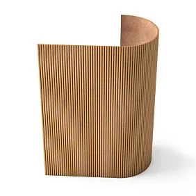
Paint-ready slatted panels are free from this limitation. High-density MDF is a material without texture, without tone, without 'character' until paint is applied. It accepts any color precisely, without distortion. Begonia, indigo, deep olive, matte black, chalk white, terracotta—any shade from any catalog is reproduced without compromise.
The same applies tomoldings on wallspolyurethane decor. Polyurethane decor comes in a neutral white tone and is ready for painting without preliminary priming (when using specialized primers). You can paint it the same tone as the slats—resulting in a monochrome system. Or in a contrasting one—resulting in a two-tone architectural composition. Or add a metallic patina—resulting in a historical effect of gilded molding.


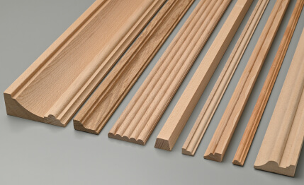
Paint-ready MDF: technical specifications
Paint-ready slatted panels are made from MDF with a density of 780–830 kg/m³. This is an important parameter: it is precisely the high density that ensures:
-
A smooth surface without pores (paint applies evenly, without 'absorption');
-
Geometric precision—slats do not warp when painted with water-based compositions;
-
The possibility of sanding and repainting without loss of shape;
-
Resistance to mechanical impact – the battens do not crumple when touched.
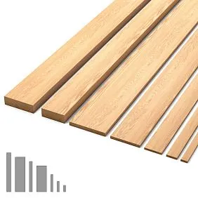
Standard batten cross-sections: width 15–60 mm, spacing 30–120 mm. Load-bearing base thickness 9–12 mm. Surface – sanded, ready for priming and painting.
Our factory also produces:


Why polyurethane is ideal for monochrome systems
Decorative wall moldingPolyurethane paired with MDF battens is the perfect union precisely because both materials accept the coating identically. With proper surface preparation and the same primer, uniform painting with a roller and brush yields identical results on both materials. In the finished interior, the battens and cornices look like a single architectural system, cast from one material.
Get Consultation
Which painting schemes work best
There are several painting schemes for 'battens plus molding' systems, and each creates a fundamentally different visual and psychological effect.
First scheme: total monochrome
Everything – battens, cornice, moldings, the wall between and behind the battens, adjacent surfaces – in one tone. This is the most radical and most convincing scheme. It eliminates any color distraction and allows the architectural relief to speak for itself.
In total monochrome, a wall with battens is perceived as a sculptural object. Shadows from the battens, chiaroscuro on the molding profiles – all of this is visible without color 'noise'. The interior appears more expensive and complex than it is.
Practical application:paintable slatted wall panelsIn warm white (RAL 9010), polyurethane cornice in the same tone, moldings and baseboard — in the same. Ceiling — in the same or slightly lighter. Result: an infinitely calm, airy, 'architectural' space.
Best colors for total monochrome: white and its variations, warm light grays, dusty beiges, sooty and charcoal tones in dark interiors.
Second scheme: dual tone — wall and relief
Wall (including the space between and behind the battens) — in one color. Battens, cornices, moldings — in another. This is the classic 'main background plus architectural elements' scheme used in European interiors of the 18th–19th centuries: dark green walls with white cornices and moldings, blue walls with cream stucco.
Paintable lath panelsIn dual tone, they give the interior visual complexity and dynamism. Battens 'read' against the background, stucco decor stands out and attracts the eye. This is a scheme for those who want expressiveness, not just calmness.
Working tone pairs:
-
Dark green (RAL 6028) + white (RAL 9010);
-
Indigo (RAL 5011) + light gray (RAL 7035);
-
Anthracite (RAL 7021) + warm white (RAL 9001);
-
Terracotta (RAL 8003) + ivory (RAL 1014);
-
Dusty lavender + cool white;
-
Bottle green + golden ochre (accent scheme).
Scheme three: three-tone (background — relief — accent)
The most complex and most impressive scheme. Wall — base tone. Battens and moldings — second tone. Pilaster capitals, keystones, rosettes — accent third tone (metal, gold, patina, bright contrast).
This scheme requires a confident design decision: an incorrectly chosen third tone destroys the unity of the system. But with precise selection — it creates an interior of the 'authorial design' category, which cannot be reproduced by accident.
How to combine battens and molding in one tone
The monochrome system 'battens plus molding' — the main theme of this article, because it is precisely this that realizes the potential of both materials most fully. Let's examine it in detail.
The 'unified surface' principle
When battens andwall molding are painted in one tone, the wall ceases to be a 'wall with attached elements' and becomes a unified architectural object. This is a fundamentally important psychological and visual difference: you see not decor on a wall, but the wall itself as part of the architecture.
Achieving a uniform surface effect is only possible under three conditions:
-
Uniform color on all elements—without the slightest deviation in tone;
-
Uniform type of coating—matte, satin, or glossy simultaneously on all surfaces;
-
Carefully puttied and painted joints—no visible seams.
Matte vs. Satin: What to Choose
The type of finish coating significantly affects the final effect:
Matte coating—maximum architectural effect. The absence of gloss makes the surface resemble a plastered volume. Shadows from slats and relief moldings are clearly visible, without reflections. Matte monochrome is the most 'serious' and 'architectural' result.
Satin coating—a compromise between matte and glossy. A slight silk sheen emphasizes the relief and adds 'liveliness' to the surface. It washes well and is resistant to fingerprints. An optimal choice for living spaces—especially where walls may be subject to everyday wear.
Glossy coating—maximum theatrical effect. The relief of slats and moldings reflects in the gloss—the surface looks rich and slightly unexpected. However: on a matte wall next to a glossy slatted surface, the difference in finish is visible even in the same color. Gloss requires perfect substrate preparation.
Sequence of painting a monochrome system
The correct painting sequence is key to achieving a result without streaks, transitions, or 'foreign' zones:
-
Priming all surfaces — a single layer of acrylic primer on the battens, panel base, moldings, cornices, and wall. The primer ensures uniform absorbency across different materials;
-
First coat of paint — first, use a brush to work all relief details (grooves between battens, molding corners, cornice profiles), then use a roller on flat surfaces;
-
Drying — at least 2 hours at normal temperature with ventilation;
-
Light sanding — with 220–240 grit sandpaper on smooth surfaces (battens, base) to remove the 'nap' raised by the first coat;
-
Second coat of paint — with the same tools, in the same order;
-
If necessary — a third coat for rich dark tones.
When contrast is needed
Monochrome is a powerful tool. But it requires confidence. Not every interior and not every client is ready for total single-color uniformity. A contrasting scheme, when applied skillfully, is no less convincing — and often more accessible for DIY implementation.
Contrast as a zoning tool
A dark slatted wall in the living area — and light walls in the rest of the space. Or: dark molding frames on a light wall, defining functional zones in an open layout. Contrasting molding works as a graphic designation of architectural boundaries — where there are no physical partitions.
Slatted panels in the living room interiorA dark tone on one accent wall with light others — a classic of contrast zoning. The dark wall 'recedes' backward, making the space deeper. Light walls 'expand,' making it wider. This is not an illusion, but the real work of color contrast with spatial perception.
Contrast as an accent frame
WhiteWall molding— moldings, cornices, pilasters — on a dark colored background. It is precisely this contrast that creates that 'old mansion' or 'expensive club' effect, so often reproduced in restaurants and hotels. At the same time, the dark background can be a rich green, deep blue, or dark chocolate — white molding works with any of them.
Slatted panels in this scheme are the background, molding is the architectural frame. The slats create rhythm and texture on the dark surface,Decorative stuccocreates structure and accents. Two tools with two different tasks — and a unified, coordinated result.
When contrast doesn't work
Contrast ruins an interior when:
-
There are more than three tones in one room;
-
A contrasting color is chosen without considering temperature (a warm shade next to a cool one without a connecting neutral);
-
The size of the contrast element is disproportionate to the space (too small on a large wall or too large in a small room);
-
There is contrast, but no rhythm — different elements in different tones without a system.
Architectural systems: boiserie, frame decor, and slat rhythm
Let's examine three main architectural systems where paintable slat panels and molding work together.
Boiserie: wooden panels with a molded frame
Boiserie (boiserie) is a French word denoting a system of wooden wall panels divided by frame decor into rectangular fields. Historically, it was carved wooden trim with gilding. In a modern interpretation — slat panels or flat MDF panels inside polyurethane molding frames.
paintable slatted wall panelsInside molding frames — a modern interpretation of boiserie. Polyurethane frames are mounted over the slat surface, forming rectangular 'cartouches.' This gives the wall two levels of relief at once: slat rhythm inside + frame structure outside.
Proportions of boiserie cartouches:
-
Field width: 600–900 mm (for ceiling height 2.5–3 m);
-
Field height: from 800 mm to the full height of the room;
-
Distance between frames: 60–100 mm;
-
Frame molding width: 40–80 mm.
Frame decor without slats
Second option: polyurethane molding frames on a smooth wall — without slat infill. Slat panels are installed only in the lower zone of the wall (panel belt height 80–120 cm), and the upper part is a frame system with smooth fields. This is a lighter-feeling system, suitable for small rooms.
Slat rhythm with cornice framing
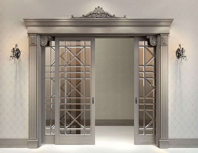
Third option — the simplest and yet very effective:slatted panels for wallson one accent wall or in the lower zone of the entire room,Moldings decorationin the form of a cornice along the upper border and a molding-border along the lower one. Two horizontal lines frame the slat rhythm and make it a complete architectural field.
Color programs for different styles
Neoclassicism: strictness through monochrome
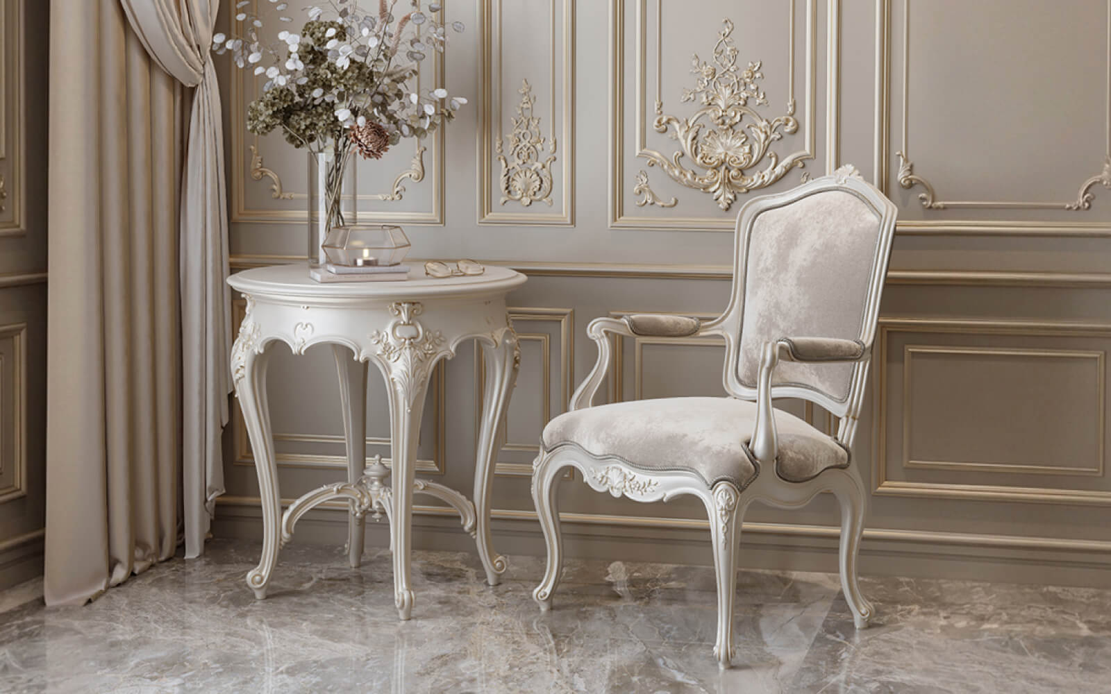
Neoclassical interiors are built on precise proportions, classical profiles, and restrained color palettes. Here, paintable slatted panels work best in neutral tones—warm white, light beige, powdery gray. Wall moldings should be in the same tone or slightly more saturated so the profiles stand out.
The best scheme for neoclassicism: walls in warm white, a polyurethane cornice with a classical profile 90–120 mm high in the same tone. Slats in the lower wall zone—in the same white or slightly warmer (cream). The baseboard iswooden trim—tall, 90–110 mm.
Modern classic: color as the main statement
Modern classic is a style that allows bold color with strict form. This is where paintable slatted panels truly shine. A saturated color (dark green, indigo, burgundy, anthracite) on an accent slatted wall framed by white polyurethane molding is a visually powerful yet structurally disciplined solution.
For this style, profile choice is important: the molding should be classical (with a cavetto, ogee, or fillet) rather than a minimalist rectangle. It is the classical profile with bright contrast that creates that 'luxury club' effect.
Scandinavian minimalism: white as absolute
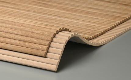
Painted MDF plank panelsin white tone is the absolute classic of the Scandinavian approach to finishing. Moldings here are minimal: a thin cornice 40–50 mm, a simple rectangular molding without complex profiles. Everything is in a unified white. The rhythm of the slats creates enough texture so the white surface doesn't appear empty.
For the Scandinavian scheme, the slat spacing is important: 50–70 mm with a slat width of 20–25 mm. Narrow spacing creates a dense textile-like rhythm—a 'textile effect' that has become a signature technique in Scandinavian design over the last decade.
Loft: dark monochrome and industrial relief
In a loft interiorpaintable slatted wall panelsdark or saturated tones work. Anthracite, matte black, dark gray, dark blue. Moldings are either absent or presented as a minimalist corner cornice without ornament.
Texture is important for a loft:Wooden slat panelssolid wood (unpainted, in a natural tone) or MDF slats with a pronounced milled surface for painting in dark colors. Lighting is directional, spot lighting, creating clear shadows from the slats.
Art Deco: Geometry and Metal
Art Deco is a style where geometry and metallic accents serve as the main tools. Slatted panels here are a strict vertical rhythm. Moldings are geometric friezes, stepped moldings, corner blocks. All relief is in a single tone, but individual accent elements (rosettes, keystones) have applied metallic paint.
Bronze, aged gold, dark nickel are accent finishes for molding elements in the Art Deco scheme. The rest is matte monochrome in dark neutral tones.
Which paints and preparation are important
The quality of the final result is 30% dependent on the material and 70% on preparation and the correctly chosen coating. This is not an exaggeration, but a reality faced by anyone who has ever painted a slatted surface.
Paint selection: what's important
For MDF slatted panels:
-
Acrylic paints with high solids content (at least 40%) — good coverage, even tone;
-
Alkyd enamels — maximum coating durability, recommended for high-traffic areas (hallways, kitchens);
-
Water-based paints with latex additives — excellent washable surface, suitable for bedrooms and living rooms.
For polyurethane products:
-
The same compositions as for MDF — polyurethane is compatible with all types of paint;
-
Specialized primers for smooth surfaces — mandatory when using acrylic paints on large areas.
What to avoid:
-
Cheap paints with low pigment content — require 4–5 coats for a rich tone;
-
Paints without a specified finish type — no guarantee of surface uniformity;
-
Glossy paints without perfect surface preparation — every surface defect is amplified by the gloss.
Priming: don't skimp
The most common mistake: starting to paint without primer or using a 'primer-paint 2-in-1'. For high-density MDF, a specialized primer with good adhesion and leveling absorption is important. MDF edges (panel cuts) are especially porous and without primer absorb 300–400% more paint than the main surface.
For polyurethane products: acrylic primer or shellac primer (when using oil-based coatings on top). Shellac primer provides maximum adhesion on smooth polyurethane surfaces and is recommended for subsequent painting in rich dark tones.
Sealing joints: acrylic, not putty
Joints between slatted panels and cornices, between cornices and ceilings, between moldings and walls — are treated with elastic acrylic sealant (paintable). This is crucial: rigid putty cracks at the slightest structural movement. Elastic acrylic holds micro-deformations without cracking.
Applying sealant: gun, thin seam, immediately smoothed with a wet finger. Drying time before painting — 1–2 hours. After drying, the sealant accepts paint without traces.
Main mistakes in painting and geometry
First mistake: different tones on slats and molding
It seems simple to buy 'white' paint for slats and 'white' for molding. In reality, one manufacturer's white is warm (with a yellowish tone), another's is cold (with a bluish tone). On a flat wall, the difference isn't visible. On adjacent relief surfaces — it's glaring.
Solution: use the same paint can for all system elements. If the volume is large—mix from one batch. Always check the shade on samples under the lighting that will be in the finished room.
Second mistake: ignoring MDF edges
Slatted panels create many edges during installation—where a panel ends, is cut to fit an angle, or joins another section. These edges must be primed separately, puttied (if necessary), and painted with a separate brush before installing the adjacent element. Skipping an edge means getting a dark stripe-gap in the finished system.
Third mistake: painting before full installation
Some craftsmen paint slats before mounting them on the wall to avoid dragging a brush into the grooves. This is convenient but creates a problem: mounting points, cuts, and joints after installation require mandatory touch-up. The final coat should always be applied after the entire system is fully installed—only this way can you achieve a uniform surface.
Fourth mistake: misalignment of levels and verticals
installation of slatted panelsand subsequent placement of molding frames must be done strictly according to level—laser or bubble. A molding frame glued 'by eye' looks like a crookedly hung picture after a year. A level is a mandatory tool, not an option.
Fifth mistake: too much relief in a small space
A small room (less than 12 m²) with slatted panels, molding frames, cornices, and pilasters looks overloaded. Relief works for a space only when it has room to be perceived. In a small room, choose one accent element: either slats or molding—not both in a full set.
Slatted panels on the ceiling paired with ceiling molding
A topic often overlooked: the ceiling.Batten panels for ceilingspaired with polyurethane ceiling cornices and rosettes create that 'expensive-looking ceiling' effect, which is hard to achieve by other means.
Horizontal slats on the ceiling, painted to match the walls or in contrast, plus a ceiling rosette in the center and a cornice around the perimeter—this is a complete architectural system 'from top to bottom.' The eye moves from the slatted ceiling to the walls with moldings, to the slatted wall panels in the lower zone—and everywhere encounters a unified system.
Specifics of application in different rooms
Living room: accent or system
In the living room, two approaches are possible. First: one accent wall—slatted panels in a bright or dark tone, molding around the perimeter of this wall, the remaining walls—neutral. Second: a unified system throughout the entire room—slats in the lower belt of all walls, a cornice around the entire perimeter, molding frames on the upper belt.
The first approach is faster and simpler. The second—is significantly more expressive and creates a complete architectural image.
Bedroom: tranquility through monochrome
slatted panels in the bedroomabove the headboard in a monochrome system—is one of the most functionally and aesthetically justified applications. Total white monochrome in the bedroom creates a sense of serenity and space. A light cornice along the ceiling completes the system without overloading it.
For the bedroom, avoid overly complex relief and saturated tones—they hinder relaxation. Simple slats with a small pitch, a minimalist cornice, a molding border along the upper boundary of the slatted zone—this is enough.
Study and library: dark monochrome as a working tool
In the studyPaintable lath panelsDark saturated tones (dark green, indigo, anthracite, dark chocolate) create an environment for concentration. Dark monochrome absorbs scattered attention and focuses the gaze on the workspace.
Wall moldingThe decor in the study can be more saturated than in other rooms: molding frames imitating book sections, a cornice with ornamentation, pilasters on the sides of the work wall. Everything is in a unified dark tone with patinated accents.
Corridor and hallway: speed of perception
Slatted panels in the hallway interiorMDF slatted panels for painting are one of the best solutions for narrow dark corridors. Light monochrome (white, powder, mint) visually expands the space. Vertical slats raise the ceiling. The cornice creates a horizontal finishing line. The hallway transforms from a dark dead end into an architectural transition.
Technical specifications and selection parameters
MDF slatted panels for painting: what to check when ordering
-
MDF density: not less than 780 kg/m³;
-
Surface sanding: Ra not more than 0.8 µm (the smaller, the smoother the finish);
-
Board moisture content: 6–8% (normalized, not 'fresh');
-
Geometric accuracy: tolerance for slat width ±0.1 mm, for pitch ±0.2 mm;
-
Length: 2400–3000 mm (for standard wall height, cut without a welded seam);
-
End coating: puttied or primed (ends must not remain 'bare').
Polyurethane products: quality parameters
-
Density: 150–220 kg/m³ for wall elements (120 kg/m³ — only for ceiling elements);
-
Profile accuracy: tolerance ±0.5 mm (with higher tolerance, elements of the same article may differ noticeably);
-
Absence of bubbles and underfills: surface without visible defects;
-
Straightness: a linear meter of cornice must not have a deflection of more than 1 mm.
FAQ: answers to frequently asked questions
Is it necessary to use primer before painting MDF slatted panels?
Absolutely. MDF without primer absorbs paint unevenly — ends and more porous areas require 3–4 coats instead of 2. Specialized primer for MDF evens out absorption and reduces paint consumption by 30–40%.
Can paintable slatted wall panels be painted with regular wall paint?
Yes, provided proper priming is done. Choose paint with a solids content of at least 40% and a hiding power (contrast ratio) of at least 97% for saturated tones.
Which polyurethane cornice pairs best with paintable slatted panels?
For monochrome systems — any profile matching the style. For Scandinavian minimalism — rectangular, 40–60 mm. For modern classic — a profile with a soft cove, 70–90 mm. For neoclassical — classic multi-part, 90–140 mm.
How often will slatted panels need repainting?
With quality paint and normal use — once every 7–10 years. Local damage (scratches, stains) can be spot-touched up at any time.
Can polyurethane molding be installed on a wall independently?
Yes. Installing polyurethane molding is an accessible task for someone with basic skills. You'll need: mounting adhesive or liquid nails, painter's tape for temporary fixation during setting, a laser level, a saw for trimming. Detailed instructions are in the section installation of slatted panels.
What's better for a monochrome system — matte or satin paint?
Depends on the room. Bedroom, living room — matte (maximum architectural effect). Hallway, kitchen, children's room — satin (easier to clean, more durable). Study — matte or oil satin (noble appearance).
How many coats of paint are needed for a saturated dark tone on MDF?
For dark tones (anthracite, dark green, indigo) — minimum 3 coats over primer. First coat — base, second — reveals missed spots, third — finishing. When using professional paints with high pigment content — 2 coats may be possible.
About the company STAVROS
All materials discussed in this article —paintable slatted wall panels— made from high-density MDF,wall molding— made from polyurethane — cornices, moldings, pilasters, rosettes and the full range of architectural decor — are presented in the STAVROS company catalog.
STAVROS is a Russian manufacturer backed by a full production cycle: from cutting slatted panels with a tolerance of ±0.1 mm to casting polyurethane products in its own molds with profile accuracy to tenths of a millimeter. Over 4000 items, 39 product groups, compatible systems created as a unified whole, not a random assortment of products.
STAVROS works with professional designers, architectural studios, and private clients across Russia. If you need an interior with precise color tuning, architectural depth, and long-lasting relevance — contact STAVROS specialists. System selection consultation — free. Installation instructions — openly available. Materials — with quality and dimensional accuracy guarantees.


