


Article Contents:
- Why visual examples decide everything — and simultaneously nothing
- What makes a slatted interior beautiful: five key parameters
- Parameter 1: Rhythm — the ratio of slat width and gap
- Parameter 2: Tone — cold, warm, neutral
- Parameter 3: Height of the structure relative to the room
- Parameter 4: Molding as a frame or as an accent
- Parameter 5: Lighting as part of the design
- Living room: visual scenarios for the main room
- Scenario 1: TV wall with vertical slats
- Scenario 2: Accent wall behind the sofa — light, natural tone
- Scenario 3: Monochrome living room — slats and molding in the same tone
- Scenario 4: Living room in neoclassical style — dark slats, ceiling coffer
- Bedroom: slats and molding as a language of tranquility
- Slatted panel headboard: three visual formats
- Molding in the bedroom: minimalism or classic
- Color solutions for a bedroom with slats and molding
- Hallway: the first frame of your home
- Three visual solutions for the hallway
- Kitchen: battens and molding in the most demanding room
- What makes a kitchen batten wall look beautiful in photos
- How ceiling molding completes an interior composition
- Types of molding and their role in interiors with battens
- Modern and classic scenarios for combining battens and molding: a complete solution map
- How to choose the scale of decor according to ceiling height
- Ceiling up to 2.5 m: a strategy of lightness
- Ceiling 2.5–2.8 m: the golden range
- Ceiling 2.8–3.2 m: space for architecture
- Ceiling above 3.2 m: country format
- Visual solutions by rooms: summary table of parameters
- How to 'read' slatted interior photos: a practical guide
- Lighting in slatted interiors: scenarios for different rooms
- Three-level lighting system
- Molding and built-in lighting
- Common mistakes when reproducing beautiful photos
- Mistake 1: Incorrect scale when copying photos
- Mistake 2: Wooden slats in an unsuitable area
- Mistake 3: Molding without primer and repainting to match the tone
- Mistake 4: Slatted wall without accent lighting
- Mistake 5: Lack of finishing elements
- FAQ: Popular Questions About Slatted Panels and Molding
- About the Company STAVROS

There comes a moment when you look at an interior — and you understand: this is it. Not because it's expensive. Not because it's exotic. But because every element is exactly where it should be. The walls speak with the vertical rhythm of slats. The ceiling responds with the horizontal frame of molding. And together — it breathes.
It is precisely for this feeling that people spend hours scrolling through interior photos in search of 'their' solution. And this is where the main difficulty begins: one beautiful picture doesn't explain why it works. What lies behind it? What proportions? What material? Why is this particular cornice exactly like this — and not another?
This article is about what's hidden behind beautiful photos. About the principles that makeslatted wall panels photosattractive. About how ceiling molding completes this picture. And about specific solutions for each room — living room, bedroom, hallway, kitchen.


Why visual examples decide everything — and simultaneously nothing
A person makes a decision about an interior not through calculations, but through images. This is normal — visual thinking works faster than analytical. Saw → wanted → looking for a way to reproduce.
But here lies the trap. A beautiful interior photo is the result of dozens of invisible decisions: the proportions of the slats, the correct gap, the lighting angle, the exact shade of the finish, the proportionality of the molding cornice. To reproduce the picture without understanding its logic is to get something similar, but not it. Slightly wider slats — the rhythm became heavier. A slightly larger cornice — the ceiling 'dropped'. A different shade — the ensemble fell apart.
Therefore, the most correct approach to studyingphotos of slatted panels in interior— it's not just 'like/dislike', it's analysis. Ask yourself questions: what rhythm do the slats create? Where does the structure begin and end? What does the molding do — accentuate or frame? How does light interact with the surface?
This very breakdown is the content of this article.


What makes a slatted interior beautiful: five key parameters
Before analyzing rooms individually — let's formulate principles that work everywhere. These are five parameters that determine the final visual result.
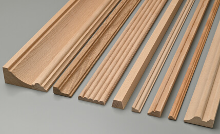
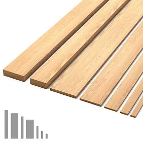
Our factory also produces:


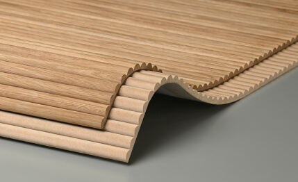
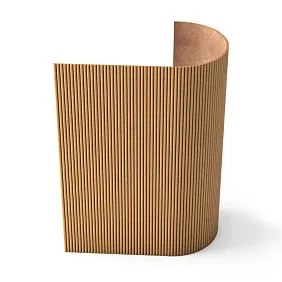
Parameter 1: Rhythm — the ratio of slat width to gap
The most common mistake when reproducing a beautiful interior from photos is incorrect ratio of slat to gap. In beautiful photos this ratio almost always follows the rule: gap = 20–30% of slat width.
55 mm slat → 12–16 mm gap. 40 mm slat → 8–12 mm gap. 70 mm slat → 14–20 mm gap.
Smaller gap (10–15% of slat) — dense, monolithic rhythm, closer to classic. Larger gap (30–35% of slat) — light, airy, modern. Both proportions work — but they cannot be mixed within one project.
Get Consultation
Parameter 2: Tone — cold, warm, neutral
In photos of interiors with slatted panels, the tone always speaks first. Warm wood, cold anthracite, pure white—this is not just color, it's the temperature of the space.
Rule: the tone of the slats and the tone of the molding must belong to the same color temperature. Warm slats (oak, walnut) + cold white molding—they 'don't hear' each other. Warm slats + molding in warm milk or ivory—a unified voice.
Parameter 3: Height of the structure relative to the room
Slatted panels from floor to ceiling—one visual solution. A panel scheme (up to 1.4–1.6 m) with horizontal molding—another. Slats only in the lower third of the wall—a third.
In photos, it's important to see how the structure relates to the height of the room: whether it 'stretches' the space or creates an 'enveloping' effect.
Parameter 4: Molding as a frame or as an accent
Ceiling moldingIn beautiful photos, it always plays one of two roles—and never both simultaneously in one space.
Frame: cornice around the ceiling perimeter, molding at transitions—molding organizes the space without claiming dominance.
Accent: complex ceiling coffer, large rosette, ornamental elements—molding is the main decorative statement on the ceiling.
In the first case, slats on the walls can be accentual. In the second—they should be laconic.
Parameter 5: Lighting as part of design
The best photos of interiors with slatted panels are taken with properly set lighting: a directional light source at a 30–45° angle to the slat surface creates vertical shadows in the gaps — and the surface gains depth that is absent with general lighting.
When viewing photos, pay attention to the lighting of the slatted wall — this is always an intentional decision.
Living room: visual scenarios for the main room
The living room is the richest space for slatted solutions. It has the square footage, the height, the 'publicness' — it's the room that guests see, where evenings are spent, where the main impression of the home is formed.
Scenario 1: TV wall with vertical slats
This is the most popular request in the category ofslatted panels in living room interior photos: a dark slatted wall with a TV in the center, shelves on the sides, built-in lighting.
Visual mechanics: dark vertical slats (anthracite RAL 7016 or deep blue) create a neutral 'theatrical backdrop' for the screen. The TV doesn't 'hang' in emptiness — it's integrated into the wall's architecture. Shelves integrated into the structure disappear as objects and become part of the plane.
Parameters for this solution: battens 45–55 mm, gap 12–14 mm, dark tone, built-in LED strip in the gaps or behind the top rail.
Molding above the TV wall: cornice 70–90 mm in white tone around the perimeter of the ceiling. The contrast between the dark batten wall and the white cornice creates a clear 'separation' of the ceiling from the wall.ceilings with moldingsIn this scenario — white ceiling, white cornice, ceiling rosette above the center of the living room.
Scenario 2: Accent wall behind the sofa — light, natural tone
LightWooden slat panelsBehind the sofa — a wall where the eye 'rests'. Warm oak or ash with transparent oil. Battens 55–65 mm with a 14–16 mm gap on a dark load-bearing base — the gaps recede into shadow and create depth.
Visual effect: a wall with natural wood makes the living room warmer, 'brings it closer' to nature. The sofa looks organic against its background regardless of the upholstery color.
Molding in this scenario: classic cornice with a profile shelf, 80–100 mm, in white or cream tone. Rosette above the center of the living room with a diameter of 350–450 mm. Light fixture in a classic or modern-classic style.
Combination: live wood battens + white molding = neoclassical natural interior. Not style for style's sake, but a space where you want to be.
Scenario 3: Monochrome living room — battens and molding in the same tone
In bold living room photographs, a solution is encountered that requires confidence: all white. White battens, white ceiling, white cornice, white moldings on the walls. And against this background — dark furniture, live plants, colored textiles.
Why it works: the monochrome white shell is a neutral environment where every piece of furniture, every accessory is a full-fledged character. The battens are perceived through their relief, through the play of light in the gaps—not through color.
Molding in monochrome: the cornice and moldings in the same white base as the battens. Molded frames on the walls around the perimeter are 'panels' of classical architecture in a modern interior.
Wall slat panels in interiorA living room in white is a timeless solution. Because white is not a fashion color, but a neutral language of architecture.
Scenario 4: Living room in neoclassical style—dark battens, coffered ceiling
For living rooms with ceilings from 2.8 m and an area from 20 m²—a scenario of maximum architectural complexity. Dark battens (walnut, anthracite) on three walls. The fourth wall is windows. Ceiling: coffered layout with moldings, a 100–120 mm cornice with ornament, a 450–500 mm rosette in the center.
Why it looks beautiful in photos: the contrast of dark walls and a light ceiling creates a 'tent' feeling. The space is defined yet lofty.
What's important when reproducing: a dark perimeter of walls requires good lighting—otherwise the room will be gloomy. A minimum of four directional light sources: two on the batten walls, two on the dining or sofa area.
Bedroom: battens and molding as a language of tranquility
A bedroom is an interior that serves a different purpose than a living room. Not to 'impress,' but to 'create a state.' Tranquility, an enveloping environment, a respite from the visual noise of the outside world.
In the most beautiful photos of bedrooms with batten panels, one pattern is always noticeable: nothing shouts. The battens are restrained, in a neutral or warm tone. The molding is laconic, without ornamental overload. Soft surfaces—bedding, headboard, rug—take the leading role.
Slatted panel headboard: three visual formats
Format 1: Full wall from floor to ceiling. Slats run continuously behind the bed and on its sides. The bed is 'built-in' to the slatted architecture. Above the bed is a 55–70 mm cornice, above the cornice is the ceiling. This format works in bedrooms with ceilings from 2.7 m.
Format 2: Headboard zone only, panel scheme. Slats 1.2–1.6 m high directly behind the bed, topped with molding, above — solid paint. An intimate, cozy format for small bedrooms. Molding in the tone of the slats — the transition is seamless.
Format 3: Slatted 'portal' — slats only on the strip behind the headboard. Structure width = bed width + 30–40 cm on each side. On the sides and top — molding framing the 'portal'. This is a decorative element with clear boundaries. Above the portal is a ceiling rosette, under which hangs a sconce or a pair of wall lights.
Molding in the bedroom: minimalism or classic
Ceiling moldingBedroom molding is not the same as in the formal living room. The scale here is different: smaller, quieter, more delicate.
Bedroom cornice: 45–70 mm, smooth or with a light profile. No ornament — ornamental molding in the bedroom creates visual activity that interferes with rest.
Rosette in the bedroom: only if there is a pendant light. Diameter: 150–250 mm. A delicate rosette above a chandelier or pendant light — an architectural accent without overload.
Moldings: a rectangular molding 'frame' on the ceiling above the bed — a 'ceiling carpet' outlining the sleeping area. Simple profile, small height (30–45 mm).
Color solutions for a bedroom with slats and molding
| Tone of slats | Stucco tone | Wall tone | Style |
|---|---|---|---|
| Dusty Rose NCS S 2020-R | White | White / Cream | Boudoir, delicate |
| Gray-beige taupe | White | Light gray | Neutral modern |
| Warm oak (natural) | Milky | White | Natural, Scandinavian |
| Smoky blue | White | White / light gray-blue | Marine, calm |
| Dark gray anthracite | White | Light gray | Masculine, minimalist |
| White | White | White | Monochromatic, meditative |
Entryway: the first frame of your home
The entryway is often overlooked in interior photographs — it is rarely shot separately, rarely shown in professional shoots. And this is a misconception: it is the entryway that forms the first impression, which affects the perception of the entire rest of the space.
The best photos of entryways with slatted panels and stucco decor share several common features:
A unified vertical. The slats run strictly from floor to ceiling or up to the cornice — without breaks, without transitions. Any horizontal break in a narrow room 'cuts' the space into parts and makes it even tighter.
Mirror as part of the slatted system. The mirror is integrated into the slatted wall — either 'inset' into the structure or framed with molding on its surface. A mirror simply leaned against a slatted wall or hung separately disrupts the architectural logic.
Cornice as a finishing touch. Even in an entryway of 4 m², a ceiling cornice of 45–55 mm creates a 'horizontal frame' that makes the space feel complete. Without a cornice, the top edge of the slatted structure appears 'unfinished'.
Slatted panels in the hallway interior— a detailed photo guide on application in corridors and halls of various formats.
Three visual solutions for the hallway
Solution 1: Light hallway — white slats, white cornice, mirror in molding.
All white. Slats 40–45 mm with a 10–12 mm gap. Cornice 50 mm. Molding frame around the mirror. Floor: light large porcelain tile. Coat rack: wood or brass.
Effect: the hallway 'opens up,' appears larger, brighter.
Solution 2: Dark hallway — contrast and character.
Dark slats (anthracite, dark green) + white ceiling + white cornice. Dark walls with a white top — the ceiling 'rises.' Full-length mirror in a brass frame. Fixture with spot lighting.
Effect: a hallway with character — you remember it after leaving.
Solution 3: Wood in the hallway — a natural approach.
Natural ash or oak on the end wall. Minimalist cornice 50–60 mm white. Wooden baseboard matching the slats. Linen rug.
Effect: a warm hallway that 'welcomes' you from the road.
Kitchen: slats and molding in the most demanding room
In beautiful photos of kitchens with slatted panels, there's always one area: the dining area. Not the work zone, not the backsplash, not the sink area. Specifically the dining wall behind the table — where there's no direct contact with steam and grease aerosols.
What makes a kitchen slatted wall look beautiful in photos
Material:MDF wall slat panelswith moisture-resistant coating — in the kitchen this isn't an option, it's a necessity. A beautiful photo with natural wood in the dining table area — that's the correct application of the material.
Dining area: the wall behind the table is framed with molding—a rectangular frame that 'highlights' the slatted section from the rest of the space. This is a technique from classical architecture: a 'panel' in a frame.
Above the slatted area: a cornicemolded decoration on the ceilingand a chandelier over the dining table — a classic pair. Chandelier + pendant light over the table + slatted wall behind it = a complete kitchen scene.
Cabinet color: dark cabinets (anthracite, dark blue) + light slats behind the dining area. Or light cabinets + dark slats. The contrast between the cabinets and the slatted wall is what makes a kitchen photo expressive.
How ceiling molding completes the interior composition
Think of the interior as a painting. Slatted panels are the pictorial layer: texture, rhythm, color. AndCeiling moldingis the frame. A good frame does not compete with the painting. It shapes its perception: sets boundaries, creates scale, communicates status.
Without a cornice, a slatted wall is just a finish. With a cornice, it's an architectural element, part of a system.
This is not a metaphor, it's the mechanics of visual perception: the horizontal line of the cornice 'closes' the vertical rhythm of the slats and gives the eye a stopping point. Without this point, the eye 'drifts' into the ceiling without completion.
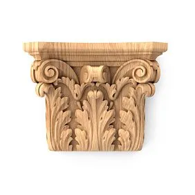
Types of molding and their role in an interior with slats
Ceiling cornice: a basic element, the horizontal boundary between wall and ceiling. Size 45–150 mm depending on room height and style.
Wall molding: a horizontal profile dividing the upper and lower zones of the wall. Paired with a slatted structure, the molding finishes its top edge.
Ceiling rosettes and medallions: a decorative centerpiece for the ceiling. For a chandelier — a rosette 200–500 mm. A decorative accent without a light fixture — a medallion or ornamental molding.
Applied elements: decorative pilasters at the edges of the slatted structure, keystones above openings, corner overlays — elements that turn finishing into architecture.
Modern and classic scenarios for combining slats and molding: a complete solution map
| Style | Slats | Molding | Ceiling | Light fixture | Feature |
|---|---|---|---|---|---|
| Minimalism | White, 35–40 mm | Smooth cornice 40–50 mm | White | Recessed spotlights | No ornament |
| Scandinavian | Oak/ash, 50–60 mm | Smooth cornice 50–60 mm, white | White | Suspended minimalist | Tree + white = nature |
| Neoclassical | White or walnut, 55–65 mm | Profile cornice 80–100 mm + rosette | White | Classic chandelier | Molding frames on walls |
| Modern Classic | Anthracite or blue, 45–55 mm | Cornice 70–80 mm white | White | Pendant with metal | Contrast of dark and white |
| Dark neoclassicism | Walnut/anthracite, 60–70 mm | Cornice 90–120 mm, matching the slats | Milky/cream | Classic with brass | Ceiling coffer made of moldings |
| Provence/Tuscan | Aged oak, beige, 50–65 mm | Ornamental cornice 80–100 mm | Ivory | Wrought iron pendant | Warm palette, decorative rosettes |
| Loft with classic | Anthracite, 40–50 mm | Smooth cornice 45–55 mm, white | White | Track industrial | Minimal molding |
| Art Deco | White or gold, 40–50 mm | Geometric moldings, rosette | White + gold details | Geometric pendant | Geometry, symmetry |
How to choose decor scale according to ceiling height
This is one of the most practical questions that arises when working with photos: you see a beautiful interior, want to recreate it — but there the ceilings are 3.2 m, and yours are 2.5. Or vice versa. How to adapt?
Ceiling up to 2.5 m: lightness strategy
Low ceilings are the most common situation in Russian city apartments. The main task of decor: to visually 'raise' the ceiling.
Battens: narrow (35–45 mm), light tone, from floor to ceiling. Vertical rhythm — maximum stretching effect.
Cornice: smooth, 40–50 mm, without ornament, in the tone of the ceiling (white → white cornice). The cornice is 'built into' the ceiling, does not stand out — the ceiling appears higher.
Ceiling medallion: none, or maximum diameter 120–150 mm.
Wall moldings: horizontal moldings — no. They 'cut' the height. Only vertical accents along the edges of the batten structure.
Ceiling 2.5–2.8 m: golden range
This range is the most universal. Any formats are acceptable, it's important to maintain proportionality.
Recesses: 45–60 mm. Any tone.
Cornice: 55–80 mm. Profiled with a shelf — appropriate. Ornamental — acceptable in a classical style.
Rosette: 200–350 mm.
Moldings: a horizontal molding at a height of 1.4–1.6 m in a panel scheme — creates a 'classical portal' without losing height.
Ceiling 2.8–3.2 m: room for architecture
Here, stucco gets maximum possibilities. Cornice 80–120 mm. Ceiling coffer from moldings. Rosette 350–500 mm. Recesses 55–70 mm.
Important: at a great height without stucco, the ceiling seems 'weightless,' detaches from the walls.ceilings with moldingsin rooms with a height from 2.8 m — not a luxury, but an architectural necessity.
Ceiling above 3.2 m: country format
Classical cornice 120–180 mm. Complex coffered ceiling. Recesses from 70 mm. Ornamental stucco with full relief.
This is the scale of a country house, a large hall, or a commercial interior. It is rare in a city apartment, but if present, it offers an opportunity to create a truly formal interior.
Visual solutions by room: summary table of parameters
| Room | Batten width | Gap | Cornice height | Rosette | Tone |
|---|---|---|---|---|---|
| Living room (TV wall) | 45–55 mm | 12–14 mm | 70–90 mm | 300–450 mm | Dark or white |
| Living room (accent behind sofa) | 55–65 mm | 14–16 mm | 80–100 mm | 350–500 mm | Warm wood |
| Bedroom (headboard) | 40–55 mm | 10–14 mm | 50–70 mm | 150–250 mm | Neutral/warm |
| Hallway (narrow) | 35–45 mm | 10–12 mm | 45–60 mm | No / 120–150 mm | Light |
| Kitchen (dining area) | 50–60 mm | 12–16 mm | 60–80 mm | 250–350 mm | White/wood |
| Office | 40–55 mm | 12–14 mm | 60–80 mm | 200–300 mm | Dark |
| Children's room | 35–45 mm | 10–12 mm | 45–55 mm | 120–200 mm | Bright/neutral |
How to 'Read' Photos of Slatted Interiors: A Practical Guide
When you find a photo of an interior that inspires you, use the following analysis algorithm:
1. Determine the width of the slat relative to a standard object. A door handle is 130 mm, an outlet is 80 mm, a brick is 250 mm. By comparing with these, you can roughly understand the actual size of the slat.
2. Look at how the structure ends. At the top: a cornice or molding? At the bottom: a baseboard or joint with the floor? Left-right: molding or just a wall? Finishing elements are the 'frame' that makes the structure complete.
3. Identify the light sources. Where does the light fall on the slatted wall from? If there are shadows in the gaps, it means the light is directional. This is not accidental but an intentional decision.
4. Find the cornice. 90% of professional interior photos have a cornice — it creates a horizontal rhythm, without which the ceiling seems 'cut off'. Sometimes it's hard to see — look for a thin horizontal shadow near the ceiling.
5. Assess the proportion of the cornice to the room height. If the cornice seems 'correct' — remember its approximate size: about 1.5–2.5% of the room height. For a height of 2.7 m — a cornice of about 40–68 mm. This is the golden range.
Usewall slatted panels interior photoas a source of inspiration — that's correct. But understanding the logic behind the picture is what distinguishes a realized project from a failed attempt.
Lighting in a slatted interior: scenarios for different rooms
About lighting in an interior with slatted panels and moldings — separately, because this is exactly what makes some photos expressive and others — bland.
Three-level lighting system
In a room with slatted panels and decorative moldings, professional designers always build three levels:
General lighting: a chandelier under a ceiling rosette or recessed spotlights. Diffuse, covering the entire room. Color temperature: 2700–3000 K for warm tones, 3000–3500 K for neutral ones.
Accent lighting on a slatted wall: directional spotlights or track lighting at a 30–45° angle to the surface. Creates vertical shadows in the gaps — the wall 'comes to life'. This is the main thing that makes a slatted wall look three-dimensional in a photograph.
Indirect lighting: LED strip behind the cornice (the ceiling glows) or behind the slatted structure from below. Creates an atmospheric 'halo'—light without a visible source. Temperature: 2700 K.
All three levels — on independent switches or dimmers. Morning lighting and evening lighting — different scenarios.
Molding and built-in lighting
Polyurethane cornice with a groove for an LED strip — a special profile developed specifically for this application. The strip is installed in the groove on the back side, the light is directed at the ceiling — a 'light halo' without a visible source.
Polyurethane ceiling decorationwith built-in lighting — a solution that looks expensive and complex in photos, but in implementation is simple and affordable.
Typical mistakes when recreating beautiful photos
Let's finish the conversation about visual solutions with what most often goes wrong.
Mistake 1: Incorrect scale when copying a photo
The photo was taken with a wide-angle lens — the room appears larger, the slats narrower, the cornice smaller. When recreating it 'exactly as is' in a real room, the result is overloaded. Always reduce the size of elements by 10–20% from what seems 'correct' in the photo.
Error 2: Wooden battens in an unsuitable area
A beautiful photo shows wooden battens in a bathroom. But this is a design solution with forced ventilation, special coating, and thermally modified wood. Attempting to replicate it without these conditions guarantees material degradation.
Error 3: Molding without primer and repainting to match the tone
Polyurethane molding straight out of the box is white and factory-made. It doesn't match the tone or texture of painted walls and battens. Without primer and final painting, it looks like 'blobs' on the ceiling, not architectural decor.
Error 4: Batten wall without accent lighting
Without directional lighting, a batten wall is just a rhythmic surface. Shadows in the gaps, depth, volume—all of this works only with proper lighting.
Mistake 5: Lack of finishing elements
There's a cornice, there are battens—but no baseboard, no molding along the edges of the structure, joints aren't finished. In the photo, it looks like an 'unfinished renovation.' Finishing elements are 10% of the project cost but deliver 40% of the visual result.
FAQ: Popular questions about batten panels and molding
Where to find quality photos of batten panels in interiors with molding?
In the STAVROS catalog —slatted wall panels photoswith breakdown by rooms, styles, and color concepts. Photos from real projects, not renders.
Can you use slatted panels with molding in an apartment with a 2.5 m ceiling?
Yes. A smooth cornice 45–50 mm, narrow slats 35–45 mm in a light tone — this combination visually 'raises' the room without overloading it.
What type of molding to choose for a living room with dark slats?
White smooth cornice 70–80 mm — a contrasting, clear transition. Ceiling rosette 300–400 mm in white. Molding frames on the same dark wall in white tone — 'painting' in white on a dark background.
Slatted panels in living room interior photos — what to look at to choose the format correctly?
Look at the slat/gap ratio, at how the structure is finished at the top and bottom, how light interacts with the surface. A detailed visual guide is on the pagewall slatted panels in interior photos.
How to avoid mistakes with cornice size?
Rule: cornice height = 1.5–2.5% of the room height. At 2.5 m — 37–62 mm. At 2.8 m — 42–70 mm. At 3.0 m — 45–75 mm. This is the range of the 'correct' cornice.
Can slatted panels be combined with wallpaper?
Yes: the slatted structure occupies the accent wall, wallpaper covers the rest. Important: the tone of the wallpaper and the tone of the slats must belong to the same color temperature. A slatted wall and wallpaper with an active pattern—avoid: two 'active' elements compete.
Is Ceiling molding needed in a minimalist interior?
A smooth cornice 40–50 mm without ornament is also molding. Minimalism does not mean the absence of architectural transitions: a clear horizontal line of the cornice in a white tone on a white ceiling is an invisible frame that makes the interior complete.
Which slatted panels look best in photos?
Those with the correct slat/gap ratio, the correct tone, and good accent lighting. Wooden slat panels with a live wood grain pattern and UV varnish under directional lighting are among the most photogenic.
About the company STAVROS
Beautiful interior photographs start with the right materials. Not with selecting references—with choosing what it will be made from. Because the difference between 'beautiful in a photo' and 'beautiful after ten years' lies precisely in the material.
STAVROS is a Russian full-cycle manufacturer of architectural elements from wood and polyurethane. Own production: chamber drying of solid wood to 8–10%, CNC milling with a tolerance of ±0.1 mm, application of two-component coatings in factory conditions. Full documentation: declaration of conformity, emission class E1, technical specifications.
In the STAVROS catalog for your project:slatted wall panels photos — a visual guide to application; Wooden slat panelsmade of oak and ash with UV varnish;MDF slatted panel— MR class with 2K coating;Ceiling moldingmade of non-yellowing polyurethane;ceilings with moldings— ideas and solutions;Ceiling molding— types, installation, selection;Moldings made of polyurethane— cornices, moldings, baseboards;slatted wall panels in the interior— a complete architectural breakdown.
Free consultation on material selection, proportions, and visual solutions — for any project, from a 4 m² hallway to a country house hall. STAVROS — because your interior deserves to look just as good in twenty years as on opening day.


