Article Contents:
- The Philosophy of an Accent Wall: Why Restraint is Necessary
- The Rule of Three Accents
- Breathing Space
- Choosing the Right Wall: Where to Create an Accent
- Behind the Functional Center
- Wall with Architectural Features
- Wall Visible from Other Rooms
- Minimalist Approach: Less is More
- One Large Element Instead of Many Small Ones
- Symmetry as a Tool for Order
- Monochromatic Palette
- Geometric Compositions: The Power of Simple Forms
- Single Frame
- Three-Part Division
- Two-Tier Composition
- Decorative Overlays: When and How to Use Them
- The Principle of a Single Accent
- Symmetrical Pairs
- Size Matters
- The Role of Lighting: How Light Creates Volume
- Side Lighting with Wall Lamps
- Hidden Lighting
- Natural Lighting
- Color strategies: from monochrome to contrast
- White on White: The Classic of Restraint
- Tonal Transitions
- Contrast: When It's Appropriate
- Background Color: When the Wall Isn't White
- Scale and Proportions: The Mathematics of Beauty
- Golden Ratio
- Rule of Odd Numbers
- Scale of Elements Relative to the Wall
- Stylistic solutions: From classic to modern
- Modern classicism
- Scandinavian minimalism
- Modern style
- Loft with a Hint of Classic
- Step-by-Step Process: From Idea to Implementation
- Step 1: Planning and Sketching
- Step 2: Material Selection
- Step 3: Wall Preparation
- Step 4: Marking
- Step 5: Installation
- Step 6: Final Finishing
- Common Mistakes and How to Avoid Them
- Mistake 1: Too Many Elements
- Mistake 2: Incorrect Proportions
- Mistake 3: Crooked Marking
- Mistake 4: Poor Wall Preparation
- Mistake 5: Unsuitable Color
- Maintenance and Durability
- Regular Cleaning
- Touch-Up Painting
- Repair of damage
- Repainting
- Questions and Answers: Everything You Wanted to Know
- In Conclusion: Beauty in Simplicity
- STAVROS Company: Your Partner in Creating the Perfect Interior

Have you ever walked into a room and felt it was too flashy, overloaded with details, where the eye finds no rest? Or, on the contrary, encountered an interior so austere that it seems lifeless, like an operating room? Between these extremes lies an elegant balance—the art of creating an accent wall usingmoldings on wallsthat doesn't overwhelm or tire, yet still draws the eye and gives the space character.
A wall with molding can become the visual center of a room, that very 'highlight' that unites the entire interior into a cohesive whole. But there's a catch here: the slightest mistake in element selection or composition—and instead of an elegant accent, you get the effect of a museum exhibit or palace-like overload. So how do you find that fine line between expressiveness and restraint?
Let's figure it out together. I'll tell you not just what a wall decorated with molding is, but also how to make it the main character of the interior without turning it into an intrusive decoration. Ready to dive into the world of architectural harmony?


The Philosophy of an Accent Wall: Why Restraint is Needed
Before grabbing moldings and overlays, let's ask a fundamental question: what is an accent wall and what role does it play in an interior? An accent is not just 'something beautiful on the wall.' It's a strategic focal point, a compositional center around which the rest of the setting is built.
Imagine a painting in a frame. The frame exists to highlight the artwork, but not to compete with it. If the frame is too massive, gilded, adorned with a hundred curls—it starts to 'eat up' the image itself. An accent wall works on the same principle: it should attract attention, but not steal the show.
Why is this important? Because human perception has its limits. Our brain is wired so that it can focus on only one to three main objects at a time. If there are more such objects in a room, visual noise arises—a state where the eye darts between elements, finding no place to rest. This tires, irritates, and creates discomfort.


The Rule of Three Accents
In interior design, there is an unwritten rule: no more than three accents per room. This could be an accent wall, a bright piece of furniture, and an expressive light fixture. Or an accent wall, a fireplace, and a large plant. The main thing is not to overdo it.
If you've decided that a wall with molding will be one of these accents, all other elements should play a supporting role. Furniture—in calm colors and shapes. Textiles—without flashy prints. Decor—minimal. Let the molding speak for itself, without competing with other heroes of the interior.
Our factory also produces:


Breathing Space
There is a concept in design—'negative space' or 'air.' These are areas free from objects and details that allow the eye to rest. The more complex the accent wall, the more of this air there should be around it.
If you've decorated a wall with a complex composition ofdecorative elements, the adjacent walls should be as neutral as possible. No paintings, shelves with souvenirs, plate collections. Let the accent wall breathe, surrounded by calm.
Get Consultation
Choosing the right wall: where to create an accent
Not every wall in a room is suitable for an accent role. There are laws of composition and spatial perception that indicate where exactly to place your architectural masterpiece.
Behind the functional center
The most natural place for an accent wall is behind the functional center of the room. In the living room, this is the sofa area or, less often, the TV area. In the bedroom—the headboard of the bed. In the dining room—the wall behind the dining table. In the study—behind the desk.
Why exactly there? Because the gaze automatically directs itself to functionally significant zones. When you enter the living room, you subconsciously look at the sofa—the place where the family gathers. If the wall behind the sofa is an accent wall, it will enhance this focus, creating a visual frame for the relaxation area.
Mistake: making an accent wall that is not connected to any functional zone. For example, an empty wall opposite the entrance to the room if nothing is placed there. Yes, it is the first thing seen upon entry, but it does not create a meaningful connection with the space; it hangs like a decoration.
Wall with architectural features
If the room has a wall with a niche, a protrusion, a fireplace, or a large window—this is an ideal candidate for accent design. Architectural features themselves create a focal point, and molding will enhance them, emphasize them, and make them even more expressive.
A niche in the wall is a wonderful opportunity to create a framed composition using moldings, turning the recess into a kind of portal or display. A fireplace is a traditional object for molding framing, as it is already a compositional center. A large window can be accentuated with pilasters on the sides and a cornice on top, creating the effect of a classic window portal.
Wall visible from other rooms
If the layout is open (kitchen-living room, living room-hallway), choose for the accent a wall that is visible from several zones. This will create a visual connection between the rooms and become a unifying element.
For example, an accent wall in the living room, visible from the kitchen, sets the tone for the entire space. Entering the apartment through the hallway and seeing from there the impressivestucco in interiorliving room, the guest immediately understands that this is a well-thought-out, stylish home.
Minimalist approach: less is more
Now about the main principle of creating an accent wall without overload—minimalism in the selection of elements. This does not mean abandoning molding altogether. It means choosing the most important, most expressive elements and discarding everything unnecessary.
One large element instead of many small ones
Instead of covering the entire wall with dozens of small decorative overlays, it is better to choose one large but expressive decorative element. This could be a large panel, a massive rosette in the center of the composition, or a monumental frame made of moldings.
A large element creates a strong visual effect but does not overload the space with details. The gaze focuses on it, reads the shape and proportions, and then settles. In contrast, many small elements force the eye to dart around, trying to take everything in at once.
Imagine two paintings: one with a single large rose, the other with a bouquet of thirty small flowers. Which one makes a stronger impression? Correct, the one with a single expressive object.
Symmetry as a tool of order
Symmetrical compositions are perceived as orderly, calm, and harmonious. Asymmetry can be interesting, but it requires a subtle sense of balance—one mistake, and the composition falls apart or becomes irritatingly unbalanced.
If you are not a professional designer, start with symmetry. Divide the wall into two equal parts with an imaginary vertical axis. Place elements mirroring each other relative to this axis. Two identical overlays to the left and right of the center. Moldings forming a symmetrical frame.pilastersat the edges of the wall, framing the central zone.
Symmetry does not mean boredom. It means visual stability, which allows the molding to look appropriate and unobtrusive.
Monochromatic palette
Want to avoid overload? Reject color contrasts. Paint the wall decorated with molding and the molding itself in the same color. The effect will be created solely through relief, the play of light and shadow.
A monochromatic palette—white on white, gray on gray—looks incredibly refined. It speaks of taste, of an understanding of design subtleties. This is a case where luxury manifests not in gold and shine but in delicacy and restraint.
Of course, you can also use contrasting combinations—dark moldings on a light wall or vice versa. But this is a riskier technique, requiring an accurate understanding of proportions and scales. One wrong step—and instead of an elegant accent, you get a heavy, oppressive structure.
Geometric compositions: the power of simple forms
The most reliable way to create an expressive but not overloaded accent wall is to use geometric compositions made of moldings. Rectangles, squares, vertical panels—these simple forms have a powerful visual impact.
Single Frame
The simplest and yet one of the most effective schemes is a single large rectangular frame in the center of the wall. Its dimensions should be proportional to the size of the wall itself. Too small — it will get lost. Too large — it will create a feeling of tightness.
Follow the rule: the frame should occupy approximately 60-70% of the wall area. The margins from the edges of the wall to the frame should be uniform on all sides or, if the wall is tall, the top margin can be slightly larger than the bottom one (this creates visual balance, as our perception tends to see the center slightly above the geometric midpoint).
Inside the frame, you can use contrasting finishes — a different paint color, wallpaper with a subtle pattern, textured plaster. Or leave it monochromatic, and then the effect will be built solely on the relief of the moldings.
For the frame, chooseMoldings made of polyurethane medium or wide profile — 5-10 cm. Moldings that are too thin for a large frame will look unimpressive. The profile can be either simple rectangular or shaped — depending on the interior style.
Three-Part Division
A classic architectural technique — dividing a vertical plane into three parts. Applied to an accent wall, this can look like three vertical panels separated by moldings.
The proportions can be equal (three identical panels) or unequal, with emphasis on the central part (it is wider than the side ones). The second option is more dynamic and creates a hierarchy — the central panel becomes the main one, the side ones — supporting.
Inside the panels, you can use different finishes, but it's important not to overdo it here. If the central panel has an expressive texture or color, the side ones should be neutral. Or all three panels are painted the same, and the effect is created solely by the moldings dividing the space.
Two-Tier Composition
Horizontal division of the wall into two tiers — lower and upper — also works as an accent scheme. This is a reference to classic paneling, where the lower part of the wall was finished with wooden panels.
The horizontal molding runs at a height of approximately one-third from the floor (90-120 cm). The lower zone can be painted in a darker shade or have additional vertical division into sections. The upper one remains light and calm.
This scheme visually expands the room and makes it more squat and cozy. It is ideal for rooms with high ceilings, where you need to reduce the visual height to create an intimate atmosphere.
Decorative Overlays: When and How to Use Them
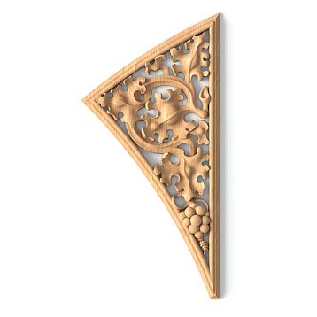
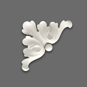
Decorative Inserts — these are small three-dimensional elements with ornament or relief, which are mounted on the wall as independent accents. They can be floral, geometric, abstract — there are countless options.
Overlays have a strong decorative effect, but that's precisely why it's easy to overdo them. So how to use them without overloading?
The Principle of a Single Accent
The safest solution is one overlay in the composition. For example, in the center of a rectangular frame made of moldings. Or above the headboard of a bed. Or in the keystone above a doorway.
One overlay works like a piece of jewelry — a brooch on a jacket lapel. It attracts the eye but doesn't overload the image. Two or three overlays on a wall already require careful compositional work. Five or more — this is already risky territory, where it's easy to slide into excess.
Symmetrical Pairs
If one overlay seems insufficient, use symmetrical pairs. Two identical overlays, placed mirror-symmetrically relative to the central axis of the wall. This can be on both sides of a fireplace, at the edges of a large mirror, in the upper corners of a frame composition.
Symmetry creates a sense of order and completeness. Even if the overlays are quite large and ornate, symmetrical placement prevents the composition from falling apart or looking chaotic.
Size Matters
The simpler the interior, the fewer other decorative elements it has, the larger the overlay can be. And vice versa: in a space already saturated with decor, choose overlays of a small size or even abandon them in favor of laconic moldings.
For a modern minimalist interior, you can allow yourself one large overlay with a diameter of 30-50 cm — it will become a dramatic accent against a calm background. For a classic interior, where there is already ceiling molding, cornices, furniture with carvings, it's better to limit yourself to overlays with a diameter of 10-15 cm or do without them altogether.
The Role of Lighting: How Light Creates Volume
Molding lives in light. Relief that is barely noticeable under flat frontal lighting, under side or directional light turns into a play of deep shadows and bright highlights. Proper lighting can enhance the effect of molding many times over. Improper lighting can kill it completely.
Side Lighting with Wall Sconces
The most effective way to highlight an accent wall is to place wall sconces with directional light along its edges or above it. Light falling at an angle glides over the relief of moldings and overlays, creating expressive chiaroscuro.
The sharper the angle of the light, the more dramatic the effect. Fixtures installed so that the light runs almost parallel to the wall create maximum depth of relief. This is especially effective in the evening, when the main lighting is dimmed.
Choose lighting fixtures in a style that matches the interior. For classic interiors — sconces with shades, for modern ones — sleek spotlights or linear fixtures.
Hidden lighting
An even more sophisticated solution is an LED strip hidden behind moldings or in niches. It provides soft, diffused lighting that seems to highlight the plaster decor from within, creating a floating effect.
For this, moldings are mounted with a small gap from the wall (1-2 cm), and an LED strip is placed in the resulting gap. The light is directed at the wall, reflects off it, and creates a glow around the moldings.
This technique requires planning at the design stage — you need to consider electrical wiring, power supply installation, and dimming options. But the result is worth the effort: a wall with plasterwork becomes a glowing architectural feature.
Natural lighting
Don't forget about natural light. If the accent wall is perpendicular to the window, light will fall on it from the side, creating natural chiaroscuro. This is the ideal situation — the relief of the plasterwork will change throughout the day depending on the sun's position, making the interior lively and dynamic.
If the wall is opposite the window, the light will be frontal, and the relief will be less pronounced. In this case, evening lighting with wall fixtures or hidden LED strips is especially important.
Color strategies: from monochrome to contrast
Color is a powerful tool that can either enhance the effect of an accent wall or completely ruin it. Let's explore which color strategies work forstucco decorationwithout overloading.
White on white: the classic of restraint
The safest and yet one of the most sophisticated solutions is a monochrome white palette. The wall is painted white (or a very light shade of white — ivory, milk, linen), and the plasterwork is also white. The effect is created solely by the relief.
This solution works in any style — from classic to modern minimalism. It is universal, timeless, always looks expensive and stylish. White on white is the language of architecture, not decoration, and that's precisely why it is so powerful.
An important nuance: use not exactly the same shades of white for the wall and plasterwork. The wall can be slightly warmer (with a creamy undertone), the plasterwork — slightly cooler (with a bluish tint). Or vice versa. This subtle contrast, barely noticeable to the eye, creates additional depth.
Tonal transitions
A step away from monochrome is using different tones of the same color. For example, the wall is painted light gray, the plasterwork — a darker gray. Or the wall is beige, the plasterwork — brown. Or the wall is blue, the plasterwork — dark blue.
A tonal transition creates a visible but not loud contrast. The plasterwork stands out but doesn't detach from the wall, remaining in the same color family. This is more expressive than monochrome but less risky than full contrast.
Contrast: when it's appropriate
Contrasting combinations — dark on light or light on dark — create the most expressive effect. Black moldings on a white wall. White plasterwork on a graphite wall. Gold overlays on a burgundy background.
Contrast attracts attention, making the plasterwork the main hero of the interior. But that's precisely why it requires caution. A contrasting accent wall should be the only strong accent in the room. Everything else — furniture, textiles, decor — should be as calm as possible.
Contrast works well in large spaces with high ceilings, where there is room to handle such a powerful visual effect. In small rooms, contrasting plasterwork can be overwhelming.
Background color: when the wall isn't white
If you want to use a colored background (not white or shades of gray), choose muted, complex shades. Dusty pink, gray-blue, olive, terracotta, deep emerald. Avoid bright, pure colors — they compete with the plasterwork and distract attention.
On a colored background, plasterwork is usually painted white or a light shade. This creates contrast, but a soft, not harsh one, thanks to the complexity of the base color.
Scale and proportions: the mathematics of beauty
Why do some accent walls look harmonious while others look awkward? It's about proportions. There are mathematical patterns of perception that determine what we find beautiful and what we don't.
The Golden Ratio
The Golden Ratio (approximately 1:1.618) is a proportion found in nature and used since ancient times in architecture and art. The human eye perceives it as the most harmonious.
Applied to an accent wall: if you create a rectangular frame, its proportions should correspond to the Golden Ratio. Width 100 cm — height 162 cm. Width 150 cm — height 243 cm. You don't have to follow this rule literally, but keep it in mind as a guideline.
If you divide the wall horizontally into two parts, the dividing line should not be in the middle but at a distance of approximately 62% from the bottom edge (or 38% from the top). This creates a more dynamic and visually pleasing composition than splitting it in half.
The Rule of Odd Numbers
In composition, an odd number of elements is perceived as more harmonious than an even number. One element — a strong accent. Three elements — a balanced group. Five elements — a complex but orderly composition.
Two elements create a sense of incompleteness (although symmetrical pairs of two elements are an exception—they work due to mirroring). Four elements often break into two pairs without a single center.
If you are placing decorative overlays on an accent wall, use them in quantities of one, three, or five. Not two or four.
Scale of elements relative to the wall
Too small elements on a large wall will get lost. Too large ones in a small room will overwhelm the space. How to find balance?
General rule: decorative elements should occupy 15-25% of the wall area. If the wall is 3 meters wide and 2.7 meters high (area 8.1 sq.m), molding elements (frames, overlays) should occupy approximately 1.2-2 sq.m.
Of course, this is an approximate guideline. In a minimalist interior, this proportion can be reduced to 10-15%. In a more decorative one—increased to 30%. But these numbers are a starting point that helps avoid mistakes.
Stylistic Solutions: From Classic to Modern
How to adapt an accent wall with molding to a specific interior style while maintaining the principle of restraint?
Modern classic
Modern classic (neoclassical) is classical forms stripped of excessive decoration. Symmetrical compositions of rectangular frames, laconic moldings with minimal ornamentation, and a restrained color palette are appropriate here.
Usemedium-profile moldings— 5-7 cm wide, with moderate relief. Create one to three frames on the wall, no more. Paint everything white or light gray. Complement with symmetrical wall lights.
Choose furniture with classic silhouettes but without excessive carving and gilding. Textiles—noble textures (linen, silk, velvet), calm colors. The result—elegance without pretentiousness.
Scandinavian minimalism
Scandinavian style loves simplicity, functionality, and an abundance of light. Molding is used delicately here—as a subtle hint of classicism, not as the main character.
Choose the thinnest moldings—2-4 cm, rectangular profile. Create one laconic frame or simple panel division. Paint white or very light gray—matching the walls. The effect should be barely noticeable, almost graphic.
Avoid decorative overlays and ornamental elements—they are alien to Scandinavian aesthetics. Let the molding work exclusively to structure the space, not for decorativeness.
Modern style
Contemporary style is open to experiments. Here you can use both classical molding in an unexpected context (for example, white moldings on a brightly painted wall) and non-standard geometric compositions.
Try asymmetrical schemes—frames of different sizes, offset from the center. Or vertical panels of unequal width. Or one large frame, positioned not in the center of the wall but shifted to the edge.
Colors can be bold—graphite, indigo, terracotta, bottle green. But the molding against such a background should be laconic so as not to compete with the color.
Loft with a hint of classicism
Industrial loft and molding seem incompatible. But it is precisely this contrast that can yield an interesting effect—an unexpected combination of rough textures (brick, concrete, metal) with elegant classical forms.
Use white molding against a brick wall or gray-painted concrete. Choose simple forms—one or two frames, without overlays or ornaments. The effect is built on the contrast of textures: smooth molding against a rough background.
This is a solution for the bold, but it works, creating a unique, memorable interior.
Step-by-step process: from idea to implementation
So, you've decided to create an accent wall. Where to start and how to proceed to avoid mistakes?
Step 1: Planning and sketch
Don't start by buying materials. Start with planning. Make a sketch—not necessarily a professional drawing, but at least a hand-drawn sketch or one in a graphic editor.
Measure the wall. Determine its proportions. Estimate where furniture will be placed, which zones need highlighting. Draw several composition options. Compare them. Choose the one that seems most balanced.
Show the sketches to trusted acquaintances. Ask their opinion. Sometimes a fresh outside perspective helps spot errors you missed.
Step 2: Material selection
When the composition is determined, select specific elements. Study the assortment of polyurethane moldingsanddecorative insertsChoose profiles that match your interior style.
Pay attention to the dimensions. Write down the exact parameters of the selected elements. Calculate how many linear meters of moldings you will need. Don't forget to add 10-15% extra (for cutting errors).
Also purchase polyurethane adhesive, acrylic putty for sealing joints, primer, and paint.
Step 3: Wall Preparation
Before installing the molding, the wall must be prepared. It should be level (deviations no more than 2-3 mm per meter), clean (free of dust, grease, peeling coatings), and primed.
If the wall is uneven, level it with plaster or putty. If there is old paint or wallpaper, remove it. If the surface is loose, apply two coats of deep-penetration primer.
This is a boring stage, but critically important. The quality of the final result depends 80% on the quality of preparation.
Step 4: Marking
Marking is the most crucial moment. Use a laser level or a long ruler and a spirit level. Draw lines on the wall along which the moldings will run.
Mark not only the placement lines but also reference points for checking symmetry. Measure distances from the wall corners, from the ceiling, from the floor. Everything must be mathematically precise.
Don't rush. Spending several hours on marking is normal. Correcting a mistake at this stage is easy. After gluing — almost impossible.
Step 5: Installation
Cut the moldings to size. Join corners at 45° (use a miter box or a miter saw). Apply adhesive to the back of the moldings, place them on the wall along the marked lines, press.
Work carefully. Remove excess adhesive immediately with a damp sponge. Check each element with a level before fixing. If necessary, use painter's tape for temporary fixation until the adhesive sets.
Let the adhesive dry completely (usually 24 hours) before the next stage.
Step 6: Final Finishing
After the adhesive dries, inspect the joints. Fill gaps with acrylic putty. After it dries, sand with fine sandpaper. Wipe off dust.
Apply primer to the molding and wall (if it is not yet painted). After the primer dries, paint in the chosen color. Usually, two to three coats of paint are needed for even coverage.
Let the paint dry completely. Your accent wall is ready.
Common mistakes and how to avoid them
Even experienced craftsmen sometimes make mistakes. Beginners — even more so. Let's look at the most common mistakes and how to prevent them.
Mistake 1: Too many elements
This is the main mistake — the desire to use as much decor as possible. Ten overlays instead of one. Five frames instead of two. Moldings on all walls instead of one accent wall.
How to avoid: Create a sketch and show it to several people. If at least one says "too much," remove a third of the elements. It's better to have too little than too much.
Mistake 2: Incorrect proportions
Too small elements on a large wall. Too thin moldings for a large frame. Too wide moldings in a small room.
How to avoid: Use the golden ratio rule and common sense. Take a photo of the wall, print it, and draw the composition to scale on it. This will help assess proportions before starting work.
Mistake 3: Crooked marking
Moldings are not strictly horizontal or vertical. Frames are asymmetrical. Corners join unevenly.
How to avoid: Use a laser level. Check each marking line twice. Don't rely on your eye — it's deceptive.
Mistake 4: Poor wall preparation
Attempting to glue molding onto an uneven, dusty, or old-paint-covered wall.
How to avoid: Don't skimp on preparation time. Level, clean, prime. This is the foundation of a quality result.
Error 5: Unsuitable color
A combination of wall and molding that is either too contrasting or, conversely, too similar in tone.
How to avoid: make samples. Paint scraps of moldings in the chosen color and attach them to the wall (painted in the base color). Evaluate how it looks under different lighting — during the day and in the evening, under natural and artificial light.
Care and longevity
An accent wall with molding has been created. How to preserve its beauty for many years?
Regular cleaning
Dust is the main enemy of molding. It accumulates in the relief, making elements dull. Once a month or two, wipe the molding with a dry soft cloth or use a vacuum cleaner with a brush attachment.
For more thorough cleaning, you can use a slightly damp sponge. Avoid excess water and aggressive cleaning agents.
Touch-up painting
Over time, wear marks, stains, and minor damage may appear on the wall. They are easily fixed with local touch-up painting. Use the same paint that was used initially (or the closest possible shade).
Apply the paint with a brush to the damaged area. After drying, if the boundary of the touched-up spot is noticeable, lightly blend it by applying a semi-transparent layer of paint over a larger area around it.
Repair of damage
If a molding element is damaged (chip, crack), it is easily fixed. Small chips are filled with acrylic putty, the missing relief is formed, then sanded and touched up after drying.
If an element has come unglued, remove it completely, clean off the old adhesive, apply fresh adhesive, and re-glue it. After drying, seal the joint with putty and touch up.
Repainting
Want to change the color? Polyurethane molding can be easily repainted. Clean the surface of dust and grease. Apply primer (if changing from a light color to a dark one or vice versa). Paint in the new shade.
Repainting is a simple way to update the interior without dismantling and replacing elements.
Questions and answers: everything you wanted to know
Let's answer the questions that most often arise for those planning to create an accent wall with molding.
Can molding be used in a small room?
Yes, but with caution. Choose concise elements with a small cross-section. One simple frame or panel division will not overload even a small room. Avoid many small elements and ornamented overlays.
How much does it cost to create an accent wall?
For a wall measuring 3×2.7 meters, approximately 12-15 meters of moldings will be needed (depending on the composition). The cost of polyurethane moldings is from 300 to 1500 rubles per meter. Total materials: 4000-20000 rubles. Labor cost of craftsmen (if not doing it yourself) — about the same. Total cost: 8000-40000 rubles.
Can molding be installed by oneself?
Yes. Installing polyurethane molding does not require special skills. Basic tools (level, miter box, saw), accuracy, and patience are needed. If you know how to hang wallpaper, you can handle molding.
How to choose between polyurethane, plaster, and wood?
Polyurethane is the optimal choice for most situations. It is lightweight, moisture-resistant, inexpensive, and easy to install. Plaster is heavier, more expensive, requires professional installation, but has deeper relief. Wood is a premium option with a unique texture, but the most expensive and demanding of conditions (afraid of moisture and temperature fluctuations).
Can molding be used in humid rooms?
Yes, if it is polyurethane. It is moisture-resistant and does not deform in a humid environment. It is important to use moisture-resistant adhesive and washable paint. In a bathroom or kitchen, polyurethane molding will last as long as in a living room.
How to combine molding on the wall with molding on the ceiling?
Use elements of a similar style and profile. If the walls have classic ornamented moldings, the ceiling should have a classic cornice. If the walls have minimalist rectangular strips, the ceiling cornice should also be concise. Unity of style is critical for harmony.
How long does it take to create an accent wall?
Wall preparation (if leveling is required) — 1-2 days. Marking and installation of molding — 1 day. Sealing joints and sanding — half a day. Priming and painting — 1-2 days (accounting for drying time of layers). Total: 4-6 days from start to full completion.
Can molding be removed without damaging the wall?
Yes, but with caveats. Polyurethane elements glued with quality adhesive can be removed with some effort. Minor damage to the wall's finish layer (paint or plaster) is possible, which is easily fixed with putty and touch-up painting.
How does molding affect the perception of ceiling height?
Horizontal panel division (molding at one-third height) visually lowers the ceiling, making the room more squat and cozy. Vertical elements (pilasters, vertical panels) visually raise the ceiling. Choose a scheme depending on the desired effect.
What's better: one large frame or several small ones?
For a minimalist approach without clutter — one large frame. It creates a strong focal point without fragmenting the space. Several small frames require careful compositional planning and are suitable for more decorative interiors.
In conclusion: beauty in simplicity
We've come a long way — from the philosophy of an accent wall to specific installation and painting techniques. What's the main takeaway?
Beauty lies not in the quantity of details, but in their quality and proper placement. One expressivea decorative elementis worth ten small and indistinct ones. A carefully thought-out composition of three moldings surpasses a chaotic accumulation of a dozen overlays.
An accent wall with molding is an art of restraint. It's the ability to say 'enough' at the moment you want to add one more element. It's the understanding that the empty space around the decor is just as important as the decor itself.
When you create such a wall, you're not just gluing moldings. You're building a composition, playing with proportions, working with light and shadow. You become the architect of your own space, the author of an interior that will delight you for years.
Don't be afraid to experiment, but do so consciously. Plan, measure, draw sketches. And remember: at any moment you can stop and ask yourself: 'Do I need another element, or is it already enough?' Most often, the correct answer is enough.
STAVROS Company: your partner in creating the perfect interior
When it comes to quality materials for creating an accent wall, it's impossible not to mention STAVROS — the leader of the Russian architectural decor market with a long history.
STAVROS offers an exceptional selectionpolyurethane molding— from concise moldings for minimalist interiors to exquisiterosettesand overlays for classical spaces. The company's catalog features solutions for any style, budget, and project complexity level.
What distinguishes STAVROS products from competitors? First and foremost — impeccable manufacturing quality. Each element is made from high-density polyurethane using European technologies, guaranteeing sharp relief, stable geometry, and durability. Dimensional deviation does not exceed 0.5 mm over two meters of length — this is a professional standard ensuring perfect element joining.
The breadth of STAVROS's assortment is impressive. Here you'll find moldings of all profiles and sizes — from thin 2-centimeter strips for Scandinavian interiors to massive 15-centimeter cornices for palace classicism. Decorative overlays are available in dozens of variants — from strict geometry to lush floral compositions.pilasters, capitals, consoles, friezes — everything needed to create a full-fledged architectural ensemble.
STAVROS pays special attention to product eco-friendliness. All elements are made from safe materials that do not emit harmful substances and have undergone strict certification. This is especially important for residential spaces, where family health is the top priority.
The company operates throughout Russia, ensuring fast delivery to any region. Moscow, Saint Petersburg, Kazan, Yekaterinburg, Novosibirsk — STAVROS's geography covers the entire country. Professional consultants will help select optimal elements for your project, calculate the required amount of materials, and provide recommendations for installation and finishing.
STAVROS is not just a decor store, it's a partner in creating interiors that inspire. By choosing STAVROS products, you choose quality tested by thousands of completed projects, craftsmanship traditions, and modern technologies. Your accent wall, created with STAVROS materials, will become a source of pride and admiration for many years.
Start your journey to the perfect interior with STAVROS. Because beauty deserves the best materials.