Article Contents:
- Baroque and Empire: two facets of golden luxury
- Baroque: passion, movement, excess
- Empire: strictness, symmetry, imperial power
- Which style to choose for a modern apartment?
- Carved wooden baseboard: luxury begins from the floor
- Height 100-120 mm: when size matters
- Carved profile: the language of classical forms
- Carved ornaments: acanthus, grapes, palmettes
- Material: solid oak or beech
- Gilded mirror in a carved frame: the center of composition and a light portal
- Size and proportions: from intimate to monumental
- Carved frame: baroque opulence or empire strictness
- Gilding: from gold leaf to imitation gold leaf
- Mirror placement: above the fireplace, console, between windows
- Repeating carved motifs: visual rhyme in the interior
- Acanthus leaves: from floor to mirror
- Palmettes and laurel wreaths: empire strictness
- Geometric ornaments: meander, beads, fluting
- Floral motifs: roses, tulips, grapes
- Gilding: imitation gold leaf on baseboard and frame as a unifying element
- Selective gilding: gold on carving, base in color
- Full gilding: when gold floods everything
- Patination: the effect of antiquity and nobility
- How not to overload the interior: balance between luxury and taste
- Rule of one accent
- Rule of emptiness
- Rule of color balance
- Rule of material diversity
- Questions and Answers: Golden Classic Without Mistakes
- Can gilded elements be used in a small apartment?
- How much does real gilding cost?
- How to care for gilding?
- Will a gilded mirror suit a modern interior?
- Can gold and silver be combined in one interior?
- Is a gilded baseboard needed if there is a gilded mirror?
- What baseboard height is optimal for a classic interior?
- How to choose lighting for a gilded mirror?
- Conclusion: Luxury That Speaks of You

Gold never goes out of style. It shone in the halls of Versailles under Louis XIV, adorned St. Petersburg palaces during Elizabeth's time, and glittered in the mansions of Moscow nobility in the early 20th century. And today, in 2026, when minimalism dictates its rules, gold is returning—not as provincial ostentation, but as a conscious choice of those who value real, tangible, material luxury.Mirror in a gold framein the living room, a carved baseboard with gilded accents, ceiling stucco with golden cartouches—this is not a museum reconstruction, it's a modern interpretation of classic luxury. But how to bring palace splendor into an ordinary apartment without turning it into a theatrical set? How to balance gilding and carving so that the interior breathes luxury rather than suffocates from an excess of decor? Let's understand this art.


Baroque and Empire: Two Facets of Golden Luxury
Gold in the interior is first and foremost a stylistic choice. Two historical styles created the canon of gilded decor: Baroque with its opulence and Empire with its solemnity.


Baroque: Passion, Movement, Excess
Baroque was born in 17th-century Italy as a style meant to astonish, delight, and overwhelm with its magnificence. It is the style of the Catholic Church during the Counter-Reformation, the style of absolute monarchies, a style where luxury is not decoration but ideology.
Furniture in Baroque styleabounds with curved lines, asymmetrical compositions, deep carving with floral motifs. Acanthus leaves—the symbol of Baroque—twist, curl, creating a sense of endless movement. Cherubs with chubby cheeks, grotesque-faced mascaron, rocaille shells, cartouches with coats of arms—all inhabit Baroque carving.
Gilding in Baroque is selective, on the protruding elements of the carving. Gold emphasizes volume, creates a play of light and shadow. Under candlelight or chandelier light, the gilded carving comes alive—flashing with bright brilliance one moment, sinking into deep shadow the next. It is theatricality, drama, emotionality.
Baroque colors are saturated: burgundy, emerald, sapphire, purple. Gold on these colors looks even brighter, creating a rich, almost overloaded visual effect.Italian Baroque Furnituredemonstrates this excess as the highest virtue: the more carving, the brighter the gilding, the more luxurious the result.
Our factory also produces:


Empire: Strictness, Symmetry, Imperial Power
Empire is the style of Napoleon, the style of an empire that sought to revive the grandeur of the Roman state. If Baroque is passion, then Empire is power. If Baroque curves, Empire stands straight.
Carving in Empire is symmetrical, ordered. Instead of twisting acanthus—strict palmettes, laurel wreaths, military trophies (helmets, spears, shields), antique motifs (griffins, sphinxes, caryatids). The ornament follows clear geometry, the composition is precise to the millimeter.
Gilding in Empire is also selective, but more restrained than in Baroque. Gold is used to emphasize important elements—column capitals, rosettes, applied ornaments. Gilding does not flood the entire surface but places accents, creating solemnity without excess.
Empire colors—white, cream, blue, green—are cold, noble. Gold on white looks classic, cold, formal. These are interiors where power is expressed not through shouting, but through monumental confidence.
Get Consultation
Which style to choose for a modern apartment?
Pure Baroque is difficult to fit into a modern apartment—too dark, too saturated, too decorative. But Baroque elements—curved frames, acanthus carving, selective gilding—work wonderfully if dosed.
Empire is easier to adapt. Its strictness, symmetry, light palette with golden accents create solemnity without heaviness. Empire pairs well with modern volumes, high ceilings, large windows.
A compromise—Neoclassicism with Baroque accents. Strict symmetry and light walls (from Empire), plus curved frames and acanthus carving (from Baroque), plus moderate gilding. This synthesis creates modern luxury that does not copy the past but reinterprets it.
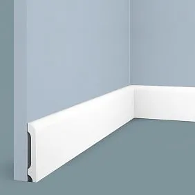
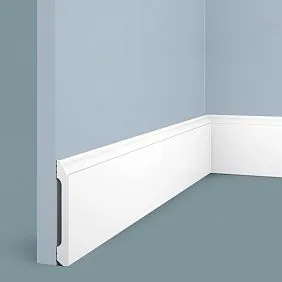
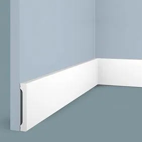
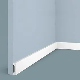
Carved wooden skirting board: luxury begins from the floor
A skirting board is not just a strip covering the joint between the floor and the wall. In an interior where every detail matters,Wooden baseboardit becomes an architectural element that sets the scale, style, and level of decorativeness.
Height 100-120 mm: when size matters
A standard skirting board with a height of 60-80 mm gets lost in interiors with high ceilings.Wide Wooden Skirting BoardA height of 100-120 mm creates monumentality, a visual foundation upon which the entire interior is built.
A tall skirting board changes the proportions of a room. It visually raises the floor, creating a sense of a podium, an elevation. This is especially important in formal rooms — living rooms, dining rooms, studies — where solemnity is needed.
But the height of the skirting board must correspond to the ceiling height. With ceilings of 270 cm, a 100 mm skirting board is the upper limit of reasonableness. With ceilings of 300-350 cm, skirting boards of 120-150 mm can be used. With low ceilings of 250 cm, a tall skirting board will visually lower the ceiling even further — here it's better to limit to 80 mm.
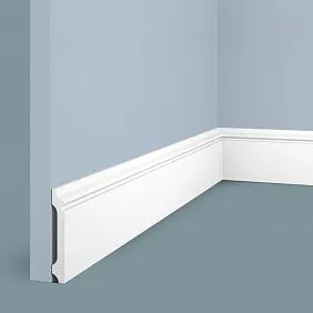
Carved profile: the language of classical forms
A carved skirting board is not just a tall strip; it is a complex profile with beads, coves, shelves, and carved ornaments.Figurative and carved skirting boardcreates a play of light and shadow, volume, and visual complexity.
A classic carved profile includes several elements:
Lower shelf (30-40 mm high) — a wide flat part adjacent to the floor. It can be decorated with shallow carving — flutes (vertical grooves), beads (a chain of small convex elements), meander (a geometric ornament).
Bead (a convex rounded element) — creates volume, catches light. The bead can be smooth or decorated with spiral carving, pearl molding (a chain of small balls).
Cove (a concave element) — creates shadow, depth. Carved ornaments — acanthus leaves, palmettes, grapevines — are often placed in the cove.
Upper shelf — a narrow flat part adjacent to the wall. It can be decorated with carving or left smooth.
Such a profile is the result of centuries of development in classical architecture. It repeats the logic of ancient orders, where each element has structural and decorative significance.
Carved ornaments: acanthus, grapevine, palmettes
Carving turns a skirting board into a work of applied art.Wood Carvingfor skirting boards uses traditional motifs, each carrying stylistic meaning.
Acanthus — a stylized leaf of the acanthus plant, with jagged edges, voluminous, dramatic. Acanthus carving is characteristic of Baroque and the Corinthian order. Acanthus leaves can cover the entire height of the skirting board or be placed rhythmically — every 30-50 cm.
Grapevine — an elegant, winding motif with leaves and clusters. Symbolizes fertility, abundance, joy of life. Grapevine carving is lighter, more elegant than acanthus, suitable for interiors where decorativeness without heaviness is needed.
Palmettes — stylized fan-shaped leaves, symmetrical, orderly. Characteristic of Classicism and Empire style. Palmettes create rhythm, solemnity, classical strictness.
Meander — a geometric ornament in the form of a broken line repeating infinitely. An ancient motif symbolizing eternity, the infinity of time. The meander is strict, graphic, suitable for Empire and Neoclassical styles.
Carving can be deep (high relief), where the ornament protrudes 5-10 mm from the background, creating strong shadows. Or shallow (bas-relief), where the ornament is barely perceptible, creating a delicate decorative effect. The choice depends on the style and desired degree of decorativeness.
Material: solid oak or beech
Carving requires dense wood that does not chip, crack, and holds fine details. Solid oak (density 700-800 kg/m³) is the optimal choice. Oak is strong, durable, and its grain is beautiful even under a layer of gilding.
Solid beech (density 700-780 kg/m³) is an alternative to oak. Beech is lighter, fine-grained, and cuts well. It is ideal for skirting boards that will be painted white or cream — beech grain is less pronounced, resulting in a smooth painted surface.
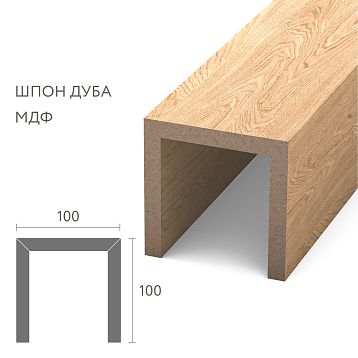
MDF with a milled profile is a budget imitation of carved wood. Milling gives a repeating ornament, machine precision, but not the liveliness of hand carving. MDF is suitable for mid-price segment interiors where a decorative effect is needed without investing in solid wood.
But for true palace luxury, there is no alternative to solid wood. Only natural wood, only the hand carving of a master who feels the material, sees how the ornament is born from the wood's texture.
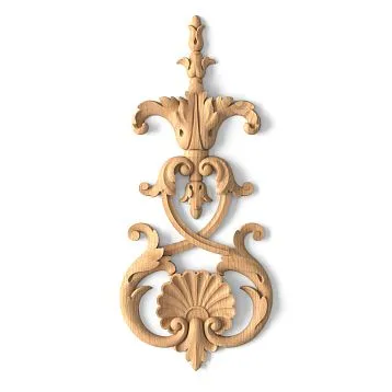
Gilded mirror in a carved frame: the center of the composition and a portal of light
A mirror in an interior is not just a functional object. It is a portal that doubles the space, multiplies light, and reflects the beauty of the room.mirror in a carved framewith gilding becomes the center of the composition, around which the entire interior is built.
Size and proportions: from intimate to monumental
The size of the mirror is determined by the size of the room and its function. In a living room of 30-40 sq.m, a monumental mirror of 100x180 cm or even 120x200 cm is appropriate. Such a mirror dominates, organizes the space around itself, and creates a sense of grandeur.
In a bedroom, a mirror of 80x120 cm above a dressing table or chest of drawers is sufficient. In an entryway — a vertical mirror of 60x150 cm, showing the full-length figure.
Mirror proportions are classic — 2:3 (e.g., 80x120 cm) or 1:2 (e.g., 60x120 cm). Square mirrors in gilded frames are used less often — a square is more static, less elegant than a vertical rectangle.
The frame adds 20-30 cm to the mirror's size on each side. A mirror pane of 80x120 cm in a frame 15 cm wide becomes an object measuring 110x150 cm. This must be considered when planning placement — the wall must be large enough to accommodate the mirror with its frame and leave space around it.
Carved frame: Baroque opulence or Empire strictness
Wooden frame for a mirrorin gold is the culmination of the carver's and gilder's skill.
A Baroque frame abounds with curved lines. The frame's corners are not straight but rounded, often with cartouches (decorative shields with ornament). The frame's profile is complex — several beads, coves, and fillets. The carving is dense, deep — acanthus leaves cover the entire frame, creating a sense of golden lace. In some places, the carving is so deep it becomes almost openwork — an acanthus leaf separates from the background, creating a three-dimensional effect.
An Empire frame is stricter. The profile is rectilinear, the corners are clear, straight or with small rosettes. The carving is placed not as a continuous carpet, but rhythmically — palmettes at the corners, a laurel wreath at the top, symmetrical scrolls on the sides. Between the carved elements are smooth areas that give the eye a rest. The gilding can be solid or selective — only on the carved elements, leaving the smooth areas in white or cream.
A Neoclassical frame simplifies classical motifs. The carving is delicate, shallow, stylized. Instead of lush acanthus — simple leaves, instead of complex cartouches — geometric rosettes. Gilding is often replaced by silvering or matte gold coating (without shine), creating a modern elegance.
Frame width — from 10 to 20 cm. A narrow frame (10-12 cm) suits small mirrors and neoclassical interiors. A wide frame (15-20 cm) — for large mirrors and Baroque, Empire interiors where monumentality is needed.
Gilding: from gold leaf to composition leaf
Gilding is the pinnacle of decorative craftsmanship. There are several gilding techniques, each yielding a different result.
Gold leaf — the thinnest sheets of real gold (microns thick), applied to gesso (chalk ground). This is the traditional technique used to gild icons, furniture, and picture frames in museums. Gold leaf gives a deep, warm, living shine. It does not tarnish, does not oxidize, lasts for centuries. But it is expensive — the price of gold plus the labor intensity make gold leaf gilding an elite technique.
Composition leaf (imitation gold leaf) — thin sheets of a copper-zinc alloy that look like gold but cost many times less. Composition leaf gives a bright, warm shine, visually almost indistinguishable from real gold. But composition leaf oxidizes, darkens over time, and requires a protective varnish coating. It is a compromise between aesthetics and budget.
Gold paint — a modern material, paint with metallic pigments that imitates gold. Applied with a brush or spray. Gives an even coating but without the depth and play of light characteristic of leaf gold. Gold paint is a budget solution suitable for modern interiors where a golden accent is needed without pretensions to museum quality.
Wax gilding — wax with a gold pigment, rubbed into the carving. Creates a matte, noble shine without bright gloss.Baroque in interioroften uses wax gilding to create an effect of antiquity, patina, and antiqueness.
Selective gilding — when gold is applied only to the raised parts of the carving, and the recesses remain in another color (white, cream, dark brown) — creates the maximum decorative effect. Light catches the golden protrusions, shadows recede into the dark recesses, the carving comes to life, becomes three-dimensional, almost sculptural.
Mirror placement: above the fireplace, console, between windows
A gilded mirror in a carved frame requires worthy placement. It cannot hang just anywhere — such an object organizes the space around itself.
Above the fireplace — the classic place for a formal mirror. The fireplace (real or decorative) creates a horizontal axis, the mirror above it — a vertical one. Together they form the compositional center of the living room. The gilded frame of the mirror echoes the marble or wooden fireplace surround, creating material richness.
Above a console — another classic option. A console (a narrow table on curved legs) creates a functional and decorative zone. Vases, candelabras, clocks, and sculptures are placed on the console. The mirror above the console reflects these objects, doubles them, creating visual abundance.
Between windows — a technique that visually unites two windows into one composition. A mirror placed on the wall between windows reflects light from the windows, making the room brighter. This technique is characteristic of formal halls with several windows on one wall.
On an accent wall — in modern interiors, a mirror can be the sole element on an empty wall, creating a dramatic accent. The wall is painted a deep color (emerald, sapphire, burgundy), and only one gilded mirror is placed on it. The contrast of the saturated color and gold creates a visual impact, a memorable effect.
Mounting height — the center of the mirror at eye level (160-170 cm from the floor). This ensures comfortable use and visual balance. Too high — the mirror feels disconnected from the space. Too low — it loses its sense of grandeur.
Repeating carved motifs: visual rhyme in the interior
When the baseboard and mirror frame feature repeating carved ornaments, a visual rhyme, a connection emerges, uniting the floor and wall into a single composition.
Acanthus leaves: from floor to mirror
If the baseboard features acanthus carving, it's logical to use acanthus on the mirror frame as well. This creates stylistic unity, recognizability, and classical harmony.
The acanthus on the baseboard can be shallow, delicate — gentle leaf curves, placed rhythmically every 40-50 cm. The acanthus on the mirror frame is more lush, deep, dramatic — leaves cover the entire frame, creating golden lace.
This difference in decorative scale is justified: the baseboard is a background element, its carving should not dominate. The mirror frame is an accent object; here, the carving can be maximally expressive.
Palmettes and laurel wreaths: Empire-style strictness
If the interior is in the Empire style, the carved motifs should be strict, symmetrical. Palmettes on the baseboard are placed with mathematical precision — at equal intervals, of the same size. Palmettes on the mirror frame repeat the same shape but are larger.
Laurel wreath — a classic Empire motif, symbolizing victory, glory, triumph. The wreath can encircle the mirror along the frame's perimeter or be placed at the top, like a crown. If the baseboard has elements of laurel ornamentation, this creates a connection between the floor and the mirror.
Geometric ornaments: meander, beads, fluting
Geometric carving creates rhythm, order, classical strictness. A meander (broken line) on the baseboard can be repeated on the mirror frame, creating a visual echo. Beads (a chain of small convex elements) on the baseboard's torus can echo beads on the inner edge of the frame.
Fluting (vertical grooves) — a motif borrowed from ancient columns. Fluting on the baseboard creates a vertical rhythm, visually elongating the space. Fluting on the mirror frame repeats this logic, linking the two elements into a unified system.
Floral motifs: roses, tulips, grapes
Floral carving is less strict than geometric but no less effective. Roses, tulips, grapevines, oak leaves — all these motifs were used in classical carving.
If a grapevine is carved on the baseboard, the mirror frame can feature the same motif but more detailed — with drawn leaves, clusters, tendrils. Grapes symbolize abundance, joy of life, fertility — a motif suitable for dining rooms, living rooms, spaces associated with hospitality.
Roses — a symbol of beauty, love, perfection. Rose carving is delicate, graceful, suitable for bedrooms, boudoirs, women's studies. The rose on the baseboard is small, stylized. The rose on the mirror frame is lush, blooming, voluminous.
Gilding: gold leaf on the baseboard and frame as a unifying element
Gilding is a powerful tool for creating unity. When the baseboard and mirror frame are gilded using the same method, they are automatically linked, forming a golden thread that runs through the interior from floor to walls.
Selective gilding: gold on the carving, base in color
The most effective technique is selective gilding, where gold is applied only to the raised parts of the carving, while the base (smooth areas of the profile) remains a different color.
White base with gold — a classic combination characteristic of Empire and Neoclassical styles. The baseboard is painted white (matte, no shine), carved elements are gilded. The mirror frame is executed in the same technique — white base, gold carving. This creates a light, grand, formal effect.
Cream base with gold — a warmer, softer option. Cream color (ivory, warm milk) creates a sense of antiquity, patina, nobility. Gold on cream looks more delicate than on white, creating sophistication without coldness.
Dark base with gold — a dramatic, contrasting combination. The baseboard and frame are tinted a dark color (dark brown, wenge, black), the carving is gilded. Gold on a dark background shines brightly, creating maximum decorative effect. This solution is for interiors where drama, visual power, Baroque excess is desired.
Full gilding: when gold covers everything
Full gilding — when the entire baseboard and entire frame are covered in gold — creates maximum luxury but requires caution. An excess of gold turns the interior into a theatrical set, a museum display case; it loses vitality.
Full gilding works if the gilded elements are few and placed against a neutral background. For example, a gilded baseboard on white walls, a gilded mirror on the same white wall, with no more gold elsewhere. The whiteness of the walls balances the gold, creating equilibrium.
If there is a lot of gold (gilded baseboard, gilded mirror frame, gilded chandelier, gilded furniture legs), the interior becomes overloaded. Gold ceases to be an accent, becomes the background, loses its value.
Patination: the effect of antiquity and nobility
Patina is a dark pigment applied to gilding and then partially wiped off, remaining in the recesses of the carving. This creates an effect of aging, noble wear, and antiquity.
Molding with gilding and patinalooks as if it has survived centuries. The gold has slightly tarnished, the dark base shows through in places, and dark patina has accumulated in the recesses of the carving. This is not a reproduction but an object with history.
Patination of the baseboard and mirror frame using the same technique creates stylistic unity. If the patina on the baseboard is dark brown, it should be the same shade on the frame. If the patina is greenish (imitating oxidized bronze), this shade should be repeated.
Patina is especially relevant for interiors styled to look antique—antique, vintage, eclectic. It softens the brightness of gold, makes it more noble and calm, and integrates it into a space where history, not novelty, is valued.
How to avoid overloading the interior: balance between luxury and taste
Gold, carving, high baseboards, monumental mirrors—all these are powerful decorative tools. How to use them without turning the interior into an overloaded set?
Rule of one accent
Each room should have one main accent. If it's a gilded mirror, everything else should serve as a background. The baseboard can be carved, but the gilding on it should be delicate and selective. Furniture should be classic but without excessive carving. Walls should be neutral—white, cream, light gray.
If there are several accents (gilded mirror, gilded chandelier, gilded furniture), they compete for attention, creating visual chaos. The eye has nowhere to rest, and the interior becomes tiring.
Rule of emptiness
There should be space between decorative elements—visual emptiness that gives the eye a break. If a gilded baseboard transitions into gilded molding, and that into a gilded ceiling cornice, a golden frame forms around the perimeter of the room. This can be impressive but requires ample space and high ceilings.
In a standard apartment with 270 cm ceilings, it's better to limit yourself to a gilded baseboard and a gilded mirror, leaving the ceiling cornice white or omitting it altogether. This creates balance, airiness, and doesn't overload the space.
Rule of color balance
Gold is active; it attracts attention. To balance it, a calm background is needed. White, cream, light gray walls are the perfect backdrop for gold. Saturated colors (emerald, sapphire, burgundy) can be used but in moderation—one accent wall where the gilded mirror is placed.
If the walls are dark, the ceiling should be white. If the walls are a saturated color, the floor should be light. These contrasts create visual variety, preventing the interior from becoming monotonous or overloaded.
Rule of material diversity
Gold pairs well with other noble materials—marble, velvet, silk, crystal. A gilded mirror above a marble console, a crystal chandelier, velvet curtains—these materials enhance each other, creating a sense of luxury.
But avoid cheap imitations. Plastic "marble," synthetic "velvet," glass "crystal" next to a genuine gilded mirror made of solid wood will create dissonance. It's better to have fewer elements, but genuine, high-quality, noble ones.
Questions and answers: golden classic without mistakes
Can gilded elements be used in a small apartment?
Yes, but in moderation. One medium-sized gilded mirror (60x90 cm) in the hallway or living room will create an accent without overloading the space. Avoid massive frames and solid gilding—in a small space, this is overwhelming.
How much does real gilding cost?
Gold leaf gilding—from 5000 to 15000 rubles per square meter depending on the gold purity and complexity of the work. Imitation gold leaf—from 1500 to 4000 rubles per square meter. Gold paint—from 500 rubles per square meter. The price reflects quality and durability.
How to care for gilding?
Gilding does not like moisture and abrasives. Wipe with a dry, soft cloth to remove dust. Once a year, you can use special gilding cleaning products. Do not use cleaning agents, alcohol, solvents—they damage the gilding.
Will a gilded mirror suit a modern interior?
Yes, if the frame is simplified, the carving is stylized, and the gilding is matte (without shine). A neoclassical frame with delicate carving and matte gold fits into a modern interior, creating a bridge between tradition and modernity.
Can gold and silver be combined in one interior?
It's better not to. Gold is warm, silver is cold; they compete. If you want a cold metal, use only silver (silver-plated frame, chrome-plated fixtures). If warm—only gold.
Is a gilded baseboard necessary if there is a gilded mirror?
Not necessarily. It's enough for the baseboard to be carved from the same material as the frame, but without gilding. Gold only on the mirror will create an accent. Gold on both the baseboard and the mirror is a more luxurious but also riskier solution.
What baseboard height is optimal for a classic interior?
For ceilings 270 cm — 100-120 mm. For ceilings 300 cm and higher — 120-150 mm. A carved baseboard of this height creates monumentality without overwhelming the space.
How to choose lighting for a gilded mirror?
Side sconces with warm light (2700-3000K) create a play of light on the gilding and emphasize the carving. Cold light (4000K and above) makes the gold look dull and lifeless. Directed light from above creates dramatic shadows in the carving.
Conclusion: Luxury that speaks about you
Gold in the interior is not a fashion that comes and goes. It is an eternal value, a material embodiment of luxury that retains its significance for centuries. When you chooseMirror in a gold frameand a carved baseboard with gilding, you are not just choosing decor. You are choosing an attitude towards the home as a space where beauty, craftsmanship, and the nobility of materials matter.
Palatial luxury in a modern apartment is not about copying Versailles, but about rethinking classical principles. Carving, gilding, high baseboards, monumental mirrors — all these elements work if used consciously, in measured doses, with an understanding of balance.
For over half a century, the company STAVROS has been creating products that embody classical luxury at a modern level of quality.Carved baseboards made of solid oak and beech, mirror frames with hand carving and gilding, moldings, cornices — each product is created with attention to detail, respect for tradition, and an understanding that true luxury is craftsmanship, not imitation.
STAVROS uses only solid oak, beech, ash — wood dried to 8-10% moisture content, stable and durable. Carving is done by hand by craftsmen who master traditional techniques and modern tools. Gilding is applied using classical technology — gold leaf on gesso, with or without patination, depending on the desired effect.
Every project is unique. You can order a carved baseboard to custom sizes, choose an ornament from the catalog, or order custom carving. You can choose the type of gilding — from economical gold paint to premium gold leaf. STAVROS consultants will help you select a baseboard and mirror frame so that they form a unified system and harmoniously fit into your interior.
Decorative moldings with gildingfrom STAVROS is not mass production where everything is the same. It is an opportunity to create an interior that reflects your taste, your values, your understanding of luxury. Gold, carving, solid wood — these are materials that do not go out of style, that retain their value for decades, that can be passed down to future generations.
By choosing a gilded mirror in a carved frame and a high baseboard with gilding from STAVROS, you are investing not just in decor, but in atmosphere, in the feeling of home as a space where beauty matters. Where every detail is crafted with skill. Where luxury is not ostentatious, but genuine, material, tangible. Where gold shines not like cheap tinsel, but like a noble metal, processed by the hands of craftsmen who know the value of their craft.