


Article Contents:
- What slat panel texture really is — and why it's more important than color
- Three types of texture in slat panels: how to tell them apart
- How to read slat panel texture in photos before purchase
- What 'honest' oak texture means and why it matters
- Polyurethane molding: what to look for in photos and what lies behind it
- Three functions of molding in combination with slat panels
- How to read molding profile in photos
- How to combine slat texture with molding: a practical methodology
- Five working combinations — honestly broken down
- Which combinations look mature and will work in ten years
- Molding scale depending on ceiling height
- Combinations that smell of cheap renovation
- Laminate 'wood-look' + molding with baroque ornament
- Dark slats + dark molding + dark wall in a small room
- Different moldings on one wall without a system
- PVC slats + polyurethane molding for painting
- Too frequent slats + molding with a small ornament
- Slatted panel and molding in different areas of the apartment: what changes
- Living Room
- Bedroom
- Hallway and corridor
- Kitchen
- Installation: how the correct installation sequence affects the final look of the combination
- Textural dialogue: when battens and molding are not the only participants
- Additional elements: overlays and corner blocks
- Molding color relative to batten panel: three strategies
- Answers to popular questions
- STAVROS: the material foundation for correct combinations

There is one mistake even people with good taste make. They choose panels and moldings separately—each element beautiful on its own—and end up with an interior that looks cluttered, random, visually noisy. Beautiful things assembled without logic don't yield a beautiful result. They produce exactly what designers call 'visual clutter': a lot of everything, and nothing specific.
The conversation about how to choose texture combinations isn't about taste or trends. It's about the laws of perception: how the eye reads a surface, how the brain classifies materials, where the dialogue of textures ends and their conflict begins. Batten panels with their own expressive texture and polyurethane molding with a geometrically clean profile are two different 'voices' in a space. To make them sound in unison, you need to understand the nature of each.
This article is a practical guide. No fluff, no generic phrases about 'harmony' and 'balance'. Only specifics: what to look for in photos before purchase, which texture parameters affect compatibility, where molding enhances a batten surface and where it destroys it, and why some combinations look mature even after ten years while others become outdated before the finish paint dries.


What batten panel texture really is—and why it's more important than color
Most people, when choosingslatted panels for wallsThey look at the color. Light or dark, warm or cool, wood or painted. Color is the first thing the eye notices. But color is not the first thing that determines the long-term perception of a surface.
Texture is how a surface interacts with light. A rough surface scatters light—it looks soft, tactile, organic. A smooth surface reflects light—it looks clean, graphic, technological. The linear texture of a batten directs light along its rhythm—it creates movement, direction, dynamism. It is precisely this movement that distinguishes a batten surface from any other wall solution: it doesn't just 'cover' the wall, it gives it direction.
Understanding this is fundamentally important before you open a molding catalog. Because molding is also texture. It is relief. It is light and shadow in the form of a profile. And if you don't understand how your batten surface 'speaks,' you won't understand which molding harmonizes with it and which clashes.


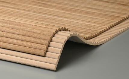
Three types of texture in batten panels: how to distinguish them
Natural wood grain texture is the texture of solid wood battens or veneer with a natural fiber pattern. Oak, ash, walnut, pine—each species has its own character: oak reads as large and substantial, ash as lighter and softer, walnut as darker and richer.Slat panel textureSolid wood is not a decor; it's natural documentary: no two patterns are the same, always a living surface with deviations that make it authentic.
What's important for pairing: natural wood grain is the dominant voice. It is rich in information—fibers, knots, tonal transitions. Molding next to such a surface should be neutral: a clean geometric profile without ornament, which frames rather than competes. Ornamental molding with botanical motifs next to natural wood grain is two patterns on one wall. The result is visual overload.
Painted solid texture is MDF for painting. The batten surface is smooth or with a slight bevel, evenly painted in the chosen shade. There is no texture as such—only the shape of the batten and its rhythm. This is a 'silent' surface that allows the molding to speak louder.Painted MDF plank panelsIt is the perfect backdrop for molding with a more complex profile because the batten does not overpower it with its own texture.
Laminated and film texture is an imitation of wood, stone, concrete, or fabric in the form of a film or laminate coating on MDF. The batten surface reads as an imitation—it is regular, repeatable, predictable. It lacks the randomness of living nature. This is not inherently bad: such panels provide a clear, controlled visual effect. But for pairing with molding, it requires particular precision: an artificial texture combined with an artificial ornament very easily slips into 'imitation of imitation.'
Our factory also produces:


How to read the texture of a slat panel in photos before purchase
Here's a situation familiar to everyone: you look at a photo on a website, everything looks great. You order — and the actual surface turns out to be different from what you expected. Lighter or darker, rougher or smoother, warmer or cooler. How to avoid this?
First rule: look at how light falls on the slat surface. In photos with side lighting, the texture is read most honestly: all relief variations, all fibers, all chamfers are visible. Photos with direct frontal lighting 'flatten' the surface and hide its depth. If the catalog only has frontal photos — that's insufficient information for making a decision.
Second: assess the width of the slat relative to the scale of the space in the photo. A narrow slat of twenty-thirty millimeters creates a fine, frequent rhythm — 'busyness' or 'fabric' depending on the context. A wide slat of sixty-eighty millimeters — a slow, substantial rhythm.Wooden slat panelsOak or ash in a wide format reads as monumental — each slat as a separate element. In a narrow format — as a textile pattern.
Third: check the gap between slats. The gap is shadow. A deep slat with a ten-fifteen millimeter gap creates a pronounced shadow-stripe that enhances the relief. A flat slat placed tightly against its neighbor — minimal relief, almost a flat surface. In photos, this is read by the depth of shadows in the gaps. The darker the shadow between slats — the higher the relief.
Fourth: look at the ends. A quality photo should show the ends of the slats — they indicate material thickness and processing quality. An MDF slat of fourteen-eighteen millimeters — substantial, holds its shape. A thin slat of six-eight millimeters — lightweight, for decorative, not architectural tasks.
Get Consultation
What does 'honest' oak texture mean and why it's important
Slat panel textureSolid oak — is not a uniform surface. It always has tonal variation: one slat is lighter, another has a dark knot, a third has a pronounced pearlescent 'shimmer' in the fibers. This very non-uniformity is the value of solid wood — it makes the wall alive.
The problem arises when a person chooses an oak panel based on a 'beautiful' photo where all the slats are perfectly uniform in color—this is a sign of a laminated finish, not real wood. Real oak is never perfectly uniform. If all the slats in the photo are the same tone, it's not solid wood. It's either veneer on MDF or laminate. There's nothing wrong with that—but you need to understand the difference before buying.
This is critical when combining with molding. The uneven, natural texture of wood requires a neutral molding with a minimal profile. Laminated wood imitation is more manageable, allowing for moldings with slightly more complex profiles.
Polyurethane molding: what to look for in photos and what lies behind it
Open any catalogof the polyurethane molding—and you'll see hundreds of options. Different widths, different projections, different profiles: with a bead, with ornamentation, with bands, with botanical motifs. How do you choose the one that will work specifically with your slatted panel?
The answer doesn't start with the question 'what do I like,' but with the question 'what does this surface do.' Molding on a wall next to a slatted panel isn't just decoration. It's an architectural tool with specific functions: framing, dividing, finishing. And each of these functions requires its own type of profile.
Three functions of molding in combination with a slatted panel
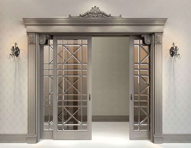
Framing—molding as a frame around the perimeter of the slatted field. Function: to create a border between the slatted surface and the surrounding wall. For this function, a profile that reads as a clear line is needed: a straight molding with one or two steps, width twenty to fifty millimeters. Nothing extra.polyurethane decorative moldingswith ornamentation in a framing function is excessive: the ornament draws the eye away from the slatted surface to the molding, and the frame starts to 'outshout' what it's supposed to frame.
Division—a horizontal molding-band dividing the wall into zones by height. Function: to create hierarchy. The upper zone is visually primary, the lower zone is secondary. For this function, a profile with a pronounced horizontal projection is needed: the molding should cast a shadow from below, emphasizing the horizontal division. Width thirty to sixty millimeters, projection from the wall eight to fifteen millimeters.
Finishing — molding at the ceiling or floor, completing the slatted surface from above or below. Function: to create a sense of completion. Without finishing, the slats technically 'end' at the ceiling. With finishing, they transition into the architectural context. For ceiling finishing — a cornice or wide molding with a cove; for floor — a baseboard, coordinated in profile with the frame molding.
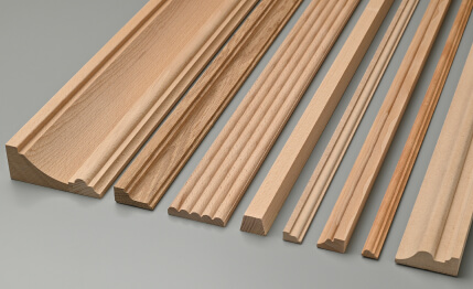
How to read a molding profile in a photo
In a photo of molding, you should always look at its cross-section — the transverse profile cut. It is the cross-section that tells about the shadow the molding will cast under real lighting conditions.
Flat profile (straight strip without ledges) — minimal shadow, modern look, maximally neutral. Works well with any slatted texture.
Profile with a cove (smooth concave or convex arc) — soft shadow, elegant transition. A classic profile that looks neither too modern nor too historical.
Profile with fillets (several horizontal steps) — complex multi-level shadow. Expressive, requires distance: looks good on molding wider than fifty millimeters; on narrow molding, small fillets 'clutter' the profile.
Ornamental profile (floral, geometric, or historical motifs) — an independent decorative element. Competes with the texture of the slatted panel. Works only where the slats have a uniform, neutral surface — for example, MDF painted in a single tone.
The key question when viewing a photo of molding: what shadow does it create? Look not at the profile itself, but at the shadows beneath it — they show the real plasticity of the element under side lighting conditions. Catalog photos with direct light often 'devalue' a complex profile, making it look like a flat strip. A good photo of molding always has side lighting, which reveals the full depth of the profile.
How to combine slatted texture with molding: a working methodology
Stop thinking in terms of 'like — dislike' regarding individual elements. Start thinking in terms of 'how these surfaces interact'. This is a fundamental shift — from aesthetic evaluation to analytical selection.
To select a combination, three parameters of each element are needed:
-
Texture saturation: high (live wood with pronounced grain), medium (veneer, laminate with soft pattern), low (painted MDF, solid-color slats)
-
Profile complexity: high (ornament, multiple bands, complex outline), medium (two-three steps, bead), low (straight strip, one step)
-
Tonal contrast: high (dark slats — white molding), medium (medium-tone slats — molding in a similar tone with nuance), low (monochrome — slats and molding in the same color)
Rule: the sum of texture saturation and profile complexity should remain constant — conventionally no more than four out of six possible units. If the texture has high saturation (three units), the profile should be low complexity (one unit). If the texture has low saturation (one unit) — the profile can be more complex (up to three units).
This is not mathematics. It's intuition translated into a system. Experienced designers feel this unconsciously. A beginner — can check themselves against this scheme before placing an order.
Five working combinations — honestly analyzed
First combination: natural oak + white straight molding
Slat panel texturefrom solid oak in a light or honey tone — and white molding with a simple rectangular profile twenty-five-thirty-five millimeters. Tonal contrast high. Texture saturation high. Profile complexity — minimal. Result: a lively warm wood surface and a clean white architectural line. Scandinavian archetype. This combination never goes out of style — it's too firmly rooted in the basic principles of perceiving 'natural plus pure'.
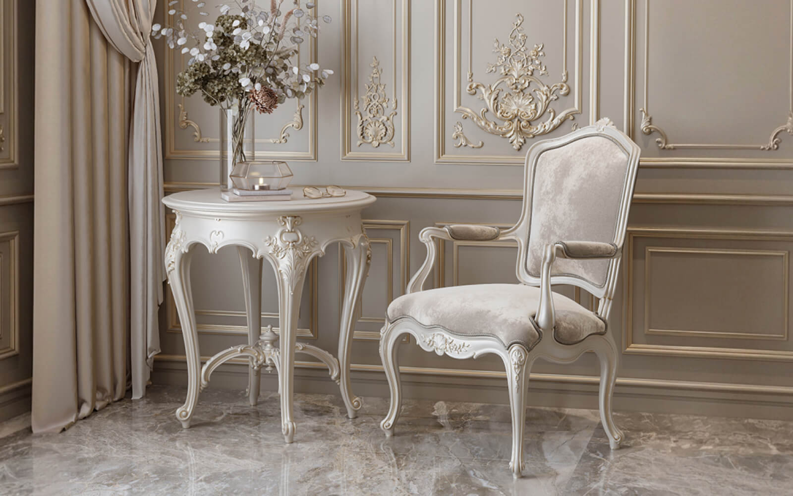
Second combination: painted MDF in a dark tone + white molding with a bead
paintable slatted wall panelsIn matte anthracite or deep blue — and white molding with a 35–50 mm bead. High contrast. Neutral texture (uniform MDF). Medium complexity profile. Result: clear architectural graphics, modern neoclassicism. The molding here works to its full potential precisely because the texture of the slats does not compete with it.
Combination three: ash veneer in a medium tone + molding matching the slats with a light banded profile
Slats in the tone of natural ash — a soft gray-beige — and molding of the same tonality with two or three bands. Low contrast. Medium-saturation texture. Medium complexity profile. Result: a monochrome volumetric surface where the molding reads as an architectural detail, not as a contrasting accent. This is a 'quiet' solution — for interiors where restraint is an intention, not an accident.
Combination four: white MDF slats + white molding with an ornamental profile
A completely white wall — slats and molding in the same tone. Zero contrast. Neutral texture. The profile can be more complex — ornamental or historical — because with zero tonal contrast, even a complex profile reads as light plasticity, not as a separate decorative object. This solution is for classic and neoclassical interiors where a 'sculpted' wall is needed — as if it were made of architectural plaster.
Combination five: dark walnut slats + matte black molding
A monochrome solution in a dark register. Walnut slats — almost black, with a warm reddish-brown undertone. Matte black molding with a simple rectangular profile. Minimal contrast. High-saturation wood texture. Result: a deep, intense solution where the molding merely defines the boundaries of the slatted field, not claiming independence. For accent walls in living rooms and bedrooms with good natural lighting.
Which combinations look mature and will work in ten years
The longevity of a visual solution is not a matter of trend. It's a matter of relying on basic principles: contrast, rhythm, hierarchy, scale. Solutions based on these principles outlive any trends. Solutions based solely on current relevance become outdated along with it.
What looks mature and endures over time:
-
Monochromatic solutions with high tonal consistency—where the slats, molding, and the wall behind them are united in one color family. The difference lies only in relief and texture, not in color.
-
High-contrast solutions with minimal profile complexity—dark and white, but with simple, clean lines without ornamentation.
-
Natural materials (solid wood, veneer) with neutral geometric moldings—a dialogue between organic forms and geometry that has existed in architecture for millennia.
-
Slatted panels in interior designWith molding only along the perimeter, without decoration on the slatted surface itself—a concise architectural framing.
What quickly becomes outdated—we'll discuss a bit later, in the section on mistakes.
Scale of molding depending on ceiling height
This is a technical detail that is often ignored—and then people wonder why the molding 'presses down' or 'gets lost'.
For ceilings up to two sixty—molding no wider than forty millimeters. Wide molding in a low room visually further lowers the ceiling, creating a sense of the upper horizon approaching.
For ceilings two sixty to three meters—molding forty to seventy millimeters. This is the standard zone where most classic profiles work.
For ceilings above three meters—molding can be from seventy millimeters and above. A high room 'absorbs' narrow molding—it gets lost, becomes unnoticeable. Here, a large-scale profile with a pronounced projection is needed.
Polyurethane moldings in interior designAvailable in a wide range of widths—from fifteen millimeters to several hundred. When choosing, always consider not only 'what looks good in the photo,' but also the ceiling height and the area of the slatted field next to which the molding will be placed.
Combinations that smell of cheap renovation
It's unpleasant to talk about mistakes—but they are the most common in realized interiors. Not because people didn't try. But because they made choices of beautiful elements without a systematic analysis of their compatibility.
Laminate 'wood-look' + molding with baroque ornament
This is a clash of two imitations: the laminated slat imitates wood, the molding with curls imitates palace decor. The result is two streams of 'fakeness' on one wall. The eye reads this as cheapness—even if both elements cost a decent amount of money. Because the problem is not the price, but the combination of two different 'languages of pretense' that expose each other.
Dark slats + dark molding + dark wall in a small room
Tunnel effect. A monochrome dark solution works in large spaces with good lighting. In a room smaller than sixteen square meters without natural light, it absorbs all the space and creates a feeling of confinement, not intimacy.slatted panels in the bedroomIn a dark finish, they require good artificial lighting and sufficient room volume—otherwise, it's not atmosphere, but claustrophobia.
Different moldings on one wall without a system
Frame molding—one profile. Horizontal molding—another. Ceiling molding—a third. And all three are 'similar,' but not identical. This is a classic interior miscalculation. Within one wall, all molding profiles should belong to one system—the same profile style, one proportion of setbacks, one logic of plasticity. Mixing 'similar but different' profiles creates a feeling of chaos that is difficult to articulate but impossible not to feel.
PVC slats + polyurethane molding for painting
Plastic slats reflect light differently than matte polyurethane under paint. Even painted the same color, they will appear different due to differences in surface structure and reflection coefficient. This nuance is invisible in a catalog and very noticeable in a real interior when the lighting angle changes.
Too frequent slats + molding with fine ornament
Fine pattern plus fine pattern creates a vibrating surface that tires the eye. Narrow slats of twenty millimeters with a five-millimeter gap already create a rich, fine rhythm. Molding with a fine ornament on top of that is a visual overload. The principle: the finer the rhythm of the slats, the larger and simpler the molding should be.
Slatted panel and molding in different areas of the apartment: what changes
The same combination of slatted panel texture and polyurethane molding works differently in different rooms. And this is not an abstract consideration, but specific practice.
Living Room
The living room is a space for representation, communication, and display. A more expressive dialogue of textures is appropriate here: a contrasting tonal choice, molding with a more complex profile as an architectural gesture.Slatted panels in the living room interiorThis is an accent wall that everyone sees. The molding here should complete and frame, creating a sense of wholeness. The scale is slightly larger than in other rooms.
Bedroom
The bedroom is a space for restoration. Surface quiet is needed here: tonal unity, soft texture, molding with a minimal profile. Complex ornamental molding in the bedroom is visual noise that hinders relaxation. Ideally, a monochrome solution in warm neutral tones: slats and molding in the same color, with the difference only in relief.
Hallway and corridor
A narrow, elongated space is the most demanding regarding the scale of details.Slatted panels in the hallway interiorVertical slats increase the height. The molding here is only a horizontal belt at the level of one hundred to one hundred and ten centimeters (the visual "eyebrow" line) or a frame molding around the perimeter of the slatted field. Nothing large in a narrow space — molding wider than fifty millimeters in a corridor up to one and a half meters wide will "press".
Kitchen
In the kitchen, a slatted panel most often acts as an accent backsplash or as island cladding. The molding here is functional — a transition between zones, framing the backsplash. For the kitchen — only MDF with a coating or solid wood treated with oil or varnish.Slatted panels in the kitchenrequire special attention to moisture resistance — polyurethane molding is optimal in this sense: it is not afraid of household humidity, does not swell, and is painted with water-dispersion compounds.
Installation: how the correct installation order affects the final appearance of the combination
Combining textures is not only about choosing materials but also about the installation sequence. An incorrect order destroys even correctly selected elements.
Correct order for a slatted panel with a frame molding:
First stage — installation of the frame or wall preparation, marking the position of the slatted field taking into account the frame molding. The frame will occupy space around the perimeter — its width must be considered in advance, otherwise the field will be smaller than planned.
Second stage —installation of slatted panelsstrictly according to the markings, with consistent gaps between the slats. The slats do not reach the junction with the molding by five to seven millimeters — this gap will be covered by the molding's base.
Third stage — installation of the frame molding around the perimeter of the slatted field. The molding is glued and, if necessary, fixed with finishing nails and a nail setter. Joints — at forty-five degrees with precise cutting.
Stage four — final painting. If battens and molding are the same tone — paint assembled with a roller or sprayer. If different tones — demarcate with painter's tape. Painting assembled allows covering all joints and achieving a unified monolithic surface.
A detailed guide oninstalling batten panels on the wall— with a breakdown of all stages and typical installation errors.
Textural dialogue: when battens and molding are not the only participants
Batten panels and molding rarely exist on a wall alone. Nearby are the ceiling, floor, furniture, textiles. And each of these elements participates in the textural dialogue.
If battens are oak — and the floor is also oak, the battens and floor should be coordinated in tone, but not identical. An identical wood tone on floor and walls creates 'gluedness' — the space loses depth. A nuanced difference in tone (battens lighter, floor darker or vice versa) — creates depth without disrupting unity.
If molding is white — and the ceiling is white, this coordination visually 'raises' the ceiling: molding at the ceiling is read as a transition, not as a boundary.
If molding matches the tone of the battens — and the surrounding wall is the same tone, a monochromatic architectural surface is created, where relief is the only source of distinction. This solution requires good lighting: without it, the relief is not readable and monochrome looks like just a flat wall.
Slatted panels with lighting— is a separate story. Glowing gaps between battens change the tonal balance of the surface in the evening, and molding that works well in daylight may lose clarity and dissolve into the overall illuminated surface under the light of LED strips in the gaps. When planning lighting, consider the contrast of the molding not only in daylight but also under artificial side lighting.
Additional elements: overlays and corner blocks
Corner blocks at molding-frame joints are a detail often underestimated. With a properly executed 45-degree miter joint, a corner block is unnecessary—it's used when the joint is technically complex or when you want to add an accent point at the frame corners.
Polyurethane appliqués— a separate category: decorative inserts, rosettes, medallions, consoles. Combined with slatted paneling, they are appropriate only as singular accents—for example, a central medallion above a fireplace or symmetrical consoles on the sides of the slatted field. Their task is to create a point of visual accent, not an additional ornamental layer. Rule: on one wall with a slatted field—no more than one or two accent overlay elements.
When selecting, ensure the overlay's ornament belongs to the same stylistic system as the molding profile. An Empire-style overlay and a Modern-style molding—this is not eclecticism, it's inconsistency.
Molding color relative to the slatted panel: three strategies
Strategy one: matching tone—slats and molding painted the same color. A unified monochrome surface. The difference is only in relief. Works in any style. Reads as architecture, not as decor.
Strategy two: contrast—dark slats and light molding or vice versa. The molding becomes an accent. Reads as graphic. Requires clean, confident color choices—no 'muddiness' in tone.
Strategy three: nuance—slats and molding from the same color family but different tones. Slats in gray, molding in white. Slats in light beige, molding in cream. This is the most complex and 'mature' solution—nuanced tonal analysis requires precision in selection and a good understanding of how tones interact under different types of lighting.
Answers to Popular Questions
Can solid wood slatted panels be combined with paintable polyurethane molding?
Yes, and this is a classic solution. The solid wood remains in its natural tone, the molding is white or in a neutral tone. The only requirement: paintable molding must have a smooth surface without pores. Quality polyurethane ensures this.
How to match the width of the molding to the width of the slat?
General rule: the width of the molding is one-third to one-half the width of the slat. Slats forty millimeters wide — molding fifteen to twenty millimeters. Slats sixty millimeters wide — molding twenty to thirty millimeters. A wider molding 'overwhelms' the scale of the slat and becomes self-sufficient.
What to do if the molding and slats are the same color but look different?
Different materials (MDF and polyurethane) accept paint differently: polyurethane gives a smoother surface with a higher gloss even with the same matte finish. The solution is to use the same paint material for both elements and the same application technique.
Is molding needed if the slat panel covers the entire wall from floor to ceiling?
With full slat wall covering, the molding becomes a horizontal belt dividing the surface into zones, or a ceiling cornice finishing the wall at the top. Frame molding around the perimeter is not needed with full wall covering — there is no need to highlight a field that is the entire wall.
What dodecorative slatted panelswith vertical slats combined with horizontal molding look like?
This is the classic architectural solution of 'vertical and horizontal': the vertical rhythm of the slats creates an upward movement, the horizontal molding-belt 'stops' it and creates stability. Proportion: a horizontal belt at one-third height from the floor is a classic ratio characteristic of historical interiors.
What molding to choose forMDF slat panelfor painting, if the interior is in loft style?
For loft — molding with a minimal profile or its complete absence. Loft is built on the rejection of decorative layers. If molding is needed — only as a functional framing without any ornamental elements: a simple rectangular profile twenty-thirty millimeters in metal or a matte dark tone.
What is the difference betweenslatted modular wall panelfrom a set of individual slats for combination with molding?
Modular panel — a ready-made block of fixed size with a given slat spacing. It is mounted as a single element and already contains a finished back panel. For frame molding, this is convenient: the molding frames the module as a finished object. A set of individual slats provides more freedom in the size of the field but requires more careful marking when installing the frame molding.
STAVROS: the material foundation for correct combinations
The choice of texture, profile, tone, and scale — all this works only when the material itself is executed precisely. Inaccurate slat geometry destroys the rhythm. Porous molding for painting gives an uneven surface. Dimensional discrepancies lead to visible gaps at the joints.
STAVROS producesRafter panelsfrom solid wood and MDF with precise geometry parameters, stable slat spacing, and high-quality finishing. Full assortment — from wide slats for painting to narrow slats made of solid oak with natural texture.
STAVROS offersPolyurethane moldings, cornices, and baseboardsin a wide range of profiles: from minimal rectangular to complex cornice — for any interior style and any framing task. Surface for painting without pores, stable profile geometry along the entire length, possibility of angled joining without loss of precision.
When the material is made correctly, the combination of textures works exactly as you intended — without compromises and without disappointment after installation. STAVROS is the material foundation for solutions that will look mature today and remain so in ten years.


