


Article Contents:
- Why Baroque in a modern interior requires strict dosage
- How slatted panels become a neutral architectural base
- Colors and materials that work best with Baroque furniture
- Warm neutrals as the perfect base
- Deep saturated tones: a bold approach
- Solid oak: natural tone as a third way
- How to incorporate decorative elements without overload
- The rule of empty space
- Textiles: velvet, silk, linen — but in moderation
- Live flowers and natural materials
- Which rooms can withstand Baroque and shiplap aesthetics
- Living room: the main stage
- Bedroom: headboard zone
- Entrance Hall and Foyer: The First Impression
- Study: a place for dark splendor
- Mistakes that make an interior look caricatured
- First mistake: oversaturation with Baroque items
- Second Mistake: Scale Mismatch
- Third mistake: mixing several styles besides Baroque
- Fourth mistake: clashing colors
- Fifth mistake: cheap imitations
- Sixth mistake: improper lighting
- Slatted panels in the kitchen with Baroque elements: a special case
- Modular slatted panels: flexibility as an architectural principle
- How to buy Baroque furniture and slatted panels: a practical guide
- Slatted panels in the bedroom with Baroque: analysis of a specific scenario
- Wall finishing with slatted panels: technical aspect when working with heavy furniture
- FAQ: popular questions about combining slatted panels and Baroque furniture
- About the Company STAVROS
When the virtuoso carving of the 17th century meets the laconic rhythm of modern wooden slats in one space — it's either the birth of a masterpiece or an aesthetic catastrophe. The gap between the two poles is thin, almost imperceptible, but it determines whether you'll get a vibrant, mature interior or a caricature of palace enfilades. This material is about how to confidently walk this gap without stumbling.


Why Baroque in a modern interior requires strict dosage
Baroque is excess as a principle. Not just ornament, but ornament within ornament. Not just gilding, but gilding over carving over a curved leg. The style was born in an era when interiors were literally political tools: Louis XIV's Versailles demonstrated state power through every square centimeter of surface. An empty wall was perceived as weakness. Free space — as an architectural error.
Today this logic doesn't work. Modern people live in conditions of visual overload: screens, advertising, information flow. The home has become an antidote to this noise, not its continuation. That's precisely whybaroque furniturein a modern interior needs strict editing — not the destruction of the style, but its intelligent dosing.
The mistake of the majority is to perceive Baroque furniture as part of a single system that must be recreated in its entirety. The Versailles chair with cabriole curves, a console with acanthus leaf scrolls, a mirror in a carved frame — all of this is magnificent individually. But when stucco on the ceiling, fresco painting, heavy floor-length curtains, and three more pieces of furniture in the same spirit are added to them — the space stops breathing. It turns into a theatrical set in which it is uncomfortable to live.
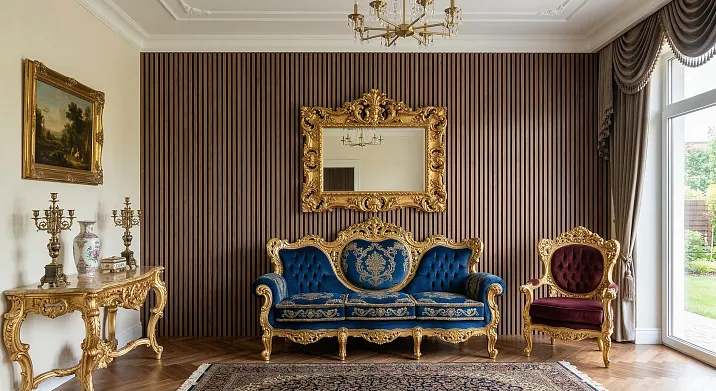
Strict dosing of Baroque in a modern home is the rule of one accent per space. One piece of Baroque furniture per room, maximum two, if they do not compete with each other. The rest of the space should be neutral, architecturally restrained — and this is precisely whereRafter panels.
Why does Baroque only withstand measured application? Because the eye works on the principle of contrast: a complex object is perceived as the main one only when there is silence around it. A Versailles chair against a slatted wall is a sculpture on a pedestal. The same chair against a stucco wall, a painted ceiling, and a patterned carpet is a detail in chaos that the eye stops noticing.


How slatted panels become a neutral architectural base
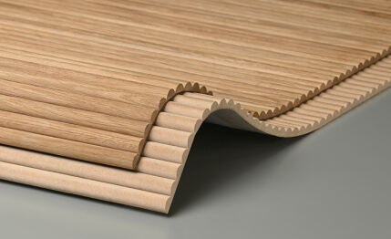
Slats are rhythm. Repeating, even, calming. It is this rhythmicity that makesSlatted wall panelsan ideal background for the complex plasticity of Baroque furniture.
Look at this from the perspective of visual theory. Baroque furniture is saturated with curves: S-shaped legs, convex fronts, scrolls, shells, acanthus leaves. This is a world of smooth, organic forms, unpredictable line movement. A slatted panel is the complete opposite: straight verticals, a strict module, predictable repetition. Two opposite languages of form, when they meet, do not conflict — they create a dialogue. Exactly as a quiet pause in music makes a loud chord audible.
A slatted wall panel in this interior performs the function of an architectural base — a neutral foundation that does not claim the role of the main hero, but gives the space structure and scale. This is not an empty wall: the slats have depth, texture, play of light and shadow with side lighting. But it is also not a competitor to the Baroque piece — the slatted panel speaks quietly, allowing the furniture to speak loudly.
The vertical orientation of the slats is especially organic in combination with the high backs of Baroque chairs and beds: the vertical rhythm of the wall emphasizes and supports the vertical character of the furniture itself. This unity of direction with a contrast of form is one of the techniques designers use to create a visual connection between elements that seem incompatible at first glance.
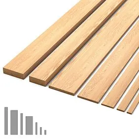
The material of the slatted panel is also important.Wooden slat panelsSolid oak speaks the same language as Baroque furniture—the language of natural wood. The carved legs of a console and oak slats on the wall are not a random pairing but a material rhyme. If Baroque furniture is made of oak or walnut with a tint, oak slats with a similar stain will create a sense of a unified spatial statement.
MDF slatted panel for paintingoffers a different tool—color as a background. Painted in a deep neutral tone—warm white, soft greige, rich sage green—such a wall becomes an ideal canvas for a Baroque accent. MDF allows for a smooth, even surface of the slats without defects, which is especially important when working with dark and saturated colors.
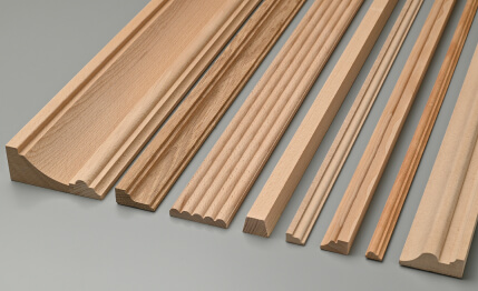
Our factory also produces:


Colors and materials that work best with Baroque furniture
Color scheme is a key tool when working with Baroque furniture in a modern interior. It is the color that determines whether the space will be solemn or theatrical, luxurious or overloaded.
Get Consultation
Warm neutrals as the perfect base
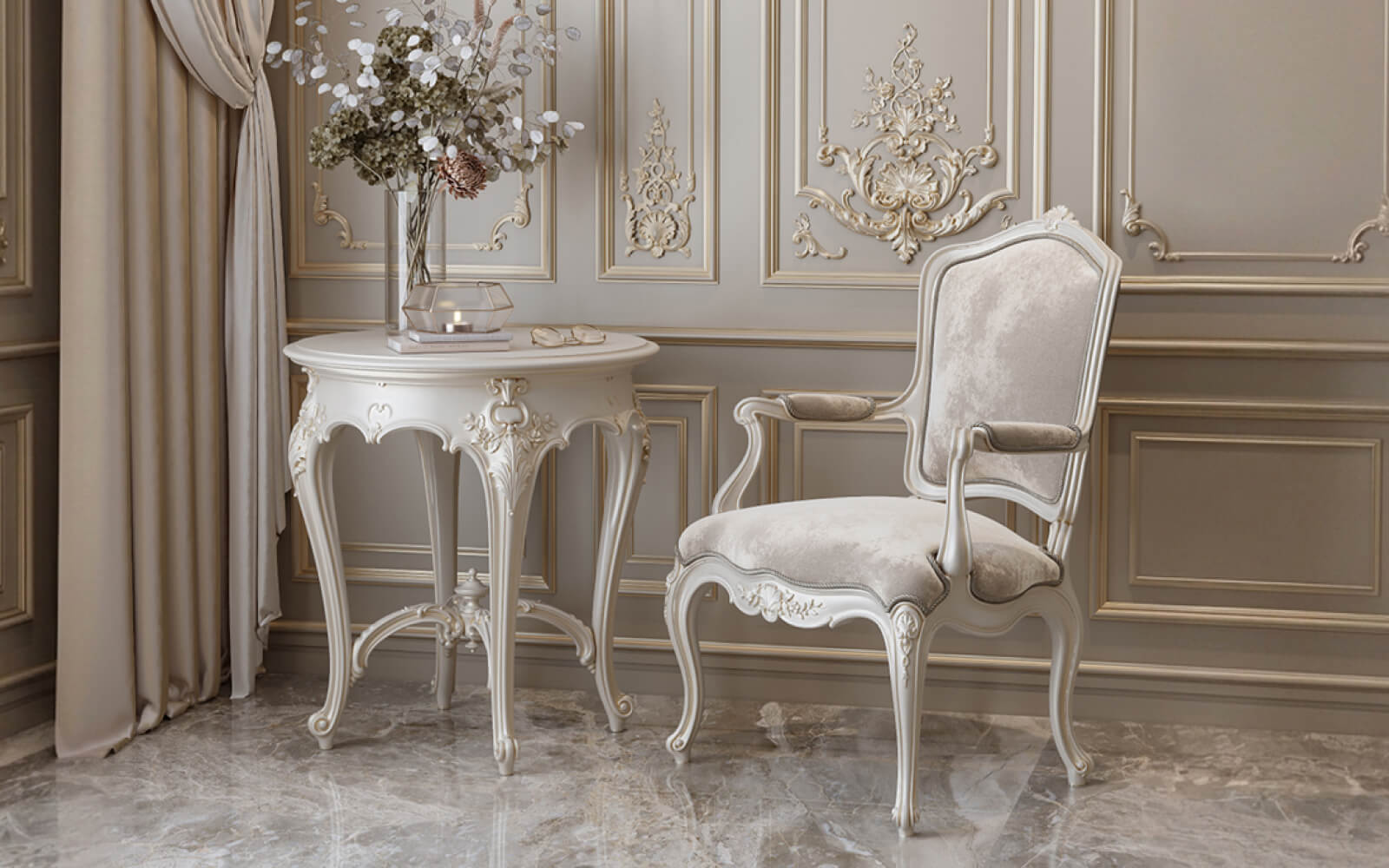
Cream, vanilla, warm white like NCS S 0502-Y or RAL 9001, linen, soft cashmere—this is the first and most versatile group of colors for walls with slatted panels paired with Baroque furniture. Warm neutrals do not compete with gilding and carving; they accentuate it. Against a linen slatted wall, a Versailles armchair with gilded details looks like a piece of jewelry in a silk box.
A tonal approach works especially effectively: the wall and furniture are kept in close shades of the same warm palette. For example, a slatted panel in a warm cashmere color,Classic Furniturewith beige-gold upholstery, wooden details with a light walnut tint. A unified tonality creates a sense of calm dignity without pomp.
Deep saturated tones: a bold approach
For those who want more than a neutral background — dark slatted walls contrasted with Baroque furniture. This is a strong technique requiring confidence and precise calculation. Deep bluish-green, anthracite, rich plum, dark brown — against such a backdropDark classic furniturelooks solemn and dramatic, while light upholstery or gilded details flare up like a light source.
This approach is closer to historically authentic Baroque: the walls of Versailles were not white — they were burgundy, green, blue, upholstered in silk. A slatted panel in a dark color provides the same depth as expensive wall upholstery, but with a modern geometric structure that keeps the space from sinking into historical imitation.
If you chooseMDF slatted panels for painting, dark tones are one of the main reasons for their popularity: the smooth MDF surface accepts any color with perfect depth.
Solid oak: natural tone as a third way
Solid oak slat panelswith tobacco, cognac, or fumed oak staining create a warm, lively background that is both neutral and expressive. The natural grain pattern of oak is a texture that doesn't shout but doesn't stay silent either. Paired with carved Baroque furniture made from similar wood, it creates a sense of kinship, of originating from the same material environment.
An oak slat in a tobacco tone plus an armchair upholstered in aged leather color — this is a space that looks as if it has been evolving for decades, not assembled from a catalog in a week.
How to incorporate decorative elements without overloading
A decorative element in an interior with Baroque furniture is either an enhancer or a destroyer. The boundary between them lies in quantity, scale, and relationship with the main accent.
The rule of empty space
Every large decorative item requires a zone of visual rest around it. The Versailles console with carved details should stand against a slatted wall without competing objects within a radius of one and a half meters. Above it—a mirror in a carved frame or a single painting in a strict frame, but not a gallery of five items.
The slatted wall serves as this rest zone: its rhythm does not require additional attention; it exists as an architectural texture that recedes into the background as soon as a Baroque item is introduced into the room.
Textiles: velvet, silk, linen—but in moderation
The upholstery of Baroque furniture is a separate story. Historically, it is velvet, silk, tapestry with ornament. In a modern interpretation, a restrained palette works better: solid velvet in a saturated tone (emerald, deep blue, eggplant, mustard), linen fabric with texture for a lighter option. Ornamental fabrics on upholstery are only permissible with a completely neutral environment—a slatted wall without pattern, a solid-color rug, minimal decor.
Curtains in an interior with Baroque furniture and slatted panels are a separate architectural task. Heavy drapes with a valance immerse the space in historical theater. A more contemporary solution is dense linen or velvet curtains without tiebacks and tassels, which fall in a strict vertical line, rhyming with the vertical rhythm of the slats.
Live flowers and natural materials
An unexpected but effective technique—live or dried plants next to a Baroque accent. Greenery does not compete with carving; it enlivens it. A large plant in a planter without ornament, a branch in a vase—this is a natural counterpoint to man-made luxury. It looks especially organic next to oak slatted panels: nature speaks with nature.
Which rooms can withstand the aesthetics of Baroque and slats
Not all spaces are equally ready for the combination of baroque furniture and slatted walls. There are rooms where this union unfolds in all its strength, and spaces where it requires utmost caution.
Living room: the main stage
The living room is the first and main space for a baroque accent. This is where there is room for one or two large pieces: a Versailles armchair or a sofa with carved details, a console against a slatted wall, a mirror in a frame. The ceiling height in the living room allows the slatted wall panels to fully deploy their vertical rhythm, and the room itself is large enough to preserve zones of visual rest.
Slatted panels in the living room interiorhave become one of the main solutions for accent walls over the past five years. Paired with a baroque armchair or console, this solution looks like the result of a professional designer's work.
The TV zone with slatted panels and a baroque element is a separate task. The TV itself is a modern object that neutralizes baroque pathos. If the slatted wall behind the TV is complemented by one piece of baroque furniture—a coffee table or an ottoman—this contrast works as an intentional play of eras, not as stylistic confusion.
Bedroom: headboard zone
The bedroom is the second most potential space. Here, the slatted panel primarily works asheadboard area design: the vertical rhythm of the slats behind the bed creates an architectural niche, highlights the sleeping area, and sets the scale. If the bed is made in the spirit of baroque—with a carved headboard, a high back—the slatted panel becomes a neutral backdrop that emphasizes the silhouette of the headboard without competing with it.
Versailles bedside tables next to a slatted wall in an oak tone—this combination works on the level of material kinship: wood speaks to wood, carving is read against the rhythmic plane of the slats.
Hallway and Hall: First Impression
The hallway is the space that forms the first impression of the house. One baroque item at the entrance—a console with a mirror in a carved frame—can create a strong effect of luxury and thoughtfulness.Slatted panels in the hallway interiorwill provide architectural expressiveness even in a small corridor, and the vertical rhythm will visually stretch the space upward.
A hallway with a slatted wall and a Versailles console is a functional, convincing image. The small scale of the space won't allow it to be overloaded: one slatted wall and one Baroque item—that's enough for a strong impression.
Study: A place for dark splendor
A home study is a space where dark classic furniture with slatted walls unfolds most fully. A deep green or anthracite tone for the slatted panels, a solid wood desk with carved details, a leather-upholstered armchair—this is a space that appeals to the image of a Victorian library, reinterpreted in modern terms. Dark classic furniture in such a setting looks organic: the dark background absorbs its weight, makes it part of the overall atmosphere, not a museum exhibit.
Mistakes that make an interior caricatured
Mistakes in working with Baroque and modern materials are a separate science. Most of them are not obvious at the moment of decision-making, but are clearly visible in the finished space.
First mistake: oversaturation with Baroque items
Three Baroque-style armchairs, a console, a carved coffee table, and a framed mirror—all in one room with a slatted wall. The number of Baroque accents exceeds the slatted panel's ability to contain them. The slats fail to serve as a neutral base when surrounded by too much complex form. The result is a space with no main character and no quiet.
Solution: one or two large Baroque items per room. The rest of the furniture should be neutral, with simple geometry.
Second mistake: scale mismatch
A small Baroque bedside table in a room with 2.5 m ceilings and full-wall slatted panels—a scale dissonance. A small Baroque item gets lost against a large architectural surface. The slatted wall sets the scale—and the Baroque item must match it.
Solution: select items considering the wall area. A large slatted wall requires a large Baroque accent—a bed with a tall headboard, a large armchair, a console of significant size.
Mistake three: mixing multiple styles besides Baroque
Baroque plus Provence plus Scandinavian minimalism plus slatted paneling is a stylistic disaster. Slatted paneling in a modern interior gravitates toward Scandinavian or Japanese minimalist aesthetics. Baroque gravitates toward classical European tradition. These two directions can coexist precisely because they are polar opposites. But adding a third style destroys the logic of contrast.
Solution: stick to one stylistic conflict—slatted paneling and Baroque. Everything else should be neutral.
Mistake four: clashing colors
Shrieking contrasts without a connecting tone—bright red in the upholstery of a Baroque armchair against a cold gray slatted wall with a bluish tint. Or an attempt to do everything at once: gilded furniture, a green wall, a terracotta rug, blue upholstery.
Solution: choose a main color theme of two to three tones. The remaining colors should only be accents. The slatted wall and furniture must have at least one connecting color bridge—the tone of the wood, a warm neutral floor, unified hardware metal.
Mistake five: cheap imitations
PVC slatted panels with wood imitation and mass-produced Baroque furniture made of chipboard with sprayed 'gold' plating—this is the most common mistake. The Baroque style is merciless to cheap imitation: it instantly turns into decor from a shopping mall. PVC slatted panels, in turn, lack the depth of texture and play of light that make slatted paneling an architectural surface.
Solution: if the budget is limited, it's better to choose one quality Baroque item and one slatted panel made of MDF or oak than to fill the space with imitations. The quality of the material here is more important than quantity.
Mistake six: incorrect lighting
Baroque furniture thrives in directed, warm lighting. Cold overhead light from LED lamps with a color temperature of 4000–6500 K kills gilded details, makes wood look gray and lifeless, and a slatted panel loses its play of light and shadow under such illumination. The space becomes flat and official—not luxurious, but institutional.
Solution: warm light at 2700–3000 K, spotlights angled toward the slatted wall, table and floor lamps with shades that provide diffused warm light.Slatted panels with lighting— a hidden LED strip behind the slats is one way to bring the wall to life and add depth to the space.
Slatted panels in a kitchen with Baroque elements: a special case
The kitchen is a space rarely considered for Baroque experimentation, and that's a mistake.Slatted panels in the kitchenas an accent wall or island cladding combined with one Baroque element—a mirror in a carved frame, a console sideboard, a Baroque chair at the bar counter—creates an interesting image of mixed eras.
The key requirement for the kitchen: the Baroque element must be outside the work zone. A carved console against the wall, Baroque chairs at the dining table—yes. A carved backsplash, gilded fronts on work cabinets—no. Work surfaces must be functional and neutral, and it is precisely the neutral slatted wall next to them that works as an architectural transition to the Baroque accent.
Modular slatted panels: flexibility as an architectural principle
Worthy of special attention aremodular slat wall panels: they allow forming accent zones of arbitrary shape and size without covering the entire wall. This opens up additional possibilities when working with Baroque furniture.
For example: not the entire wall behind the sofa is covered with slats, but only its central part—rectangular or arched. Such a 'frame' of slats concentrates the gaze, creates a niche, and a Baroque item inside or in front of it is perceived as an exhibit intentionally displayed. This is a technique from museum design transferred into a living space.
Flexible slatted panelsThey allow working with arched niches and rounded forms—which is especially relevant in interiors with Baroque furniture, where arched openings and niches are historical architectural elements.
How to buy Baroque furniture and slatted panels: a practical guide
If you've decided to combine these two worlds in your interior, the sequence of actions is more important than any theoretical principles.
The first step is to determine the main focal point. Which Baroque-style furniture piece will become the central statement of the space? Is it a bed or an armchair in the bedroom, a console in the hallway, a sofa in the living room?Buy Baroque Furnitureneeds to be done before making decisions about the walls, because the proportions, color, and scale of the furniture determine the parameters of the slatted background.
The second step is to choose a slatted panel to complement the furniture. If you've decided to buy classic furniture made of oak with a walnut finish, an oak slatted panel in a similar tone will create tonal unity. If the furniture has gilding and light upholstery—a warm white MDF slatted panel for painting.
The third step is to determine the room's color scheme, taking into account the floor, ceiling, and textiles. Ensure that no element competes with the Baroque focal point in terms of saturation and complexity of form.
The fourth step is to plan the lighting. Directed warm light is a mandatory condition for both elements to work effectively.
The fifth step is the installation of slatted panels.installation of slatted panelsis performed on a prepared, level, clean surface. Rigid panels are attached with adhesive and finishing nails; for significant wall irregularities—on a metal frame with an air gap for acoustic padding.
Slatted Panels in a Bedroom with Baroque: Analysis of a Specific Scenario
Imagine a specific space: a bedroom with an area of 18 m², ceilings 2.7 m high. A Versailles bed with a high carved headboard upholstered in deep blue velvet. Nightstands from the same collection series.
The wall behind the headboard:slatted panels in the bedroomMDF for painting, color — a rich gray-blue (conventionally Farrow & Ball Hague Blue interpreted in a domestic enamel). The other three walls — warm cream. Floor — light oak. Ceiling — white.
Result: the dark slatted wall behind the bed creates a volumetric niche that visually highlights the sleeping area and emphasizes the high headboard. The blue tone of the wall rhymes with the blue upholstery — not matching exactly, but rhyming, creating a color connection. The warm cream walls balance the dark accent. The light floor prevents the space from becoming too heavy.
This space is not theatrical. It is luxurious — calm, confident, without an extra word.
Wall Finishing with Slatted Panels: Technical Aspect When Working with Heavy Furniture
One practical point that is often overlooked:Wall finishing with slatted panelsin a space with Baroque furniture requires planning the mounting points for heavy mirrors and consoles.
A mirror in a carved frame above a console can weigh 30–50 kg. It cannot be attached directly to the slatted panel — MDF and oak slats are not designed for such a point load. Solution: before installing the panels, mount embedded elements (metal plates or pieces of plywood embedded in the wall) in the wall, the positions of which coincide with the planned mounting points for heavy mirrors and shelves. The fastener goes through the embedded element into the load-bearing structure of the wall, and the slatted panel is installed on top, concealing the embedded elements.
It's a technical detail, but it's precisely such details that distinguish a professionally planned interior from a beautiful idea that fell apart during implementation.
FAQ: popular questions about combining slatted panels and Baroque furniture
Can slatted panels be combined with gilded Baroque furniture?
Yes, and it's one of the most expressive options. The key condition is that the color of the slatted panel should be either a warm neutral (cream, linen, warm white) or a deep dark tone (anthracite, dark green, navy). On the first, the gilding glows; on the second, it flashes. Avoid cold gray and silver backgrounds—they dull the gold and make it look cheap.
Oak or MDF slatted panels—which is better for a Baroque interior?
It depends on the task. Oak slats with tinting create a material rhyme with wooden Baroque furniture—this is a solution for those who value naturalness and tactile richness. MDF for painting provides color—even, saturated, without distracting texture, which is especially important if you want a dark or neutral background that completely yields the role of the main character to the furniture.
How many Baroque items are permissible in one room?
A maximum of two large accent items in one space. At the same time, they should not compete with each other: one occupies a central position (for example, a bed or sofa), the second—a supplementary one (bedside table, console, coffee table). If both items are of the same scale and both claim the role of the center—the space loses hierarchy.
Can slatted panels and Baroque furniture be purchased in one place?
Yes. STAVROS produces bothslatted panels for wallsmade of MDF and solid oak,classical furniture in the Baroque style— beds, armchairs, consoles, mirrors, cabinets. This allows you to select both elements within a unified material logic, coordinating colors and tones already at the design stage.
Slatted panels in the bathroom — can a Baroque element be added?
A bathroom with MDF slatted panels painted with moisture-resistant enamel and a mirror in a carved frame is a perfectly workable scenario. A Baroque mirror in the bathroom works precisely because everything else in the space is neutral: white plumbing, plain tiles, a slatted wall with one accent. The main thing is not to introduce additional decorative elements.
Is a designer needed to create such an interior?
A professional designer will significantly reduce the risk of errors — especially when working with scale, color, and light. However, if you understand the basic principles (one accent, neutral background, tonal connection, warm light) and work with quality materials, a DIY solution is quite possible. Start small: one slatted accent wall, one Baroque item. Live in the space, add details gradually.
What additional materials work well in such an aesthetic?
Natural stone (marble, travertine) for surfaces, brass or bronze for metal details (handles, lamp bases, mirror frames), natural textiles — linen, velvet, wool. Glass in picture and mirror frames. All these are materials that have a historical connection to Baroque and are simultaneously organic in a modern interior.
About the company STAVROS
This conversation about luxury, form, and architectural precision would be incomplete without a word about who stands behind the materials discussed.
STAVROS is a Russian manufacturer that createsslatted panels made of MDF and solid oakandclassical furniture in the Baroque styleunder one roof. It is not an aggregator store or a middleman—it is a producer that controls quality at every stage: from wood selection to the final finish.
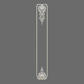
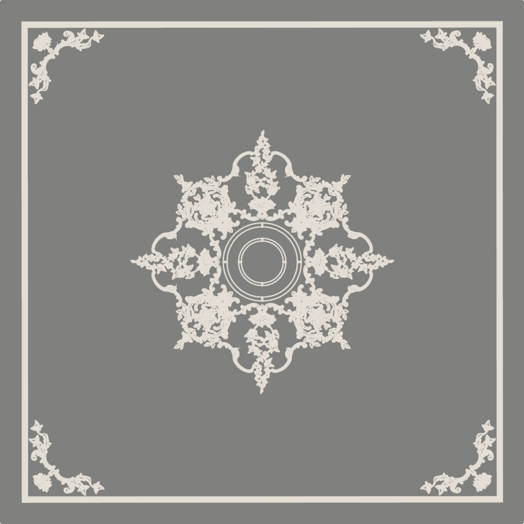
STAVROS slatted panels are available in two versions—MDF for painting and solid oak for tinting and varnishing—and come in rigid and flexible (for curved surfaces) options. The classic furniture collection includes beds, armchairs, consoles, coffee tables, cabinets, and mirrors in carved frames from the Versailles, Marseilles, Adele, Estelle, and other series—each piece crafted with an understanding of proportions and historical forms.
STAVROS works with private clients and design projects, offers custom-made furniture and panels, and provides consultations on material selection and color solutions. This is where you canbuy wall slat panelsand simultaneously select Baroque-style furniture to match—cohesively, in a unified material logic, without the risk of a style clash.