Article Contents:
- Why starting with baseboard is sensible: the "bottom-up" design logic
- Baseboard as the foundation of visual hierarchy
- Economic logic: from affordable to expensive
- Technological installation sequence
- Baseboard as a stylistic marker
- Psychology of perception: first impression
- Baseboard height and molding width: the mathematics of proportions
- Classic proportions: the golden ratio rule
- Dependence on ceiling height
- Coordination with wall moldings
- Ceiling cornice: completing the vertical
- Influence of profile on visual mass
- Room-specific rules: different rooms - different rules
- Matching with door casings and staircase: the triad of basic elements
- Door casings: vertical echo of baseboard
- Baseboard and casing junction: technical and aesthetic aspect
- Staircase: the most complex element of coordination
- Baseboard and thresholds: a micro-detail with great significance
- Color coordination: baseboard as a color anchor
- Three classic color solution strategies
- Color wheel: baseboard as a connecting element
- Color temperature: warm + cool = dissonance
- Black and white: universal solutions with nuances
- Color hierarchy: from light to dark
- Error checklist: what NOT to do
- Error 1: Too thin baseboard for high ceilings
- Error 2: Baseboard and casings of different colors (without a concept)
- Error 3: Cheap plastic baseboard with expensive wooden casings
- Error 4: Skirting board is heavier than the ceiling cornice
- Error 5: Profile inconsistency
- Error 6: White skirting on white walls with light flooring
- Error 7: Ignoring skirting when planning
- Error 8: Different skirting in adjacent rooms
- Error 9: Skirting wider than door casing
- Error 10: Warm skirting + cold doors (or vice versa)
- FAQ: Popular questions about skirting in interior design
- Conclusion: The conductor plays the first violin

In the symphony of interior design, every instrument matters, but the conductor sets the tempo, rhythm, and overall sound. And if we seek such a conductor among finishing elements, it is, paradoxically, the most unobtrusive detail — the skirting. Not the chandelier that captures attention. Not the striking decorative cornice crowning the walls. Not the luxurious moldings creating architectural relief. But the humble strip at the base of the wall, which most people even fail to notice.
Exactly in this unobtrusiveness lies the secret.wooden baseboardIt works on a subconscious level, creating the basic harmony of space. It defines scale, sets proportions, establishes color logic. The height of the skirting determines the width of wall moldings. The profile dictates the complexity of decoration allowed on walls and ceiling. The color determines the entire color palette of the interior.
Professional designers know: interior design should begin not with striking details, but with basic elements. And skirting is one of them. Choosing the right skirting gives you a coordinate system in which all other decorative elements find their place naturally and harmoniously. Making a mistake with the skirting condemns you to endless battles with disharmony, where each new element will either disappear or conflict with the rest.
Why does this happen? Because skirting is the point of reference for vertical scale of the room. It is the zero mark from which the eye begins to interpret space. It is the boundary between floor and wall, and precisely its character determines how all elements above will be perceived. A tall, heavy skirting creates a sense of solidity, demanding corresponding weight from all other details. A thin, minimalist skirting, on the contrary, dictates lightness and airiness of the entire composition.


Why starting with skirting is sensible: the "bottom-up" design logic
The traditional approach to interior design often goes from general to specific: first, the style is chosen, then main accents (chandelier, furniture, textiles), and only at the end, almost by default, "technical" details like skirting and door casings are selected. This is fundamentally incorrect logic, leading to disjointed elements and lack of cohesion.


Skirting as the foundation of visual hierarchy
Imagine a building. Can you design it starting from the roof? Theoretically, yes, but practically, it’s absurd. Architecture proceeds from the foundation upward, because each subsequent level depends on the previous one, conforms to its parameters, and follows its logic.
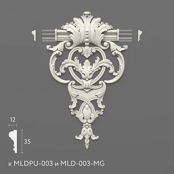
In Interior Designwooden baseboardThis is the foundation of visual architecture. Its height defines the basic module of space. If the skirting is 120 mm high, it sets a specific scale that all other elements must follow. Door casings 70 mm wide will look natural. A ceiling cornice 100–140 mm high will create a harmonious pair. Wall moldings 50–80 mm wide will fit into this proportional system.
But if you add to this 120 mm skirting thin casings 40 mm wide and a narrow ceiling cornice 60 mm, a visual dissonance will arise. The skirting will appear disproportionately heavy and oppressive, "heavy," despite being perfectly normal in size — simply because the other elements do not conform to the scale established by the skirting.
Our factory also produces:


Economic logic: from affordable to expensive
There is also a practical aspect. Skirting is one of the most affordable decorative elements.wooden baseboards for floorThey cost significantly less than, say, carved wooden wall panels or exclusive ceiling outlets. Starting with skirting lets you define the basic level of finishing without risking your budget.
If later it turns out that the chosen skirting requires expensive additions (heavy casings from premium wood, complex moldings), you can still adjust your choice before making costly purchases. But if you first buy an expensive chandelier for hundreds of thousands, and then realize that the skirting must match it (and your budget is already exhausted), you’ll face an irreconcilable contradiction.
Get Consultation
Technological installation sequence
Skirting is installed among the last elements of finishing — after walls, after flooring, but before furniture placement. This means you can choose it early, right at the start of the project, and base your selection of all other elements on it. But changing the skirting after finishing is practically impossible without extensive renovation.
A ceiling cornice can be reinstalled in a day or two. Door casings can be replaced in a few hours. But skirting — especially wooden, carefully fitted to floor and walls, often installed with combined fastening (adhesive + nails) — is extremely difficult to remove without damaging the flooring and lower wall sections.
Therefore, a sensible strategy is to decide on the skirting early and do so consciously, understanding that this choice will determine much in the future.
Skirting as a stylistic marker
The type of skirting instantly signals the interior style. A tall, complex-profiled, routed skirting — this is classic, neoclassical, English style. A medium-height, simple rectangular skirting — Scandinavian minimalism, modern style. A thin concealed skirting or even its absence (shadow gap) — ultra-modern interiors, high-tech.
By selecting the skirting board style, you automatically define the stylistic boundaries for all other elements. A classic skirting board 150 mm high will not suit minimalist hardware and flat casings—they will look out of place. You will need matching door casings with mullion construction, classic casings, possibly wall moldings and panels. The entire interior logic will be built around this initial choice.
Perception Psychology: First Impression
When a person enters a room, their gaze sweeps across the space, absorbing information in fractions of a second. Although few consciously look at the skirting board, the subconscious registers its parameters and draws conclusions about the character of the space.
A heavy skirting board is subconsciously perceived as 'solid,' 'substantial,' 'durable,' 'expensive.' A thin one—as 'light,' 'modern,' 'minimalist,' 'airy.' The absence of a skirting board—as 'avant-garde,' 'unusual,' but sometimes also as 'unfinished.'
If other interior elements contradict this first impression, cognitive dissonance arises. The person may not understand exactly what bothers them, but a sense of discomfort, mismatch, 'something is off' will remain.
Skirting Board Height and Molding Width: The Mathematics of Proportions
The beauty of architecture is mathematics. Proportions, ratios, rhythms—all of this can be expressed in numbers. And there are formulas tested over centuries that help create harmonious spaces.
Classic Proportions: The Golden Ratio Rule
The Golden Ratio (proportion 1:1.618) is a universal principle of harmony discovered even in antiquity. Applied to interior decoration, it works as follows: if the skirting board height is taken as one unit, then the door casing width should be approximately 0.6–0.7 of this value, and the wall molding width—0.4–0.5.
Practical Example:
-
Skirting Board Height: 120 mm
-
Door Casings: 120 × 0.65 = 78 mm (optimal 70–80 mm)
-
Wall Moldings: 120 × 0.45 = 54 mm (optimal 50–60 mm)
-
Ceiling Cornice: 120 × 1.0 or 1.2 = 120–144 mm
These ratios are not absolute, but they work in the overwhelming majority of cases, creating visually pleasing proportions.
Dependence on Ceiling Height
Skirting board height is not an absolute value—it always relates to the room’s height. The higher the ceiling, the more substantial skirting board is acceptable and desirable.
For standard ceilings 2.5–2.7 m:
-
Minimum skirting board height: 50–60 mm (in extreme minimalism)
-
Optimal: 70–100 mm
-
Maximum: 120 mm (at 2.7 m)
For high ceilings 3.0–3.5 m:
-
Minimum: 80 mm
-
Optimal: 100–140 mm
-
Maximum: 180 mm
For very high ceilings 4 m and above:
-
Minimum: 100 mm
-
Optimal: 140–200 mm
-
Maximum: 250 mm and above
Calculation Formula: Skirting Board Height = Room Height / 25–30
For a room height of 2700 mm:
2700 / 27 = 100 mm - optimal skirting height.
Coordination with wall moldings
If wall moldings are planned for use in the interiorof polyurethane moldingsto create decorative panels or frames, their width should be coordinated with the skirting height.
Principle of size hierarchy:
Skirting (as a basic element) should be the largest horizontal element on the wall. Wall moldings - medium-sized. Thin decorative strips and pilasters - the smallest.
If the skirting has a height of 100 mm:
-
Main wall moldings (for creating panels): 50-70 mm
-
Additional moldings (within panels): 30-40 mm
-
Decorative strips: 15-25 mm
Violation of this hierarchy creates visual chaos. If a wall molding is wider than the skirting, it begins to look like an alien element, 'glued' to the wall, rather than an organic part of the architecture.
Ceiling cornice: completion of verticality
Ceiling cornice is the upper boundary of the wall, the logical counterpart to the skirting. There should be proportional correspondence between them.
Classic rule:
Ceiling cornice height = skirting height × 1.0–1.5
That is, the cornice may be equal to the skirting (creating a symmetrical frame) or slightly larger (creating an accent on the upper part of the space).
Examples:
-
Skirting 80 mm → cornice 80–120 mm
-
Skirting 100 mm → cornice 100–150 mm
-
Skirting 120 mm → cornice 120–180 mm
In modern interiors, deviations from this rule are possible (for example, a massive skirting with a minimalist thin cornice, or vice versa), but such solutions require professional intuition and should be intentional, not random.
Influence of profile on visual mass
Height is not the only parameter determining the visual mass of the skirting. The profile - the cross-sectional shape - is also important.
A simple rectangular profile is visually perceived as lighter than its actual height. A 100 mm rectangular skirting appears less massive than a 100 mm skirting with a complex classical profile (shelf, bead, cove).
A complex classical profile adds visual mass. An 80 mm skirting with an elaborate profile may appear larger than a 100 mm skirting with a simple shape.
This must be considered when coordinating with moldings. If the skirting has an elaborate profile, wall moldings should also have an expressive shape (not necessarily identical, but proportionally complex). If the skirting is minimalist, the moldings should be similarly minimalist.
Room-specific rules: different rooms - different rules
In an ideal world, all rooms in the house would have a single skirting, creating a stylistic unity. But reality often requires compromises.
Grand areas (living room, hall, dining room) - here, a skirting with maximum height and profile richness is appropriate. This establishes the grandeur and formality of the space.
Private areas (bedrooms) - a more restrained skirting, possibly slightly lower or with a simpler profile. Creates intimacy and coziness.
Utility areas (entryways, corridors) - practical mid-height skirting, resistant to mechanical impacts. Here, function is more important than aesthetics.
Wet zones (bathrooms, toilets) - specific solutions (ceramic, stone, moisture-resistant polyurethane skirting), often lower height due to finishing characteristics.
Even when varying skirting height across rooms, it's important to maintain stylistic and proportional unity. If the living room has 120 mm of classic-profile skirting, the bedroom may have 100 mm of the same profile, but not 70 mm of modern minimalist design — this would break the overall coherence.
Matching with door casings and staircase: the triad of basic elements
Skirting, door casings, and staircase elements form a triad of basic wooden (or wood-imitating) interior elements. Their consistency is critically important for the spatial integrity.
Door casings: vertical echo of skirting
Casings are vertical frames around door openings. And they must be stylistically and dimensionally coordinated with the skirting.
Rule of material unity:
If the skirting is wooden, the casings must also be wooden (or convincingly imitating wood). Wooden skirting + plastic casings = cheap, mismatched look.
Rule of color coordination:
Ideally, skirting and casings should be the same color. This creates a visual frame for the space, where vertical lines of the casings echo horizontal lines of the skirting.
Exceptions are possible (e.g., dark skirting matching floor color, white casings matching door color), but this must be an intentional design decision, not a coincidence.
Rule of proportionality:
Casing width = 0.6–0.8 of skirting height (as previously mentioned).
Examples:
-
70 mm skirting → 45–55 mm casing
-
100 mm skirting → 60–80 mm casing
-
120 mm skirting → 75–95 mm casing
Rule of profile correspondence:
The casing profile should correspond to the skirting profile. If the skirting has a classic profile with molding and coves, the casing should have similar elements (not necessarily identical, but in the same stylistic context).
If the skirting is a simple rectangle, the casing should also be minimalist. Mixing classic skirting with minimalist casings creates a stylistic mismatch.
Skirting and casing junction: technical and aesthetic aspect
Where the skirting meets the door casing, a junction node forms. Its proper execution is a sign of professionalism.
Option 1: Skirting butts against casing flush
The skirting is cut at a right angle and rests against the casing. This is simple but not the most elegant solution. The end of the skirting remains visible.
Option 2: Skirting is cut at a 45-degree angle
A neat corner joint is created, resembling an external angle. More refined but requires precise cutting.
Option 3: Skirting 'extends under' the casing
The casing is installed over the skirting, covering it. Possible if the casing is wide enough and projects from the wall. Visually, the casing appears to run from floor to top of the opening, creating a unified vertical line.
Option 4: Casing is installed at skirting height
The casing does not start from the floor but from the top edge of the skirting. Between the floor and the casing is the skirting, continuing around the entire perimeter. A classic solution for traditional interiors.
The choice of the option depends on the interior style and construction of the elements, but it should be consistent throughout the house. If in one room the skirting board is flush, in another at 45 degrees, and in the third under the casing - it looks unprofessional.
Staircase: the most complex element of coordination
If there is a staircase in the house, its elements (balusters, posts, risers, skirting along the stair run) must be coordinated with the floor skirting.
Staircase skirting (skirting board):
This is a protective strip running along the wall along the sloped staircase. Its height and profile must match the floor skirting. Visually, this creates the impression that the skirting 'rises' along the staircase, connecting floors.
Balusters:
If the balusters are wooden, their wood species and color must match the skirting. A dark oak skirting requires dark oak balusters. A white painted skirting requires white balusters.
The baluster profile (turned, flat, carved) must correlate with the complexity of the skirting profile. Simple skirting + ornate balusters = visual mismatch.
Posts:
Staircase support posts are the most massive wooden elements. They must be made of the same wood species and color as the skirting and balusters. The height of the post is not related to the height of the skirting (determined by the railing height), but the stylistic approach must match.
Risers:
Vertical parts of the steps. They can be painted in the skirting color (creating a vertical rhythm) or in a contrasting color. But if the skirting is wooden with visible grain, the risers should also show the wood grain (even if the color is different).
Skirting and thresholds: micro-detail with great significance
Room thresholds (transition strips between different floor coverings) - another element that must be coordinated with the skirting.
Color coordination:
The threshold should ideally be the same color as the skirting. If the skirting is dark oak, the threshold should also be dark oak. This creates a color logic: all 'frame' elements (skirting, thresholds, casings) are the same color.
Material coordination:
A wooden skirting requires wooden or convincingly wood-imitating thresholds. Aluminum thresholds 'gold' or 'bronze' with a wooden skirting - cheap look.
Width:
Thresholds are usually narrower than skirting (30-50 mm vs 70-120 mm skirting), but if the threshold is too narrow (20 mm) and the skirting is bulky (120 mm), disproportion occurs. Optimal ratio: threshold width = 0.3-0.5 of skirting height.
Color coordination: skirting as a color anchor
The color of the skirting is one of the key colors of the interior, creating the basis for the entire color composition. It determines how walls, floors, furniture, and textiles will be perceived.
Three classic color solution strategies
Strategy 1: Skirting in floor color
The skirting is matched to the floor covering, creating a unified horizontal plane that visually expands the floor. Walls appear lighter and more airy.
Advantages:
-
Visual expansion of floor area
-
Walls appear higher
-
Suitable for small rooms
-
Ease of selection (skirting is often sold in combination with floor covering)
Disadvantages:
-
Less distinct boundary between floor and wall
-
Skirting becomes almost invisible (good for minimalism, bad for classic)
When to use:
For modern interiors, small spaces, when you want to visually expand the room.
Baseboard is painted the same color as the walls, becoming their continuation. The floor visually separates, becoming an independent element.
Walls appear more substantial and grounded.
Advantages:
-
Wall color works more actively in the interior.
-
Suitable for expressive wall colors (not only white).
-
Suitable for expressive wall colors (not only white)
Disadvantages:
-
Visual reduction of ceiling height.
-
The floor may appear 'inserted' into the space, rather than an organic part of it.
When to use:
For high rooms where walls have a beautiful saturated color that you want to enhance. For interiors where wall monolithicity is important.
Strategy 3: Contrasting color baseboard (classic - white)
Whitewooden baseboardAgainst dark floors and colorful walls - a classic solution creating clear spatial graphics.
Advantages:
-
Clear spatial structure.
-
Elegance, classic refinement.
-
Suitable for any floor and wall colors.
-
Baseboard becomes a noticeable decorative element.
Disadvantages:
-
Requires perfect cleanliness (white gets dirty).
-
May appear too contrasting in some interiors.
-
Requires coordination with other white elements (baseboards, cornices).
When to use:
For classical and neoclassical interiors, to create a graphic, structured space. For interiors with other white elements (doors, windows, moldings).
Color wheel: baseboard as a connecting element
In complex color schemes (using 3-5 colors), the baseboard can serve as a connecting element, unifying scattered colors into a composition.
Example:
-
Floor: natural oak (warm honey tone)
-
Walls: gray-blue (cool tone)
-
Furniture: dark walnut (warm, but darker than the floor)
How to connect these colors? Using a baseboard of intermediate shade:
-
Option 1: Gray-brown baseboard (warm gray, unifying the warmth of the floor and coolness of the walls)
-
Option 2: Light walnut color baseboard (darker than the floor, lighter than furniture, creates a gradient)
Color temperature: warm + cool = dissonance
One of the most common mistakes - combining warm and cool shades of the same color.
Example of error:
-
Warm honey-toned oak floor
-
Wooden skirting in a cold gray-beige tone ("white oak")
Both elements are wooden and light, but one is warm and the other is cool. The result is they "argue," creating no harmony.
Rule: All wooden elements must have the same color temperature (either all warm or all cool).
Warm wood tones: natural oak, walnut, cherry, teak, honey and golden hues.
Cool wood tones: white oak, gray ash, bleached species, gray-brown tones.
Black and white: universal solutions with nuances
White skirting:
Universal solution, compatible with any floor and any walls. But "white" is not one color. There are dozens of white shades: cool white with a bluish undertone, warm white with a cream undertone, white with a grayish tone.
When choosing a white skirting, coordinate it with the white color of doors, windows, and ceiling moldings. If the doors are "cool white" and the skirting is "warm white" (ivory), they will appear different, even though both are white.
Black skirting:
Dramatic, modern solution. Black skirting creates clear graphic lines, emphasizing the contours of the space. It pairs well with light floors (creating contrast) and dark floors (blending into a single plane).
But black is an active color; it must be repeated throughout the interior. Black skirting + black window frames or black hardware, or black furniture. A lone black skirting without support will look random.
Color hierarchy: from light to dark
Classic rule: the darkest is the floor, the lightest is the ceiling, intermediate is the walls.
Skirting in this scheme can be:
-
In the color of the floor (dark) — emphasizes horizontal lines
-
In the color of the walls (intermediate) — emphasizes vertical lines
-
Lighter than the floor but darker than the walls (intermediate) — creates a gradient
Breaking this hierarchy (dark walls, light floor) creates an unusual, non-standard effect. In this case, the skirting becomes critically important — it can either support this inversion (light skirting) or soften it (dark skirting, connecting the light floor with dark walls).
Checklist of mistakes: how NOT to do it
Professionals learn not only from positive examples but also from mistakes. Here are the most common errors related to skirting that ruin interior harmony.
Error 1: Too thin skirting for a high ceiling
Manifestation:
Ceiling 3 meters high, skirting only 50 mm tall. Or, completely omitting skirting in favor of a "shadow gap" in a room with classical architecture.
Consequences:
The space appears unfinished, lacking a foundation. Walls seem to "float in the air." There is no visual support, and the boundary between floor and wall is blurred.
Solution:
Follow proportions: skirting height = room height / 25-30. For a 3-meter room, minimum 100 mm, ideally 120 mm.
Error 2: Skirting and casing in different colors (without a concept)
Manifestation:
Dark oak skirting matching the floor color + white casing matching door color, without a thought-out color logic.
Consequences:
Spatial fragmentation, lack of color cohesion. Elements appear randomly chosen.
Solution:
Either skirting and casing are the same color (creating a unified frame), or an intentional contrasting scheme, where contrast is supported by other interior elements.
Error 3: Cheap plastic skirting with expensive wooden casings
Manifestation:
Saving on skirting (plastic "wood-like") when buying expensive wooden casings, doors, and parquet.
Consequences:
Cheap look of the entire interior. The plastic skirting reveals itself upon close inspection (unnatural texture, plastic sheen), which diminishes the expensive finish.
Solution:
If the main elements are wooden, the skirting should also be wooden. Saving on skirting is saving in the wrong place. Better to choose a simpler profile but natural material.
Error 4: Skirting is heavier than the ceiling cornice
Manifestation:
Skirting 120 mm with an elaborate profile + ceiling cornice 60 mm with a simple shape.
Consequences:
The space appears inverted, heavy at the bottom and light at the top. Visual hierarchy is disrupted.
Solution:
The ceiling cornice should not be less than the skirting (ideally slightly larger or equal). If skirting is 120 mm, cornice should be 120-150 mm.
Error 5: Profile inconsistency
Manifestation:
Classic skirting with complex profile (with moldings, coves, carving) + simple modern casings with flat cross-section.
Consequences:
Style mismatch. Elements appear to belong to different interiors.
Solution:
Profiles must be consistent. Classic skirting requires classic casings (not necessarily identical, but in the same style). Modern skirting requires modern casings.
Error 6: White skirting on white walls with a light floor
Manifestation:
White skirting, white walls, light parquet. Everything blends into a single-tone patch.
Consequences:
Lack of spatial structure, unreadable architecture, sense of incompleteness.
Solution:
There must be contrast with at least one element. Either the floor is darker (creating contrast with white), or the walls are colored, or the skirting is not pure white but has a slight tint (ivory, cream).
Error 7: Ignoring skirting during planning
Manifestation:
Skirting is chosen at the last moment, when walls, floor, doors, and furniture are already done. It turns out that the desired skirting doesn't fit in price, size, or color.
Consequences:
Compromise solution that doesn't satisfy. Skirting doesn't match the overall concept and stands out of style.
Solution:
Include skirting selection in the initial stage of interior planning. Define its parameters (material, height, profile, color) before purchasing main materials.
Error 8: Different skirting in adjacent rooms
Manifestation:
In the living room, skirting 120 mm with classic profile; in the adjacent dining room (no door, open space) — skirting 70 mm with minimalist shape.
Consequences:
Visual break in space, lack of continuity. The view stumbles at the room boundary.
Solution:
Within a single open space (even if formally different rooms), skirting must be the same. Skirting change is allowed only behind a door or at a clear architectural boundary.
Error 9: Skirting wider than casing
Manifestation:
High skirting (120 mm) with narrow casings (50 mm). At the junction, skirting protrudes beyond the casing.
Consequences:
Violation of proportions, visual clumsiness. The casing appears disproportionately thin.
Solution:
Casing must be wider than skirting or at least equal to it. If skirting is 120 mm, casing should be at least 75 mm, ideally 80-90 mm.
Error 10: Warm skirting + cold doors (or vice versa)
Manifestation:
Oak skirting with warm golden tone + doors made of bleached ash in cold gray-white tone.
Consequences:
Color dissonance. Elements do not create harmony and appear mismatched.
Solution:
All wooden elements must have the same color temperature. Either all warm tones or all cool tones.
FAQ: Popular questions about skirting boards in interior design
Can different skirting board heights be used in different rooms?
Yes, but with limitations. In formal areas (living room, hallway), a higher skirting board is acceptable; in private areas (bedrooms), it should be slightly lower. However, the difference should not be drastic (e.g., 120 mm in the living room and 100 mm in the bedroom is acceptable, but 120 mm and 60 mm is too large a gap). Within a single visual zone (e.g., combined kitchen-living room), the skirting board must be uniform.
Which is more important when choosing skirting board color — floor or door?
There is no universal answer; it depends on the concept. The classic approach is to match the skirting board to door and casing colors (creating a unified spatial frame). The modern approach is to match the skirting board to the floor color (extending the horizontal plane). Both options are correct; the choice depends on the desired effect and interior style.
Is it necessary to buy skirting board from the same manufacturer as the flooring?
Not necessary, but recommended if you want exact color matching. Flooring manufacturers usually offer skirting boards in matching tones from their collections, ensuring perfect alignment. If purchasing skirting board separately, bring a floor sample for color comparison under good lighting.
Which skirting board to choose for a small room — high or low?
For small rooms with standard ceilings (2.5–2.7 m), the optimal skirting board height is medium — 70–90 mm. Too low (50 mm) will appear insignificant; too high (120 mm and above) will visually 'eat' wall height. Also, for small rooms, skirting boards in floor or wall color (not contrasting) are preferable to avoid fragmenting the space.
Do you need to replace skirting board when changing flooring?
It depends on the situation. If the new flooring is close in color to the old one, the skirting board can remain. If the color changes radically (e.g., from dark oak to light beech), it’s better to replace or repaint the skirting board. Wooden skirting boards can be sanded and repainted to the desired color — cheaper than replacement.
Can wooden skirting board be painted white?
Yes, wooden skirting board paints excellently. The process: sanding, priming, painting with enamel or acrylic paint in 2–3 layers. This allows changing interior style without replacing the skirting board. From classic 'wood' it transforms into modern white.
How often should skirting board be replaced?
Quality wooden skirting board lasts decades. It should only be replaced during major interior concept changes (style change, radical color shift) or due to physical wear (cracks, chips, deformation). During cosmetic repairs (wallpaper replacement, wall painting), skirting board is usually left unchanged.
What to do if skirting board is already installed but doesn’t match new doors?
Options: 1) Repaint skirting board to match new door casings. 2) Replace door casings to match the skirting board. 3) If skirting board suits you and doors are expensive and you don’t want to replace them, introduce an intermediate color in the interior (furniture, textiles) to link skirting board and doors. 4) As a last resort — accept the contrast if it’s not critical.
Which skirting board material is better — wood, MDF, or polyurethane?
For classic and neoclassical interiors, where naturalness and elegance matter, preferwooden baseboards for floorThey are more expensive but look and feel differently. MDF is a good price-quality compromise, looks respectable, cheaper than wood. Polyurethane is for humid areas or budget projects. Plastic — only for utilitarian zones (technical rooms, garages).
Can wooden skirting board be combined with polyurethane moldings on walls?
Yes, this is a common practice. The key is to coordinate style, scale, and color. If skirting board is classic profile,Moldings made of polyurethanemoldings should also be classic. If skirting board is dark wood, moldings are painted white or light tone (classic contrast), or match the skirting board color (for unity).
Conclusion: the conductor plays first violin
The metaphor of skirting board as conductor proves more accurate than it may seem. The conductor is not the loudest instrument in the orchestra, often inaudible in overall sound. Yet it sets the tempo, monitors balance, and directs musicians. Without a conductor, the orchestra becomes cacophony, where each musician plays independently.
Similarly, the skirting board. It is not the most noticeable interior element, not the most expensive, not the most dramatic. Yet it sets the basic coordinate system in which all other elements find their place. Its height determines the scale of decor. Its color creates the base color palette. Its profile dictates the style of all wooden and decorative elements.
Starting interior design with a conscious choice of skirting board gives you a reliable foundation on which the rest of the composition easily builds. Door casings are logically selected — proportional to skirting board. Wall moldings naturally coordinate — following the established scale. Ceiling cornice finds its size — as a logical completion of verticality. Colors form a harmonious palette — because the base color is defined.
Ignoring skirting board at the initial stage, leaving its selection 'for later', risks ending up with a disjointed interior where elements are not connected, where each detail exists independently, where there is no cohesion or completeness. And correcting this will be difficult — a skirting board installed last must somehow coordinate with already existing elements, which often proves impossible without compromises.
STAVROS Company offers the widest selection ofwooden baseboardsof various heights, profiles, wood species. From minimalist modern profiles with rectangular cross-sections to richly decorated classical baseboards with carving and milling. Oak, beech, larch, ash — species to suit any taste and budget. Options for staining, tinting, and patination — to achieve precise color matching with the interior design concept.
The assortment also includesMoldings made of polyurethanefor walls and ceilings that can be perfectly coordinated with the chosen baseboard in scale, style, and color. Professional consultants will help select a set of elements that create a harmonious composition.
Start with the baseboard. Choose the right size, right profile, right color. And the rest of the interior will come together like a puzzle, where each detail finds its only correct place. Because the conductor has already set the tempo, defined the tonality, indicated the direction. All that remains is to follow this wise logic, and your interior will sound like a well-tuned orchestra, where each instrument is in its place, and the overall sound delights and impresses.