Article Contents:
- Accent philosophy: one against many
- One baroque piece per zone rule
- Baroque as a bridge between eras
- Carving: gradations from restrained to ornate
- Light carving: hinting at baroque
- Medium carving: a statement of style
- Heavy carving: theatrical opulence
- Depth of carving: why it matters
- Gilding: the line between refinement and excess
- Localized gilding: accents on accents
- Full gilding: maximalism and risk
- Patina gold: effect of antiquity
- Alternatives to gold: silver, bronze, copper
- Fabric: tactile luxury and visual weight
- Velvet: baroque classic
- Silk and satin: sheen and delicacy
- Jacquard: pattern and texture
- Solid color upholstery: when carving speaks for itself
- Composition: how to place baroque accent and surroundings
- Rule of contrasting surroundings
- Symmetry as a method of integration
- Asymmetry as a modern approach
- Center of the room: when baroque furniture demands a starring role
- When center is justified: dining table, bed
- When center is excessive: chairs, chests, consoles
- Visual center vs geometric center
- Proportions: scale of baroque furniture to room volume
- Rule of thirds: furniture should not occupy more than one-third of visible wall height
- Width of the item to wall width: balance of mass
- Depth of furniture and passageways
- Usage scenarios: where baroque accent works best
- Living room: chair by the window
- Bedroom: chest as an alternative to headboard
- Entryway: console and mirror
- Dining room: table as compositional anchor
- Mistakes when buying baroque furniture: what to avoid
- Error 1: Buying a complete baroque set
- Error 2: Placing baroque furniture in a small room
- Error 3: Not considering upholstery color
- Error 4: Incorrect lighting
- Error 5: Buying imitation instead of quality piece
- Conclusion: baroque as punctuation in interior text
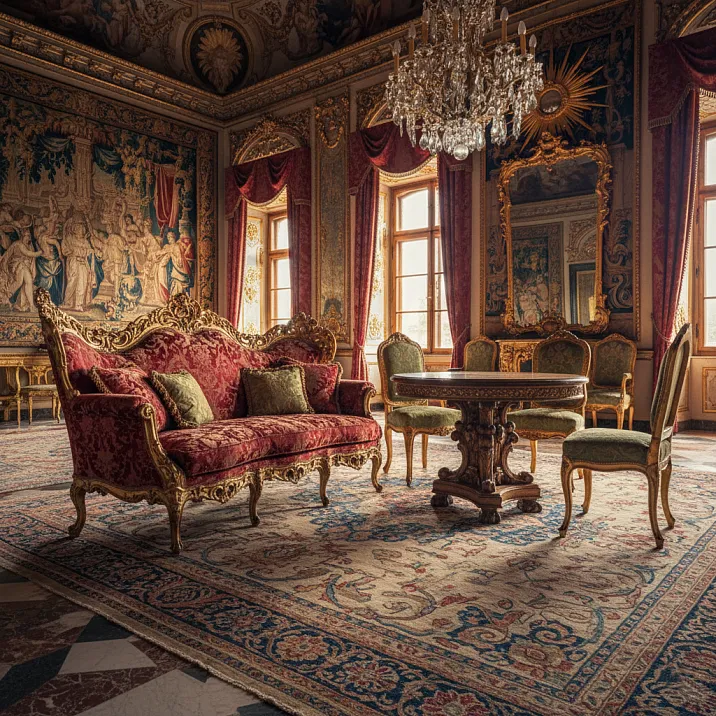
Baroque in interior design is a temptation that easily leads to losing sense of proportion. One carved gilded chest looks like a work of art, two — already excessive, three — and the room becomes a museum exhibit or, worse, a cheap restaurant’s decor. The problem isn’t the style itself, but its dosage. Baroque was born in an era when palaces were built with dozens of rooms, each five meters high, with windows reaching human height. In such spaces, abundance of carving, gilding, heavy fabrics was perceived naturally. Modern apartments, even spacious ones, have a different scale: ceilings 2.7–3.2 meters, rooms 20–40 square meters. Attempting to reproduce baroque exactly as it was leads to visual overload, where the eye has nowhere to rest from the abundance of details. But there is another way:Buy Baroque furniturenot to create a baroque interior, but as an accent in a neutral or classical space. One carved and gilded chair surrounded by restrained furniture, one chest as a focal point in the bedroom, one console in the entryway — this is enough to introduce luxury without turning the home into a Versailles copy. In this article, we’ll examine not the history of the style, but the practical mechanics: how to choose baroque items based on the degree of carving and gilding, how upholstery fabric affects the visual weight of furniture, how to build a composition around a baroque accent, when to place such furniture in the center of the room, and when against the wall, and what proportions of the item to the room preserve balance.


Accent philosophy: one against many
Baroque is a style where every item strives to be the main focus. A carved gilded chest does not want to be a background element; it demands attention. A carved chair with brocade upholstery does not tolerate competition. This is not a flaw, but the nature of the style: baroque was created to demonstrate wealth and power, every piece of furniture was a statement. But in one space, five statements cannot coexist simultaneously — they shout over each other, and in the end, none is heard.


One baroque item per zone rule
In a living room of 25–30 square meters, one large baroque item is sufficient: either a chest, or a console, or a pair of chairs. Not all at once. The rest of the furniture — sofa, coffee table, wardrobe — can be in a classical style, but restrained, without heavy carving or gilding. They create a background on which the baroque accent sounds loud and clear.
In the bedroom, this could be a bed with a carved headboard or a chest with gilded appliqués. Nightstands and wardrobes — neutral, simple shapes, possibly made of the same wood, but without decoration. The baroque headboard becomes the visual center, everything else supports it without competing.
In the dining room — a table with carved legs or a buffet with gilding. Chairs may be classical, but simple in shape. A chandelier, perhaps crystal (it is associated with baroque), but not overloaded with pendants.
This rule is not rigid, but useful. If you break it, do so consciously, understanding the risk of overload.
Our factory also produces:


Baroque as a bridge between eras
One baroque item in a modern or neoclassical setting — is not eclecticism, but a dialogue between eras. Modern minimalism is built on the absence of decoration, on clean forms, on emptiness as a value. Baroque is the opposite: decoration as a value, ornament as content. One baroque item in a minimalist space creates tension, making the interior more interesting. The emptiness around emphasizes the excess of baroque, while baroque, in turn, makes emptiness not boring, but meaningful.
In neoclassicism, the baroque accent works as a reminder of roots. Neoclassicism is simplified, rationalized classicism, where excess is removed, leaving only structure. A baroque item returns emotion, theatricality, which neoclassicism sometimes lacks.
Get Consultation
Carving: gradations from restrained to abundant
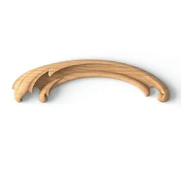
Carving is the foundation of baroque aesthetics. It is not a flat ornament drawn on the surface, but a three-dimensional sculpture, where each swirl, each leaf protrudes above the surface, casts a shadow, creates a play of light. But carving comes in different degrees of complexity and abundance, and this determines how strongly the item will dominate in the interior.
Light carving: hint of baroque
Light carving consists of individual decorative elements on smooth surfaces. A commode with carved appliqués on the corners but smooth drawer fronts. A chair with carved legs and armrests but a simple back. A console with a carved frieze under the tabletop but without carving on the legs.
Such furniture easily integrates into restrained interiors. The carving is present, hinting at baroque, but not shouting. It's a good choice for first experience with baroque accents or for small rooms where abundant carving visually overloads the space.
Medium carving: a statement of style
Medium carving is when decoration occupies a significant portion of visible surfaces, but not all. A commode where drawer fronts are framed by carved borders, corners adorned with appliqués, legs carved, but drawer central panels smooth. A chair where the back, armrests, and legs are carved, but the seat (covered by upholstery) is undecorated.
Such furniture is unambiguously read as baroque. It attracts attention and demands space around it. In a room with medium-carved furniture, restraint is needed in everything else: walls without heavy moldings, simple textiles, no complex patterns.
Heavy carving: theatrical luxury
Heavy carving is when almost all visible surfaces are covered with ornament. A commode where each drawer is a solid composition of scrolls, leaves, flowers, where carving extends from fronts to sides, legs, and upper parts. A chair where the back is a solid carved panel, armrests sculptural volutes, legs curved with multi-level relief.
Such furniture is a work of art, a museum exhibit. It demands special care: space around it, proper lighting (to let the carving cast expressive shadows), minimal other accents in the room. Heavy carving is maximal baroque, and buying such furniture is worth only if you are ready to subordinate the entire room’s interior to it.
Carving depth: why it matters
Carving is evaluated not only by coverage area but also by relief depth. Fine carving (relief depth 5–10 mm) creates a delicate pattern resembling engraving. Deep carving (20–40 mm and more) is sculpture, where elements almost detach from the base, hanging in the air.
For accent furniture in modern interiors, choose medium or deep carving. Fine carving may get lost, especially if the furniture is dark. Deep carving works under any lighting — shadows are deep, relief is clearly readable.
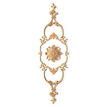
Gilding: the line between elegance and excess
Gilding in baroque furniture is not an option, but almost mandatory. Yet, gold may be minimal (only on accent details) or maximal (entire carving covered), and this radically changes the perception of the object.
Localized gilding: accents on accents
Localized gilding is when only individual protruding elements of carving are gilded: tips of leaves, convex parts of scrolls, tops of volutes. The base of the furniture remains in the natural wood color (dark walnut, redwood) or white enamel. Gold plays the role of light reflections, attracts attention, but does not dominate.
Such furniture looks elegant but not shouty. It easily fits into interiors where restraint with elements of luxury is valued. Localized gilding is a choice for those who want a baroque accent but fear kitsch.
Full gilding: maximalism and risk
Full gilding is when all carving is covered in gold: every scroll, every leaf, every convexity. The base of the furniture (smooth surfaces) may be in contrasting colors — white enamel, black lacquer, saturated blue or green. Or even gold itself.
Fully gilded furniture is baroque in its most theatrical, palace-like form. Such furniture is stunningly beautiful but demands special care. In a small room, it overwhelms. Under improper lighting (too bright or too yellow), gold looks not noble but fake. Surrounded by other gilded items, it creates a sense of excess, even vulgarity.
Full gilding is a choice for spacious rooms (from 30 square meters), with high ceilings (from 3 meters), with good natural or thoughtfully designed artificial lighting. And definitely — as the only such item in the room.
Patinated gold: effect of antiquity
Patinated gold is gilding with a patina (darkening) applied to recesses of the relief. Gold appears not bright and new, but aged, with green or brown tones in the recesses. This creates an antique effect, as if the furniture has passed through centuries.
Patinated gold is softer, calmer, than pure gold. It doesn’t reflect light sharply, doesn’t shout about its value. For modern interiors where authenticity and history (even imitated) are valued, patinated gold is the optimal choice. The furniture looks not like a new piece, but like an heirloom, which adds value in the viewer’s eyes.
Alternatives to gold: silver, bronze, copper
Gold is classic baroque, but not the only option. Silvering (covering with silver or silver imitation) creates a cool sheen, more restrained than gold. Silver carving on white or gray furniture is baroque with a minimalist character, if such a thing is possible.
Bronze and copper give a warm, but less bright sheen than gold. Bronze appliqués on dark wood — this is strict, almost masculine baroque, devoid of sweetness.
The choice of metal depends on the overall interior palette. Warm interiors (beige, brown, cream walls) — gold, bronze, copper. Cool (gray, blue, white) — silver, chrome.
Fabric: tactile luxury and visual weight
In baroque furniture, upholstery fabric is no less important than carving and gilding. Heavy, luxurious fabrics enhance the baroque character, while light, neutral ones soften it.
Velvet: baroque classic
Velvet is a fabric with short, dense pile, giving deep, saturated color and soft sheen. Velvet is associated with luxury, palaces, and theatrical boxes. A carved gilded chair upholstered in deep burgundy, emerald, or sapphire velvet — this is quintessential baroque.
But velvet is visually heavy. It attracts attention and dominates the interior. A velvet armchair in a small living room may visually consume all the space. If you choose velvet, limit yourself to one item (an armchair or a small sofa), and let the rest of the furniture be upholstered in neutral fabrics.
The color of velvet also matters. Dark, saturated colors (burgundy, emerald, sapphire, purple) — maximum luxury, but maximum weight. Light velvet (ash-pink, gray-blue, cream) — a more airy option, baroque with a touch of modernity.
Silk and satin: shine and delicacy
Silk and satin are smooth fabrics with a characteristic sheen. Silk is more expensive, satin (usually synthetic or blended) is cheaper, but visually they are similar. Shiny fabric on baroque furniture enhances the sense of luxury, but the sheen can be excessive.
Velvet upholstery requires careful maintenance — it is easily damaged and stains are difficult to remove. This furniture is not for everyday active use, but for formal areas where it is rarely sat upon.
An alternative — fabrics with a silk-like effect (jacquard with satin weave, artificial silk), which provide a similar sheen but are more practical.
Jacquard: pattern and texture
Jacquard is a fabric with a complex woven pattern (damask, floral ornaments, geometric motifs). The pattern is created not by printing, but by interweaving threads of different colors or textures. Jacquard has a relief surface, and it is pleasant to touch.
Jacquard with damask pattern (large symmetrical floral motifs) — a baroque tradition. Such upholstery is decorative by itself, adding visual complexity to the furniture. But if carving and gilding are already abundant, a large-patterned jacquard may overload the piece. In this case, it is better to choose a jacquard with a small, unobtrusive pattern or a solid-colored fabric.
Solid upholstery: when carving speaks for itself
Solid upholstery without pattern — this is a way to let carving and gilding speak for themselves, without competition from the fabric.Versailles armchairWith abundant carving and gilding, upholstered in a solid, calm-colored velvet, it looks harmonious: carving — the star, fabric — an elegant background.
The color of solid upholstery can be neutral (beige, gray, cream) or accent (burgundy, emerald, blue). Neutral color makes furniture more versatile, easier to fit into different interiors. Accent color enhances drama, but requires support from other interior elements (pillows, curtains, rug of the same or coordinating color).
Composition: how to place baroque accent and surroundings
Baroque furniture does not exist in a vacuum. It is part of a composition, and whether it looks like an accent or an out-of-place element depends on how you arrange it relative to other items.
Rule of contrasting surroundings
Baroque items look best against contrasting surroundings. A carved, gilded armchair against a plain white wall, without paintings, shelves, or moldings — the wall as a clean canvas, the chair as a sculpture on that canvas. A carved commode between two simple geometric cabinets or between two minimalist bedside tables — the baroque commode appears even more striking against restrained neighbors.
If surrounded by other decorative elements (paintings in carved frames, heavy moldings on walls, other carved furniture), it disappears. The eye cannot focus, everything blends into visual noise.
Symmetry as a method of integration
Baroque loves symmetry. If placing a pair of baroque armchairs in the living room, position them symmetrically relative to the room’s axis: at the ends of the sofa, at the ends of the fireplace, at the ends of the window. Symmetry creates a sense of order and balance, making baroque items part of a thought-out composition, rather than random guests.
If a baroque item is alone (an armchair, a commode), you can create symmetry around it: two identical lamps on either side of the commode, a mirror centered directly above it. The baroque item becomes the center of a symmetrical composition, emphasizing its importance.
Asymmetry as a modern approach
Asymmetrical placement — a more modern, relaxed approach. A baroque armchair is not paired, but stands alone, slightly off-center, creating dynamism. This works well in eclectic interiors where different styles and eras coexist.
But asymmetry requires a sense of balance. If placing a baroque armchair to the left of a window, balance it with something on the right — not necessarily another baroque item, but something with similar visual weight: a large potted plant, a floor lamp, a shelving unit.
Center of the room: when baroque furniture demands a starring role
Baroque furniture, by nature, is center-seeking — it wants to be the center of attention. But literally placing furniture in the center of the room requires caution.
When the center is justified: dining table, bed
A dining table with baroque carved legs, placed in the center of the dining room — this is logical. The table always stands in the center, chairs surround it, and the composition is built around it. The baroque character of the table sets the tone for the entire dining room.
A bed with carved headboard, placed in the center of the bedroom — also natural. The bed is the main piece in the bedroom, its place at the center of the wall (or near the center). A baroque headboard makes the bed even more dominant.
A carved-legged side table in the living room center (between the sofa and chairs) — works if the table is not too large and not overloaded with decor. A light carved table on curved legs adds elegance to the living room without dominating.
When the center is overloaded: chairs, chests, consoles
A chair in the center of the room is an odd solution unless it's a throne or an exhibit in a museum. Chairs are placed against walls, in corners, grouped around tables, but not in the center of empty space. A baroque chair is no exception. It can stand by a window, forming a reading nook, or by a fireplace, or paired with another chair at the ends of the sofa, but not in the center of the room.
A chest placed in the center of the room looks like a museum exhibit on a pedestal. This may be justified in a very spacious closet or exhibition hall, but in a residential interior, a chest is a wall-mounted piece, opposite the bed or between windows.
A console — by definition, a piece of furniture placed against a wall (a console is a lightweight table without rear legs, resting on the wall). A baroque console in the hallway against the wall, under a mirror — a classic solution.
Visual center vs geometric center
It is important to distinguish between the geometric center of the room (intersection of diagonals) and the visual center (what first catches the eye upon entry). The visual center may be the wall opposite the door, the window area, or the fireplace.
Baroque furniture should be placed in the visual center, but not necessarily in the geometric center. A carved chest opposite the entrance to the bedroom — a visual center, although it stands against the wall, not in the center of the room. A baroque console under the mirror in the hallway opposite the door — the first thing you see upon entering the apartment.
Proportions: scale of baroque furniture to room volume
Baroque furniture is often larger than usual: high-backed chairs, heavy chests, wide tables on curved legs. This is part of the style: baroque does not like miniaturization. However, large furniture in a small room creates a sense of confinement.
The one-third rule: furniture should not occupy more than one-third of the visible wall height
If the ceiling height is 2.7 meters, a baroque chest or console should not exceed 90 centimeters. A carved chair with a high back may be 120-130 cm (this is an exception, as the chair is perceived vertically, and the high back is justified both functionally and visually).
This rule is approximate but useful. If furniture occupies half the wall height, it visually presses down, making the ceiling appear lower.
Width of the item to width of the wall: balance of mass
A baroque chest 180 cm wide against a 2-meter-long wall — too much; the chest is almost equal to the wall, with no space at the edges. Against a 3-meter-long wall, the same chest looks harmonious: 60 cm of free space remains on each side, and the chest does not press on the corners.
Optimal ratio: the width of the furniture should be 50-70% of the width of the wall it stands against. This leaves enough free space on the sides, making the furniture appear as part of the wall, not as a barricade.
Depth of furniture and walkways
Baroque furniture is often deeper than usual: curved forms, protruding carved elements add volume. A console may have a depth of 50-60 cm (standard — 30-40), a chest — 60-70 cm. This must be considered when planning walkways.
The minimum width of a walkway in a room is 70 cm. If you place a deep baroque chest in a narrow bedroom, the walkway may shrink to 50 cm, making movement uncomfortable. In this case, either choose less deep furniture, or place it against a wall where there is no walkway (end wall of the room).
Usage scenarios: where baroque accents work best
Let’s examine specific examples where a single baroque piece transforms the interior without overloading it.
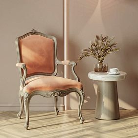
Living room: chair by the window
Modern living room with a minimalist sofa, glass-and-metal coffee table, smooth walls without decor. By the window, creating a reading nook — a carved gilded chair upholstered in emerald velvet. Beside it, a lamp with a simple shade, and a small rug underfoot.
The chair is the only baroque piece, and precisely because of this, it works. It brings warmth, history, and tactile quality to the modern space. Sitting in it by the window with a book, you feel like a hero of a 19th-century novel. But when you look at the room as a whole, it remains modern, not museum-like.
Bedroom: chest as an alternative to headboard
Bedroom with a simple bed without a headboard (or with a minimalist fabric-covered headboard), white walls, light parquet flooring. Opposite the bed — a baroque chest with carved facades, gilded appliqués, marble top. On the chest, a mirror in a simple frame, two lamps.
The chest is the visual center of the bedroom. It is sufficiently large and decorative to compensate for the absence of an expressive headboard. This solution is for those who want a baroque accent but do not want a complicated bed.
Hallway: console and mirror
Narrow hallway, white walls, built-in wardrobe with smooth facades. Against the wall opposite the entrance — a baroque console on curved carved legs, gilded. Above the console, a mirror in a gilded frame (baroque frame, but not overloaded). On the console, a vase or tray for keys.
This is the first thing you see upon entering the apartment. The console sets the tone, hinting that the apartment values beauty and history. But further, in other rooms, the interior may be more restrained.
Dining Room: Table as the Composition Anchor
Dining room with simple walls, minimalist buffet or sideboard. In the center — a dining table with baroque carved legs, a tabletop made of solid dark wood. Around the table are simple, classic chairs, but without carving — wooden with soft seats.
The table is the anchor of the composition. Its carved legs are visible beneath the tabletop, creating visual interest but not dominating (the tabletop is large, legs are only at the corners). Chairs are intentionally simple to avoid competing with the table.
Mistakes When Buying Baroque Furniture: What to Avoid
Even knowing the theory, it's easy to make mistakes in selection. Let's examine typical errors.
Error 1: Buying a Complete Baroque Set
You saw a beautiful baroque set for the living room in a store: sofa, two chairs, coffee table, console — all carved, gilded, as a set. You bought everything. You arranged it in the living room. You ended up with a museum or furniture store salon, but not a livable space.
How to avoid it: buy one or two items from the set, at most three if the room is very large. The rest — neutral, from other sources.
Error 2: Placing Baroque Furniture in a Small Room
A large carved chair with a high back in a 12-square-meter room with a 2.5-meter ceiling. The chair takes up a quarter of the room, visually presses down, making the space even smaller.
How to avoid it: for small rooms, choose baroque items of smaller scale: console instead of chest, chair instead of armchair, small table instead of large one. Or use white baroque furniture with light gilding — it visually feels lighter than dark furniture.
Error 3: Not Considering Upholstery Color
You bought a baroque chair upholstered in bright red velvet. In the store, against other baroque items, it looked natural. At home, against gray walls and modern furniture — it looked like an alien object, too loud.
How to avoid it: if you're buying baroque furniture as an accent in a restrained interior, choose upholstery in calm, neutral, or muted colors. Saturated bright colors require support from other interior elements.
Error 4: Incorrect Lighting
You bought a carved gilded chest, placed it against a wall with no window and no lights. The carving is in shadow, the gilding doesn't gleam, the chest looks gloomy, details are not visible.
How to avoid it: baroque furniture requires good lighting. Side lighting (from a window or a side lamp) reveals the carving, gilding gleams. Plan placement with lighting in mind.
Error 5: Buying an Imposture Instead of Quality Item
You decided to save money, bought 'baroque-style' furniture made of MDF with glued-on plastic 'carved' elements, 'gilded' with gold-colored paint. From afar, it looks similar, up close — cheap and fake.
How to avoid it: baroque is a style where quality is critical. Carving must be real (wood, hand-carved or high-quality machine carving), gilding — real gold or quality imitation (gold leaf, metallic powder-based gold paint), but not just yellow paint. It's better to buy one quality item than five cheap imitations.
Conclusion: Baroque as Punctuation in Interior Text
Baroque furniture in a modern interior — it's not an attempt to recreate the past, but a way to place a visual accent, an exclamation mark that draws attention and sets an emotional tone. One carved gilded item surrounded by restrained forms works like a jewel: it shouldn't be on every finger and in every ear, one is enough to emphasize the image.
to buy Baroque furnitureUnderstanding baroque means not only appreciating the beauty of the style, but also its power. Baroque dominates; it cannot be background. Therefore, choosing a baroque item is always a decision about what will be the main focus in the room, around which the composition will be built. Carving, even moderate, creates visual complexity that the eye reads as richness of form. Gilding, even local, adds light reflections that make the item alive, changing depending on the time of day and angle of light. Upholstery fabric — velvet, silk, jacquard — provides tactile and visual richness that contrasts with smooth modern surfaces.
Composition around a baroque accent is built on the principle of contrast: the more decorative the accent, the more restrained the surroundings.Classic FurnitureBaroque does not tolerate competition — if there are two baroque items in a room, they must be related (a pair of chairs, a table-and-chair set), but not a random collection of different baroque items.
The center of the room as a place for baroque furniture is justified only if it is functionally logical (dining table, bed). In other cases, a baroque item is placed not in the geometric center, but in the visual one — the spot where the gaze falls first, which forms the first impression of the room.
Proportions of baroque furniture to room size — a critical parameter. Large baroque furniture requires space around it: air, light, freedom. In small rooms, choose smaller-scale baroque items or avoid baroque in favor of more compact styles.
Company STAVROS has been creating for more than 23 yearsclassic furnitureincluding baroque collections, where each item is the result of work by master carvers, gilders, upholsterers.Versailles armchairPresented in the catalog — an example of baroque furniture that can work as an accent: carving is expressive enough to read as baroque, but not overloaded to overwhelm the space. Gilding is local, on protruding elements of carving, creating shine without excess. Upholstery is offered in a wide range of fabrics — from velvet to jacquard, from saturated colors to neutrals — allowing the chair to be adapted to a specific interior.
STAVROS works not only with ready-made collections but also with custom orders: you can adapt the size of an item to a specific space, choose the degree of gilding (from minimal to lavish), select upholstery fabric to match the interior palette. The masters understand that baroque furniture, in a modern context, is often used as an accent, and are ready to adjust the design so that the piece retains its baroque character without dominating excessively.
Each STAVROS item is not a factory-produced item, but the result of handcrafting: carving is done by woodworkers, gilding is applied using traditional techniques (surgical gold, patina, antiquing), upholstery is done by hand, taking into account the anatomy of the form and the aesthetics of folds. The quality of execution ensures that the baroque item will not look like a cheap imitation, but will become a true masterpiece that retains its value over time, possibly even increasing in value, becoming a family heirloom.
Buying baroque furniture is an investment not in quantity, but in quality and emotional impact. One item, chosen with an understanding of its role, its proportions relative to the space, and its connection to the surroundings through composition, can transform an interior more than a dozen neutral items. Baroque is not a background—it is an accent, and precisely in this capacity, used sparingly and consciously, it reveals its power, not turning the home into a theatrical set, but enriching it with layers of meaning, beauty, and history that make the space not merely functional, but alive, expressive, and memorable.