


Article Contents:
- Why the same wood tone in the interior is almost never 'just a coincidence'
- What role does a wooden handle play in the overall composition of doors and furniture
- Handle as a color point on a vertical plane
- Handle as a connecting element between the door and furniture
- Why wooden trim defines the perception of a door more than it seems
- Trim as a visual frame for the opening
- Trim as a connecting element between the door and the wall
- Solid wood trim vs MDF trim: what matters more in tone
- What to compare besides the color itself: wood species, texture, finish, warmth level
- Wood species: the primary comparison point
- Warm or cool: the most subtle and most important parameter
- Matte or glossy: the finish changes everything
- How the wood grain pattern affects the perception of tone
- When you need a maximally identical tone, and when a close but not identical one is better
- Cases where a maximally precise tone is important
- Cases where a 'close' tone is sufficient
- How to select solid wood handles and trim for different interior scenarios
- Light interior: white walls, light furniture, white or gray doors
- Warm beige interior: cream-beige walls, champagne-toned furniture, warm oak flooring
- Classic interior: dark furniture, dark doors, tall door trims
- Modern classic: neutral tones, greige furniture, doors in dark gray-brown color
- Dark furniture and light door: how to work 'in the interval'
- How to link doors and furniture with a single wood scenario: principles and techniques
- Three anchor points instead of solid wood
- Neutral background — a unifying element
- Wood should 'flow' — the principle of logical transition
- Mistakes that make wood on doors and furniture look random
- Mistake 1: Selecting based on a photograph
- Error 2: Comparing samples under different lighting
- Error 3: Not accounting for the finish coating
- Error 4: Taking a casing that is 'approximately similar'
- Error 5: Choosing a handle of a different undertone
- Error 6: Mixing yellow lacquer with natural oil
- Practical checklist before choosing a wooden handle and casing
- Wooden casing in modern and classic interiors: what's the difference in approach
- FAQ: answers to questions about solid wood handles and casings
- Conclusion

There is one aspect in interior design that's hard to explain in words but impossible not to feel: when the wood 'doesn't match'. A door made of light oak, furniture with a warm walnut tint, furniture handles of some vaguely yellow tone, a casing slightly cooler than desired — and all this together creates the impression that the interior was assembled hastily, piece by piece, without a unified concept. Expensive materials, quality finishes, good furniture — yet the space still doesn't 'read' as a whole.
The reason is almost always the same: mismatched wood tones. It's what destroys the integrity of an interior faster than any other finishing mistake. And that's precisely why a wooden handle,Wooden casingThe door and door leaf should be selected not separately, but as parts of a single architectural and color system.
This article is about how to build this system. Without abstractions, without catalog descriptions—only logic that truly works in the space.


Why the same wood tone in an interior is almost never 'just a coincidence'
Many are convinced: just choose 'oak'—and everything will be the same tone. This is the most common and most costly misconception in interior practice.
Wood is a living material, and 'oak' is not a color, but a species. The same oak can be bleached, natural, tinted honey, smoky, tobacco, dark walnut. All of these are 'oak,' but on one wall they not only don't match—they actively clash.
Add to this the finish: oil gives one feel, varnish another, wax a third. Matte 'dampens' the warmth of wood, gloss enhances it. Under the same artificial lighting, two samples of 'warm walnut' can look completely different—if one has an oil finish and the other has a varnish layer with added pigment.
That is precisely why selecting the wood tone for doors and furniture is not a shopping trip with a phone photo. It is methodical work: comparing samples in the same light, understanding the difference between warm and cool undertones, knowing how the finish changes the perception of the species.
And that is precisely why wooden handles, trim, and furniture fronts should be considered in one context, side by side, not each on its own.


What role a wooden handle plays in the overall composition of the door and furniture
Let's start with the least obvious. The handle is a small detail. People often choose it last, after deciding on doors, furniture, trim, flooring. 'Something wooden to match'—a typical task description.
But it's the handle that is the detail the eye focuses on with every use. A person touches the handle with their hands, sees it from arm's length. It's not a background element—it's the foreground.
Our factory also produces:


The handle as a color point on a vertical plane
A door is perceived as a large plane—the eye glides over it as over a background. But the handle stands on this plane as an accent. If its tone clashes with the overall scheme—it's immediately noticeable, and no other correct decisions will fix the impression.
Wooden Handlemade from solid wood without a finish allows you to see the natural wood grain. It's a living, warm object in the hand. But precisely for this reason, it's important that its tone and wood species do not conflict with the tone of the door leaf and casing.
On furniture, the handle performs the same function, only even more concentrated: it can be placed in a row across a cabinet or dresser front—and then the row of handles creates a horizontal rhythm, which is read as a separate band of color. If this color is 'colder' or 'yellower' than the furniture front—the interior falls apart.
Get Consultation
The handle as a connecting element between the door and furniture
Here is the most powerful technique, which is rarely used consciously: a wooden handle can become a 'translator' between the door and furniture if their shades slightly diverge.
Example: furniture made of dark walnut, a door made of natural oak—they are close but not identical. If you choose wooden handles for the furniture in a tone that lies exactly between them—slightly warmer than oak, slightly lighter than walnut—the transition becomes smooth, and the difference in tone is perceived as a conscious play of shades, not as a mistake.
This is not theory—it's practice used by experienced designers. The handle as a 'mediator' between two materials—a very powerful technique for complex interiors.
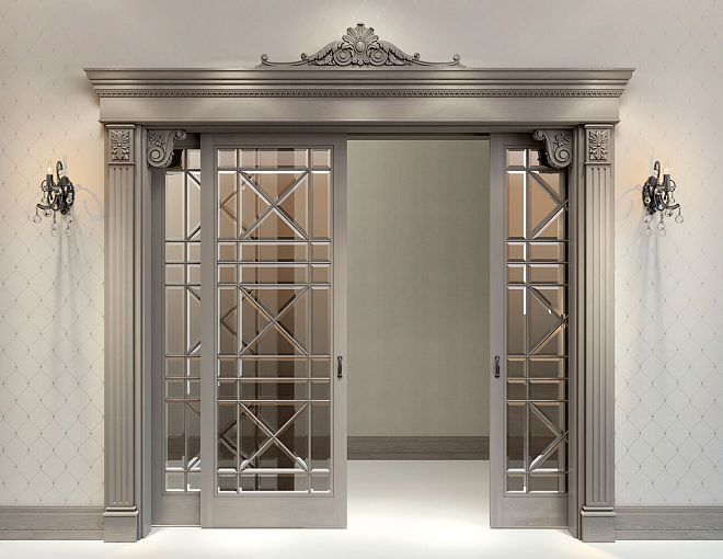
Why a wooden casing defines the perception of a door more strongly than it seems
The door casing is an element that is thought of last. 'Well, it's just a frame around the door.' And in vain.
Door casing as a visual frame for the opening
PreciselyWooden door architraveIt defines the contour that separates the door from the wall. It is the boundary between two materials. And it is precisely at this boundary that the gaze lingers the longest: here the transition occurs, here the relationship of tones is read.
If the solid wood casing matches the wood species and finish of the door leaf, the door unit looks like a single, well-thought-out system. If the casing is made of a different material, a different tone, or has a different finish, it turns into a foreign body that tears the unit apart.
Door casing as a connecting element between the door and the wall
In interiors with warm neutral walls (beige, cream, warm white), a wooden door casing serves another function: it 'introduces' wood into the space. If the casing is a warm oak tone against cream walls, the door integrates organically into the room's overall tone, without standing out.
If the casing is contrasting — dark on a light wall — it becomes an accent frame. This is acceptable but requires support: a similar dark tone in the furniture, floor, or baseboard. Otherwise, the dark casing looks like an installer's mistake.
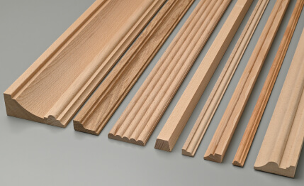
Solid wood casing vs MDF casing: what matters more in tone
Here is a crucial point. An MDF casing is painted or covered with a film — its tone is stable and predictable. Solid wood is alive: it changes shade over time, reacts to lighting, has a natural grain pattern that 'moves' depending on the viewing angle.
If the furniture is solid wood, the door is solid wood — the casing should also be solid wood. Only then will all three elements 'speak' the same language. MDF next to natural wood gives itself away immediately — with a somewhat dead evenness of tone, a lack of natural play.
What to compare besides color: species, texture, finish, warmth level
This is the most in-depth and technically important section of the article. Most mistakes in matching wood tone happen precisely because people only compare color—and miss everything else.
Wood species: the primary point of comparison
Each species has its own texture character and its own natural undertone.
| Species | Natural tone | Texture character | Pairs well with |
|---|---|---|---|
| Light oak | Warm neutral | Pronounced grain, large pattern | Beech, light ash |
| Dark oak / stained | Warm brown | Same, more saturated | Walnut, cherry |
| Beech | Pink-beige, neutral | Fine texture, uniform | Maple, light oak |
| Walnut | Chocolate brown, warm | Straight grain, sometimes with moiré | Dark oak, cherry |
| Ash | Light with pronounced pores | Linear texture | Maple, light oak |
| Maple | Creamy white, almost neutral | Fine uniform texture | Ash, white beech |
| Cherry | Reddish, saturated | Fine, slightly 'satin' | Walnut, mahogany |
This list is not absolute, but a working guideline. If the door is made of light oak and the furniture is made of cherry, the difference in undertones (warm neutral versus reddish) will be noticeable and will require a connecting element. Wooden handles in the 'honey oak' tone can become such a connector.
Warm or Cold: The Most Subtle and Most Important Parameter
All wood is divided into 'warm' and 'cold' based on undertone:
-
Warm — with yellow, golden, honey, reddish notes. Natural oak, walnut, cherry, larch — are warm.
-
Cold — with gray, beige-gray, ashy notes. Whitewashed oak, gray ash, some types of maple — are cold.
Mixing warm and cold wood in one space is very risky. Warm walnut next to cold whitewashed oak creates a feeling of incompatibility, even if both materials are beautiful on their own.
When you match a wooden handle to a door frame and door — the first question is not 'lighter or darker,' but 'warmer or colder.'
Matte or Glossy: The Finish Changes Everything
The same wood species looks different under different finishes:
-
Oil finish — deep, matte, emphasizes texture, 'deepens' the shade, makes it richer and warmer
-
Wax finish — soft semi-gloss, lively feel, slightly lighter than oil
-
Varnish coating — adds shine, 'lifts' the surface, sometimes slightly 'plasticizes' the texture
-
Tinting + varnish — the most unpredictable result: the pigment layer can shift the tone in any direction
Rule: if the door is varnished and the handles are solid wood with an oil finish — the wood tone on the handles will appear more saturated. This is not bad, but it needs to be understood in advance.
How the grain pattern affects the perception of tone
Fine, uniform texture (beech, maple) visually 'lightens' the surface — the eye reads it as more uniform and light. A large, pronounced pattern (oak with tangential cut, walnut with moiré pattern) makes the surface visually richer and heavier, even if the base tone is identical.
This means that when selectingWooden handlesfor a door with a large oak pattern, it must be considered: a fine-textured beech handle of the same shade will appear lighter. Not because it is lighter — but because that's how vision works.
When a maximally identical tone is needed, and when a close but not identical one is better
This is a question to which there is no single correct answer. It depends on the space, the relative arrangement of elements, and what effect you want to achieve.
Cases where a maximally precise tone is important
A small space—a hallway, a small entryway, a compact bedroom. When the door, trim, handles, and furniture are close together and visible at the same time—the slightest discrepancy in tone is immediately noticeable. Maximum precision is needed here: one wood species, one finish, one manufacturer.
Built-in furniture next to the door unit—a sliding wardrobe next to the door, a walk-in closet with a door in the same opening. When furniture and a door literally adjoin, the tone must match as precisely as possible—otherwise, the boundary between them will look like a defect.
A walk-through room or open-plan layout—when several doors are visible at the same time, and all should be perceived as a single row.
Cases where a 'close' tone is sufficient
Different rooms—if the furniture in the bedroom and the door in the living room are in separate spaces and are never visible simultaneously, a wider variation in shades is acceptable.
Different planes—a horizontal parquet floor and vertical doors with trim will never be 'in the frame' simultaneously under normal observation. Here, a shift of 1–2 tones is acceptable if the overall warmth of the wood matches.
Intentional play of shades—when a designer consciously builds a 'warm ladder' of tones: from a light floor to slightly darker furniture to an even slightly darker trim. This works if the difference in tones is consistent and logical—and does not work if the elements are arranged randomly.
The main rule: a small but intentional difference in tone is better than an unsuccessful attempt to achieve a perfect match. 'Almost the same, but not quite' is the worst option because it looks like a mistake.
How to choose a wooden handle and solid wood trim for different interior scenarios
Moving from theory to practice. Let's examine specific interior scenarios.
Light interior: white walls, light furniture, white or gray doors
This is the most common context in modern apartments. Doors are white or 'white matte', furniture is white or gray, walls are neutral.
Task: add wooden handles and trims that introduce the warmth of natural material without disrupting the purity of the light space.
Solution:
-
Solid wood handles without tinting — natural beech or maple, slightly pinkish-cream tone, matte oil finish
-
Wooden trim made of bleached oak or ash, light gray-beige tone
-
Floor made of light parquet boards of the same or similar tone
Effect: in a white interior, wood in a natural tone looks like a warm accent that doesn't overload the space.
Warm beige interior: walls are creamy beige, furniture in champagne tone, floor made of warm oak
One of the most advantageous scenarios for natural wood. A warm space is the best environment for solid wood handles and trims.
Solution:
-
Wooden handles made of natural oak (honey tone) or beech with oil finish
-
Wooden oak door casing in the same or slightly more saturated tone
-
Door made of natural oak or stained in 'honey' color
Effect: the entire space reads as 'warm wood' — from floor to casing, from handle to furniture front
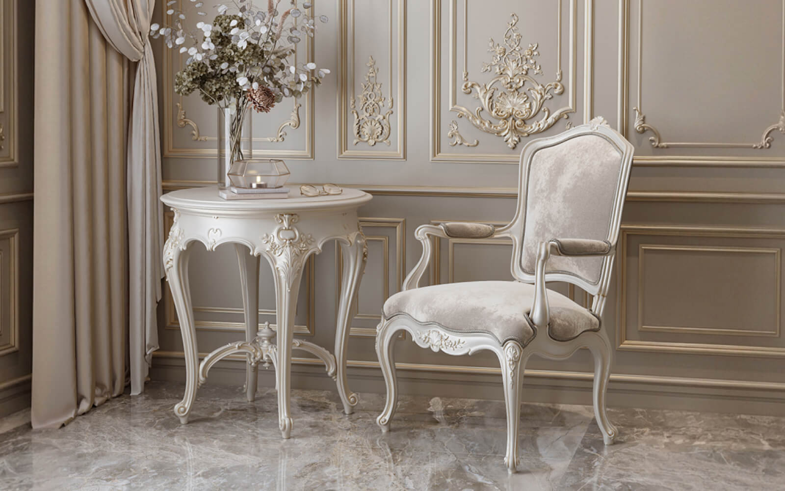
Classic interior: dark furniture, dark doors, tall casings
A different logic works here — not tone-on-tone, but tonal hierarchy
-
Furniture made of walnut or dark oak — the most saturated tone
-
Door and casing made of solid wood in a close tone, but half a step lighter
-
buy wooden handlesmade of walnut or dark oak to match the furniture — this creates a connection through an accent detail
Effect: a rich, saturated interior with well-managed tonal depth
Modern classic: neutral tones, 'greige' furniture, doors in 'dark gray-brown' color
A tricky case because 'greige' (gray-beige) doesn't pair well with all wood tones.
-
A warm gray wall background calls for gray-brown or ashy wood tones—smoked oak, gray ash, 'Richmond oak'.
-
Solid wood handles with a matte oil finish in the 'gray oak' tone.
-
Architrave made from the same or a similar tone of solid stained wood.
The mistake in this scenario: choosing warm honey-toned handles for a cool gray interior. The warm and cool undertones will clash.
Dark furniture and a light door: how to work 'within the interval'.
This is a real situation many face: the door is already there (light), and the furniture bought is dark. How to choose handles and architraves?
The answer is to work on the 'in-between' principle:
-
Architrave in an intermediate tone—slightly darker than the door, but noticeably lighter than the furniture.
-
Handles in a tone closer to the furniture—create a visual 'bridge'.
This solution doesn't make the interior perfect, but visually 'connects' the poles. Read more about techniquesdecorating doorsusing overlays and moldings—there are many precise solutions for non-standard situations.
How to link doors and furniture with a single wood scenario: principles and techniques
Three anchor points instead of solid wood
The most common mistake when working with wood in interiors is trying to 'woodify' everything: floor, doors, furniture, handles, trims, baseboards, ceiling cornices. When wood is everywhere, it stops being a material and turns into a background, losing expressiveness.
A working scheme is three anchor points:
-
Floor—the horizontal plane of wood, the largest
-
Door unit (door + trim + handle)—a vertical architectural point
-
One furniture element—a bed, wardrobe, or dresser, where wooden handles support the overall tone
These three points are enough for the interior to be perceived as intentionally 'wooden' without a sense of overload.
Neutral background — a unifying element
Walls and ceilings are the 'air' of the interior. If they are neutral (white, cream, light gray, warm beige)—they allow wooden elements to resonate without competition. If the walls themselves have a bright texture or saturated color, the wood begins to 'argue' with them.
Wood should 'flow' — the principle of logical transition
In a good interior, the gaze moves from the floor to the walls to the furniture and does not encounter sharp tonal 'steps'. The floor is slightly warmer than the walls. The trim matches the furniture tone. The handle connects the furniture with the door. This is the 'flow' of wood through the space.
When wood 'flows' — the interior seems thoughtful, expensive, cohesive. When it 'jumps' — it seems random, even if all elements are individually high-quality.
The entire assortmentwooden products— from handles to trim and baseboards — should be considered in this logic: as parts of one system.
Mistakes that make wood on doors and furniture look random
This section is not for criticism, but for prevention. Let's analyze typical mistakes that cost people extra money and nerves.
Mistake 1: Selecting from a photograph
Monitor and phone screens provide distorted color reproduction. The same wood sample looks different on different screens. Choosing a wooden handle and solid wood trim 'from a picture' is almost a guaranteed path to disappointment.
Rule: compare samples only in person, preferably under the lighting conditions that will be in the finished interior.
Mistake 2: Comparing samples under different lighting
Samples in a showroom under halogen light, parquet in one store under fluorescent lamps, handles in another store under daylight — these are three different lighting situations. Wood changes shade depending on the light spectrum.
Warm yellow lighting 'warms up' any wood. Cold daylight 'cools it down'. Halogen 'saturates' reddish tones.
Rule: take physical samples from different places and compare them in the same location under the same lighting.
Mistake 3: Not accounting for the finish coating
Comparing an untreated wood sample with one already coated with varnish is a classic mistake. Varnish adds shine and can shift the tone toward yellow or brown. Oil emphasizes depth.
Rule: look at the sample with the same coating that will be on the finished product.
Mistake 4: Taking trim that is 'approximately similar'
A door casing is a frame that a person sees every time they pass by a door. A 'roughly similar' casing on a door opening becomes a constant source of visual discomfort.
Rule: a wooden door casing should be selected from the same species and with the same finish as the door leaf — or from a consciously contrasting material, if that is a design decision.
Mistake 5: Choosing a handle of a different undertone
"Well, the difference is very small, warm and cool, they won't notice" — one of the most common self-deceptions. They will notice. Always. Because the handle is in the zone of maximum attention — at eye and hand level.
Rule: when selecting wooden handles, the first criterion is the temperature of the undertone (warm or cool), not just lightness.
Mistake 6: Mixing yellow lacquer with natural oil
In the 1990s and 2000s, there was a lot of furniture with bright yellow lacquer — such 'Soviet oak' or 'laminate imitating wood'. If there is such an element in the interior and wooden handles and casings with oil finish are placed nearby — conflict is inevitable. Yellow lacquer and living oil speak different languages.
If it is impossible to get away from the old lacquer —Door Decorationusing overlay elements can become a way to update their character without complete replacement.
Practical checklist before choosing a wooden handle and casing
This list will help you make decisions systematically, not intuitively.
Step 1. Identify the anchor material
What already exists and won't change? Gender? Furniture? Doors? This element is your 'anchor,' and everything else is selected to match it.
Step 2. Identify the species of the anchor material
Is it oak, walnut, beech, ash, cherry? Is it a natural tone or a tint?
Step 3. Determine the undertone: warm or cool
Does the anchor material have yellow, honey, reddish notes—or gray, ashy, cool ones?
Step 4. Identify the finish of the anchor material
Oil, wax, varnish, film, tint + varnish? This is important for understanding how other elements will combine.
Step 5. Gather physical samples
Take samples of trim, handles, and furniture fronts and compare them side by side in one place under the lighting that will be in the finished interior.
Step 6. Check the undertone temperature
All samples must belong to the same thermal zone: either all warm or all cool. Mixing is only permissible as a conscious technique.
Step 7. Decide whether you need an exact match or a close one
Adjacent elements (furniture flush against a door) require an exact match. Elements in different zones allow for a close match.
Step 8. Evaluate the finish of the final elements
Ensure that wooden handles and solid wood trim have a finish compatible in character with the existing elements.
After this checklist, the decision will become obvious. AndWooden casingand handles for it are now a matter of choosing a specific item from the catalog, not agonizing guesswork.
Wooden trim in modern and classic interiors: what's the difference in approach
A casing is an element with history. A classic casing is wide, with a developed profile and a cornice finish—an architectural detail that originated from the Empire and Classicism styles. A modern casing is thin, geometrically strict, with almost no relief.
In classic and neoclassical interiors, a wide wooden casing is an organic element. It supports the architectural sophistication of the space, echoing moldings, baseboards, and cornices.
In a modern interior, a different approach is needed: a thin rectangular solid wood casing, with minimal relief or none at all. It defines the opening without 'decorating' it in the classic sense.
And if the style is 'warm modern classic' or neoclassical? Then a casing with a soft profile (bevel, small cornice) works perfectly: enough detailing to read as an architectural element, but without heavy pomp.
To study how casings, moldings, and overlays work together incollection of furniture in classic style—the logic visible there can be applied to a door unit.
FAQ: answers to questions about wooden handles and solid wood casings
How to choose a wooden handle for an interior door?
First of all—determine the wood species and tone of the door leaf. The handle should belong to the same thermal zone (warm or cool undertone). Ideally: the same species and finish as the leaf, or a similar species from the same tonal family. Avoid 'approximately similar'—with daily use, the difference in tone becomes noticeable.
How to choose a solid wood casing to match furniture?
Determine the anchor tone of the furniture. If the furniture is made of natural oak — use an oak architrave of the same or similar tone. If the furniture is made of dark walnut — use a walnut architrave or dark stained oak. The main rule: do not mix warm and cool wood without conscious design logic.
Is it necessary to achieve a perfect match in wood tone?
Not always. In compact spaces where furniture and a door are close together — yes, precision is important. If the elements are in different zones — matching the undertone temperature is sufficient. A slight difference in tone with the same wood 'warmth' creates a lively play of shades, not a mistake.
Can different types of wood be combined in one interior?
Yes, if they belong to the same thermal zone and have compatible grain patterns. Oak and walnut are a good combination (both warm). Oak and cherry are possible but require caution (cherry is redder). Whitewashed oak and dark walnut — no: too different both in temperature and saturation.
What has a stronger influence on the shade: the wood species or the finish?
The finish. The same wood species looks significantly different under different finishes. That's why selection should be done using samples with the final finish, not 'raw' wood.
How to avoid mistakes when choosing wooden handles?
Look not only at the color, but also at: undertone temperature (warm/cool), type of finish (matte/glossy), character of the texture (coarse/fine). And only compare in person, under the lighting that will be in your space.
Is a wooden architrave suitable for a modern interior?
Yes, with the correct profile choice. A modern interior needs a thin, geometric architrave without complex relief. Made from solid wood — even more organic, because it adds warmth and natural texture to an environment that is often cold and 'technological'.
Can you match handles to furniture and door trims to doors?
Yes, this is a viable strategy. Furniture handles support the facades. Door trims support the door leaf. The goal is to ensure both solutions do not conflict with each other. This is achieved by working within the same thermal zone and tonal range.
Conclusion
The tone of wood in an interior is a language. And like any language, it requires grammar: clear rules that allow elements to converse with each other, not shout in discord. A wooden handle is not just hardware. A wooden door trim is not just an 'addition to a door'. These are details that either assemble the interior into a cohesive system or dismantle it.
When the wood species, undertone, finish, and texture of all wooden elements belong to the same 'family'—the space begins to breathe calmly and confidently. The eye moves through it without hesitation, without the 'scratches' of mismatched tones, without a sense of randomness.
This is precisely the result that systematic selection of handles and trims leads to. Not 'buy a wooden handle,' but build a wooden narrative—from the floor to the door hardware.
The company STAVROS manufactures wooden handles, solid wood trims, moldings, baseboards, and the full range of millwork and decorative products from natural wood. Full-cycle production: from timber procurement to final oil or varnish finish. STAVROS works with oak, beech, ash, walnut—and offers products that are initially designed as elements of a single tonal system. Here you can select handles, trims, and decorative elements from one manufacturer, from the same wood batch—and achieve exactly the result this entire analysis aimed for: an interior where wood speaks with one voice.


