Article Contents:
- White Base: Why Primed Elements Rule the World
- Color as Language: When to Whisper in Tone, When to Shout with Contrast
- Paints and Brushes: The Technology of Flawless Results
- Patina and Gilding: When Plain Color Isn't Enough
- Color Solutions for Different Rooms
- Painting Mistakes and How to Fix Them
- Decorative Techniques for Advanced Users
- Frequently Asked Questions
- Conclusion: your interior, your rules

A white primed surface is a blank canvas, an invitation to creativity. Moldings, baseboards, and decorative plasterwork ready for painting open up limitless possibilities for creating an interior that truly reflects your individuality. There are no factory color limitations, no compromises with ready-made solutions. Only your vision, your palette, your style. But freedom requires knowledge—how to prepare the surface, which paint to choose, how to achieve a perfect result. We dive into the world of painting decorative elements, where technology meets art.

White Base: Why Primed Elements Rule the World
Ready-to-paint elements are a revolution in interior decorating. They arrive from the factory coated with white primer, prepared for the application of the final color. No lengthy preparation, sanding, or puttying. The surface is perfectly smooth, all pores are sealed, and adhesion is ensured. All that remains is to choose the color and apply the paint.
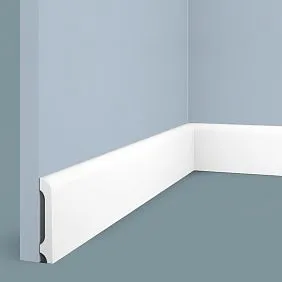
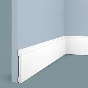
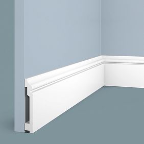
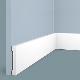
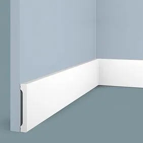
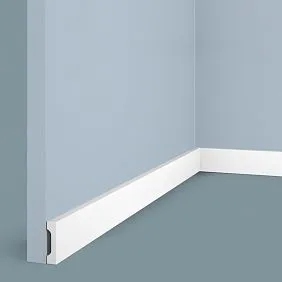
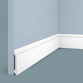
— is a horizontal element that frames the room at the bottom of the walls where the wall meets the floor. Skirting boards perform several functions: they hide the technological gap between the wall and floor covering (necessary for thermal expansion), protect the lower part of the wall from mechanical damage, create visual completion, and may conceal wiring.It consists of pressed wood fiber with a density of 760-850 kg/m³, coated with factory primer. The surface is sanded to a 220-240 grit, absolutely smooth, without roughness or unevenness. The primer is a special water-based compound that fills the micro-pores of the MDF, creates a moisture barrier, and ensures perfect paint adhesion. The primer layer thickness is 40-60 microns—enough for protection but not so much as to hide the profile's clarity.
Polyurethane ready for painting leaves production with a matte white surface, ready for painting without additional priming.Moldings made of polyurethaneThey have a closed-pore structure—the material does not absorb paint, ensuring even pigment distribution. One coat of primer and two coats of paint create a perfectly uniform coating without the base showing through, without color variation, and without the need for multiple repaints.
The advantages of ready-to-paint elements over pre-colored ones are obvious. You are not limited to a factory palette—you can create an exact match to the tone of the walls, floor, or furniture. After a few years, when changing the interior concept, the decor can be easily repainted without removal—simply apply a new color over the old one. Savings on transportation and storage—white elements are universal, do not require sorting by color, and take up less warehouse space.
Wall cladding for paintingUsing MDF paneling and cornices creates architectural expressiveness that can be adapted to any color scheme. Today the walls are gray, the decor is white—next year the walls are peach, the decor is toned or a contrasting dark color. Flexibility without the need to replace elements.
The quality of factory primer is critically important. Professional manufacturers apply primer in factory conditions where temperature, humidity, and layer thickness are controlled. The primer dries in special chambers where uniform polymerization is ensured without dust or contamination. The result is a perfectly prepared surface, superior to what can be done on-site.
But white primer is not just about practicality. It is an aesthetic in itself. White moldings, baseboards, and plasterwork create a classic, airy interior. White reflects light, visually enlarges space, and creates a sense of cleanliness and order. Many leave the elements white without even thinking about repainting. And this is a completely justified choice, especially for rooms lacking natural light.


Color as Language: When to Whisper in Tone, When to Shout with Contrast
Painting decor to match the wall color is a technique that dissolves boundaries, creating a monolithic space. When the baseboard, moldings, and cornices are painted the same shade as the walls, they cease to be read as separate elements. The eye glides over the surface without stumbling over contrasting lines. The space seems larger, more cohesive, and calmer.
This approach works in minimalist interiors where the purity of form without visual noise is important. Gray walls—gray baseboards 120-150 mm high create graphic severity. Dark blue walls—dark blue decor immerses you in the depth of color, creating intimacy and coziness. Beige walls—beige elements form a soft, enveloping atmosphere without sharp accents.
A monochrome scheme requires impeccable painting quality. When the decor and walls are the same color, any color variation, any difference in sheen is immediately noticeable. Use the same paint for the walls and decor—this guarantees identical shade. Apply the same number of coats—two on the walls, two on the decor. Check the match under both daylight and artificial light—some pigments change shade depending on the light spectrum.
Contrast painting is the opposite approach, where the decor stands out, creates accents, and structures the space. White moldings on dark walls—a classic technique that makes architectural details the main heroes of the interior. Dark baseboards on light walls—a modern solution that grounds the space, creating visual weight at the bottom.
Contrast works in classic interiors where moldings form panels on the walls. White moldings break up a colored wall into rectangles, creating rhythm, proportion, and architectural logic. Inside the panels, the wall is painted a rich color—emerald, sapphire, burgundy. The moldings remain white, creating clear boundaries like picture frames.
Colored decor on white walls is a bold solution for modern interiors. Black baseboards 100-120 mm high on white walls create graphic clarity, emphasizing the geometry of the space. Gold moldings on a white background add luxury without overload—the gold is dosed, works as an accent, and does not dominate.
How to decide, contrast or tone? Assess the size of the room. In small rooms, contrasting decor fragments the space, making it even smaller. Monochrome visually expands it. In large spaces, contrast creates structure, preventing the space from becoming amorphous. Consider ceiling height. With low ceilings of 2.5-2.7 meters, a white ceiling cornice on colored walls visually raises the height. A contrasting dark cornice, on the contrary, lowers the ceiling.
Transitional schemes—a golden mean between monochrome and contrast. The decor is painted in a shade 2-3 tones lighter or darker than the walls. There is a difference, but it is delicate, creating a subtle play of halftones. Light gray walls—white decor with a slight gray tint. Dark beige walls—light beige decor. Visual structure is preserved, but without the sharpness of contrast.
Our factory also produces:


Paints and Brushes: The Technology of Flawless Results
Surface preparation is the foundation of quality painting. Even ready-to-paint elements require preliminary treatment. Inspect the decor for defects—factory flaws, transportation damage, unevenness. Fill minor scratches and chips with acrylic putty, sand with 240-320 grit sandpaper after drying. Remove dust with a damp cloth and let dry.
Degreasing is a mandatory step, especially if the elements have been stored for a long time and may have accumulated dust or grease stains. Wipe the surface with a weak soap solution or a special degreaser. Rinse with clean water and dry. Grease stains reduce paint adhesion, causing peeling and crater formation.
Additional priming is not always necessary.MDF skirting boards for paintingwith factory primer are ready for painting without additional preparation. But if the primer is damaged or the element has been puttied, apply an acrylic wood primer. The primer is applied in a thin layer with a brush or roller and dries for 2-4 hours. After drying, the surface is lightly matted with fine-grit sandpaper to improve the adhesion of the topcoat paint.
Polyurethane is primed with a special primer for plastics. Regular wood primers do not adhere well to polymer surfaces. Acrylic primer for plastics creates an intermediate layer that chemically bonds with the polyurethane and ensures paint adhesion. The primer is applied thinly, without drips, and dries for 3-4 hours. Matting is not required—acrylic paint adheres perfectly to such a primer.
Paint selection depends on the material of the decor and operating conditions. For MDF, water-based acrylic and latex paints are suitable. They do not contain aggressive solvents that can cause MDF to swell. They form an elastic film resistant to cracking. Easily tinted to any shade. Virtually odorless and safe for use in living spaces.
For polyurethane, water-based acrylic paints are optimal. They create a breathable coating that does not block the material's micropores. They have good adhesion to primed polyurethane. Dry in 4-6 hours, allowing two coats to be applied in one day. Resistant to wet cleaning and do not yellow over time.
Alkyd enamels are used less frequently—they provide a harder and glossier finish but have a strong odor and take a long time to dry (12-24 hours). They are used in high-traffic areas—entryways, hallways—where decor is subject to frequent mechanical impact. Alkyd enamel is wear-resistant and can be easily cleaned even with aggressive agents.
The degree of paint gloss affects the visual perception of the decor. Matte paints hide minor surface imperfections and create a noble velvety texture. Semi-matte paints offer a compromise between the aesthetics of matte and the practicality of glossy. They are easy to clean but do not produce harsh reflections. Glossy paints emphasize relief, create interplay of light and shadow, but require a perfectly prepared surface—any unevenness will be visible.
Tools for painting are selected depending on the size and relief of the elements. A short-nap roller (5-7 mm) is suitable for smooth surfaces—flat skirting boards, simple moldings. Provides an even coating without roller marks. A flat brush 30-50 mm wide is used for profiled elements with recesses and protrusions. The brush penetrates the relief and paints all details.
A paint sprayer is a professional tool for painting large quantities of decor. Provides a perfectly even coating without brush or roller marks. Paint consumption is 20-30% less compared to a brush. Work speed is 3-4 times higher. However, it requires skill—incorrect settings cause drips or unevenness. Work is performed with a respirator due to paint mist formation.
The technique of applying paint is simple but requires care. The first layer is the base, applied thinly without trying to completely cover the primer. Slight transparency is acceptable. The main thing is uniformity, absence of drips and missed spots. Drying time is 4-6 hours for acrylic paints. The second layer is the finish, applied after the first layer is completely dry. Covers all gaps, creates a rich, even color.
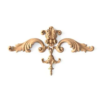
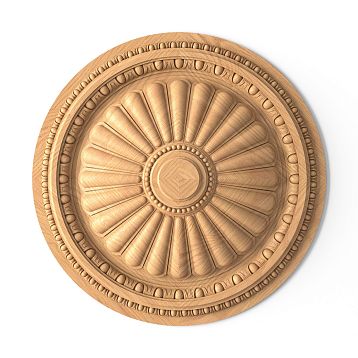
Complex profiles with deep recesses require special attention. Paint is applied with a brush, pressing it into the relief. Excess is removed with an almost dry brush to avoid paint accumulation in the recesses.Sculptural decorationswith fine carving are painted in several stages—first the recesses with a thin brush, then the protruding parts with a roller or wide brush.
Temperature and air humidity affect painting quality. Optimal temperature is 18-25°C, humidity 40-60%. At lower temperatures, paint dries slowly, possibly causing drips. At high humidity, paint does not polymerize well, leaving the coating sticky. Avoid painting in direct sunlight—paint dries too quickly, not having time to level, leaving brush marks.
Get Consultation
Patina and gilding: when simple color is not enough
Patination of moldingsis a technique that adds depth and age. The essence of the method is applying two or more layers of paint followed by partial removal of the upper layers. A light base color (ivory, light gray, beige) is covered with a dark patina (brown, black, green), which is then wiped off the protruding parts, remaining only in the recesses. This creates an effect of noble antiquity, where time has left its mark on the relief.
The technique of two-color patination is simple and accessible for DIY. The molding is painted with the base color in two coats and completely dried. The patinating composition is applied with a brush or sponge, covering the entire surface and filling the recesses. After 5-15 minutes, when the patina has begun to set but is not yet completely dry, take a damp sponge or soft cloth and wipe it off the protruding parts with circular motions. It remains only in the recesses, creating contrast.
The degree of wiping determines the intensity of the effect. Light wiping, removing 30-40% of the patina, creates a delicate hint of age. Active wiping, removing 80-90%, gives only a suggestion of antiquity, with patina visible only in the deepest recesses. The choice depends on the desired intensity and interior style. Classical interiors require moderate patina, Baroque—rich, modern classic—minimal.
Multi-layer patination is a technique for professionals, creating complexity unattainable with two colors. On an ivory base, golden ochre (wiped 70%), red-brown (wiped 90%), and black (applied selectively in the deepest areas) are applied sequentially. Each layer dries for 4-6 hours before applying the next. The result is multi-layered depth, interplay of halftones, visual complexity worthy of museum interiors.
Gilding of moldings turns decor into a work of jewelry art. Not real gold is used (that is astronomically expensive), but imitation—composition leaf, gold paint, metallic pigments. Composition leaf is ultra-thin sheets of copper or aluminum alloy imitating gold. Applied to a special adhesive size, which remains tacky for 12-24 hours. The leaf sheets are laid onto the adhesive, pressed with a soft brush, and excess is removed. The result is a mirror-like metallic surface.
Gold paint is simpler to use than composition leaf but gives a less impressive result. It is acrylic paint with metallic pigments, creating a golden sheen. Applied with a brush in 2-3 coats. The shine depends on the concentration of metallic particles—budget paints give dull gold, professional ones—bright radiance. Gold paint is used for accent gilding—only the protruding parts of the molding, only the edges of leaves and scrolls.
Combined finish—patina plus gilding—creates maximum luxury. The molding is painted ivory, patinated dark brown, then the protruding parts are covered with gold paint. Gold against a dark patina background creates dramatic contrast. Such molding is appropriate in formal interiors, classic living rooms, spaces where representativeness is important.
Protection of the decorative coating is a mandatory final step. Patinated and gilded surfaces are fragile—patina wears off from touch, gold darkens from oxidation. Protective varnish creates a barrier. Use water-based acrylic varnish, matte or semi-matte. Glossy varnish gives an unnatural shine, inappropriate for patina. Varnish is applied with a soft brush in two coats with intermediate drying of 4-6 hours.
Color solutions for different rooms
Living room—a formal space where decor must match the status. White remains a classic—white ceiling cornices, white wall moldings create airiness and light. For more interesting solutions, use light tinting—warm white with a creamy undertone for cozy interiors, cool white with a gray tint for modern spaces.
Contrast solutions in the living room require boldness. Dark blue walls with white moldings create depth and drama. Emerald walls with gold cornices—Art Deco luxury. Gray walls with black skirting boards—graphic modernity. The choice depends on room size (in small spaces, contrast fragments the space), natural light (in dark rooms, dark walls are oppressive), ceiling height (low ceilings require a light upper part).
Bedroom—a territory of calm where decor should not be irritating. Pastel shades work unfailingly. Light gray walls—white decor with a light gray tint. Beige walls—decor in the same tone or 1-2 shades lighter. Lavender walls—white decor with a cool undertone. Avoid bright contrasts and saturated colors—they are stimulating and hinder relaxation.
Children's room—a space for experiments. Bright decor colors are appropriate here, which would be out of place in other rooms. Yellow skirting boards on white walls create a sunny mood. Blue moldings in a boy's room support a sky theme. Pink elements in a girl's room—a traditional but effective solution. Colored decor is easy to repaint when the child grows up and tastes change.
The kitchen demands practicality. Paint must withstand wet cleaning, grease stains, and temperature fluctuations. Use alkyd enamels or special kitchen acrylic paints with enhanced durability. Colors: white, light gray, beige. Bright colors in the kitchen become tiresome quickly. Decor should serve as a background for furniture and appliances, not compete with them.
The bathroom is a zone of maximum humidity. Polyurethane molding is the ideal material, unafraid of water. Paint: water-resistant acrylic or latex for wet areas. The color is traditionally white—it is associated with cleanliness. But modern trends allow for dark walls (graphite, anthracite, dark blue) with white or gold decorative elements. This creates drama, unexpected for a bathroom.
The hallway is a high-traffic area where decor gets dirty the fastest. The lower part of the walls and baseboards are painted in dark tones—gray, graphite, dark brown. Dirt is less noticeable on dark colors. The upper part and ceiling cornices remain light, visually raising the ceiling. Paint: washable acrylic or alkyd enamel with increased abrasion resistance.
Painting mistakes and their correction
Drips are the most common mistake when painting decor. They occur from excess paint on the brush or roller. Fresh drips are removed with an almost dry brush—the paint is blended and smoothed. If a drip has dried, it needs to be carefully cut off with a blade or sanded with fine-grit sandpaper, then repaint that area.
Missed spots are skipped areas where primer or the previous layer remains visible. They occur due to an insufficient number of coats or poor lighting during painting. They are corrected by local touch-ups with a thin brush. But if there are many missed spots, it's easier to apply another full coat of paint to the entire element.
Brush marks are streaks that remain if the paint is too thick or the brush is stiff. They are corrected by sanding after drying (sandpaper grit 320-400), dust removal, and applying a new coat with thinner paint. Use soft brushes with medium-length synthetic bristles—they leave fewer marks.
Uneven color is a variation in shade, spots where the color is lighter or darker. It arises from insufficient paint mixing, applying too thin a coat, or differences in the surface's absorbency. It is corrected by applying an additional leveling coat. Before application, thoroughly mix the paint to achieve absolute uniformity.
Paint peeling is a critical problem where the coating falls off in pieces. Causes: poor adhesion due to grease contamination, incompatibility of primer and paint, painting over old paint without sanding. Correction is radical: remove all peeling paint, clean down to the base, re-prime, repaint. Prevention: thorough surface preparation, using compatible materials.
Yellowing of white paint is a problem that appears after several months or years. Causes: low-quality paint, using alkyd compounds over water-based paint, lack of light (white paint in dark rooms yellows faster). Correction: repaint with high-quality water-based acrylic paint with UV filters that prevent yellowing.
Cracking is a network of fine cracks on the paint surface. It arises from applying too thick a coat, painting at low temperatures, or incompatibility of layers. If the cracks are superficial, sand with 320-grit sandpaper, remove dust, apply a finish coat. If the cracks are deep, remove the cracked layer, repaint from scratch following the technology.
Repainting unsuccessfully painted decor is a procedure requiring patience. If the new color is lighter than the old one, 3-4 coats will be needed for complete coverage. If the new color is darker, 2 coats are enough. Before repainting, the surface is sanded with fine-grit sandpaper to improve adhesion. Glossy paints require more thorough sanding than matte ones.
Local repair of painted decor—touching up damaged areas. A scratch or chip is cleaned, filled with acrylic putty, sanded. Then touched up with a brush using the same paint. The problem: matching the exact shade if time has passed and the paint has changed color. Keep leftover paint for future repairs. If no paint remains, you'll have to repaint the entire element.
Decorative techniques for advanced users
Ombre on moldings—a smooth transition from one color to another. The technique is complex and requires skill. The base color is applied to the entire element. While it's still wet, a second color is applied to one edge, the border between colors is blended with a wet brush, creating a gradient. The effect is impressive but requires quick work—the paint must not dry before blending is complete.
Stencil decor—applying patterns to smooth elements using stencils. The stencil is secured with painter's tape, paint is applied with a sponge using light dabbing motions. The result is clear patterns—geometric patterns, floral motifs, abstraction. The technique can turn a simple baseboard into an art object.
Aged paint effect—imitation of peeling paint. A light base coat is applied, then a dark one over it. The dark layer is partially sanded off in areas of natural wear—corners, edges, protrusions. It creates the impression that the dark paint has worn away over time, revealing the light base. A technique for vintage and shabby chic interiors.
Metallic effects—using paints with metallic pigments. Silver, bronze, copper create a noble shine. They are applied over a pre-painted dark base—metallic looks deeper on dark. You can cover the entire element or just the protruding parts, creating accents.
Crackle—imitation of paint cracked with age. Special crackle varnish is applied between two layers of paint. As it dries, it cracks, creating a network of cracks through which the bottom paint is visible. The effect of an antique mirror or furniture. The technique requires precise adherence to the varnish manufacturer's instructions—drying time and layer thickness are critical.
Frequently asked questions
Can you paint polyurethane molding with regular water-based paint?
Yes, you can.polyurethane decorative elementsPolyurethane elements with factory primer can be painted with any interior water-based paints—acrylic, latex, silicone. Preliminary priming is not required if the surface is clean. Apply two coats of paint with intermediate drying of 4-6 hours.
Do you need to remove baseboards before painting?
It depends on the situation. If the baseboards are not yet installed, paint before installation—it's easier, with no risk of staining walls and floors. If the baseboards are already in place, they can be painted while installed, protecting walls and floors with painter's tape.Painting installed baseboardsrequires care but is quite doable.
How many coats of paint should be applied?
A minimum of two coats to achieve a uniform color. The first coat is the base, may show through. The second is the finish, covering all gaps. If painting a light color over a dark base, 3-4 coats may be needed. Each subsequent coat is applied after the previous one has completely dried.
How to avoid drips when painting relief elements?
Use minimal paint on the brush. It's better to apply two thin coats than one thick one. Press the brush into the recesses of the relief, but don't overload them with paint. Remove excess with an almost dry brush. Work in good lighting—drips are easier to notice and correct while the paint is still wet.
Can molding be repainted from another color to white?
Yes, but it will require more layers. Dark colors are difficult to cover with light ones. First, apply a white or light gray hiding primer in 1-2 coats. Then 2-3 coats of white paint. The total number of coats can reach 4-5. Each coat must dry completely before applying the next.
Which paint is better — matte or glossy?
For decorative elements, matte or semi-matte is more often used. Matte hides minor defects, creates a noble surface, and does not produce glare. Glossy emphasizes the relief, creates a play of light, but requires perfect preparation—any unevenness will be visible. Semi-matte is the golden mean, combining the aesthetics of matte and the practicality of glossy.
How long does acrylic paint take to dry on decor?
Drying time between coats is 4-6 hours at a temperature of 20-22°C and humidity of 50-60%. Full polymerization is 24-48 hours. Decor can be installed 6-8 hours after applying the final coat, but the coating gains full strength after two days. Avoid mechanical impact in the first 24 hours.
Can patination be done independently or is a specialist needed?
Simple two-color patination is accessible for independent execution. The technique is not difficult—apply the patina, partially wipe it off. The main thing is to act confidently and quickly, not allowing the patina to dry completely.Complex multi-layer patinationis better entrusted to professionals—the result depends on experience and a sense of proportion.
Can aerosol paint be used for decor?
Yes, aerosols provide an even coating without brush marks. Convenient for small elements of complex shape. Work in a well-ventilated area or outdoors. Hold the can at a distance of 20-30 cm, apply paint with smooth movements without stopping in one spot. Disadvantages—high consumption, difficulty in matching the exact shade, toxicity when working indoors.
How to protect painted decor from damage?
A final protective varnish extends the life of the coating. Use a water-based acrylic varnish, matte or semi-matte. Apply a thin coat with a soft brush after the paint has completely dried. The varnish creates a hard film resistant to abrasion and wet cleaning. Especially important for decor in hallways, corridors, children's rooms.
Conclusion: your interior, your rules
Painting moldings, baseboards, and molding is not just a technical procedure. It is a creative process where you become the author of the interior's color solution. A white primed surface is a blank canvas inviting experimentation. Monochrome or contrast, classic white or bold color, simple painting or sophisticated patination—the choice is determined only by your vision and courage.
Moldings for paintingandMDF skirting boardsopen limitless possibilities for creating unique interiors. Each project becomes a reflection of the owner's individuality, where color works to reveal the concept of the space. Light tones visually expand, dark ones create intimacy, bright ones add energy, pastels calm.
The painting technology is simple in principle—preparation, priming, applying paint in two coats. But the devil is in the details. The quality of surface preparation, the choice of compatible materials, the correct application technique, adherence to temperature and humidity conditions—each factor influences the final result. Perfectly painted decor is visually indistinguishable from factory-colored, but gives what factory solutions cannot—absolute alignment with your color concept.
Mistakes are inevitable, especially with first-time experience. Runs, missed spots, brush marks—all of this is fixable. Painting gives the right to make mistakes and the possibility of redoing. Didn't like the color—repaint it. Want to change the concept in a year—repaint it again. Paint-ready decor is adaptive, it grows and changes with you, not requiring replacement when preferences change.
The company STAVROS offers the widest range of decorative elements for painting.MDF skirting boardswith heights from 80 to 200 mm with diverse profiles—from simple rounded to complex multi-step.Moldings made of polyurethanefor walls and ceilings—dozens of profiles from minimalist to baroque.Relief Decoration—rosettes, overlays, corner elements, capitals with the finest detailing.
All STAVROS products are supplied with factory primer, ready for painting. The surface is sanded to perfect smoothness, primer is applied under controlled conditions, ensuring excellent adhesion of any paints. The geometry of the profiles is absolutely precise—joints meet without gaps, corners cut cleanly without chips.
STAVROS consultants will help select elements for your concept, calculate the required quantity, advise on optimal paints and painting technologies. We work with professional decorators and private clients, with large-scale projects and intimate apartments. For projects from 150,000 rubles, we offer the service of factory painting in any color from the RAL catalog or a custom-matched shade.
Create interiors without limits, where every element precisely reflects your vision, with STAVROS—a partner that gives you creative freedom.