


Article Contents:
- Psychology of color perception in interior design
- Influence of color on spatial perception
- Color temperature and emotional impact
- Classic strategy: skirting board in floor tone
- Principles of harmonious combination
- Technical aspects of selection
- Modern trend: skirting board in door tone
- Architectural logic of the solution
- Implementation options
- Contrasting solutions: boldness in design
- Philosophy of contrast
- Rules for working with contrast
- Universal solution: white skirting board
- Advantages of white color
- Shades of white color
- Care for white skirting board
- Color adaptation to interior style
- Classical styles
- Modern directions
- Practical aspects of color selection
- Lighting and color perception
- Room dimensions and color effects
- Painting technologies for skirting boards
- Modern coatings and paints
- Coating application techniques
- Seasonal and fashion trends
- Current color trends
- Adaptation to seasonal changes
- Psychological aspects of color selection
- Influence of color on mood
- Cultural and symbolic meanings
- Errors in Choosing Baseboard Color
- Common Misconceptions
- How to Avoid Mistakes
- Frequently Asked Questions

The color of the baseboard determines the visual perception of the entire interior, creating a connecting element between different surfaces in the room. The correct choice of baseboard color can dramatically change the proportions of the room, highlight architectural features, or conceal layout shortcomings. Wooden Skirting Boards in Interior Design They not only serve a functional role in protecting the junction between the floor and the wall, but also become an important design tool for creating a cohesive and harmonious space.
The modern approach to choosing baseboard color offers numerous strategies: from classic matching with floor tone to bold contrasting solutions. Each option has its advantages and creates a specific visual effect. Understanding the principles of color interaction will help make the right decision and create an interior that will please the eye for years.


Psychology of Color Perception in Interior Design


Influence of Color on Spatial Perception
The color of the baseboard directly affects the perception of room size and proportions. Light tones visually expand the space, creating a sense of airiness and openness. White Wooden Baseboard is a universal solution for small rooms where every square meter counts.
Dark shades, on the contrary, create a sense of solidity and coziness, but may visually reduce the space. Black Wooden Baseboard becomes a striking accent in spacious rooms with high ceilings, where there is no need to fear visual compression of space.
Neutral tones create a calm base for experimenting with bright decorative elements. Gray Wooden Baseboard combines beautifully with various color schemes without competing with main interior elements for attention.
Our factory also produces:
Color Temperature and Emotional Impact
Warm wood tones create an atmosphere of coziness and security. Golden, honey, and brown baseboard tones fill the room with warmth, especially when combined with natural lighting. Such colors are ideal for living areas, where it is important to create a relaxing atmosphere.
Cool tones give the interior a sense of strictness and modernity. They are suitable for work areas, kitchens, and bathrooms, where an atmosphere of cleanliness and order is important. Combining cool tones with quality artificial lighting creates a sense of technology and progress.
Balanced neutral tones allow the interior to be easily adapted to changing needs and tastes. They serve as an ideal backdrop for seasonal decor updates without requiring major renovations of the space.
Get Consultation
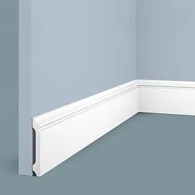
Classic Strategy: Baseboard in Floor Tone
Principles of Harmonious Combination
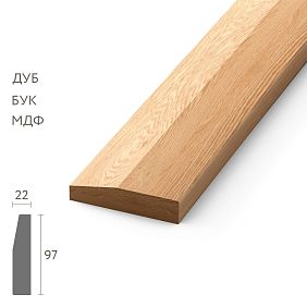
The traditional approach implies selecting a baseboard in the tone of the floor covering, creating visual unity of the horizontal surface. This solution is especially effective when using parquet or solid wood planks with a pronounced wood grain. Oak wooden skirting board perfectly complements oak floors, creating a sense of material continuity.
Exact color matching is not always necessary. Minor variations within 1-2 tones are acceptable, creating a subtle play of shades without disrupting overall harmony. It is important to consider that wood has the property of changing color under the influence of light and time, so minor differences may smooth out over time.
Advantages of tonal unity include visual expansion of floor area, creation of a calm, soothing interior, and universal applicability for various styles from classic to modern. A potential drawback may be some monotony, especially in small rooms.
Technical Aspects of Selection
When choosing a baseboard in the tone of the floor, it is important to consider not only color but also the character of the wood grain. Radial and tangential cuts create different patterns that should harmonize with each other. A baseboard with a more subdued texture can successfully complement an active floor pattern.
Room lighting significantly affects color perception. Colors appear cooler with north-facing windows and warmer with south-facing windows. Beautiful wooden skirting boards They should look harmonious under any lighting, so it's important to evaluate color combinations at different times of day.
The glossiness of the finish also affects color perception. Matte surfaces appear darker, glossy ones appear lighter. To achieve perfect matching, it's important to use finishes with the same level of gloss.
Modern trend: skirting board in the same tone as the doors
Architectural logic of the solution
Choosing skirting boards in the same tone as door panels creates architectural continuity in the interior, unifying vertical elements of the room. This approach is especially effective in rooms with multiple doorways, where the skirting board becomes a unifying element of the architectural composition.
Color harmony between doors and skirting boards creates a sense of thoughtful and professional design. The eye glides smoothly through the room, not lingering on random color patches. This solution is especially suitable for studio apartments and open-plan spaces.
Practical advantages include ease of selection during renovation — simply knowing the door color is enough to choose the right skirting board. When replacing doors, it's easy to select a new skirting board in the matching tone, preserving the overall interior concept.
Implementation options
Exact matching with door panel color creates maximum integration of elements. However, more complex solutions are possible, where the skirting board matches the door frame or molding color, creating subtle color accents.
In rooms with contrasting doors (e.g., dark against light walls), a skirting board of the same color creates a visual frame that emphasizes the geometry of the space. Wooden floor with white skirting board Combined with white doors, it creates a fresh, modern look.
Gradient transitions allow for more complex color compositions. The skirting board can be slightly darker or lighter than the doors, creating subtle tone variations without harsh contrasts.
Contrasting solutions: boldness in design
Philosophy of contrast
A contrasting skirting board becomes an active design element, creating dynamism and expressiveness in the interior. This approach requires boldness and a good understanding of color relationships, but the result can exceed all expectations.
Light skirting board on a dark floor creates a visual lifting effect, making the room appear higher. Dark skirting board on a light floor creates the opposite effect — grounding and solidity. The choice depends on the desired result and the specific characteristics of the room.
Color contrasts should be thoughtfully designed and supported by other interior elements. An isolated contrasting element may appear random and inappropriate. It's important to create color connections through textiles, accessories, and furniture.
Rules for working with contrast
The strength of contrast should match the character of the room and the interior style. In minimalist spaces, even a small contrast can become a noticeable accent. In eclectic interiors, bolder color solutions are acceptable.
The proportions of contrasting elements affect the overall perception. A narrow contrasting skirting board creates a subtle graphic line, while a wide one becomes a dominant element. It's important to maintain a balance between the element's activity and its size.
The quality of contrasting solutions must be flawless. Any installation flaws, unevenness, or scratches become especially noticeable against a contrasting background. This requires higher skill levels from installers and high-quality materials.
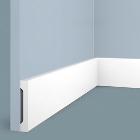
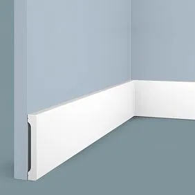
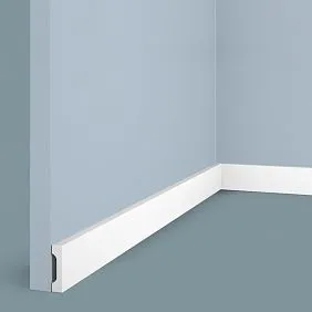
Universal solution: white skirting board
Advantages of white color
White color has unique properties in interiors. It visually expands space, reflects maximum light, creates a sense of cleanliness and freshness. A white skirting board matches any wall, floor, or furniture color, making it a universal solution.
Practical advantages include the ability to easily refresh the interior without replacing the skirting board. Changing wall color, flooring, or furniture does not require replacing the white skirting board — it remains relevant in any color scheme.
White color creates an effect of architectural completeness, as if the skirting board is part of the building's structure, not merely a decorative element. This is especially important in modern interiors, where minimalism and functionality are valued.
Shades of white color
White color has many shades: warm (ivory, milk, vanilla) and cool (arctic white, bluish-white). The choice of specific shade depends on the overall color temperature of the interior and the type of lighting.
Painted wooden skirting boards allow obtaining any desired shade of white. Modern paints provide even coverage, resistance to abrasion, and the possibility of local repair if necessary.
Matte white surfaces hide minor dirt and mechanical damage better than glossy ones. However, glossy finishes are easier to clean and more wear-resistant.
Care for white skirting boards
The white color requires more careful maintenance, as any dirt is noticeable on it. Modern coatings have significantly simplified care for white surfaces, providing ease of cleaning and resistance to yellowing.
Regular dry cleaning prevents dust accumulation, which is especially noticeable on white surfaces. Wet cleaning is performed using mild detergents without abrasive particles.
Local stains are removed immediately, preventing them from being absorbed into the surface. What to paint wooden skirting boards white color - an important question requiring the selection of high-quality materials with high opacity and durability.
Color adaptation to interior style
Classic styles
Traditional interior styles prefer natural wood tones or noble dark shades. Classicism, baroque, and neoclassicism require color harmony with furniture and architectural details. The skirting board becomes an extension of the overall color scheme, not standing out as a separate element.
The English style implies using dark wood species: mahogany, walnut, dark oak. The skirting board color should support this tradition, creating an atmosphere of respectability and solidity.
French Provence, on the contrary, leans toward light, bleached tones. A white or cream-colored skirting board with a patina effect creates the characteristic rustic romantic atmosphere of the style.
Modern trends
Minimalism requires color restraint and absence of random accents. The skirting board should blend into the overall background, not drawing attention. White, gray, or exactly matching the wall color - optimal solutions for minimalist interiors.
Scandinavian style prefers natural light wood tones or white color. Material and coating eco-friendliness is important. Paint for wooden skirting boards must be safe for health and not emit harmful substances.
Loft and industrial styles allow bold contrasts and unconventional color solutions. A dark skirting board on a light concrete floor, metallic tones, deliberately rough textures - all of this corresponds to the style's aesthetics.
Practical aspects of color selection
Lighting and color perception
Natural lighting changes throughout the day, affecting the perception of skirting board color. Morning and evening lighting has a warm color temperature, daylight has a cooler one. The skirting board color should look harmonious under any lighting.
Artificial lighting also affects color perception. Incandescent lamps give a warm tone, fluorescent lamps - a cool one, LED lamps can have various color temperatures. When choosing color, it is important to consider the type of main lighting in the room.
Window placement determines the character of natural lighting. Northern windows provide cool light, southern ones - warm. This affects color perception and should be considered when choosing skirting board shade.
Room size and color effects
In small rooms, light-colored skirting boards create a sense of space expansion. Dark tones may visually reduce an already limited area. However, in some cases, a dark skirting board can create a cozy effect in a small room.
Ceiling height affects skirting board color choice. In rooms with low ceilings, a light-colored skirting board matching the walls visually increases height. A contrasting dark skirting board creates a horizontal line that may further reduce visual height.
Room proportions are also important. In long, narrow rooms, transverse color accents can visually expand the space. Longitudinal elements, on the contrary, emphasize the room's length.
Skirting board painting technologies
Modern coatings
Wooden skirting board for painting offers maximum freedom in color choice. Modern paints allow obtaining any shade with high precision and repeatability.
Acrylic paints provide excellent adhesion to wood, dry quickly, and have no strong odor. They are suitable for interior work and provide long-lasting coverage with the possibility of local repair.
Alkyd enamels create a more durable and wear-resistant coating, but require good ventilation during application. They are suitable for high-load areas: hallways, entryways, kitchens.
Coating application technique
Painting wooden baseboards requires careful surface preparation. Sanding ensures smoothness and even coating. Priming improves paint adhesion and prevents stains.
Painting is done in several thin layers with intermediate sanding. This ensures even coverage and prevents streaks. The final layer is applied as carefully as possible, since it determines the final appearance.
The quality of tools affects the painting result. High-quality brushes and rollers ensure even paint application without streaks or marks. When working with glossy paints, it is especially important to avoid tool marks.
Seasonal and fashion trends
Current color trends
Modern interior design trends influence the choice of skirting board color. The popularity of eco-friendly materials and natural shades makes uncolored wood tones increasingly relevant.
Various shades of gray have remained trendy for several years. They create a modern, stylish atmosphere and easily match different color schemes. Painting wooden skirting board Adapting to gray tones allows following fashion trends.
Black color is experiencing a renaissance in interior design. A black skirting board creates a graphic accent, highlights the geometry of the space, and adds elegance and modernity.
Adaptation to seasonal changes
The color of the skirting board affects the seasonal perception of the interior. Warm tones create a sense of coziness in cold weather, while cool tones refresh the space in summer.
The possibility of seasonal color updates for the skirting board depends on the selected materials and technologies. High-quality paints allow repainting the surface without removing the old coating.
Neutral skirting board colors allow adapting the interior to seasonal changes through textiles, accessories, and lighting, without altering the main architectural elements.
Psychological aspects of color selection
Influence of color on mood
The color of the skirting board, like any other interior element, affects a person's psychological state. Warm tones create a sense of safety and comfort, while cool tones evoke alertness and energy.
Bright contrasting solutions stimulate activity and creative thinking, but may cause fatigue with prolonged exposure. Calm neutral tones promote relaxation and concentration.
Personal color preferences play an important role in selection. A color that you like will be perceived positively regardless of fashion trends and design rules.
Cultural and symbolic meanings
Different cultures perceive colors differently. In European tradition, white is associated with purity and innocence, while in Eastern cultures it may symbolize mourning. These cultural connotations influence color perception in interiors.
The symbolic meaning of colors is also important. Green is associated with nature and harmony, red with energy and passion, blue with calmness and stability. Understanding symbolism helps create an interior with the desired emotional atmosphere.
Historical associations of colors influence their perception in modern interiors. Gold tones evoke the luxury of palace interiors, white suggests purity and minimalism, while dark tones convey solidity and tradition.
Mistakes in choosing skirting board color
Common misconceptions
One common mistake is ignoring lighting when choosing color. A color that looks perfect in a store under artificial lighting may appear very differently in home conditions.
Another mistake is attempting to exactly replicate the color of an interior element without considering differences in materials and textures. The same color on different materials may appear completely different.
Underestimating the impact of room size on color perception leads to poor decisions. A color that looks good in a spacious room may be inappropriate in a small room.
How to avoid mistakes
Testing color under real room conditions is a mandatory step in selection. Samples should remain in the room for several days to evaluate their appearance under different lighting and at different times of day.
Considering all interior elements when choosing skirting board color prevents accidental disharmonies. The color must harmonize not only with the floor and walls, but also with furniture, textiles, and accessories.
Consulting professional designers helps avoid costly mistakes. An experienced specialist will take into account all factors and help choose the optimal solution.
Frequently Asked Questions
What color baseboard is universal?
The most universal color for skirting boards is white. It matches any wall, floor, and furniture colors, visually expands the space, and creates a sense of freshness. White skirting boards suit most interior styles, from classic to modern. It's important to choose the right shade of white: warm for cozy interiors, cool for modern spaces. An alternative could be skirting boards in the same tone as the floor — this is a classic solution that always looks harmonious and creates a sense of unity in the horizontal surface.
Can white skirting boards be used in any interior?
White skirting boards are indeed universal, but there are nuances to their application. In classic interiors with dark furniture, white skirting boards may appear too contrasting and disrupt the stylistic integrity. In such cases, it's better to choose skirting boards in the tone of the furniture or floor. In modern interiors, white skirting boards are almost always appropriate. It's important to consider the practical aspect: white color requires more careful maintenance and often needs updating. In high-traffic areas, it's better to choose more practical colors.
Which is better: skirting boards matching wall color or floor color?
Choosing between skirting boards matching wall color or floor color depends on the desired effect. Skirting boards in the tone of walls create a seamless transition effect, visually increasing the height of the room and making walls appear as a single surface. This solution suits minimalist interiors and small rooms. Skirting boards in the tone of the floor create unity in the horizontal surface, is traditional, and always looks harmonious. It suits classic interiors and rooms with beautiful flooring that you want to highlight. The golden middle ground — a neutral color that harmonizes with both walls and floor.
Choosing the right skirting board color requires a comprehensive approach, taking into account the characteristics of the room, interior style, personal preferences, and practical considerations. Modern materials and technologies offer virtually unlimited possibilities for implementing any color solutions, from classic to the most daring avant-garde. The key is to remember that the skirting board must harmoniously fit into the overall interior concept, highlighting its strengths and creating a sense of completion and professional design.


