Article Contents:
- Basic mechanics of visual proportion alteration
- Six basic proportion correction scenarios
- Scenario one: low ceiling — creating an illusion of height
- Scenario two: too high ceiling — creating intimacy and coziness
- Scenario three: narrow long room — visual expansion
- Scenario four: square room — creating dynamics and directionality
- Scenario five: zoning a large space without partitions
- Scenario six: masking layout defects
- Materials and wood species: how choice affects proportion perception
- Color and tone: light wood versus dark in the context of proportions
- Profile and shape: how element geometry affects proportions
- Installation and technical nuances: how proper mounting enhances the effect
- Lighting as an amplifier of panel and skirting board effects
- Styles and their work with proportions through wood
- Psychology of perception: why this works
- Practical recommendations for selection and design
- STAVROS: tools for spatial architecture

Space has no objective dimensions — it is always subjective. A room of twenty square meters can feel like a cramped cage or a spacious studio depending on how its internal architecture is structured. And the main tool for managing this perception is not re-planning or demolishing walls, but precise work with verticals and horizontals through a system of wall panels and wooden skirting boards. In 2026, this technique has finally ceased to be exotic and transformed into the basic language of professional design: designers and architects no longer decorate walls, but build their architecture, usingWooden Skirting Boardsand panel systems as drafting tools that stretch, compress, divide, and unite space.
When discussing interior proportions, people usually mean the relationship between a room's length, width, and height. A narrow corridor one and a half meters wide and eight meters long is perceived as a tunnel. A room with four-meter ceilings and an area of fifteen square meters feels like a well. A square bedroom three by three meters with a two-and-a-half-meter ceiling presses down with a low sky. All these sensations are the result of proportion imbalance, and all are corrected not by construction methods, but by visual techniques where wall panels and skirting boards become the main protagonists. Horizontal lines expand and calm, vertical lines stretch and energize, large elements bring planes closer, small ones push them away, dark colors compress volume, light ones expand boundaries. All this works not theoretically, but physically: the eye reads lines, the brain interprets them as spatial coordinates, and the body reacts with a feeling of comfort or discomfort.
Why is wood the optimal material for this task? Because wooden elements have sufficient visual density to create clear guiding lines, while retaining tactile warmth that prevents the space from becoming cold and museum-like. Metal or plastic profiles can draw similar geometric schemes, but they will always look technological and detached.Wooden baseboardone hundred twenty millimeters high creates a powerful horizontal line around the room's perimeter, which visually lowers the ceiling and expands the floor — but does so softly because wood texture softens geometric rigidity. Vertical panels made of slats form rhythmic verticals that lift the gaze toward the ceiling — not aggressively, but organically, because wood is perceived as a natural, living material.


Basic mechanics of visual proportion alteration
Before discussing specific techniques, one must understand the fundamental principles of human spatial perception. The eye does not measure a room with a ruler — it evaluates relationships, seeks reference lines, reads rhythms and patterns. When a pronounced horizontal line appears in a room at a height of one meter from the floor — for example, the boundary between wall panels and the painted upper part of the wall — the brain automatically divides the vertical into two segments and begins comparing their proportions. If the lower segment is dark and dense, and the upper one light and airy, a sensation arises that the ceiling floats higher than it actually is. If the entire wall is uniform from floor to ceiling, the eye finds no intermediate anchors and perceives the height as a single monolithic block — often making low ceilings even lower, and high ones empty and unwelcoming.
Horizontal lines are always a tool for expansion and calming. WhenWide Wooden Skirting Boardruns as a continuous band around the entire room perimeter at a height of eighty or one hundred millimeters, it creates a powerful horizontal line that visually stretches the space sideways. This effect is enhanced if the skirting board contrasts with the wall in color: a dark oak skirting board on a light gray wall reads as a clear boundary that cuts off the lower part of the room and makes the floor visually wider. Add a horizontal molding or the upper border of wall panels at ninety centimeters — and you get a double horizontal line that further stretches the space in width, simultaneously visually lowering the ceiling and making the room more intimate and protected.
Vertical lines work in the opposite way: they stretch space upward, create dynamics, add swiftness. When a wall is clad with vertical wooden slats spaced fifty or seventy millimeters apart, the eye automatically slides along these lines from bottom to top, and the ceiling seems higher than with a smooth painted wall.MDF Interior Stripor solid wood, installed vertically from skirting board to ceiling cornice, transforms the wall into a set of upward-aspiring columns — this is a classic architectural technique used in Gothic cathedrals to create a sense of aspiration toward the heavens. In modern interiors, the same principle works in miniature: even a room with two-sixty ceilings visually stretches if one wall is decorated with vertical panels.
Large elements bring planes closer, small ones push them away. This rule applies to both baseboards and panels. A massiveWooden High Skirting Board— one hundred and fifty or even two hundred millimeters — visually pushes the wall forward, making it closer and more tangible. This can be useful in overly long narrow corridors: install tall baseboards on the end walls, and they will visually come closer, reducing the tunnel-like feeling. Small elements — thin slats, narrow moldings, low baseboards — on the contrary, create a sense of lightness and distance, allowing the walls to recede and free up space.
Dark colors compress, light colors expand. This is the most well-known rule, but in the context of wooden elements, it works a bit more complexly.Oak wooden skirting boardin a natural honey shade against white walls does not compress the space, but on the contrary, adds warmth and volume through contrast. But the same oak baseboard, stained dark wenge or fumed oak, creates a dense dark border that visually reduces the floor area. Wall panels made of dark walnut covering half the wall height make the room more intimate and cozy — this is good for studies, libraries, bedrooms, but contraindicated for small hallways and cramped rooms.


Six basic scenarios for correcting proportions
Our factory also produces:


Scenario one: low ceiling — creating the illusion of height
Problem: a standard apartment with ceilings of two fifty or two sixty, where space presses from above and makes it hard to breathe. The solution using wall panels and baseboards is based on two principles: vertical guides and light colors.
The first step is to abandon horizontal division of the wall into lower and upper parts. The classic scheme with panels covering one-third of the height works against you in low rooms: it creates a horizontal line that cuts the wall and visually lowers the ceiling even further. Instead, use vertical wooden slats covering the entire wall height — from the baseboard to the ceiling cornice without breaks.wooden planks on the wallare mounted with an even spacing of fifty to seventy millimeters, creating a rhythmic vertical pattern. The eye automatically slides along these lines upward, and the ceiling is perceived as higher.
The second step is to minimize the visual mass of the baseboard. In low rooms, tall, wide baseboards are contraindicated: they create a heavy horizontal base that visually presses on the floor and steals precious centimeters of height. The optimal choice isWooden baseboardfifty to seventy millimeters high with a laconic profile, painted the same color as the walls. When the baseboard blends with the wall in color, the boundary between the floor and wall softens, and the wall seems to start higher.
The third step is working with color. Wall panels and baseboards should be light: whitewashed wood species, light ash, painted in light gray or milky shades. Dark wooden elements in low rooms create visual heaviness and steal height. An exception is very thin dark vertical slats on a light background: the contrast works to enhance the vertical lines.
The fourth step is to extend the verticals to the ceiling. If possible, use a ceiling cornice of the same profile and color as the floor baseboard, but installed with a minimal gap from the ceiling. This creates a visual frame that stretches the space upward. Even better is a hidden cornice with lighting: when there is a gap with soft light between the wall and ceiling, the ceiling appears floating and visually rises.
Get Consultation
Scenario two: too high a ceiling — creating intimacy and coziness
The opposite problem: a room with ceilings of three twenty, three fifty, or even four meters, where the space seems empty, cold, and echoing. Here the task is to visually lower the ceiling, create horizontal divisions, and add warmth through wood.
The first step is horizontal division of the wall at approximately one-third of the height. In a room with a three fifty ceiling, this means a boundary at a height of one meter to one meter twenty. Below this line —wooden wall panels: either framed panels with raised fields, or assembled from horizontal boards, or vertical slatted panels, but limited in height. Above — a painted wall of a lighter shade. The boundary is framed with a wooden molding or trim, creating a clear horizontal line around the entire perimeter of the room. This line visually cuts the wall height, and the brain begins to perceive the lower segment as the main one and the upper as additional, which psychologically reduces the feeling of height.
The second step is to use a tall, massive baseboard. Here, appropriate areWide wooden skirting boardsone hundred twenty to one hundred eighty millimeters high with a rich classical profile. Such a baseboard creates a powerful visual foundation that 'grounds' the walls and makes them more substantial. The more massive the baseboard, the more it draws the eye to the lower part of the room and the less attention remains for the emptiness under the ceiling.
The third step is dark and warm wood tones. In high rooms, you can and should use saturated colors: natural oak in honey shades, stained walnut, even fumed oak. Warm tones create coziness and visually bring surfaces closer, compensating for the coldness of a large volume. The lower part of the wall in wooden panels of a dark shade visually becomes heavier and lowers, which psychologically reduces the perception of height.
The fourth step is horizontal elements and rhythms. If board panels are used, it's better to arrange them horizontally, creating a banded pattern that visually expands the space and lowers the ceiling. If the panels are vertical slatted — limit their height with a horizontal molding to avoid creating continuous verticals up to the ceiling.
Scenario three: narrow long room — visual expansion
Problem: a room two and a half meters wide and seven to eight meters long — a classic corridor effect, a tunnel where it's uncomfortable to be. The task is to visually expand the short walls and shorten the long ones.
The first step is working with the end walls. On the short end walls, use large, expressive elements that visually bring the plane closer: tall, wide baseboards, massive panels, dark or contrasting colors. For example, install on the endswooden skirting board purchasecan be one hundred and fifty millimeters high made of dark oak, and the wall above can be decorated with large vertical panels or even solid wood cladding up to half the height. Dark wood and large forms will visually bring the end walls closer, reducing the feeling of length.
The second step is working with the long walls. Here the opposite strategy is needed: light tones, horizontal lines, small elements.wooden baseboardon the long walls should be lower and lighter than on the ends — for example, seventy millimeters made of light ash or painted light gray. If wall panels are used, horizontal boards or slats are better, creating a banded pattern that visually stretches the wall in width. You can even forgo panels on the long walls altogether, leaving them simply painted a light color, which will create a visual contrast with the saturated ends.
The third step is asymmetrical accents. In a long room, avoid symmetrical placement of elements along the long walls — this emphasizes the length. Instead, create asymmetrical accents: a wooden panel or slatted composition on only part of one of the long walls, for example, in the sofa area or at the desk. This breaks the monotony and distracts attention from the overall geometry.
Scenario four: square room — creating dynamics and directionality
Problem: a perfectly square room appears static, boring, lacking movement. Although the proportions are formally ideal, the space fails to hold attention. The task is to create visual dynamics and directionality through asymmetry.
The first step is to designate one wall as the main one. Choose a wall that will be the accent wall — typically the wall behind the headboard in a bedroom, behind the sofa in a living room, or behind the desk in a study. On this wall, create a rich composition of wall panels: verticalMDF planksor a full-height solid array, or a panel system with molding frames, or solid wood cladding. This wall becomes a visual anchor that draws attention and sets the directionality of the space.
The second step is restraint on the remaining walls. The other three walls should be simpler: a standard-height baseboard, painted surfaces without panels or with minimal panel inserts. The contrast between the rich accent wall and the calm others creates a visual hierarchy and guides the eye.
The third step is diagonal rhythms. In square rooms, diagonal compositions work well: for example, wooden slats on the accent wall are placed not strictly vertically, but at a slight angle, creating a dynamic pattern. Or panels of different heights, creating a stepped, asymmetrical silhouette. Diagonals break the static nature of the square and add energy.
Scenario five: zoning a large space without partitions
Problem: a studio or an open-plan kitchen-living room where zones need to be visually separated, but physical partitions cannot be installed. Wall panels and baseboards become tools for soft zoning.
The first step is to use different types of panels in different zones. For example, in the living area — vertical wooden slats on the accent wall behind the sofa; in the kitchen area — horizontal panels at backsplash level or protective wood cladding on the lower third of the walls. The difference in orientation and character of the panels visually marks zone boundaries without creating physical barriers.
The second step is different baseboard heights. In the living area, use a taller, more formalWide wooden floor skirting board— one hundred twenty millimeters; in the kitchen area — a more practical and lower one, seventy to eighty millimeters. The change in baseboard height at the zone boundary is perceived as a change in the character of the space.
The third step is color accents. Wooden elements in different zones can be made from the same species but with different finishes: in the living room — natural oak with oil; in the kitchen — the same oak, but painted light gray for practicality. Unity of material maintains a visual connection, while the difference in finish marks the zones.
Scenario six: masking layout defects
Problem: irregular angles, non-parallel walls, varying ceiling heights in different parts of the room — all consequences of careless construction or complex architecture. Wall panels and baseboards can hide or divert attention from these defects.
The first step is creating a new visual geometry. If the walls are not parallel, do not try to emphasize this with baseboards and panels following the curved walls. Instead, create an independent architectural grid: a panel system with clear verticals and horizontals that sets its own correct geometry, unrelated to the actual angles. For example, frame compositions made of moldings forming regular rectangles distract attention from wall curvature.
The second step is local wood cladding. If one corner of the room is clearly irregular, cover it with a wooden panel system that creates a new plane.Installation of Wooden Skirting Boardand panels on battens allow creating a perfectly flat plane regardless of the condition of the base wall.
The third step is diverting attention through accents. If there is a noticeable defect in the room (a crooked corner, a height difference), create a powerful visual accent in the opposite part — a bright wall with rich wooden panels that will attract all attention to itself, leaving the problem area in the visual shadow.
Materials and wood species: how choice affects the perception of proportions
Not all wood works the same in the context of changing proportions. Different species, different finishes, different profiles create different visual effects.
Oak is a material with a pronounced large texture, clear annual rings, and high contrast between earlywood and latewood.Oak wooden skirting boardreads from a distance, creates an active visual surface. In the context of proportions, oak is good when strong guiding lines need to be created: its texture works as a natural pattern that enhances the direction of the element. Vertical oak slats enhance verticality because the grain runs lengthwise, creating natural vertical lines within each slat. Horizontal oak boards similarly enhance horizontality.
Ash — similar to oak, but lighter and even more contrasting in texture. Ash elements create a lighter, Scandinavian feel but retain texture activity. Ash is good for vertical systems in low rooms: the light color is not oppressive, and the contrasting texture emphasizes verticals.
Beech — a homogeneous, fine-textured wood with a pinkish hue. Beech baseboards and panels create a calm, neutral surface without pronounced directions. Beech is good for painting or when it is not necessary to emphasize the direction of elements, but their shape and geometry are important.
Walnut — a dark, noble wood with beautiful grain patterns. Walnut elements create luxury and visual density. In the context of proportions, walnut works as a weighting element: walnut panels on the lower third of a wall visually lower the room's center of gravity, which is good for overly tall spaces.
Pine — a soft, light wood with an unremarkable texture and knots. Pine elements create a rustic coziness but do not work as architectural tools — the texture is too neutral, the color too yellow. Pine is good for country and Provence styles, where precise work with proportions is not required.
MDF with coating — not natural wood, but an important material for architectural tasks.MDF railpainted in a solid color creates perfectly clean lines without the visual noise of texture. When the task is to create a clear graphic system of verticals or horizontals, paintable MDF works better than solid wood: there are no distracting wood patterns, only pure geometry.
Color and tone: light wood vs. dark wood in the context of proportions
The color of wooden elements radically affects the perception of proportions, sometimes more than the geometry itself.
Light species and finishes — whitewashed oak, light ash, birch, pine under white paint — visually expand space and raise ceilings. Lightwith a classic profile creates a sense of solidity, reliability.is especially effective in small rooms with low ceilings: it creates the necessary boundary between floor and wall but does not steal visual centimeters, as dark baseboards do. Light wall panels covering the full height of a wall create a sense of airiness and spaciousness even in cramped rooms.
Mid-tones — natural oak, ash, untoned beech — are a universal solution that adds warmth without visually compressing the space. Such elements work in most interiors with standard proportions, where radical correction is not required.
Dark tones — bog oak, walnut, wenge, dark stains — visually compress space and lower ceilings, but create nobility, intimacy, and coziness. Dark wooden elements are good in large, high-ceilinged rooms where excess volume needs to be visually densified. In small rooms, dark wood should be used sparingly: for example, darkand paint it to the desired shade — standard practice in modern design. It is important to use special wood finishes that allow the material to breathe.and leave the walls light, creating a contrast that emphasizes boundaries but doesn't overwhelm the space.
Gray stains — a modern trend that turns wood into a monochrome graphic material. Gray wood works as a neutral element that doesn't pull the space towards warmth or coolness, preserving the tactile texture but removing color activity. Gray panels and baseboards are good in urban interiors where restraint and geometric purity are important.
Profile and Shape: How the Geometry of an Element Affects Proportions
Besides color and texture, the geometry of the elements themselves is important — their profile, thickness, and relief.
Simple rectangular profiles — minimalistWooden baseboardwithout coves or protrusions, just a flat plank — create a clear graphic line. Such profiles are good in modern interiors where proportions are corrected through pure geometry without decorative complications. A rectangular profile doesn't distract attention with light play on the relief; all the power is in the direction and color.
Complex classical profiles — baseboards with coves, flutes, protrusions — create a play of light and shadow, adding visual mass. A complex profile makes the element more noticeable, heavy, and substantial. In the context of proportions, complex profiles are good when a certain level needs to be visually weighted down: for example, a massive baseboard with a complex profile in a high room visually lowers the center of gravity.
Rounded profiles — baseboards and battens with soft radii — create delicacy and smoothness. Rounded elements attract less attention than sharp-edged ones and work more softly. In low rooms, a rounded baseboard is psychologically more comfortable than an angular one — sharp edges at eye level create visual tension.
Relief and brushed surfaces — when the wood texture is emphasized by mechanical processing, additional light play is created. Relief enhances the direction of the element: brushed vertical battens further emphasize the verticality due to shadows in the grooves.
Installation and Technical Nuances: How Proper Installation Enhances the Effect
Even elements perfectly chosen for color and geometry won't work if the installation is sloppy. Precision is critical when working with proportions.
Installing baseboards — corners must meet perfectly, without gaps. When a baseboard creates a continuous line around the perimeter of a room, the brain perceives it as a single element, and the space-expanding effect is maximized. If the corners meet with gaps, the line is broken, and the effect is lost.How to Cut Wooden Baseboardcorrectly — use a miter saw with precise angle adjustment, check the actual angles of the room (they are rarely exactly ninety degrees), and fine-tune joints with fine sandpaper.
Installing wall panels — verticality or horizontality is critical. If battens are installed vertically but with a slight deviation from vertical, the brain will notice it, and instead of a sense of upward momentum, discomfort from incorrectness will arise. Use a laser level for marking, check each batten with a plumb line or level.
Uniform spacing between elements — when battens or planks are placed with uneven spacing, the rhythm is disrupted, and the effect is lost. Precise marking with uniform spacing is critical for creating a visual rhythm that controls the perception of proportions.
Clean joints — any visible gaps, cracks, or unevenness destroy the illusion of a solid architectural system. In monochrome interiors, where baseboards and panels are painted the same color as the walls, joints can be filled and painted to achieve a monolithic effect.
Lighting as an Amplifier for the Effect of Panels and Baseboards
Wooden elements don't exist in a vacuum — their work with proportions heavily depends on lighting.
Side lighting emphasizes relief and direction. When light falls along a wall with vertical battens, each batten casts a shadow, and the vertical lines are greatly enhanced. If light falls perpendicular to the battens, they appear almost flat. When planning a panel system for proportion correction, consider where the main light will come from.
Bottom lighting — an LED strip installed behind the baseboard with a slight offset from the floor creates a floating wall effect. The wall seems to start higher, and the floor visually expands. This is a powerful technique for low rooms.
Top lighting — a hidden strip behind a ceiling cornice creates a floating ceiling effect, visually raising it. A combination of bottom and top lighting in narrow rooms creates a sense of spaciousness due to glowing horizontal lines at the top and bottom.
Accent lighting for panels — directional lights illuminating wooden panels on an accent wall emphasize texture and relief, enhancing the visual significance of that wall. This works to highlight the main wall in square rooms.
Styles and Their Work with Proportions Through Wood
Classicism uses wood to create respectability and monumentality. Classical interiors usually have good initial proportions (high ceilings, spacious areas), and wooden elements work to emphasize this scale. High baseboards, panel systems covering one-third to half the wall height, dark noble species — all this creates a sense of solidity and stability.
Neoclassicism — a lighter version of classicism, where the proportions of modern apartments are corrected with delicate means. Medium-height baseboards, laconic panels, light tones — the goal is not to create a palace, but to add nobility to a standard space.
Scandinavian style uses wood minimally and delicately. Low baseboards, vertical battens only on accent areas, light species or white paint — the goal is to expand and brighten the space while preserving the tactile warmth of wood.
Loft uses wood as a contrast to industrial materials. Rough brushed planks, horizontal panels with emphasized defects — the goal is to create textural richness and tactility against a backdrop of cold concrete and brick. Proportions in lofts are often initially interesting (high ceilings, large windows), and wood works not for correction, but for enrichment.
Modern style uses wood architecturally and graphically.wooden planks on the wallThey create geometric patterns that structure the space. The goal is to create visual dynamics and complexity through rhythm, asymmetry, and contrasts. Proportions are adjusted freely, without regard for classical canons.
Psychology of Perception: Why It Works
Ultimately, it's important to understand why all of this works at all—why lines on walls change our perception of space.
The human brain constantly builds a spatial model of the environment using visual cues. When we see vertical lines, the brain extrapolates them upward, and the space appears taller. When we see horizontal lines, it stretches them sideways, and the space appears wider. This is not an optical illusion in the literal sense, but a feature of how visual perception works.
Wood enhances these effects through its materiality. Wooden elements are perceived as structural, supportive—unlike paint or wallpaper, which are read as surface finishes. When we see a wooden baseboard, the brain registers it as part of the building's structure, as an element that holds something up, something to lean on. This creates a sense of reliability and stability, which psychologically influences comfort in the space.
The texture and tactility of wood add a dimension of touch to purely visual perception. Even if we don't touch the wooden panels with our hands, the brain knows what they feel like—warm, rough or smooth, alive. This creates a richer, multi-dimensional perception of space compared to smooth painted surfaces.
Practical Recommendations for Selection and Design
Start with an honest assessment of your room's proportions. Measure the length, width, and height. Determine what exactly you're not satisfied with: too low, too narrow, too square, too empty? Each problem has a solution through a system of wall panels and baseboards.
Choose the wood species based on budget and style. For classic and neoclassical interiors—oak or walnut. For Scandinavian—ash or birch. For modern interiors to be painted—MDF. For budget country projects—pine.
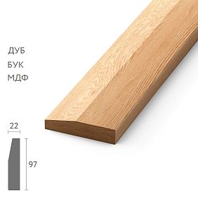
Determine the height and profile of the baseboard. For low ceilings—no higher than seventy millimeters, simple profile. For high ceilings—from one hundred twenty and above, complex profile possible. For standard ceilings—eighty to one hundred millimeters, medium profile.
Design the panel system. Determine which walls will have panels, at what height, vertical or horizontal, solid or with gaps. Draw a diagram, calculate the amount of material.
Coordinate the color scheme. Decide whether the wooden elements will contrast with the walls or blend with them. Contrast enhances the effect of boundaries and directions, monochrome creates integrity and expansion.
Hire professionals for installation or thoroughly study the technology if doing it yourself. The quality of installation is half the success. Crooked slats or gaps in baseboard corners will ruin the entire effect.
STAVROS: Tools for Spatial Architecture
When it comes to a systematic approach to changing interior proportions through wooden elements, not only the concept is critical, but also the quality of materials, manufacturing precision, and the consistency of all elements with each other. Buying a baseboard separately in one place, panels in another, casings in a third—means getting a set of disparate parts that don't form a system. The company STAVROS offers precisely a systematic approach: all elements—fromwooden baseboardstowall panels—It begins with understanding the basic principles of visual perception of space. The golden ratio, the rule of thirds, symmetry and asymmetry — all these classical principles are applied in wooden wall decoration.tomolding—are produced in a single technological cycle, from coordinated wood species, with precise profiles that complement each other.
STAVROS's production capabilities allow for the manufacture of both standard catalog elements and custom solutions for specific projects. If your task requires a non-standard height baseboard or slats of a specific cross-section, this is implemented without problems. Work is done with solid oak, ash, beech, walnut, as well as high-density European MDF—this provides the opportunity to select the optimal solution for any budget and any style.
Special attention is paid to geometric precision—when you create an architectural system for proportion correction, even millimeter deviations are unacceptable. STAVROS profiles are manufactured on high-precision equipment with tolerances of ±0.1 mm, which is critical for perfect joints and creating solid visual lines. When two pieces of baseboard from different batches join without adjustment—this is the result of strict quality control at every stage of production.
A wide range of finishing coatings—from natural oils and waxes to professional varnishes and enamels—allows for any visual effect: from warm natural wood to graphic monochrome. Custom tinting in any shade based on a sample is possible, which is critical when you need to precisely match the project's color scheme.
STAVROS specialists' technical support helps at the design stage: you can get a consultation on choosing baseboard height, panel type, installation method, based on the specific tasks of correcting your room's proportions. This is not just selling materials, but a partnership in creating a space that works correctly—visually, psychologically, functionally.
Choosing STAVROS to implement a project for changing interior proportions through a system of wooden elements, you get not just quality materials, but a comprehensive solution: coordinated profiles, precise geometry, a wide choice of species and coatings, customization possibilities, professional support. Because real work with spatial proportions requires not compromises, but precision, systematicity, and an understanding of how each element affects the whole. And this is exactly what STAVROS offers its clients: tools for creating a space that not only looks beautiful but feels right, lives comfortably, and works for you every day, managing perception through precisely calibrated proportions, created from the noble, living material—wood.