


Article Contents:
- Minimalism and Materiality: Why Variety Does Not Contradict Simplicity
- Textural Contrast as the Basis of Expressiveness
- Functional Justification of Each Material
- Economy Through Quality: The Investment Logic of Minimalism
- Wood in Minimalist Forms: Texture Without Ornament
- Panels of Simple Geometry: Rectangles and Squares
- Rails as Graphic Lines: Rhythm and Air
- Baseboards and Casings: Minimum Profile, Maximum Precision
- Wood Color: From Natural to Monochromatic
- Polyurethane as a Tool of Geometry: Lines Without Mass
- Cornices with Rectangular Sections: Pure Horizontals
- Baseboards with Concealed Mounting: Wall Levitation
- Moldings as Frames: Structuring Planes
- Outlets and Covers: Point Accents
- Color and Texture: Balance on the Edge of Asceticism
- Monochromatic Palette with Textural Variations
- Accent Color Through Wood
- Textural Contrast Without Color
- Case Studies of Minimalist Interiors: Practice of Pure Geometry
- Studio Apartment 45 Square Meters: Maximum Function, Minimum Means
- Suburban House 120 Square Meters: Minimalism with Natural Context
- Office 80 Square Meters: Minimalism for Concentration
- Conclusion: Minimalism as the Art of Selection

Minimalism in Interior Design— a philosophy where value is measured not by the number of elements, but by the quality of their execution, precision of lines, purity of forms. Every detail carries function and meaning, nothing is superfluous.Wooden panels— in a minimalist space, not decoration, but a structural element creating textural contrast with smooth painted surfaces.Oak planks— form graphic geometry, rhythmic verticals or horizontals, dividing space without partitions.Polyurethane finishAdds architectural clarity — straight cornice lines, hidden skirting, minimalist moldings without ornamentation. The combination of live wood texture and perfect polyurethane smoothness creates interiors where minimal means produce maximum impact.


Minimalism and Materiality: Why Variety Does Not Contradict Simplicity
A common misconception about minimalism — the less material, the purer the style. Monochromatic white spaces without textural variety quickly turn sterile, cold, and devoid of humanity. True minimalism uses material variety to create depth while preserving visual purity.


Textural Contrast as the Basis of Expressiveness
Smooth painted walls psychologically feel cold — a flat matte or glossy surface does not provide the eye with points of interest. The gaze glides over, not lingering, and the space is perceived as unfinished and temporary.Wooden panelsOn one wall, create a textural accent — annual rings, grain direction, natural color variations of wood transform a flat surface into an object of contemplation.
The contrast between organic and artificial enriches perception. Wood — a living material with natural irregularity, each board is unique. Polyurethane — synthetic with absolute uniformity, each element is identical. Their proximity highlights the naturalness of one and the technological nature of the other, creating a dialogue between nature and civilization — a central theme of modern minimalism.
Tactile variety is critical for spaces where visual minimalism may seem austere. Touching a warm, silky-oiled wooden panel evokes a sense of coziness and homeliness. The polyurethane cornice is cool, smooth, and neutral. This difference in temperature and texture makes a minimalist space not cold, but balanced.
Our factory also produces:


Functional Justification of Each Material
In minimalism, every element must have functional justification — decoration for decoration’s sake is unacceptable.Oak planksBehind the TV, performs an acoustic function — disperses sound, preventing echo, typical for minimalist spaces with minimal soft furnishings and textiles. Simultaneously, creates a visual structure, defining a zone.
Polyurethane finishHides technical gaps, compensates for wall irregularities without bulky structures. A hidden polyurethane skirting with an aluminum profile creates a visual effect of floating walls — a 10-15 millimeter gap between wall and floor, often with backlighting. Functionally hides the deformation joint, visually lightens the space.
Zoning space with wooden elements without solid partitions preserves the openness of minimalist layouts while providing functional separation. A lath wall between the living room and bedroom in a studio is transparent but creates a visual boundary. Minimalism gains structure without losing air and light.
Get Consultation
Economy through Quality: Investment Logic of Minimalism
Minimalism is cheaper than maximalism in terms of number of elements, but more expensive per unit quality. One square meter of premium oak panels creates a greater effect than ten square meters of cheap imitation. High-quality polyurethane elements with perfect geometry and smoothness justify their cost through longevity and visual purity.
The absence of decorative excess redirects the budget toward materials and execution. Instead of many cheap details — a few expensive, but perfect ones. Oak laths with 40x40 mm cross-section from radial sawing with ideal geometry cost 2000-3000 rubles per meter. For an accent wall 3x2.5 meters with 150 mm spacing, you need 17 laths 2.5 meters long — 100,000-130,000 rubles. Expensive, but the result lasts decades, never becomes stylistically outdated.
Polyurethane elements with simple profiles without ornamentation are more affordable than carved classical ones. A 80 mm wide skirting with a simple beveled profile costs 300-500 rubles per meter versus 800-1500 for profiles with moldings. A 100 mm wide rectangular cornice costs 400-700 rubles per meter versus 1200-2500 for complex profiles. Minimalist profiles save budget while preserving material quality.
Wood in minimalist forms: texture without ornamentation
Minimalist use of wood rejects carving, complex profiles, and ornamentation. It values the purity of form, honesty of material, and expressiveness of natural texture.
Panels of simple geometry: rectangles and squares
Wooden panelsFor minimalism — rectangular or square without molding frames. A 1200x400 mm oak or beech plywood panel, 10-12 mm thick, is glued directly to the wall or mounted on a hidden frame. Without frames, without protruding edges — only a flat surface with wood texture.
Panel layout is geometrically strict. Horizontal stripes of equal width with equal intervals — rhythm creates structure. Panels 300 mm wide with 50 mm intervals (painted wall) from floor to 2000 mm height create a graphic striped wall. Seven panels high, minimalist precision.
Vertical layout elongates space. Panels 400 mm wide, from floor to ceiling 2600 mm, with 100 mm intervals. Five panels on a 3000 mm wide wall. Verticals create dynamism, upward direction, visual height increase.
Checkerboard layout of 600x600 mm square panels with alternating grain direction — vertical and horizontal — creates a geometric pattern that is natural yet structured. Eight panels on a 2400x2400 mm wall. Each panel is unique due to texture, yet together they form an orderly composition.
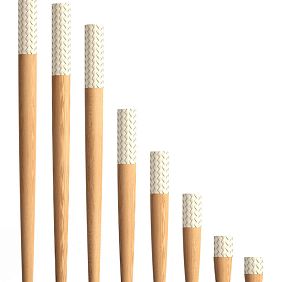
Laths as graphic lines: rhythm and air
Oak planksWith cross-sections of 20x40, 30x40, 40x40 mm, they create linear graphics. Vertical laths with 100-200 mm spacing transform a wall into a rhythmic structure — alternating wood and painted wall, light and shadow under side lighting. Simplicity of form, complexity of perception.
The contrast between the wood and the background enhances the graphic quality. Dark oak slats stained in wenge on a white wall—maximum contrast, black-and-white graphics. Light beech slats on a gray wall—medium contrast, calm harmony. Oak slats in a natural tone on a beige wall—minimal contrast, tonal softness.
Transparency of lath structures preserves the airy quality of minimalist space. A 150-200 mm spacing creates 70-80% transparency — through the laths, the wall, window, or another room is visible. Zoning is achieved while maintaining visual connection between zones, critical for minimalism.
Monochromatic lath walls enhance minimalism. Laths are painted the same color as the wall behind them — white laths on a white wall. Structure is read only through shadows from protruding laths and play of light on edges. Maximum restraint, sophistication through simplicity.
Baseboards and casing: minimal profile, maximum precision
Minimalist wooden skirting boards - rectangular strips 80-100 mm high, 15-20 mm thick, without profiling or with minimal 2-3 mm bevel. Finished oak or beech in oil or lacquer. Perfect geometry - straight angles, parallel edges, tight joints without gaps.
Hidden skirting board - a trend of recent minimalism. Aluminum profile 60-80 mm high mounted to the wall, creating a 10-15 mm gap between wall and floor. Profile painted to match wall color or covered with thin 3-5 mm oak strip. Floating wall effect, visual lightness, possibility of hidden under-lighting from below.
Door and window casings in minimalism are rectangular, without extensions, protrusions, or decoration. Strip 60-80 mm wide, 10-15 mm thick, made from the same wood species as skirting boards. Installation flush with wall or with minimal 3-5 mm protrusion. Visual connection with skirting boards through material, color, and geometry.
Wood color: from natural to monochrome
Natural wood color without tinting - first choice for minimalism. Golden-brown oak, pinkish-yellow beech demonstrate material honesty. Oil finish highlights texture, leaves surface breathable and tactilely pleasant. For Scandinavian and eco-minimalism, natural wood is essential.
Whitewashed oak or beech - popular solution for light minimalist interiors. Special oil or stain lightens wood by 2-3 tones, preserving visible texture. Result - almost white wood with delicate wood grain pattern. In rooms with insufficient natural light, whitewashed wood creates visual expansion and freshness.
Dark stained wood - for contrasting minimalist interiors. Oak stained with wenge or black stain becomes almost black while preserving texture. Dark panels or strips on white walls - classic minimalist graphic. In spacious rooms with abundant light, dark wood creates drama without gloom.
Wood painted in monochrome palette - modern interpretation of minimalism. Wooden panels painted in the same color as walls (white, gray, black) while preserving visible texture. Material is recognizable, but no color contrast. Maximum visual purity, textural complexity.
Polyurethane as a tool of geometry: lines without mass
Polyurethane finishIn minimalist interiors, performs the role of graphic lines, creating architectural structure without visual weight or decorative excess.
Crown molding with rectangular cross-section: clean horizontals
Minimalist ceiling moldings - rectangular strips 80-120 mm wide, 40-60 mm high, without profiling, rounding, or ornament. Only straight edges, sharp angles. Painted to match ceiling (usually white) or walls, creating geometric boundary between planes.
Hidden under-lighting behind molding - functional and aesthetic minimalist solution. LED strip between molding and ceiling provides soft diffused glow, reflected from ceiling. Molding visually floats, boundary between it and ceiling blurs. In low rooms, effect of visual height increase is significant.
Shadow gap instead of molding - radical minimalism. Ceiling and walls meet not tightly, but with 20-30 mm gap, inside which darkness or hidden under-lighting is located. Polyurethane profile hides in the gap, creating technical possibility while visually invisible. Ceiling floats above walls, space appears infinite.
Hidden skirting boards: floating walls
Hidden skirting board from aluminum profile with polyurethane insert - typical minimalist solution. Profile 60-80 mm high mounted to wall, creating 10-15 mm gap between wall and floor. Polyurethane strip 50-60 mm wide inserted into profile, covering it but leaving gap visible.
Under-lighting of hidden skirting board enhances floating effect. LED strip in the gap creates a light strip along the floor perimeter. At night or evening, under-lighting acts as guiding light, not requiring main lighting to be turned on. During day, visible as light strip, emphasizing space geometry.
Skirting board color matches overall palette. White skirting on white walls - complete blending, visibility only of gap. Black on white walls - contrasting graphic line along floor. Gray on gray walls - tonal harmony, delicate structure.
Moldings as frames: structuring planes
Polyurethane moldings in minimalism - thin strips 20-40 mm wide, 5-10 mm thick, rectangular or trapezoidal cross-section without decoration. Used to create geometric frames on walls, mark zones, frame panels.
Vertical moldings from floor to ceiling divide wall into sections. Three moldings spaced 1000 mm apart create four equal sections on 3600 mm wide wall. Sections painted in different gray shades or one section highlighted with wooden panels. Moldings as graphic grid organize chaos into order.
Horizontal moldings at 1000-1200 mm height divide wall vertically, creating three-part structure - lower, middle, upper. Each zone treated differently - lower with wooden panels, middle painted, upper with wallpaper or decorative plaster. Molding as architectural boundary makes transition logical.
Outlets and covers: point accents
Minimalist ceiling outlets - round or square discs 300-500 mm diameter/side without ornament, only smooth surface with concentric rings or squares. Painted to match ceiling, creating barely noticeable relief accent around chandelier or light fixture.
Polyurethane rectangular covers for switches and outlets without decoration create visual unity with moldings and moldings. Instead of plastic frames of standard size - polyurethane rectangles 150x100 mm, painted to match wall color. Switch and outlet integrated into wall plane, not disrupting purity.
Color and texture: balance on the edge of asceticism
Minimalism balances between visual purity and sterility. Proper use of color and texture prevents sliding into lifeless emptiness.
Monochrome palette with textural variations
White as primary color of minimalism gains depth through textural variety. White painted walls matte, white ceiling molding semi-matte, white wooden panels with visible texture under white oil. Three shades of white, three textures create multi-layered effect within monochrome color scheme.
Gray palette from light gray to graphite creates tonal depth. Walls light gray, polyurethane moldings medium gray, wooden strips stained dark gray. Gradation of tones organizes space by importance - light recedes, dark advances, medium tones balance.
Black-and-white contrast - classic minimalism. White walls, black floor, black wooden planks or panels on white walls, white polyurethane cornices. Graphic, clear, dramatic without color complexity. For spacious rooms with abundant light, the black-and-white palette creates artistic expressiveness.
Accent color through wood
Natural wood as the only color accent in a monochromatic space creates a visual focus. White walls, white ceiling, light gray floor, natural oak panels on one wall. The golden-brown tone of the wood becomes an accent, drawing the eye and adding warmth to the cold monochromatic setting.
The color of wood can vary to achieve the desired effect. Light beech in Scandinavian minimalism adds freshness and naturalness. Dark stained oak in contrastive minimalism creates a dramatic accent. Reddish tones of exotic woods introduce surprise and individuality.
Limiting the accent to one zone concentrates attention. The entire apartment is monochromatic, with wooden paneling only behind the bed headboard in the bedroom. Or behind the sofa in the living room. Or on the ceiling in the hallway. The single zone with color and wood texture becomes a visual event, a memorable element.
Textural contrast without color
Texture creates visual richness without color variety. Smooth painted wall, textured wooden panels with brush finish, smooth polyurethane cornice — three textures, one color (white). Light plays differently on each surface, creating visual complexity.
The direction of texture also works. Vertical wooden planks, horizontal floorboards, smooth ceiling. Perpendicular directions create geometric dynamics. The eye follows the verticals of the planks upward, then switches to the horizontals of the floor, then settles on the smoothness of the ceiling.
Texture scale is variable. Fine-grained beech, medium-grained oak, coarse-grained ash. In one interior, one or two species at most, but their textural differences create variety while maintaining material unity — everywhere wood, but different.
Minimalist interior cases: practice of pure geometry
Theoretical principles are concretized in real projects, where wood and polyurethane create minimalist spaces with character.
45-square-meter studio apartment: maximum functionality, minimum means
Open space 7x6.5 meters, ceilings 2.65 meters. Zoning without partitions — living room, bedroom, kitchen, hallway in one volume. Walls are matte white, floor is light gray ceramic tile resembling concrete, ceiling is white. Monochromatic base.
Bedroom zone is highlighted by vertical oak planks 40x40 mm spaced 120 mm apart, 2400 mm high. Natural color under oil — the only color accent in the studio. Plank wall length 2500 mm, behind it is the bed. Planks create a visual boundary while maintaining transparency — from the living room, through the planks, the window of the bedroom zone is visible.
Living room zone — white sofa, white walls, wooden coffee table made of the same oak as the planks. TV on the wall without additional decor. Rectangular-sectioned polyurethane cornice 100x50 mm around the ceiling, white with hidden lighting. The floating ceiling effect compensates for the low 2.65 meters.
Kitchen linear along one wall 3 meters. Glossy white facades without handles (push-to-open mechanisms). Countertop and backsplash made of the same light gray ceramic tile as the floor — visual unity. Bar counter separates the kitchen from the living room — oak countertop 40 mm thick on white polyurethane legs (painted, no imitation).
Hallway is not a separate zone. Entrance door opens into the common space. Along the wall by the door, a low white shoe cabinet, above it horizontal oak planks 30x40 mm spaced 100 mm apart on a 1500x600 mm wall section — place for coat hooks. Minimalism of function — nothing extra.
Lighting is multi-level. Hidden backlighting behind the cornice for general soft light. Track spotlights on black rails for accent lighting — directed at the plank wall, coffee table, bar counter. Minimalism does not mean darkness — abundance of directional light creates drama.
Rural house 120 square meters: minimalism with natural context
One-story house with panoramic windows, surrounded by forest. Interior space flows into nature. Minimalism here is not cold geometry, but a frame for appreciating nature.
Living room 35 square meters with a 4-meter-wide window overlooking the forest. Walls are white, ceiling 3 meters high, white with oak beams 100x150 mm, running across the ceiling at 1500 mm intervals. Beams in natural color — connection to nature outside the window. Between beams, ceiling is smooth white.
Floor is wide oak parquet boards 200 mm wide, natural tone. Wall opposite the window is clad with oak panels from floor to ceiling without gaps — solid wooden surface. Panels vertical, 150 mm wide, tightly joined. Wood texture as art, requiring no additions.
Fireplace in the corner made of minimalist black metal design — glass cube with open flame. Chimney is black cylinder 200 mm diameter from fireplace to ceiling, through ceiling to roof. Chimney vertical contrasts with horizontal beams — geometric play.
Furniture is minimal — low gray sofa without armrests, two cube-shaped chairs, coffee table made of solid oak 1200x800x300 mm as a monolithic block. No TV — panoramic window on the forest is more important than a screen. Bookshelves integrated into wooden wall — routed niches 300x300x300 mm, parts of panels cut out, creating recessed shelves.
Bedroom 20 square meters with window overlooking the forest. Absolute minimalism — bed on low platform 100 mm high made of oak, no headboard. Walls are smooth white without decor. Ceiling is white with one transverse oak beam. Built-in wardrobe along the entire wall without visible doors — white push-to-open panels, when closed, the wardrobe is not visible, wall appears monolithic.
Bathroom 12 square meters — white ceramic, gray ceramic tile, oak countertop under sink. Hidden-mount polyurethane skirting with backlighting creates floating walls. Frameless mirror covering the entire wall — visual doubling of space. Minimalism of function — bathtub, shower, sink, toilet, nothing decorative.
Office 80 square meters: minimalism for concentration
Open office space for a creative studio. Requires concentration, minimum distractions, maximum functionality. Walls are matte light gray, ceiling white, floor dark gray polished concrete.
Work zone — six white MDF desks along the walls. Above each desk, vertical oak planks 30x30 mm spaced 80 mm from desk to ceiling — area 1200x1600 mm. Planks create a visual boundary for each employee’s workspace, acoustically diffuse sound, and hold pinboards for notes. Functionality and aesthetics.
Meeting zone — glass partition from floor to ceiling separates from the common space. Behind glass, desk made of solid oak 3000x1200 mm on black metal legs. Wall behind desk — white with horizontal polyurethane moldings, creating a modular grid for mounting boards, screens. Minimalism with functional flexibility.
Living area - gray modular sofas, low oak coffee table, bookshelves along the wall made of oak planks with 300 mm spacing - books between the planks, planks as shelf structure. Coffee machine on a separate oak countertop integrated into the wall.
Office lighting is functional - track systems with adjustable spotlights above each workstation, 500 lux on the desk. Fluorescent panels on the ceiling for general lighting. Polyurethane cornice around the perimeter with hidden backlighting for evening work when bright lighting is excessive.
Conclusion: minimalism as an art of selection
ModernMinimalism in Interior DesignNot a rejection of materials, but a careful selection of few, yet perfect ones.Wooden panelsandOak planksThey bring natural texture, warmth, and tactile richness into monochromatic spaces.Polyurethane finishCreates architectural clarity, graphic lines, hidden functions without visual weight.
The balance between organic and synthetic prevents sterility. Wood adds life, polyurethane adds order. Textural contrast enriches visual perception despite restrained color. Functional justification of each element prevents decorative excess — if an element is not functional, it is unnecessary.
Geometry becomes the basis of beauty. Clear lines of planks, straight angles of panels, parallel cornices create visual music from the simplest elements. Rhythm, repetition, symmetry organize space without decorative excess.
Execution quality is critical. Minimalism does not tolerate carelessness — every joint, every angle, every edge is visible. Ideal geometry of wooden elements, flawless smoothness of polyurethane, precision of assembly determine success. Cutting corners on quality destroys minimalism, turning it into poverty.
The longevity of minimalist solutions pays for the investment. Simple forms do not become outdated stylistically. Oak planks remain current after 20 years, acquiring patina. Polyurethane elements retain geometry for decades. Minimalism is a timeless style, an investment in permanence.
Create spaces where every element is in its place, every line is meaningful, every material is fully expressed. Minimalism is not emptiness, but concentration of value in few, yet perfect elements. Your space deserves such precision, such honesty, such pure geometry.


