


Article Contents:
- Principles of Compositional Unity: From Chaos to Harmony
- The Law of Style Unity: Speaking the Same Language
- The Law of Scale Correspondence: Proportions Decide Everything
- The Law of Color Coordination: Shades as Connecting Threads
- Furniture Handles as Compositional Nodes
- Geometry of Form: From Handle to Wall
- Materiality and Texture: Wood as a Connecting Thread
- Rhythm and Repetition: The Music of Forms
- Wall Molding: Architectural Context for Furniture
- Molding Frames: Framing Furniture
- Vertical Pilasters: Rhythm and Division
- Horizontal Borders and Friezes: Zoning by Height
- Ceiling as the Fifth Wall: Completing the Composition
- Ceiling Cornices: Boundary and Connection
- Ceiling Rosettes: Vertical Axes
- Ceiling Coffers: Complex Geometry
- Practical Scenarios: From Concept to Implementation
- Living Room with Classic Furniture
- Kitchen in Scandinavian Style
- Bedroom in Neoclassical Style
- Common Mistakes and How to Avoid Them
- Scale Error: When Handles Get Lost Against Molding
- Style Error: When Modern Meets Baroque
- Color Error: When Shades Don't Match
- Rhythm Error: Chaotic Arrangement
- Frequently Asked Questions
- Is It Necessary to Use the Same Material for Handles and Molding?
- Can Handles of Different Shapes Be Used in One Interior?
- How to Choose the Size of a Ceiling Rosette?
- Is Molding Needed in a Minimalist Interior?
- How to tie furniture and molding together with color if the walls are colored?
- Can molding be added to an already finished interior with furniture?
- How often should wall moldings be used?
- Is it mandatory to use a ceiling rosette?
- How to combine wooden handles made from different wood species?
- Can overlays on furniture fronts be used together with wall molding?
- Company STAVROS: the architect of your space

An interior becomes a cohesive work of art when every element is connected by invisible threads to the others. There is no separately beautiful furniture, separately beautiful walls, separately beautiful ceiling — there is a unified space where everything works towards a common effect.Designer furniture handlesbecome the connecting link between the horizontality of the fronts and the verticality of the walls, anddesigner moldingscreates an architectural framework that unites all planes into a harmonious composition.
Most people approach interior design element by element: they choose furniture, then wall finishes, then ceiling decor. The result is a collection of disparate objects that exist in parallel but do not interact with each other. The professional approach is different — first, a concept of connections is created, a system of echoes of forms, colors, and materials. And only then are specific elements selected that embody this system.
Why do some interiors look harmonious even on a minimal budget, while others appear chaotic despite expensive furniture and finishes? The secret lies in compositional unity. WhenBeautiful moldings on wallsrepeats the shape of furniture handles, when the rhythm of wall moldings matches the rhythm of cabinet front divisions, when the pattern of a ceiling rosette echoes the decor on dresser doors — the magic of integrity is born. The space begins to sound like a symphony, where every instrument is in its place.


Principles of compositional unity: from chaos to harmony
Creating a connected interior begins not with purchasing specific items, but with understanding the fundamental principles that govern our perception of space.


The law of stylistic unity: speaking the same language
Every historical style is a system of visual codes, a language of forms and ornaments. Classicism operates with symmetry, strict proportions, and antique motifs. Baroque — with curved lines, lush swirls, and theatricality. Art Nouveau — with smooth biomorphic forms, stylized plants, and the rejection of right angles.
When minimalist rectangular oak handles are installed on kitchen fronts, and Baroque molding with lush roses and putti is on the living room walls, visual dissonance arises. These are two different languages that do not understand each other. The brain expends energy trying to reconcile the contradiction and experiences discomfort.
The solution is to choose one stylistic code and follow it consistently. If furniture handles are geometric and modern — the molding should be laconic, with simple profiles and minimal ornamentation. If the handles are carved, with plant motifs — the molding can be ornamental, with acanthus leaves and rosettes.
This does not mean strict historical accuracy. Modern eclecticism allows for mixing eras, but within a common logic. Neoclassical molding can be combined with Scandinavian-style furniture if a light palette, simple handle shapes, and laconic molding profiles are used. The main thing is the commonality of the visual language, not literal adherence to the canons of one style.
Our factory also produces:


The law of scale correspondence: proportions decide everything
The human eye is sensitive to size ratios. Small elements against large ones get lost and appear insignificant. Large ones against small ones overwhelm and disrupt the balance.
If massive wooden handles 25 cm long are installed on cabinet fronts, and thin 2 cm wide moldings are on the walls, the handles will dominate and draw attention. The wall will become a background for the furniture, losing its own significance. Conversely: miniature 3 cm diameter button handles against wide 15 cm cornices and large wall panels will disappear, and the furniture will visually shrink.
The optimal ratio is comparability of scales. The width of a furniture handle should be approximately equal to the width of a wall molding (plus or minus 20-30%). The height of the handle's relief should relate to the depth of the molding's relief. The size of decorative overlays on fronts should be proportional to the size of wall panels.
The rule of the golden ratio works here too. If the maximum width of wall decor is X cm, the optimal length of a furniture handle is 0.618×X cm. This creates a harmonious ratio without conscious calculation — the brain reads the proportion as natural.
Get Consultation
The law of color coordination: shades as threads of connection
Color is the most powerful tool for uniting disparate elements into a single whole. The same shade, repeating in different parts of the interior, creates a visual rhyme that connects the space.
Monochromatic scenario: walls painted light gray, wall molding in white, furniture fronts in graphite gray, furniture handles made of natural light oak. The gray palette unites all surfaces, and the warm tone of the wooden handles adds an accent without destroying the integrity.
Contrast scenario: white walls, white molding (monochrome), furniture fronts dark blue, handles made of oak stained dark brown. The dark handles echo the dark fronts, creating unity of the furniture block against the light background of the walls.
Accent scenario: general background neutral (beige walls, white molding, light furniture fronts), but several elements are painted bright emerald — one wall overlay, wooden furniture handles stained green. The accent color unites walls and furniture, creating a recurring theme.
Important: color echoes must be precise. Not just 'green,' but a specific shade of green—emerald, olive, malachite. A spread of shades within one color creates a sense of randomness, not thoughtfulness.
Furniture handles as compositional nodes
Designer furniture handles—not just functional hardware. They are points where the gaze stops, lingers, reads information. Properly chosen and placed handles become compositional nodes that structure the space.
Geometry of form: from handle to wall
The shape of a furniture handle is a visual code that should find resonance in other interior elements.
Rectangular pull handles with clear edges dictate geometric logic to the entire space. On walls, rectangular molding frames, strict vertical pilasters, linear cornices with minimal decor are appropriate. The ceiling—with clear geometric layouts of straight-line moldings. Everything is subordinated to the logic of straight lines and right angles.
Round knob handles introduce softness, roundness of forms. They are supported by round wall sockets, oval panels, cornices with rounded profiles. One can useceiling rosettesof round shape, which visually rhyme with the round handles on the furniture below.
Asymmetric handles of unusual shapes (triangular, boat-shaped, sculptural) require support from non-standard decorative elements. These can be asymmetric wall overlays, unusual configurations of molding frames, avant-garde ceiling compositions.
The echo should not be literal (no need to place round sockets exactly above round handles). It is enough for the forms to be comparable, belonging to the same family—all angular or all rounded, all symmetrical or all asymmetric.
Materiality and texture: wood as a connecting thread
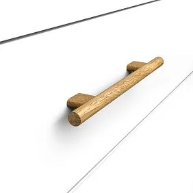
Wooden handles made of solid oak or beech have an expressive texture—annual rings, grain direction, natural shade variations are visible. This textural quality should find continuation in other elements.
If the interior hasWooden trim—moldings, baseboards, architraves made of the same solid oak—the connection is obvious. The same wood, the same texture, the same tonality create material unity.
If there is no wooden trim, but polyurethane molding is used, it can be painted in a shade that imitates the wood of the handles. There are special glazing compositions that create the illusion of wood texture on polyurethane—not an exact copy, but a hint that the brain reads as material kinship.
An alternative path—contrast of materials, but with preservation of tonal commonality. Dark wooden handles made of stained oak + white polyurethane molding on dark gray walls. The contrast of dark wood and white polyurethane is obvious, but they are united by both contrasting with the dark walls, both being accent elements.
Rhythm and repeatability: music of forms
Rhythm—regular repetition of elements at certain intervals—creates a sense of order and harmony. Furniture handles, placed with a certain rhythm on facades, set this rhythm for the entire space.
A kitchen set with a vertical row of drawers, each with a horizontal handle—creates a vertical rhythm (repeating horizontals at equal intervals). This rhythm can be supported on the wall with horizontal moldings, placed at the same interval vertically.
A wardrobe with three doors, each with two vertical handles—creates a grid structure (6 points, organized in 3 columns of 2 rows). The wall behind the wardrobe can be decorated with molding frames forming a similar grid—2 rows of 3 frames.
It is important not to copy the rhythm literally (it will look mechanistic), but to create variations. If the rhythm on the furniture is frequent (handles every 40 cm), on the wall it can be sparse (molding divisions every 80 cm). The main thing is to preserve the multiplicity of intervals.
Molding on walls: architectural context for furniture
Walls are the background against which furniture exists. But not a passive background, but an active environment that can either enhance the furniture or lose it.Beautiful moldings on wallscreates an architectural structure that integrates furniture into the space.
Molding frames: framing furniture
A classic technique—creating a molding frame on the wall behind the furniture, which visually highlights this area, turning it into an architectural niche.
Behind the sofa in the living room—a vertical rectangular frame made ofmoldingfrom floor to ceiling, slightly wider than the sofa. The frame creates the illusion that the sofa is built into the wall, is part of the architecture, not just placed against it.
Behind the kitchen set—horizontal moldings at countertop height and at the height of the upper cabinets. They divide the wall into zones (base, work, hanging), structure the space, making the set part of the architectural composition.
Behind the dresser in the bedroom—a square or horizontal rectangular frame, inside which is a contrasting wall color or wallpaper with a pattern. The dresser against this frame looks like an exhibit in a museum display case—highlighted, significant, compositionally complete.
Molding width for frames — 5-10 cm, profile — simple (rectangular or with a minimal bevel for modern interiors, with a classic ogee or torus for traditional). Color — contrasting to the wall (white on gray, gray on white) or tonal (tone-on-tone, but with a different texture — glossy molding on a matte wall).
Vertical pilasters: rhythm and division
A pilaster is a vertical element that imitates a flat column. In interiors, polyurethane pilasters create vertical accents that divide long walls into sections.
A long wall with a row of cabinets — pilasters between the cabinets visually divide the furniture mass into separate blocks, preventing a monotonous effect. Handles on cabinet doors become horizontal accents, pilasters — vertical ones. Vertical and horizontal intersect, creating a grid-like structure.
A tall wall with a tall cabinet — pilasters on the sides of the cabinet visually frame it, creating an architectural portal. Especially effective if the pilasters run from floor to ceiling, while the cabinet only reaches a certain height. An illusion is created that the cabinet is built-in between architectural elements.
Pilasters can be smooth (simple rectangular profile without ornament) or decorated (with fluting, carving, overlays). The choice depends on the interior style and the complexity of the furniture handles: the more complex the handles, the simpler the pilasters should be, and vice versa.
Horizontal borders and friezes: zoning by height
Horizontal moldings running along the wall at a certain height divide the wall into zones — lower and upper, base and main. This is an ancient architectural technique that also works in residential interiors.
Molding at a height of 90-100 cm from the floor — classic panel height. The wall below the molding can be painted a different color (darker than the upper part), clad with wooden panels, or wallpapered with a dense pattern. Furniture placed along such a wall visually integrates into the lower zone. Furniture handles located below the molding are perceived as part of a unified decorative system.
Molding at a height of 200-220 cm — at the level of doorways. It creates a horizontal line that visually expands the room (horizontal always expands). Tall cabinets reaching this line look harmoniously integrated into the architecture. Handles on the upper cabinet doors end up exactly under the molding, creating compositional completeness.
Two moldings — at heights of 100 cm and 200 cm — divide the wall into three zones. This is a complex but very expressive scheme suitable for high rooms (from 3 meters) and requires corresponding furniture of different heights.
Ceiling as the fifth wall: completing the composition
The ceiling is often ignored, left white and smooth. This is a mistake: the ceiling is as significant a plane as the walls, and decorating it with molding completes the creation of a cohesive space.
Ceiling cornices: boundary and connection
A cornice is a molding running along the perimeter of a room at the junction of the wall and ceiling. It serves a dual function: it separates the wall and ceiling (visually makes the room taller) and connects them (creates a transitional zone).
The choice of cornice width is critical. A narrow cornice (5-7 cm) is almost unnoticeable, works as a technical detail. A medium one (10-15 cm) creates a noticeable boundary, adds architectural character. A wide one (20-30 cm) becomes a powerful decorative element, dominating the space.
The cornice profile should echo the profiles of the wall moldings. If the walls use moldings with a classic torus, the cornice should have a similar profile. If the wall moldings are rectangular — the cornice is also rectangular.
Cornice color — usually white (even with colored walls), but variations are possible. A cornice in the wall color creates a monochrome flow from wall to ceiling. A cornice in a contrasting color (e.g., black on white walls and white ceiling) creates a graphic frame.
The connection between the cornice and furniture handles is indirect, through a common style. Geometric handles require a geometric cornice, classic ones — a classic profile.
Ceiling rosettes: vertical axes
Ceiling rosetteA rosette is a round or polygonal overlay on the ceiling, usually at the chandelier mounting point. But its function is not only decorative-technical (to hide wires), but also compositional.
A rosette creates a focal point on the ceiling. The eye, gliding over the walls and furniture, rises to the ceiling and finds a center there — the rosette. This completes the visual journey, closes the composition.
The size of the rosette should correspond to the scale of the room and furniture. In a small room with compact furniture, a large rosette 80 cm in diameter will be overwhelming. Better 40-50 cm. In a spacious hall with massive cabinets and dressers, a small rosette will get lost — 60-80 cm or even larger is needed.
The rosette ornament should echo the ornamentation of furniture handles and wall molding. If the handles are smooth, geometric — the rosette has minimal ornament, simple concentric circles or radial rays. If the handles are carved, with floral motifs — the rosette can be ornamented, with acanthus, flowers, scrolls.
The placement of the rosette defines the vertical axis of the room. A focal piece of furniture — a dining table, a central dresser, a bed — is often placed under the rosette. The furniture handles on this piece end up on the same axis as the rosette, creating a visual vertical from floor to ceiling.
Ceiling coffers: complex geometry
Coffers are recessed rectangular or square sections on the ceiling, framed by moldings. This is a complex but effective technique suitable for high rooms (from 3 meters).
A coffered structure creates a geometric grid on the ceiling — a series of rectangles or squares separated by molding ribs. This grid visually rhymes with the grid of furniture fronts, divided into sections by handles and panels.
If a cabinet front has three vertical rows of handles (three doors), the ceiling above the cabinet can be divided into three coffers. The vertical axes of the coffers coincide with the vertical axes of the door
s. This creates a strict geometric connection between the furniture and the ceiling.
The depth of coffers is 5-10 cm (enough to create a play of light and shadow, but not to critically reduce the height of the room). The inner surface of coffers can be painted in a contrasting color (e.g., light gray coffers on a white ceiling) or in the same color but with a different texture (glossy coffers on a matte ceiling).
Practical Scenarios: From Concept to Implementation
Theory becomes clear through specific examples. Let's consider several typical interior situations and ways to create compositional unity.
Living Room with Classic Furniture
Initial data: living room 25 m², ceiling height 2.8 m, walls light beige, ceiling white. Furniture: classic buffet with carved oval oak handles, chest of drawers with similar handles, coffee table with carved oak legs.
Solution: the wall behind the buffet is decorated with a vertical polyurethane molding frame 150 cm wide, height from floor to ceiling cornice. Molding width 8 cm, classic profile (cavetto + torus). Molding color — white, inside the frame the wall is painted a shade darker than the main beige.
Wall behind the dresser - a horizontal frame 120 cm wide, 80 cm high (at the level of the mirror hanging above the dresser). Same molding, same proportions. Symmetry with the buffet frame is not required, but proportionality is maintained.
Ceiling: perimeter cornice 12 cm wide with a classic profile, repeating the profile of the wall moldings. Above the dining area (if present) or in the geometric center of the room — a ceiling rosette 60 cm in diameter with a plant ornament (acanthus leaves), echoing the carving on the furniture handles and legs.
Result: furniture, walls, ceiling are connected by a common classic language. Oval handles on the furniture rhyme with the round rosette on the ceiling (both are rounded shapes). Carving on handles and legs echoes the rosette ornament. Molding frames on the walls create an architectural context into which the furniture naturally fits.
Kitchen in Scandinavian Style
Initial data: kitchen-living room 18 m², ceiling height 2.7 m, walls white, ceiling white. Furniture: kitchen set with light fronts (whitewashed oak),Wooden handlesrectangular, minimalist, made of light beech.
Solution: wall above the work area (backsplash) — white matte ceramic tile. Walls in the dining area — also white, but with added structure: horizontal molding at a height of 100 cm from the floor, dividing the wall into a panel (lower part) and an upper part. Molding simple, rectangular, 5 cm wide, white.
Lower part of the wall (panel) painted light gray (2 shades darker than white), upper part — white. The dining table stands against this wall, the rectangular wooden table legs visually continue the vertical lines set by the molding (molding — horizontal, legs — vertical, together — a geometric grid).
Ceiling: minimalist cornice 7 cm wide, rectangular profile, white. No rosettes (Scandinavian style leans towards minimalism). Instead of a rosette — several spotlights arranged geometrically (in a line or square grid), supporting the geometry of the rectangular handles.
Result: a clean, laconic interior where rectangular handles set a geometric theme, which develops in rectangular moldings, rectangular table legs, linear arrangement of lights. The light palette (white, light gray, whitewashed oak) unites all elements tonally.
Bedroom in Neoclassical Style
Initial data: bedroom 20 m², ceiling height 3 m, walls dark gray, ceiling white. Furniture: bed withcarved wooden legsmade of oak, nightstands with oval wooden handles (oak with dark stain), tall wardrobe with similar handles.
Solution: wall behind the bed headboard — the main accent. A large molding composition is created: central vertical frame 180 cm wide, height from floor to ceiling cornice, inside it — a horizontal frame (at headboard level) 180 cm wide, 140 cm high. Molding 10 cm wide, painted white (contrast with dark gray walls).
Inside the horizontal frame — wallpaper with a thin graphic pattern or decorative plaster with a light texture. The frame surrounds the bed headboard, visually turning it into part of the architectural composition.
Wall with the wardrobe: vertical pilasters on the sides of the wardrobe (from floor to ceiling), white, creating the illusion that the wardrobe is built into an architectural niche. Oval handles on the wardrobe doors are placed on the vertical axis of each door, creating a rhythmic pattern.
Ceiling: wide cornice (15 cm) with a neoclassical profile (combination of straight and rounded elements), white. Above the bed — an oval ceiling rosette 70×50 cm with an exquisite neoclassical ornament (laurel wreaths, ribbons), white. The rosette is positioned exactly above the center of the bed, creating a vertical axis.
Result: a dramatic, elegant interior where the dark background of the walls makes the white moldings and dark wooden furniture elements the main characters. Oval handles rhyme with the oval ceiling rosette. Carved bed legs echo the rosette ornament. Molding frames on the walls create theatricality, turning the bedroom into a boudoir.
Common mistakes and how to avoid them
Even understanding the principles, it's easy to make mistakes in the details. Let's look at typical blunders and ways to prevent them.
Scale error: when handles get lost against the molding background
Situation: large molding frames made of 12-centimeter molding on the walls, an 80 cm diameter ceiling rosette, but on the furniture — miniature knob handles 2.5 cm in diameter. The handles visually disappear, the furniture looks bland against the powerful architectural molding.
Solution: either increase the handles (replace with 15-20 cm long pull handles), or reduce the scale of the molding (molding 6-8 cm, rosette 50-60 cm). The scales should be comparable.
Style Error: When Modern Meets Baroque
Situation: minimalist rectangular stainless steel handles in the kitchen, and a lush Baroque ceiling rosette with putti and garlands in the living room (open-plan layout, kitchen-living room). The visual conflict is irresolvable.
Solution: bring to a common stylistic denominator. Either replace the handles with more classic ones (wooden, with light carving), or replace the rosette with a laconic, geometric one. The third option is to zone the space so that the kitchen and living room are visually separated, and each zone has its own style (but this is difficult in an open-plan layout).
Color error: when shades do not match
Situation: oak wooden handles with a cool gray tint, and the molding is painted in a warm cream color. The color temperature (cool vs. warm) does not match, creating dissonance.
Solution: coordinate the color temperature. Either repaint the molding in a cool gray-white, or replace the handles with oak in a warm honey shade. The color temperature should be uniform for all interior elements.
Rhythm error: chaotic arrangement
Situation: handles on furniture fronts are arranged haphazardly (on one door at the top, on another at the bottom, on a third in the center), and on the walls, molding frames of different sizes and proportions without visible logic. The result is visual chaos.
Solution: introduce a system. Determine where the handles should be (all at the same height or according to the same principle—for example, always 10 cm from the edge of the door). Make the molding frames proportional—either all the same, or subordinate to a single modular grid (for example, all multiples of 60 cm: 60×80, 120×160, 60×120).
Frequently Asked Questions
Is it necessary to use the same material for handles and molding?
No, it is not necessary. You can combine wooden handles with polyurethane molding. The main thing is to coordinate by color, style, and scale. Material is secondary to visual form.
Can handles of different shapes be used in one interior?
Yes, but carefully. If these are different rooms (kitchen and bedroom), each can have its own handles. If it is one space, it is better to stick to one shape or family of shapes (all geometric or all organic).
How to choose the size of a ceiling rosette?
Rule: the diameter of the rosette should be approximately 1/3 of the smaller side of the room. For a room 4×5 meters, the optimal rosette is 60-70 cm. For a room 3×3.5 meters—40-50 cm.
Is molding needed in a minimalist interior?
Minimalism does not exclude molding but requires its laconicism. Simple rectangular moldings without ornament, thin cornices, absence of rosettes or geometric rosettes without decoration—all of this works in minimalism.
How to link furniture and molding by color if the walls are colored?
If the walls are, for example, blue, the molding can be white (contrast), and the handles can be either white (unity with the molding), natural wood (accent), or the color of the walls (merging furniture with the wall). The choice depends on the desired effect.
Can molding be added to an already finished interior with furniture?
Yes, this is one way to link disparate elements. Choose molding that matches the style and scale of the existing furniture, and the interior will gain integrity.
How often should wall moldings be used?
There is no universal rule. In a classic interior, moldings can cover all walls with a grid of frames. In a modern one—one accent wall is enough. The main thing is that the amount of molding corresponds to the amount of furniture: a lot of furniture—a lot of molding, little furniture—little molding.
Is it necessary to use a ceiling rosette?
No, if the interior style does not require it. In minimalism, Scandinavian, loft styles, a rosette is excessive. In classic, neoclassical, art deco styles, a rosette is an almost mandatory element.
How to combine wooden handles of different wood species?
In one room, it is better to use one species. In different rooms, you can vary: oak in the kitchen, beech in the bedroom. But then the molding in these rooms should also differ (by color or profile).
Can overlays on furniture fronts be used together with wall molding?
Yes, and this creates a very strong connection. Overlays on fronts and overlays on walls, executed in the same style (for example, classic floral ornaments), turn furniture and walls into a single decorative ensemble.
Company STAVROS: architect of your space
Creating an interior where every element is connected to others by invisible threads of harmony is an art that requires not only taste but also quality materials. For 23 years, the company STAVROS has been creating tools for this art:wooden furniture handlesmade from solid oak and beech,polyurethane decorative molding, Wooden trimfor walls and ceilings.
The 6000 m² production complex in Saint Petersburg houses 19 CNC machines for wood processing, a polyurethane casting section, and a painting workshop for finishing. The full production cycle under one roof ensures consistency across all elements — handles, moldings, rosettes, and pilasters are executed in a unified style, compatible in proportions and scale.
The STAVROS assortment comprises over 4000 decorative items. 32 models of furniture handles in various shapes (round, rectangular, oval, triangular, asymmetric) made from solid oak and beech. Over 800 models of polyurethane moldings (moldings, cornices, rosettes, pilasters, overlays) in styles ranging from strict classic to avant-garde modern. Wooden millwork from solid wood and MDF — cornices, baseboards, casings, battens.
Every item in the STAVROS catalog is designed with compositional principles in mind. The width of moldings, sizes of rosettes, and proportions of handles are selected to easily combine with each other. A designer does not need to painstakingly search for compatible elements from different sources — in the STAVROS catalog, everything is already coordinated.
STAVROS technical support offers free consultations on creating compositional unity in interiors. Specialists will help select handles to match chosen moldings, calculate the optimal number of moldings for creating wall panels, and determine the size of ceiling rosettes. For designers, a service for developing custom elements is available — exclusive handles or moldings based on original sketches.
STAVROS material quality meets European standards. Oak and beech wood is dried to 8-10% moisture content, preventing deformation. Polyurethane is two-component, dense (350-400 kg/m³), bubble-free, with clear relief detailing. Coatings — professional oils, varnishes, enamels — ensure protection and durability.
Logistics cover all of Russia and the CIS. Our own warehouse with constant stock of popular items allows shipping orders within 1-2 days. Special packaging (cardboard boxes with cushioning, wooden crates for long items) guarantees safe transportation.
Choosing STAVROS means not just a set of beautiful items, but a system of elements designed to work together. Handles that harmonize with moldings. Moldings that complement handles. Millwork that ties everything into a unified architectural space. This is not accidental; it is the result of 23 years of work, thousands of completed projects, and a deep understanding of the laws of composition and harmony.
Your interior deserves to be a cohesive work where every detail is in its place, where nothing can be removed or added without disrupting the balance. STAVROS provides you with the tools to create such an interior — tools tested by time, precise down to the millimeter, created with respect for your taste and space.


