Article Contents:
- Anatomy of Baroque upholstered furniture: why it requires a surrounding environment
- Scale and presence
- Color and contrast
- Carving and its perception
- Panels and moldings: creating an architectural background
- Rectangular panels: framing for furniture
- High panels: vertical division of walls
- Pilasters: vertical accents
- Cornices: transition from walls to ceiling
- Cornice width and profile
- Color and finish
- Ceiling rosette
- Floor lamps and lighting: creating atmosphere
- Chandelier: center of the lighting scenario
- Floor lamps: sculptural light
- Sconces: wall accents of light
- Floor mirrors: multiplying space and light
- Size and Proportions
- Carving and gilding of the frame
- Mirror placement
- Balance of visual and tactile: comfort in luxury
- Ergonomics of a Baroque armchair
- Tactility of upholstery
- Pillows and throws: layers of comfort
- Frequently asked questions about Baroque upholstered furniture
- Isn't Baroque furniture too rigid and uncomfortable?
- How to care for velvet upholstery?
- Can Baroque furniture be used in a small room?
- Does Baroque furniture combine with modern technologies?
- How to choose upholstery color to match the interior?
- Is it necessary to replace all furniture in the room with Baroque pieces?
- Conclusion

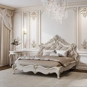
Feel the difference: you sit ina soft Baroque armchairin the middle of an ordinary room with bare walls — and you sink into the same armchair, surrounded by carved panels, under the flickering light of a chandelier, in front of a floor mirror in a gilded frame. The first option is dissonance; the armchair looks random, detached from context. The second is harmony, where furniture and surroundings enhance each other, creating a zone of luxury that captivates all the senses.Baroque upholstered furniturerequires an appropriate setting — not because it is capricious, but because its nature is to be part of an ensemble, where cornices, panels, floor lamps, and mirrors work together to create a space where visual splendor combines with tactile comfort.
The balance between beauty and comfort is the key task of Baroque. The style is famous for its opulence, but this does not mean sacrificing comfort for effect. Deep seats, anatomical backs, and the softest velvet create physical pleasure, while the carved frame, gilding, and surrounding decor provide aesthetic pleasure. When both aspects work, the space becomes a place where you want to linger, where every evening turns into a ritual, where the interior is not a background but an active participant in your life.


The Anatomy of Baroque Upholstered Furniture: Why It Requires a Setting
Furniture in Baroque stylewas created for palaces, where every room is a work of art, where walls, ceilings, and floors are as elaborately crafted as the furniture itself. When moving a Baroque armchair or sofa into a modern interior, we face a challenge: either adapt the space to the furniture, or the furniture will look alien.


Scale and Presence
Baroque upholstered furniture is not miniature. An armchair with a tall carved back, curved armrests, and tufted upholstery occupies space not only physically but also visually. Its presence is dominant — the carving catches light, creates shadows, the gilding shimmers, the velvet changes shade depending on the viewing angle. Such a piece cannot be just one of many — it demands attention, acknowledgment of its importance.
When the walls around the armchair are bare, white, and flat, the armchair looks too massive, overloaded, out of place. But add carved panels, moldings that create architectural relief to the wall, and the armchair gains context. It no longer stands out from the space but becomes part of it, an element of a composition where the verticals of pilasters echo the vertical of the armchair's back, where the ornament on the moldings relates to the carving on the armrests.
Our factory also produces:


Color and Contrast
The upholstery of Baroque furniture is often rich — burgundy velvet, emerald silk, sapphire brocade. These deep colors require support in the interior. If everything around is neutral beige, the armchair looks like a stain, too bright, disharmonious. But if the upholstery color echoes the color of the curtains, sofa cushions, rug, or the patina shade on the cornices — a color harmony emerges.
Contrast also works, but it must be deliberate. A dark armchair against a light wall creates drama, but the wall should not be empty — moldings, overlays painted in the same light tone create texture, which softens the contrast, making it elegant, not harsh.
Get Consultation
Carving and Its Perception
The carved frame of a Baroque armchair is a masterpiece of craftsmanship, where acanthus leaves, volutes, and cartouches create a three-dimensional ornament. But the carving is only visible with proper lighting. Overhead flat light kills the relief, makes the carving flat, unnoticeable. Side light from a floor lamp or sconce highlights every protrusion, every indentation; the carving comes to life, becomes dramatic, noticeable.
Besides lighting, the perception of carving depends on what is around. If the walls are smooth, the armchair's carving stands out but may seem excessive. If the walls have relief — moldings, overlays, stucco — the armchair's carving is not alone; it is part of a system of ornaments that creates the Baroque richness of decor characteristic of the style.
Panels and Moldings: Creating an Architectural Background
Walls in a Baroque interior are not just vertical planes painted a color. They are architectural elements, structured by moldings, divided into panels, framed by cornices.interior decorationtransforms a flat wall into a relief composition that creates a worthy backdrop for luxurious furniture.
Rectangular Panels: A Frame for Furniture
A rectangular panel made of moldings on the wall behind an armchair or sofa works as a visual frame that connects the furniture to the wall, making it not freestanding but integrated into the architecture. The panel size is slightly larger than the furniture's dimensions — if the armchair is 90 cm wide, the panel is 120-130 cm; if the sofa is 200 cm, the panel is 240-260 cm. Such proportions create a visual pause, a transition from the furniture to the rest of the wall.
The profile of the moldings for the panel should be sufficiently massive — 8-12 cm wide — to be read as an architectural element, not a thin frame. The complexity of the profile — smooth, milled, with ornament — depends on the Baroque style you are recreating. Early Baroque — more austere moldings; late Baroque — with lush carving, scrolls.
The color of the moldings can match the wall, creating relief only through shadows, or be contrasting — white moldings on a colored wall, gilded on a dark one, patinated graphite on a light one. Gilded moldings echo the gilding of the armchair's frame, creating material unity.
Tall Panels: Vertical Division of Walls
Panels in the lower third of the wall — a classic technique that creates visual weight at the bottom, making the interior stable, grounded. Panel height is 100-140 cm from the floor, which corresponds to the height of an armchair's back, armrests. Panels are framed by moldings; inside, they can be painted the same color or a shade darker, can be upholstered with fabric, clad in wood, or covered with wallpaper with a pattern.
Fabric upholstery of panels echoes the furniture upholstery — if the sofa is upholstered in emerald velvet, the panels can be upholstered in the same velvet or a related fabric, creating textural unity. Wooden panels made of the same oak or beech as the furniture frame, painted or patinated similarly, create material kinship.
The upper part of the wall above the panels remains smooth or is decorated with more delicate decor — wallpaper with a subtle pattern, painted in a light tone, creating a balance between the decorated lower part and the calmer upper part.
Pilasters: Vertical Accents
Pilasters are decorative half-columns that protrude from the wall, creating vertical spatial divisions and organizing walls into sections. They are installed at room corners, on both sides of windows, doors, and fireplaces, establishing an architectural rhythm. Between pilasters, panels, mirrors, paintings, and furniture are placed.
The style of the pilasters should match the furniture. If the furniture has Corinthian capitals on its legs, the pilasters should also be Corinthian. If the furniture is more austere, Doric or Tuscan pilasters are more appropriate. The height of pilasters from floor to ceiling or to the cornice creates a powerful vertical that increases the visual height of the room.
Pilasters can be smooth, fluted — with vertical grooves — or adorned with carved appliqués along the entire length of the shaft. A gilded capital on a white pilaster echoes the gilding of the chair, creating golden accents throughout the space.
Cornices: the transition from walls to ceiling
Ceiling cornice — molding at the junction of the wall and ceiling — is critical for completing the vertical composition. Without a cornice, the wall simply ends, meeting the ceiling abruptly and inharmoniously. The cornice creates a transition, visually increases the height of the room, and adds architectural complexity.
Cornice width and profile
The width of the cornice is determined by the ceiling height. In rooms with ceilings of 2.7-3 m, a cornice 12-18 cm wide looks proportional. In rooms with ceilings of 3.5-4 m and higher, a cornice of 20-30 cm is needed; otherwise, it will get lost and appear insufficient.
The cornice profile is multi-level, with projections, grooves, sometimes with carved ornamentation along the lower edge. The complexity of the profile should correspond to the overall decorativeness of the interior. If the furniture is lush, carved, the cornice should also be complex. If the furniture is more restrained, the cornice is more laconic to avoid overloading.
Color and finish
The cornice is usually painted white or cream, creating a neutral transition to the ceiling. But gilding, patina add luxury. A gilded cornice is an accent that connects the gilding on furniture, mirror frames, and door handles into a unified system. Patina in the recesses of the cornice emphasizes the relief, making it more expressive.
Hidden lighting behind the cornice is a modern technique that 17th-century Baroque did not know, but it fits organically. An LED strip directed upward at the ceiling creates soft lighting that makes the ceiling visually higher and adds atmosphere in the evening. Warm light of 2700-3000K creates coziness; cooler light creates a modernity that is alien to Baroque.
Ceiling rosette
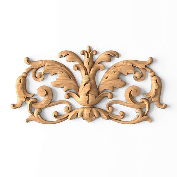
A central rosette on the ceiling, from which the chandelier descends, is a classic element of Baroque interior. The rosette — a round or oval carved appliqué with floral ornamentation, volutes, putti — creates a focal point on the ceiling, concentrating attention on the chandelier.
The diameter of the rosette depends on the size of the room. In a small living room of 4×5 m, a rosette with a diameter of 60-80 cm is sufficient; in a spacious living room of 6×8 m, a rosette of 100-150 cm is needed. A rosette that is too small gets lost; one that is too large overwhelms and occupies the entire ceiling.
The carving of the rosette should echo the carving of the furniture — if the chair has acanthus leaves, the rosette should also have acanthus. Gilding, patina on the rosette create a connection with the finish of the cornices and furniture. The rosette is not just a technical detail for attaching the chandelier, but a full-fledged decorative element that completes the composition.
Floor lamps and lighting: creating atmosphere
Lighting in a Baroque interior is not just a function, but a tool for creating atmosphere, emphasizing decor, and managing mood.The Splendor of Baroquereveals itself under proper light, which highlights carving, creates shadows, and makes gilding shimmer.
Chandelier: the center of the lighting scenario
A multi-tiered crystal chandelier is a symbol of Baroque, a light source that is simultaneously a decoration. The chandelier hangs in the center of the room or above the central element — a table, a seating area with armchairs. The light from the chandelier is directed downward and sideways, illuminating furniture and creating overall brightness.
But one chandelier is not enough. Overhead light from the chandelier is flat, does not create shadows that highlight carving on furniture or the relief of moldings. Additional sources are needed — side, lower light, which create volume, depth, drama.
Floor lamps: sculptural light
A floor lamp next to an armchair is a classic pair that provides local lighting for reading, while simultaneously creating side light that emphasizes the carving of the chair frame. The style of the floor lamp should match the furniture — a carved wooden base, gilded details, a fabric lampshade that diffuses light and creates softness.
The height of the floor lamp is 150-180 cm, which allows light to fall from above and the side onto the chair, creating shadows in the recesses of the carving and revealing the relief. A lampshade made of silk, brocade, velvet echoes the upholstery of the furniture — if the chair is upholstered in burgundy velvet, the lampshade can be cream or golden, creating warm light that harmonizes with the burgundy.
The floor lamp is not just functional — it is a sculptural object that complements the interior. The carved base of the floor lamp can repeat the shape of the chair legs, creating a visual connection. Gilding on the floor lamp echoes the gilding of cornices, mirror frames, creating golden accents throughout the space.
Sconces: wall accents of light
Sconces on walls on both sides of a mirror, painting, or panel create symmetrical light accents that emphasize architectural elements. The style of the sconces — candle-like arms or fabric shades on carved brackets — should correspond to the overall style.
The installation height of sconces is 160-180 cm from the floor, which creates side light at eye level, emphasizing the relief of moldings and carving of wall appliqués. The light is directed upward and sideways, creating soft illumination that is not harsh on the eyes but sufficient to create atmosphere.
Sconces can be painted to match the walls, blending into the space and only appearing when turned on. Or they can be contrasting — gilded on a dark wall, black on a light one — creating decorative accents even when turned off.
Full-length mirrors: multiplying space and light
A full-length mirror in a carved gilded frame is a classic element of Baroque interior, which works not only functionally but also compositionally, spatially, and in terms of lighting.
Size and proportions
A full-length mirror with a height of 180-220 cm and a width of 80-120 cm allows one to see themselves in full height, while simultaneously creating a powerful vertical accent in the interior. The proportions of the mirror should be elongated, vertical, which corresponds to Baroque's love for verticals and aspiration upward.
The mirror frame — massive, carved, with lush ornamentation — can be wider than the mirror itself, creating a decorative surround. A frame width of 15-30 cm around the perimeter makes the mirror not just a functional item, but a furniture object, a room decoration.
Carving and Gilding of the Frame
The carving on the mirror frame should echo the carving on the furniture and moldings, creating visual unity. If a chair has acanthus leaves on its armrests, the mirror frame should also feature acanthus. If the wall moldings have volutes, the mirror frame includes volutes.
Gilding of the frame is a classic choice that creates luxury, reflects light, making the mirror a luminous object. Gilding can be solid or accent—only in the recesses of the carving, on the protrusions, creating a play of gold and natural wood or paint.
Patina on the gilding adds an effect of antiquity, nobility, making the frame not a new piece but an item with history, which corresponds to the Baroque love for continuity and connection with the past.
Mirror Placement
A floor mirror is not placed against any wall, but thoughtfully, so that the reflection works for the interior. A mirror opposite a window reflects natural light, making the room brighter and visually larger. A mirror opposite a chandelier multiplies its light, creates the illusion of two chandeliers, adding luxury.
A mirror placed between two armchairs, behind a console table, creates a symmetrical composition where the armchairs frame the mirror, and the mirror reflects the armchairs, creating a visual infinity characteristic of Baroque palace enfilades.
The tilt angle of the mirror, if the design allows, affects what is reflected. A mirror slightly tilted forward reflects the ceiling with its rosette and chandelier, multiplying the decor. A vertical mirror reflects the opposite wall, which is important to consider—the wall should be decorative, otherwise the reflection will be empty.
Balance of Visual and Tactile: Comfort in Luxury
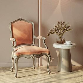
Baroque is often criticized for excess, for sacrificing comfort for effect. But historically, Baroque furniture was created for people who spent hours in it—reading, conversing, resting. Comfort was critical, and craftsmen knew how to combine luxury with convenience.
Ergonomics of a Baroque Armchair
ModernBaroque armchairtakes ergonomics into account—the backrest has an anatomical curve that supports the lower back, a seat height of 45-48 cm ensures comfortable seating, a depth of 50-60 cm allows leaning back without losing back support.
Armrests at a height of 20-25 cm from the seat allow comfortable placement of the arms without raising the shoulders. An armrest width of 8-12 cm is sufficient to avoid pressure on the forearm. A soft pad on the armrest, upholstered in the same fabric as the seat, adds tactile comfort.
A backrest tilt angle of 100-110 degrees is a compromise between an upright position suitable for conversation and reading, and a reclined position suitable for rest. Some Baroque armchairs have an adjustable backrest, which is rare but found in modern interpretations of the style.
Tactility of Upholstery
Velvet, silk, brocade—the fabrics used to upholster Baroque furniture—are not only visually luxurious but also tactilely pleasant. Velvet is soft, warm, plush, pleasant to the touch. Silk is smooth, cool, glides under the hand. Brocade is dense, textured, creates a sense of materiality and weight.
Diamond tufting—a diamond-patterned design with button pulls—is not merely decorative; it creates volume and softness that is pleasant to lean against. A tufting depth of 3-5 cm creates a pronounced relief that massages the back, provides micro-ventilation, preventing the back from sweating.
The filler under the upholstery—high-density foam, latex, horsehair—provides softness and resilience. A seat that is too soft—you sink in, making it difficult to stand up; too hard—you tire quickly. The optimal filler density creates comfort that can be enjoyed for hours.
Pillows and Throws: Layers of Comfort
Decorative pillows on an armchair or sofa add not only visual luxury but also tactile comfort. A pillow in the small of the back provides additional support, allowing adjustment of the seat depth. A pillow under the elbow creates softness to lean on.
The fabrics of the pillows should echo the furniture upholstery but not be identical—if the armchair is upholstered in burgundy velvet, the pillows can be golden, cream, with gold-thread embroidery, creating color variety. Tassels, fringe on the edges of pillows—a Baroque detail that adds decorativeness.
A throw made of cashmere, wool, draped over the arm of an armchair, creates coziness and a readiness for rest. The color of the throw can be neutral—beige, gray—not competing with the upholstery, or contrasting—if the upholstery is cool, the throw is warm, creating a color dialogue.
Frequently Asked Questions About Baroque Upholstered Furniture
Isn't Baroque furniture too hard, uncomfortable?
Historically, early Baroque furniture of the 17th century could be hard—filler technologies were primitive, using horsehair, sea grass. Modern Baroque furniture uses foam, latex, spring blocks, which provide comfort not inferior to modern furniture. The main thing is to check before purchase, sit in it, evaluate the ergonomics.
How to care for velvet upholstery?
Velvet requires delicate care. Regular cleaning with a soft brush or vacuum with an upholstery attachment removes dust without damaging the pile. Stains are removed with special velvet cleaners, without rubbing, by blotting. Professional dry cleaning every one to two years extends the life of the upholstery. Protection from direct sunlight prevents fading.
Can Baroque furniture be used in a small room?
A full Baroque suite—sofa, two armchairs, table—requires space. But a single Baroque armchair works even in a compact room if the surroundings support it—moldings, a floor lamp, a mirror create a Baroque atmosphere without overloading. Choose a medium-sized armchair, without excessively massive armrests.
Does baroque furniture go well with modern technology?
Baroque and technology are compatible if the technology is hidden. A TV behind the doors of a carved cabinet, speakers disguised as decorative objects, smart lighting with dimmers — technology provides comfort without destroying the historical atmosphere. It's important not to flaunt the equipment, not to make it the visual center.
How to choose upholstery color to match the interior?
Upholstery color is determined by the overall interior palette. If the walls are light, the upholstery can be rich — burgundy, emerald — creating a color accent. If the walls are colored, the upholstery can be neutral — cream, beige — not competing with the walls. The upholstery should echo the color of curtains, carpets, pillows, creating color unity.
Is it necessary to replace all furniture in a room with baroque pieces?
Not necessarily. A baroque armchair or sofa can be an accent in an eclectic interior if the surroundings support it — moldings, floor lamps, mirrors. Mixing styles is acceptable if there are unifying elements — color, material, scale. But a full-fledged baroque space requires most elements to be stylistically related.
Conclusion
Baroque upholstered furniture— is not just sofas and armchairs, it is the center of the composition around which the entire space is built. Carved frames, luxurious upholstery, gilding require appropriate surroundings — panels, cornices, floor lamps, mirrors — which create a baroque atmosphere where each element enhances the other. A single baroque armchair in the middle of a minimalist room is a dissonance, but the same armchair surrounded by moldings, under the light of a floor lamp, in front of a gilded mirror becomes part of an ensemble where visual splendor combines with tactile comfort.
The balance between beauty and convenience is not a compromise, but a synthesis, where the ergonomics of the back, the softness of the upholstery, the depth of the seat provide physical comfort, and the carving, gilding, surrounding decor provide aesthetic pleasure. When you sink into a deep armchair upholstered in burgundy velvet, touch the carved gilded armrest, see your reflection in a floor mirror illuminated by the flickering light of a crystal chandelier — this is not a museum experience, but a living one, where luxury is natural, where comfort is not sacrificed for beauty.
The company STAVROS creates baroque style soft furniture, where every armchair, sofa, banquette is the result of the work of carving, upholstery, and gilding masters. Versailles armchair— the embodiment of French Baroque with exquisite floral carving, anatomically comfortable back, precise proportions, a wide selection of upholstery fabrics from velvet to natural leather — demonstrates how luxury combines with comfort. The frame made of solid oak or beech ensures strength, durability, the possibility of painting in any color with patination in gold, silver, graphite creates individuality, matching your interior. interior decoration STAVROS — moldings, cornices, panels, carved overlays, rosettes — is made from the same solid wood, in the same styles as the furniture, providing the opportunity to create compositional unity, where the carving on the armchair echoes the ornament on the moldings, where the gilding of the frame is connected to the gilding of the cornices, where the entire space works as a symphony of forms, colors, textures. Professional designers help design a luxury zone — select furniture, wall decor, lighting, mirrors, create a 3D visualization that allows you to see the result before production begins, adjust details, ensure that visual and tactile, beauty and comfort are balanced. The stock program ensures quick shipment of popular models, custom manufacturing allows creating unique furniture according to individual dimensions, with exclusive carving, non-standard upholstery, which fully matches your vision. Choosing STAVROS, you choose craftsmanship passed down from generation to generation, the quality of natural wood, the beauty of hand carving, the comfort of thoughtful ergonomics, the opportunity to create a space where every evening is a celebration, where the interior is not a background, but an active participant in life, where luxury and comfort are inseparable.