


Article Contents:
- Why 'Wall Molding Photos' Is One of the Most In-Demand Search Queries
- Eyes Choose Before the Mind
- Why Wall Molding Is Back at the Peak of Interest
- What Wall Molding Looks Like in Interiors: A Breakdown by Picture Types
- Molding Frames: The Most Common Photo
- Accent Wall with Geometric Pattern
- Paneled Wall (Boiserie): Photos for Those Who Want More
- Molding Around Functional Zones: Fireplace, TV, Mirror
- What types of molding are most commonly seen in interior photos
- Molding: the universal hero
- Overlays and Ornaments: Accent Details
- Pilasters: when vertical dynamics are needed
- Round moldings and non-standard profiles
- Wall molding: photos by interior style
- Classic: the triumph of white and gold
- Neoclassical: architectural without opulence
- Modern classic: when wood meets molding
- Light monochrome interiors: molding in wall color
- Contrast molding: when boldness is desired
- Wall Molding: Ideas and Photos by Room
- Living Room: The Main Stage of Interior Design
- Bedroom: Intimacy and Depth
- Hallway: Architecture from the First Step
- Study: Status Expressed in Details
- Dining Room: The Aristocracy of Dining
- The Most Successful Wall Molding Design Scenarios
- Accent Wall: The Main Photo of Your Apartment
- Wall Behind the Sofa: A Classic Genre
- Fireplace in a Molded Frame
- Molding around the mirror: narcissism with elegance
- Niche design
- How to choose molding from photos: honest advice
- Look at the scale, not just the ornament
- Consider the lighting in the photo
- Look at the furniture style, not just the wall decor
- Don't copy someone else's interior — take the principle
- What to choose: moldings, panels, or decorative elements
- When simple molding frames are enough
- When a more complex composition is needed
- When is minimalist decor best
- When is a more expressive relief justified
- Common mistakes when choosing wall molding
- Mistake 1: Blindly copying a beautiful photo
- Mistake 2: Too complex a pattern in a small room
- Mistake 3: Overloading a wall with details
- Mistake 4: Lack of a compositional center
- Mistake 5: Mismatch with furniture style
- How to assemble a harmonious wall with molding: a practical guide
- Step 1: Determine the main accent of the wall
- Step 2: Choose the rhythm — the number and arrangement of frames
- Step 3: Coordinate decor with lighting
- Step 4: Resolve the color question
- Step 5: Use photos as a guide, not a template
- Conclusion: how to seek inspiration without getting lost in the photo stream
- FAQ: answers to popular questions about wall molding
- About the Company STAVROS
Let's be honest: no one searches for photos of molding for academic knowledge. When a person types 'wall molding photo' into a search, they want to feel — how it looks, whether it will suit them, whether they will enjoy living in such an interior. This is a search for inspiration, not instructions. And it is precisely this — the image, the visual, the specific sensation — that we will start with.
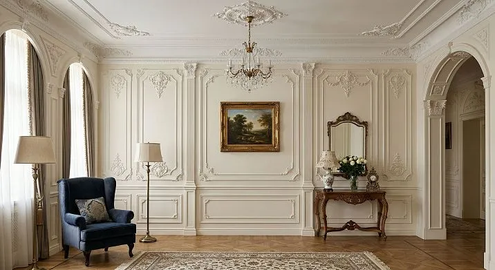
Imagine a living room. One wall — behind the sofa — is decorated with rectangular molding frames. Everything is in a unified tone: the wall, the frames, the ceiling cornice — the color of warm linen. Wall sconces on the sides provide lateral light. The relief of the frames comes alive in this light, softly transitioning from shadow to light. No wallpaper, no paintings — just architecture. This is what wall molding looks like in a modern interior. Not baroque, not a palace. Simply a well-thought-out wall.
It is precisely such images that we will analyze in this article — from simple to complex, from classical to contemporary.


Why 'wall molding photo' is one of the most in-demand queries


The eyes choose before the mind does
Human perception works this way: we first see, then we think. Any design decision undergoes a visual check long before purchase. This is precisely why the search for 'wall molding photo' is not a buyer's query, it is the query of a person who is building the image of their future space.
He doesn't need technical specifications, but an answer to the question: 'Is this beautiful? Will it suit me? How does it work in a real interior—not in a render, but in a living room?'
Our factory also produces:


Why wall molding is back at the peak of interest
Several reasons that explain the current rise in popularity of wall decorative molding:
-
Fatigue from 'empty' interiors—Scandinavian minimalism with white walls and a lack of details began to feel sterile;
-
Growing demand for 'homeliness' and coziness—decor is returning as a way to create a lived-in, warm, thoughtful space;
-
Availability of materials—Polyurethane moldingsmade decorative decor several times cheaper and easier to install;
-
Neoclassicism and modern classicism in trends—the most relevant interior styles directly imply the use of moldings, frames, and architectural details.
And that's why so many people search online for photos with molding—they want to see how it might look in an ordinary person's apartment, not in the Palace of Versailles.
Get Consultation
What wall molding looks like in an interior: a breakdown by picture types
Molding frames: the most common photo
If you search for 'wall molding photo,' most popular images are precisely frames made from moldings. Rectangular or square outlines, arranged in a row on one wall. Monochrome solution: frames and wall in the same color. Sometimes—wallpaper or decorative plaster inside the frame niches.
Why is this so popular? Because it is a universal, accessible, and clean solution. Frames don't shout, don't 'overwhelm' the space, and don't require historical ambiance. They work in living rooms, bedrooms, hallways, studies—in both classic and modern interiors.
STAVROS wall moldingsare available in dozens of profiles—smooth, with grooves, with ornamentation—allowing you to assemble a frame system for any style: from minimalist to rich neoclassical.
Accent wall with geometric pattern
The second most popular type of photo is an accent wall completely covered with a molding geometric pattern: diamonds, hexagons, asymmetric sections, non-standard shapes. This is a bolder and more modern solution. It works in eclectic, contemporary classic, and avant-garde interiors.
Wall finishing with moldings in a modern interioris a separate design discipline. Here, molding ceases to be an element of historical decor and becomes a modern tool of visual art.
Paneled wall (boiserie): photos for those who want more
Walls fully cladwall panelswith wood or MDF featuring molding frames, pilasters, and cornices — this is a photo category for serious projects. Such images create a 'wow' effect: the space looks like the interior of a noble mansion or a Parisian hotel.
At the same time, modern STAVROS wall panels are not massive marble slabs, but lightweight, technological systems, accessible even for a city apartment with 3-meter ceilings.
Molding around functional zones: fireplace, television, mirror
Another very popular type of photo is decorating a specific object with molding: a fireplace, television, mirror, niche. Moldings serve as an architectural frame — they integrate the object into the wall, making it an organic part of the space.
Molding around a mirror looks especially impressive in photos: a mirror in a molding frame with side sconces is one of the most 'recognizable' images of a modern classic interior.
What types of molding are most often found in interior photos
Molding — the universal hero
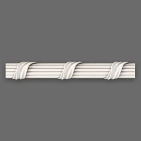
decorative wall moldings— are extended profiles with a figured cross-section. By shape, they are divided into:
-
smooth — a clean cross-section without ornament, for modern interiors;
-
with a recessed profile — a deep groove that creates pronounced chiaroscuro;
-
with ornament — a relief pattern along the entire length, for classic and neoclassical styles;
-
assembled — several profiles of different cross-sections in one system.
Most interior photos use smooth or moderately recessed moldings — they are the most versatile and not strictly tied to one style.
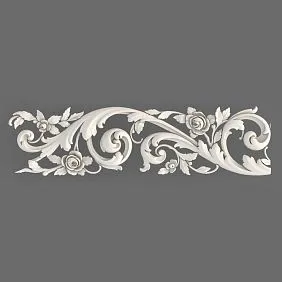
Overlays and Ornaments: Accent Details
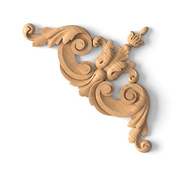
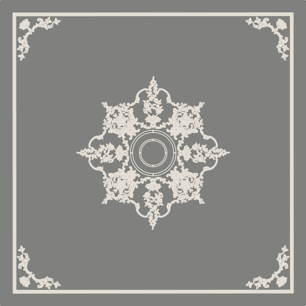
A separate world — custom-madePolyurethane decorative appliques. Corner blocks at molding intersections, central medallions within frames, ornamental inserts above doors and niches. In photos, they create what professional photographers call a 'focal point': where there is an overlay, the eye lingers.
The size of corner overlays ranges from 5×5 to 20×20 cm. Central medallions range from 15 to 50 cm. The choice is determined by the scale of the frame and the height of the room.
Pilasters: when vertical dynamics are needed
In photos of living rooms and studies with classic decor, pilasters are regularly seen — flat vertical projections that mimic columns. They create a powerful vertical rhythm: a wall with pilasters doesn't just look painted — it looks architecturally designed.
Pilasters are especially effective on either side of a fireplace, at an entrance group, or in niches with bookshelves. In combination withwith complex stucco decorationpilasters create a complete architectural system from floor to ceiling.
Round moldings and custom profiles
An interesting modern trend is the use ofround moldings and curved profiles. They create smooth arched frames, oval surrounds, and wavy wall divisions. In photos, such solutions look fresh and unexpected—this is wall stucco that does not refer to the historical past but lives in the space 'here and now'.
Wall stucco: photos by interior style
Classic: the triumph of white and gold
In photos of classic living rooms and halls, stucco is always a system: base molding, framed panels, pilasters, ornamental overlays, cornice. Colors are white on white, cream with gilding, ivory with patina. The relief is rich: acanthus leaves, volutes, meanders, cartouches.
Such an interior in photos makes an irresistible impression of solemnity. But it's important to understand: this solution requires high ceilings (from 3 m), large areas, and thoughtful lighting. In a standard city apartment with a 2.6 m ceiling, classic stucco will feel oppressive rather than decorative.
Neoclassical: Architectural without Opulence
The most 'reposted' and coveted photos with molding are from neoclassical interiors. Here, the structural logic of classicism (symmetry, tiering, rhythm) is preserved, but the decor becomes more restrained. Moldings have a moderate profile. Frames are without overlays or with minimal corner elements. Color is monochromatic: everything in a single palette.
It is neoclassical photos that most often elicit the reaction 'I want that too'—they look both expensive and contemporary at the same time. And this is the most implementable format:molding for accent wallsin the neoclassical style is installed quickly and does not require a professional craftsman.
Modern Classic: When Wood Meets Molding
One of the most beautiful types of photos in modern interior publications is the combination of wooden panels with molding framing. The warm texture of oak or walnut, bounded by the clear profiles of moldings—this is a contrast of materials within a unity of style. PreciselyDecorative elements for wall finishingmade of polyurethane in combination with wooden panels create this effect.
Light Monochromatic Interiors: Molding in Wall Color
A separate and very relevant category of photos is completely monochromatic interiors, where the molding, walls, and ceiling are painted in the same tone. Gray-beige, warm white, soft anthracite—and against this background, only the relief of the moldings creates depth and texture. No contrast—only chiaroscuro.
Such photos have been an absolute trend for the last three to four years. They look both calm and sophisticated at the same time. And it's one of the easiest solutions to implement: you install moldings, paint everything one color—and you get exactly the look you saw in the photo.
Contrasting molding: when you want boldness
White molding on a dark wall is a striking and quite bold solution. In photos, such interiors make a strong impression: a deep blue, green, or graphite background with snow-white molding frames—this is a graphically clear, confident composition. It requires good taste and properly selected lighting.
The reverse option—toned moldings on a white wall. This is a more restrained but no less effective solution.
Wall molding: ideas and photos by room
Living room: the main theater of the interior
The living room is a space with the maximum viewing distance and the maximum visual 'representation' of the apartment. It is here that wall molding produces the most expressive result.
The most popular scenarios from living room photos:
-
The wall behind the sofa—a system of molding frames, with a decorative overlay in the central frame. The wall is perceived as an architectural backdrop for the sofa.
-
TV area—moldings form a frame around the television. On the sides—symmetrical niches with lighting or vertical molding pilasters. The TV stops 'hanging'—it becomes integrated.
-
Fireplace wall — a portal with pilasters and cornice. The most solemn and rich scenario.
-
Full panel cladding — all walls or one covered with a boiserie system. Maximum presence effect.
Stucco decor: the art that transforms the interior— from simple frames to full-fledged architectural systems.
Bedroom: intimacy and depth
In photos of bedrooms with stucco, one recurring technique is most often seen: an accent wall behind the bed headboard. Molded frames in the wall color, sometimes — one central overlay. No contrast, no solemnity. Just the depth of relief, emphasized by bedside sconces.
This is an intimate, calm solution that turns the bed headboard into an architectural element.Accent zone in the bedroom with moldings and baseboards— one of the simplest and most effective ways to change the perception of the bedroom.
Tip for small bedrooms: frames with elongated proportions (taller than wider) visually raise the ceiling. This is especially noticeable in photos with ceilings of 2.5–2.6 m.
Hallway: Architecture from the First Step
Photos of hallways with molding are divided into two types: small and long narrow ones. And for both, decorative molding works in its own way.
In a small hallway — one or two vertical moldings on the end wall or a system of frames painted to match the wall color. This adds nobility without weighing it down.
In a long corridor — rhythmic vertical moldings along the entire length create an arcade effect. In photos, such solutions look unexpectedly expressive: the corridor turns into a ceremonial passage.
Study: Status Expressed in Details
A home study with molding is a photo from the 'everything is immediately clear' category. Framed panels on the walls, book niches with molding frames, possibly — pilasters on the sides of the work area. Everything says one thing: the person who works here understands what quality is.
Wall Molding: Decorative Overlays, Moldings, and Panels for a Modern Interior— modular solutions that allow creating a complex study composition from standard elements.
Dining Room: The Aristocracy of Dining
In interior publications, dining rooms with molding are invariably the most 'luxurious' photos. The most ambitious scenarios are usually implemented here: a full set of cornices, pilasters, coffered ceiling, paneled walls. If the space allows (ceiling from 2.9–3 m, area from 20 sq. m) — the dining room reveals the potential of decorative molding to the fullest.
Most successful wall molding design scenarios
Accent wall: the main photo of your apartment
An accent wall with molding is the 'entry point' into the theme of wall decor for most people. One wall decorated with molding frames—and the entire apartment already looks different. Such a wall becomes the focal point of the living room, bedroom, or hallway.
The secret to a beautiful accent wall photo: frames must have equal margins from the edges and from each other, their proportions must be precise. An error of 2–3 cm is noticeable to the naked eye.
Wall behind the sofa: a classic of the genre
One of the most popular schemes in photos is molding directly behind the sofa. Several rectangular frames, often with corner blocks at intersections. Side sconces or floor lamps create side lighting that reveals the relief. The effect in photos and in reality—an interior magazine right in your home.
Fireplace in a molded frame
In photos with fireplaces, molding is almost always present. And it's not just about aesthetics: the molded framing of the fireplace serves an architectural function—it 'integrates' the fireplace into the room's system, making it part of the wall, not a standalone object.
Portal + pilasters on the sides + horizontal cornice above the fireplace—this is the minimum set for a complete solution. The result, judging by photos, exceeds expectations.
Molding around a mirror: narcissism with elegance
A mirror in a molding frame is one of the timeless techniques. But it's especially effective when the frame doesn't look like a store-bought one, but like an architectural detail of the wall: the molding goes inward, framing the mirror around the entire perimeter, with corner blocks or ornamental inserts. In the photo, it looks like a built-in mirror with an architectural context.
Niche design
A niche framed with molding along its contour transforms from a construction solution into a design one. Especially if the inside of the niche is a different color or material, and the molding creates a clear boundary. In photos, such niches often become the most expressive detail of the interior.
How to choose molding from photos: honest advice
Look at the scale, not just the ornament
The main trap when choosing molding from photos is to look at the beauty of the ornament and not think about the scale. Molding that looks perfect in a 4-meter-high hall will appear bulky in an apartment with 2.6-meter ceilings. Pay attention to the proportions of the wall and the molding in the photo—they should match the proportions of your room.
Approximate table:
| Ceiling Height | Molding width | Frame proportions |
|---|---|---|
| up to 2.6 m | 20–30 mm | Elongated |
| 2.6–2.9 m | 30–45 mm | 3:2 or 2:1 |
| 2.9–3.5 m | 45–65 mm | Free |
| over 3.5 m | 65–100 mm | Square, for example |
Consider the lighting in the photo
Beautiful photos of molding are almost always taken with side directional lighting. This is no coincidence—side lighting reveals the relief, creates shadow in the profile, and makes the molding 'come alive'. If your room only has top diffuse lighting, the relief will be less expressive than in the photo. Plan for sconces, floor lamps, or spotlights at the same time as choosing the molding.
Look at the style of the furniture, not just the wall decor
The most common mistake: a person sees a beautiful wall with molding in a photo but doesn't notice that all the furniture in the frame is also in a classical style. Then they install the same molding in a room with IKEA furniture and modern lighting fixtures—and get a stylistic dissonance.
Before choosing molding based on a photo, honestly assess: what style is your furniture? Classical molding with rich ornamentation requires corresponding furniture. Geometric frames without ornamentation work with any style.
Don't copy someone else's interior—take the principle
A good photo is a guideline, not a template. You have different proportions, different lighting, a different layout. Take from the photo you like: the principle of frame arrangement, the color scheme, the ratio of 'active' to 'empty' parts of the wall. But apply it to your specific space.
What to choose: moldings, panels, or decorative elements
When simple molding frames are enough
If the goal is to give the wall structure and nobility without major investments — a simple system of frames made of smooth moldings in the color of the wall is sufficient. This is the most affordable, quick, and universal solution. Suitable for any room, any style (with the right profile choice) and any budget.
STAVROS polyurethane moldings are the optimal choice for such a task: lightweight, clearly profiled, ready to be painted in any color.
When a more complex composition is needed
If you want to create a true architectural wall — with decorative accents, ornamentation, a visual center — add corner blocks, central overlays, and decorative ornaments to the frames. This is the level of work visible in most 'inspiring' photos from interior design publications.
Wall molding: decorative overlays, moldings, and polyurethane panelsfor modern interiors — a full range of ready-made solutions.
When minimalist decor is better
In small rooms, in modern interiors, with ceilings up to 2.7 m — choose minimalism: one horizontal molding or several frames without overlays. Monochrome color solution. No ornaments. The decor works exclusively through relief and proportions.
When more expressive relief is justified
In high-ceilinged rooms (from 3 m), in classical and neoclassical projects, in formal living rooms — boldly use ornamental moldings, overlays, pilasters. Rich relief requires space and height. Without them, it feels oppressive. With them — it creates that very impression people seek in photos.
Common mistakes when choosing wall molding
Mistake 1: Blindly copying a beautiful photo
The photo from an interior magazine was taken in a space with 3.5 m ceilings and natural light from panoramic windows. Transferring this to an apartment with 2.5 m ceilings and one small window means getting a completely different result. A photo is inspiration, not a technical specification.
Mistake 2: Too complex an ornament in a small room
Rich Baroque stucco in a 14–16 sq. m room creates a feeling of oppressive decor. The rule: the smaller the room, the simpler the elements should be.
Mistake 3: Overloading a wall with details
A wall that has frames, sconces, paintings, wallpaper within frames, an ornamental frieze, and corner overlays all at once — this is not decor, it's visual noise. Stucco requires space and pauses.
Mistake 4: Lack of a compositional center
Frames evenly scattered across a wall without a center look like wallpaper — a repeating pattern. There should be a main frame, a main element, a point that draws the eye. This could be a central overlay, a mirror in a molding frame, a TV in a molding frame — anything, but there must be a center.
Mistake 5: Mismatch with furniture style
If the furniture in the room is in a loft or industrial style, and cornices with acanthus leaves and rocaille are mounted on the wall — conflict is inevitable. Molding should speak the language of the furniture and space.
How to assemble a harmonious wall with molding: a practical guide
Step 1: Determine the main accent of the wall
What will be the center of your wall? A TV? A sofa? A fireplace? A mirror? Nothing? The answer to this question determines the entire scheme: the main element is placed in the central or largest frame, while the others play the role of the 'entourage'.
Step 2: Choose the rhythm — the number and arrangement of frames
An odd number of large frames with a central one — for a symmetrical, solemn scheme. An even number of identical frames — for a rhythmic, calm solution. Vertical moldings from floor to ceiling — for dynamism and height.
Step 3: Coordinate the decor with the lighting
Directional light = expressive relief. Choose the placement of sconces or spotlights in advance, before installing the molding. Ideally, the light should hit the wall surface at a 30–45 degree angle.
Step 4: Resolve the color question
Monochrome — for a delicate, sophisticated interior. Contrast — for a graphically expressive one. If unsure — start with monochrome: it always works.
Step 5: Use photos as a guide, not as a template
Find 3–4 photos that inspire you. Identify common principles from them: rhythm of frames, color scheme, ratio of decor to 'empty' wall. Apply these principles to your space.
Conclusion: how to seek inspiration without getting lost in the photo stream
Photos of molding in interiors are a tool, not an answer. Beautiful pictures set a direction, but the final decision always remains with you and your specific room.
Three main selection principles that always work:
-
Scale before ornament — the correct size of an element is more important than the beauty of its pattern.
-
Monochrome is safer than contrast — if in doubt about the color scheme, paint the molding to match the wall color.
-
Fewer details, more air — three correctly placed frames are better than twelve chaotic ones.
The most universal solutions that work in most apartments: smooth moldings of medium cross-section, rectangular frames in the wall color, one horizontal molding at chair rail level. This set is enough for a wall to stop being just a painted surface and become an architectural statement.
FAQ: answers to popular questions about wall molding
What kind of wall molding looks modern?
Smooth moldings without ornamentation, geometric frames, monochromatic color scheme. Contrast molding looks especially modern — white frames on a dark wall or tinted moldings on a neutral background.
Where does molding look best on a wall?
In the living room — behind the sofa or in the TV area. In the bedroom — behind the headboard of the bed. In the hallway — on the end wall. In the study — behind the desk.
Is molding suitable for a small room?
Yes, but choose elements of a delicate scale: thin moldings, frames of elongated proportions, a monochromatic solution. No ornamentation, no pilasters.
What is better to choose: moldings or ready-made decorative molding?
Moldings — for creating structure (frames, divisions, framing). Ready-made decorative elements (overlays, rosettes) — for accents within this structure. The best results — when combining both.
Can molding be used on only one wall?
This is the most common modern scenario — an accent wall. It works in all styles and room sizes.
What molding is best for a living room?
Frames made of moldings on an accent wall behind the sofa — a universal choice. For a more formal interior — add overlays and pilasters. For maximum effect — boiserie wall panels.
Is molding suitable for a bedroom?
Perfectly. An accent wall behind the headboard with frames matching the wall color is one of the most elegant and delicate scenarios.
Should molding be matched to the wall color?
In a monochrome solution — yes: everything in the same tone. In a contrasting one — no: white molding on a colored wall or vice versa. Both options work; monochrome is more delicate, contrast is more expressive.
Which photos of molding are most useful for selection?
Those that show real apartments with standard ceilings (2.6–2.9 m), not designer showrooms with 4-meter ceilings. The scale should match your space.
How to avoid overloading the interior with stucco decor?
Define one main accent. Let the wall 'breathe' — pauses are more important than details. Limit the number of elements. Avoid competing accents on one wall.
About the company STAVROS
No beautiful photo of molding appears without a quality product behind it. And if you want your walls to look like in the best photos from interior magazines — it's important to choose the right manufacturer.
STAVROS is a St. Petersburg company, existing since 2002, with a production area of 6,000 sq. m and a full production cycle. Over 4,000 product items: moldings of all profiles and sizes, decorative overlays, pilasters, rosettes, cornices, wall panels. Production on 19 CNC machines with manual finishing — this is what ensures the clarity of relief and detailing visible in photos.
STAVROS products are exported to the USA, Canada, the UK, and France. The company has been awarded the title 'Industry Leader of Russia'.
When you choosepolyurethane wall molding STAVROS— you get material that looks exactly like in the best interior photos. Because it's exactly what's behind those photos.