


Article Contents:
- Philosophy of restrained baroque: why less is more
- Accent chair: how to choose the main character of the interior
- First supporting element: mirror in carved frame
- Second supporting element: console, side table, or floor lamp
- Composition of three elements: how to create a visual triangle
- Balance: how not to cross the line between accent and overload
- Mistakes when introducing baroque sparingly
- Color palette: how baroque combines with neutral background
- Baroque in different rooms: living room, bedroom, office
- Modern interpretations of baroque: how to adapt the style
- FAQ: answers to key questions about restrained baroque
- Conclusion: STAVROS — baroque without overload

Baroque is not a style, it is a dictatorship. One wrong step — and the house turns into a museum exhibit, where it is uncomfortable to breathe, awkward to sit, scary to touch the furniture. Gilding suffocates, carving screams, velvet presses. But what if we take baroque not totally, but point by point? What if we introduce it sparingly, like a spice in a dish — just enough to taste, but not to burn the receptors? One piece of furniture carrying the full power of the style, and two elements supporting it, creating a composition, but not overloading the space. This is a surgical method:Buy Baroque furnitureOne chair can transform a room more than a full set.


Philosophy of restrained baroque: why less is more
Baroque was born as a style of absolute power, where every detail had to scream about wealth, status, power. Palaces of Louis XIV, Roman cathedrals, Viennese palaces — this is total baroque, where there is no pause, where every centimeter is covered with ornament, gilding, painting. But what works in spaces with five-meter ceilings and three-hundred-square-meter halls kills ordinary apartments. Abundance of carving, gold, heavy fabrics turns living space into a stage decoration, where a person feels out of place.
Restrained baroque is not a compromise, it is a concept. One strong accent creates a focal point, attracts attention, sets the tone for the entire interior. The rest of the space remains neutral, breathable, comfortable. It is like a painting in a museum: it hangs on a white wall, surrounded by emptiness, and it is precisely because of this that it is visible. If the entire wall is covered with paintings, the gaze does not know where to look, perception blurs. The same applies to interiors: one baroque chair against a calm background sounds like a solo violin in a symphony orchestra — clear, strong, unforgettable.
Two supporting elements are not an attempt to create an ensemble, but a compositional necessity. One item hangs in the air, it is alone, disconnected from the space. Three items — that is already too much, it begins to overload. Two supporting elements create a triangle, a basic stable form on which the entire visual composition rests. They should not be as luxurious as the accent chair. On the contrary, they should be more modest, quieter, but speak the same language — through material, color, shape.
Balance is the key word. Too little baroque — and the accent disappears, dissolves into the neutral background. Too much — and overload begins, visual noise, discomfort. The right dosage is when the chair immediately attracts attention, the supporting elements create a connection with the rest of the space, and everything between them remains calm, allowing the eye to rest. This is not an intuitive solution, it is an exact calculation, taking into account the room's area, ceiling height, amount of natural light, color palette, textures.


Accent chair: how to choose the main character of the interior
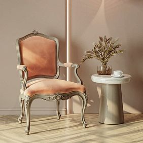
Not every chair can be an accent. It must have sufficient visual strength to hold attention, but without becoming a caricature.Versailles 004-001This is an example of a correct accent. Carved back with plant ornament, curved armrests, legs with scrolls, rich upholstery — all this says 'baroque' unequivocally, without half-tones. But at the same time, the chair's dimensions are reasonable, it does not fill half the room, does not require a separate pedestal. It is large enough to be noticeable, and compact enough to fit into modern space.
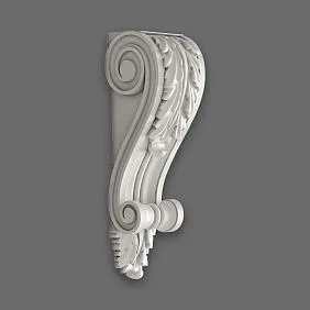
Relief is the first thing the eye notices. A baroque chair cannot be smooth. Carving on the back, armrests, legs creates a play of light and shadow, volume, depth. Relief should be complex, but readable. If the carving is too fine, it blends into a homogeneous mass from afar, losing detail. If too coarse, it looks crude, amateurish. The correct baroque relief is when the overall composition is visible from three meters away, and individual leaves, scrolls, flowers are distinguishable from one meter away.decorative rose outletsCarving on the chair's back can be an additional element of relief, enhancing the baroque sound.
Gilding is a dangerous tool. Too much gold — and the chair looks like theatrical props. Too little — and the baroque character is lost. Gold in baroque should not be uniform. The classic approach — gilding only protruding parts of carving, while recesses remain in the color of wood or are darkened with patina. This creates depth, volume, without turning the chair into a golden ingot. Another option — fragmented gilding, when gold is applied only to key elements: top of the back, edges of armrests, central rosette. This is enough for the chair to sparkle, but not enough to blind.
Upholstery fabric determines the character of the chair no less than carving. Baroque requires rich, dense fabrics with pronounced texture. Velvet — the genre's classic, it catches light, creates a soft glow, looks expensive and solemn. Brocade, tapestry, embroidered silk — all these are baroque fabrics. But the upholstery color must be chosen according to the surroundings. If the room is light, with white or beige walls, the chair can be a deep saturated color — burgundy, emerald, dark blue. If the interior already has dark accents, the chair is better to choose light — cream, gold, dusty rose. The contrast between the chair and the background should be sufficient for the chair to stand out, but not so sharp that it looks foreign.
The size of the chair is critical. A too small chair will not be able to be an accent — it will disappear among other furniture. A too large chair will take up too much space, visually overloading the room. For a standard living room of 20-25 square meters, the optimal size of a baroque chair is: width 70-80 cm, depth 80-90 cm, back height 100-110 cm. This is enough for the chair to be noticeable and comfortable, but not overwhelming.Furniture legsBaroque chairs always have curved, often cabriole-shaped arms — outward curve at the top, inward curve at the bottom, ending in a scroll or foot.
Our factory also produces:


First supporting element: mirror in a carved frame
The mirror frame should echo the chair's carving style but not be an exact copy. If the chair features botanical ornamentation (leaves, flowers, vines), the frame may have the same motif but in a more restrained execution. Alternatively, if the chair's carving is dense and detailed, the frame may be more minimalist with larger elements. It is important that they speak the same language but do not repeat each other literally.
It can be applied separately and added to a simple frame, creating a baroque decoration independently.Buy decorative elementsIt can be applied separately and added to a simple frame, creating a baroque decoration independently.
The frame's gilding should match the chair's gilding. If the chair has partial gilding, the frame should also be partially gilded. If the chair is fully gilded (which is rare and requires a very large space), the frame may be fully gilded. But most often, the optimal option is when gold appears fragmentarily: on protruding parts of the carving, in central rosettes, along the frame's edge. This creates compositional unity without turning the room into a golden reserve.
The mirror's placement is critical for balance. If the chair is positioned to the left of the entrance, the mirror should be placed to the right, on the opposite wall or perpendicular. This creates a visual triangle, guiding the eye through the room, preventing all focal points from clustering in one area. If the chair is placed by the window, the mirror may hang on the opposite wall, reflecting and multiplying the window's light, making the room brighter. The mirror should not hang directly opposite the chair — this creates a mirror corridor where the chair endlessly reflects, which looks strange and uncomfortable.
Second supporting element: console, side table, or floor lamp
Get Consultation
Two supporting elements create a stable composition. The second element should be a functional piece of furniture that adds practicality while supporting the baroque line. A console (if there is wall space available), a coffee table (if the chair is in a lounge area), or a floor lamp (if additional lighting is needed) — all of these can function as the second supporting element.
A console is a narrow table placed against a wall, usually under a mirror. A baroque console has curved legs, a carved frame, often a marble or wooden top. It does not need to be as richly decorated as the chair — it is a supporting element, not an accent. It is sufficient for the leg shape to echo the chair's leg shape, with a small carving or gilding on the tabletop or frame.
It can be applied separately and added to a simple frame, creating a baroque decoration independently.buy furniture legsIt can be applied separately and added to a simple frame, creating a baroque decoration independently.
A coffee table functions as a supporting element if the chair is part of a lounge area — next to a sofa, in the living room. The table should be elegant, on high legs, with carving or gilding that echoes the chair. It is important that the table is not bulky — baroque furniture tends toward visual heaviness, and if the table is too large, it will compete with the chair for attention. It is better to choose a small table with a marble or glass top, which visually feels lighter than wood.
A floor lamp is a supporting element that works through verticality. If the chair is placed in a corner, by the window, in a reading zone, a light source is needed nearby. A baroque floor lamp is not a minimalist metal stand — it is a sculptural object with a carved wooden or wrought metal base, a rich fabric shade with fringe or tassels. The lamp does not need to be fully gilded; sufficient gold accents on the base or shade frame are enough. The lamp's height should be such that the light falls comfortably on the chair for reading, but the lamp itself should not obstruct the view or clutter the space.
The choice between a console, a side table, or a floor lamp depends on functional needs and available space. A console requires a blank wall of at least 120 cm in length. A side table requires free space in front of the chair and sofa. A floor lamp requires minimal space but creates a vertical accent that may visually overload the room if the ceilings are low. General rule: if the chair stands alone as an accent, a floor lamp is better. If the chair is part of a group of furniture, a side table works better. If there is an empty wall nearby, a console is the ideal choice.
Composition of three elements: how to create a visual triangle
Chair, mirror, console (or side table, or floor lamp) — three points. These three points should form a triangle, the basic stable geometric shape on which the entire visual composition rests. The triangle does not have to be equilateral or rectangular — the main thing is that the three elements should not stand in a straight line or cluster in one corner.
Example composition in the living room: the chair is placed to the left of the window, the mirror hangs on the opposite wall (to the right of the entrance), the console stands under the mirror. The three points form a triangle that guides the eye through the room, creating a movement path, preventing all focal points from gathering in one area. When a person enters the room, they first see the mirror and console (they are closer to the entrance), then their gaze moves to the chair by the window. This creates intrigue, prompting exploration of the space.
Example composition in the bedroom: the chair is placed in the corner, next to it is a floor lamp, and the mirror hangs on the opposite wall above the dressing table. The chair and floor lamp create a reading zone, the mirror — a self-care zone. The three elements are stylistically linked (baroque carving, gilding, rich fabrics), but functionally they operate independently. This prevents overload — baroque is present but measured, in three points, while the rest of the space remains calm.
The height of the elements also plays a role. The chair is a low element (seat height 45-50 cm, back 100-110 cm). Console or side table — medium element (height 70-80 cm). Mirror or floor lamp — high element (mirror starts at 80-90 cm and rises to 150-180 cm, floor lamp reaches 150-170 cm). Different heights create visual dynamics, preventing the composition from being flat or single-level. The gaze moves not only horizontally (from chair to mirror to console), but also vertically (from low chair to high mirror to medium console).
Color coordination strengthens the composition. If the chair's upholstery is burgundy, a burgundy vase can be placed on the console. If the mirror frame is gilded, the floor lamp's shade may have a gold fringe. If the chair's legs are made of dark wood, the console's top may be made of the same wood. These repetitions of color, material, and texture create invisible threads connecting the three elements into a unified composition, even though they are placed in different parts of the room.
Balance: how not to cross the line between accent and overload
Baroque is a style that, by nature, strives for excess. Its strength lies in abundance, accumulation of details, and multi-layeredness. But in modern spaces, where air, light, and simplicity are valued, baroque must be controlled, dosed, not allowed to dominate everything. Balance is when baroque elements are present, creating an atmosphere, but do not overwhelm.
First rule of balance: for each baroque element, there should be at least three square meters of neutral space. If the chair occupies one square meter, there should be three square meters of free floor or wall space around it. If the mirror hangs on a four-square-meter wall, the remaining three square meters of wall should be empty or filled neutrally (solid paint, no decoration). This allows baroque to breathe, does not press on the space, preserves the feeling of freedom.
Second rule: one accent, two supporting elements — this is the maximum for a room up to 25 square meters. If the room is larger (30-40 square meters), you can add one more supporting element — a fourth point in the composition. But no more. Five to six baroque items — this is already overload, visual noise begins, baroque stops being an accent and becomes a background, and a background should not shout.
Third rule: gilding should be dosed more strictly than carving. Carving is form and volume — it can be abundant if executed well. Gold is color, which attracts the eye more strongly than any other. Too much gold — and the room becomes a museum or a temple. Optimal dosage: gilding is present on all three elements (chair, mirror, console/table/lamp), but on each element it occupies no more than 20-30% of visible surface.— everything must correspond to the chosen era.Gilding can be used on walls or ceilings, but very locally, at key points — corners, center of the ceiling, door trim.
Fourth rule: textiles should balance the rigidity of wood and metal. Baroque furniture is carved, angular (despite curved lines), hard. Textiles soften this, adding comfort and warmth. The chair's upholstery is the main textile. Additionally, you can add one or two cushions on the sofa or bed, in fabric that echoes the chair's upholstery. Or heavy drapes with gold trim, if the chair is placed by the window. But rugs, throws, and covers on other furniture should remain neutral, solid-colored, without ornament. Otherwise, textiles begin to compete with baroque furniture, creating visual chaos.
Fifth rule: wall and floor colors should be as calm as possible. Light neutral tones — white, cream, light gray, beige — create a background on which the baroque chair looks even more luxurious. Dark walls (navy, emerald, burgundy) also work, but require more light, otherwise the room becomes gloomy. Bright, saturated wall colors (yellow, orange, red) do not match baroque — they compete for attention, creating visual conflict.polyurethane wall moldingsWall panels can be used to create wall panels, but the panels themselves should be painted in calm tones, without bright contrasts.
Monochrome — all baroque elements are executed in one color, most often white or black. A white baroque chair with white carving and white upholstery looks sculptural and graphic. A black baroque chair with black carving and black upholstery appears dramatic and powerful. Monochrome simplifies perception, removes the clutter characteristic of traditional baroque, making the style more modern.
The first mistake is choosing a weak accent. A chair that should be an accent is not luxurious enough. Simple carving, absence of gilding, modest upholstery — such a chair will not hold attention, it will dissolve into the interior. The accent must be strong and unequivocal, so it is immediately clear: this is baroque, the main character. If the chair does not look sufficiently imposing, it is better to choose another, more decorative one.Buy Baroque furnitureIt must be of high quality, with detailed carving, proper gilding, rich upholstery.
The second mistake — supporting elements are too luxurious. A mirror in a frame that does not yield decoratively to the chair. A console covered with carving and gilding from legs to tabletop. As a result, instead of one accent, there are three, they begin to compete with each other, the gaze does not know where to look. Supporting elements should be more modest than the accent. If the chair has intricate carving on the backrest, armrests, and legs, the mirror should have carving only on the frame, and the console — only on the legs.
The third mistake — lack of composition. Three elements stand chaotically, do not form a triangle, are not visually connected. The chair in one corner, the mirror on the adjacent wall half a meter from the chair, the console on the third wall. As a result, all elements cluster in one zone, leaving the rest of the space empty. Or, conversely: the chair against one wall, the mirror on the opposite wall, the console on the third, and all of them stand centered on their respective walls, forming a cross, not a triangle. Composition requires careful planning — you need to draw a room plan, arrange elements so that they form a visually stable shape.
The fourth mistake — mismatch in scale. A huge chair in a small room overwhelms the space, turning the room into a box filled with one item. A small, elegant chair in a large hall disappears, does not create an accent. The size of the chair must correspond to the size of the room. For small spaces (15-20 square meters) compact baroque chairs are chosen, without wide armrests, with a high backrest that creates a vertical accent. For larger spaces (30-40 square meters and more) one can allow massive chairs with wide seats, powerful armrests, heavy upholstery.
The fifth mistake — ignoring lighting. A baroque chair requires light so that the carving is readable, the gold shines, the fabric shows texture. If the chair stands in a dark corner, without additional lighting, all its beauty is lost. There should be a light source next to the chair — a floor lamp, a table lamp, a wall sconce. Directional light is best, highlighting the relief of the carving, creating play of light and shadow.Wooden cornicesIntegrated lighting can work as an additional light source if the chair is placed next to a window and the cornice is above it.
Color palette: how baroque combines with a neutral background
Baroque traditionally uses saturated, deep colors: burgundy, emerald, dark blue, gold, purple. But in restrained baroque, these colors should be localized in accent elements, while the background remains neutral. The contrast between a bright chair and a calm wall — this is what makes the chair an accent.
Light background — white, cream, light gray — works best. On such a background, any color appears more saturated, carving is more readable, gold shines brighter. If the walls are white, the chair can be any color — from burgundy to emerald. If the walls are cream or beige, it is better to choose a chair in warm tones — gold, terracotta, bronze. If the walls are gray, the chair should be chosen in cool tones — dark blue, emerald, silver.
Dark background — dark gray, graphite, dark blue — creates drama, depth. But on such a background, the chair must be either very light (cream, gold, white with gilding) or contrasting (burgundy on dark blue background, emerald on graphite). A dark chair on a dark background will disappear, not creating an accent. A dark background requires more light — additional lighting next to the chair is mandatory, otherwise the room will become gloomy.
Colored background — walls painted in a saturated color — is difficult for baroque. If, for example, the walls are olive, the chair should be either contrasting (burgundy, gold) or in the same color range but a different shade (darker or lighter olive). But it is simpler to avoid colored walls, leaving them neutral. Color can be introduced through textiles — curtains, rug, cushions — but walls should remain calm.
Gold in the interior must be dosed not only on furniture but also in decor. If the chair has gilding, gold accents can be repeated in the mirror frame, the base of the floor lamp, the curtain tiebacks, the vase on the console. But the total amount of gold in the room should not exceed 10-15% of the visible area, otherwise it becomes overloaded. Gold is a spice, not the main dish.Wall moldingWith gilding can be used locally — in the corners of the ceiling, around the door frame, but not around the entire perimeter of the room.
Baroque in different rooms: living room, bedroom, office
Living room — the most logical place for restrained baroque. Here guests are received, here representativeness and status matter.Versailles 004-001It can stand next to a neutral modern sofa, creating an interesting contrast between classicism and modernity. A carved mirror hangs above the console on the opposite wall, a floor lamp stands next to the chair. Three elements create a baroque line, while the rest of the furniture remains modern — a glass and metal coffee table, a shelf with minimalist facades, a monochromatic rug. Such a combination looks fresh, not clichéd, shows the owner's taste and boldness.
Bedroom — a place for rest, where baroque should be especially restrained. An overly luxurious bedroom does not invite sleep, creates tension. One baroque chair in the corner, as a place for reading or changing clothes, a mirror above the dressing table, a small bedside table with carved legs — this is enough. The bed can be modern, with a simple headboard, or classic, but without excessive carving. Textiles — bedding, coverlet, curtains — should be calm, monochromatic or with a subtle, unobtrusive pattern.furniture legsThe bedside tables can echo the chair's legs, creating a stylistic connection.
Office — another place where baroque is appropriate. Here solidity, seriousness, respect for tradition matter. A baroque chair can stand behind the desk or in the relaxation zone, if the office is large enough. A bookcase with glass doors and carved cornices, a table lamp on a carved wooden base, a globe on a carved stand — all these are supporting elements that create an atmosphere of scholarly respectability. But the walls should remain calm, without excessive decoration.Wooden baseboardA wide, carved, can be the only decorative element on the walls, creating a sense of completeness in the interior.
Dining room — less obvious, but possible place for baroque. The dining table can be simple, modern, and the chairs neutral. But two baroque chairs at the head of the table (for the hosts) will create an accent, emphasize status. A buffet or sideboard with carved facades, a chandelier with crystal pendants — these are supporting elements. But the rest of the space — walls, floor, textiles — remains simple.Balusters for staircaseThe chairs can be carved, baroque, if the dining room is next to a staircase, creating a stylistic connection.
Entryway — the most challenging place for baroque, as it is usually a small, cramped space. But one small baroque chair or bench for shoes, a mirror in a carved frame, a console for keys and bags — this is the minimal set that creates an impression even upon entering the house. The key is not to overload a small space. The chair should be compact, the console narrow, the mirror vertical. Lighting is critical — entryways usually lack natural light, so bright fixtures are needed to highlight the beauty of baroque elements.
Modern interpretations of baroque: how to adapt the style
Baroque of the 17th-18th centuries — this is a historical style that is not always suitable in modern spaces in its pure form. But there are modern interpretations of baroque, where the spirit of the style is preserved, but forms are simplified, excess is removed. Neo-baroque — this direction takes key elements (carving, gilding, rich fabrics, curved lines), but presents them in a more restrained, subdued manner.
Simplified carving — instead of detailed floral motifs with many small elements, large, graphic forms are used. Scrolls are more restrained, leaves stylized, ornament geometricized. This preserves the baroque character, but makes furniture more modern, less museum-like. Such carving fits better into interiors with minimalist elements, does not create visual conflict.
Subdued gilding — instead of abundant gilding, minimal gold is used, only at key points. Or instead of gold, silver, bronze, patinated metal is used. This creates baroque luster, but not as strongly expressed. Especially relevant in interiors with cool color palettes, where warm gold may appear inappropriate.
Neutral upholstery colors — instead of traditional burgundy, emerald, purple fabrics, gray, beige, white, black are used. Velvet remains, but in calm tones. This makes the baroque chair more universal, easier to fit into modern interiors. Such a chair can stand next to a minimalist sofa and not create a visual break.
Mixing materials — classical baroque uses wood, fabric, possibly metal for gilding. Modern baroque adds glass, acrylic, chrome-plated metal. For example, a baroque chair with a carved wooden frame, but with transparent acrylic armrests. Or a table with baroque carved legs, but with a glass top. This creates an interesting contrast between historical style and modern materials, making furniture current, not retrograde.
In baroque style, it is especially popular in Scandinavian and minimalist interiors, where it adds decorative appeal without compromising the overall minimalism.White classic furnitureCarving is cleaned with a soft dry brush, removing dust from recesses. Gilding is wiped with a dry soft cloth, avoiding abrasives and wet cleaning (water may damage mercury gilding). Upholstery is vacuumed with a furniture attachment, stains are removed with specialized cleaners for the specific fabric type. Wood is polished every six months with wax or a special antique furniture formula.
FAQ: Answers to key questions about restrained baroque
Can baroque be added to a minimalist interior?
Yes, and it is one of the most effective techniques. One baroque chair in a minimalist room becomes a powerful accent, drawing all attention and creating intrigue. The key is to choose a chair in a neutral color palette (white, gray, black) so that it does not conflict with the minimalist palette. The carving can be detailed, but the gilding should be minimal or absent.
How many baroque elements can be added to one room?
For a room of 20-25 square meters, it is optimal to have three elements: one accent (chair) and two supporting elements (mirror, console, floor lamp). For a room of 30-40 square meters, you can add a fourth element. More is not recommended — it begins to feel overloaded, and baroque stops being an accent and becomes a background.
How to choose the upholstery color for a baroque accent chair?
The color should contrast with the wall color but fit into the overall color palette of the interior. If the walls are light, choose saturated tones — burgundy, emerald, dark blue. If the walls are dark, choose light tones — cream, gold, dusty rose. If the interior is monochrome, the chair can be the same color but with different saturation or texture.
Where is the best place to position a baroque chair in the living room?
Avoid the center of the room — the chair should not obstruct movement. Best locations: corner by the window (creates a reading zone with natural light), next to the fireplace (classic position for a chair), opposite the sofa (part of the relaxation zone, but not directly against the sofa — at least 1.5 meters distance for a coffee table and circulation).
Is gilding mandatory for a baroque chair?
No, gilding is an option, not a mandatory element. Baroque can be expressed through carving, curved lines, and rich upholstery. A chair made of dark wood with detailed carving and without gilding looks solid, respectable, and less flashy. Gilding adds luxury, but its absence makes the furniture more versatile and easier to integrate into various interiors.
What fabrics are best suited for upholstering a baroque chair?
Velvet — classic, creates a soft sheen, looks expensive. Silk — luxurious but less practical, easily damaged. Tapestry — dense, durable, with rich patterns. Brocade — heavy, formal, with metallic threads. For everyday use, velvet or tapestry are better. For formal interiors, silk or brocade can be used.
Can baroque be combined with Scandinavian style?
Yes, it is an interesting combination. Scandinavian style is light, minimalist, with natural materials. One white or light-gray baroque chair with minimal gilding fits perfectly, adding decorative appeal without compromising the overall lightness. Supporting elements — a simple mirror in a delicate carved frame, a white floor lamp with a textile shade.
Carving is cleaned with a soft dry brush, removing dust from recesses. Gilding is wiped with a dry soft cloth, avoiding abrasives and wet cleaning (water may damage mercury gilding). Upholstery is vacuumed with a furniture attachment, stains are removed with specialized cleaners for the specific fabric type. Wood is polished every six months with wax or a special antique furniture compound.
Carving is cleaned with a soft dry brush, removing dust from recesses. Gilding is wiped with a dry soft cloth, avoiding abrasives and wet cleaning (water may damage mercury gilding). Upholstery is vacuumed with a furniture attachment, stains are removed with specialized cleaners for the specific fabric type. Wood is polished every six months with wax or a special antique furniture formula.
Which modern styles pair well with baroque?
Art Deco (shared love of luxury, geometry, expensive materials), Eclecticism (intentional mixing of styles), Glamour (shine, gold, velvet), Fusion (free combination of elements from different eras). Does not pair with High-Tech (too cold, technological), Loft (too industrial, brutal), Provence (too naive, rustic).
Where to buy quality baroque chairs and supporting elements?
Contact manufacturers specializing in classic furniture with their own production. Check the quality of carving (detailing, clarity), frame material (solid wood, not MDF), gilding method (mercury gilding or high-quality imitation), upholstery fabric (natural or high-quality blend).buy classic style furnitureContact manufacturers specializing in classical furniture with their own production. Check the quality of carving (detail, clarity), frame material (solid wood, not MDF), gilding method (mercury gilding or quality imitation), upholstery fabric (natural or high-quality blend).
Conclusion: STAVROS — baroque without overload
Measured Baroque — it is the art of balance. One chair bearing all the luxury of the style, two supporting elements creating a composition, and a neutral environment allowing them to breathe. This allows you to enjoy the beauty of Baroque without turning your home into a museum. Carving, gilding, velvet, curved lines — all of this is present, but measured, precisely, surgically. The result — an interior that looks rich but not overloaded, luxurious but not pretentious, classic but contemporary.
STAVROS offers a collection of classical baroque furniture, produced on its own premises from solid oak and beech.Versailles 004-001mirrors in carved framesMirrors in carved framesfor creating a complete composition. Delivery to Moscow, Saint Petersburg, and all of Russia. Consultations with specialists will help choose elements that will create baroque in your home — luxurious but not overwhelming, noticeable but not loud. STAVROS — baroque that you can live with, not just display.wooden decorative elementsandpolyurethane, Moldings, Crown Molding, balusters, Furniture legsHow to incorporate baroque moderately: accent chair and two supporting elements | Company STAVROS


