Article Contents:
- Psychology of perceiving long narrow spaces
- Tunnel effect: how it is formed
- What changes perception: rhythm, light, depth
- Baseboard as the architectural foundation of a rhythmic composition
- Choosing baseboard height for a hallway
- Baseboard color: contrast or tone-on-tone
- Baseboard as the starting point for vertical moldings
- Creating a rhythmic structure: sectioning walls with moldings
- Determining the rhythm step: the mathematics of beauty
- Panel zone height: where to stop the verticals
- Symmetry or asymmetry: what to choose for a hallway
- Mirrors in the rhythmic structure: placement strategy
- Small vertical mirrors in sections: distribution principle
- Alternating mirror and solid sections: pattern options
- What mirrors reflect: controlling reflections
- Practical implementation: from project to installation
- Measurements and calculations: accuracy is critical
- Material selection: wood, MDF, or polyurethane
- Installation: sequence and nuances
- Color strategies for visual space correction
- Light bottom, neutral top: classic scheme
- Dark accent: mirror frames and moldings
- Monochrome: deepening the space
- How to visually change hallway proportions with mirrors
- Expanding a narrow hallway: mirrors on long walls
- Shortening a long hallway: mirror at the end
- Raising a low ceiling: vertical mirrors and vertical rhythm
- Lighting as Part of the Composition
- Overhead lighting: general light
- Accent lighting: mirror backlighting
- Hidden lighting: LED strips in moldings
- Frequently asked questions about rhythmic corridor decor
- What is the minimum corridor width for creating a sectional composition?
- Can this technique be used in a corridor with low ceilings (2.5 meters)?
- How much does it cost to implement a project for a 6-meter corridor?
- How to care for mirrors in the corridor?
- Is special mirror mounting required in such a system?
- Can the project be implemented as a DIY?
- How to deal with doorways in the corridor?
- Does this technique work in an L-shaped corridor with a turn?
- Conclusion: the corridor as a gallery

Long narrow corridors are an architectural curse of standard apartments and private houses. The monotonous tunnel perspective tires the eyes, creates psychological pressure, and turns the transit space into a dreary passageway that one wants to traverse quickly. However, there are techniques that can radically change the perception of such spaces.Rhythmic division of walls with moldings, strategically placed mirrors, properly selected baseboards as the baseline of the composition — all of this transforms a planning flaw into an architectural virtue.A corridor with well-thought-out baseboards and wall panels becomes not just a functional passageway, but a part of the interior that is pleasant to see daily.


Psychology of perceiving long narrow spaces
Why does a long corridor cause discomfort? It's due to evolutionary mechanisms of spatial perception. The human brain is wired to assess the environment in terms of safety and comfort. A wide open space gives a sense of freedom, control, and maneuverability. A narrow long passage activates ancient instincts — it is a potentially dangerous trap that restricts movement and hides threats around corners.


Tunnel effect: how it forms
Parallel walls receding into perspective create the effect of a narrowing tunnel. The geometry of linear perspective makes the far end of the corridor appear even narrower than it actually is. Monotony enhances the effect — when both walls are identical, without accents or focal points, the gaze slides along them with nothing to latch onto, nowhere to stop. This creates a sense of infinity, tires the eyes, and evokes a desire to leave the space.
Low lighting in standard corridors (often there are no windows) exacerbates the problem. Dark corners appear even narrower. The lack of natural light makes the space gloomy and unattractive. The psychological perception of the corridor as something temporary, non-residential, and utilitarian does not encourage investing in its finishing — and a vicious circle emerges: poor finishing enhances negative perception.
The absence of visual pauses, stopping points for the gaze, turns the corridor into a track that must be traversed. There is nothing to make one slow down, examine a detail, or feel interest. A continuous homogeneous wall 6-8 meters long is a visual desert that induces boredom.
Our factory also produces:


What changes perception: rhythm, light, depth
Rhythm — the repetition of elements at certain intervals — structures space, breaks monotony, and creates visual stops. When a wall is divided into sections by moldings, the eye perceives not a continuous plane but a sequence of elements. This creates readability, organization, and interest. The corridor ceases to be a tunnel and becomes a gallery.
Light, especially reflected by mirrors, doubles brightness, creates a play of reflections, and adds dynamism. A mirror in a dark corridor is a window that lets in light from another space (though this is an illusion — the mirror reflects the same corridor). Psychologically, this works powerfully — the space is perceived as brighter, more spacious, and more lively.
Depth, created by the relief of moldings, panels, and volumetric elements, destroys the flatness of walls. Even a slight relief (a molding projection of 10-15 mm) creates a play of light and shadow, makes the wall volumetric and architectural. The corridor gains three-dimensionality instead of flat graphicness.
Get Consultation
Baseboard as the architectural base of a rhythmic composition
Any architectural composition begins with a foundation.baseboard in the corridor — is not just a technical element covering the gap between the wall and floor. It is the foundation from which the entire vertical structure of wall finishing is built.
Choosing skirting board height for a hallway
Standard skirting boards with a height of 60-70 mm are too modest for creating an architectural composition. They serve a technical function but cannot act as a visual base for a panel system.high baseboards 100-120 mmcreate a solid foundation, visually ground the composition, protect the lower part of the wall from mechanical damage — relevant for hallways and corridors with high traffic.
For rooms with high ceilings (2.8-3.2 meters), skirting boards of 140-160 mm are appropriate. They do not appear bulky in a space of such scale; on the contrary — they create the correct proportion between the room's height and its horizontal divisions. A 160 mm skirting board conveys seriousness, respectability, and emphasizes the status of the space.
Not only the size but also the profile of the skirting board is important. For corridors where practicality is key, profiles with slight relief are suitable — they are easier to clean, and dust does not accumulate in the recesses. For formal spaces (halls, galleries in private homes), classic profiles with beads and projections that create decorativeness are appropriate.
Skirting board color: contrast or matching tone
A white skirting board against light walls is a classic solution that visually expands the space, creating lightness and airiness. White reflects light, making the corridor brighter. This is a universal choice for narrow, dark corridors where every unit of illumination is critical.
A contrasting dark skirting board (gray, black, dark brown) against light walls creates a clear horizontal line along the perimeter of the corridor. This is graphic, modern, and emphasizes the architecture. A dark base appears visually more stable than a light one — the space seems more grounded and stable. Practically, a dark skirting board hides dirt better than a white one.
A skirting board matching the floor tone (wooden for parquet, dark for dark tiles) creates a visual extension of the floor covering onto the wall. This slightly raises the floor visually and can be used to correct room proportions. If a corridor is too high and narrow, a dark floor and dark skirting board make it appear lower and cozier.
Skirting board as the starting point for vertical moldings
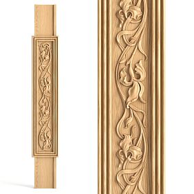
In a hallway panel decoration system, vertical moldings start from the skirting board and rise to a certain height (usually 100-120 cm, forming a panel zone). It is important that the vertical molding and skirting board visually harmonize — they should be made of the same material (wood, MDF, polyurethane), the same color, and have coordinated profiles.
If the skirting board is wooden, the vertical moldings should also be wooden (or a high-quality imitation). If the skirting board is painted white MDF, the moldings should be white MDF. Material mismatch disrupts visual unity — the composition appears random, assembled from disparate elements.
The junction of the vertical molding with the skirting board is a critical point. Professional installation ensures a tight fit, absence of gaps, and neat alignment of profiles. An amateur often leaves a gap, fills it with sealant, which looks sloppy. Or the molding is installed not perfectly vertical, with a slight tilt — the eye perceives this as an error.
Creating a rhythmic structure: sectioning walls with moldings
The main technique for transforming a long corridor is dividing the walls into repeating sections.Moldings create framesinside which panels, mirrors, or painted fragments are placed. The rhythm of repeating sections structures the space, creates visual pauses, and turns the corridor into an organized architectural environment.
Determining the rhythm step: the mathematics of beauty
The rhythm step is the distance between the centers of repeating elements. For a corridor, this is the distance between the vertical moldings framing the sections. A step that is too frequent (sections of 40-50 cm) creates fragmentation and restlessness. A step that is too sparse (sections of 150-200 cm) does not create sufficient rhythm; the wall remains monotonous.
The optimal step for residential corridors is 70-100 cm. This creates a readable rhythm, a sufficient number of sections (on a 6-meter wall, this results in 6-8 sections), and a convenient size for placing a mirror, painting, or simply a painted fragment inside a section.
The step can be regular (all sections of the same width) or with variations (alternating wide and narrow sections, the central section wider than the side ones). Regular rhythm creates calmness, predictability, and classicism. Rhythm with variations creates dynamism, interest, and modernity.
Mathematically pleasing proportions are 1:1 (square sections), 2:3, 3:5 (ratios close to the golden section). Sections with proportions of 1:2 or 1:3 create elongated vertical rectangles that visually raise the ceiling. Horizontally elongated sections (2:1) visually widen a narrow corridor but require sufficient ceiling height; otherwise, the space will appear squat.
Panel zone height: where to stop the verticals
The classic height of a panel zone in a corridor is 90-120 cm from the floor. This is the level to which the vertical moldings rise, forming the framing of the sections. Above this level, the wall remains smooth, painted, without additional division (or with minimal division — for example, a narrow border under the ceiling).
A height of 90 cm corresponds to traditional wainscoting, a protective panel framing of the lower part of the wall. This is practical — mechanical damage, dirt, and wear occur precisely in this zone. Panels (wooden, MDF, PVC) protect the wall, are easy to clean, and can be replaced if damaged.
A height of 120 cm creates a more substantial panel zone, suitable for high ceilings (from 2.8 meters). It conveys seriousness, fundamentality, and is appropriate in spacious halls, galleries, and formal corridors. In a standard apartment with 2.6-meter ceilings, a 120 cm panel zone can visually lower the ceiling.
The completion of the panel zone is a horizontal molding that runs the entire length of the corridor at the level of the upper edge of the vertical moldings. This is a critical element that unifies the entire composition. It should be expressive enough (minimum width of 40-50 mm) to be read as a significant architectural detail, but not excessively massive.
Symmetry or asymmetry: what to choose for a corridor
Symmetrical division — sections of the same width, regularly arranged on both long walls of the corridor mirroring each other. Left wall — 7 sections of 80 cm, right wall — 7 sections of 80 cm, starting and ending at the same level. This creates order, classicism, and solemnity. Suitable for classic, neoclassical, and traditional interior styles.
Asymmetrical division — sections of varying widths, not strictly mirroring each other on the opposite wall. For example, left wall — alternating sections of 60 cm and 100 cm, right wall — regular sections of 80 cm. Or the sections on one wall are offset relative to the sections on the opposite wall. This creates dynamism, modernity, and individuality. Suitable for contemporary, eclectic, and authorial projects.
For long corridors without branches, symmetry is preferable—it creates a rhythm that guides the eye along the space and organizes movement. For corridors with complex shapes (with turns, branches, niches), asymmetry allows adapting the composition to the architecture without forcibly trying to squeeze it into a symmetrical scheme.
Mirrors in rhythmic structure: placement strategy
Mirrors in a corridor serve several purposes: they reflect light (critical for windowless rooms), visually expand the space, create an illusion of depth, and serve functionally (the ability to check oneself before leaving). But randomly hung mirrors do not create an effect. A strategy is needed.
Small vertical mirrors in sections: distribution principle
Instead of one large mirror on the wall, it is logical to place several small mirrors integrated into the rhythmic structure of the sections. The mirror occupies the inner space of one section (or several), framed by the same molding as the empty sections. Visually, it is perceived as part of the panel system, not a separate object.
The size of the mirror in a section depends on the size of the section. If the section is 70×100 cm (width × height of the panel zone), the mirror can be 50×80 cm (leaving 10 cm from the edges of the molding frame). A mirror that is too large, filling the entire section flush with the molding, looks cramped, without breathing room. One that is too small gets lost in the frame.
Vertical orientation of mirrors in a corridor is preferable to horizontal. A vertical mirror 40×80 cm visually raises the ceiling, creates slenderness. A horizontal one 80×40 cm expands the space, but with low ceilings can visually lower them even more. Square mirrors are neutral, not pulling the space up or wide.
Alternation of mirrored and solid sections: pattern options
Pattern 1:1 — a mirrored section alternates with a solid one (paneled or painted). On a wall of 8 sections, there are 4 mirrors. This is the maximum number of reflective surfaces, creating an abundance of light and highlights. Suitable for very dark corridors where adding light is critical. Risk — an excess of mirrors can create visual restlessness, multiplicity of reflections.
Pattern 1:2 — one mirrored section, two solid ones, then mirrored again. For 9 sections — 3 mirrors. This is a balanced solution, creating a sufficient number of reflective surfaces without overload. Suitable for most residential corridors. The rhythm is read clearly, mirrors create accents but do not dominate.
Pattern 1:3 or 1:4 — one mirror per 4-5 sections. This is minimal use of mirrors, where they serve as accents, not the main element. Suitable for corridors with sufficient natural light (there is a window at the end or side windows), where the task of mirrors is not to add light, but to create visual focal points.
Asymmetric pattern — mirrors are placed not regularly, but in key locations: opposite the entrance door, in an area reflecting a beautiful part of the interior, in the darkest part of the corridor. This approach requires design flair—you need to feel where the mirror will give maximum effect.
What mirrors reflect: controlling reflections
A mirror reflects what is opposite it. If opposite is a blank wall, the reflection is boring. If opposite is a window, the mirror reflects light, nature outside, doubles the effect of glazing. If opposite is a beautiful interior item (a console with a vase, a painting, a lamp), the mirror doubles its presence.
When planning mirror placement in a corridor, you need to visualize or check on-site what exactly will be reflected. A mirror opposite the entrance door reflects entering people—functionally convenient (checked oneself before leaving), but can be psychologically uncomfortable for guests (not everyone likes seeing their reflection immediately upon entering).
A mirror reflecting another mirror on the opposite wall creates an infinite corridor effect—reflections recede into depth. This is dramatic but can be disorienting, creating visual complexity. Use with caution, only if it is a deliberate artistic technique.
Mirrors in a corridor reflecting light fixtures visually double the illumination. If there are two sconces on the wall and a mirror opposite, it seems there are four sconces. This is an effective way to enhance light without increasing the number of sources. It is important that the fixtures do not shine direct light into the mirror at eye level—this creates unpleasant glare.
Practical implementation: from project to installation
A beautiful idea requires competent implementation. Between the concept of a rhythmic corridor with mirrors and the real result lies the stage of design, calculations, material procurement, and professional installation.
Measurements and calculation: accuracy is critical
Measure the length of both long walls of the corridor with centimeter accuracy. Check if the lengths are the same (in old houses, walls can differ by 5-10 cm due to masonry irregularities). Measure the ceiling height at several points—the floor and ceiling may have a slope. Identified deviations must be considered in the design.
Determine the number of sections that logically fit on the wall. For a wall 6 meters long with a desired section width of 80 cm, that's 7.5 sections. You can make 7 sections of 85 cm each or 8 sections of 75 cm. The choice depends on which number is closer to the desired proportion and aesthetics.
Calculate the amount of materials. For 8 vertical moldings 100 cm high, you need 8 linear meters (plus a margin for trimming—buy 10 meters). For a horizontal molding 6 meters long, you need 6 meters (plus a margin—buy 7 meters). Moldings are usually sold in 2-meter strips, so you need 5 strips of vertical molding and 4 strips of horizontal.
Calculate the sizes and quantity of mirrors. If mirrors are placed in every other section (pattern 1:1), for 8 sections you need 4 mirrors. The mirror size is 10-15 cm smaller than the inner size of the section on each side. If the inner section size is 60×85 cm, order a mirror 40-50×65-75 cm.
Choice of materials: wood, MDF, or polyurethane
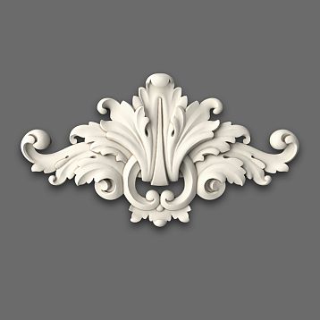
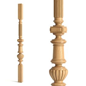
Wooden moldings— the choice for those who value naturalness, durability, and the possibility of multiple repainting. Oak or beech provide strength, stability, and noble texture. The cost is higher than alternatives, but the result pays off with decades of service. Forcorridors in a classic stylewood is the optimal choice.
MDF moldings with factory primer for painting—the golden mean in price and quality. MDF is more stable than wood (does not warp from humidity), easier to process, and costs 2-3 times less than solid wood. After painting with quality enamel, MDF is visually indistinguishable from wood. For corridors in modern classic, contemporary, minimalism, MDF is quite sufficient.
Polyurethane moldings—a budget option for those who want a decorative effect with minimal costs. Polyurethane is lightweight, moisture-resistant, and mounted with adhesive without complex fasteners. Huge selection of profiles. Disadvantage—artificiality of the material, lack of the tactile warmth of wood. Forhigh-traffic corridorsimpact-resistant polystyrene that withstands mechanical stress can be used.
Installation: Sequence and Nuances
Start with marking. Using a laser level or a long straightedge with a bubble level, mark a horizontal line on the wall at the height of the top edge of the panel zone (e.g., 100 cm from the floor). This line must be strictly horizontal along the entire length of the corridor, even if the floor has a slope.
Mark vertical lines indicating the position of vertical moldings. If sections are 80 cm, the first vertical line is at a distance of 80 cm from the corner, the second 80 cm from the first, and so on. Use a plumb line or laser level to check the verticality of the lines.
Install vertical moldings from the baseboard to the horizontal line. Moldings are attached with adhesive (liquid nails, construction adhesive) with additional fastening using finishing nails or screws every 30-40 cm. Ensure strict verticality — a deviation of even 1 degree will be noticeable.
Install the horizontal molding along the top edge of the panel zone. It connects to the vertical moldings at a right angle (or with a 45-degree miter cut if the profiles are complex). Joints should be tight, without gaps. After installation, joints are filled with acrylic putty, sanded, and painted.
Attach mirrors after the molding system is fully completed. Use special mirror holders (clips) or professional mirror adhesive. The mirror should be positioned with a 5-10 mm gap from the molding, not touching it — contact between glass and wood can cause chips.
Color Strategies for Visual Space Correction
Color is a powerful tool for managing spatial perception. The right color strategy can visually expand a narrow corridor, shorten a too-long one, and raise a low ceiling.
Light bottom, neutral top: classic scheme
The panel zone (from the baseboard to the horizontal molding at a height of 100-120 cm) is painted a light color — white, light gray, beige, light blue. The upper part of the wall (from the horizontal molding to the ceiling) — a shade darker or in a more saturated tone of the same color. For example, bottom — light gray RAL 9002, top — medium gray RAL 7035.
This scheme visually lightens the bottom of the room (the light panel zone appears light and airy), creating visual stability (the darker top doesn't feel oppressive but grounds the composition). This is a time-tested solution that works in most cases.
Moldings (vertical and horizontal) are painted white or a color contrasting with the panels. White moldings on a light gray background create clear graphics, emphasizing the geometry of the sections. Moldings a shade darker than the background create a softer, tonal contrast.
Dark accent: mirror frames and moldings
The entire panel zone (moldings and infill between them) is painted a light color, but the moldings framing the mirrors are highlighted in a dark color — black, graphite, dark brown. This creates an accent on the mirrors, sets them apart from the overall rhythmic structure, turning them into focal points.
This technique works when there are few mirrors (pattern 1:3 or 1:4). If there is a mirror in every other section, dark frames on all mirrors will create excessive busyness. It's better to highlight one or two central mirrors with a dark frame, leaving the rest in light frames.
Dark mirror frames can be complemented with a dark baseboard (of the same shade). The resulting composition: dark baseboard at the bottom, light panel zone with vertical moldings, several dark mirror frames as accents, light upper wall. This creates a balance of dark and light, graphic quality, and modernity.
Monochromatic: deepening space
All elements — walls, moldings, panels — are painted the same color. Distinction is created only by the relief of the moldings (play of light and shadow) and mirrors (reflective surfaces contrast with matte painted ones). This is a maximally restrained solution, creating visual integrity and solidity.
A light monochromatic scheme (all white or light gray) visually expands the corridor to the maximum. Boundaries between elements are blurred, the space appears as a single volume, not a set of planes. Suitable for very narrow corridors (width less than 100 cm), where every bit of visual expansion is critical.
A dark monochromatic scheme (all gray, graphite, dark blue) creates intimacy, coziness, drama. The corridor turns into a gallery where mirrors glow with reflections against a dark background. Requires good artificial lighting — a dark corridor with dark finishes without sufficient light will feel gloomy.
How to visually change corridor proportions with mirrors
Mirrors are not just reflective surfaces, but tools of optical illusion, capable of changing the perceived shape of space.
Expanding a narrow corridor: mirrors on long walls
Mirrors placed on one or both long walls of the corridor reflect the opposite wall, creating an illusion of additional depth. The corridor appears wider than it is. The effect is enhanced if the mirrors reflect light surfaces or light sources.
For maximum expansion effect, place mirrors on both long walls opposite each other (but not directly opposite to avoid an infinite corridor effect). A mirror on the left wall at the beginning of the corridor, a mirror on the right wall in the middle, again on the left at the end — such staggered placement creates multiple reflections, visual complexity, and a sense of spaciousness.
Horizontally elongated mirrors (e.g., 100×40 cm) create a stronger expansion effect than vertical ones of the same size. But they require integration into corresponding horizontal sections, which can disrupt the vertical rhythm of the composition. A compromise is square mirrors, which expand space evenly in all directions.
Shortening a long corridor: mirror at the end
A large mirror placed on the end wall of the corridor (at the end of the passage) reflects the entire corridor, creating an illusion of continued space. Paradoxically, this visually shortens the corridor — the gaze meets the reflection, which is perceived as a volume, not a flat wall. The corridor appears not as a long passage, but as a more square-shaped room.
To enhance the effect, the mirror at the end should be large — ideally spanning the entire width of the wall (or at least 80% of the width) and reaching from the baseboard to the horizontal molding of the panel zone. A small mirror at the end will not create a sufficient illusion of volume.
The frame of the end mirror should be expressive, continuing the rhythm of the moldings on the long walls. If the vertical moldings on the long walls are 40 mm wide, the frame of the end mirror should also be about 40 mm. This creates visual unity — the end mirror is perceived as the final element of the rhythmic composition.
Raising a low ceiling: vertical mirrors and vertical rhythm
Vertically oriented mirrors, stretching from the baseboard almost to the ceiling (e.g., 40×200 cm with a ceiling height of 2.6 m), create vertical dominants that visually raise the ceiling. The eye follows the verticals upward, making the space appear taller.
The vertical rhythm of moldings supports the effect. Frequent vertical moldings (spaced 60-70 cm apart) create a forest of verticals that guide the gaze upward. Horizontal lines should be minimal — one horizontal molding at a height of 100-120 cm, with no other horizontals. The fewer horizontal divisions, the taller the ceiling appears.
A light ceiling, continuing the color of the upper part of the walls, visually merges with them, blurring the boundary between the wall and ceiling. This makes the height indefinite, making the ceiling seem higher. In contrast, a contrasting dark ceiling clearly marks the upper boundary, emphasizing the actual (low) height of the room.
Lighting as part of the composition
The rhythmic structure of moldings and mirrors requires proper lighting to fully reveal its potential. Light emphasizes the relief, creates a play of shadows, and makes the mirrors work.
Overhead lighting: general light
Ceiling fixtures (spotlights, linear lights, pendants) create general illumination for the hallway. For hallways, fixtures placed in a line along the central axis of the ceiling at intervals of 1.5-2 meters are optimal. This creates uniform lighting without dark corners.
The direction of light is important. Downward-facing fixtures illuminate the floor, providing functional light for movement, but do not emphasize the wall relief. Fixtures with diffused light (shades, reflectors) provide softer light that also illuminates the walls. This is more advantageous for perceiving the molding composition.
The color temperature of light affects the perception of the finish color. Warm light (2700-3000K) makes white and beige shades warmer and cozier. Neutral white (4000K) keeps colors close to natural. Cool white (5000-6000K) makes white even whiter, gray bluish, creating a modern, cool atmosphere.
Accent lighting: mirror backlighting
Wall sconces placed on the sides or above mirrors create accent lighting that highlights the mirrors within the overall composition. The light reflected by the mirror doubles, creating a locally bright zone.
Placing sconces requires planning at the design stage — wiring must be run to the installation points. The classic option is two sconces on either side of the mirror at a height of 160-180 cm. The modern option is one fixture above the mirror (a linear LED light running the entire width of the mirror).
The fixtures should coordinate with the interior style and the rhythm of the composition. For a classic rhythmic structure, traditional sconces with shades and brackets are suitable. For a modern one, minimalist fixtures with geometric shapes, metal finishes, and directional light are appropriate.
Hidden backlighting: LED strips in moldings
Modern technology allows embedding LED strips into moldings, creating hidden backlighting that softly illuminates the wall. The LED strip is placed in a special molding with a groove (or between two moldings creating a groove), with the light directed along the wall, creating a glowing effect.
Hidden backlighting in the horizontal molding separating the panel zone and the upper part of the wall creates a floating effect — the molding glows, appearing detached from the wall. This is modern, technological, and impressive in the evening.
Hidden backlighting in a niche behind the mirror (if the mirror is mounted at a small distance from the wall) creates the effect of a glowing mirror floating on the wall. This requires a special mounting structure, but the result is impressive — the mirror becomes a light object, a dominant feature of the space.
Frequently asked questions about rhythmic hallway decor
What is the minimum hallway width for creating a sectional composition?
The minimum width is 90 cm. In narrower hallways, volumetric moldings (protruding 10-15 mm from the wall) can visually narrow the space, creating a feeling of tightness. For widths of 90-100 cm, use the flattest possible moldings (protrusion of 5-8 mm) and avoid placing sections on both walls opposite each other — it's better to have one wall with rhythm and the other smooth.
Can this technique be used in a hallway with low ceilings (2.5 meters)?
Yes, but with adjustments. Limit the panel zone height to 90-100 cm (not 120 cm) to leave more space for the upper part of the wall. Use vertically elongated sections (narrow and tall) that create a vertical rhythm, visually raising the ceiling. Avoid multiple horizontal divisions — they cut the height, making the ceiling appear lower.
How much does it cost to implement a project for a 6-meter hallway?
Approximate calculation for a 6×1.2 m hallway with 2.7 m ceilings: MDF moldings for painting (vertical 16 linear meters, horizontal 12 linear meters) at 800 rub/m = 22,400 rub; baseboard 12 linear meters at 1,500 rub/m = 18,000 rub; mirrors 4 pcs size 50×80 cm at 8,000 rub = 32,000 rub; paint and consumables = 6,000 rub; installer labor = 35,000 rub. Total about 113,000 rubles. Using polyurethane reduces material costs to 12-15 thousand, total about 70 thousand.
How to care for mirrors in the hallway?
Wipe mirrors with glass cleaner every 1-2 weeks. In hallways, they get dirty faster than in rooms (dust, splashes from entering from outside). Avoid abrasive agents that scratch the mirror coating. For moldings around mirrors, use a slightly damp cloth, avoiding over-wetting the joints.
Is special mirror mounting required in such a system?
Yes, mirrors are mounted to the wall independently of the moldings. Use mirror holder clips (for mirrors 4-6 mm thick) or double-sided mounting tape for mirrors. Moldings only frame the mirror and do not support its weight. Leave a gap of 5-8 mm between the edge of the mirror and the molding — the mirror should not touch the wood.
Can the project be implemented by yourself?
With carpentry experience and necessary tools (miter saw, level, screwdriver) — yes. Critical are measurement accuracy, careful miter cuts of moldings, controlling verticality and horizontality during installation. Finish painting requires skill — uneven layers and drips are very noticeable on moldings. If you lack experience, it's better to entrust installation to professionals.
How to handle doorways in the corridor?
Doors are incorporated into the rhythmic structure. The doorway is framed with moldings that coordinate with the section moldings. You can have the vertical moldings of the sections continue through the door level, creating the impression that the door is another section in the rhythm. It's important that the door framing and sections are executed in a unified style.
Does this technique work in an L-shaped corridor with a turn?
Yes, and even better than in a straight one. The turn naturally divides the corridor into two sections, each decorated with its own rhythm. In the first section (before the turn) — one rhythm of sections; after the turn — a continuation of the same rhythm or a slight variation (different spacing, different mirror pattern). The corner of the turn is the place for an accent mirror or decorative element.
Conclusion: The corridor as a gallery
A long corridor ceases to be a problem when it is perceived not as a planning flaw, but as an opportunity. An opportunity to create an architectural gallery, where the rhythm of moldings organizes movement, mirrors multiply light and space, and a thoughtful composition pleases the eye daily.The right combination of moldings, baseboards, and mirrorstransforms the most inconvenient corridor into a memorable part of the interior.
Implementing such a project requires planning, quality materials, and professional execution. Randomly screwed-on moldings and mirrors won't create the effect — you need a system, rhythm, proportions. But the result justifies the investment — the corridor becomes a space you want to look at, photograph, and show to guests.
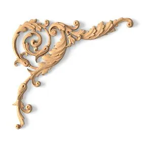
STAVROS company offers the full range of materials for creating rhythmic compositions in corridors.Wooden moldingsof various profiles and sizes, baseboards from 60 to 200 mm in height, mirror frames, elements for creating panel systems — all made from selected solid oak and beech, professionally kiln-dried to 8-10% moisture content.
STAVROS's production facilities are equipped with modern equipment ensuring perfect geometry of products. CNC milling centers create profiles with an accuracy of up to 0.1 mm, guaranteeing tight joining of elements during installation. Multi-stage quality control at every step — from wood selection to packaging — ensures consistently high results.
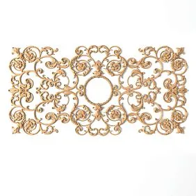
A wide range of profiles allows selecting a solution for any style — from classic moldings with rich relief to minimalist rectangular strips for modern interiors.Cornices, moldings, and baseboards for creating the architectural frameworkof a room are available in dozens of variations, among which everyone can find a suitable solution.
The possibility of ordering custom-sized products solves the problem of non-standard rooms. Need a molding of a specific length without joints? Need to adapt a profile to a specific concept? STAVROS manufactures individual solutions within production capabilities. Production time from two weeks, cost calculated individually.
STAVROS specialists' consulting support helps at the project planning stage. How to calculate the optimal section spacing for a specific corridor? Which molding profile will create the desired effect? How much material to order considering cutting waste? Experienced consultants, working with interior designers for over twenty years, will answer all questions and suggest optimal solutions.
Partnership with professional installers allows STAVROS to recommend trusted specialists skilled in working with wooden trim, understanding the importance of accuracy when creating rhythmic compositions. Proper installation is half the project's success. Quality materials in the hands of an experienced installer become flawless interiors.
STAVROS logistics ensures delivery to Moscow, Moscow region, and regions of Russia. Each product is individually packaged, protected from damage during transportation. For large orders, door-to-door delivery and unloading by company personnel are organized. Material safety during transit is a priority for the logistics service.
Product warranty confirms confidence in quality. If manufacturing defects are found, the product is replaced by the company without additional conditions. The return rate is less than 0.5% over the last five years — an indicator of stable production processes and high quality control.
Create corridors that inspire. Transform utilitarian transit spaces into architectural galleries where rhythm and light create harmony. Choose quality materials, trust professionals, don't be afraid of bold solutions. STAVROS — your partner in creating interiors where every detail is thought out, where architecture serves beauty and comfort, where quality is guaranteed by decades of experience. Start transforming your corridor today — the space you pass through daily deserves to be beautiful.