Article Contents:
- Anatomy of Baroque: Breaking Down the Style into Elements
- Dynamism of Form: Movement in Stillness
- Horror Vacui: Fear of Emptiness
- Symmetry and Centrality
- Baroque Ornaments: A Language to Be Read
- Acanthus: The King of Baroque Carving
- Cartouche and Volutes: A Frame for Coats of Arms
- Putti and Cherubs: Heavenly Inhabitants
- Floral Garlands: Nature as Ornament
- Proportions: The Mathematics of Beauty
- Golden Ratio: The Eternal Formula
- Vertical and Horizontal: The Clash of Opposites
- Scale and Contrast: Playing with Sizes
- Color and Gilding: The Alchemy of Light
- Gold: The Metal of the Gods
- Color Pairs: Dark and Light
- Silver and Copper: Cold and Warm
- Venetian School: Marine Fantasy in Decor
- Marine Mythology in Carving
- Colored Lacquers: Eastern Influence
- Mirrors: Multiplying Luxury
- How STAVROS Furniture Works with Decor
- Repetition of Ornaments: Creating an Ensemble
- Moldings and Panels: Architectural Context
- Ceiling Solutions: The Celestial Vault
- Materials: What to Choose for Authenticity
- Solid Wood: Warmth and Texture
- Fabrics: Velvet and Brocade
- Stone and Metal: Accents of Nobility
- Lighting: play of light and shadow
- Chandeliers: The Architecture of Light
- Sconces and Candles: Local Light Sources
- Hidden Lighting: Modern Magic
- Frequently Asked Questions About Recreating Baroque
- Is it possible to create a Baroque interior in a small apartment?
- How expensive is it to create an authentic Baroque interior?
- How to combine Baroque with modern conveniences?
- Is it necessary to copy Italian models exactly?
- What are the most common mistakes made when creating a Baroque interior?
- Can Baroque be mixed with other styles?
- Conclusion

What do the palaces of the Venetian Doges and a modern Moscow apartment have in common? At first glance — nothing. But if you look more closely at the principles upon which it was createdItalian Baroque Furniture, understand the logic of its decor, break down the ornaments into components — it becomes clear: the spirit of Venice, the luxury of Rome, the elegance of Florence can be recreated in any space where there is a desire to surround oneself with beauty, where craftsmanship is valued, where one is ready to move beyond faceless minimalism.
Furniture in Baroque style— is not just curved legs and gilding. It is a philosophy where every curl of carving has meaning, every proportion is precise, every ornament tells a story. When we talk about recreating an authentic Baroque space in Russia, it's not about blind copying, but about understanding the principles that make this style recognizable, exciting, eternal. Let's examine howClassic Furnitureis complemented byinterior decor, creating a space where every morning begins with an aesthetic experience.


Anatomy of Baroque: Breaking Down the Style into Elements
Baroque was born in 17th-century Italy as a response to the restraint of the Renaissance, as an explosion of emotion, theatricality, a desire to astonish, to delight, to make one forget the mundane. To recreate this style, one must understand what it consists of, what principles form its foundation.


Dynamism of Form: Movement in Stillness
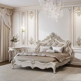
The main difference between Baroque and preceding styles is the rejection of straight lines, of static quality. The leg of a Baroque chair doesn't just support the seat — it curves, as if dancing, creating a sense of movement. The back of an armchair is not rectangular — it is curved, streamlined, like a sea wave. This principle is called contrapposto — dynamic balance, borrowed from sculpture, where the figure is tense yet stable.
In furniture, this is expressed through S-shaped legs, curved stretchers, undulating cornices. Even a rectangular cabinet in Baroque does not have flat fronts — they are convex or concave, creating a play of volumes. When you choose furniture for a Baroque interior, look for these curves, this rejection of geometric simplicity. A straight leg is not Baroque; it's Classicism or Empire.
Our factory also produces:


Horror vacui: Fear of Emptiness
Italian masters of the 17th century feared emptiness — every centimeter of surface had to be filled with decor. But this is not a chaotic accumulation; it is a thoughtful composition where ornaments follow a strict hierarchy. The central rosette on a cabinet door is the focal point; from it radiate garlands, scrolls, leaves, filling the space but leaving the center as the main element.
The principle of horror vacui applies to the walls of a Baroque interior. A bare wall is unacceptable. Moldings, panels, carved overlays structure the surface, turning a plane into an architectural object. The ceiling also cannot be empty — stucco, coffers, painting create the illusion of a celestial vault populated by angels.
Get Consultation
Symmetry and Centrality
Despite its apparent excess, Baroque is strictly symmetrical. A central axis runs through every piece of furniture, through every room. Carved overlays are placed in pairs, mirrored relative to the center. Two armchairs on either side of the fireplace, two candelabra on a console, two windows with identical curtains — symmetry creates a sense of order despite the opulence.
The center of the composition is always highlighted — it is larger, more complex, more richly decorated. On a cabinet facade, the central door is wider than the side ones, its carving denser. In a room, the center is the fireplace, table, bed — around which everything else is arranged. Determine the center of your space, make it the focal point, subordinate all other elements to it.
Baroque Ornaments: A Language to be Read
The carving on Baroque furniture is not just decoration; it is a language, a system of symbols that modern people often do not understand. But when you begin to read these ornaments, the furniture gains additional meaning, becoming not just beautiful, but meaningful.
Acanthus: The King of Baroque Carving
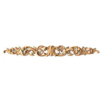
The acanthus leaf — from a Mediterranean plant with serrated edges — became the main motif of Baroque decor. Why? In Christian symbolism, acanthus signified overcoming earthly passions, thorns on the path to paradise. In a secular context — nobility, elegance, connection with antiquity, where acanthus adorned Corinthian capitals.
Acanthus leaves on Baroque furniture curve, twist, and create intricate cascades. They emerge from corners, frame central rosettes, and creep up legs from bottom to top. When selecting carved appliqués for your interior, look for acanthus motifs—they instantly create a Baroque feel and recognizable style.
Cartouche and volutes: a frame for coats of arms
A cartouche is a decorative frame, often with curled edges, inside which the owner's coat of arms was placed in palace furniture. Volutes—spiral-shaped scrolls along the edges of the cartouche—created dynamism, movement, making the frame not static but alive.
In a modern interior, a cartouche can be empty or contain a monogram or initials. But its form itself is a Baroque sign that indicates the style. A carved cartouche appliqué on a chest of drawers door, on a bed headboard, or on the wall above a console works as an instant style identifier.
Putti and cherubs: heavenly inhabitants
Winged infants—putti—inhabit Baroque furniture and interiors. They play musical instruments, hold garlands, and support cartouches. In a religious context, they are angels; in a secular one, they are cupids, symbols of love, joy, and carefreeness.
Figurative carved appliqués with putti are complex, requiring virtuoso skill. They make furniture sculptural, voluminous, turning a flat facade into a bas-relief. If you want maximum Baroque—add putti, but remember: they require space, high ceilings, otherwise they will overwhelm.
Floral garlands: nature as ornament
Flowers, fruits, leaves intertwined with ribbons—a classic Baroque motif that creates a sense of abundance, celebration, and eternal summer. Garlands drape, hang, frame, and connect different elements of the composition. Roses symbolize love, grapes—fertility and the Eucharist, laurel—glory, pomegranates—resurrection.
Linear carved appliqués with floral garlands are ideal for framing panels, doorways, and mirrors. They create continuity, rhythm, and connect individual items into an ensemble.
Proportions: the mathematics of beauty
Baroque may seem chaotic, excessive, but behind this apparent excess lies strict mathematics, a system of proportions that makes the style harmonious.
Golden ratio: the eternal formula
The golden ratio—a proportion where the whole relates to the larger part as the larger part relates to the smaller, approximately 1.618—was used intuitively or consciously by Italian masters. The height of a chair back to the seat height, the width of a central cabinet door to the side widths, the size of a central rosette to the facade size—all obey this proportion.
When planning a Baroque interior, use the golden ratio for placing decor. A wall panel should not be exactly in the middle height-wise—it should divide the wall in the golden ratio proportion, approximately 60% from the bottom, 40% from the top. This creates visual harmony that the eye perceives as correct, even without understanding why.
Vertical and horizontal: the struggle of opposites
Baroque furniture is often vertical—high chair backs, cabinets stretching to the ceiling, pilasters dividing facades. Verticality creates monumentality, solemnity, an aspiration upward, toward the heavenly. But verticality is always balanced by horizontality—cornices, plinths, shelves that stop the gaze and create stability.
In the interior, this is expressed through the alternation of vertical and horizontal elements. A tall cabinet—above it a horizontal cornice. Vertical pilasters on the wall—between them a horizontal panel. This creates rhythm, preventing the eye from tiring of uniform directions.
Scale and contrast: a play of sizes
Baroque loves contrasts in size—a large carved rosette neighbors with small scrolls, a massive table leg ends with an elegant leaf. This contrast creates dynamism, interest, makes one examine the furniture and discover details.
When applyingFurniture decor, vary the scale. One large appliqué is better than ten small ones—it creates a focal point. But the large one needs to be supported by small details around it, otherwise it will hang isolated, unconnected to the surroundings.
Color and gilding: the alchemy of light
Color in Baroque is not just coloring; it is a way of managing light, creating atmosphere, and emphasizing form.
Gold: the metal of the gods
Gilding is the hallmark of Baroque, especially Venetian. But gold was not simply applied to the entire surface—it was used selectively, emphasizing the recesses of carving, protruding details, creating contrast with the main color of the wood or paint. Gold leaf—the thinnest sheets glued onto a special base—creates shimmer, a play of light that cannot be reproduced with paint.
In a modern interior, gold leaf is expensive and requires professional application. An alternative is gold patina, which is rubbed into the recesses of the carving, remaining in the grooves, creating the effect of aged gilding. Gold patina on dark wood is a classic of Venetian Baroque. On white or cream—a French interpretation.
Color pairs: dark and light
Baroque operates with contrasting color pairs. Dark wood—walnut, stained oak—contrasts with gold and white marble tabletops. White-painted furniture contrasts with dark upholstery—burgundy, emerald, sapphire velvet. These contrasts create drama, expressiveness, preventing the interior from becoming flat.
When choosing a color for a Baroque interior, avoid pastels—they are too soft, saccharine for Baroque. You need saturated, deep colors—wine-red, royal blue, emerald green, purple. But these colors should be noble, not garish—velvet, not plastic; natural pigments, not synthetic neon ones.
Silver and copper: cold and warm
In addition to gold, Baroque utilized silver and copper. Silver—cold, moon-like—created a different effect than gold. Silver patina on carvings gave a sense of coolness, aristocracy, and restraint. Copper—warm, reddish—added homeliness, coziness, and was more democratic than gold.
The choice between gold, silver, and copper is determined by the character of the interior. Formal rooms—the living room, dining room—require gold. Private ones—the bedroom, study—can feature silver. Copper is good in libraries, music salons, where an intellectual atmosphere is important.
Venetian School: Marine Fantasy in Decoration
Venice is a unique city where Baroque acquired distinctive features. The maritime republic, which traded with the East, introduced elements into Baroque that were not present in Rome or Florence.
Marine Mythology in Carving
Dolphins, tritons, seahorses, shells, waves—Venetian furniture is populated with marine creatures. Table legs end in dolphin tails, armchair armrests feature triton heads, carved overlays depict open shells with pearls inside. This is not just decoration—these are symbols of Venice's wealth, its connection to the sea, its cosmopolitanism.
By adding marine motifs to the interior, you create a recognizably Venetian atmosphere. A carved shell overlay above a bathroom mirror, dolphins on console legs in the hallway, wave-like cornices—all these are references to Serenissima, the Most Serene Republic.
Colored Lacquers: Eastern Influence
Venetian masters were the first in Europe to master the technique of colored lacquers, brought from China and Japan. Green, red, black lacquers with gold paintings turned furniture into picturesque panels. The lacquering technique is complex—dozens of layers, each polished by hand, creating a depth unattainable with ordinary paint.
In a modern Baroque interior, colored lacquers can be used as accents—one lacquered chest of drawers, a box, a panel on the wall creates a Venetian accent without overloading the space.
Mirrors: Multiplying Luxury
Venice was the center of mirror production in Europe—Murano glass was famous for its purity and quality. Venetian interiors used mirrors generously—they multiplied candlelight, created the illusion of endless enfilades, made rooms visually larger.
Mirrors in carved frames with gilding are an essential element of Venetian Baroque. The frame should be no less decorative than the furniture—carved volutes, cartouches, putti turn the mirror into an independent work of art.
How STAVROS Furniture Works with Decor
Creating an authentic Baroque interior requires not just purchasing furniture in the right style, but also thoughtfully supplementing it with decorative elements that connect individual pieces into an ensemble.
Repeating Ornaments: Creating an Ensemble
The main principle is that the carving on the furniture should echo the decor on the walls, ceiling, and doors. If the chair back features acanthus leaves, then the wall overlays should also include acanthus. If the cabinet doors have cartouches, then a cartouche above the doorway is appropriate.
This does not mean identical repetition—the ornaments should be related, but not clones. A carved wall overlay can be larger, simpler, or more complex than on the furniture, but the carving style—depth, character of lines, proportions—should match. This creates visual unity, the impression that everything was made by one craftsman, at one time.
Moldings and Panels: Architectural Context
Furniture in Baroque does not stand against bare walls—the walls are structured with moldings that create panels, frames, architectural elements. A rectangular panel of moldings behind a bed headboard, behind a sofa, behind a dining table frames the furniture, making it part of the architecture.
The size of the panel should relate to the size of the furniture—the panel's width slightly greater than the item's width, the height proportional. The molding profile should not be too thin—in Baroque, everything is massive, tangible, material. A molding width of 8-15 cm is typical for Baroque interiors.
Ceiling Solutions: The Celestial Vault
The ceiling in a Baroque room is not a white plane, but a continuation of the vertical composition. A wide cornice at the junction of the wall and ceiling creates a transition, visually increasing the height. A central ceiling rosette, from which the chandelier descends, acts as a focal point, gathering the composition.
The rosette should be proportionate to the room—in a small bedroom, a diameter of 60-80 cm is sufficient; in a spacious living room, a rosette of 100-150 cm is needed. The rosette carving can be flat or three-dimensional—three-dimensional creates more dramatic shadows, flat is more delicate, suitable for more restrained interiors.
Materials: What to Choose for Authenticity
Baroque is demanding of materials—fakes, imitations, cheap alternatives instantly ruin the style. Only natural materials, professionally processed, create the desired feeling.
Solid Wood: Warmth and Texture
Oak, beech, walnut—species used by Italian masters—are available today. Solid wood has a texture, weight, and tactility that cannot be imitated. When you touch a carved detail made of oak, you feel its density, coolness, roughness—this material presence is critical for Baroque, a style that appeals to all the senses.
MDF, plywood, plastic imitating wood are unacceptable in a serious Baroque interior. They can mimic the appearance, but not the weight, sound, smell, or tactility. Baroque is a multi-sensory experience, where not only how it looks but also how it feels is important.
Fabrics: Velvet and Brocade
Upholstery, curtains, cushions — textiles in Baroque are as important as wood. Deep-pile velvet that changes color depending on the direction of light creates luxury and tactile pleasure. Brocade with gold threads, jacquard with large patterns — fabrics that are decorative in themselves.
Synthetic velvet doesn't work — it's too uniform, without light play, without the noble patina that appears on natural velvet over time. Silk, wool, cotton — only natural fibers create the proper sense of quality, time, and authenticity.
Stone and metal: accents of nobility
Marble for countertops, fireplace portals, flooring — a classic Baroque choice. White Carrara with gray veins, green Verde Antico, black Portoro — each type of marble creates its own atmosphere. Marble is cool to the touch, heavy, durable — its presence adds monumentality.
Brass, bronze for hardware — handles, hinges, overlay keyholes — create golden accents that echo the gilding of carvings. Modern hardware made of stainless steel, chrome, aluminum is alien to Baroque — alloys that oxidize, develop patina, and live through time are needed.
Lighting: Play of Light and Shadow
Baroque was created for candlelight — flickering, moving, creating deep shadows. Modern electric lighting must imitate this effect, otherwise the interior will appear flat.
Chandeliers: architecture of light
Crystal chandelier — a symbol of Baroque, although the first chandeliers were wooden, with gilding and candles. Crystal became popular later, but today it is associated with Baroque luxury. The chandelier should be multi-tiered, voluminous, with dozens of elements that catch light, multiply it, and create a play of reflections.
Chandelier size is critical — too small gets lost, too large overwhelms. The chandelier's diameter should be approximately half the width of the table it hangs over, or one-third the room's width if centered. Hanging height: 70-90 cm above the table, or so the chandelier's lowest point is 2.1-2.3 m from the floor in a room without a table.
Sconces and candles: local sources
Sconces on walls on both sides of mirrors, paintings, doors create local lighting that emphasizes architectural elements and creates multi-level light. Sconces should have fabric shades or imitate candle arms with candle-shaped bulbs.
Real candles in candelabras, candlesticks add authenticity. Flickering live flame creates an atmosphere impossible to reproduce with electricity. Safety requires caution, but for special occasions — dinners, receiving guests — candles are indispensable.
Hidden lighting: modern magic
LED strips hidden behind cornices, inside display cases, under furniture create lighting unavailable in the 17th century but organic to Baroque. Warm light 2700K, directed at carvings, emphasizes relief, creates shadows, and makes decor three-dimensional.
Lighting should be invisible — the light source itself is hidden, only the effect is visible. This creates magic, the impression that furniture and decor glow from within, especially effective with gilded carvings.
Frequently asked questions about recreating Baroque
Can a Baroque interior be created in a small apartment?
Full Baroque requires space — high ceilings, large rooms. But Baroque elements can be adapted for compact spaces. One or two Baroque chairs, a carved mirror, wall moldings will create a Baroque mood without overloading. The key is not to try to cram everything at once, but to select a few key pieces.
How expensive is it to create an authentic Baroque interior?
Authentic Baroque with hand-carved details, gold leaf, antique furniture — is very expensive. But modern technologies — 3D milling of carvings, quality gilding imitations, natural materials — allow creating a visually convincing Baroque interior for reasonable money. What matters more is not cost, but understanding the style's principles, correct proportions, and quality execution.
How to combine Baroque with modern conveniences?
Baroque integrates modern technologies excellently if they're hidden. A TV behind carved cabinet doors, climate control behind decorative grilles, modern kitchen appliances behind Baroque facades — technologies shouldn't be visible, shouldn't destroy the historical atmosphere.
Is it necessary to copy Italian examples exactly?
No, Baroque allows interpretation. Understanding the principles is important, but copying specific historical items isn't necessary. Modern craftsmen can create Baroque furniture and decor adapted to modern needs, preserving stylistics, proportions, ornaments, but changing sizes, functions, materials.
What mistakes are most common when creating a Baroque interior?
The main mistake — excess without system, when decor is applied chaotically without understanding composition. Second mistake — using cheap imitations that destroy the sense of quality. Third — ignoring proportions, when small furniture is placed in a large room or vice versa. Fourth — incorrect lighting, flat overhead light that kills carving volume.
Can Baroque be mixed with other styles?
Baroque is self-sufficient and mixes poorly with minimalism, high-tech, Scandinavian style — they're philosophically opposite. But Baroque combines with other classical styles — Rococo (lighter), Classicism (stricter), Empire (more monumental). Transitions between them are smooth, possible in different rooms of one house.
Conclusion
Recreating the spirit of Venice in Russia is an ambitious but achievable task if one understands thatItalian Baroque Furniture— it's not a set of decorative techniques, but a philosophy of life where beauty is paramount, where every detail is considered, where nothing is accidental. By breaking down Baroque stylistics into components — dynamism of forms, horror vacui, symmetry, reading ornaments as text, understanding proportions, working with gold and color — we gain tools for creating authentic space that doesn't copy, but recreates, adapts, interprets historical heritage.
Furniture in Baroque styleSTAVROS creations are born from an understanding of all these principles — carving is performed on 3D machines with subsequent manual refinement, guaranteeing the depth and detail characteristic of historical examples.interior decoration— overlays, moldings, cornices, rosettes — are manufactured in the same stylistic vein as the furniture, enabling the creation of compositional unity where the carving on a chair echoes the overlays on the walls, where the entire space works as a symphony of forms. Painting, patination, and gilding are performed by professionals who know how to create the effect of antique furniture, how to make gilding appear not fresh and garish, but as if it has weathered centuries.
The Venetian Baroque school with its marine mythology, colored lacquers, and mirrors in carved frames is represented in separate collections, where dolphins, shells, and waves create the recognizable atmosphere of Serenissima. Roman monumentality, Florentine restraint, Neapolitan expression — each regional interpretation of Italian Baroque can be recreated through the correct selection of furniture, decor, and color schemes.
The company STAVROS manufacturesclassic furnitureandFurniture decorfrom solid oak and beech, using historical examples as a foundation but adapting them to modern needs. Chairs, tables, chests of drawers, and cabinets in the Baroque style are manufactured with correct proportions, with carving that creates dynamism, and with the possibility of patination in gold, silver, and copper, creating effects characteristic of historical furniture. Each piece can be painted in any color — from the natural tone of the wood to white, cream, black — with subsequent patination that emphasizes the carving, adds depth, and creates a sense of time. Carved overlays, rosettes, cartouches, and garlands are produced on the same equipment, from the same solid wood, guaranteeing a perfect match with the furniture and the possibility of creating an ensemble where every detail supports another. Moldings, cornices, and ceiling rosettes complete the architectural design, transforming a room from a collection of objects into an integral Baroque space. Professional STAVROS designers help plan the interior, select furniture and decor, and create 3D visualizations that allow you to see the result before production begins, adjust details, and ensure the Baroque philosophy is correctly embodied. Custom manufacturing to the client's dimensions, the possibility of creating unique carvings from sketches, and a choice from dozens of finishing options make each project unique, corresponding precisely to your vision of Baroque beauty. By choosing STAVROS, you choose not just furniture, but the opportunity to live in a space where every morning begins with admiration, where beauty is not ostentation but a way of life, where the spirit of Venice, the luxury of Rome, and the elegance of Florence become the reality of your home. Let Baroque enter your life not as a museum exhibit, but as a living philosophy where luxury is natural, where craftsmanship is valued, and where every detail works to create a space worthy of kings.