Article Contents:
- Psychology of Small Spaces: Why Size Matters
- How the Brain Perceives Limited Volumes
- Fears and Misconceptions About Decor in Small Apartments
- Choosing Scale: Narrow Moldings as the Basis for a Light Interior
- Profile Width and Visual Perception
- Molding Profile: Simplicity vs. Complexity
- Materials for Thin Moldings
- Ceiling Molding: Lightness Instead of Monumentality
- Ceiling Baseboards for Low Rooms
- Rosettes and Coffers in Limited Space
- Cornice Lighting as a Tool for Expansion
- Vertical and Horizontal Divisions: Geometry of Space Expansion
- Vertical Moldings and Visual Height
- Horizontal Lines and Width Expansion
- Wall frame compositions
- Light-Colored Paintable Elements: Airiness Through Color
- Why Light Shades Expand Space
- Paintable Elements Made of MDF and Polyurethane
- Matte and Glossy Finishes
- Practical Techniques for Placing Decor in Small Rooms
- Accent Wall vs. Perimeter Decor
- Vertical Zoning in Studios
- Framing of functional elements
- Mistakes to avoid
- Scale Disproportion
- Over-decorating
- Incorrect Color Contrast
- Materials and Their Specifics in Small Spaces
- Individual Approach: Molding to Your Taste
- MDF for Painting: Budget and Quality
- Polystyrene for Temporary Solutions
- DIY Decor Installation: Step-by-Step Guide
- Surface Preparation
- Marking and Cutting
- Gluing and Finishing
- Real solutions for typical layouts
- Khrushchyovka: working with 5-6 meter rooms
- 25-30 meter studio: zoning without partitions
- Modern one-room apartment 35-40 meters: balancing style and function
- Frequently Asked Questions
- STAVROS Company: your partner in creating stylish small-space interiors

A thirty-square-meter apartment is not a sentence, but an opportunity for creative realization. It is in small spaces thatinterior decorationworks most effectively: properly selected elements can visually expand a room, raise low ceilings, create a sense of air and spaciousness where there seems to be none. The main mistake of small apartment owners is refusing decorative elements for fear of overloading the interior. But it is precisely a well-placedinterior wall decorbecomes a tool for visually expanding space, not shrinking it. The question is not whether to use moldings and cornices, but how to do it meaningfully, with an understanding of architectural laws and perception features.


Psychology of small space: why size matters


How the brain perceives limited volumes
The human eye and brain assess the size of a room not only by actual area but also by visual markers: the number of vertical and horizontal lines, richness of details, color contrasts, lighting. An empty white room three by three meters may seem more spacious than one of the same size but cluttered with dark bulky furniture and overloaded with colorful decor.
Decorative elements work as guides for the gaze. Vertical moldings lead the eye upward, creating an illusion of high ceilings. Horizontal lines at the upper third of the wall expand the space horizontally. Properly placed elements organize chaos, structure space, create visual reference points that the brain uses to assess scale.
The absence of decor does not make a small room more spacious—it makes it flat, one-dimensional, visually poor. Walls without divisions merge into a monotonous plane, which rather emphasizes the limited space than hides it. Moderate decor, on the contrary, creates depth, layering, interplay of planes, which visually enriches the interior.
Our factory also produces:


Fears and misconceptions about decor in small apartments
Misconception one: any decor reduces space. Incorrect. Massive, dark, contrasting decor indeed visually consumes volume. But light, bright, thoughtfully placed decor, on the contrary, structures and expands. A thin ceiling plinth painted the color of the ceiling visually raises it, creating a floating effect. Vertical moldings make walls taller.
Misconception two: a small room needs minimalism. Not necessarily. Minimalism requires ideal room proportions, flawless execution, expensive materials. In a small apartment with crooked walls and low ceilings, bare minimalism often looks not stylish but dreary. Moderate decor masks flaws, distracts attention, creates character.
Misconception three: decor is expensive and complicated. Modern materials—polyurethane, MDF, polystyrene—make quality decor affordable. Installation of most elements is so simple that even a beginner can handle it. A saw, miter box, glue—minimal tool set.
The right approach: not to refuse decor, but to choose it consciously. Narrow profiles instead of wide ones. Light shades instead of dark ones. Verticals and horizontals instead of chaotic placement. Concise forms instead of overloaded ornaments. And a small apartment gains style, character, visual lightness.
Get Consultation
Choosing scale: narrow moldings as the basis of a light interior
Profile width and visual perception
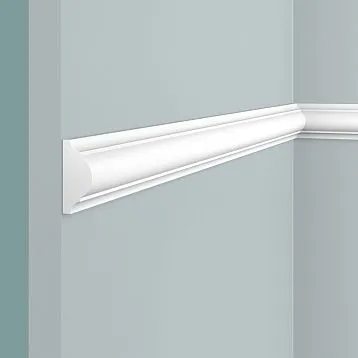
Molding width is a critically important parameter for small spaces. Every extra centimeter visually takes away space, creates a sense of massiveness, pressure. For rooms up to fifteen square meters, moldings 20-50 millimeters wide are optimal. They create necessary structure, define lines, but remain delicate, unobtrusive.
Paintable moldings in interior designwidth 30-40 millimeters is an ideal choice for small space. They are expressive enough to read as an architectural element, but not wide enough to overload walls. Painted the color of the walls, they create a barely perceptible relief that works in light. Contrasting ones form a graphic structure without excessive massiveness.
Wide moldings—80-120 millimeters and more—are appropriate only in rooms with ceiling heights from three meters and area from twenty-five square meters. In a standard city apartment with ceilings 2.5-2.7 meters, they look bulky, visually lower the ceiling, narrow the walls. This does not mean they cannot be used at all, but application should be pinpoint: one accent, not framing the entire perimeter.
Molding profile: simplicity versus complexity
A complex multi-step profile with many protrusions, grooves, bevels creates rich chiaroscuro but requires space for perception. In a small room, such molding looks excessively decorative, overloaded with details. The eye does not have time to read all the information, visual noise arises.
A simple profile—a smooth arc, one or two bevels, minimal relief—is read instantly. It creates a clear line that structures space but does not distract attention. For modern interiors, almost flat moldings with barely noticeable relief depth of 3-5 millimeters are suitable. For classic ones—profiles with a light volute or quarter round, but without excessive detailing.
Surface smoothness is also important. Moldings with ornaments, carvings, repeating patterns are good in formal halls, but in a small apartment create visual overload. Exception—pinpoint application: one carved overlay on an accent wall, framed by simple moldings. Contrast of simple and complex creates interest without overloading.
Materials for thin moldings
MDF moldings for painting are the optimal choice for budget projects. The material is dense, homogeneous, holds shape well, easy to cut and install. Primed surface is ready for painting with any paints. Profiles from 10 to 60 millimeters wide allow creating elegant framings, frames, wall divisions.
Polyurethane moldings combine lightness and strength. They are not afraid of moisture, temperature changes, do not deform over time. Polyurethane allows creating more complex profiles while maintaining low weight. Painted with acrylic and water-based paints, creating any desired shade.
Solid wood moldings are a premium option suitable for interiors where the naturalness of materials is important. Wood creates a special tactile and visual warmth but requires a stable microclimate. Thin wooden profiles 20-30 millimeters wide are quite fragile and require careful handling during installation.
Ceiling molding: lightness instead of monumentality
Ceiling skirting boards for low rooms
Standard ceiling height in typical houses is 2.5-2.7 meters. This is somewhat low, and any massive decor visually lowers the ceiling even further, creating a feeling of pressure. Traditional wide cornices with deep relief are inappropriate here. But completely abandoning ceiling framing makes the interior look unfinished.
Narrow ceiling skirting boards 30-50 millimeters wide are the solution. They create a neat boundary between the wall and ceiling, mask the joint, but do not overload. Painted the same color as the ceiling, they visually extend it downward, creating an illusion of additional centimeters in height. A white skirting board on a white ceiling is a classic scheme for low rooms.
A contrasting option—a dark skirting board on a light ceiling or a light one on a dark ceiling—works differently. It clearly defines the boundary, creates graphic quality, but visually reduces height. This technique is appropriate when you want to create intimacy and coziness, but not when the goal is to expand the space. For small apartments, it's better to stick to monochrome: the ceiling and skirting board should be the same color.
Rosettes and coffers in limited space
A ceiling rosette is a traditional element of classic interior design, framing a chandelier. In tall formal halls, rosettes can reach a meter in diameter, becoming standalone works of art. But in a small apartment, a large rosette looks out of place, overloads the ceiling, and draws attention to its limited area.
Small rosettes 30-40 centimeters in diameter with simple, laconic ornamentation are a reasonable compromise. They frame the chandelier, create a compositional center, but do not dominate. Flat rosettes with minimal relief depth of 5-10 millimeters create a delicate accent without overloading the ceiling with mass.
Coffered ceilings—a system of intersecting beams forming recesses—are a luxury for large spaces. In a room of twelve square meters with a 2.6-meter ceiling, coffers will create a feeling of a cage, visually lower the ceiling, and overload the space. An alternative is imitation coffering: one central frame made of thin moldings, framing the chandelier area. This creates architectural interest without overloading.
Cornice lighting as a tool for expansion
One of the most effective techniques for visually raising a ceiling is cornice LED lighting. An LED strip is installed behind the ceiling skirting board, 8-12 centimeters away from the wall. The light is directed upward, onto the ceiling, creating a soft diffused glow that visually separates the ceiling from the walls.
Floating effect: the ceiling appears separated from the walls, as if floating in the air. The boundary between the wall and ceiling blurs, and the ceiling visually rises. This works especially effectively when the ceiling is painted lighter than the walls—the light enhances the contrast and creates additional depth.
Cornice lighting requires special cornices with a ledge behind which the strip is hidden. The width of such a cornice is usually 60-100 millimeters, but visually it does not overload because the ceiling itself appears higher. Light temperature is also important: warm white (3000-4000K) creates coziness, while cool white (5000-6500K) gives a sense of spaciousness and height.
Vertical and horizontal divisions: geometry for expanding space
Vertical moldings and visual height
Vertical lines in an interior work as an elongating element: they guide the eye from bottom to top, creating an illusion of greater room height. In small apartments with low ceilings, vertical moldings become a simple and effective tool for visual correction.
Classic scheme: vertical moldings from floor to ceiling, dividing the wall into panels. Each panel is 60-90 centimeters wide, with full wall height. Moldings are narrow—20-30 millimeters—painted the same color as the walls or half a tone lighter. This division creates rhythm, structures the wall, and visually elongates the room.
Contrasting option: dark vertical moldings on light walls or light on dark. This creates graphic quality and modernity, suitable for minimalist, Scandinavian, and contemporary interiors. But it's important not to overdo the quantity: three to four vertical lines on one wall are enough; more will create visual noise.
Alternative placement: vertical moldings not along the entire wall height, but only in the upper third—from 180 centimeters up to the ceiling. This creates an illusion of high walls: the eye slides upward along the verticals, and the brain extends the lines downward, perceiving the room as taller. This technique works if the lower part of the wall is designed neutrally, without fragmented elements.
Horizontal lines and width expansion
Horizontal moldings work to expand the width of a space. A continuous line running along the wall makes the eye follow it, visually lengthening the wall. But placement height is critically important here: an incorrectly placed horizontal molding can visually cut the wall in half, making it appear lower.
Optimal height for a horizontal molding is the upper third of the wall, at 180-200 centimeters from the floor. This creates an effect of a high plinth and a lighter upper part. The lower part of the wall can be darker or have a different texture, while the upper part is lighter. The molding acts as a boundary between zones, visually raising the ceiling.
Low placement—at 90-100 centimeters—creates a classic division into panels and wallpaper. This is a traditional solution characteristic of English and French interiors. In small rooms with low ceilings, such division is risky: it can make the walls appear visually lower. It works only if the upper part is painted very light, almost white.
Framed compositions on walls
Creating rectangular or square frames from moldings on walls is a classic technique that structures the plane, creates visual interest, and defines functional zones. In small apartments, this technique requires caution: an excess of frames creates fragmentation and visual chaos.
One or two large rectangles on an accent wall is the optimal solution. Frame size should be about one-third of the wall width and half the height. Inside the frame, you can place wallpaper of a different color or texture, paint it a contrasting shade, or hang a painting or mirror. The frame acts as a visual anchor, organizing the composition.
Multiple small frames—a trend in recent years, coming from classic French interiors. Four to twelve rectangular panels framed by thin moldings are created on one wall. This creates graphic quality, rhythm, and architectural interest. But in small spaces, it works only if the moldings are extremely thin—15-20 millimeters—and painted exactly the same color as the walls. Contrast here is dangerous: it will create overload.
Light-colored paintable elements: airiness through color
Why light shades expand space
The laws of optics are inexorable: light surfaces reflect more light, appear farther away, and visually expand space. Dark surfaces absorb light, appear closer, and narrow it. In small apartments, a light color palette is not just a stylistic choice but a necessity.
White is the absolute champion of visual expansion. White walls, white ceilings, white moldings and baseboards create a sense of air, light, and spaciousness. A room appears 15-20 percent larger than its actual size. A monochrome white interior requires impeccable execution, quality materials, and thoughtful lighting, but the result is worth it.
Light shades—cream, ivory, light gray, soft blue, pale pink—work almost as effectively as white but add warmth, character, and individuality. Walls in a soft cream shade with white moldings create a delicate contrast, structure the space, yet maintain overall lightness.
Painting elements made of MDF and polyurethane
Modern decorative elements made of MDF and polyurethane are produced either with a factory primer coating, ready for painting, or already painted white. This offers freedom of choice: you can keep them white, paint them any shade from the RAL or NCS palette, or create patina, metallic, or pearl effects.
Primed moldings for painting allow for perfect color unity with walls and ceilings. You paint the walls, then the moldings with the same paints. The color matches absolutely, with no tonal discrepancies. The molding blends with the wall or ceiling, creating a barely noticeable relief that only works in the light.
An alternative is contrast, but within a light palette. Light gray walls with white moldings. Cream walls with light beige moldings. There is contrast, but it's delicate, not jarring to the eye, and doesn't fragment the space. This technique creates structure and readability of elements while preserving overall airiness.
Matte and glossy finishes
Surface texture influences perception no less than color. Glossy surfaces reflect light, create highlights, visually expand space, but require perfectly smooth walls—any imperfection is visible on gloss. Matte surfaces absorb light, create a noble velvety feel, hide minor defects, but visually reduce space slightly.
For small apartments, a semi-matte or satin finish is optimal—something between matte and gloss. The surface softly reflects light without creating harsh highlights, visually expands, yet retains nobility. Modern acrylic paints allow for creating precisely such coatings.
Moldings and decorative plasterwork can be painted with the same level of gloss as the walls, creating a monolithic look. Or contrastingly: matte walls and semi-gloss moldings that subtly stand out in the light. This creates additional depth without disrupting the overall lightness of the palette.
Practical techniques for placing decor in small spaces
Accent wall versus perimeter decor
In a small room, there's no point in decorating all four walls equally—it creates monotony, visual overload, and a lack of a compositional center. The accent wall principle works more effectively: one wall receives maximum decorative attention, the others are designed neutrally.
Which wall to choose as the accent? Usually the one that first comes into view when entering the room. In a bedroom—the wall behind the headboard. In a living room—the wall opposite the entrance or the one with the TV, fireplace. On the accent wall, you can create a frame composition from moldings, place patterned wallpaper, or paint it a contrasting shade.
The other walls remain as simple as possible: smooth paint without divisions, minimal decor. Ceiling and floor baseboards run along the entire perimeter, creating a frame, but the walls themselves are not fragmented. This creates balance: there is visual interest from the accent wall, but no overload from excess decor.
Vertical zoning in studios
Studio apartments, where the kitchen, living room, and bedroom are combined into one space, require visual zoning. Moldings and decorative elements become tools for dividing a single volume into functional zones without building partitions, which consume precious square meters.
Vertical moldings from floor to ceiling, placed at the boundary of zones, work as visual dividers. Three verticals spaced 30 centimeters apart create the illusion of a pilaster, a conditional support, marking the boundary between the living room and bedroom. The color of the moldings contrasts with the walls so the boundary is readable.
Horizontal zoning by color, supported by a dividing molding: the kitchen area painted one color, the living room area another, the boundary marked by a vertical molding. Or different wallpapers in different zones, the seam masked by a molding. This creates a clear functional structure without cluttering the space with furniture.
Framing functional elements
TV, mirror, bed headboard, doorway—all these elements can be framed with moldings, creating an additional decorative layer. A frame of thin moldings around the TV turns it into a picture, enhances it, integrates it into the interior. A mirror in a molding frame looks more significant, works as an architectural element.
A bed headboard, highlighted by a molding frame and painted a contrasting color, becomes the compositional center of the bedroom. This could be a rectangular panel measuring 140 by 100 centimeters, framed by a molding 30 millimeters wide. Inside—patterned wallpaper or simply paint two tones darker than the other walls.
Doorways, especially wide ones converted from regular doors, can be enhanced with a portal made of moldings. Vertical moldings on the sides of the opening, a horizontal one on top create a frame that architecturally designs the transition between rooms. In small apartments, this is especially important: every element should be meaningful, not just utilitarian.
First mistake - unstructured mixing. A classic chair, loft table, Scandinavian chest, and minimalist cabinet in one room is not eclecticism, but visual chaos. Each item draws attention to itself, not creating cohesion. A system, logic, unifying idea is needed. Choose one dominant style, add a second as an addition, and possibly a third as an accent. But no more than three, and all should have something in common - color, material, era, or functionality.
Disproportion of scale
The most common mistake is using moldings and decorative plasterwork designed for large spaces in small apartments. A cornice 150 millimeters wide with deep Baroque relief, a ceiling rosette 80 centimeters in diameter, wide door casings—all these are created for halls with ceilings from three meters and areas from forty square meters.
In a room of 12 square meters with a 2.6-meter ceiling, such elements look absurd, visually oppressive, emphasizing the smallness of the space instead of hiding it. The principle is simple: the smaller the room, the more delicate the decor should be. Thin profiles, simple shapes, minimal ornamentation.
How to check proportionality? Before buying a molding, place a sample against the wall, step back three to four meters, evaluate visually. If the element looks massive, dominates, overloads—it's too wide. If it's barely noticeable, gets lost—perhaps too narrow. Seek balance: the element should be readable but not dominant.
Excessive decoration
The second common mistake is the desire to use everything at once: ceiling cornices, wall moldings, rosettes, pilasters, frames, and overlays. The result is an overloaded, visually heavy space where the eye has nowhere to rest. The principle 'more is better' does not work in decorating small spaces.
A sensible approach: choose two or three types of decorative elements and apply them consistently. For example, a ceiling baseboard around the perimeter, vertical moldings on the accent wall, a mirror frame. That's it. Nothing more is needed. Each element works, performs a function, doesn't compete with others.
The rule of pause: there should be pauses between decorated zones—neutral planes free of decor. This creates rhythm, balance, gives the eye a rest. Continuous decoration of all surfaces is tiring, visually shrinks the space.
Incorrect color contrast
Sharp contrast — black moldings on white walls, dark brown on light beige — creates graphic quality and modernity, but requires caution in small spaces. Too many contrasting lines fragment the space, create visual clutter, and make it appear smaller.
In small rooms, it's safer to work within a single tonal range: light walls with white moldings, gray walls with light gray moldings. Contrast is created by relief and chiaroscuro, not by color. This preserves the integrity and monolithic appearance of the walls, visually expanding the space.
If you want contrast, apply it locally: one accent wall with contrasting moldings, the others in the same tone. Or contrasting vertical elements on one wall, with other surfaces neutral. Dosed contrast creates interest; total contrast creates chaos.
Materials and their specifics in small spaces
Polyurethane: Lightness and Moisture Resistance
Polyurethane is a polymer material combining light weight, high strength, resistance to moisture, and temperature fluctuations. For small apartments, it's an ideal choice: polyurethane moldings and decorative elements are easily mounted on any surface, do not create a load on the walls, and last for decades without deformation.
The density of high-quality decorative polyurethane is 280-350 kilograms per cubic meter. A molding two meters long and 50 millimeters wide weighs about 300 grams — several times lighter than a wooden counterpart. Installation with polymer adhesive or liquid nails takes minutes; no additional fasteners are required.
The moisture resistance of polyurethane allows its use in bathrooms, toilets, kitchens — places where wood deforms from humidity and plaster can deteriorate. A polyurethane ceiling skirting in a four-square-meter bathroom creates a neat frame, visually raises a low ceiling, and functions without problems.
MDF for painting: budget and quality
MDF — medium-density fiberboard — is a material created by pressing fine wood fibers with binders. A homogeneous structure without knots and cracks, stable geometry, and excellent workability make MDF a popular choice for moldings, skirting boards, and architraves.
MDF moldings for paintingMDF moldings are produced with a factory-primed coating, ready for final painting. The primer deeply penetrates the MDF structure, creating a dense base for paint. You can paint the moldings any color with acrylic, alkyd, or water-based paint, achieving perfect color matching with the walls.
The price of MDF moldings is significantly lower than wooden ones with comparable quality. For a budget project decorating a small apartment, this is the optimal solution: decent appearance, ease of installation, ability to paint, affordable cost. MDF does not deform from temperature fluctuations, holds its shape well, and lasts for decades.
Polystyrene for temporary solutions
Polystyrene moldings and skirting boards are the most budget-friendly option, suitable for rental apartments or temporary renovations. The material is light, cheap, easy to install, but less durable and strong than polyurethane or MDF. Polystyrene is more fragile, requiring careful handling during transportation and installation.
Visually, quality polystyrene elements are indistinguishable from polyurethane ones. They can also be painted with water-based paints, creating the desired decorative effect. But mechanical strength is lower: an accidental impact can leave a dent, the material crumbles when cut, requiring a sharp tool.
For a small apartment where there are no high mechanical loads, polystyrene decor is quite acceptable. Ceiling skirting, wall moldings at a height inaccessible to accidental impacts will last for years. The main thing is to choose models with sufficient wall thickness, dense structure, and avoid the cheapest options with loose, porous texture.
DIY decor installation: step-by-step guide
Surface preparation
The quality of molding and decorative element installation directly depends on surface preparation. Walls and ceilings must be level, clean, dry, and dust-free. Any unevenness, bumps, or depressions will be visible after installing the molding — it will replicate the base's relief, creating gaps and seams.
Checking for levelness: apply a long straightedge or a level batten to the wall in different directions. Gaps larger than 3-5 millimeters require leveling with filler. For ceiling skirting boards, the levelness of the upper part of the walls and the ceiling perimeter is especially important — that's where the element will be glued.
Priming: after leveling and sanding, be sure to prime the surface with a deep-penetrating primer. It will strengthen the base, improve adhesive adhesion, and remove dust. The primer must dry completely before installation — usually 4-6 hours at room temperature.
Marking and Cutting
Precise marking is half the success. For ceiling skirting boards, measure the required height from the ceiling, draw a horizontal line around the perimeter of the room. Use a laser or water level — a standard bubble level may have errors. The molding is installed with its lower edge exactly along the line.
For wall moldings, marking depends on the composition. If creating frames, carefully measure distances so the frames are symmetrical and identical. Use a tape measure, level, and square. Pencil marks should be barely noticeable so they don't show through the paint later.
Cutting moldings is done with a miter saw or a fine-toothed hacksaw in a miter box. Corners are the most difficult part. For a 90-degree joint, each molding is cut at a 45-degree angle. The miter box must be precise, the saw sharp. A dull blade tears the material, creating chips.
Gluing and finishing
Adhesive is applied to the back of the molding in dots or a zigzag pattern, depending on width. For narrow moldings, one line of adhesive down the center is enough; for wide ones — two lines or a zigzag. Use a moderate amount of adhesive: excess will squeeze out when pressed, causing problems.
Apply the molding to the marking, press, hold for 30-60 seconds. Quality polymer adhesive sets quickly, but full polymerization takes 12-24 hours. Avoid putting stress on the element during this time. Immediately wipe away any squeezed-out adhesive with a damp sponge before it hardens.
Molding joints — corners and end connections — require finishing. Even with precise cutting, micro-gaps remain. Fill them with acrylic sealant or filler, smooth with a wet finger or putty knife, let dry. After drying, lightly sand with fine sandpaper. The joints will become invisible.
Painting is done after the adhesive and filler are completely dry. Use a brush for relief elements, a roller for smooth surfaces. Usually, two coats of paint are required with intermediate drying of 4-6 hours. The second coat creates an even, dense coverage without gaps.
Real solutions for typical layouts
Khrushchyovka: working with 5-6 square meter rooms
Rooms in Khrushchyovkas — 5-6 square meters — are a challenge for a designer. Every centimeter is critical here; any mistake in decor will worsen the already catastrophic crampedness. Completely abandoning decor makes such a room resemble a closet. Competent minimal decor creates structure and adds refinement.
Solution: a narrow ceiling skirting board 30-40 millimeters wide, painted exactly the same color as the ceiling. It visually extends the ceiling onto the walls, raising it. One accent wall with vertical moldings 20 millimeters wide, creating three narrow panels. The remaining walls are smooth, without decoration. The color palette is as light as possible: white, cream, light gray.
The floor skirting board is also narrow — 50-60 millimeters, in the color of the floor or walls. A wide skirting board will visually raise the floor, reducing the perceived height of the walls. Doors without architraves or with maximally narrow ones — 40-50 millimeters. Every element works towards visual expansion, not decoration.
Studio 25-30 square meters: zoning without partitions
A studio apartment with an area of 25-30 square meters is a single space requiring functional division. Moldings become a tool for zoning without building space-consuming walls. Visual boundaries instead of physical ones.
Solution: vertical divider moldings at zone boundaries. Between the kitchen and living room — three vertical moldings from floor to ceiling, imitating a pilaster. Moldings 40 millimeters wide, painted in contrast to the walls, create a readable boundary. Between the living room and bedroom — similarly, but can be complemented with a textile curtain on a ceiling track.
Horizontal division at a height of 180 centimeters in the sleeping area: the wall below is painted a darker shade, above — lighter. The boundary is marked by a horizontal molding. This creates intimacy in the bedroom, visually separating it from the common space. The living room and kitchen remain light, with minimal decor, preserving a sense of spaciousness.
Modern one-room apartment 35-40 square meters: balancing style and function
A modern one-room apartment of 35-40 square meters usually has a ceiling height of 2.7-2.8 meters, which allows a bit more freedom in choosing decor. Here you can use medium-width moldings — 40-60 millimeters, create more complex compositions, but still adhering to the principle of moderation.
Solution: a 50-millimeter ceiling skirting board with cove lighting, creating a floating ceiling effect. In the living area — an accent wall with a framed composition: one large rectangle made of moldings 40 millimeters wide, inside — wallpaper with a geometric pattern or contrasting paint.
In the sleeping area — framing the headboard with moldings, creating a visual headboard without bulky furniture. Vertical moldings on the sides of the bed, a horizontal one on top, forming a rectangular panel 160 by 120 centimeters. Inside the panel — soft upholstery or simply paint a shade darker. This creates coziness, structures the space, without overloading it.
Frequently asked questions
Can plaster moldings be used in an apartment with 2.5-meter ceilings?
Yes, but choose narrow elements up to 50 millimeters wide with a simple profile. Paint them the same color as the ceiling for a visual lift. Avoid wide cornices and massive rosettes — they will visually lower an already low ceiling.
What molding width is optimal for a 12-square-meter room?
For a room of this area, moldings 30-50 millimeters wide are optimal. Wider ones will create a sense of clutter. If you want a pronounced decorative effect, use contrasting paint, not an increase in profile width.
How are moldings attached to the wall — are screws needed?
Lightweight moldings made of polyurethane, MDF, polystyrene are attached with polymer adhesive or liquid nails without additional mechanical fasteners. Massive wooden ones may require finishing nails, but these are usually not used in small apartments.
Can moldings be painted a bright color in a small room?
Yes, but carefully. Bright moldings create a strong visual accent, attract attention, and can fragment the space. If you want color, use it locally: one accent wall with colored moldings, the rest — neutral.
Is professional installation needed or can you do it yourself?
Installing modern moldings and plasterwork is simple enough for DIY. Basic tools are needed: a miter box, saw, level, tape measure, adhesive. The main thing is marking accuracy and careful corner cuts. Many video tutorials will help you master the technique.
What adhesive to use for polyurethane moldings?
Specialized polymer adhesive for polyurethane or universal liquid nails. It is important that the adhesive does not contain solvents that damage polyurethane. Acrylic adhesives are safe and effective. Setting time 30-60 seconds, full curing 12-24 hours.
How to care for painted moldings?
Regular dry cleaning with a soft cloth or vacuum with a soft brush attachment. Every few months — wipe with a slightly damp cloth. Quality acrylic coating withstands wet cleaning without damage. Avoid abrasive cleaners and stiff brushes.
Can moldings made of different materials be combined?
Yes, if they are painted the same and have a comparable profile. For example, ceiling skirting boards made of polyurethane, wall moldings made of MDF — after painting the same color, the difference in materials is not visible. The main thing is unity of style and color palette.
Company STAVROS: your partner in creating stylish small-space interiors
For over twenty-three years, the company STAVROS has been creating decorative elements for interiors of any scale — from palace halls to compact city apartments. The widest range of moldings, skirting boards, cornices, plasterwork made of polyurethane, MDF, natural wood allows selecting solutions for rooms of any size and style.
For owners of small apartments, STAVROS offers special collections of narrow moldings and thin skirting boards, developed considering the features of small spaces. Profiles from 20 millimeters wide, simple laconic shapes, primed surface for painting — all this allows creating a stylish interior without visual overload.
In-house full-cycle production guarantees stable product quality. Modern equipment, control at every stage, use of certified European-level materials — all this makes STAVROS products a benchmark of reliability. Moldings have precise geometry, identical batch sizes, clear profile relief.
A large stock program allows shipping orders on the day of request. No need to wait for production — popular items are always in stock in the Moscow warehouse. Delivery across Russia, the ability to order from a single piece, flexible pricing make cooperation with STAVROS comfortable for any buyer — from an individual to a large construction company.