Article Contents:
- The Psychology of Color in Interior Design: Why It Matters
- Color as Nonverbal Communication
- The Neuroscience of Color Perception
- Cultural Contexts of Color
- Top 5 Color Trends 2026 for Wooden Elements
- Trend #1: Earth Tones — Return to Nature
- Trend #2: Deep Blue — From Cobalt to Indigo
- Trend #3: Green Palette — From Olive to Emerald
- Trend #4: Monochromatic Nuancing — 50 Shades of Gray (and Beyond)
- Trend #5: Bright Accents — From Fuchsia to Lime
- Color Solutions by Interior Zones
- Kitchen: Color as an Appetite and Activity Stimulant
- Living Room: Color as an Atmosphere Tool
- Bedroom: Color as a Peace Regulator
- Staircase: Color as Vertical Dynamics
- Technological Nuances of Wood Painting
- Surface Preparation: The Foundation of Quality Color
- Types of Coatings: From Stain to Enamel
- Final Protection: Preserving Color
- FAQ: Answers to Common Questions About Color
- Can Wooden Products Be Repainted If the Color Gets Boring?
- Which Color to Choose for a Small Room?
- Natural Wood or Painted Wood — Which Is More Practical?
- How to Combine the Color of Handles, Balusters, and Cornices?
- Do Bright Colors Go Out of Fashion Quickly?
- Which Colors Suit a Classic Style?
- Can Multiple Bright Colors Be Used in One Interior?
- How to Care for Painted Wooden Products?
- Does color affect the durability of the coating?
- Where to order custom color painting for wooden products?
- Conclusion: color as a personalization tool by STAVROS

Color is emotion encoded in the spectrum. It defines the mood of a space more strongly than shape or material. While the 2020s began with the dominance of white and gray, 2026 brings an explosion of color expression. But not chaotic—conscious, built on an understanding of color psychology, cultural codes, and natural harmonies.
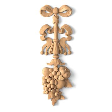
Furniture Handles, balustersandWooden cornice—elements that traditionally remained in the shadows, painted in safe neutral tones. Today, they become color accents, style drivers, tools for creating an authorial atmosphere. Natural wood, thanks to its texture and ability to accept any shade, has proven to be an ideal material for color experiments.


Color psychology in interior design: why it matters


Color as nonverbal communication
Each color carries culturally encoded meaning. Blue is associated with calm, stability, depth. Red—with energy, passion, activity. Green—with nature, growth, harmony. These associations are not accidental: they have been formed over millennia of evolution and cultural development.
When you choose a color forfurniture handles, you are not just matching a shade to the wallpaper. You are defining the emotional tone of daily interactions with the furniture. Deep blue creates a sense of stability and confidence. Warm terracotta—homely comfort and earthy solidity. Mint—freshness and lightness.
Our factory also produces:


Neuroscience of color perception
Scientific research shows: color affects physiology. Warm shades (red, orange, yellow) accelerate pulse, raise body temperature, stimulate activity. Cool shades (blue, green, purple) slow heart rate, lower blood pressure, calm.
of warm shades (honey, caramel, terracotta) stimulate energy. In the bedroom, where peace is important, cool or neutral tones (gray-blue, lavender, whitewashed oak) are preferable.Wooden handlesThis is critical for functional zones. In the kitchen, where activity and alertness are needed,
Get Consultation
Cultural contexts of color
Color is not universal. In Western culture, white is the color of purity and innocence; in Eastern culture, it is mourning. Red in China symbolizes luck; in European tradition, danger or passion.
2026 is characterized by the globalization of color codes. Designers freely mix cultural contexts, creating international interiors.balusters, painted in Japanese indigo, can coexist with a Moroccan terracotta cornice. What matters is not the ethnic origin of the color, but its emotional resonance.
Top 5 color trends of 2026 for wooden elements
Trend #1: Earth tones—return to nature
Terracotta, ochre, burnt sienna, umber, clay-pink—a palette taken straight from the earth's depths. These are not bright, screaming shades, but deep, saturated, warm colors that create a sense of rootedness, stability, and connection with nature.
Furniture Handlesin terracotta tones perfectly complement kitchens in Mediterranean, Tuscan, or Moroccan styles. They add warmth to minimalist white facades, create contrast with cold concrete or metal.
wooden cornice, painted in ochre or sienna, transforms the ceiling into a warm sky overhead. This is especially effective in rooms with high ceilings, where the cornice becomes a horizontal line organizing the space.
Painting technology: Earth tones are best realized with transparent water- or alcohol-based stains. They penetrate the wood structure, coloring the fibers while preserving the visibility of the grain. Oak with such treatment gains depth and drama; beech—a warm honey tone.
Combinations: Earth tones harmonize with natural materials—stone, linen, cotton, leather. They contrast with white, creating a clear graphic effect. They combine with each other—terracotta + ochre + umber create a layered warm palette.
Trend #2: Deep blue—from cobalt to indigo
Blue is experiencing a renaissance. But not the light blue of the 2010s—deep, saturated, almost ink-like. Cobalt, ultramarine, indigo, navy blue—shades that have been used for centuries in painting, textiles, and ceramics.
Balusters of the staircase, painted in deep blue, transform the staircase into a sculptural object. The vertical rhythm of balusters, enhanced by the saturated color, creates dynamism, attracts the eye, and organizes the space.
Blue on wood requires proper preparation. Since it is an opaque color, the wood grain is hidden. But tactility is preserved—the relief of turned or carved balusters remains readable.Wooden itemswith blue painting acquire the nobility of antique furniture.
Painting technology: Priming with white primer to even out the tone. Then 2-3 coats of acrylic or alkyd enamel. Final coating with matte varnish for protection and creating a velvety surface.
Combinations: Blue + white — a classic nautical style. Blue + brass/bronze — an aristocratic pair. Blue + natural wood — the contrast of artificial and organic. Blue + terracotta — an unexpected combination of cool and warm.
Trend #3: Green palette — from olive to emerald
Green is the color of 2026 according to leading color institutes. But not acidic grass green, but complex, dusty, noble shades. Olive, khaki, moss green, emerald, malachite.
Wooden corniceA cornice painted in olive creates a connection between the interior and nature. This is especially relevant for urban apartments lacking greenery. A ceiling cornice in green tones is a symbolic continuation of a park or garden inside the home.
Green on wood looks organic due to the natural association: wood and foliage, trunk and crown.Furniture HandlesDrawers in emerald color turn an ordinary chest of drawers into a jewelry cabinet.
Painting technology: Transparent tinting with green pigments gives a moss-on-bark effect. Opaque painting creates a dense color. Patination (applying contrasting paint into the recesses of the relief) adds depth.
Combinations: Green + gold — luxury. Green + white — freshness. Green + brown — natural harmony. Green + pink — an unexpected pair that works in modern eclectic interiors.
Trend #4: Monochromatic shading — 50 shades of gray (and not only)
Monochromatic does not mean boring. It's a play of tones within one color, creating depth through nuances. Gray palette from pearl to graphite. Beige from ivory to dark taupe. White from cold arctic to warm milky.
balustersShelves in different shades of gray create an exquisite monochromatic composition. Upper ones are lighter, lower ones are darker, creating a gradient from earth to sky. Or vice versa — darker at the top, emphasizing the massiveness of the structure.
Monochromatic paintingwooden productsrequires impeccable execution quality. When there are no color contrasts, the eye catches onto form, proportions, and processing quality. Any unevenness or imperfection becomes noticeable.
Painting technology: Multi-layer paint application with intermediate sanding. This creates a perfectly smooth surface where the color reveals its full depth. Finish: matte or satin varnish.
Combinations: Monochrome is self-sufficient. But accents of metal (chrome for cool shades, bronze for warm ones), glass, and stone are acceptable. MonochromaticWooden elementsfurniture is an ideal background for bright textiles or works of art.
Trend #5: Bright accents — from fuchsia to lime
Boldness is the new classic. After years of neutrality, designers and clients crave color. Bright, pure, unafraid to be noticeable. Fuchsia, coral, lime, lemon, turquoise.
Furniture HandlesHandles in bright color are a simple way to update furniture without replacing the fronts. A white kitchen with lime handles becomes fresh and modern. A gray chest of drawers with coral handles gains playfulness.
Dosage is important. Bright color is good in small doses. AWooden cornicewardrobe painted in fuchsia might be overkill for a living room. But bright handles on neutral furniture are the perfect balance.
Painting technology: Bright colors require perfect preparation. Primer, sanding, several coats of enamel. Any unevenness will be noticeable on a bright background. Finish — glossy varnish, emphasizing the color intensity.
Combinations: Bright accents on a neutral background. Fuchsia on white. Lime on gray. Coral on beige. Avoid combining several bright colors — this creates visual chaos.
Color solutions by interior zones
Kitchen: color as a stimulator of appetite and activity
The kitchen is the heart of the home, a place of activity and communication. The color here should stimulate but not irritate.Furniture HandlesKitchen fronts play a key role: there are many of them, they are at eye and hand level, and constantly interact with the residents.
For a classic kitchen: Warm natural tones — honey, caramel, walnut.Wooden handlesWooden fronts with a transparent oil coating, emphasizing the texture of oak or beech.
For a modern minimalist style: Gray or white handles. Monochrome, clean lines, absence of decorative excess. Wood is painted with opaque enamel, creating a perfectly smooth surface.
For an eclectic kitchen: Bright color accents. Terracotta handles on white fronts. Emerald on light gray. Lime on graphite. Boldness and individuality.
Cornice in the kitchen: If there is a ceiling cornice, it can be either neutral (white, matching the ceiling color) or contrasting (dark, creating a graphic frame). Bright colors on the cornice in the kitchen are undesirable — they overload perception.
Living room: color as a tool for atmosphere
The living room is a space for relaxation, communication, and status display. Color solutions here should be thoughtful, creating the desired atmosphere.
Wooden corniceCornice in the living room is an architectural element that defines the style. For classic interiors — natural wood with varnish or oil finish, emphasizing the texture. For neoclassical — white or light gray, creating lightness. For dramatic interiors — dark (wenge, ebony, graphite), contrasting with light walls.
Balusters (if there is a staircase or second-level balcony in the living room) become a sculptural accent. Their color can be coordinated with the cornice (creating unity) or contrasting (creating dynamism).
Bedroom: color as a regulator of tranquility
The bedroom requires calming colors. Cool or neutral tones, soft pastels, muted shades.
Furniture HandlesHandles on dressers, nightstands, and wardrobes can be lavender, gray-blue, pale green, bleached. These colors do not stimulate the nervous system, creating an atmosphere of peace.
CorniceCornice in the bedroom is better left neutral — white or matching the walls. Its task is not to attract attention, but to delicately structure the space.
Staircase: color as vertical dynamism
The staircase is a dynamic element connecting levels. Its color solution can emphasize movement or, conversely, calm it.
Balusters for staircaseSteps painted in a gradient (from light at the bottom to dark at the top or vice versa) create visual movement, enhancing the dynamism of ascent.
Monochrome balusters (all one color) create a calm rhythm, making the staircase part of the architecture, not a separate object.
Contrasting balusters (alternating dark and light) attract attention, turning the staircase into an art object.
Technological nuances of wood painting
Surface preparation: the foundation of quality color
Color reveals itself only on a perfectly prepared surface. Wood is sanded in stages: first with coarse abrasive (grit 80-120) for leveling, then medium (150-180), and finally fine (220-320) to create smoothness.
After sanding, the wood is degreased with a solvent, and dust is removed. Forwooden productsthat will be painted with opaque paints, primer is applied. It evens out absorbency and creates an adhesive layer for the paint.
Types of coatings: from stain to enamel
Transparent stains — color the wood while preserving the visibility of the grain. Available as water-based (eco-friendly but raise the grain), alcohol-based (fast-drying), and oil-based (deep penetration). Ideal forwooden cornicewhere texture is important.
Pigmented oils — contain colored pigments that not only color but also protect the wood. Create a soft semi-matte finish. Good forfurniture handleswhere tactility is important.
Acrylic paints — water-based, eco-friendly, odorless. Dry quickly, create a durable film. Suitable forbalusterswhere wear resistance is needed.
Alkyd enamels — based on synthetic resins. Provide a glossy, durable finish but have an odor and take a long time to dry. Ideal for bright, saturated colors.
Final protection: preserving color
Any color coating requires final protection. Varnishes come in:
Matte — create a velvety surface, hide minor defects, and prevent glare. Ideal for classic interiors.
Satin (semi-matte) — a universal option with a light silky sheen. Suitable for most styles.
Glossy — bright shine, emphasize color, making it more intense. Good for bright accent elements but require perfect surface preparation.
FAQ: answers to common questions about color
Can wooden items be repainted if the color becomes boring?
Yes, wood can be repainted multiple times. If it was a transparent stain — sand down to bare wood, apply a new color. If it was opaque paint — either sanding or covering with a new layer (with primer).
Which color to choose for a small room?
Light colors expand space. Whites, light grays, beigesFurniture HandlesandCrown Moldingvisually enlarge the room. Dark colors — shrink but create coziness.
Natural wood or painted — which is more practical?
Natural requires less preparation but is more sensitive to moisture and dirt. Painted is protected by paint but requires local repair if damaged.
How to combine the color of handles, balusters, and cornices?
Either unity (all the same color), or harmonious combination (warm with warm, cool with cool), or contrast (one element bright, the rest neutral).
Do bright colors go out of fashion quickly?
Neutral colors are more universal. But bright accents are easy to replace.Furniture Handleseasy to repaint or replace, refreshing the interior.
Which colors suit a classic style?
Natural wood, dark noble tones (walnut, wenge, mahogany), white, gold. Avoid bright modern colors — they clash with classic.
Can multiple bright colors be used in one interior?
Yes, but it's risky. Better one bright accent color + neutral background. Multiple bright colors require a professional approach to coloristics.
How to care for painted wooden items?
Regular dry cleaning, wet cleaning — with a soft cloth without aggressive agents. Renew coating every 3-5 years (for oil finishes), varnished ones practically do not require renewal.
Does color affect coating durability?
Dark colors fade faster than light ones under UV exposure. For sunny rooms, light or medium tones are better. Or use UV-protective varnishes.
Where to order painting of wooden items in a non-standard color?
From manufacturers offering custom tinting services. Company STAVROS paintsSolid Wood Itemsin any color upon customer request.
Conclusion: color as a personalization tool from STAVROS
2026 — the time of personalization. We are tired of mass solutions, we want spaces that reflect our individuality. Color is a simple and powerful tool for this.Furniture Handlesterracotta instead of standard chrome.balustersdeep blue instead of nondescript beige.Wooden cornicein noble green instead of obligatory white.
Color transforms functional elements into expressive accents. It creates a mood, defines the character of a space, and makes a home unique. And wood is the perfect material for color experiments, combining natural texture with limitless color possibilities.
The company STAVROS has been creatingSolid wood products, understanding: color is not just paint on a surface, it's the emotional content of an interior. Everyfurniture handle, eachBaluster, eachwooden cornicecan be painted in any color—from classic natural tones to bold custom shades.
STAVROS uses professional paints and coatings from European manufacturers, ensuring color fastness, wear resistance, and environmental safety. Painting is done in climate-controlled chambers, guaranteeing uniform coverage without drips or runs.
In the STAVROS assortment—products with a ready-made finishin current trendy colors, as well as custom tinting services. Provide a sample of your desired color (photo, fabric swatch, RAL code)—and STAVROS specialists will match an identical shade for yourwooden interior elements.
By choosing color solutions from STAVROS, you get not just painted wood, but a professionally executed color concept. Color that won't fade in a year, won't peel, won't lose saturation. Color that will delight for decades, turning a house into a space with character, mood, and soul.
The year 2026 opens the era of color diversity in interiors. Don't be afraid to experiment. Your home is your canvas.Wooden itemsfrom STAVROS are your paints. Create masterpieces.