Article Contents:
- Warm Mahogany: The Dominant Shade of the Era
- Ocher Palette: Warmth of Ancient Earth
- Gradient Transitions: Painting on Walls
- Contrasting Accents: When One Element Changes Everything
- Patina and Layering: The Effect of Time
- Natural Tones with a Modern Interpretation
- Greys and Muted Tones: Scandinavian Evolution
- Color Processing Technologies: From Craft to Art
- Psychology of color in wooden elements
- Practical Recommendations for Choosing Shades
- Care for Colored Wooden Surfaces
- Create a Color Symphony with STAVROS

Color is not just paint on the surface. It is the language of emotions, a tool for transforming space, a way to tell a story without words. In 2026, the world of interior design is experiencing a revolution in color solutions, where wood is no longer limited to its natural shades but becomes a canvas for bold experiments.Gradient Transitions in Interior Designtransform walls, furniture, and architectural elements into painted canvases, where one color smoothly blends into another, creating an illusion of movement and depth. This is a true symphony of shades, where every note matters.
Color Palette 2026reflects global cultural and psychological shifts. Humanity is tired of the cold sterility of grey minimalist interiors of the last decade. The body demands warmth, coziness, and a biological connection to nature. And designers respond to this call, returning richness of natural tones — from soft sandy to deep mahogany, from delicate ochre to saturated terracotta.Wood Tones in Interior Designbecome the main protagonists, around which the entire color composition of the space is built.


Warm Mahogany: The Dominant Shade of the Era
If one dominant color of 2026 in the category of wood tones is to be singled out, it will be Warm Mahogany — warm mahogany. This deep, rich reddish-brown shade embodies everything the modern person seeks: warmth without sweetness, luxury without vulgarity, tradition without conservatism. Warm Mahogany is the shade of fine cognac, autumn leaves under the evening sun, the cover of a beloved book.
Psychologically, this color possesses remarkable properties. It is dark enough to create a sense of protection and intimacy, but the reddish undertone adds energy and vitality, preventing the space from becoming gloomy. Neurobiological studies show that warm reddish-brown shades activate endorphin production, creating a feeling of comfort and well-being. This is a color antidepressant, especially valuable in northern latitudes with insufficient sunlight.
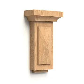
In interior design, Warm Mahogany works as a powerful visual anchor.Wooden elementsin this shade — whetherCarved appliqués for furniture, architectural pilastersordecorative moldingsimmediately attract attention, becoming compositional centers of the space. At the same time, the shade is versatile enough to pair with a wide range of other colors.
Ideal companions for Warm Mahogany are cream, ivory, and soft beige as background shades. These light neutral tones create lightness, preventing the dark wood from dominating. For contrasting accents, emerald green, deep blue, burgundy, and golden-yellow work beautifully. These saturated colors in textiles, decor, and art create a multi-layered, rich color symphony.
Warm Mahogany especially shines when combined with brass and copper. Metals in warm golden tones create a luxurious yet understated combination — this is the elegance of old-world style, reinterpreted for modernity.Carved wooden columnsColors of Warm Mahogany with brass capitals, furniture with copper handles, lamps with bronze frames — such details create an atmosphere of refined taste without pretentiousness.


Terracotta Palette: Warmth of Ancient Earth
The terracotta palette is incredibly diverse. It can be a light yellow-terracotta, reminiscent of ripe wheat and autumn fields. Or a medium red-terracotta — the color of terracotta, fired clay, Moroccan riads, and Tuscan villas. Or a deep brown-terracotta — the tone of fertile soil, forest undergrowth, tree bark. All these variations share one thing — they evoke a sense of connection to the earth, stability, rootedness.
Terracotta shades are ideal for creating interiors in Mediterranean, Moroccan, and Tuscan styles. They pair beautifully with natural stone, raw linen, handmade ceramics, and wrought metal details. Such interiors breathe history, evoking the feeling of a home that has existed for centuries, passed down from generation to generation.
Terracotta tones are ideal for creating Mediterranean, Moroccan, or Tuscan-style interiors. They pair beautifully with natural stone, raw linen, handmade ceramics, and wrought metal details. Such interiors breathe history, evoking a sense of home that has existed for centuries, passed down from generation to generation.
Wooden InlaysGradient
But terracotta tones work not only in ethnic and traditional interiors. Modern minimalist aesthetics are enriched by introducing terracotta wood, which adds warmth without compromising the strictness of lines. Light yellow-terracotta against white walls creates a sunny, optimistic atmosphere. Medium red-terracotta adds energy and character. Dark brown-terracotta brings depth and groundedness.
Our factory also produces:


Gradient Transitions: Wall Painting
The most revolutionary trend of 2026 — using gradient color transitions on wooden surfaces. This is a technique where one shade smoothly, without sharp boundaries, blends into another. Gradients create an illusion of movement, volume, and three-dimensionality on flat surfaces, transforming utilitarian interior elements into artistic installations.
Gradients on wood are achieved by applying multiple layers of toners with varying intensity, carefully blending the edges. This requires high skill — the transition must be so smooth that the eye cannot detect where one shade ends and another begins. The result is mesmerizing: a wooden panel that is dark and saturated at the bottom, gradually lightening toward the top, creating the impression that it dissolves into space.
GradientWooden panelsGradient transitions on walls act as visual spatial correctors. A vertical gradient from dark to light (bottom to top) visually raises the ceiling, creating a sense of upward movement and lightness. The reverse gradient from light to dark grounds the space, making it more stable and cozy. A horizontal gradient expands the room, creating an illusion of space receding into the distance.
Color combinations for gradients can be monochromatic — different shades of one color, from lightest to darkest. For example, a gradient from light cream-beige to deep Warm Mahogany creates a dramatic effect while maintaining color harmony. Or the gradient may be multichromatic — transitioning from one color to another related one. An ochre-yellow blending into terracotta-red, then into brown — such a gradient mimics sunset or autumn foliage.
Gradients oncarved decorative elementsWhen carved ornamentation is further enhanced by color transitions, it creates an amazing depth of image. Raised parts of the carving can be lighter, recessed parts darker — or vice versa. The play of light and shadow is complemented by the play of shades, creating a nearly three-dimensional effect that changes depending on viewing angle and lighting.
Get Consultation
Contrasting Accents: When One Element Changes Everything
a singlewooden columndeep burgundy-colored element in a light living room. Or a door portal framed by carved moldings in a saturated emerald-green shade, in a minimalist space.
Such accents act as visual exclamation points, focal points of attention around which the perception of the entire space is organized. They create drama, dynamism, making the interior memorable. But they must be used with caution — too many contrasting elements create visual chaos. The rule is simple: one, at most two contrasting accents per room.
The choice of color for a contrasting accent depends on the desired effect. Warm bright tones — red, orange, yellow — create energy, activity, optimism. Cool saturated tones — blue, green, purple — add depth, calmness, sophistication. Neutral but dark tones — black, graphite, anthracite — introduce graphic quality, strictness, modernity.
Carved Wooden Elementsespecially effective as contrasting accents. Their textured surface further enhances the visual impact of color. CarvedPilasterin a saturated cobalt-blue color is not merely a colored spot, but a sculptural object that works in three dimensions. Light falling on the relief surface creates a play of shades, making one color multifaceted.
Modern wood finishing techniques allow creating complex multi-layered color effects that mimic natural aging and patina over time. This is not simply painting in one color, but applying multiple layers of different shades with subsequent partial sanding, creating an effect of wear and history.
The base layer can be dark — for example, deep brown or black. Over it, a lighter shade is applied — cream, gray, terracotta. Then the top layer is partially sanded in areas of natural wear — at corners, protruding parts of carving, central zones frequently touched. The result — a surface that looks used for decades, yet retains freshness and cleanliness.
Such patination creates visual depth and intrigue. The eye perceives a multi-layered surface as more complex and interesting than a monochromatic one. The brain interprets signs of age as markers of authenticity and value — even if intellectually we understand the effect is artificial, the emotional reaction remains positive.
Such patination creates visual depth and intrigue. The eye perceives a multi-layered surface as more complex and interesting than a monochromatic one. The brain interprets signs of age as markers of authenticity and value — even if intellectually we understand the effect is artificial, the emotional response remains positive.
Wooden InlaysWith patina, ideal for interiors in Provence, shabby chic, vintage, and farmhouse styles. They create a sense of an inherited home, where things are passed down from generation to generation. But modern designers use patinated wood in completely contemporary interiors, creating an intriguing contrast between aged elements and ultra-modern surroundings.
Color combinations for patination can be classic — white over brown, gray over black, cream over terracotta. Or unexpected — mint green over purple, pink over gray, turquoise over terracotta. Such bold combinations create unique, original pieces impossible to find in mass production.
Natural wood tones remain relevant, but with a modern interpretation, despite the trend toward bright colors and gradients. This is not simply lacquered wood — it is wood treated with special compounds that highlight and enhance its natural beauty, making the texture more expressive and the color more saturated.
Natural wood tones remain relevant, but with a modern interpretation, despite the trend toward bright colors and gradients. This is not simply lacquered wood — it is wood treated with special compounds that highlight and enhance its natural beauty, making the texture more expressive and the color more saturated.
Oil and wax finishes penetrate deeply into the wood structure, revealing its true color, which is often much richer and more interesting than it appears at first glance. Oak stained with oil takes on a warm honey tone with golden highlights. Walnut becomes almost chocolate-colored, with purple nuances. Ash acquires a cream-gray palette with pearl-like sheens.
Brushing — a mechanical technique for removing soft wood fibers — creates a pronounced relief texture, further emphasized by toning. Depressions can be darkened, protrusions lightened, creating a contrasting, graphic surface. Alternatively, dark protrusions and light depressions can be used for the reverse effect. Brushed wood becomes a sculptural material, inviting touch and exploration with the fingers.
Solid wood productsNatural tones require the right context. Their beauty unfolds against neutral background colors — white, gray, beige. Too colorful or busy surroundings will mute the subtle play of natural hues. Natural wood needs space and light to fully express its texture and color.
Gray and muted tones: Scandinavian evolution
The Scandinavian palette of grays and muted tones evolves, becoming warmer and more complex. Cold steel gray yields to warm gray-beige, known as greige. This hybrid of gray and beige retains the neutrality of the first but adds the warmth of the second. Applied to wood, greige creates an elegant, sophisticated effect without coldness or sterility.
Gray wood toning is achieved with special water-based stains that do not hide the texture but highlight it. Growth rings remain visible, but the entire surface tone shifts into the gray spectrum. The result — a material that looks both natural and modern, traditional and current.wooden balustersor gray moldings create architectural divisions without visual heaviness.
Muted pastel shades — dusty rose, faded lavender, mint, terracotta — are applied to wood in semi-transparent layers, creating a veil effect. The color is present but unobtrusive, like a light haze. Such shades are ideal for children’s rooms, bedrooms, relaxation spaces — they soothe, create an atmosphere of tenderness and safety without childish sweetness.
Combining grays and natural wood tones creates an elegant palette that never goes out of style. Gray wall backgrounds, natural oak floors, gray-beigewooden inlays on furniture— this palette lasts for decades, easily adapts to changing trends through replacing textiles and decor, without requiring major renovations.
Color treatment technologies: from craft to art
Modern wood color treatment technologies have reached the level of high art. This is no longer simply painting with a brush — it is complex multi-stage processes using chemistry, physics, and understanding of wood structure at the molecular level.
Oil-based stains penetrate deeply into the wood structure, coloring it from within. They do not create a surface film like varnish or paint, but change the color of the fibers themselves. This means that even if the surface is mechanically damaged — scratched or chipped — the color remains because it is inside the material. Oil finishes also allow wood to breathe, preserving its natural moisture-regulating properties.
Water-based stains create more transparent, watercolor-like effects. They penetrate unevenly — denser wood areas absorb less pigment, softer areas more. This highlights the natural unevenness of the material, making each board unique. Water-based stains are eco-friendly, odorless, and dry quickly — important in modern production conditions.
Alcohol-based stains provide the most saturated, vibrant colors. They dry within minutes, allowing multiple layers to be applied in a single workday. Alcohol-based formulations are ideal for creating contrasting effects and bright accents. However, they require high application skill — due to rapid drying, mistakes are difficult to correct.
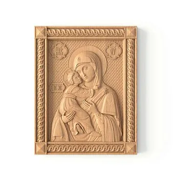
Powder pigments mixed with various binders allow creating unique colors that cannot be purchased ready-made. This is the path to true personalization — your shade, created specifically for your project.Carved Decorative Elementswith individual toning become works of applied art, existing as unique pieces.
Psychology of color of wooden elements
Choosing color for wooden interior elements is not only an aesthetic but also a deeply psychological decision. Color affects emotions, mood, productivity, and sleep quality. Understanding these mechanisms allows creating spaces that are not only beautiful but functionally support the well-being of inhabitants.
Warm tones — reddish-brown, ochre, terracotta — activate the sympathetic nervous system, increasing alertness, energy, and sociability. They are ideal for common areas — living rooms, dining rooms, kitchens — where families and guests gather.wooden columnsWarm tones create a sense of hospitality and openness.
Cool tones — gray, blue-gray, green-gray — activate the parasympathetic system, promoting relaxation, focus, and calm. They are suitable for bedrooms, offices, meditation zones. Gray-blue-toned wood in a bedroom promotes deeper, higher-quality sleep.
Color saturation also matters. Bright, saturated tones stimulate and excite, demanding attention. Their excess causes fatigue and visual noise. Muted, pastel tones soothe, create a background, allowing relaxation. In residential interiors, medium and low saturation with occasional bright accents are preferable.
Contrast — the ratio of the lightest to the darkest in a space — affects perceptual activity. High-contrast interiors stimulate and maintain alertness, suitable for work zones. Low-contrast interiors relax, suitable for rest. Gradient transitions create a medium contrast level, comfortable for prolonged stays.
Practical recommendations for choosing shades
Choosing the color of wooden elements requires consideration of multiple factors. The first — room lighting. In rooms with abundant natural light, saturated dark tones can be used — they will not make the space gloomy. In northern rooms with insufficient light, light warm tones are preferable, compensating for the lack of sunlight.
The second factor — room size. Dark tones visually reduce space, while light tones expand it. In small apartments, it’s better to limit oneself to a light palette with occasional dark accents. In spacious rooms, bold dark tones can be confidently used, making the space cozier and more intimate.
The third — existing color palette. New wooden elements should harmonize with existing furniture, flooring, and doors. If you have a dark walnut floor,Wooden moldingsa similar shade will create unity. Or you can choose a contrasting light variant to play with opposites.
Fourth — interior style. Classic styles lean toward traditional wood tones — oak, walnut, mahogany. Scandinavian — toward light and gray. Mediterranean — toward ochre and terracotta. Contemporary minimalism allows the boldest experiments, including unexpected colors and gradients.
Fifth — the function of the space. The bedroom requires calming tones. The office — stimulating concentration. The living room — creating an atmosphere of hospitality. The children's room — cheerful, but not overstimulating. Each space has its own color needs.
Care for colored wooden surfaces
Colored or stained wood requires special care to maintain the beauty of the color for many years. The first rule — protection from direct sunlight. UV radiation destroys pigments, causing fading, especially noticeable on bright, saturated colors. IfWooden elementsthey are near windows, use curtains, blinds, or UV-protective films on the glass.
Second — regular dry cleaning with a soft cloth. Dust contains abrasive particles that, when accumulated, scratch the surface, especially if wiped with a dry cloth over dusty surfaces. It is better to first sweep away dust with a soft brush or vacuum with a brush attachment, then wipe with a slightly damp cloth.
Third — avoid excessive moisture and aggressive cleaning agents. Colored finishes are often more sensitive to chemicals than natural wood under lacquer. Use specialized products for colored wood care, following the manufacturer's instructions. Never leave water puddles on the surface — wipe them immediately.
Fourth — periodic renewal of the protective layer. Depending on the type of finish and intensity of use, it is recommended to renew the oil or wax protective layer every 1-3 years. This not only protects the color but also refreshes it, making it more vibrant. The procedure can be performed yourself or by inviting a specialist.
Fifth — timely repair of damage. Scratches, chips, stains should be addressed immediately, without waiting for them to spread. Minor defects can often be masked with special wax pencils of the appropriate color. Serious damage requires professional intervention — sanding and re-staining the area.
Create a color symphony with STAVROS
Color Palette 2026for wooden interior elements — this is not a dictate of fashion, but an invitation to creativity. Warm Mahogany, ochre tones, gradient transitions, grey shades, contrasting accents — all of this are tools for creating a space that reflects your individuality, supports your well-being, delights your eyes and soul every day.
Company STAVROS offers a full range of services for color treatmentof wooden elements for interior. We work with the most modern stains, dyes, oils, allowing us to achieve any shade from existing palettes or create a unique color specifically for your project. Our masters are skilled in all current techniques — from simple single-tone staining to complex gradients and multi-layer patination.
STAVROS catalog features more than 5900 modelsof carved solid wood items — Decorative Inserts, architectural columns and pilasters, moldings, balusters, furniture hardware. Each item can be finished in any color solution — from the natural wood tone to the boldest custom stains. We provide color samples, help you choose the optimal palette for your interior, create color visualizations so you can see the result before production begins.
STAVROS works with noble wood species — oak, beech, ash, walnut — whose quality guarantees not only the longevity of the item itself but also the color finish. Properly applied staining on quality wood preserves richness and beauty for decades, becoming even more noble with age.
We understand that choosing color is an intimate, personal process requiring time and thought. Therefore, STAVROS consultants are always ready to help, explain the characteristics of different shades, show how color will appear on a specific wood species, and suggest options you may not have considered. Our goal is not to sell a ready-made solution, but to help you create your unique space.
Over twenty years of operation, STAVROS has realized hundreds of projects with the most diverse color solutions — from classic natural tones to ultra-modern gradients and contrasting accents. We have worked on historical restorations requiring precise reproduction of 18th-19th century colors, and on avant-garde private interiors where clients wanted something unprecedented. This experience allows us to solve any complexity.
Gradient Transitions in Interior Designthat are currently at the peak of popularity, require the highest level of craftsmanship. Our specialists have undergone special training in this technique, mastering the subtleties of creating smooth color transitions on wood. We can execute gradients on any items — from smalldecorative insertsto large wall panels.
Choosing STAVROS, you choose not just a supplier of wooden elements, but a partner in creating your ideal interior. We share your vision, understand the importance of every detail, guarantee quality at every stage — from wood selection to final finishing and delivery. Your home deserves colors that will delight you every day, create the right mood, and support your well-being.
Wood Tones in Interior Design2026 — this is a symphony of possibilities. From classic Warm Mahogany to avant-garde gradients, from calming greys to vibrant ochres — the entire palette of nature and human imagination is available to create your unique space. And STAVROS is ready to bring any of your color dreams to life in premium-quality material that will last for generations.
Start your color journey with STAVROS. Contact our consultants, share your ideas, order color samples, visit our showroom where you can see and feel different staining options. Color is emotion frozen in material. And we will help you choose exactly the emotions that will fill your home with warmth, beauty, and harmony.