Article Contents:
- Tactility Trend: Why Mixing Different Textures is Fashionable in 2026
- Evolution of Touch: From Visual to Tangible
- Texture Mix as a New Language of Interior Design
- Psychology of Tactile Contrast
- Three Pillars of Tactile Contrast in Modern Interior Design
- Why a Smooth Wall is Not Boring, but Necessary
- Technical Aspects of Wall Preparation
- Color Solutions for a Smooth Base
- Paint as a Tactile Tool
- Wood as an Antidote to the Digital Era
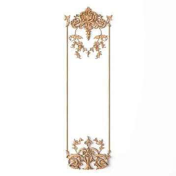
- Slat Panels: Vertical Rhythm in Interior Design
- Where to Place Wooden Slats: Accent Wall and Beyond
- Combining Wood with Other Textures
- Painting-Ready Slat Panels: Versatility of the Solution
- Skirting Board: The Unsung Hero of Interior Design
- Why MDF Specifically?
- High Skirting Board in the Context of Textural Contrast
- Size Range and Profile Selection
- Installation and Joining: Details That Make All the Difference
- Third Dimension on a Flat Wall
- How 3D Panels Hide Wall Defects
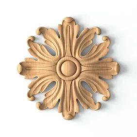
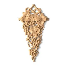
- Types of Reliefs and Their Impact on Spatial Perception
- Materials for 3D Panels
- 3D Finishing in Combination with Other Textures
- Lighting as the Key to Revealing Relief
- The Role of Profile Elements in a Textured Interior
- Cornices: The Transition from Wall to Ceiling
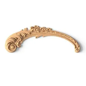
- Moldings: Frames for Textures
- Architraves: Frames for Doors and Windows
- Living Room: A Stage for a Textural Performance
- Bedroom: A Tactile Cocoon
- Entryway: First Impression
- Study: Focus and Concentration
- Monochromatic Palette: One Color, Different Textures
- Two Tones: Contrast with Wood
- Three Tones: A Complex Palette
- First Mistake: An Excess of Textures
- Second Mistake: Disproportionate Scales
- Third Mistake: Ignoring Transitions
- Fourth Mistake: Neglecting Lighting
- Fifth Mistake: Cheap Imitation Instead of Quality Material
- Micro-Relief: When Texture is Barely Perceptible
- Mixing Natural and Painted Textures
- Terracotta and Clay: The Return of Natural Textures
- Biophilic Design and Living Walls
- Can Wooden Slats and 3D Panels Be Combined in One Room?
- What Height Should a Baseboard Be in a Modern Interior?
- Should 3D Panels Be Painted or Left White?
- How to Care for Wooden Slats on a Wall?
- Can 3D panels be used in the bathroom?
- How to achieve the effect of an expensive interior on a limited budget?
- What types of wooden wall finishes exist besides slats?
- How to properly coordinate baseboards with cornices?
- Can slats be installed over 3D panels?
- What adhesive should be used for installing MDF baseboards and moldings?

Imagine a room where you don't just want to live, but literally want to touch every wall. To run your palm over a velvety painted surface, feel the warm rhythm of wooden slats, let your gaze linger on the wavy relief of a volumetric panel. This is not a utopia, not a picture from a magazine, but an entirely achievable reality—that very play of textures that becomes the main technique in interior design in 2026. The contrast between smooth and textured, between minimalism and detail, between cold geometry and the living warmth of natural material—this is what shapes a space where every square meter tells its own story.
In this article, we will analyze in detail how tactile contrast works, whyWall cladding for paintinghas become an essential foundation for any accent decor, how to properly introduce wood and volumetric elements, and whyBaseboard MDFplays a much more significant role than it seems at first glance.


The trend towards tactility: why mixing different textures is fashionable in 2026


The evolution of touch: from visual to tangible
For a long time, interior design existed within the paradigm of visual perception. We selected colors, built compositions, planned lighting—all for the eyes. But humans perceive the world not only through sight. Tactility, that is, the ability to feel a surface through touch, turned out to be that missing link that transforms a beautiful space into a truly comfortable one.
Why exactly now, in 2026, has this trend gained such momentum? The answer lies on the surface—literally. After several years of dominance by Scandinavian minimalism with its white walls and clean forms, after an era of screens and digital interfaces, people have begun to yearn for reality. For the roughness of stone, the grooves of wood, the smoothness of a painted wall, the relief of a volumetric panel. Tactility has become a form of protest against virtuality, and designers caught on instantly.
Our factory also produces:


Mixing textures as a new language of interior design
Mixing textures is not a chaotic accumulation of materials. It is a thoughtful dialogue of surfaces, where each texture plays its role. A smooth painted wall creates a pause, allowing the eye to rest.Wooden wall claddingbrings warmth and natural rhythm. Volumetric panels with three-dimensional patterns add drama, depth, and intrigue. And at the bottom, near the floor, a tall MDF baseboard sets a clear boundary, separating decorative chaos from the floor's horizontal plane.
This approach works in any style—from neoclassical to contemporary, from loft to Japanese wabi-sabi. The difference lies only in proportions, scale, and specific materials. But the principle remains unchanged: the contrast of textures enhances the perception of each. Smooth next to textured appears even smoother, and textured next to smooth becomes even more expressive.
Get Consultation
The psychology of tactile contrast
There are studies in neurodesign that confirm: a variety of textures in a space reduces stress levels, increases the feeling of safety, and stimulates cognitive functions. Monotonous surfaces, on the contrary, can cause sensory deprivation—a deficit of sensations that the brain compensates for with anxiety.
This is why modern designers don't just recommend but strongly advise introducing at least three different textures into an interior. The ideal formula looks like this: one smooth base surface, one textured accent surface, and one volumetric decorative element. Plus transitional elements—cornices, moldings, baseboards—that tie these textures into a cohesive whole.
The three pillars of tactile contrast in modern interiors
Let's define the materials and solutions that shape textural contrast in 2026 interiors:
-
Smooth base—walls prepared for painting, with a perfectly even surface. This is the background, the canvas, the silence on which all other melodies will sound.
-
Warm accent—wooden slats, beadboard, solid wood or veneered MDF panels. The vertical or horizontal rhythm of lines, the living texture of wood fibers, the warm color of natural wood or the noble shade of a tinted surface.
-
Volumetric dramatic element—3D wall finishingusing three-dimensional panels, carved overlays, relief moldings. This is what stops the gaze, what you want to examine and touch.
And the connecting element—profile products: cornices, trims, tall baseboards, which ensure transitions between planes and materials, creating a sense of architectural completeness.
Smooth base: preparing walls for painting as a background for active decor
Why a Smooth Wall Isn't Boring, It's Essential
There's a common misconception that a smooth, monochromatic wall is a sign of unfinished renovation or a lazy approach to design. In reality, it's the opposite. A perfectly prepared and painted wall is perhaps the most challenging to execute and the most impressive type of finish. It requires flawless surface preparation, smart paint selection, and professional application. But the result is worth every effort.
A smooth wall works like a clean canvas. It doesn't compete with accent decor; it highlights it. Next to a textured 3D panel, a flat painted surface creates a contrast that makes the volumetric element even more expressive. Next to wooden slats, a smooth wall emphasizes the rhythm and warmth of the wood. Without this contrast, the accent elements would simply get lost, dissolving into visual noise.
Technical Aspects of Wall Preparation
QualityWall cladding for paintingbegins long before a brush or roller touches the surface. Here are the key stages that cannot be skipped:
Leveling. Walls are plastered using guides to achieve a flat plane. The permissible deviation for walls to be painted is no more than 1–2 mm over two meters. This is stricter than for walls to be wallpapered because paint highlights the slightest imperfections.
Filling. After the plaster layer dries, a finishing filler is applied—typically in two or three coats with intermediate sanding. It's the filler that provides that very smoothness which turns the wall into a perfect backdrop.
Priming. A primed surface ensures even paint absorption and prevents stains. The choice of primer depends on the type of paint and substrate.
Painting. The final stage is applying interior paint. To create a tactile contrast, it's better to choose matte or semi-matte paint: it gives a velvety-to-the-touch surface that pleasantly contrasts with the gloss of wood or the volume of 3D panels.
Color Solutions for a Smooth Base
What color to choose for walls that will become a backdrop for textured decor? It depends on the overall interior concept, but there are several universal rules:
-
Light neutral tones—white, ivory, pearl gray, warm beige—work practically always. They maximally reveal the texture of accent elements and visually expand the space.
-
Deep saturated shades—graphite, dark blue, emerald, terracotta—create a dramatic contrast with natural-colored wooden slats. Such a combination suits studies, bedrooms, living rooms in art deco or modern classic style.
-
Complex muted tones—dusty rose, sage green, lavender gray—are the perfect choice for interiors where softness and subtlety are important. They don't shout, don't argue with accents, but delicately shade them.
It's important to remember: the more active the textured decor, the calmer the base should be. If the accent wall features complex 3D panels with pronounced relief, it's better to paint the other walls in a calm, solid color without patterns or textures.
Paint as a Tactile Tool
Not all paints feel the same to the touch. Matte interior paint gives a slightly rough, velvety surface. Semi-matte—a bit smoother, with a slight silky sheen. Glossy—slippery, light-reflecting, almost mirror-like.
For interiors with textural contrast, a matte or semi-matte texture is optimal. It creates a feeling of softness and depth, doesn't produce glare, and doesn't compete with the shine of lacquered wood or polished 3D panels. If you want to enhance the contrast, you can use the 'gloss on matte' technique: cover the main walls with matte paint, and individual architectural details—cornices, moldings,MDF baseboards—paint with semi-gloss enamel of the same color. The difference in the degree of shine will create a subtle, sophisticated contrast.
Wooden Rhythm: Using Slats to Create a Warm, Textural Accent
Wood as an Antidote to the Digital Age
Why does wood remain the most sought-after material for accent finishing, despite the emergence of many synthetic alternatives? The answer is simple: no artificial material can reproduce that unique combination of visual warmth, tactile pleasure, and emotional response that natural wood provides.
Wooden wall cladding—is not just a decorative technique. It's a connection with nature, introduced into the space where we spend most of our lives. Wood 'breathes'—it absorbs and releases moisture, regulating the room's microclimate. Wood ages beautifully—over the years, its texture becomes even more expressive. Wood smells—the subtle aroma of coniferous or noble species fills the room, creating a sense of coziness and safety.
Slat Panels: Vertical Rhythm in the Interior
Slat panels, or baffles, are one of the most popular ways to introduce wooden texture into an interior. They are vertical (less often—horizontal or diagonal) slats, fixed to a base with a certain spacing. The rhythm of these slats creates a visual effect, similar to a musical one: repeating elements of the same width, separated by equal intervals, are perceived by the eye as a harmonious pattern.
What makes slat panels good in the context of textural contrast?
- They create a pronounced relief that sharply contrasts with the smooth painted wall next to it.
- Vertical slats visually increase the height of the room—a useful property for rooms with standard ceiling heights.
- Deep shadows form between the slats, which change depending on lighting and time of day. This makes the wall 'alive,' dynamic.
- Wooden slats can be painted, tinted, oiled, or varnished, adapting them to any interior color palette.
Various wood species are used for slatted panels. Oak provides maximum strength and a noble texture. Ash offers a slightly lighter but equally expressive grain. Beech features a uniform structure without pronounced fibers. Softwoods — pine, spruce — are more affordable and have their characteristic pattern with contrasting annual rings.
Where to place wooden slats: accent wall and beyond
The classic option is an accent wall behind the bed headboard in the bedroom or behind the sofa in the living room. But slatted panels can do more:
In the hallway — wooden slats on the wall opposite the entrance create a striking first impression and set the tone for the entire interior. Combined with a mirror and proper lighting, they transform a utilitarian space into a full-fledged design zone.
On the ceiling — slats transitioning from the wall to the ceiling visually unite these planes and create a sense of architectural volume. This technique is especially effective in rooms with high ceilings. For ceiling finishing, you can useMDF corniceswhich will ensure a neat transition from wall to ceiling.
As a partition — slatted panels installed vertically from floor to ceiling can serve as a transparent partition, zoning the space without destroying its integrity. Light penetrates through the gaps between the slats, creating a beautiful play of shadows.
Around the TV area — wooden slats behind the television not only create a textured background but also conceal wires, which can be routed behind the panel.
Combining wood with other textures
Wooden wall finishes are best revealed in contrast with other materials. Here are several proven combinations:
-
Wood + smooth paint — a classic contrast of warm and neutral, textured and smooth. Works flawlessly.
-
Wood + stone — a natural duo that creates the feel of a mountain chalet or country house. Stone masonry by the fireplace and wooden slats on the adjacent wall — a formula for coziness.
-
Wood + metal — a combination characteristic of loft and industrial styles. Brass or black metal inserts between wooden slats add modernity.
-
Wood + 3D panels — a more complex but extremely effective combination. It's important that both textures don't compete with each other, so it's better to place them on different walls or areas of the room.
Painting-ready slatted panels: versatility of the solution
Wood texture doesn't always have to be natural. Sometimes the design requires slats to be painted — to match the walls, in a contrasting color, or in a shade harmonizing with the overall palette. In this case, painting-ready MDF slatted panels are used — they have a smooth, prepared surface that takes paint excellently and allows for a perfectly even finish.
Painted slats retain their relief and rhythm but lose the wood grain. This is appropriate in minimalist interiors where color is more important than texture. For example, white slats on a white wall create a subtle relief accent, noticeable only with side lighting. This technique is ideal for bedrooms and relaxation areas where visual overload is undesirable.
Geometry from below: smooth high MDF skirting as the perfect boundary between floor and wall
Skirting: the unsung hero of the interior
Let's talk about what's usually discussed last — skirting boards. This modest finishing element is often perceived as a technical necessity: something has to cover the joint between the floor and wall. But in interiors with pronounced textural contrast,Baseboard MDFit takes on a completely different role — it becomes an architectural element that sets the scale, proportions, and character of the entire room.
A high skirting — from 100 mm and above — creates a sense of solidity, classical precision. It visually 'lifts' the wall, giving it completeness and weight. Combined with smooth painted walls, a high skirting forms that geometric purity which becomes a counterpoint to textural accents.
Why MDF specifically?
Among all materials for skirting board manufacturing, MDF holds a special place — and here's why:
Dimensional stability. Unlike solid wood, MDF hardly reacts to changes in humidity and temperature. This means the skirting won't warp, crack, or develop gaps between itself and the wall.
Perfect geometry. MDF is processed on CNC machines, ensuring perfectly straight edges and precise profile adherence. Each plank is an exact copy of the previous one, guaranteeing flawless joints.
Paintability. MDF skirting comes primed and ready for painting. This allows painting it to exactly match the wall color or, conversely, in a contrasting shade. Paint applies evenly to MDF without sagging or spotting.
Profile variety. From simple straight sections to complex classical profiles with coves, shelves, and chamfers — MDF allows creating skirting boards of any shape, adapting them to the specific interior style.
Affordability. With comparable finish quality, MDF skirting is significantly cheaper than oak or ash solid wood equivalents. This is important considering that skirting is a linear product, and quite a lot is required.
High Skirting Board in the Context of Textural Contrast
How does a high skirting board work in an interior built on texture play? Let's consider several scenarios:
Scenario 1: Smooth skirting board + smooth wall + wooden slats. The skirting board is painted the same color as the wall, creating a unified lower zone. Wooden slats start above the top edge of the skirting board. This results in a clear horizontal division: the lower third of the wall is calm and smooth; the upper two-thirds are textured and rhythmic. Here, the skirting board plays the role of a visual support, a 'pedestal' for the wooden accent.
Scenario 2: Contrasting skirting board + light wall + 3D panels. The skirting board is painted a dark color (graphite, anthracite, dark gray), the wall is light. 3D panels are mounted on the accent wall. The dark skirting board creates a 'frame' from below, emphasizing the contrast between the horizontality of the floor and the verticality of the wall. This solution is characteristic of modern classic and contemporary styles.
Scenario 3: High skirting board as part of wainscoting. In classic and neoclassical interiors, a high skirting board is often part of wall panels — wainscoting. In this case, it is combined withmoldingsand raised panels, forming the lower part of the wall with pronounced architectural plasticity. The upper part of the wall can be smooth and painted or wallpapered with texture.
Size Range and Profile Selection
When choosing an MDF floor skirting board, it is important to consider the proportions of the room:
-
Ceiling height up to 2.7 m — optimal skirting board height is 80–100 mm. A higher skirting board can visually 'weigh down' the space.
-
Ceiling height 2.7–3.2 m — you can use a skirting board with a height of 100–150 mm. This is the 'golden mean' suitable for most styles.
-
Ceiling height from 3.2 m — skirting boards with a height of 150–200 mm and even higher are appropriate. They will emphasize the scale of the room and create classic proportions.
The skirting board profile should harmonize with the other profile products in the interior — cornices, architraves, moldings. If the cornice has a complex classic profile with several setbacks, the skirting board should also be profiled. If the cornice is simple and laconic — choose a corresponding skirting board.
Installation and Joining: Details That Make All the Difference
Even the most beautiful skirting board will lose its appearance with careless installation. Here are a few recommendations:
- Corner joints are made with a miter cut — a 45-degree cut. Use a miter saw for a precise cut.
- Linear joints are best placed in the least noticeable places — behind furniture, in corners.
- After installation, all joints are filled, sanded, and touched up with paint. This ensures a monolithic effect.
- MDF skirting board is attached with adhesive (liquid nails) and/or mechanically (with screws followed by filling the screw heads). The choice of method depends on the evenness of the walls and the weight of the product.
Volume: 3D Finishing as a Way to Hide Defects and Add Depth
The Third Dimension on a Flat Wall
A wall is a plane. Two coordinates, two dimensions. But what if we add a third?3D wall finishingusing volumetric panels, relief overlays, and carved elements does exactly that — turns a flat surface into a three-dimensional field where light and shadow play the main roles.
3D panels are not a novelty. They have existed for over a decade. But in 2026, they are experiencing a true renaissance, and there are several reasons for this:
- Production technologies have become more accessible, and the range has become more diverse.
- Designers have learned to use 3D panels in a measured way, as an accent, not as a continuous covering.
- Panels made from eco-friendly materials — gypsum, MDF, natural stone — have appeared, which can be painted and adapted to any style.
- 3D printing has opened up possibilities for creating unique, non-standard reliefs based on custom designs.
How 3D Panels Hide Wall Defects
One of the non-obvious but extremely valuable properties of 3D panels is their ability to mask imperfections in the substrate. If a wall has minor unevenness, cracks, traces of old utilities, a volumetric panel will hide all of this under its relief.
This does not mean that wall preparation can be skipped entirely. The substrate must be strong, dry, and cleaned of flaking coatings. But perfect leveling to 'zero,' as for painting, is not required. The panel's relief 'absorbs' minor defects, making them invisible.
This is precisely why 3D finishes are often used in renovating secondary housing, where walls are far from ideal. Instead of spending the budget on multi-layer puttying and sanding, these funds can be directed towards impressive volumetric panels that solve two problems simultaneously: they conceal defects and create an expressive accent.
Types of Reliefs and Their Impact on Spatial Perception
The relief of 3D panels varies greatly, and each type creates its own effect:
Wavy relief — soft, flowing lines reminiscent of sea waves or dunes. Creates a sense of movement and fluidity. Best suited for bedrooms, bathrooms, and relaxation areas. Wavy panels reduce the tension of right angles and hard lines typical of urban housing.
Geometric relief — clear edges, angles, repeating modules (diamonds, hexagons, squares, triangles). Brings structure and order. Suitable for offices, living rooms, and commercial interiors. Geometric panels pair well with wooden slats and high skirting boards, creating a unified system of straight lines and clear proportions.
Organic relief — imitation of natural forms: tree bark, stone surfaces, coral structures, honeycomb patterns. Introduces an element of naturalness and unpredictability. Works well in interiors styled as wabi-sabi, eco-style, or rustic.
Sculptural relief — complex, unique forms, often created from custom designs. This is no longer just a finish, but a work of art on the wall. Used as a focal point — on one wall or even part of a wall — as the main visual accent of the interior.
Materials for 3D Panels
Gypsum — the classic material for volumetric panels. Eco-friendly, easy to paint, provides clear relief. Disadvantages — fragility and sensitivity to moisture. Suitable for living rooms with normal humidity levels.
MDF — a stronger and more stable material. MDF panels can be installed in rooms with moderate humidity. They are easy to paint, have clear geometry and smooth edges. Often used for geometric reliefs where edge precision is important.
Polyurethane — a lightweight, durable, moisture-resistant material. Suitable for bathrooms and kitchens. Polyurethane panels are distinguished by high relief detail and durability.
Natural stone and concrete — heavy but extremely effective materials for creating brutal, expressive 3D surfaces. Used in loft and industrial interiors, as well as in commercial spaces.
3D Finish in Combination with Other Textures
3D panels are the 'soloist' in the orchestra of textures. They require an 'accompaniment' — a calm background that allows them to shine at full strength. This is why a smooth base is so important: without it, 3D panels risk turning from an accent into visual chaos.
The optimal placement scheme looks like this:
- Accent wall — 3D panels. This could be the wall behind the bed headboard, the wall behind the fireplace, the wall behind the desk, or the wall in the TV area.
- Side walls — smooth paint in a neutral tone. Provides visual calm and contrast.
- Wall opposite the accent wall — wooden slats or neutral finish. If a wooden accent is placed opposite the 3D panels, it creates a dialogue of textures — interesting, but requiring careful balancing.
- Lower part of all walls — a high MDF floor skirting board, uniting all surfaces into a single whole.
Lighting as the Key to Revealing the Relief
Without proper lighting, 3D panels lose half their expressiveness. The volumetric relief is revealed through shadow, and shadow is the result of directional light.
For 3D walls, the following work best:
-
Wall lighting from above or below — linear LED fixtures installed along the top or bottom edge of the panel create grazing light that emphasizes every protrusion and recess.
-
Track lights with a narrow beam — directed at the wall at an acute angle, they create dramatic side lighting with deep shadows.
-
Built-in lighting in cornices — LED strip, hidden behindceiling cornice, provides soft diffused light that gently washes the wall from top to bottom, revealing the relief without harsh contrasts.
Avoid frontal, uniform lighting of 3D walls — it will 'kill' the relief, making it practically invisible.
Architectural Details: Moldings, Cornices, and Architraves as the Connecting Link
The Role of Profile Elements in a Textured Interior
We have examined in detail the three main textures — smooth paint, wooden slats, and 3D panels. But what ties them together? What ensures transitions between different surfaces, preventing them from looking like disjointed patches on the wall?
This function is performed by architectural profile elements: cornices, moldings, casings, pilasters. They work like punctuation marks in text — without them, a sentence may be understandable, but reading becomes tiresome.
Cornices: transition from wall to ceiling
A ceiling cornice is not just a strip covering a joint. It is an architectural technique that forms the upper boundary of a wall, sets the scale of a room, and creates a visual transition from the vertical to the horizontal plane.
In an interior with textural contrast, the cornice is especially important. It 'reconciles' a smooth wall with the ceiling, a wooden panel with the ceiling, a 3D relief with the ceiling. Without a cornice, all these surfaces simply end abruptly, creating a sense of incompleteness.
For modern interiors with wooden slats and 3D panels, MDF cornices for painting are suitable — laconic, with a simple profile, but sufficient width to create visual weight. Such a cornice can be painted to match the ceiling color, the wall color, or a contrasting tone — depending on the design task.
Moldings: frames for textures
Moldings— this is perhaps the most versatile tool in the arsenal of a designer working with textures. They can:
- Frame a 3D panel zone, creating a 'frame' for them, similar to a picture frame.
- Divide a wall into horizontal zones — lower (baseboard + wainscoting) and upper (paint or wallpaper).
- Mark the boundary between a smooth wall and wooden slats.
- Form panels on a smooth painted wall, adding restrained relief without using volumetric panels.
MDF moldings are ideal for paintable interiors. They have a clear profile, smooth edges, and a smooth surface that takes paint excellently. After installation and painting, the molding looks like a single whole with the wall, creating the impression of classical plasterwork.
Casings: frames for doors and windows
Door and window openings are another transition zone between textures. The casing framing the opening should harmonize with both the door leaf and the wall. If the wall is smooth and painted in a calm tone, the casing can be simple and laconic. If the wall is decorated with wooden slats, the casing can repeat the material or color of the slats.
MDF baseboardsMDF casings for painting are a universal solution: they can be painted any color, adapting to a specific context. The width of the casing is chosen according to the scale of the room and the height of the baseboard — these elements should be proportionate.
Practical schemes: how to combine textures in specific rooms
Living room: a stage for a textural performance
The living room is the most representative room in the house, and it is here that textural contrast unfolds to its fullest. Here is a detailed scheme:
The wall behind the sofa (or behind the TV) — accent, with wooden slats of natural oak color. The height of the slats — from floor to ceiling. Between the lower edge of the slats and the floor — a high MDF baseboard, painted to match the color of the slats or in a contrasting tone.
The opposite wall — smooth, painted in warm gray or pearl tone. On this wall, you can place paintings or photographs in thin frames — they will become a graphic accent on a calm background.
The wall with a fireplace or niche — 3D panels with geometric relief, painted to match the wall color. The volumetric relief is accentuated by lighting hidden behind the ceiling cornice.
The fourth wall — smooth, matching the tone of the wall opposite the accent wall, with a door opening framed by an MDF casing.
Floor — parquet board or engineered board of natural color. The transition from floor to wall is decorated with a highMDF floor baseboardof a uniform profile around the entire perimeter.
Ceiling — flat, painted, with a cornice around the perimeter.
Bedroom: a tactile cocoon
The bedroom is a place where tactility plays a primary role. Here we literally touch surfaces — lie down, sit down, lean.
The wall behind the headboard — wooden slats, transitioning from the wall to the ceiling. The warm texture of oak or ash creates a sense of a natural cocoon.
Side walls — smooth paint in a soft, muted tone: powder, sand, dusty blue.
The wall opposite the bed can be completely smooth (if a TV or mirror is placed on it) or have a slight relief—for example, wall panels with molding inserts.
Baseboard—tall, painted the same color as the walls, creating a unified base around the perimeter.
Entryway: First Impression
In the entryway, textural contrast serves practical purposes: it masks signs of wear (slatted panels and 3D walls hide minor damage better than smooth paint), zones the space (slats in the mirror area, smooth wall in the wardrobe area), and creates a sense of thoughtfulness and style from the first step.
Study: Focus and Concentration
In the workspace, geometric 3D panels behind the desk create a background for video conferences and simultaneously stimulate concentration. The side walls are smooth and calm. Wooden elements—shelving units, shelves, slats—add warmth, necessary for balancing strictness and coziness.
Color Strategies for Textured Interiors
Monochromatic Palette: One Color, Different Textures
One of the most effective strategies is to paint all surfaces in one color, allowing texture to become the sole source of visual variety. A white smooth wall, white wooden slats, white 3D panels, white baseboard—sounds boring? Not at all. With proper lighting, white relief creates a surprisingly rich play of tones—from pure white on the protrusions to silvery gray in the shadows. The texture begins to 'speak' the language of light, and this conversation is captivating.
Two Tones: Contrast with Wood
Classic scheme: smooth walls in one tone (e.g., white or light gray), wooden elements in a natural color (oak, walnut, ash). Two tones—neutral and warm—create a comfortable contrast without overloading the space.
Three Tones: Complex Palette
For more complex interiors, three colors can be used: one for smooth walls, one for wooden elements, one for 3D panels. It is important that these three colors belong to the same color family or are connected by the principle of 'warm—neutral—cool'.
Example: walls—warm beige, wooden slats—natural oak, 3D panels—gray-blue. Neutral beige unites warm wood and cool relief, preventing them from clashing.
Common Mistakes When Working with Textures
First Mistake: Excess of Textures
More is not always better. If every wall has its own unique texture, the eye cannot find a point of rest, and the space becomes tiring. The rule of three textures (smooth + relief + volumetric) is not a dogma but a good guideline. A fourth texture is only permissible in very large rooms with clear zoning.
Second Mistake: Disproportionate Scale
Small relief on a large wall gets lost. Large relief in a small room is overwhelming. The scale of textural elements should correspond to the size of the room. In compact rooms, use small slats with frequent spacing and 3D panels with delicate relief. In spacious halls, you can afford wide slats and large volumetric patterns.
Third Mistake: Ignoring Transitions
Abrupt termination of wooden slats without framing, the junction of a 3D panel with a smooth wall without molding, lack of a baseboard at the bottom—all this creates a sense of incompleteness. Every transition between textures should be framed by an architectural element: molding, slat, corner piece, cornice.
Fourth Mistake: Neglecting Lighting
We've already mentioned this, but it's worth repeating: texture without proper lighting is dead texture. Plan lighting simultaneously with the selection of finishing materials. Determine where accent textures will be and provide directional lighting for them.
Fifth Mistake: Cheap Imitation Instead of Quality Material
Plastic panels 'wood-look,' vinyl wallpaper '3D-look,' thin baseboard 'stone-look'—all these imitations give themselves away from two steps away. A tactile interior is about real materials, real sensations. A quality MDF panel for painting looks and feels much better than a plastic imitation and costs quite reasonable money.
Trends 2026: What's New in the World of Textural Contrast
Micro-Relief: When Texture is Barely Perceptible
One of the freshest trends is micro-relief. These are surfaces whose texture is only noticeable upon close inspection or touch. Fine hatching on a wall panel, barely noticeable grooves on a painted surface, minimal height variation on a 3D panel—all this creates a subtle, almost intimate tactile sensation that makes the space more 'human' without visual overload.
Mixing Natural and Painted Textures
Another trend is combining natural wood texture with painted elements made of the same wood or MDF. For example, the central part of an accent wall is natural oak with visible grain, and the side 'frames' are MDF slats painted to match the walls. This creates a 'window to nature' effect—the wooden fragment is perceived as something special, valuable, highlighted from the general context.
Terracotta and Clay: The Return of Natural Textures
In 2026, designers are increasingly turning to clay and terracotta textures—not only in tiles but also in wall panels. These materials provide a uniquely warm texture that pairs beautifully with wood and contrasts with smooth painted walls.
Biophilic Design and Living Walls
Textural contrast goes beyond inanimate materials. Living walls—vertical gardens made of stabilized moss, lichen, succulents—bring a completely unique texture that cannot be replicated by any artificial means. Soft, velvety moss next to smooth paint and rigid wooden slats creates a triple tactile contrast of incredible strength.
Budget Solutions: Textural Contrast Without Extra Cost
Playing with textures doesn't necessarily require a huge budget. Here are several strategies that allow you to create a striking tactile contrast at moderate cost:
Paint-ready walls are the most affordable option for finishing (provided the walls are already leveled). Quality paint is cheaper than wallpaper, and the result, when applied correctly, looks more elegant.
Paint-ready MDF slat panels are cheaper than natural wooden slats but look just as good when painted. The rhythm and relief are preserved, while the cost per square meter is reduced by 30–50%.
3D gypsum panels are among the most affordable in price. With proper installation and painting, gypsum panels provide a stunning volumetric effect.
HighBaseboard MDF— costs significantly less than solid wood but looks absolutely identical after painting. Saving on baseboards is not a compromise but a rational choice.
MDF moldings allow you to create classic relief on smooth walls without using expensive wall panels. Rectangular panels made from moldings, painted to match the wall color, add texture at minimal cost.
Frequently asked questions
Can wooden slats and 3D panels be combined in the same room?
Yes, but with one important rule: place them on different walls and in different zones. If wooden slats and 3D panels end up next to each other on the same wall, they will compete and create visual chaos. The optimal scheme: slats on the wall behind the sofa, 3D panels on the wall with the fireplace. Between them—smooth painted walls providing a 'pause'.
How high should a baseboard be in a modern interior?
It depends on ceiling height and interior style. For standard ceilings of 2.5–2.7 m, an optimal baseboard height is 80–100 mm. For ceilings of 2.7–3.0 m—100–150 mm. For high ceilings from 3 m—150 mm and above. In neoclassical interiors, baseboards can reach 200–250 mm—this creates a sense of classical proportions.
Should 3D panels be painted or left white?
It depends on the goal. White 3D panels on a white wall create subtle monochrome relief—elegant and restrained. 3D panels painted in a dark tone on a light background provide a contrasting, dramatic effect. Painted to match the wall color—they create a 'textural spot' effect, where the relief is only noticeable under certain lighting. Each option is good in its own way; choose based on the overall concept.
How to care for wooden slats on the wall?
Wooden slats coated with oil or varnish require minimal care. It's enough to periodically wipe them with a dry or slightly damp cloth to remove dust. Avoid aggressive cleaning agents and abrasive sponges. Varnished slats are more resistant to dirt than oiled ones, but oiled finishes are easier to restore—just apply a fresh coat of oil.
Can 3D panels be used in a bathroom?
Yes, but with caveats. Gypsum panels are not suitable for wet areas—they absorb moisture and can warp. For bathrooms, use 3D panels made of moisture-resistant polyurethane or special waterproof MDF. Also, ensure the room is well-ventilated. In areas of direct water contact (wall above the bathtub, shower wall), it's better to use tiles, and place 3D panels on 'dry' walls.
How to achieve the effect of an expensive interior on a limited budget?
The secret lies in three things: perfectly prepared paint-ready walls (a smooth base is inexpensive but looks luxurious), high MDF baseboards (creates a sense of classical architecture), and one expressive textural accent (wooden slats or a 3D panel on one wall). Don't try to 'decorate' every wall—one accent is quite enough to create an impressive effect.
What types of wooden wall finishes exist besides slats?
Besides slat panels,Wooden wall claddingincludes many options: solid wood or veneer wall panels, wooden cladding, cork coverings, wooden mosaic, end-grain wood cuts, veneered MDF panels. Each type provides its own unique texture and visual effect. The choice depends on interior style, budget, and functional requirements.
How to properly match baseboards with cornices?
Baseboards and cornices are the 'top and bottom' of the wall, and they should be harmoniously linked. The main rules: if the cornice has a complex profile with several ledges, the baseboard should also be profiled but slightly simpler; the height of the cornice is usually 50–70% of the baseboard height; it's better to paint both elements the same color—this creates an architectural frame for the wall.
Can slats be installed over 3D panels?
Technically—yes, but visually it's almost always overkill. Two active relief elements on one surface will compete, creating a sense of chaos. If you want to combine both techniques, separate them in space: slats on one wall, 3D panels on another.
What adhesive should be used for installing MDF skirting boards and moldings?
For installing MDF products, it is recommended to use specialized construction adhesive (liquid nails) with an acrylic or polyurethane base. It is important that the adhesive is compatible with MDF and the wall material (plaster, drywall, concrete). When installing heavy or wide elements—for example, tall skirting boards—additional fastening with screws followed by filling the holes is recommended.
Balance between minimalism and detail: conclusion
The art of textural contrast is the art of balance. Too little texture—and the interior seems empty, sterile, lifeless. Too much—and it becomes tiring, overwhelming, oppressive. The truth, as is often the case, lies between the extremes.
Minimalism and detailing are not antagonists, but partners. Minimalism provides clarity of perception, architectural clarity, and visual calm. Detailing fills the space with content, warmth, and individuality. When a smooth wall transitions into a rhythmic wooden panel, and that, in turn, neighbors a volumetric 3D relief—and all of this is united by well-chosen profile elements—an interior is born in which one wants to live.
A smooth base of high-quality prepared and painted walls. A warm accent of natural wood. Volumetric relief of 3D panels. Clear geometry of tall skirting boards and cornices. Four components, four voices that together create the polyphony of a tactile interior.
STAVROS offers a full range of profile products made from MDF and solid wood, necessary for creating such an interior: from tall floor skirting boards and ceiling cornices to architraves, moldings, and decorative panels. All products are made from high-quality MDF, prepared for painting, and can be adapted to any style—from strict minimalism to classic. STAVROS is the partner that ensures architectural precision and aesthetic perfection of every detail in your interior, allowing you to focus on the main thing—creating a space that reflects your individuality and brings joy every day.