Article Contents:
- Aesthetic Function of Cornices: More Than Just a Board
- Creating a Visual Frame
- Carrier of Style and Era
- Focal Point and Attention Control
- Emotional Impact
- Relief and Profile: Language of Forms
- Smooth Profiles: Minimalist Forms
- Relief Classical Profiles
- Shadow-Casting Profiles
- Profiles with niche for backlighting
- Multi-level composite profiles
- Lighting Scenarios: When the Cornice Glows
- Floating Ceiling: Classic Lighting Design
- Accent Wall Lighting
- Two-Sided Lighting: Three-Dimensional Glow
- Zonal and Color Lighting
- Sensors and Automation
- Combining with Baseboards and Door Frames: Decorative System
- Style Unity
- Proportionality of elements
- Color coordination
- Wall Panels and Molding
- Color Solutions and Painting: Palette of Possibilities
- White: Universality and Purity
- Ceiling Color: Blending and Height
- Wall Color: Extending Space
- Contrasting Solutions: Graphics and Accent
- Decorative Techniques: Patina, Gold Leaf, Metallic
- Visual Correction of Room Proportions
- Low Ceilings: Creating the Illusion of Height
- High Ceilings: Adding Coziness
- Long and Narrow Rooms: Compensating Proportions
- Square Rooms: Avoiding Monotony
- Irregular Geometry: Masking Defects
- Workshop on styles: from classic to high-tech
- Classic and neoclassic
- Minimalism
- Scandinavian Style
- Loft and industrial
- Provence and Country Style
- Art Deco
- Modern eclecticism
- Decor trends 2025: what is relevant
- Frequently Asked Questions
- Conclusion

Imagine: you enter a room, and your gaze involuntarily glides upward, toward the junction of wall and ceiling. Where there is usually a dull void or a rough technical seam, you are greeted by an elegant decorative cornice — either classic with swirling acanthus leaves, or ultra-modern with geometric edges, or mysteriously glowing from within, creating a floating ceiling effect. And suddenly, the entire room transforms: the ceiling seems higher, the space more noble, the interior complete. Magic? No, just the right decor.
Choosing decorative cornices from polystyrene is not a trip to the store with the goal of "buying something white and long." It is a creative process where aesthetics and functionality, traditions and innovations, personal taste and laws of harmony intertwine. Wide or narrow? Smooth or with ornament? With backlighting or without? White, colored, gold-leafed? Every decision affects the final result, transforming an ordinary dwelling into a space you want to admire, photograph, and show to friends.
The modern market offers such an abundance of forms, sizes, and styles that it's easy to get overwhelmed. But if you know the key principles of selection, understand how relief and light work, how the cornice interacts with other decorative elements, and how it can visually alter the proportions of a room — the choice becomes not a struggle, but an engaging journey into the world of interior design.


Aesthetic function of cornices: more than just a plank
When people think about renovation, a ceiling cornice rarely appears on the priority list. Windows, doors, floors, furniture — these are what seem important. A cornice is perceived as an option, something you can quite easily do without. But once you see a room with professionally selected decor and without it — the difference becomes obvious.


Creating a visual frame
Any work of art needs a frame. A painting without a frame is just a canvas on the wall. An interior without a cornice is just a finished box.decorative corniceIt works like a picture frame — it frames the space, gives it completeness, creates a sense of thoughtfulness and finish.
This frame works on multiple levels of perception. First, it creates a clear boundary between vertical and horizontal planes — walls and ceiling. Without a cornice, this transition is blurred, undefined. With a cornice — graphic, structured. Second, the cornice sets the scale of the room. A wide monumental profile enlarges the space, making it significant. A narrow delicate one emphasizes intimacy, coziness.
Our factory also produces:


Carrier of style and era
Look at the cornice — and you immediately understand in what style the interior is designed. A lush relief profile with plant motifs screams classic. A strict geometric profile with sharp edges — minimalism or art deco. An imitation of a wooden beam — country or loft. The cornice is one of the most obvious indicators of the interior's stylistic affiliation.
Moreover,decorative profilecarries a cultural code, refers to specific eras and traditions. Corinthian order — ancient Greece. Modernist curves — the turn of the 19th-20th centuries. Soviet minimalism — the era of functionalism. Choosing a cornice, you are not simply buying linear meters of polystyrene — you are choosing the history you want to tell about your home.
Get Consultation
Focal point and attention control
The human gaze is drawn to contrasts, boundaries, changes. The cornice — it is the boundary between wall and ceiling, a natural point where the gaze glides. A properly chosen cornice accentuates this zone, turning it into a strong visual element.
A wide contrasting cornice (for example, white on dark walls) attracts attention, becomes a dominant feature. The gaze constantly returns to this line, glides along it around the perimeter of the room. This creates dynamics, movement within the interior. A narrow cornice in the same finish, on the contrary, works delicately, almost unnoticed — it structures the space, but does not dominate.
A cornice with backlighting works especially interestingly. A glowing line around the ceiling perimeter — a powerful visual magnet. It captures the gaze, creates an atmosphere, sets the mood throughout the entire room.
Emotional Impact
An interior is not only about functionality and beauty. It is about emotions, sensations, atmosphere. And the cornice contributes to the emotional palette of the space.
A tall narrow cornice visually raises the ceiling, creating a sense of lightness, airiness, freedom. A low wide one lowers the ceiling, making the space more grounded, cozy, protected. A lush relief cornice adds festivity, grandeur — such an interior is associated with celebrations, entertaining guests. A sleek smooth one sets a tone of calm, concentration, contemplation.
When choosing a cornice, consider: what mood should the room create? What do you want to feel when entering it? Energy or relaxation? Grandeur or intimacy? Openness or seclusion? The right cornice will help create the desired atmosphere.
Relief and profile: language of forms
If the cornice is a proposition in the text of the interior, then the relief is its intonation, expressiveness, character. The same item in width with different relief will create completely different effects.
Smooth profiles: minimalism of form
A smooth cornice without ornament — it is pure geometry. Rectangle, trapezoid, slope, step — simple forms that work on the strength of lines, not decorative details.
Such profiles are ideal for modern interiors. Minimalism, Scandinavian style, contemporary, high-tech — everywhere where simplicity and functionality are valued, a smooth cornice is perfectly suited. It does not distract, does not overload, does not compete with furniture and decor. Its task — to draw a clear line and step back into the background.
But 'simple' does not mean 'boring'. The geometry of the cross-section of a smooth profile can be very expressive. A cornice with a sloped edge creates a dynamic shadow line. A profile with several parallel steps — an illusion of multi-layered depth. An asymmetrical cut — a modern sculptural form.
The width of smooth cornices is usually 3-12 cm. Wider ones without relief support begin to look bulky, "heavy". Color - most often white or matching the walls/ceiling, but contrasting solutions are also possible.
Relief classical profiles
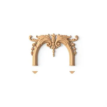
Opposite to smooth ones - cornices with developed ornamentation. Here, polystyrene imitates traditional plaster molding with its richness of forms and details.
Classical ornament motifs:
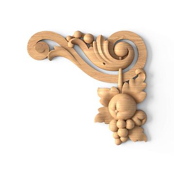
Plant-based: acanthus leaves, grapevine, oak leaves, rosettes, floral garlands. This is the heritage of ancient and Renaissance traditions. Such arelief corniceis associated with classical styles - baroque, classicism, neoclassicism.
Geometric: meander (Greek ornament of broken lines), Ionic (egg-shaped elements), teeth, beads, flutes (vertical grooves). More rigid than plant-based, but also classical. Good for interiors where classicism combines with modernity.
Order-based: elements of classical architectural orders - Doric, Ionic, Corinthian. Very large-scale, monumental profiles for high ceilings and large spaces.
Combined: combination of different motifs - plant-based and geometric, flat and three-dimensional elements. The most complex and expressive profiles.
Relief depth varies from 2-3 mm (barely noticeable, delicate) to 15-20 mm (expressive, dramatic). The deeper the relief, the stronger the play of light and shadow, the more expressive the cornice. But maintenance is also more complex - dust accumulates in deep recesses.
Company STAVROS, in partnership with the renowned manufacturer Hi Wood, offers collections with authentic classical ornaments - from restrained to luxurious.
Shadow-forming profiles
A special category - cornices specially designed to create an expressive shadow line. Their geometry is designed to maximize the contrast of light and shadow.
Usually these are profiles with an overhanging eave or shelf that protrudes over the wall, casting a clear shadow. Such a cornice can be smooth or with relief, but its main feature is working with shadow.
Shadow-forming profiles are especially good in interiors where graphic quality, contrast, and volume play are valued. Modern classicism, art deco, contemporary - styles where such a cornice fully reveals itself.
Profiles with recessed lighting
Functional relief - a niche (shelf) for mounting an LED strip. Such acornice with backlightingcombines decorative and lighting functions.
Structurally, this is a profile whose upper part forms a horizontal shelf 3-6 cm wide. The LED strip is glued onto it. A lip 3-5 cm high hides the strip from direct view. Light is directed toward the ceiling (creating a floating ceiling effect) or toward the wall (emphasizing the shadow line).
Profiles with niches can be smooth (for modern interiors) or with ornament (for classic interiors with modern lighting solutions). This is one of the most popular types of cornices in recent years - a combination of traditional decor and innovative lighting.
Multi-level Composite Profiles
For maximum expressiveness, multi-tiered cornices are used. Several parallel strips of different widths and relief, positioned at different heights, create an illusion of architectural complexity.
Such profiles are chosen for spacious rooms with high ceilings (from 3 meters), where a simple cornice would be lost. Living rooms, halls, offices in classical or palace style - this is their territory.
Width of composite profiles - from 15 to 40-50 cm. This is no longer just a cornice, but a full-fledged architectural element that defines the character of the interior.
Lighting scenarios: when the cornice lights up
Integration of lighting into ceiling decor - one of the main trends of the last decade. Hidden backlighting, built into the cornice, solves several tasks at once: creates an impressive atmosphere, provides additional lighting, visually transforms the space.
Floating ceiling: classic lighting design
The most popular effect - the illusion of a floating ceiling. A cornice with a niche is mounted with a small offset from the ceiling (8-15 cm). The LED strip in the niche is directed upward. Light reflects off the ceiling, bathing it in soft, even illumination.
In this case, the cornice itself remains in shadow - it is not visible. Only the glowing strip between the wall and ceiling is visible. This creates the impression that the ceiling does not rest on the walls, but floats in the air. Especially effective with stretch ceilings - the glossy surface enhances the effect multiple times due to light reflection.
This scenario is universal - suitable for bedrooms (creating a relaxing atmosphere), living rooms (adding grandeur), and corridors (visually expanding narrow spaces).
Important nuances: the color temperature of the light should be comfortable (warm white 2700-3000K for living rooms, neutral 4000K for kitchens and bathrooms). Brightness — moderate, 5-7 W/m is sufficient for background lighting. A more powerful strip will be glaring and overheat.
Accent wall lighting
Alternative scenario — the light is directed not at the ceiling, but at the wall. The strip is placed to illuminate the wall area under the cornice. This creates a vertical light strip 30-50 cm wide around the entire room perimeter.
This variant is more intense and active. It doesn't so much create an atmosphere as draw attention to the junction between the wall and ceiling, highlighting the architecture. Good for modern interiors where graphic elements and contrast are valued.
Works especially effectively on textured walls — decorative plaster, brick, concrete. Light gliding over the relief surface creates expressive play of light and shadow, revealing the texture.
Two-sided lighting: volumetric glow
The most vivid and effective variant — light goes simultaneously upward (to the ceiling) and downward (to the wall). For this, either two rows of LED strips or a special dual-sided profile are used.
Two-sided lighting creates powerful volumetric glow around the room perimeter. The room is literally bathed in soft diffused light. This solution is ideal for large spaces — living rooms, dining rooms, halls. In small rooms, it may be excessive.
Zonal and colored lighting
It is not necessary to illuminate the entire perimeter uniformly. You can create light zones — bright lighting above functional zones (kitchen, desk), dim lighting above relaxation zones (sofa, bed).
RGB strip allows changing the color of the lighting. You can choose the shade according to your mood: warm yellow for cozy atmosphere, cool blue for concentration, green for relaxation, red for celebration. Or set dynamic scenarios — smooth color transitions, pulsing, moving lights.
Colored lighting — a controversial solution. In residential interiors, it should be used sparingly, without falling into kitsch. However, it is perfect for home theaters, gaming rooms, bars.
Sensors and automation
Modern systems allow automating the control of lighting. Motion sensors turn on the light when someone enters the room. Light sensors adjust brightness depending on the time of day. Timers turn the lighting on/off according to a schedule.
Integration with smart home systems provides full control via smartphone or voice commands. "Alexa, turn on romantic lighting in the living room" — and the cornice lights up with warm, dimmed light.
Combination with baseboards and moldings: a decorative system
Interior cornicesThey rarely exist in isolation. Usually, they are part of a decorative system that includes baseboards, wall moldings, door and window casings. For the interior to look cohesive and harmonious, all these elements must coordinate with each other.
Style unity
The first and main rule — all decorative elements must be consistent in style. Mixing styles is permissible, but requires refined taste and understanding of compositional laws. Beginners are better off maintaining stylistic unity.
If the ceiling cornice is classic with floral ornamentation, the baseboard should not be ultra-modern and smooth. Choose a baseboard from the same collection or with a similar decorative style. Similarly with casings — their profile should match the cornice profile.
The ideal option — elements from the same manufacturer's collection. Designers initially plan their compatibility. The HiWood brand, partner of STAVROS, produces comprehensive collections where cornices, baseboards, and moldings harmonize perfectly.
Proportionality of elements
The second rule — proportionality. A wide, heavy cornice requires a corresponding baseboard. If the top has a 15-centimeter profile with ornate detailing, and the bottom has a thin 5-centimeter baseboard — the composition falls apart and looks unbalanced.
Sample proportions:
-
Crown 3-5 cm — baseboard 5-7 cm
-
Crown 6-10 cm — baseboard 8-12 cm
-
Cornice 12-18 cm — baseboard 12-20 cm
-
Cornice over 18 cm — baseboard from 18 cm
Casings are usually narrower than cornices and baseboards — 5-10 cm wide. Wall moldings (if used) — the narrowest, 3-7 cm.
Color coordination
The third rule — color coordination. Several possible schemes:
All white: a universal solution. Cornice, baseboard, casings — all white. Works in any style, visually unifies space, creates a sense of freshness and cleanliness.
Decor in the color of ceiling and floor: cornice blends with ceiling, baseboard — with floor. Decor is subtly integrated into the finish, not drawing attention. Suitable for minimalist interiors.
Decor in wall color: cornice and skirting board painted in wall color. Visually, walls "grow" from floor to ceiling, making the room appear higher. A technique for low ceilings.
Contrasting scheme: decor contrasts with finish. For example, white cornice and skirting board against gray walls. Decor reads clearly and becomes a graphic accent in the interior.
Gradient scheme: cornice lighter than walls, skirting board darker. Creates a smooth transition from light ceiling to dark floor. An advanced technique requiring precise shade selection.
Wall panels and moldings
In classical interiors, it is popular to divide walls into panels using moldings. Vertical and horizontal strips form rectangular frames, within which the wall is painted in another shade or covered with wallpaper.
In such a composition, the cornice is the upper boundary, the skirting board is the lower, and moldings structure the middle section. All elements must belong to the same stylistic family. Moldings are similar to cornice and skirting board, but repeat their decorative language — if the cornice has a floral ornament, moldings also have a floral one, but smaller.
Classic wall division scheme: lower panel (plinth) up to 80-100 cm from the floor, middle (main) and upper (frieze) panels under the ceiling 20-40 cm. Each zone is distinguished by its own shade, boundaries marked by moldings.
Color solutions and painting: palette of possibilities
White polystyrene cornice — classic that never goes out of fashion. But painting opens up boundless opportunities for creativity and integrating decor into the interior color scheme.
White: universality and purity
White — the default color for ceiling decor. And there are reasons for this:
-
Universality: white matches any wall and ceiling colors
-
Visual expansion: white reflects light, making the space brighter and more spacious
-
Neutrality: white cornice does not compete with other interior elements, does not draw attention
-
Lightness: white details appear weightless, do not weigh down the space
-
Tradition: white molding — classic, tested over centuries
White works everywhere — from tiny Khrushchev apartments to palace halls, from Scandinavian minimalism to French baroque. It is a safe choice that will never be a mistake.
Ceiling color: blending and height
Painting the cornice in ceiling color creates a visual blending effect. The cornice ceases to be perceived as a separate element and becomes an extension of the ceiling plane. The ceiling seems to "descend" by the width of the cornice.
This technique is used in two scenarios:
High ceilings: if ceilings are 3.5 meters and higher, they can be visually "lowered," making the space cozier and less monumental. A cornice painted in ceiling color serves this purpose.
Colored ceilings: if the ceiling is painted in a color (gray, blue, beige), a cornice of the same shade creates a harmonious unity.
Minus: the ceiling visually appears lower. In rooms with ceilings 2.5–2.7 m, this effect is undesirable.
Wall color: stretching space
The opposite approach — cornice in wall color. Now walls visually "grow" upward to the ceiling. The boundary between wall and ceiling blurs, making the room appear higher.
This is a salvation for rooms with low ceilings. Paint both walls and cornice in one color (not necessarily white — it can be gray, beige, blue), and leave the ceiling white. The vertical will visually stretch.
Additional bonus: if walls are textured (decorative plaster, relief wallpaper), a cornice of the same color blends with them, making decor subtle.
Contrasting solutions: graphics and accents
Contrasting cornice — a bold solution that turns decor into an active compositional element. Options:
Dark cornice on light walls: black, dark gray, graphite cornice on white or light gray walls. Clear graphic line, distinctly modern. Suitable for lofts, industrial interiors, modern classics.
Light cornice on dark walls: white cornice on dark blue, green, burgundy walls. Cornice glows against dark background, draws attention, sets rhythm. Classic technique for rich, dramatic interiors.
Colored cornice: the cornice is painted in a bright color - blue, green, terracotta. A very bold solution requiring refined taste. The cornice color should harmonize with other interior elements (textiles, furniture, decor).
Contrasting solutions visually enlarge the cornice, making it noticeable. If the cornice is narrow (5-7 cm), contrast can be appropriate. If wide (15+ cm), contrasting paint may overload the space.
Decorative techniques: patina, gold leaf, metallic.
In addition to simple single-color painting, there are decorative techniques that imitate noble materials:
Patina: creating an effect of antiquity. A base layer of light paint, over which a dark layer is applied, partially worn away and remaining in the recesses of the relief. Results in a vintage, aged look. Ideal for Provencal and shabby chic interiors.
Gold leaf and silvering: imitation of gilded or silvered moldings. A base layer of warm tone, over which gold or silver paint is applied using the "dry brush" technique on raised parts of the relief. Luxurious, festive, suitable for classical and palace interiors.
Metallic: paints with metallic effect - bronze, copper, brass. Create noble shimmer and play of light. Good for eclectic interiors where eras and styles mix.
Venetian plaster: imitation of marble surface. Complex multi-layer technique requiring skill, but the result is stunning - the cornice looks carved from a single block of stone.
Visual correction of room proportions
Correctly selected and installedceiling designwith a cornice can correct room deficiencies and visually alter its geometry.
Low ceilings: creating the illusion of height
Problem: ceilings 2.4-2.6 m, room appears low and oppressive.
Solutions:
-
Narrow cornice (3-6 cm), not stealing height
-
Cornice in wall color - walls visually "grow" up to the ceiling
-
Vertical moldings from cornice downward - enhance verticality
-
Avoid wide, bulky profiles and dark cornice colors
High ceilings: adding coziness
Problem: ceilings 3.5-4 m, room appears like a "well", cold and uninviting.
Solutions:
-
Wide cornice (15-25 cm), visually lowering the ceiling
-
Cornice in ceiling color - ceiling "descends" by the width of the cornice
-
Multi-level composite profiles - create horizontal division
-
Dark cornice on light walls - horizontal line draws the eye, interrupts verticality
Long narrow rooms: compensating proportions
Problem: room-vagon, cramped, tunnel-like.
Solutions:
-
Cornice only on short walls, leave long walls undecorated - visually "shortens" the room
-
Contrasting cornice on short walls - emphasizes ends, distracts from long walls
-
Vertical moldings on long walls, dividing them into squares - breaks up length
Square rooms: avoid monotony
Problem: a room with a proper square shape may look dull and static.
Solutions:
-
Different crown molding profiles on different walls (but in a unified style) - create dynamism
-
Accent wall with a wider or decorative crown molding
-
Crown molding with lighting on one or two walls, without lighting on the others
Irregular geometry: masking defects
Problem: corners are not straight, walls are not parallel, ceiling is curved - typical reality of old houses.
Solutions:
-
Crown molding is installed strictly horizontally (level), not following the ceiling's curvature - the eye focuses on the crown molding, making the curvature less noticeable
-
A wide crown molding hides more defects than a narrow one
-
Relief profile distracts attention from geometric imperfections
-
Gaps between crown molding and ceiling are filled with putty or sealant
Practical guide to styles: from classic to high-tech
Theory without practice - empty sound. Let's examine specific recommendations for choosing crown molding for popular interior styles.
Classicism and neoclassicism
Style character: tradition, symmetry, proportionality, reference to classical and Renaissance heritage.
Crown molding selection: relief profiles with classic ornamentation. Plant motifs (acanthus leaves, grapevine), geometric (meander, Ionic), order elements. Width medium-large (10-20 cm for neoclassicism, 15-30 cm for classicism).
Relief: pronounced, depth 5-15 mm. Ornament clear, detailed.
Color: white - classic. For formal interiors - gold, patina, imitation of ivory.
Combinations: with a high baseboard (12-20 cm) of similar design, wall moldings, ceiling rose, pilasters.
Lighting: optional. If used - warm white light, delicate, non-intrusive.
Example: crown molding 15 cm wide with acanthus leaf and Ionic ornament, white with slight patina, combined with 18 cm baseboard and wall moldings forming panels. Ceiling rose 60 cm diameter under chandelier.
Minimalism
Style character: simple forms, absence of decoration, functionality, plenty of air and light.
Crown molding selection: smooth profile without ornament. Simple geometric cross-section - rectangle, trapezoid, bevel. Width narrow-medium (3-7 cm).
Relief: absent. Maximum - one or two grooves for light surface structuring.
Color: white or exactly the color of walls/ceiling. Goal - make the crown molding inconspicuous, delicate.
Combinations: with a similarly minimalist baseboard (5-10 cm), without additional moldings or decoration.
Lighting: desirable. Hidden LED strip creating a floating ceiling effect. Neutral or cool white light.
Example: 5 cm crown molding with simple rectangular cross-section, white, with a recess for lighting. 7 cm baseboard matching wall color. No additional decoration.
Scandinavian style
Style character: light tones, natural materials, simplicity, coziness, functionality.
Crown molding selection: smooth or with minimal relief. Width narrow-medium (4-8 cm).
Relief: minimal - light grooves, rounded edges. No ornaments.
Color: white in 90% of cases. Scandinavian interior is built on the color white.
Combinations: with white baseboard (6-10 cm). Wood in interior (furniture, floor) contrasts with white decor.
Lighting: optional. If present - warm white light, soft and cozy.
Example: cornice 6 cm with slight rounding, snowy white, combined with white baseboard 8 cm. Walls light gray, floor light wood, furniture natural oak.
Loft and industrial
Style character: openness, brutality, combination of rough industrial elements and modern comfort.
Cornice selection: smooth geometric profile OR imitation of wooden or metal beam. Medium width (6-12 cm).
Relief: either absent (smooth profile), or imitates wood/metal texture.
Color: gray, graphite, black, dark brown (wood tone). Contrast with white or concrete walls.
Combinations: with minimalist baseboard or without baseboard (often absent in loft).
Lighting: actively used. Often open (strip visible, as part of industrial aesthetics). Cool white or RGB lighting.
Example: 8 cm cornice with simple rectangular cross-section, painted graphite, with exposed cool white LED strip. Brick or concrete walls, white ceiling.
Provence and country
Style character: French provincial romance, pastel tones, floral motifs, vintage feel.
Cornice selection: profile with relief, but not bulky, but delicate. Floral motifs, but stylized, simple. Medium width (7-12 cm).
Relief: moderate, depth 3-7 mm. Ornament light, unobtrusive.
Color: white, cream, ivory, dusty rose, lavender. Must have patina, weathered paint effect, artificial aging.
Combinations: with baseboard (10-15 cm) of similar design and color. Molding on walls is possible but not mandatory.
Lighting: not typical. Provence relies on natural light and soft lamps with fabric shades.
Example: 10 cm cornice with stylized floral and leaf ornament, white with light gray-blue patina and worn effect. 12 cm baseboard in the same color range.
Art Deco
Style character: luxury, geometry, symmetry, contrasts, reference to 1920s-30s.
Cornice selection: geometric profile with steps, bevels, angles. Or classic with geometric ornament (meander, zigzags). Medium-large width (10-18 cm).
Relief: clear, graphic. Step forms, symmetrical patterns.
Color: white, black, gold, silver, bronze. Contrasting combinations (black with gold).
Combinations: with high baseboard (15-20 cm), molding creating geometric panels on walls.
Lighting: encouraged. Highlights geometry, adds drama. Color - usually warm white or gold.
Example: 14 cm cornice with stepped profile, white with gilding on protruding edges. Warm lighting. 16 cm baseboard in the same color range. Walls dark blue or emerald.
Modern Eclecticism
Style character: mix of eras and styles, unexpected combinations, individuality.
Cornice selection: any, as long as it fits the overall concept. Mixing is allowed - classic on one wall, modern on another.
Relief: any.
Color: any, even the most unexpected. Bright, saturated shades.
Combinations: may be asymmetrical. Cornice and baseboard can be of different styles (but there should be a unifying idea).
Lighting: optional, creative solutions are possible.
Example: classic cornice with ornament, painted dark blue, with bright RGB lighting. Walls are white, furniture is modern. Eclecticism — playing with contrasts.
2025 Decoration Trends: What's Current
The design world constantly evolves. Let's consider the currentdecoration trends, influencing the choice of cornices.
Return of Classic: After a decade of minimalist dominance, classic interiors are back in style. But this is not the heavy classic of the 2000s, but a lightened, modernized neoclassicism. Reliefs in cornices, but restrained. Ornaments, but not overloaded.
Light Integration: LED lighting in cornices is no longer exotic, but standard. The trend is toward smart control, dynamic scenes, and colored lighting for zoning.
Dark Interiors: Dark walls (deep blue, green, graphite) are gaining popularity. Against this backdrop, white cornices glow, creating contrast. Or, conversely, cornices in the same tone as the walls, almost invisible.
Ecological: Demand for safe materials is growing. Polystyrene from reputable manufacturers such as HiWood, with safety certifications.
Personalization: People want uniqueness. Interest is growing in custom-painted cornices, decorative techniques, and combined solutions.
Frequently asked questions
What width of cornice to choose for a standard apartment with 2.7 m ceilings?
Optimally 6-10 cm. This will provide a noticeable shadow line without overloading the space. For minimalist interiors, 4-6 cm; for classic, 10-12 cm.
Is it necessary to paint a polystyrene cornice?
Not necessary, but recommended. Paint protects against yellowing, simplifies maintenance, and allows integration into the interior color scheme.
Can cornices of different styles be combined in one room?
Technically possible, but risky. This requires refined taste and understanding of composition. Beginners are better off sticking to one style.
How to choose a cornice for a room with an uneven ceiling?
Mount the cornice strictly horizontally (level), not following the ceiling's curvature. Fill gaps between the cornice and ceiling with putty or sealant.
Is primer needed before painting the cornice?
Not mandatory, but recommended for an ideal result. Primer equalizes surface absorption, improves paint adhesion, and reduces paint consumption.
How much does a quality polystyrene cornice cost?
Simple smooth profiles — from 50 rubles per linear meter. Medium relief — 150-400 rubles. Wide with rich ornament — 400-800 rubles. Premium collections — from 800 rubles.
How does a polystyrene cornice differ from a polyurethane one?
Polyurethane is denser, stronger, and more expensive. It better retains fine relief details and is not afraid of moisture. Polystyrene is lighter, cheaper, and easier to process. In dry rooms, both materials are equivalent.
Can a cornice be installed on a stretch ceiling?
The cornice is mounted on the wall, not on the stretch fabric. It is either installed before stretching (fabric is tucked behind the cornice) or after (cornice covers the technological gap between fabric and wall).
How to care for a cornice with lighting?
Regularly wipe with a soft brush or cloth. Do not wet the area with LED strips. Check contacts once a year and tighten loose connections.
Do you need pre-made corner pieces, or can you manage with a 45-degree cut?
Pre-cut angles simplify installation and guarantee a perfect joint. However, they are more expensive and not available for all profiles. Cutting at 45 degrees is a universal method requiring care.
Conclusion
Choosing decorative polystyrene cornices is an exciting journey at the intersection of aesthetics and functionality, tradition and innovation. A properly selected cornice completes the interior, like a frame completes a painting. It creates a visual boundary between the wall and ceiling, sets the space’s style, corrects proportions, and becomes a foundation for striking lighting solutions.
Key factors for successful selection: understanding the aesthetic role of the cornice, knowledge of relief and profile characteristics, proper use of backlighting, harmonious coordination with skirting boards and door casings, thoughtful color solutions, consideration of room proportions, and alignment with interior style. Each of these aspects is important, and only their combined application yields an ideal result.
The world of ceiling decoration is boundless — from minimalist, austere profiles to luxurious classical cornices with gold accents, from simple white strips to innovative systems with LED backlighting and smart controls. In this diversity, everyone will find a solution that matches their taste, budget, and goals.
Working with reliable suppliers of quality materials guarantees you an excellent result. The company STAVROS, in partnership with the renowned manufacturer Hi Wood, offers an extensive catalog of decorative cornices — from classic to ultra-modern, from budget to premium. Experienced consultants will help you select the optimal profile for your specific task, calculate the required material and fittings, provide installation, painting, and backlighting integration advice. With quality materials and professional approach, your interior will achieve the perfect finish and harmony that turns your home into a dream space!