Article Contents:
- Magic of Lines: How Decorative Finishing Affects the Perception of Room Height and Width
- Why Does Our Brain Get Fooled?
- Three Axes of Perception
- Role of Contrast and Shadow in Profile Decoration
- Rhythm and Module
- Vertical as the Main Tool
- How to Correctly Calculate Batten Spacing
- The 'Floor-to-Ceiling' Technique and Its Enhancement
- Cornice as a Continuation of the Vertical
- Material Matters: Polyurethane or Wood?
- Horizontal vs. Vertical
- Three Levels of Division
- Molding Placement Height: Subtleties and Nuances
- Molding Frames on Walls: Classic That Works
- Frame Proportions: Golden Ratio on Your Wall
- Mirror — A Window to a Parallel World
- Which Decoration to Choose for Mirror Framing
- Mirror Placement: Where and How
- Mirror Panels and Composite Compositions
- Skirting Board — The Invisible Architect
- Skirting Board Matching Floor Color: Expanding Area
- Skirting Board Matching Wall Color: Raising Height
- Contrasting Skirting Board: Graphic Accent
- MDF or Solid Wood: What to Choose for Floor Skirting
- Door Casings and Their Impact on Proportions
- Niches and Pseudo-Columns
- Ceiling Decor as the Final Touch
- Step One: Diagnosis
- Step Two: Technique Selection
- Step Three: Material Selection
- Step Four: Installation and Finishing
- A Unified Stylistic Ensemble
- Hardware as a Detail of the Overall Picture
- Staircase Elements in the Context of Spatial Geometry
- Moldings in Wall Color: Invisible Relief
- Contrasting Moldings: Clear Graphics
- Accent Painting Inside Frames
- Overdoing the Decor
- Scale mismatch
- Ignoring lighting
- Incorrect Material Choice for Specific Conditions
- Classic and neoclassic
- Scandinavian Style
- Art Deco
- Minimalism
- Comparison with Replanning
- Durability and maintenance

Every room is not just a set of walls, floor, and ceiling. It is a three-dimensional environment where a person spends hours, days, and years of their life. And if you've ever noticed that one room seems spacious and light, while another feels cramped and oppressive, even though their square footage is the same, then you already intuitively understand what this is about. The visual proportions of a room are determined not so much by its actual dimensions, but by how our brain reads the lines, planes, and transitions between them. This is precisely whereMoldings made of polyurethanemoldings, wooden slats, ceiling cornices, and floor baseboards come into play — tools capable of rewriting the geometric story of your interior without demolishing a single partition.
Consider this: why do classical palace halls with ceilings only three meters high seem majestic to us? Why do some modern studio apartments with a height of 2.7 meters appear squat and uncomfortable? The answer lies not in the numbers on the blueprint, but in the language of lines — verticals, horizontals, proportional divisions set by decorative finishes. And today, we will break down this language to the last letter so you can apply it in your own home.


The Magic of Lines: How Decorative Finishes Affect the Perception of Room Height and Width


Why Does Our Brain Get Fooled?
Human vision is an amazing yet easily manipulated tool. We don't measure distances with our eyes down to the centimeter. Instead, the brain relies on contextual cues: the direction of lines, the contrast of boundaries, the rhythm of repeating elements. Vertical lines make the gaze move up and down, and the room is perceived as taller. Horizontal lines guide the gaze along the wall, stretching it in our mind. This is not theory, but the physiology of perception, confirmed by decades of research in architectural psychology.
Decorative profiles — cornices, moldings, slats, baseboards — are essentially controlled lines. By placing them in a certain way, you literally draw instructions on the walls and ceilings for the viewer's eyes: 'Look up,' 'Move to the right,' 'A new plane begins here.' And if these instructions are composed skillfully, the room transforms without a single additional cubic meter of space.
Our factory also produces:


Three Axes of Perception
Any room has three dimensions: height, width, and depth. Each of them can be adjusted using profile elements. It is important to understand that decorative finishing does not work on one dimension in isolation—it redistributes visual accents, and the result depends on the combination of techniques.
Height is adjusted with vertical elements: battens, pilasters, elongated upward frames made of moldings. Width—with horizontal articulation: belts, friezes, extended moldings running along the wall. Depth—using perspective illusions: mirrors in relief frames, niches with lighting, gradient transitions from dark to light. Let's examine each of these techniques in more detail.
Get Consultation
The role of contrast and shadow in profile decor
A molding or batten is not just a strip of material on the wall. It is a three-dimensional element that casts a shadow. And it is this shadow that makes the line legible. A flat glued strip hardly affects the perception of space because it does not create relief. But a profiled molding with a cross-section of a specific shape—semicircular, stepped, teardrop-shaped—creates a clear line of light and shadow under side lighting, which works as a graphic technique.
That is why the choice of profile is of fundamental importance.Moldings made of polyurethaneare produced in dozens of cross-section variants—from minimalist rectangular to complex classical ones with flutes and Ionic beads. Each of these profiles interacts with light differently, and consequently, manages the perception of space differently. For a room with a low ceiling and one window facing north, one profile is suitable, while for a spacious living room with panoramic glazing—a completely different one. That is precisely whyDecorative wall finishingrequires not a template approach, but a thoughtful analysis of the specific space.
Rhythm and module
There is another aspect that is often overlooked: rhythm. Repeating elements—battens installed at equal intervals, a series of identical molding frames on the wall—create a modular structure. The brain reads the module and extrapolates it across the entire plane, assessing the size of the wall not in abstract units, but in the number of repetitions. A narrow spacing of battens visually increases the number of modules, and the wall appears longer or taller—depending on the orientation of the elements.
This principle has been used in architecture for centuries: think of colonnades, arcades, paneled wainscoting. Today, the same technique works in modern interiors whenwooden plankis installed on the wall vertically every 40–60 mm, turning a flat surface into a rhythmic structure reaching upward. Such a wall instantly begins to work on increasing the ceiling, even if its actual height does not exceed the standard 2.65 m.
Raising the ceiling: vertical wooden battens and cornices extending onto the ceiling
Vertical as the main tool
If you are concerned about a low ceiling, the first thing to do is introduce vertical elements into the interior. This could be wall cladding with wooden battens from floor to ceiling, pilasters on the sides of a doorway, elongated vertical panels made of moldings. All these techniques force the gaze to move from bottom to top, and the brain automatically adds several virtual centimeters of height to the room.
Vertical battens are perhaps the most effective and simultaneously most relevant technique for this task. Modern interior design actively uses batten panels as an accent element: they are used to decorate the wall behind a bed headboard, the TV area in a living room, an entryway. But far from everyone considers that battens are not just a fashionable trend, but a powerful proportion corrector. If you want tobuy a wooden battenfor decorating an accent wall, pay attention to the thickness and width of the profile: overly wide battens with large spacing create a monumental effect, but do not elongate the space as well as narrow battens with a frequent rhythm.
How to correctly calculate batten spacing
The most frequently asked question: at what distance from each other should battens be mounted? There is no universal answer because the spacing depends on the width of the batten itself, the height of the wall, and the effect you want to achieve. However, there is a proven proportion: the distance between battens should be equal to the width of the batten or slightly more—up to one and a half widths. With such a layout, the rhythm becomes dense, but the battens do not merge into a single mass, and each vertical remains legible.
For a standardRK-001 lies in its natural origin. Oak and beech, used to manufacture the ruler, are environmentally friendly and renewable resources. This makes the ruler safe for health and suitable for use in residential and public spaces, creating a healthy microclimate.with a width of 20–30 mm, the optimal spacing is 25–45 mm. On a wall 3 meters long with such spacing, 35 to 55 battens will fit—enough to create a pronounced vertical rhythm. With a ceiling height of 2.5 m, this rhythm will be read by the brain as 'tall space' because the number of repeating verticals makes the eye linger on the wall, and it is perceived as more spacious than it actually is.
The 'floor-to-ceiling' technique and its enhancement
A key mistake when working with vertical battens is to stop them at the level of the wall-ceiling junction. If a batten meets a ceiling cornice or simply ends at the upper boundary of the wall, the brain registers this boundary and notes: 'Here is the ceiling.' But if the battens extend onto the ceiling—even by 10–15 centimeters—the boundary between the wall and ceiling becomes blurred, and the height of the room ceases to be read as a fixed value. The ceiling seems to 'move back' upward, recedes from the eye, and the room feels significantly taller.
This technique can be enhanced if you addceiling moldingto the batten wall. But not a simple one: plaster decor in this case should be placed not around the perimeter, but precisely in the transition zone of the battens onto the ceiling, creating a unified composition. This could be a ceiling rosette located strictly above the batten panel, or decorative overlays rhythmically echoing the batten spacing. Such a system of 'wall—battens—ceiling—plasterwork' forms a continuous visual route along which the gaze rises from bottom to top and does not encounter a rigid boundary.
Cornice as an extension of the vertical
Ceiling cornices deserve separate mention. Paradoxically, a cornice—a horizontal element—can work to increase height if used correctly. A classic mistake: a massive wide cornice in a room with a 2.5 m ceiling. It 'eats up' the top 10–15 centimeters of the wall, lowering the visual boundary of the ceiling even further. The correct approach is to use a narrow cornice of the same color as the ceiling. In this case, the cornice does not separate the wall and ceiling but, on the contrary, unites them, extending the white zone downward by several centimeters.
An even more effective technique: a cornice installed not at the wall-ceiling junction, but 5–7 centimeters below it. The space between the cornice and the actual junction is painted the color of the ceiling. As a result, the ceiling 'descends' onto the wall, its perceived area increases, and the wall visually shortens vertically. Sounds counterintuitive? Possibly. But this technique works unfailingly because the brain considers everything painted its color and located above the horizontal boundary as the ceiling. Cornices andMoldings made of polyurethaneare ideal for implementing this technique, as they are lightweight, easy to install, and can be painted any desired shade.
Material matters: polyurethane or wood?
When selecting material for vertical elements, it's important to consider not only aesthetics but also practical aspects. Wooden slats provide a warm, textured, lively effect. The wood grain—its fibers, tonal transitions, slight roughness—adds depth to the wall and makes each slat unique. This is especially important in interiors leaning towards Scandinavian style, eco-style, or modern classic.
Solid wood productspossess that quality of authenticity which cannot be replicated by synthetic materials. When you touch a wooden slat on the wall, you feel the warmth of a living material—and this sensation subconsciously transfers to the perception of the entire space. A room with wooden slats appears not only taller but also cozier.
On the other hand,Polyurethane Itemshave their undeniable advantages: absolute moisture resistance (critical for bathrooms and kitchens), lightness (installation does not require wall reinforcement), low cost while maintaining clear relief. Polyurethane moldings can be painted to match the wall, ceiling, or an accent color, providing maximum flexibility in working with the interior's color palette.
Expanding Walls: Horizontal Space Division Using Polyurethane Moldings
Horizontal vs. Vertical
If vertical elements raise the ceiling, then horizontal ones expand the walls. These are two opposite techniques, and they should be applied consciously, depending on the task. In a narrow, elongated room—a hallway, long bedroom, rectangular kitchen—horizontal division with moldings will visually stretch the short walls, compensating for the 'railcar' feeling.
The principle works as follows: a molding stretched horizontally along the wall creates a line along which the gaze slides from left to right (or right to left). The longer this line, the longer the wall appears. If the molding continuously runs around the entire room along the perimeter, it unites all walls into a single horizontal plane, and the room is perceived as wider.
Three Levels of Division
Classical architectural theory distinguishes three zones of horizontal wall division: the plinth (lower part, from the floor to approximately 70–90 cm), the main field (from 90 cm to a height of 180–200 cm), and the frieze (from 180–200 cm to the ceiling). These three zones are separated by horizontal moldings—so-called belts. Each belt visually divides the wall into registers, and the brain evaluates the width of each register separately, summing them up. As a result, the wall appears wider than it actually is.
For implementing this technique,Moldings made of polyurethaneare ideal. They are produced in various lengths—typically from 2 to 2.4 meters—easily join each other, forming a continuous line of any length. Joints, filled and painted, are absolutely invisible, and the line looks seamless. This is important: a break in the horizontal molding disrupts the illusion of continuity and negates the entire expansion effect.
Molding Placement Height: Subtleties and Nuances
Where exactly on the wall to place the horizontal molding is a question on which the entire result depends. If the task is to visually lower the ceiling (yes, sometimes this is needed—in rooms with disproportionately high ceilings and small area), the molding is placed high, at a level of 180–200 cm from the floor. Everything above the molding is painted the color of the ceiling, and the ceiling 'descends' downward, while the wall becomes visually wider and shorter.
If the goal is simply to expand the wall without affecting the height, the molding is installed at a level of 90–100 cm from the floor. The lower part of the wall can be decorated differently from the upper part—with a different color, texture, wallpaper. This contrast between the two zones emphasizes the horizontal line of the molding and enhances the expansion effect.Decorative wall finishingin this case becomes a true art of architectural optics, where every centimeter counts.
Molding Frames on Walls: Classic That Works
One of the most popular techniques for horizontal division is creating so-called boiserie, or molding frames on walls. Rectangular frames made of moldings, evenly distributed across the wall, create a modular grid that simultaneously structures the space and expands it.
Here's how it works: three or four frames in a row on a long wall—the gaze slides from one to another, reading the rhythm and mentally extending it beyond the wall. The brain perceives the wall as longer because the rhythmic structure implies continuation. This technique is especially effective in living rooms, dining rooms, and hallways, where walls have sufficient length to accommodate three or more modules.
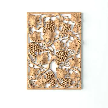
For forming molding frames, profiles with classic or modern cross-sections are used. Polyurethane moldings are good because they allow creating perfectly straight right angles: the profile is cut at 45 degrees, joined, filled—and the corner looks flawless. Wooden moldings are also suitable for this task, especially if the interior requires warm, natural texture. In the catalog ofmoldings, cornices, and baseboards made of solid woodyou can find profiles of various cross-sections—from a laconic rectangular to a complex multi-step one, suitable for classic and neoclassical interiors.
Frame Proportions: The Golden Ratio on Your Wall
A logical question arises: what size should the molding frames be? And here, everything is not as simple as it seems. Too small frames on a large wall get lost and don't create the desired effect. Too large ones—overwhelm the space and make the room visually heavier.
The optimal frame proportion is approximately 2:3 or 3:5 (a ratio close to the golden ratio). At the same time, the distance from the frame to the floor, ceiling, adjacent frames, and wall corners should be approximately the same—10–20 centimeters depending on the scale of the room. If the room is small, frames are placed with minimal offsets so they fill a larger part of the wall. In spacious rooms, offsets can be increased, allowing the wall to 'breathe.'
Inside the frames, accent painting can be applied: a slightly darker or lighter shade of the same color palette as the main wall. This technique adds depth and makes the frames three-dimensional, enhancing the shadow play of the profile.
Mirror Effect: Framing Mirrors with Decorative Molding to Create 'Portals' into Deep Space
Mirror—A Window to a Parallel World
Mirrors in interiors are not just functional items for checking your hair before leaving. A mirror is a visual portal that doubles the space, adding non-existent depth to a room. But a 'bare' mirror, simply glued to the wall, works at fifty percent of its potential. To unlock it fully, the mirror needs to be framed—to create a frame around it that turns the reflection from a random illusion into a deliberate architectural technique.
And here, decorative molding comes to the forefront. Framing a mirror with moldings, cornice profiles, or decorative overlays turns it into something resembling a window or doorway leading to another room. The brain, accustomed to the fact that openings are framed with casings and cornices, perceives such a mirror not as a reflective surface, but as a real opening in the wall, behind which another room opens up. The illusion of depth is enhanced many times over.
What decor to choose for framing a mirror
The framing style depends on the interior style. For classical and neoclassical spaces, Ceiling molding and walls in the form of applied rosettes, scrolls, and cartouches. However, the same decorative elements work perfectly around mirrors as well — especially large rosettes in the upper corners of the frame and vertical fluted strips on the sides. Such a composition turns the mirror into a true architectural portal, and the reflection in it is perceived as a view from a window into the courtyard of a palazzo.
For modern interiors, a more concise framing is suitable: a strict frame made of rectangular polyurethane molding, without ornamentation or curvilinear elements. Such a frame does not draw attention to itself but gently directs the gaze into the mirror, emphasizing its 'window-like' nature. The effect of expanding the space is fully preserved.
Mirror placement: where and how
The maximum depth effect is achieved when the mirror is placed opposite a window or light source. The reflection of the window in the framed mirror creates the illusion of a second window, making the room appear twice as bright and spacious. If the mirror is placed opposite a door, it visually extends the corridor or enfilade, adding a non-existent perspective.
Another powerful technique is a floor-to-ceiling mirror on a narrow wall of the room, framed around the perimeter with wide molding. Such a mirror completely 'dissolves' the wall, and the room is perceived as twice as wide. If the molding frame matches the style of the door casings, the illusion of an opening becomes almost indistinguishable from reality.
Interestingly, this technique works excellently in hallways as well. A small hallway, one wall of which is completely occupied by a mirror in decorative framing, loses its cramped feel and turns into something resembling a spacious hall. Decorative wall finishing around the mirror — a cornice at the top, pilasters on the sides, and a baseboard at the bottom — completes the illusion and makes it convincing.
Mirror panels and composite compositions
It is not necessary to use one large mirror. A series of mirror panels separated by thin moldings creates a mullion effect — like an old French window with small panes. Each segment reflects its own fragment of the room, and the combined reflection is perceived as a view through a multi-part window. This technique is especially good for interiors in Provencal, Art Deco, and neoclassical styles.
To create a 'mullion,' narrow moldings 15–25 mm wide are used, glued directly onto the mirror surface. Polyurethane profiles are ideal for this task: they are lightweight, do not burden the mirror surface, and easily adhere to the glass with mounting adhesive.
Mirror inserts in wall panels framed with wooden moldings can also be used. In this case, each panel represents a mini-portal with a reflection, and the wall turns into a gallery of 'windows.' Wooden frames add warmth and nobility to the composition, especially if using Molding and cornices made of solid wood with the texture of natural oak, ash, or beech.
Floor contour: how the color of the baseboard (matching walls or floor) changes the floor area
Baseboard — the invisible architect
The baseboard is usually thought of last. It is installed at the final stage of renovation when all major decisions have already been made, and its role is reduced to covering the joint between the wall and the floor. But in fact, the baseboard is one of the most influential interior elements in terms of perceived proportions. And here's why.
The baseboard defines the visual boundary of the floor. If it contrasts with the floor, the boundary is clear, and the floor area is perceived accurately. If the baseboard matches the floor color, the boundary blurs, and the floor 'creeps' up the wall, visually expanding its area. If the baseboard matches the wall color, it 'attaches' the lower part of the wall to the vertical plane, making the wall visually extend down to the floor, while the floor appears narrower.
This may seem like a small detail, but the difference can be significant. In a room of 15–18 square meters, changing the color of the baseboard can visually add or subtract a couple of square meters of perceived floor area. For small spaces, this is a noticeable change.
Baseboard matching the floor color: expanding the area
WhenWooden baseboard painted or tinted to match the floor covering, it ceases to be a boundary and becomes an extension of the floor. The eye does not fixate on the joint between the horizontal and vertical planes because there is no color transition. As a result, the perceived floor area increases by the width of the baseboard along the entire perimeter of the room.
Let's calculate. A room 4 × 5 meters, baseboard height 80 mm. Perimeter — 18 meters. Visually added area: 18 × 0.08 = 1.44 square meters. That's almost ten percent of the actual floor area! Of course, this is not a physical increase, but in terms of perception, the effect is substantial.
To achieve this effect, it is important that the baseboard matches the floor tone as closely as possible. If the floor is natural oak parquet, the baseboard should also be oak, with the same tint shade. wooden baseboard solid wood is ideal for this task, as it can be tinted and varnished exactly like the parquet board, achieving a perfect color match.
Baseboard matching the wall color: raising the height
The reverse technique: the baseboard is painted to match the wall color. In this case, it ceases to be a floor element and becomes the lower part of the wall. Visually, the wall starts right from the floor, without an intermediary, and its perceived height increases by the height of the baseboard. Simultaneously, the floor area subjectively narrows because the dark (or at least different from the floor) strip around the perimeter 'bites off' the edge.
This technique is ideal for rooms with low ceilings and sufficient floor area, where the loss of visual square meters of floor is not critical, but the gain in height is desirable. A baseboard painted to match the wall color works especially well with high profiles: 100 mm and more. At such a height, the baseboard contributes noticeably to the overall wall height, and the ceiling is perceived as 7–10 centimeters higher than it actually is.
For rooms where it is necessary to simultaneously expand the floor and raise the ceiling, there is a compromise option: the baseboard is painted in a neutral intermediate tone that matches neither the floor nor the wall. In this case, it acts as an independent element separating the horizontal and vertical planes but does not accentuate the boundary.
Contrasting baseboard: graphic accent
A separate story is the contrasting baseboard. A white baseboard on a dark floor and walls, a dark baseboard on a light background — such a technique does not expand or narrow the space but creates a clear graphic outline emphasizing the geometry of the room. This is an aesthetic solution appropriate in interiors where geometry is a conscious stylistic choice: Scandinavian spaces with white baseboards and light wooden floors, lofts with dark metal baseboards.
However, a contrasting baseboard has a side effect: it highlights all wall and floor irregularities. If a wall has a slight curve, a contrasting baseboard will mercilessly expose it. Therefore, before choosing a contrasting option, ensure the walls are perfectly leveled. A baseboard made of quality material — for example,skirting made of solid wood— possesses sufficient rigidity to adhere to the wall without gaps, yet enough flexibility to compensate for minor imperfections.
MDF or solid wood: what to choose for floor baseboards
The choice of baseboard material depends on several factors: type of flooring, room humidity, budget, and stylistic preferences.Floor baseboard made of MDFis distinguished by shape stability, resistance to humidity fluctuations, and a smooth surface, ideally suited for painting. It performs excellently in interiors where the baseboard is painted to match the wall color — since MDF lacks a pronounced grain that could show through the paint.
A wooden baseboard, on the contrary, reveals its beauty precisely when stained or varnished, allowing the wood grain to remain visible. It is indispensable in interiors with parquet floors, wooden furniture, and other elements made of natural wood.with a classic profile creates a sense of solidity, reliability.is chosen by those who value material authenticity and are unwilling to settle for imitation.
Both options — MDF and solid wood — are available in various heights, from compact 40–50 mm to impressive 120–150 mm. The taller the baseboard, the stronger its influence on the perceived proportions of the room. Tall baseboards are associated with classic interiors, spacious halls, respectable mansions — and transfer these associations to any room where they are installed. Even a small room of twelve square meters with a 100 mm high baseboard looks more solid and substantial than with a 50 mm baseboard.
Auxiliary techniques: how details change the whole
Door casings and their influence on proportions
When discussing moldings and profile elements, door casings cannot be overlooked. A door opening is a break in the wall, and how it is framed directly affects the perception of the entire room. A wide casing with a pronounced profile visually enlarges the door opening, making it grand and significant. A narrow, flat casing, conversely, minimizes the opening, preserving the wall's integrity.
If a door is located on a short wall in a narrow room, a wide casing will make the wall appear even narrower because the opening will 'consume' a significant portion of it. In this case, it's better to use a narrow casing in the wall color so the door blends maximally with the background. Conversely, on a long wall, a wide casing with an elaborate cornice above the door creates an accent that breaks the monotony of the extended plane.
Niches and faux columns
Another way to adjust proportions is by creating niches and pilasters using moldings and battens. A shallow niche (3–5 centimeters), framed by moldings, adds depth to the wall and creates a three-dimensional structure. Pilasters — vertical projections imitating columns — emphasize wall height and give the room an orderly strictness.
To create pilasters, wooden battens are used, applied to the wall and topped with a polyurethane capital. This combination of materials — wood and polyurethane — allows for maximum expressiveness at a reasonable cost. The wooden body of the pilaster provides warmth and texture, while the polyurethane capital offers clear ornamentation and resistance to damage.
Ceiling decor as the finishing touch
The ceiling is the fifth wall of a room, and its design influences proportions no less than the vertical surfaces. A smooth white ceiling without any elements is perceived neutrally: it doesn't attract attention and doesn't participate in forming spatial illusions. But add a decorative element to it — a rosette, cornice, coffered grid — and the ceiling begins to work actively.
Ceiling molding— rosettes, corner appliqués, central medallions — draws the gaze upward and causes the brain to linger on analyzing the ceiling plane. The longer the eye examines the ceiling, the farther away it seems. This is a paradoxical but effective principle: a detailed ceiling is perceived as higher than an empty one — provided the decor isn't too bulky and doesn't 'press down' from above.
For rooms with ceilings up to 2.7 m, it's better to use flat decorative appliqués that add relief without significantly increasing volume. For rooms with high ceilings (3 meters and above), three-dimensional rosettes, coffered panels, and multi-level cornices are permissible — they 'saturate' the ceiling, making it visually closer and cozier, which can be necessary in disproportionately high but small-area rooms.
Practical recommendations: a step-by-step approach to correcting proportions
Step one: diagnosis
Before buying moldings and battens, you need to precisely determine which proportions you're dissatisfied with. Take a tape measure and measure the room: length, width, height. Calculate the ratios. An ideal room in plan is a square or rectangle with an aspect ratio no greater than 1:1.5. The ideal height is approximately one-third of the room's shorter side. If your room deviates from these proportions, you know what to work on.
Make a list of problems: does the ceiling seem low? Is the room too narrow? Does one wall dominate the others? Does the floor seem small due to a dark contrasting baseboard? Each problem is solved with its own set of techniques, and it's important not to apply contradictory techniques simultaneously. For example, vertical battens on a wall and a horizontal molding on the same wall neutralize each other — one detail says 'up,' the other says 'wide,' and the brain receives a mixed signal.
Step two: choosing techniques
Having identified the problems, select the techniques:
- Low ceiling → vertical battens, cornice in ceiling color, baseboard in wall color, mirror in vertical framing.
- Narrow room → horizontal moldings, mirror on short wall, baseboard in floor color.
- Disproportionately high ceiling → horizontal wall articulation, coffers on ceiling, wide contrasting cornice.
- Small area → mirrors in framing, baseboard in floor color, light walls with molding frames in matching tone.
Step three: material selection
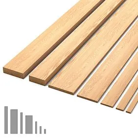
Each application has an optimal material. Vertical battens look best made from natural wood — oak, ash, beech.Wooden plankSolid wood has a unique grain that makes each slat one-of-a-kind. Wall molding frames and ceiling cornices are most conveniently made from polyurethane — it's lightweight, easy to work with, and ideal for painting. Floor skirting boards — from solid wood or MDF, depending on budget and style.
Step four: installation and finishing
Installing moldings and battens is a process requiring precision. Moldings are attached with construction adhesive and, if necessary, additionally secured with screws or nails. Battens are installed on prepared lathing or directly on the wall using adhesive and micro-pins. Skirting boards are attached to the wall — not the floor! — to compensate for possible floor covering deformations.
After installation, all joints are filled, sanded, and painted. The quality of the finishing is the key factor determining the result. A sloppy joint or an unpainted gap can ruin the entire illusion, turning an elegant architectural trick into cheap craftwork.
Combined solutions: when moldings meet furniture
A unified stylistic ensemble
Decorative profiles on walls and ceilings don't exist in a vacuum — they interact with furniture, textiles, lighting. And if the walls are decorated with classic molding frames, and the furniture is ultra-modern, minimalist, with chrome legs — a stylistic dissonance arises that negates the entire effect.
For classic and neoclassical interiors with molding decor, it's logical to selectclassic furniture— with paneled fronts, carved elements, fluted legs. Such furniture echoes the profiles on the walls and creates a unified stylistic field where each element supports the others.
Hardware as a detail of the overall picture
Even such small details asFurniture Handlesaffect the integrity of perception. Handles with classic ornamentation, echoing the pattern of moldings on the walls, close the stylistic circle and make the interior complete. Metal handles with botanical motifs rhyme with polyurethane rosettes on the ceiling; wooden handles with a smooth, streamlined shape — with minimalist wooden battens on the walls.
We are used to separating 'finishing' and 'furnishing,' but in a well-designed interior, this separation is conditional. Molding on the wall, a batten behind the sofa, a handle on a chest of drawers, a skirting board at the floor — all these are elements of one visual equation, and the result is determined by how well they are coordinated with each other.
Staircase elements in the context of spatial geometry
If your interior includes a staircase — a two-level apartment, an attic, a country house — it also participates in shaping proportions. Staircase balusters, railings, and newel posts set a powerful vertical rhythm that can be supported by vertical battens on adjacent walls. If you needbuy balustersfor updating a staircase, select a profile that harmonizes with the battens and moldings in the main space. Turned classic balusters pair with profiled moldings; smooth rectangular ones — with minimalist wooden battens. This interplay of forms unites the staircase and the room into a single architectural statement.
Color strategies when working with moldings and battens
Moldings in wall color: invisible relief
One of the most elegant approaches is to paint moldings exactly the same color as the wall. In this case, the profiles are not visually accentuated, but their shadow relief remains. The wall gains depth and texture while maintaining color uniformity. This technique is ideal for small spaces where contrasting moldings could 'fragment' an already limited surface.
Moldings in wall color work especially well with directional lighting: when light falls from the side, the relief of the profiles is revealed in shadows, creating a subtle play of light and dark. In the evening, with wall sconces on, a wall with invisible moldings comes alive and becomes three-dimensional — this is one of the most beautiful lighting effects available in a residential interior.
Contrasting moldings: clear graphics
The opposite approach is to make moldings as noticeable as possible. White moldings on dark walls, dark ones on light walls. This technique creates an expressive graphic structure that clearly articulates the wall and controls the perception of proportions. Contrasting moldings are a powerful tool, but they require flawless installation: any unevenness, any unpainted joint instantly becomes noticeable.
Accent painting inside frames
As we've already mentioned, the interior of molding frames can be painted a different tone than the main wall. This adds another level of depth and allows for accent placement. For example, on a wall with four molding frames, the two outer ones are painted the main wall color, and the two central ones — in a darker tone. The gaze focuses on the center of the wall, and its edges 'recede,' visually widening the wall.
For painting inside frames, wallpaper can also be used — solid-colored or with a subtle pattern. In this case, the molding acts as a trim for the wallpaper insert, and the wall gains additional textural complexity. The main thing is to maintain stylistic unity: if the moldings are classic, the wallpaper should also be classic (damask, stripe, medallions); if the moldings are minimalist, the wallpaper — geometric or solid-colored.
Mistakes to avoid
Overdoing the decor
The most common mistake is trying to use all techniques simultaneously. Vertical battens, horizontal moldings, ceiling rosettes, contrasting skirting boards, mirrors in stucco frames — if all this is gathered in one room of 15 square meters, instead of a harmonious space, you get visual chaos. Each technique requires 'breathing room' around itself, and the smaller the room, the fewer techniques it can accommodate.
The rule is simple: identify one or two problems, choose one or two techniques to solve them, and implement them with quality. It's better to have one perfectly executed accent wall with vertical battens than four walls covered with moldings, battens, mirrors, and rosettes.
Scale mismatch
The second most common mistake is incorrect decor scale. Massive moldings with a profile width of 80–100 mm, suitable for a hall with a 3.5-meter ceiling, will overwhelm a small bedroom. Thin moldings 20 mm wide will get lost on a huge wall and produce no effect.
Use the following proportion as a guide: the profile width of the molding should be approximately 1/50–1/30 of the wall height. For a 2.5 m wall, this is 50–83 mm. For a 3 m wall — 60–100 mm. For a ceiling cornice, slightly more is acceptable — up to 1/20 of the height, i.e., 125 mm for a 2.5 m wall.
Ignoring lighting
Moldings and battens are three-dimensional elements, and they only work with side lighting. If a room is lit solely by a central ceiling fixture, shadows from the moldings will be minimal, and all the relief will be lost. When planning decorative finishes, be sure to consider lighting: sconces on the walls, directional lights, hidden lighting behind the cornice. It is the light that 'activates' moldings and battens, transforming them from passive strips on the wall into active architectural elements.
Incorrect material choice for specific conditions
Wooden battens in a bathroom with high humidity will warp and crack. Polyurethane moldings in areas of high mechanical stress — for example, in a hallway where they are constantly bumped by shoulders or bags — can get damaged. Choose the material based on operating conditions: polyurethane for wet areas, wood for living rooms where temperature and humidity are stable.
Integrating decorative profiles into various interior styles
Classic and Neoclassic
For a classic interior, moldings are not a decorative addition but an integral structural element. Classic walls without molding frames, cornices, and baseboards look unfinished, like a painting without a frame. Complex profiles with floral motifs, wide cornices with modillions, ceiling rosettes with acanthus leaves are appropriate here.
The classic scheme involves a clear three-part division of the wall: plinth (baseboard + lower panel), main field (molding frames), frieze (upper cornice). This structure is not only beautiful but also functional in terms of proportions: it allows you to control the height and width of the room by varying the position of the horizontal bands.
Scandinavian style
In Scandinavian interiors, moldings are used minimally, but wooden battens are ubiquitous. Light wood (pine, birch, maple), matte finish, natural tones — all this creates a calm, harmonious environment. Battens here are usually left in their natural color or lightly tinted with white stain, preserving the wood texture. Baseboards are white, matching the walls. Ceiling cornices are minimal or absent altogether.
Art Deco style is renowned for its love of ornamentation, symmetry, and refined details. The molded decoration NPU-422 can become an excellent complement to geometric motifs and contrasting color combinations characteristic of this style. Try highlighting it with metallic paint or patina — and you’ll get an eye-catching detail that’s hard to look away from.
Art Deco is a style where geometry is elevated to an absolute. Moldings take on special significance here: symmetrical frames with geometric proportions, radial compositions of battens, mirrors framed with characteristic stepped profiles. Art Deco is characterized by contrasting color solutions: gold moldings on dark walls, black battens on a light background. This style requires impeccable precision in installation and perfect symmetry.
Minimalism
It might seem that minimalism and moldings are incompatible. But this is a misconception. In a minimalist interior, profile elements are used even more deliberately: a single molding running along the perimeter of the room at a height of 90 cm can transform a bland 'white cube' into a well-thought-out space with a clearly readable horizontal structure. Minimalism does not reject lines — it insists on their meaningfulness. Every molding here serves a functional purpose and cannot be removed without compromising the composition.
Cost and economics of spatial correction
Comparison with redevelopment
Decorative correction of proportions using moldings and battens costs an order of magnitude less than any redevelopment. Demolishing a partition, moving a doorway, changing the ceiling level — all of this requires design approvals, construction work, debris removal, and subsequent repairs. The cost of such work starts from several tens of thousands of rubles and can reach hundreds of thousands.
Decorative finishing with moldings, battens, and baseboards is work done on top of finished walls, requiring no approvals or major interventions. The cost of materials — polyurethane moldings, wooden battens, baseboards — is significantly lower than the cost of construction work. And the effect is comparable: visually 'raising' the ceiling by 10–15 centimeters or 'widening' a wall by half a meter can be achieved without a single swing of a sledgehammer.
Durability and maintenance
Moldings made of polyurethanePolyurethane moldings are practically eternal: they are not afraid of moisture, do not deform, and do not dry out. The only maintenance required is periodic dusting and repainting when updating the interior. Wooden elements — battens, baseboards, solid wood moldings — require slightly more attention: humidity control, periodic renewal of varnish or oil coating. But with proper care, wooden decor lasts for decades, acquiring a noble patina over the years and becoming even more beautiful.