


Article Contents:
- Three approaches to skirting board color
- First approach: skirting board matching floor tone
- Second approach: skirting board matching wall tone
- Third approach: contrasting skirting board
- White wooden skirting board: universal option for light interiors
- Why white skirting board is immortal classic
- White skirting board with different floors: compatibility table
- White is not one color: nuances of white for skirting board
- Texture vs. enamel: two types of white skirting board
- Wenge, dark and black wooden skirting boards: bold solutions
- Logic of dark skirting board
- Wenge wooden skirting board: when appropriate
- Black wooden skirting board: maximum contrast
- Dark oak: natural tone without stain
- Gray wooden skirting board: neutral option for modern interiors
- Gray as new neutral
- Gray range: from light gray to anthracite
- Gray skirting board with gray and concrete walls
- Gray wooden skirting board: how to achieve the tone
- Beautiful wooden skirting boards: color solutions for specific styles
- Scandinavian Style
- Classic and neoclassic
- Loft and Industrial Style
- Modern art deco and "new luxury"
- How to achieve uniform shade when painting skirting board
- Reasons for tone discrepancy on finished skirting board
- Paint application technology for even tone
- Stain and tinting: color charts for oak and pine
- Why oak and pine give different results with same stain
- Color charts of stains for oak skirting board
- Color charts of stains for pine (with pre-conditioner)
- Practical algorithm for skirting board tinting to match the floor
- FAQ: answers to popular questions about wooden skirting board color
- About the Company STAVROS

Skirting board color is one of those questions most people answer at the last moment: when the floor is laid, walls are painted, furniture is delivered. And then it turns out that the skirting board is the detail that either "glues" the interior together or cuts it into disjointed pieces.
A skirting board is a line. A horizontal line that the eye sees along the entire perimeter of the room. If it's lighter than the wall — it "raises" the ceiling. If darker than the floor — it "grounds" the room. If it matches the wall tone — it disappears. If contrasting — it becomes an accent. This line has enormous power over the perception of space, and that's precisely why the colorwooden baseboarddeserves a thoughtful decision, not a random choice at the hardware store checkout.
This article is about a system. About three basic approaches to skirting board color, how each works in specific situations, and how to achieve the desired tone on a factory-made solid wood skirting board — using stain, tinting, or painting.


Three approaches to skirting board color


First approach: skirting board matching the floor tone
A skirting board matching the tone of the floor covering is a classic most often recommended in basic interior design textbooks. The logic: the skirting board is perceived as an extension of the floor, a "vertical edge" of the horizontal plane. The boundary between floor and wall becomes soft, unnoticeable.
This is not the boldest, but one of the most reliable choices. Especially in situations where the interior is already rich in details: patterned wallpaper, textured walls, bright furniture. Here, a skirting board "matching the floor tone" is a tactful silence at the right moment.
When this works especially well:
-
Oak parquet floor in natural tone + oak skirting board under the same oil = flawlessly coordinated space
-
Dark wenge laminate +wenge wooden skirting board= monolithic "dark base" of the interior, visually lowering the room's center of gravity
-
Light floorboards + light beech skirting board under oil = Scandinavian lightness, "air" at floor level
Practical difficulty: achieving an exact match between skirting board and floor tones from different materials is a non-trivial task. Oak parquet and oak skirting board coated with the same oil in the same batch — will match. Oak parquet + pine skirting board under "oak" stain — that's a different story: different wood species absorb stain differently, the tone will be slightly different. How to work with this — in the section about stain.
Our factory also produces:


Second approach: skirting board matching the wall tone
A skirting board matching the wall tone is a "disappearance" strategy. The skirting board blends with the wall, the boundary between the vertical and the floor's horizontal becomes invisible. Visual result: the wall seems to descend all the way to the floor, the room appears taller.
White walls +white wooden skirting board— the most common implementation of this approach. Not because it's "beautiful" in itself, but because it's a universal neutral solution that contradicts nothing: neither light floors, nor dark ones, nor any furniture color.
When a skirting board matching the wall tone is the best choice:
-
Rooms with low ceiling height (up to 2.6 m): skirting board "disappears" into the wall, ceiling visually rises
-
Interiors with accent floors (mosaic, bright tiles, designer parquet): skirting board shouldn't "compete" with the floor for attention
-
Open-plan layouts where one space flows into another: a single white skirting board along the entire perimeter creates cohesion
-
Rooms with textured or bright wallpaper: skirting board matching the wall tone = tactful accompaniment, not a competitor
Get Consultation
Third approach: contrasting skirting board
A contrasting skirting board is the boldest and most expressive. It doesn't hide, doesn't blend. It's an accent. A black horizontal line against a light floor and white walls. A dark blue stripe in a room with a terracotta floor. Honey-amber oak against a gray concrete floor.
Contrastingblack wooden skirting board— the most 'New York' solution: a strict horizontal accent that gives the room architectural clarity. This works in modern interiors where there are no random details—only intentional ones.
When contrast is justified:
-
High ceilings (from 3 m): a dark baseboard doesn't 'weigh down' but 'anchors' the space
-
Light minimalist interiors where one strong element is needed
-
Scandinavian style: white + dark wood — a canonical pair
-
Loft: dark baseboard + dark furniture + white walls = industrial elegance
What to avoid with a contrasting baseboard:
-
Very small rooms: the contrasting line 'cuts' the walls, making them appear even lower
-
Interiors with many decorative details: a contrasting baseboard competes with them
-
Inconsistency with door frames and window slopes — all wooden elements should be in a unified tonal system
White wooden baseboard: a universal option for light interiors
Why white baseboard is an immortal classic
white wooden skirting board— this is not a lack of solution. It is the most considered solution for most typical apartments. White baseboard is not chosen out of boredom—it is chosen with an understanding of the 'zero conflict' principle: white baseboard does not enter into color contradiction with any floor or any walls.
In Soviet apartments, white (or rather, creamy-white from oil paint) baseboard was the standard. Today, white solid wood baseboard under white enamel is the standard for modern housing in Scandinavian, minimalist, neoclassical, and classic styles.
White baseboard with different floors: compatibility table
| Floor type | Effect of white baseboard | Assessment |
|---|---|---|
| Light oak, ash (natural) | Smooth transition, soft separation | Excellent |
| Dark parquet (wenge, teak) | Clear delineation, a 'frame' for the dark floor | Good |
| Gray concrete / porcelain tile | Neutral border, does not attract attention | Good |
| Terracotta tile | Contrast, accent — a 'white frame' for a warm floor | Depends on the style |
| White or light marble | Blends in, floor and wall become a single surface | Excellent |
| Parquet 'like parquet' with a complex pattern | Baseboard recedes, floor pattern is the main focus | Excellent |
White is Not One Color: Nuances of White for Baseboards
The main mistake when choosing a white baseboard is thinking that 'white' is one color. There are over two hundred shades of white in the RAL system and over one hundred in the NCS system. For wooden baseboards for painting, the key ones are:
RAL 9010 (pure white): a cool, bright white without a yellow undertone. For modern interiors with LED lighting (neutral white light 4000–5000K). With warm light (2700K) — appears slightly bluish.
RAL 9001 (cream white): a warm white with a slight yellow undertone. For interiors with warm lighting, for classic styles, for rooms with wood in a natural tone.
RAL 9002 (grey-white): between white and light grey. For rooms with grey walls, for industrial style, for concrete floor coverings.
NCS S 0500-N (neutral white): without warmth or coldness, absolutely neutral. A professional choice of designers for rooms where a 'zero' color temperature is needed.
Tip: before ordering baseboard painting — compare the sample with the lighting of your specific room, at different times of the day. White in daylight and white in evening lighting are different things.
Texture vs. Enamel: Two Types of White Baseboard
White solid wood baseboards come in two types:
For white enamel: the wood is completely hidden under an opaque coating. The surface is even, smooth, 'porcelain-like'. Suitable for classic and modern interiors. Requires high-quality knot filling and surface preparation.
Whitening (white oil, white wax): the wood is visible — its texture, pores, fibers. The white coating 'impregnates' the surface without hiding the structure. Very organic for Scandinavian interiors, for interiors with linen textiles and natural materials. Oak under white oil — a unique 'sea-bleached wood' effect.
Wenge, Dark, and Black Wooden Baseboards: Bold Solutions
The Logic of a Dark Baseboard
A dark baseboard in an interior is a solution for those who know how to manage space boldly.Dark wooden baseboard— be it wenge, mocha, dark oak, or black enamel — creates a visual 'plinth' for the room: a dark strip near the floor as an architectural 'signature' of the space.
Why are dark baseboards trending today? Because a modern interior is an interior with clear boundaries. Clean planes, clear lines, intentional contrasts instead of 'softening everything'. A dark baseboard is a marker of this aesthetic.
Wenge wooden baseboard: when appropriate
wenge wooden skirting board— chocolate-dark, almost black with a brown undertone. In an interior, it works in two scenarios:
Scenario 1: Baseboard matching the tone of a dark wenge floor. Dark parquet or laminate 'under wenge' + baseboard of the same tone = a monolithic dark base that makes the room heavier at the floor. Works in high rooms (from 3 m) with light, bright furniture and white walls — a balance of heavy bottom and light top.
Scenario 2: Contrasting wenge baseboard on a light floor. Light parquet or white tile + wenge baseboard = strong contrast. An architectural line at the floor like a 'calligraphic stroke'. For rooms with high ceilings, where this contrast does not 'squeeze' the space.
A baseboard 'under wenge' on solid wood is a stain. Natural wenge wood is rare in Russia and expensive. A practical solution:oak baseboard K-series STAVROS+ 'wenge' stain (Osmo Dekorwachs 3611 or Borma Legno Color 'Wenge'). Oak under a wenge stain gives a very convincing result: a deep chocolate tone with visible fiber texture.
Black wooden baseboard: ultimate contrast
black wooden skirting board— is not 'very dark'. It is specifically black: RAL 9005 ('black night', deep neutral black) or RAL 9011 (graphite-black with a warm undertone).
Black solid wood baseboard under enamel — in interiors:
-
Japanese minimalism / wabi-sabi: a black line at the floor — zen architecture
-
New York apartment / loft: black metal + black baseboard = industrial precision
-
Modern classic (neo-classicism): white walls + black baseboard = theatrical contrast, like a classic tailcoat
Important nuance: black skirting boards "demand" height. In a room with a 2.4 m ceiling height, a 100 mm black skirting board is 4% of the wall height. Visually, that's a lot. In a room with a 3.2 m ceiling height, the same skirting board is 3%. That's fine. The rule: the lower the ceiling, the lower the black skirting board should be (40–60 mm maximum).
Dark oak: natural tone without stain
Dark oak with oil finish is not black and not wenge; it is its own special tone: a deep walnut-brown with golden halftones where light rays fall on the wood fiber texture. This is one of the most "expensive" looking options for a wooden skirting board.
Wooden skirting board K-series made of oakfinished with Osmo Polyx-Oil in "dark oak" color (3011) — this is exactly that option. The wood "works" on its own: the oil reveals the depth of tone, the structure of tangential and radial cuts, the characteristic "ray" of oak. This is living wood in its best color, without trying to imitate something else.
Grey wooden skirting board: a neutral option for modern interiors
Grey as the new neutral
GreyWooden baseboard— a phenomenon of the last decade. Even in the 2000s, a grey skirting board was exotic. Today, it is one of the most requested colors among designers working in styles like "Nordic minimalism," "modern classic," "concrete loft."
Why grey? Because grey is "white for those who find white too soft, and black for those who find black too harsh." Grey is a compromise with character.
Range of grey: from light grey to anthracite
Grey skirting board is not one tone. The range is huge:
Light grey (RAL 7035, NCS S 1002-B): almost white, with a slight grey tint. For rooms with light walls and light floors — a delicate demarcation without white sharpness.
Medium grey (RAL 7044, RAL 7040): classic "architectural grey." Works well with concrete floors, grey walls, wood in natural tones.
Anthracite (RAL 7016, RAL 7021): very dark grey with a bluish or greenish undertone. Almost black, but warmer. For modern interiors with dark accents — preferable to black: not as "harsh."
Warm grey-beige (NCS S 3005-Y50R, Greige): grey with a warm beige undertone. For rooms with warm lighting, wood, textiles — a grey that "befriends" warmth.
Grey skirting board with grey and concrete walls
Gray Wooden Baseboardwith grey or concrete walls — this is a "disappearance" scenario combined with neutrality. The skirting board is not visible as a separate element — it becomes part of the grey plane of the wall. This works.
But: if the floor is also grey (concrete, grey porcelain stoneware) — the grey skirting board "gets lost" completely. The room becomes a monochrome cube without a horizon. If that is precisely the goal, the scenario works. If at least a slight boundary is needed — the skirting board should be slightly darker or lighter than the wall, even while remaining in the grey palette.
Grey wooden skirting board: how to achieve the tone
Grey wooden skirting board made of solid wood for painting — standard acrylic or alkyd paint in the desired RAL/NCS shade. But a grey skirting board made of solid wood "as wood" is different. Grey oak:
Oak with grey oil or grey stain — one of the most impressive results. The structure of the oak "reads" through the grey tone — the wood grain pattern is visible but muted by grey. The effect of Scandinavian patina: like wood that has lain under snow all winter.
Osmo Dekorwachs 3119 (silver-grey) on oak — exactly this result. Tone: light silver-grey, slightly cool. For Scandinavian interiors with white walls and light parquet — an option without alternatives.
Beautiful wooden skirting boards: color solutions for specific styles
Scandinavian style
Beautiful wooden skirting boardsin a Scandinavian interior: white or whitewashed. Formula: white floor (ash, birch, or parquet with white oil finish) + white walls + white skirting board = "snowy" lightness of space. Or: light floor + grey skirting board + white walls = Scandinavian "minus one tone."
Profile: simple, with minimal relief. K-034 (flat with chamfer, height 40–60 mm) — ideal for Scandinavian style.
Classicism and neoclassicism
White skirting board with a height of 80–120 mm with a classic molded profile (K-009, K-018 K-series) under white enamel RAL 9010 — an indisputable standard. Addition:KZ-series cornices STAVROSon the ceiling in the same white tone = architectural frame of the room.
In a neoclassical interior with natural-tone oak parquet flooring, the baseboard can be either white (creating a continuous wall reading from floor to ceiling) or match the parquet tone (creating a 'seamless flow' from floor to baseboard).
Loft and industrial style
Dark skirting board - anthracite, black, wenge - in an interior with brickwork, metal elements, exposed utilities. Profile: flat rectangle, no classic moldings. Height: 80–100 mm - an accent line at the floor.
Alternative: metal baseboard (steel, aluminum). However, a dark wooden baseboard is warmer, provides better sound absorption, and doesn't produce a metallic 'ring' when struck.
Modern Art Deco and 'new luxury'
Golden patina or rich dark brown oak baseboard + height 120–150 mm + decorative profile K-018 or K-066 — in an interior with velvet furniture, marble surfaces, and brass hardware. This is a 'luxury' wooden baseboard option that enhances the impression of opulence.
How to achieve a uniform shade when painting a baseboard
Reasons for color variation on a finished baseboard
Even when painted the same color, a wooden baseboard can turn out uneven. Reasons:
Varying wood porosity. At end grains, knots, and areas with different grain direction — paint absorbs differently. These areas appear darker or more saturated. Solution: use a sealing primer (shellac or acrylic) to equalize porosity.
Different paint batches. Even the same paint product code from different batches can have slight shade variations. For large perimeters (30+ linear meters) — use all paint from a single batch (one mix number). Mix the required amount before starting work.
Uneven paint layer thickness. On vertical edges, paint runs — creating a thinner layer. On horizontal surfaces — thicker. Different thickness = different tone. Solution: use a medium-stiff brush, apply with 'stretching' strokes in one direction for even coverage.
Incorrect lighting during painting. Painting under one light source (incandescent bulb) and evaluating under another (daylight) — the color will appear different. Always evaluate the result under the lighting where the baseboard will be installed.
Paint application technique for uniform color
-
Putty knots and defects → sand with P180
-
Sealing primer (Tikkurila Otex or shellac) — 1 coat → dry 4 hours
-
Sand with P220 (raised grain)
-
First coat of paint — dilute 5–10% with water (for water-based) or white spirit (for alkyd). A thin 'absorbing' layer
-
Drying → sand with P320
-
Second coat of paint — normal consistency, undiluted
-
Drying → sand with P400 (if 'porcelain' smoothness is desired)
-
Third coat — final, very thin, avoid brushing over partially dried layer
Stain and tinting: color charts for oak and pine
Why oak and pine produce different results with the same stain
Oak and pine are fundamentally different wood species in structure. Oak: dense, uniform structure, slow stain absorption, accurately conveys subtle tonal variations. Pine: soft latewood and very soft earlywood, aggressive stain absorption, significant color variation within a single plank.
Practical conclusion: 'walnut' stain on oak → warm, uniform brown-golden tone. The same stain on pine → uneven, with dark spots in soft earlywood, barely affecting hard growth rings. Result — not 'walnut' but a 'tiger-stripe' pattern with sharp dark bands.
For pine, a specialized approach is recommended: use a penetrating antiseptic (yellow-brown) as a sealer before staining or a pre-stain wood conditioner — it equalizes absorption, making pine baseboard behave more like oak.
Stain color charts for oak baseboard
| Stain tone | Type | Result on oak | Style |
|---|---|---|---|
| Natural (Osmo 3101) | Oil | Warm golden-beige | Scandinavian, modern |
| Honey (3044) | Oil | Amber, warm | Classic, country |
| Teak (Borma Teak) | Water-based | Warm brown-red | Tropical, colonial |
| Walnut (Walnut) | Water-based | Medium brown | Classic |
| Dark walnut (3011) | Oil | Deep chocolate | Classic, neoclassic |
| Wenge (3611) | Oil | Dark chocolate-black | Modern, loft |
| Silver-gray (3119) | Oil | Cool gray with texture | Scandinavian |
| Whitewashed oak (3032) | Oil | Light, bleached | Scandinavian, Provence |
| Ebony (3090) | Oil | Black with texture | Loft, modern |
Stain color charts for pine (with pre-conditioner)
| Stain tone | Result on pine (with conditioner) | Without conditioner |
|---|---|---|
| Light oak | Uniform warm yellow | Spotted |
| Walnut | Medium brown with a yellowish tint | Striped (sharp rings) |
| Dark walnut | Brown-dark, texture visible | Sharp-contrast |
| Wenge | Dark, uneven | Very uneven |
| Gray | Cool gray | Uneven |
Practical algorithm for tinting a skirting board to match the floor
-
Floor sample. Cut a 20×20 cm piece from the floor (if tile - photo under your lighting). This is the tone standard.
-
Selecting stain on a blank from the same wood (oak, pine) - apply 3–5 stain options on strips of one skirting board, view under room lighting. Choose the one closest to the floor tone.
-
Finish coating. Remember: oil tints the surface - finish oil over stain will change the tone (adds warmth). Varnish - does not change tone, but adds gloss. Also apply the finish coating to a test strip.
-
Tone assessment. Place the test strip next to the floor sample. View under daylight and evening light. Achieve a match under both.
-
Application to the entire perimeter. Work with one batch of stain and one batch of finish oil/varnish.
FAQ: answers to popular questions about wooden skirting board color
Should the skirting board color match the door trim color?
Yes, in most cases - this is a rule that 'glues' the interior together. Exception: if the doors are an intentional accent (dark door in a white interior), then the trim can be dark, and the skirting board - white.
Can a wooden skirting board be painted a bright color (blue, green, red)?
Yes - if it is an intentional design concept. But: a bright skirting board 'outlines' the room with a bright color, creating an optical effect of a 'horizontal band' that visually lowers the ceiling. For living spaces - risky. For a children's or playroom - possible.
What is better - paint or oil for a wooden skirting board to match the parquet color?
If the parquet is oiled - skirting board under the same oil. One coating system, one manufacturer. Exact tone match is almost guaranteed. If the parquet is varnished - skirting board under tinting varnish.
How to choose a wooden skirting board color for a gray floor?
Gray floor + white skirting board = clear 'floor - wall' separation. Gray floor + gray skirting board of the same tone = 'disappearing' line. Gray floor + dark anthracite skirting board = modern architectural clarity. Depends on the overall interior design solution.
Is it necessary to coordinate the skirting board color with the furniture?
Direct matching is not necessary, but 'temperature' coordination is needed: warm wood furniture + warm brown skirting board + warm white walls. Or cool gray floor + cool gray skirting board + cool furniture shades.
About the company STAVROS
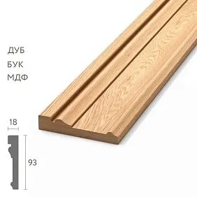
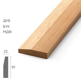
Wooden skirting board K-series STAVROScomes in a 'white' finish — sanded solid wood without coating, ready for any paint, varnish, or oil in any RAL, NCS, or Pantone color. Over 30 profiles made from kiln-dried oak and beech (moisture content 8–10%), sanded to P180 — coating applies perfectly, color comes out even from the first layer.
For all color solutions — a single product line: the same oak incarved casings, KZ-series cornicesandstaircase components. One manufacturer, one wood species, one batch — and the entire wooden interior of the house comes out in a uniform tone without having to match 'by analogy'.
Color samples: 180 rub./set. Warehouses in Moscow and Saint Petersburg. Color solution consultation: 8 (800) 555-46-75.
STAVROS — because the right baseboard color is immediately visible, while the wrong one is seen every day.


