


Article Contents:
- Principle of ornament unity: why it works
- Choosing base ornament: furniture as starting point
- Types of ornaments and their characteristics
- Ornament scaling: from furniture to walls
- Scaling rules
- Scaling example: from dresser to wall panel
- Ornament repetition in cornices: horizontal connection lines
- Types of cornices and their ornamental solution
- Creating rhythm through repetition
- Wall panels and moldings: vertical and horizontal structure
- Principles of creating panel structure
- Integrating furniture ornament into wall panels
- Door casings: frame for opening, continuation of ornament
- Classic scheme: casing + cornice
- Door leaf overlays
- Symmetry of door decor
- Symmetry and balance: foundation of classic composition
- Types of symmetry in interior
- Balance instead of symmetry
- Creating visual rhythm: element repetition
- Monotonous rhythm: calm and order
- Complex rhythm: dynamics and interest
- Gradient rhythm: intensification or fading
- Scale and proportions: coordinating element sizes
- Scale coordination rules
- Proportions within composition
- Working with color: highlighting or merging ornament
- Merging: tone on tone
- Contrast: highlighting the ornament
- Patina: effect of antiquity
- Practical example: creating a unified ornament line in the living room
- Step 1: Choosing a base ornament
- Step 2: Furniture
- Step 3: Wall panels
- Step 4: Doors
- Step 5: Ceiling
- Step 6: Color scheme
- Result
- Mistakes when creating a unified ornament line
- Mistake 1: Ornament excess
- Mistake 2: Scale inconsistency
- Mistake 3: Mixing incompatible styles
- Mistake 4: Lack of rhythm
- Frequently Asked Questions
- Can different ornaments be used in one interior?
- How many ornament repetitions are needed to create unity?
- Should the ornament be copied exactly or is general similarity enough?
- What to do if furniture is already present but wall decor is missing?
- Which ornament is easiest to scale?
- Can a unified ornament line be created in a small apartment?
- How to coordinate furniture ornament and wall interior decor if they are made of different materials?
- How to avoid a museum-like, 'palatial' feel?
- Are special skills needed to create a unified ornament line?
- Conclusion: harmony through repetition

Why do some classic interiors look cohesive, harmonious, and meticulously detailed, while others appear as a collection of beautiful but disjointed items? The secret lies in the visual connection between elements. When the ornamentdecorative insertson furniture is repeated in wall panels, cornices, door trims—the space gains a unified rhythm, symmetry, and architectural logic. This is not a random coincidence but a deliberate design effort to scale elements, create visual echoes, and form compositional axes.
Imagine: on the cabinet facade, a carved overlay with acanthus leaves; above the door, a cornice with the same motif; on the wall panels, moldings framing the space with the same ornament. The eye registers this repetition, and the brain perceives the room as orderly, structured, and noble. In this article, we will reveal the principles of creating such visual integrity: how to choose ornaments, scale them for different surfaces, and work with symmetry, rhythm, and balance.


The principle of ornament unity: why it works
Classic interiors are built on the repetition of forms, lines, and motifs. This is a legacy of palace architecture, where every decorative element—from furniture carvings to ceiling moldings—adhered to a single artistic concept. Baroque, Rococo, Empire, Neoclassical—in all these styles, ornamentation is not chaotic but ordered, governed by rhythm, symmetry, and hierarchy.
Furniture decorwith a specific ornament becomes the starting point for developing the decorative program of the entire room. If the dresser features overlays with a botanical pattern—grapevines, oak leaves, floral garlands—this motif can be extended to other areas of the room. The cornice above the window repeats the grapevine. The wall moldings are framed with a delicate ornament of oak leaves. The door trim is crowned with a floral garland. The result is a space where all elements are visually connected, creating a unified narrative line.
This does not mean the ornament must be absolutely identical everywhere. It is about visual echoes: a common carving style (Baroque opulence or classical restraint), similar motifs (botanical, geometric, figurative), the same relief depth, and scale of details. When these parameters align, the interior appears as a thoughtfully designed whole, not a random collection of decor.


Choosing a Base Ornament: Furniture as the Starting Point
Start with the furniture. It's preciselyDecorative Insertson cabinets, dressers, and tables that set the tone for the entire decorative solution. If you're planning the interior from scratch, choose overlays whose ornament you particularly like, and use them as a starting point when selecting wall decor. If the furniture is already in place, analyze its ornaments and look for moldings, cornices, and trims with similar motifs.
Our factory also produces:


Types of Ornaments and Their Characteristics
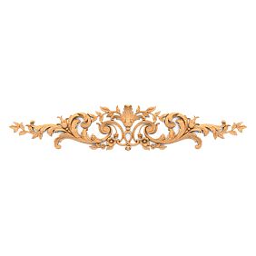
Floral ornament is the most common in classic styles. Acanthus leaves, grapevines, oak branches, floral bouquets, rosettes. This type of ornament is flexible, easily scalable, and looks organic on any surface—from small overlays to large cornices. Floral motifs create a sense of luxury, abundance, and life.
Geometric ornament—meanders, diamonds, squares, circles, intertwined ribbons. Geometry is more austere than florals, suitable for neoclassical interiors, Empire style, and Greek style. Geometric ornaments create rhythm, order, and mathematical beauty.
Figurative ornament—mascarons (masks), putti (cherubs), mythological creatures, animals. This type is more complex to scale and is used as focal points—in the centers of compositions, on key elements (above the fireplace, above the entrance door). Figurative ornament adds drama, narrative, and individuality.
Mixed ornament—a combination of floral, geometric, and figurative elements in a single composition. Baroque and Rococo adore such mixtures: acanthus leaves intertwine with rocaille (stylized shells), putti hide among them, everything framed by C-shaped scrolls. Complex, luxurious, and requires skill in balancing.
When choosing a base ornament forof furniture decor, consider the scale of the room. In spacious rooms with high ceilings, large, detailed ornaments work—they are visible from afar and create an impression. In smaller rooms, it's better to choose finer, more delicate motifs—they don't overwhelm the space.
Get Consultation
Scaling Ornament: From Furniture to Walls
Directly copying an ornament from a furniture overlay to a wall cornice rarely works. A furniture overlay measuring 150x100 mm is viewed from a distance of 1-2 meters, and the carving details are clearly visible. A cornice above a door or under the ceiling is viewed from a distance of 3-5 meters, and small details will blur into an indistinct spot. Therefore, the ornament needs to be scaled: enlarged for distant surfaces, simplified for complex elements while preserving the overall character.
Scaling Rules
Rule 1: Preserve the essence, simplify the details. If a furniture overlay has a carved acanthus leaf with fine veins, scrolls, and serrated edges, for a cornice, keep the general leaf shape and large scrolls, but simplify the serration and remove fine veins. From a distance, it will read as the same motif but won't get lost in details.
Rule 2: Increase the size of elements proportionally to the distance. If a furniture overlay with a leaf 50 mm wide is visible from 1.5 meters, a cornice visible from 4 meters should have a leaf width of 50 × (4 ÷ 1.5) ≈ 135 mm. This is a rough calculation, but it provides a guideline.
Rule 3: The depth of relief increases slower than the width. If a furniture overlay has a relief of 10 mm, a cornice should not have a relief of 27 mm (proportional to the width increase), but 15-18 mm. Too deep a relief on large elements looks coarse.
Rule 4: The repetition rhythm changes depending on the scale of the surface. On a furniture facade 600 mm wide, there may be three repeating ornament elements. On a wall 4000 mm long, there should be not 20 of the same elements (proportionally), but 7-10—otherwise, the ornament will become fussy and tiring.
Scaling Example: From Dresser to Wall Panel
Original overlay on the dresser: central composition 200x150 mm, floral ornament with two acanthus leaves, a grape cluster in the center, and C-shaped scrolls along the edges. Carving depth 12 mm, detailing is high—veins on the leaves and individual grapes are visible.
Adaptation for a wall panel (panel 1000x1500 mm, viewing distance 3-4 meters): central composition enlarged to 600x450 mm. Acanthus leaves retained their shape, but veins were enlarged, and fine serrations were simplified. The grape cluster was enlarged, the number of grapes reduced from 20 to 8-10, each grape larger. C-shaped scrolls were thickened so as not to get lost at a distance. Carving depth increased to 18 mm, but not proportionally to the size increase. Result: the ornament reads as the same as on the dresser but adapted to the scale of the wall and viewing distance.
Repeating Ornament in Cornices: Horizontal Lines of Connection
Cornices are horizontal elements running along the perimeter of a room: under the ceiling, above doors, above windows, at the border of wall panels. They create horizontal lines that structure the space and connect the walls into a unified system. By repeating the ornament of furniture overlays in cornices, you create a visual rhythm that unites vertical (furniture) and horizontal (cornices) elements of the interior.
Types of Cornices and Their Ornamental Solutions
Ceiling cornice—runs along the perimeter of the room at the junction of the wall and ceiling. This cornice is visible from afar, so the ornament should be large, clear, without small details. If the furniture has a floral ornament, the ceiling cornice can have a stylized floral border—a repeating motif of leaves or flowers, simplified to a silhouette.
Cornice above the door—a horizontal element crowning the door opening. The viewing distance is less than for a ceiling cornice (2-3 meters), allowing for more detailed ornamentation. If the furniture has a central overlay with acanthus leaves, the cornice above the door can have a simplified version of the same overlay in the center, with moldings featuring a delicate floral pattern along the edges.
Cornice at the border of wall panels—a horizontal molding dividing the wall into upper and lower parts (traditional height 90-120 cm from the floor, forming boiserie—paneled cladding). This cornice is viewed from a close distance (1-2 meters), allowing for ornamentation close in detail to furniture overlays. A repeating motif of the same leaves as on the dresser will create a direct visual connection between the furniture and the walls.
Creating Rhythm Through Repetition
Rhythm is the regular repetition of elements at certain intervals. In music, rhythm is created by beats; in architecture, by columns; in interiors, by repeating decorative details. Cornices with ornament create a horizontal rhythm that guides the eye along the perimeter of the room.
If the cornice ornament repeats the motif of furniture overlays, the rhythm is enhanced: the eye recognizes a familiar element, transfers it to the walls, creating a sense of unity. Monotonous rhythm (identical elements at equal intervals) creates calm and order. Complex rhythm (alternating large and small elements, variable intervals) creates dynamism and interest.
Example: a ceiling cornice with a repeating floral motif (leaf, flower, leaf, flower) every 300 mm. On the walls—three pieces of furniture (wardrobe, dresser, console) with central overlays of the same motif but more detailed. The eye easily recognizes the connection: the cornice ornament is a simplified version of the furniture ornament, and the entire space is perceived as a unified composition.
Wall panels and moldings: vertical and horizontal structure
Wall panels created using moldings are a characteristic feature of classical interiors. Moldings form frames on walls—rectangular, square, arched—inside which there can be a painted surface, wallpaper, fabric, or carved panels. These frames structure the wall plane, transforming it from a monotonous surface into an architectural element.
Principles of creating panel structure
Horizontal division—the wall is divided into lower and upper parts by a horizontal molding. The lower part (panel) is typically 90-120 cm high, forming wainscoting. The upper part extends to the ceiling. The boundary between them is emphasized by a molding, which may have an ornament repeating the motif of furniture overlays.
Vertical division—the wall is divided by vertical moldings into sections. Each section can contain a separate composition—a framed mirror, painting, or carved panel. Vertical moldings create a rhythm that echoes the rhythm of furniture placed along the wall.
Combined division—a combination of horizontal and vertical moldings forming a grid of rectangles. This is a classic scheme for palace interiors. Each rectangle can have its own filling, but the ornament of the moldings repeats, creating unity.
Integration of furniture ornament into wall panels
IfDecorative InsertsIf furniture has a certain ornament, the moldings of wall panels should replicate its character. Exact copying is not necessary; a visual connection is sufficient.
Option 1: Moldings with the same ornament but simplified. If furniture has a central overlay with lush Baroque ornament—acanthus leaves, volutes, rocaille—the moldings of wall panels have a thin profile with a simplified Baroque pattern—stylized leaves, light curls, without fine details. From a distance, this pattern is perceived as related to the furniture, creating unity.
Option 2: Smooth moldings + carved overlays in panel centers. Moldings form frames on the wall, and inside each frame, a carved overlay with an ornament identical or similar to the furniture's is installed in the center. This is a direct visual echo: the furniture ornament is repeated on the walls but in a different scale and context.
Option 3: Corner overlays at molding joints. The moldings themselves are smooth or have a simple profile, but at the corners of the frames they form, corner carved overlays with an ornament echoing the furniture's are installed. This is a more subtle, refined technique, creating accents at key points.
Door casings: frame for the opening, continuation of ornament
A door opening is not just a functional hole in the wall but also an important element of interior composition. Casings (strips framing the door) and cornices above the door turn the opening into an architectural accent. By repeating the ornament of furniture overlays in door decor, you create another point of visual connection, enhancing the integrity of the space.
Classic scheme: casing + cornice
The door surround is complemented by a horizontal cornice above the door. The cornice can be an extension of the surround—of the same width and profile—or a protruding element, wider and more massive than the side strips. This scheme creates a complete composition, visually increases the height of the opening, and emphasizes the classical style.
The ornament of the cornice above the door should echo the ornament of furniture overlays. If a chest of drawers has a central overlay with grapevines, the cornice above the door can have stylized grapevines in the central part. The side parts of the cornice are smooth or with a simple profile; the center is accentual, ornamental.
Overlays on door panels
In addition to framing the opening, ornament can be placed on the door panel itself.Decorative InsertsOverlays are attached to the door surface, creating relief, volume, and decorative interest. If the ornament of overlays on doors repeats the ornament of overlays on furniture, the visual connection becomes obvious, and the interior gains unity.
Typical scheme: a door with panels (recessed panels). A carved overlay is installed in the center of each panel. If there are several doors (entry door, interior doors), overlays on all doors have the same or related ornament, creating a system. Furniture with the same ornament completes the composition.
Symmetry of door decor
Doors are an element requiring strict symmetry. Casings are identical on both sides of the opening; the cornice above the door is symmetrical relative to the vertical axis. Overlays on the door panel are also arranged symmetrically: central overlay on the axis, side overlays mirrored.
This door symmetry should correlate with the symmetry of furniture in the room. If the door is centered on the wall, furniture can be arranged symmetrically on either side (two armchairs, two consoles, two cabinets). The ornament of door decor repeats in the ornament of furniture overlays, symmetry is enhanced, and the space gains classical order.
Symmetry and balance: the foundation of classical composition
Symmetry is a fundamental principle of classical interiors. It creates a sense of order, stability, and solemnity. Symmetrical arrangement of furniture, decorative elements, and ornaments relative to the central axis of the room (usually a line passing through the center of the entrance door or fireplace) forms classical orderliness.
Types of symmetry in interior
Mirror symmetry—elements to the right and left of the axis are identical, like a mirror reflection. Two identical armchairs on either side of the fireplace, two identical cabinets on either side of the window, two identical sconces on either side of a mirror. The ornament on these elements is also symmetrical: overlays on cabinets are mirrored.
Radial symmetry—elements radiate from a central point, like rays. A circular rosette on the ceiling from which moldings radiate. A round table with chairs arranged around it. Radial symmetry is less common in classicism but effective in formal spaces.
Translational symmetry (rhythm)—the same element repeats at equal intervals. A row of columns, a row of windows, a row of moldings on the wall. The ornament on each element is identical, creating a monotonous rhythm.
Balance instead of symmetry
In real interiors, perfect symmetry is not always achievable: windows are placed asymmetrically, doors are offset, and the room's architecture is irregular. In such cases, balance is used—visual equilibrium between elements of different shapes but similar "visual mass."
Example: to the right of the fireplace stands a large cabinet with carved overlays, to the left—a console + mirror above it. The cabinet is more massive, but the mirror adds visual "mass" to the left side, creating balance. The ornament on the cabinet overlays and the ornament on the mirror frame are related, which connects the elements.
Balance requires a more subtle sense of proportion than symmetry but allows working with non-standard spaces while preserving classical aesthetics.
Creating visual rhythm: repetition of elements
Rhythm is the repetition of elements that creates movement in a static space. In interiors, rhythm is formed by repeating furniture (a row of chairs), decorative elements (a row of paintings), architectural details (a row of moldings), and ornaments (a repeating motif).
Monotonous rhythm: calmness and order
Monotonous rhythm—identical elements at equal intervals. Four identical chairs along a wall, five identical windows on a facade, seven identical moldings on a ceiling. The ornament on each element is identical. Monotonous rhythm creates calmness, orderliness, and predictability. This suits formal spaces where solemnity is important.
Example: a living room with four wall panels formed by moldings. In the center of each panel—a carved overlay with acanthus leaves, identical on all panels. Along one wall—three cabinets with central overlays of the same motif. The monotonous rhythm of the ornament creates a calm, majestic atmosphere.
Complex rhythm: dynamics and interest
Complex rhythm—alternating elements of different sizes or types at variable intervals. A large cabinet, a small console, a large chest of drawers, a small chair. A large overlay on the cabinet, two small ones on the console, a large one on the chest of drawers. Complex rhythm creates dynamics, visual interest, and guides the eye around the room.
Example: a wall with three panels of different sizes. The central panel is large and contains a large carved overlay. The side panels are smaller and contain two small overlays each. The ornament on the overlays is the same motif but at different scales. Complex rhythm creates a composition with an accent in the center and supporting side elements.
Gradient rhythm: crescendo or decrescendo
Gradient rhythm—gradual change in the size, density, or intensity of elements. Moldings on a wall go from large to small, or vice versa. The ornament becomes more detailed as it approaches the focal point (fireplace, window, door). Gradient rhythm creates directionality, leading the eye to the compositional center.
Example: a corridor with five doors. The central door (at the end of the corridor) has the richest decoration—a large cornice with detailed ornamentation, carved overlays on the door leaf. The side doors have more modest decoration, the ornament is simplified, and the overlay sizes are smaller. Gradient rhythm guides the eye to the central door, making it the focal point.
Scale and proportions: coordinating element sizes
Scale is the ratio of an element's size to the size of the space it occupies. A large carved overlay in a small room overwhelms and makes the space cramped. A small overlay in a huge hall gets lost and becomes unnoticeable. Correct scale creates harmony, comfort, and visual consistency.
Rules for coordinating scale
Ceiling height rule. In rooms with ceilings 2.7-3.0 m (standard city apartments), use medium-sized overlays (100-200 mm), moldings 50-80 mm wide, cornices 80-120 mm high. In rooms with ceilings 3.5-4.5 m (historic apartments, country houses), the scale increases: overlays 200-400 mm, moldings 80-150 mm, cornices 150-250 mm.
Room area rule. In rooms up to 20 sq. m, avoid massive decoration—it will overload the space. In rooms 30-50 sq. m, medium and large decoration can be used. In halls over 60 sq. m, large decoration is necessary, otherwise it will get lost.
Rule of furniture visual mass. Sizedecorative insertsmust correspond to the massiveness of the furniture. A large carved cabinet requires large overlays (200-300 mm), otherwise they will look toy-like. A delicate console on thin legs requires small, delicate overlays (80-120 mm); large ones will clash.
Proportions within a composition
Proportions are the ratio of sizes of elements within one composition. The central overlay, side overlays, and framing moldings should be coordinated in size.
Classical proportion: the central overlay makes up 40-60% of the facade width, side overlays (if present)—15-25% each, distance to edges—10-20%. Moldings framing the composition are 5-10% of the facade width. These proportions create balance where the center dominates but does not overwhelm, and side elements support but do not compete.
Working with color: highlighting or blending ornamentation
The color of the ornament determines how noticeable it is in the interior.Decorative Insertsand moldings can be painted to blend with the base (creating a subtle, refined effect) or contrast with it (creating a bright, dramatic accent).
Blending: tone-on-tone
Overlays, moldings, and cornices are painted the same color as the furniture or walls. The ornament is discernible only through relief, play of light and shadow. This creates a subtle, noble effect suitable for restrained, elegant interiors.
Example: whiteClassic Furniturewith white carved overlays, white walls with white moldings. The ornament is not conspicuous but creates volume, structure, sophistication. With proper lighting (side light, bottom lighting) the relief comes to life, the ornament becomes visible but not aggressive.
Contrast: highlighting the ornament
Overlays, moldings are painted in a contrasting color relative to the base. White overlays on dark furniture, dark moldings on light walls, gilded ornament on a painted base. Contrast makes the ornament the main visual element, creates drama, luxury.
Example: dark oak chest of drawers with gilded carved overlays, ivory-colored walls with dark brown moldings and gilded central overlays. The ornament is visible from afar, dominates the composition, creates a formal, palatial atmosphere.
Patina: effect of aging
Patina is an artificial aging technique that adds depth, multi-layered color. Base color (white, cream, gray), over it a dark patina (brown, black, green), which is worked into the recesses of the carving, creating contrast between the protruding (light) and recessed (dark) areas.
Patination emphasizes the details of the ornament, makes the carving more expressive, adds a sense of history, noble antiquity. This is the perfect technique for classic interiors, where timeless beauty is valued over novelty.
Practical example: creating a unified line of ornaments in the living room
Consider a specific project: a living room of 35 sq. m, ceilings 3.2 m, classical style with Baroque elements. Task: create a unified line of ornaments linking furniture, walls, doors, ceiling.
Step 1: Choosing the base ornament
A Baroque plant ornament with acanthus leaves, C-shaped volutes, and a central rocaille (stylized shell) was chosen. This motif will be repeated in all interior elements in different scales and degrees of detail.
Step 2: Furniture
Display cabinet (height 2200 mm, width 1200 mm): on the upper doors, central carved overlays 250x180 mm with the full ornament — detailed acanthus leaves, large volutes, central rocaille. On the lower doors — smaller overlays 180x120 mm with a simplified version of the same ornament.
Console (height 900 mm, width 1400 mm): on the front panel, a central overlay 200x150 mm with an ornament identical to the overlay on the cabinet. At the corners of the tabletop — four small corner overlays 60x60 mm with simplified volutes.
Armchairs (two symmetrical): carved armrests with volutes, backs with fine acanthus leaf carving. The ornament is less detailed than on the cabinet but recognizable.
Step 3: Wall panels
Walls are divided by a horizontal molding at a height of 110 cm (boiserie). The lower part is painted gray-blue, the upper part — light gray. Horizontal molding width 90 mm, profile with a fine plant pattern — stylized acanthus leaves, simplified compared to the furniture overlays.
On the upper part of the walls, rectangular panels are created using vertical and horizontal moldings (width 70 mm, smooth profile). In the center of each panel, a carved overlay 300x220 mm is installed with an ornament scaled from the furniture one: the same acanthus leaves and volutes, but enlarged, simplified, carving depth increased to 18 mm. Four panels total, four overlays, creating rhythm.
Step 4: Doors
The door opening is framed by architraves 120 mm wide with a simple profile. Above the door — a horizontal cornice 150 mm high, in the center of which a carved overlay 220x160 mm is installed with an ornament identical to the overlays on the cabinet, but slightly simplified. The door leaf has two panels, in the center of each — a carved overlay 180x120 mm with the same motif.
Step 5: Ceiling
Along the perimeter of the ceiling runs a cornice 200 mm high with a repeating plant ornament — stylized acanthus leaves every 400 mm. The ornament is greatly simplified compared to the furniture one (leaf silhouette without details) but recognizable. In the center of the ceiling — a carved rosette 600 mm in diameter with the full Baroque ornament, from which the chandelier hangs.
Step 6: Color scheme
All furniture is painted dark brown (fumed oak), carved overlays on the furniture are highlighted by gilding the protruding elements. Walls are painted gray-blue (lower part) and light gray (upper part). Moldings and cornices — white, carved overlays on walls — white with a light silver patina in the recesses. Door architraves and cornice — white, overlays on the door — white with gilding, echoing the furniture.
Result
The living room is perceived as a unified whole. The acanthus leaf and volute ornament is repeated on the furniture, walls, doors, ceiling, but in different scales and degrees of detail. The rhythm of repetition creates movement of the eye around the room. Symmetry of element placement (two armchairs on either side of the console, four wall panels) creates classical order. The color scheme (gilding on furniture and doors, silvering on walls) connects warm and cool zones. The interior is luxurious but not overloaded, thanks to the ornament being not excessive but precisely dosed.
Mistakes when creating a unified line of ornaments
Mistake 1: Ornament excess
The desire to 'decorate everything everywhere' leads to overload. Ornament on every centimeter of surface — on all furniture fronts, on all walls, on all doors, on the ceiling, on the floor. The eye has nowhere to rest, the interior becomes tiring, the ornament turns into visual noise.
Solution: ornament should alternate with 'emptiness' — clean surfaces without decoration. Classic ratio: 40-60% of surface with ornament, 40-60% without. This creates a balance between decoration and calm.
Mistake 2: Inconsistent scale
Small ornament on furniture, giant on walls, medium on doors — no visual connection. Each element exists on its own, the interior falls apart into fragments.
Solution: the scale of the ornament should change smoothly, proportionally to the viewing distance and the size of the surface. Create a scale series: small (furniture, close view), medium (doors, medium view), large (walls, distant view), very large (ceiling, maximum view).
Error 3: Mixing incompatible styles
Baroque lush ornament on furniture, strict Empire style on walls, modern asymmetrical on doors. The styles conflict, creating visual dissonance.
Solution: choose one style (Baroque, Rococo, Classicism, Empire, Neoclassicism) and follow its ornamental language in all elements. Variations within the style (more lush or more restrained version) are acceptable, but not mixing different styles.
Error 4: Lack of rhythm
The ornament is placed chaotically: three overlays on one cabinet, one on another, five on a third, an arbitrary number of panels with overlays on the walls. Chaos does not create composition.
Solution: establish a repetition rhythm — one element at equal intervals (monotonous rhythm), alternation of two elements (alternating rhythm), gradual increase or decrease (gradient rhythm). Rhythm creates order, predictability, visual harmony.
Frequently asked questions
Can different ornaments be used in one interior?
Yes, but they must be compatible in style and scale. For example, a plant ornament (acanthus leaves) and a geometric one (meander) from the same era (Classicism) can be combined: plant — on furniture, geometric — on moldings. But Baroque lush ornament and minimalist modern geometric are incompatible.
How many repetitions of an ornament are needed to create unity?
At least three. One element is a coincidence, two is a coincidence, three or more is a system, a rhythm. Optimally 4-7 repetitions of the ornament in different parts of the interior (furniture, walls, doors, ceiling).
Is it necessary to copy the ornament exactly or is general similarity sufficient?
Visual connection is sufficient. The ornament on the walls can be a simplified, scaled version of the ornament on the furniture, but the general character (carving style, motif type, proportions) should match. Exact copying is not necessary and often impossible due to scale differences.
What to do if furniture already exists but there is no wall decor?
Analyze the furniture ornament: determine the style (Baroque, Classicism, etc.), main motifs (leaves, flowers, geometry), carving character (deep relief, flat, openwork). Select moldings, cornices, overlays for walls with similar characteristics. The manufacturerof solid woodusually offers collections where elements are coordinated in style.
Which ornament is easiest to scale?
Plant-based with large elements. Acanthus leaves, grape vines, floral rosettes are easily simplified for walls and ceilings: the number of details (veins, serrations) is reduced, the size of the main forms is increased. Geometric ornament is also easily scaled: meander, rhombuses, circles maintain proportions at any size.
Is it possible to create a unified line of ornaments in a small apartment?
Yes, and it is even more important than in a large house. In small spaces, visual unity is critical for a sense of integrity. Use one basic ornament in all rooms (hallway, living room, bedroom), varying its scale and density depending on the size of the room. This will create a sense of thoughtfulness and visually expand the space.
How to coordinate furniture ornament andinterior wall decor, if they are made of different materials?
Material is secondary, the form of the ornament is important. Furniture overlays made of solid oak, wall moldings made of polyurethane — but if the ornament is similar, the visual connection is preserved. Unite them by color: paint them in the same tone, and the material will cease to be noticeable.
How to avoid a museum-like, 'palatial' feeling?
Dose the ornament. A classic interior does not have to be totally ornamented. Choose 2-3 key elements (central cabinet, main wall, doorway), decorate them with ornament, leave the rest calm. Use a modern color palette (gray, beige tones instead of gold and crimson), this will soften the classic style and make it relevant.
Are special skills needed to create a unified line of ornaments?
A sense of style, understanding of proportions, basic knowledge of ornamentation are needed. If you are unsure, start with a consultation from an interior designer or a specialist from a decor manufacturer. Show photos of your furniture, get recommendations for selecting wall decor. Many manufacturers offer ready-made collections where elements are already coordinated.
Conclusion: harmony through repetition
A unified line of ornaments turns a set of objects into an interior.Decorative Insertson furniture, repeating in cornices, moldings, door frames, create a visual rhythm that organizes the space, makes it orderly, noble, classic. This is not a coincidence, but the result of conscious work with ornament: choosing a basic motif, scaling for different surfaces, creating a repetition rhythm, working with symmetry, balancing decoration and emptiness.
Classic interior design is a language of forms, where each element converses with others, creating a dialogue. Ornamentation is the vocabulary of this language. The richer the vocabulary, the more expressive the speech, but the more precisely the words are chosen, the clearer the meaning. There's no need to use all ornaments that exist in the history of decorative art. It's enough to choose one or two that resonate with your spirit and develop them across all interior elements, creating visual harmony.
Furniture decorFurniture is the starting point. It is furniture that is viewed up close, its ornamentation seen in detail. Visual threads extend from the furniture to the walls, doors, and ceiling. Moldings, cornices, and architraves pick up the motif, adapt it to their scale, and create a visual echo. The eye moves around the room, recognizing familiar forms; the brain perceives the space as holistic, thoughtful, and harmonious.
Symmetry, rhythm, balance — these are the tools of classical composition. Symmetrical furniture arrangement with identical ornamentation creates solemnity. Rhythmic repetition of ornament on moldings creates movement. Balance between decorated and plain surfaces creates breathing room, space for the eye. All of this together forms a classic interior that never goes out of style, never becomes tiresome, and brings joy for decades.
interior wall decorMoldings are not just decoration, but an architectural system. Moldings create panels, panels create structure, and structure organizes space. Ornament on moldings and overlays within panels is a visual code linking walls with furniture. Doors framed by architraves with the same ornament become part of the system. The ceiling cornice, crowning the composition, completes the visual circle. Everything is connected, everything is coordinated, everything serves a single idea.
Classic FurnitureClassic furniture demands a classic setting. A carved cabinet in an empty white space looks alien, like a museum exhibit. But when the walls are adorned with moldings featuring a related ornament, doors are framed by carved architraves, and the ceiling is crowned by a cornice with the same motif — the cabinet finds its context, becomes part of a harmonious whole. The interior comes to life, gaining depth, layering, and nobility.
Working with ornament is an art requiring taste, knowledge, and a sense of proportion. But the result is worth the effort: a space where every element is connected to others, where visual harmony reigns, where it's pleasant to be, and where one wants to return. A classic interior with a unified line of ornamentation is not just beautiful; it's intelligent, thoughtful, professional. It's an interior that commands respect, admiration, and a desire to examine the details.
Company STAVROS offers a full range ofof solid woodSTAVROS offers solutions for creating classic interiors with a unified line of ornamentation. Over 400 models of carved overlays for furniture, dozens of options for moldings, cornices, and architraves in oak and beech. Collections are stylistically coordinated: Baroque, Classical, Neoclassical elements with related ornaments that are easy to combine. The possibility of custom orders based on sketches allows for creating a unique ornament repeated across all elements of your interior.
STAVROS works with designers, architects, and private clients, providing professional consultations on element selection, ornament scaling, and composition creation. In-house production guarantees the quality of each item: precise carving, proper wood drying (8-12% moisture content), and absence of defects. Delivery across Russia and the CIS, with a stock program for fast shipment of popular models.
Create an interior that will bring joy to you and your loved ones for decades, an interior with soul, character, and individuality. Start by choosing an ornament close to your heart and unfold it across all elements of the space — furniture, walls, doors, ceiling. Use the principles of scaling, rhythm, symmetry, and balance. Dose the ornament, alternate it with emptiness. And you will get a classic interior that needs no trends.


