Article Contents:
- Philosophy of contrast: why black and wood work together
- Historical roots: art deco and Japanese minimalism
- Wooden balusters: natural or black?
- Option 1: Natural balusters + black details
- Option 2: Black balusters + light steps
- Option 3: Combined approach
- Black furniture handle: a small detail with big impact
- Black handle on wooden furniture: classic contrast
- Handles as a connecting element with balusters
- Furniture legs: continuation of vertical rhythm
- Wooden legs with black elements
- Fully black legs
- Metallic legs combined with wooden elements
- Wooden cornice with black details: horizontal element under the ceiling
- Natural wood cornice + black finials
- Black cornice + wooden brackets
- Double cornice: wood + metal
- Room after room: how to distribute contrast
- Hall and staircase: the center of contrast
- Living room: restrained contrast
- Kitchen: functional contrast
- Bedroom: intimate contrast
- Bathroom: contrast in the wet zone
- Materials and finishes: how to achieve the right black
- Matte vs. glossy
- Wood stains
- Metal blackening
- Company STAVROS: comprehensive solutions for contrasting design
- FAQ: Black Accents and Wood
- Will black make the space look gloomy?
- Which wood tone pairs best with black?
- Can other colors be added, or only black-and-wood palette?
- Are black balusters harder to maintain?
- Will this trend go out of fashion in a couple of years?
- Is it suitable for families with children?
- Where to order elements for a contrasting design?
- Conclusion: Contrast as Character

After a decade of Scandinavian aesthetics dominating with its cult of white walls, light wood, and pastel tones, interior design in 2026 undergoes a dramatic shift. The softness of Nordic style gives way to graphic contrast, where black accents — furniture handles, metallic details, dark decorative elements — create visual sharpness, character, individuality. And wooden balusters play a central role in this revolution, either becoming black accents themselves or serving as a warm natural backdrop for black details.
Imagine a staircase withwooden balustersNatural honey-colored oak, where handrails are crowned with black metal accents — wrought elements, matte steel inserts. Or the reverse: balusters painted in deep matte black, set against light oak steps, creating a graphic rhythm of verticals. In the living room — a chest on wooden turned legs with black furniture handles, above it — a mirror in a natural wooden frame, suspended by a black leather strap. On windows — wooden cornices with black metal finials. The entire space is infused with contrasting drama, where warm wood and cool black create tension, energy, modernity.
This trend is not random fashion, but a response to fatigue from the bland softness of minimalism. People want character, want their homes to have a point of view, to make visual statements. Black accents on a wooden background — this is a statement of boldness, a willingness to move away from safe solutions, an understanding of the power of contrast. This article is a complete guide to creating a contrasting interior in 2026, where wood and black work in perfect balance.


Philosophy of Contrast: Why Black and Wood Work Together
Contrast is the foundation of visual perception. The human eye notices boundaries, tonal shifts, collisions of opposites. A monochromatic space (all white or all beige) requires effort to focus — the brain does not find anchor points. A contrasting space (light against dark, warm against cool) is instantly readable, creating visual clarity and energy.
Wood — a material warm by temperature (low thermal conductivity), warm by color (yellow-brown palette), warm by associations (nature, forest, organic). Wood softens, calms, grounds.
Black — a cold, graphic, urban color. Black adds strictness, clarity, drama. It is the color of boundaries, frames, accents. Black does not relax — it organizes, structures, focuses attention.
When wood and black come together in an interior, a balance of opposites emerges: warm wood prevents black from being too cold, while black prevents wood from being too cozy and provincial. This is an alliance of nature and culture, organic and geometry, tradition and modernity.


Historical Roots: Art Deco and Japanese Minimalism
Contrasting combinations of wood and black are not new. Art Deco of the 1920s actively used black lacquer (shinuazri — Chinese lacquer technique) in combination with exotic wood species (ebony, rosewood, redwood). Black lacquered panels against walnut wall paneling, black metal railings on oak staircases — a hallmark of the style.
Japanese minimalism traditionally combines natural wood (hinoki, cedar) with black lacquer elements (urushi — traditional Japanese lacquer), black ceramics, and blackened steel. This is an aesthetic of restraint, where every element matters, where contrast emphasizes form.
In 2026, these traditions return, but with new materials and technologies: water-based matte black paints, blackened stainless steel, powder coating.
Our factory also produces:


Wooden Balusters: Natural or Black?
Stair balusters — a repeating vertical element that creates rhythm. In a contrasting design, two approaches are possible: balusters as a natural element (natural wood) among black accents, or balusters as black accents against light wood.
Get Consultation
Variant 1: Natural Balusters + Black Details
Balusters made of oak, ash, or walnut retain the natural color of the wood (honey, cream, brown), covered with transparent oil or matte lacquer, emphasizing texture. Black accents are added through:
Metallic handrail elements: A wooden handrail, but with black metal details installed at joints, turns, and wall mounting points — flanges, sockets, decorative bushings. This can be blackened steel, matte black brass, powder coating.
Black support posts: At the beginning and end of the stair run, on landings — support posts are not made of wood, but of black metal (square tube, round post) with wooden capitals on top. The contrast between massive black posts and elegant wooden balusters creates drama.
Metal inserts in balusters: Modern technique — balusters partially wooden, partially metallic. For example, the lower third of a baluster — black steel tube, the upper two-thirds — turned wooden body. Or vice versa: a wooden baluster with a black metal ring in the middle.
Black mounting: Balusters are attached to steps via visible black metal flanges (decorative plates with bolts). This is an industrial accent, emphasizing construction.
Variant 2: Black Balusters + Light Steps
The balusters are painted in a deep matte black (water-based paint, preserving the subtle readability of the wood texture under the pigment layer). The steps are light oak, beech, or bleached wood. The handrail — either also black (a full monolithic black railing), or natural wood (contrast of black verticals and warm handrail, which is touched).
Visual effect: Black balusters on light steps create a graphic silhouette reminiscent of a barcode, picket fence, or bar grille. This is modern, urban, bold. The staircase becomes a sculptural art object, a focal point of the space.
Lighting: Black balusters require good lighting — otherwise they disappear into shadows. Directional spotlights from above or underlit steps from below create dramatic chiaroscuro, emphasizing the rhythm of the verticals.
Style: Suitable for minimalist, loft, industrial, Scandinavian (black-and-white version), and Japanese interiors. Not suitable for classic, country, or Provence styles — black balusters would appear out of place there.
Variant 3: Combined approach
Every second baluster is black, the rest are natural wood. Or alternating groups: three wooden, one black metal post, then again three wooden. This creates a complex rhythm, visual play, avoiding monotony.
Or gradient: lower balusters are dark (black), gradually lightening as the staircase ascends, upper ones are natural light wood. Symbolically: from darkness to light, from earth to sky.
Black furniture handle: a small detail with a big effect
If balusters set the vertical rhythm of the space,Furniture Handles— these are micro-accent details that a person touches dozens of times a day. The handle is tactile contact with the interior, and its color, material, and shape are critical to overall perception.
Black furniture handle on wooden furniture: classic contrast
A chest made of natural oak with matte black bracket handles — an image of modern elegance. A kitchen with veneered walnut facades and black profile handles (long horizontal strips along the entire facade) — minimalist luxury. A cabinet made of light beech with black round button handles — Scandinavian restraint with character.
Material of black handles:
-
Blackened steel (oxidized, patinated — has a slight texture, not perfectly black, with gray tones)
-
Matte painted steel (powder coating — smooth deep black without gloss)
-
Black brass (warmer black with brown undertone)
-
Painted wood (oak or beech handles painted black — retain the tactile warmth of wood)
-
Black ceramic (smooth, cool to the touch, associated with Japanese aesthetics)
Shape: For contrast design, prefer clear geometric shapes — rectangular brackets, cylindrical rods, round buttons, T-shaped handles. Avoid ornate scrolls or baroque ornamentation — they conflict with the modern graphic nature of black.
Handles as connecting elements with balusters
If the staircase balusters have black metal details, black furniture handles in adjacent rooms create visual continuity. The brain interprets: 'Black metal is a systemic element of this house, a recurring motif.' This creates design cohesion.
Go further: if balusters have a specific profile (e.g., square cross-section), choose furniture handles with the same square cross-section. If balusters are cylindrical, handles are round rods. Repeating geometry enhances unity.
Legs for furniture: continuation of vertical rhythm
Furniture Legs— this is the continuation of the idea of vertical supports initiated by the staircase balusters. In contrast design 2026, legs play a key role, unifying the entire vertical architecture of the house.
Wooden legs with black elements
Precision-cut legs from oak or beech for dining tables, sofas, chairs — natural wood, but with black details:
-
Black metal caps at the bottom (ferules — protective caps, simultaneously decorative)
-
Black metal ring at the top of the leg (visual accent)
-
Black paint on part of the leg (e.g., bottom third black, upper two-thirds natural wood — 'black sock' effect)
Such legs visually harmonize with the staircase balusters, especially if those also have a combination of wood and black metal.
Fully black legs
Wooden legs stained matte black. This is a more radical solution, creating graphic contrast. A table on four black turned legs with a natural-colored oak top — contrast between support and supported, dark base and light top.
A sofa on black conical legs against light parquet — lightness, visual floating (black legs appear visually thinner than light ones of the same thickness, creating the impression that the furniture almost doesn’t touch the floor).
Metal legs combined with wooden elements
Fully metal legs (black steel, cast iron) for furniture with wooden tops or seats. Coffee table: black metal frame on four conical legs + solid walnut top. Chairs: black metal frame + oak seat.
This is industrial aesthetics, loft, but softened by the presence of wood. Metal provides rigidity, wood — warmth.
Wooden cornice with black details: horizontal element under the ceiling
If balusters and legs are verticals of space,cornices for curtains— horizontals completing the composition under the ceiling. In contrast design, the cornice becomes an architectural element, not a utilitarian rod.
Wooden cornice in natural color + black finials
Round cornice 35–50 mm in diameter, made of oak, ash, or beech, finished with natural-tone oil. Ends are black metal finials (balls, cones, cubes, cylinders). The brackets holding the cornice are also black metal.
Effect: The cornice reads as an extension of the contrast concept established by balusters and handles. Natural wood stretches horizontally along the wall, black accents at the ends create visual points and boundaries.
Combination with curtains: Curtains in neutral shades (white, gray, beige, black) or natural fabrics (linen, cotton) in natural colors look good on such a cornice. Bright-colored curtains will conflict with the philosophy of contrast minimalism.
Black cornice + wooden brackets
Reverse option: the cornice itself is painted matte black (wooden, but painted), supported by natural-color wooden brackets. Or the brackets are carved, decorative, wooden, emphasizing the contrast between the utilitarian black cornice and handcrafted wooden supports.
Double cornice: wood + metal
Two cornices side by side (for different curtain layers — tulle and drapes): one natural wood, the other black metal. This is a complex but effective solution, especially for tall windows, where such a combination reads clearly.
Room after room: how to distribute contrast
Contrast design requires balance — too much black will make the space gloomy, too little — the contrast will be lost. Let’s consider how to distribute elements across rooms.
Hall and staircase: the epicenter of contrast
Staircase — the main art object, here contrast is maximal. Wooden balusters with black metal details or fully black balusters. Entrance door — solid oak in natural color with large black handle-bracket. Hall console — wooden top on black metal legs. Mirror above the console — in wooden frame with black metal hangers. Black metal light fixture (chandelier or pendant) above the staircase.
Living room: restrained contrast
In the living room, contrast is present but softer. Sofa and chairs on natural-color wooden legs, but cushions include black (alongside gray and beige). Coffee table — wood + black metal. Shelving — wooden, but with black metal supports or black handles on drawers. Cornice wooden with black finials.
Kitchen: functional contrast
Kitchen — a space where handles are especially numerous (all facades), so black handles here create a strong visual effect. Facades in oak veneer or painted in light shades + matte black profile handles. Countertop made of wood (solid or imitation) + matte black appliances (stove, range hood, refrigerator). Dining table — wood on black metal legs. Bar stools — black metal + wooden seats.
Bedroom: intimate contrast
In the bedroom, contrast is softer, more intimate. Wooden bed (headboard in solid oak or ash) with black metal legs or without visible legs (platform). Nightstands — wood with black handle-buttons. Black metal wall sconces or bedside lamps with black bases. Cornice wooden with black details. Curtains are heavy, possibly black (blackout for complete darkness).
Bathroom: contrast in the wet zone
Wooden countertop under the sink (water-resistant finish) + matte black sink-bowl. Matte black faucets, towel racks, accessories (holders, hooks). Mirror in wooden frame or frameless, but with a wooden shelf below. Black shower tray or black tiles on the floor + wooden grid on top.
Materials and Finishes: How to Achieve the Right Black
Not every black works in a contrasting design. The tone of black, gloss level, and texture are critical.
Matte vs. Glossy
Matte black is modern, restrained, noble. It does not reflect light, does not glare, appears velvety, tactilely appealing. Matte black suits minimalist, Scandinavian, Japanese, and industrial interiors. It does not shout, does not draw attention to itself, but rather to the form it paints.
Glossy black is more decorative, glamorous, creates reflections and glares. Suitable for Art Deco, glam, and maximalist interiors. When combined with natural wood, glossy black may appear too formal and cold. Use with caution.
Satin (semi-matte) — a compromise, with a light silk-like sheen without mirror-like reflectivity. Works well on metallic details — handles, finials, baluster elements.
Paints for Wood
If painting wooden balusters, legs, handles black, choose quality paints:
-
Water-based paints with high pigment content (deep black without gray tint)
-
Chalk paints (provide a velvety matte surface, popular in Scandinavian design)
-
Acrylic enamels (more durable, create even coverage)
Important: Before painting, wood must be primed (with white or gray primer), then two to three layers of black paint are applied with intermediate sanding. This ensures color depth, uniformity, and longevity.
Metal Blackening
For metallic elements (handles, baluster details, finials), blackening can be achieved through several methods:
-
Anodizing (chemical treatment creating a black oxide film on the metal surface — natural patina)
-
Powder coating (polymer coating baked at high temperature — very durable, uniform)
-
Traditional steel blackening methods (oil, heating — creates dark gray/black with texture)
Anodized and blackened metal has slight color unevenness (gray tones, patina), creating a craft aesthetic that pairs well with natural wood. Powder coating provides an ideal even color — more modern and technological.
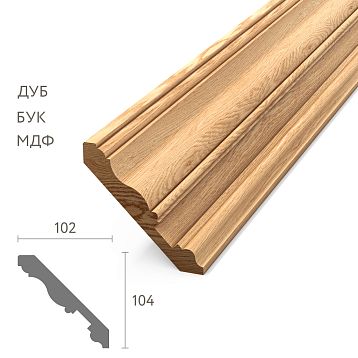
STAVROS Company: Comprehensive Solutions for Contrasting Design
Implementing contrasting design requires access to quality wooden elements and the ability to customize them. STAVROS offers:
Solid wood balusters: Over a hundred models in oak, ash, beech. Available in any color, including matte black. Combined balusters with metal inserts — custom order.
Furniture handles: Catalog of wooden and metal handles. Wooden handles can be ordered painted black. Metal handles — blackened steel, matte black brass.
Furniture legs: Precision-cut legs of various profiles in oak, beech, ash. Black finish, addition of metal elements — upon request.
Crown mouldings: Wooden crown mouldings of various diameters (28, 35, 50 mm) in oak, ash, beech. Black metal finials and brackets available as a set or separately.
Custom Projects: If you need unique elements — balusters of a specific profile, handles of non-standard shape, legs according to your sketches — STAVROS will design and manufacture them. Designer consultations will help create a cohesive contrasting interior concept.
FAQ: Black Accents and Wood
Will black make the space look gloomy?
Only if used excessively or with insufficient lighting. Black as an accent (10–20% of visual area) against light wood and white/light walls creates graphic clarity, not gloom. Key — good multi-level lighting: general light + directional spotlights + decorative accent lighting.
Which wood tone pairs best with black?
All natural tones work, but differently. Light ash + black = Scandinavian graphic design, modernity. Honey oak + black = warm elegance, balance. Dark walnut + black = drama, masculinity, depth. Avoid reddish or orange wood tones (pine with pronounced resinous appearance) — they conflict with black’s coolness.
Can other colors be added, or only black-and-wood tones?
Black and wood are the base, but you can add neutral (white, gray, beige) and natural accents (terracotta, plant green, brown leather). Use bright colors (blue, red, yellow) minimally and cautiously — they disrupt the concept's restraint. One bright accent (e.g., an emerald chair) can work, but multiple colors create chaos.
Are black balusters harder to maintain?
Dust, fingerprints, and water marks (if wiped with a damp cloth) are visible on black surfaces. More frequent cleaning is required — wipe with dry microfiber once a week, and wet clean once a month, followed by drying. Matte black hides flaws better than glossy.
Will this trend go out of fashion in a couple of years?
The contrast of black and natural wood is not seasonal fashion, but an archetypal combination with centuries-old roots (Japanese aesthetics, Art Deco). It will always remain relevant, changing only in nuances (glossy vs matte, scale of accents). If you create a quality interior with good materials, it will remain modern for decades.
Is it suitable for families with children?
Yes, but with nuances. Black surfaces require care (children’s hands leave marks), but quality finishes are easy to clean. Wooden elements are tactile, safe, and eco-friendly — ideal for children’s spaces. Avoid sharp angles on black metal details; choose rounded shapes.
Where to order elements for a contrasting design?
At STAVROS: balusters, legs, handles, cornices in wood and metal. Options for black coloring, material combinations, custom projects. Designer consultations, material quantity calculation, delivery across Russia.
Conclusion: contrast as character
Contrast design with black accents and natural wood is not just an aesthetic choice, but a statement of character. It’s an interior for people who don’t fear visual sharpness, value the balance of opposites, and understand the power of details. When wooden balusters interact with black metal elements, when furniture on wooden legs has black handles, when wooden cornices crown black finials — the space gains visual energy, rhythm, modernity without sacrificing the warmth of natural materials.
Every day, descending the stairs with contrasting balusters, opening a chest with a black handle, looking out the windows with wooden cornices — you will feel this graphic clarity, this organized order, this restrained drama. Your home will have a point of view, a visual position, a character. In an era when most choose safe neutrality, choosing contrast design is boldness, individuality, readiness for visual statements. And this is what turns a home from mere living space into an inspiring, energizing, visually pleasing space every day.