Article Contents:
- The Anatomy of White: Why One Shade Kills an Interior
- Wood Grain Texture as the Basis of Expressiveness
- Carving, Patina, Gilding: Decorative Techniques for Depth
- Legs and Base Supports: The Significance of Structural Details
- Architectural Elements as an Extension of Furniture
- Textiles and Soft Furnishings: Tactile Depth
- Color Accents: Balancing White and Tones
- Lighting as a Tool to Reveal Texture
- Mistakes That Simplify a White Interior
- Style Combination: When White Classic Meets Modernity
- Care for White Furniture: Preserving Originality
- Frequently Asked Questions
- Conclusion
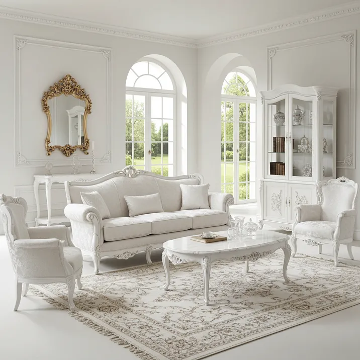
Snow-white classicism is the dream of millions of apartment and house owners. The elegance of French boudoirs, the lightness of Scandinavian apartments, the nobility of English parlors — all this is embodied in one color. But behind the apparent simplicity of white lies a treacherous trap: incorrectly chosen or processedWhite classic furnitureturns an exquisite interior into a soulless hospital room. Instead of depth and layering, you get a flat, cold, spiritless expanse.
Why does this happen? Because the color white is not unambiguous. It reveals itself through texture, relief, play of light and shadow. Carved decoration, wood grain texture, elegant linesfurniture legs— all this creates volume, visual complexity, character. It’s enough to paint details with aggressive enamel, neglect the quality of finishing, forget about layering — and a classic set loses its individuality, becoming a cheap imitation.
In this article, we will thoroughly examine how to preserve the expressiveness of white classic furniture without simplifying the interior to a primitive. You will learn about painting technologies that preserve wood texture, the role of decorative elements, color and material combinations that add depth. We will discuss typical mistakes that turn palace luxury into office sterility, and provide specific recommendations for creating a volumetric, lively, memorable space.


The Anatomy of White: Why One Shade Kills an Interior
The first and most common mistake — perceiving white as a single color. In reality, there are hundreds of shades: from cold snowy to warm cream, from transparent milk to dense plaster. Each has its own temperature, saturation, undertone. And it is precisely the variety of shades that creates the depth of a classic white interior.
Monochromatic painting of the entirecollection of furniture in classic stylewith one tone — a direct path to visual flatness. A cabinet, a chest, chairs, a tabletop merge into a single white spot, devoid of volume. The eye does not find focal points, the gaze glides over the surface, not lingering. The space seems empty, despite the abundance of objects.
The solution — working with nuances. Main planes (cabinet facades, tabletops) can be painted in a neutral white, close to the natural color of bleached wood. Carveddecorative elements— in a slightly cooler tone with a light blue undertone.Furniture legsand supports — in warm cream. These transitions are imperceptible at first glance, but create visual complexity and layering.
The temperature of white is critical for perceiving space. Cool tones with blue or gray undertones visually expand the room, add freshness, but may make the interior uncomfortable, hospital-like. They are suitable for southern rooms with abundant sunlight, where it is necessary to cool the atmosphere. Warm tones with yellow or beige undertones create intimacy, coziness, but may visually narrow the space. Ideal for northern rooms, where sunlight rarely visits.
Undertone — a hidden admixture of another color in white — determines harmony with surroundings. White with green undertone combines beautifully with natural wood and plants, creating a sense of freshness. White with pink undertone adds softness, romance, ideal for bedrooms. White with gray undertone — a choice for modern interiors where classicism combines with minimalism.
Professionals use no fewer than three to four shades of white in one room. The ceiling — the brightest, almost sterile. Walls — half a tone warmer. Furniture — even warmer and more saturated. Textiles and details — with visible undertone. This gradation creates depth without destroying the overall light palette.


Wood Grain Texture as the Basis of Expressiveness
White classic furnituremade of solid wood possesses natural texture that should not disappear under a layer of paint. The pattern of annual rings, direction of fibers, play of light on the wood surface — this is precisely the depth we strive to preserve.
Dense opaque enamel completely hides the wood structure, turning live material into a plastic imitation. Such furniture looks cheap, despite the quality of the base. This is a common mistake when repainting antique or quality modern furniture independently. The desire to achieve a perfectly white surface leads to the loss of the main virtue — the nobility of natural material.
Semi-transparent coloring technology preserves the visibility of texture. The wood is pre-treated with substances that highlight the grain pattern — stains, oils, waxes. Then a thin layer of white paint or lacquer is applied, through which the wood structure is visible. The surface becomes light but not lifeless. Each board, each element retains its individuality.
Brushing — artificial aging of wood with texture revelation — is ideally suited for white classicism. With a stiff brush or special tool, soft fibers are removed, leaving a relief surface with a pronounced pattern. After brushing
the wood is painted white, with the paint filling the grooves, while the protruding hard fibers remain slightly darker. The result is a volumetric, lively, tactilely interesting surface.
Oil with white pigment — an alternative to paint for those who wish to preserve naturalness to the maximum. The oil penetrates deep into the wood, highlights the texture, protects against moisture and dirt. The white pigment lightens the surface, but does not form a film; the wood remains "breathable." Such treatment gives furniture a noble matte finish, silky to the touch, emphasizing the naturalness of the material.
Waxing after painting adds depth. Wax fills the pores of the wood, creates a soft satin sheen, enhances the contrast between raised and recessed areas of the texture. Furniture treated with wax appears more expensive, refined, and even acquires an aged patina even in a brand-new condition.
The importance of surface preparation cannot be overestimated. Sanding with different grits, dust removal, priming — each step affects the final result. Poorly prepared surfaces will not accept paint evenly, the texture will be distorted, and stains and streaks will appear. Professionals spend two to three times more time on preparation than on painting itself.
Our factory also produces:


Carving, patina, gilding: decorative techniques for volume
Smooth white surfaces lack expressiveness. Classic style is unthinkable without decoration — carvings, moldings, patinas, gilding. It is precisely these elements that create play of light and shadow, add visual complexity, and transform furniture into a work of art.
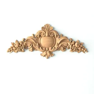
Carving into wood — a traditional way to decorate classic furniture. Carveddecorative rose outletsappliqués, friezes create relief, especially expressive on a white background. Light falling on the carved surface forms soft shadows in the recesses, emphasizing the volume of each scroll, leaf, flower. Even a simple panel with light routing looks more interesting than a completely smooth door.
Applied elements — a more affordable alternative to carving. Ready-made carved details made of wood or polyurethane are glued onto facades, creating an illusion of continuous carving.decorative elementsAfter painting, these elements made from solid wood are indistinguishable from those carved into the thickness of the door. They add depth without requiring hours of carving work.
Patina — artificial aging that gives furniture a noble patina of time. A dark patina (gray, brown, gold) is applied to a white base, then partially wiped away, leaving accents in the recesses of carvings, on edges, and areas of natural wear. The contrast between white and dark enhances relief, creating visual depth. The furniture appears as if it has served a family for decades.
Gilding and silvering — luxury of palace interiors, suitable even in modern classic spaces. A thin layer of gold or silver paint is applied to raised parts of carvings, edges, anddecorative rose outletsother details. Gold adds warmth and luxury, harmonizes with warm shades of white. Silver adds cool elegance, ideal for cool tones.
Leaf gilding — the highest level of decorative finishing. Ultra-thin sheets of gold or silver are glued onto a prepared surface, creating a genuine noble metallic finish. Leaf gold sparkles in the light, changes hue depending on viewing angle, creating a unique play of highlights. Such furniture becomes the centerpiece of the interior, its precious detail.
Polyurethane molding — an affordable alternative to wooden carving for architectural elements.Moldings, Crown Molding, — everything must correspond to the chosen era.They are painted to match the furniture tone, creating a unified style for the room. Polyurethane is easy to install, resistant to moisture, and allows creating complex decorative compositions.
Get Consultation
Legs, supports, base: importance of structural details
The lower part of furniture is often overlooked, and wrongly so. ElegantLegs for tablesexpressiveFurniture Supportscarefully craftedApronsall of this creates visual lightness and airiness, preventing the feeling of heaviness of white furniture.
Classic leg shapes are diverse: straight fluted columns, curved in the Chippendale style, turned balusters, carved with floral ornament. Each shape carries its own aesthetics and interacts differently with white. Straight legs emphasize strictness and geometry. Curved legs add elegance and dynamism. Carved legs introduce luxury and decorative appeal.
Contrasting coloringfurniture legs— an effective technique. The furniture body is white, while the legs are natural wood color, tinted, patinated, or gilded. This contrast visually lightens the furniture, creating the impression that the white mass floats above the floor. At the same time, the connection with natural material is preserved, and the interior does not lose warmth.
The height of the legs affects the perception of furniture. Low, sturdy supports provide stability and solidity, but visually weigh down white furniture. High, elegant legs create lightness and airiness, allowing visual relief of space. Forbedroom furniture in a classic stylemedium-height legs, ten to fifteen centimeters, are preferred.
Style conformity — a mandatory condition. BaroqueChair legsCurved and gilded elements are inappropriate in restrained neoclassicism. Strict rectangular legs are dull in a luxurious palace interior.Legs for chairs, Legs for coffee tablesCabinet legs must belong to one stylistic group, creating a harmonious ensemble.
Leg details demonstrate furniture quality. Rough, carelessly finished legsfurniture legsreveal cheap production. Carefully crafted, polished legs with clear transitions indicate craftsmanship and attention to detail. In white, any carelessness is doubly noticeable — there is no wood texture to distract attention.
Architectural elements as an extension of furniture
White classical furniture does not exist in isolation. It is part of the architectural environment, and its expressiveness is greatly enhanced when the furniture resonates with architectural details of the room.
Wooden baseboardPainted in the tone of the furniture, it creates visual unity. Furniture seems to grow out of the skirting board, becoming an organic part of the space. It is important to choose a skirting board with the appropriate profile — a classic high one with rounded or carved edges, not a primitive rectangular one.
Ceiling MoldingandMoldingsrepeat decorative elements of the furniture. If carved rosettes are used on cabinet facades, similar rosettes may decorate the corners of the ceiling. If the furniture has gilded details, gildeddecorative cornicewill support this theme.
Door and windowCasingsin classical style link furniture with architecture. White or patinated casings with profiles matching the profiles of furniture facades create interior unity. The room ceases to be a collection of separate items and becomes a single composition.
wooden planks on the wall— a modern approach that combines well with classic white furniture. Vertical or horizontal rails create rhythm, texture, visual complexity. Painted in white or contrasting natural wood tones, they serve as a backdrop for furniture, emphasizing its forms.
Panel wall cladding — a classic technique that enhances style. Wooden or MDF wall panels, painted in the tone of the furniture, create a noble atmosphere. Dividing walls into panels, pilasters, moldings add architectural complexity, against which furniture appears even more expressive.
Unity of color temperature between architectural elements and furniture is critical. If the furniture is warm cream-colored, skirting boards, casings, cornices must be the same tone. Mixing warm and cool whites creates dissonance, destroying interior harmony.
Textiles and soft furniture: tactile depth
White classical furniture requires textile accompaniment. Fabrics add softness, coziness, tactile variety, without which a white interior appears cold and unwelcoming.
Furniture upholstery — the first level of textile complexity. Smooth, solid white velvet or jacquard — a safe but dull choice. Textured fabrics with relief patterns, embroidery, embossing add visual interest. Tufting (carriage stitching) on the back of a sofa or headboard of a bed creates a volumetric graphic pattern of diamonds or squares.
Cushions and throws introduce color and texture accents. On a white sofa, cushions in various shades of white and beige, different textures — velvet, linen, silk, knitted fabric — are appropriate. This creates tactile variety and depth. Color accents are permissible, but they must be delicate, supporting the overall light palette.
Curtains and drapes frame the space, linking furniture with window architecture. Heavy drapes in natural linen or jacquard, painted in the tone of the furniture, add grandeur. Light tulle or organza create lightness and diffuse light. Multi-layeredness — heavy drapes plus sheer tulle — provides visual complexity.
Rugs set the tone for the lower part of the interior. A white rug — a bold solution requiring readiness for frequent cleaning. More practical are cream, beige, or gray-white rugs with subtle classic patterns. The rug should be large enough for main furniture pieces to stand on it — visually unifying the group.
Chair covers — an overlooked but effective technique. White linen or cotton covers with lace trim, bows, pleats transform ordinary chairs into refined interior pieces. Covers are easy to remove for washing, allowing the dining area’s appearance to be changed.
Color accents: balance of white and shades
A monochromatic white interior quickly tires the eye. The eye needs focal points, color accents that enliven the space without destroying its light base.
Natural wood — a natural partner to white. Solid wood countertops in natural oak, ash, walnut on whitebaseboardswooden floor,parquetmedium-tone laminate balance the whiteness of the furniture. Wooden beams, if the architecture allows, add structure and scale.
Metallic elements — bronze, brass, gold, silver — add brilliance and elegance.Furniture HandlesBronze patina, brass lampshades, mirrors in gilded frames — these accents emphasize the classic character of the interior. It is important not to overdo it: two or three metals in one room — maximum.
Pastel colors — allies of white. Soft blue, powder pink, mint, lavender, peach in small doses (decorative cushions, vases, paintings) enliven the white space, preserving its airy quality. Pastel does not compete with white but complements it, creating soft color transitions.
Greenery of plants — a living accent necessary for a white interior. Potted plants, bouquets, climbing vines add freshness and connect the interior with nature. Green is psychologically comfortable, relieving tension caused by an abundance of white. For a classic interior, suitable are plants with lush dark green leaves — ficus, monsteras, palms.
Art on the walls — an opportunity to introduce color accents in a controlled manner. Paintings, engravings, photographs in white or gilded frames support the style. The subjects may contain bright colors, but in limited quantities. A large painting with dominant beige, gray, pastel tones — ideal option.
Dark accents — sparingly, but effectively. A black mirror frame, dark gray decorative cushions, graphite candlesticks create graphic contrast, emphasizing the whiteness of main surfaces. The contrast of white and black — a classic technique, giving the interior clarity and expressiveness.
Lighting as a tool to reveal texture
Lighting shapes the perception of a white interior more strongly than any other factor. Incorrect lighting turns refined white classicism into a dull, flat, cold atmosphere.
Natural light — the main ally of white. Large windows, minimal drapery, free access to daylight make white furniture radiant, voluminous, and alive. Sunlight highlights wood texture, plays on carved details, creates soft shadows. In rooms with limited natural light, white furniture is better complemented with warmer tones.
Multi-level artificial lighting is necessary for evening hours. A single central chandelier creates flat, monotonous lighting. A combination of ceiling lights, wall sconces, floor lamps, and table lamps creates a light relief, revealing the volume of furniture and architectural details.
Directed spotlights and accent lighting highlight the beauty of individual items. A porcelain display case, carved commode, mirror in a gilded frame — each needs its own light source, isolating the object from the general background. Underlighting or side lighting creates dramatic shadows, enhancing the relief of carvings.
Light temperature is critical. Cold white light (above 4000K) makes white furniture sterile, clinical. Warm white (2700–3000K) adds coziness, emphasizes warm tones of white, softens the atmosphere. For classic interiors, warm light, close to candlelight, is preferable.
Dimmers allow controlling intensity and mood. Bright light for daytime tasks, dimmed for evening relaxation. The ability to adjust lighting makes the interior flexible, adaptable to different situations and moods.
Candles and fireplace — archaic but powerful sources of living light. The flicker of flame on white surfaces creates a magical atmosphere unattainable with electric lighting. Candlesticks on a commode, candles on a dining table, a fireplace with a white marble surround — these elements transform a classic interior into a fairy tale.
Mistakes that simplify a white interior
Even high-qualityWhite classic furnituremay appear primitive if typical interior design errors are made.
Error one — lack of texture. Smooth glossy surfaces, plastic elements, uniform textiles create visual flatness. The interior needs variety in textures: matte wood, relief plaster, coarse linen, smooth silk, knitted blanket, wrought metal. The more tactile impressions, the more voluminous the space appears.
Error two — neglecting details. Cheap plastic hardware, primitiveFurniture Handlesdecorative elements turn even quality furniture into something faceless. Details create character: qualityhandles made of brass, Decorative bracketselegant hardware — an investment in expressiveness.
Error three — ignoring scale. Small furniture in a large room disappears, large furniture in a small room overwhelms. White visually enlarges objects — this must be considered when choosing. A massive white cabinet may appear even larger than a dark counterpart of similar size.
Error four — lack of compositional center. Evenly arranged white furniture without a clear focal point creates monotony. A central piece is needed — an eye-catching carved commode, a sofa with beautiful upholstery, a dining table with strikingbasearound which the composition is built.
Error five — inappropriate economy. Buying cheap white furniture hoping that white color will hide flaws — a misconception. On the contrary, white reveals any imperfections: misaligned joints, roughness, warping. Qualitybuy classic style furniturewill cost more, but the result is incomparable.
Error six — too much white. White walls, white ceiling, white furniture, white textiles — this is not elegance, but sterility. A balance is needed: white furniture against walls of another color, or colored accents in textiles, or contrasting floor. Monochromaticity tires.
Error seven — neglecting maintenance. White furniture requires regular cleaning. Dust, stains, scratches on white surfaces are immediately noticeable. If unwilling to commit to careful upkeep, better choose darker tones or a combination finish where white is paired with natural wood.
Style combination: when classic white meets modernity
Classic furniture in modern settings often appears museum-like, detached from life. A delicate blend of classic white furniture with modern elements creates a current, lively interior without falling into stylization.
Modern art against classic furniture — a powerful contrast. Abstract painting, contemporary sculpture, art objects next to carved white chests create tension, a dialogue between eras. Classicism does not look outdated, modernity does not appear aggressive.
Minimalist accessories balance the decorative nature of classicism. Simple geometric vases, sleek lamps, modern clocks against carved white furniture create harmony. The interior is not overloaded with decor, retains air, yet does not lose its classic character.
Technologies integrated delicately. A TV in a carved white frame, hidden audio system, built-in lighting — modern conveniences do not disrupt stylistic integrity. The key is to hide wires, camouflage technology, making it inconspicuous.
wooden planks on the wall— a modern approach that complements classicism well. A rail as an architectural element has been known for centuries, but modern application — vertical or horizontal rhythmic stripes — looks current. Painted white or in contrasting tones, rails create a backdrop for classic furniture.
Industrial elements in moderation. Metal shelves, concrete surfaces, brickwork — these loft techniques can coexist with classic white furniture, creating an eclectic yet harmonious interior. The rough texture of industrial materials contrasts with the elegance of classicism, highlighting the merits of both directions.
Care for white furniture: preserving its original state
White classic furnitureRequires special care. Any stain, scratch, or dulling of the finish on white is immediately noticeable. Proper care preserves beauty for decades.
Regular dry cleaning with soft cloth removes dust before it accumulates. Use microfiber or flannel, avoid stiff brushes and abrasive materials. Dust on white creates a gray film, robbing furniture of freshness.
Wet cleaning with gentle cleaners once a week. Use specialized formulas for stained wood, avoid aggressive household chemicals. Do not allow excess moisture — water may damage the finish, seep into joints.
Polishing with wax every few months restores shine and protective properties. Natural wax creates a thin film that repels dirt, enhancing the depth of the white color. After wax application, furniture acquires a noble matte finish or a soft satin sheen.
Remove stains immediately. Spilled coffee, wine, or grease should be cleaned right away, without waiting for absorption. Blot the stain with a soft cloth, then wipe with a slightly damp cloth. Stubborn stains are removed with specialized formulas for stained wood.
Sun protection prevents yellowing. Direct sunlight over time alters the shade of white, especially if natural-based lacquers are used. Use heavy curtains during peak sun hours, or choose furniture with UV-resistant finish.
Preventive inspection reveals problems early. Minor chips, scratches, or finish cracks are easily restored if not ignored. Professional restoration every five to seven years will restore furniture to its original appearance.
Frequently Asked Questions
Can dark furniture be painted white and retain its texture?
Yes, if following proper technology. Remove old finish down to bare wood, sand the surface, apply primer. Use semi-transparent paints or lacquers, applying thin layers. Wood texture will show through, creating depth. Avoid dense, opaque enamel.
How to choose the right white shade for furniture?
Base your choice on room lighting and overall color scheme. For northern rooms with cool light, choose warm white shades with yellow or cream undertones. For southern sunny rooms, cooler tones with blue or gray undertones are acceptable. Take samples and view them under different lighting conditions.
What materials are best for white classic furniture?
Solid hardwoods (oak, beech, ash) — ideal choice. They hold shape, do not warp, and have expressive texture. MDF veneered — budget alternative, visually almost indistinguishable. Avoid particleboard and plastic — they cannot hold classic forms and quickly lose appearance.
Is patina needed on white furniture?
Patina adds depth and prevents the impression of newness. Light gray or brown patina in carved recesses and edges creates noble antiquity. But this is a matter of taste — some prefer crystal-white furniture, others — with a patina of time.
How often should white furniture finish be renewed?
Quality lacquer or oil finish lasts five to ten years without renewal with proper care. Wax requires refreshing once a year. If scratches, dullness, or loss of shine appear — it’s time for restoration. Do not wait for serious damage.
Does white classic furniture match with dark flooring?
Yes, it’s a classic combination. Dark flooring (walnut, wenge, dark oak) creates contrast, highlights the whiteness of furniture, visually lifts it above the floor. The key is sufficient lighting — otherwise, dark flooring will absorb light.
Can white furniture be used in the kitchen?
Yes, but it requires readiness for meticulous care and quality protective finish. Kitchen furniture is exposed to grease, steam, and temperature. Choose furniture with washable finish, avoid porous matte surfaces. Or use white only for upper cabinets, lower ones — natural wood.
How to avoid a hospital effect in a white interior?
Do not use one shade of white. Add textures — wood, fabric, metal. Introduce color accents through textiles and accessories. Use warm lighting, avoid cold white light. Do not paint everything white — leave contrasts.
Should you buy ready-made white furniture or paint it yourself?
Furniture from a reliable manufacturer is often better than DIY painting. Factory-applied finishes are applied under controlled conditions, following proper technology. Repainting is justified for antique furniture or unique pieces. If buying new — better to choose white right away.
How to visually lighten bulky white furniture?
Choose furniture on tall, elegantlegslegs, not on a base. Use glass inserts in facades. Avoid excessive decoration. Create contrast — white body, natural wood on legs and tabletops. Ensure good lighting — shadows under furniture create lightness.
Can you mix white furniture of different styles?
Yes, if they share a similar spirit. French Provence and English classicism can coexist. Strict neoclassicism and baroque opulence — more challenging. A unifying factor may be a single white shade and common materials. But better to stick to one style within a room.
Conclusion
White classic furnitureWhite is not just a color. It’s an interior philosophy where light, air, and clean lines prevail. But this apparent simplicity is deceptive. Behind it lie dozens of nuances: shade and texture selection, quality of finishing and painting, decorative and hardware detailing, work with light and contrast. Every detail affects perception — either creating depth and elegance, or reducing to simplicity.
Preserving wood grain texture, emphasizing relief carving, creating layering through shades and materials — this is an art requiring understanding and taste. A white interior does not forgive carelessness. Any cheap element, any style mismatch, any lighting error is instantly noticeable, destroying harmony. Yet, a well-structured white space offers a sense of lightness, freedom, timeless elegance.
Invest in quality. Choose furniture made from solid wood with professional finishing and painting. Don’t cut corners on details —quality legs, elegant handles, expressive decorative elementscreate character. Work with professionals — designers who understand classicism, craftsmen skilled in working with wood and paint.
Don’t be afraid to experiment within the style. Combine white with natural wood, introduce patina and gold, play with textiles and light. Classicism does not mean rigidity — it’s a living, evolving style capable of absorbing modern influences while remaining recognizable and noble.
If you’re looking for a reliable partner to create a classic interior using white furniture and decorative elements, consider the company STAVROS. This is not just a manufacturer, but a center of expertise in classical joinery craftsmanship and architectural decoration.
STAVROS specializes in products made from natural solid wood, preserving craft traditions while applying modern eco-friendly processing technologies. The company’s assortment includesClassic Furniturevarious styles — from restrained neoclassicism to luxurious baroque. Each item is crafted with attention to detail, quality finishing, and preservation of natural wood beauty.
A special place in the STAVROS catalog is occupied by components that allow you to create or update classic furniture.Furniture Legs and SupportsVarious styles — from simple conical to intricate carved forms — allow you to give furniture individuality.Decorative Inserts, Outlets, BracketsMade from solid wood or polyurethane, they allow you to enrich simple facades, turning standard furniture into unique pieces.
For creating a cohesive interior, STAVROS offers a full range of architectural trim and decorative elements.Wooden Skirting Boards, Crown Molding, Casings, railsMade from the same solid wood as the furniture, they create a harmonious connection between furniture pieces and room architecture.
Polyurethane moldings— an affordable alternative to expensive plaster and wooden elements.Moldings, Crown Molding, Decorative InsertsPolyurethane elements are easy to install, moisture-resistant, and paintable in any color. They allow you to create rich architectural decoration without significant costs.
STAVROS works with both private clients and professionals — architects, interior designers, construction companies, furniture workshops. Custom manufacturing is possible based on individual drawings and sketches, material selection, finishes, and dimensions tailored to specific projects. Company consultants will help calculate material quantities, select components, explain installation and maintenance specifics.
STAVROS product quality is confirmed by compliance certificates, ecological assessments, and thousands of positive customer reviews. The company uses only certified wood of legal origin, avoids toxic materials, and adheres to safety standards. Each item undergoes multi-stage quality control — from raw material acceptance to packaging of finished products.
Convenient logistics with own warehouses in Moscow and St. Petersburg ensures prompt delivery across Russia. Working with reliable transport companies allows delivery to any region with guaranteed safety. Professional packaging protects items during transport.
The STAVROS online store with detailed descriptions, photos, technical specifications, and video reviews allows you to explore the assortment and place an order conveniently and quickly. Company managers will answer any questions, assist with selection, and advise on product application.
Choosing STAVROS, you get not just materials and components, but a partner in creating a classic interior that will delight you for decades. Quality proven by time, honest prices without hidden markup, attentive service, wide assortment — the foundation of the company’s philosophy.
STAVROS — your guide to the world of true classic furniture, where white reveals its fullness while preserving the depth, texture, and nobility of natural materials!