


Article Contents:
- What decorative battens bring to interior design
- Visual rhythm and living surface
- Accent without overloading the space
- Zoning without partitions
- Working with room proportions
- Where to use decorative battens in interior design
- What decorative battens bring to interior design
- Visual rhythm and living surface
- Accent without overloading the space
- Zoning without partitions
- Working with room proportions
- Where to use decorative battens in interior design
- On an accent wall
- In the TV area
- In the sofa or bed area
- In the entryway
- In the study
- In niches, passages, and portals
- On the Ceiling
- As partitions and screens
- Decorative battens in the interior of different rooms
- Living Room
- Bedroom
- Entry Hall
- Kitchen
- Office
- Commercial spaces
- Which decorative battens are best to use in the interior
- Narrow battens: graphics and delicacy
- Medium profiles: versatility without compromise
- Wide and expressive battens: strength and character
- Flat and three-dimensional profiles
- Vertical and horizontal solutions
- How to choose the material for decorative battens for the interior
- Natural wood: living surface
- Oak: a wood species with character
- Beech: a wood species for fine work
- What to choose under enamel
- What to choose for tinting
- How material affects interior mood
- How to choose decorative slat color in interior
- Under the floor level
- Under furniture
- In contrast to walls
- To match calm finish
- Light and dark slats: when each works
- How to choose slat size and spacing: precise calculation
- Slat width and room scale
- Slat thickness and volume perception
- Spacing between slats: rhythm of space
- How not to overload the interior
- Vertical or horizontal slats in interior
- When vertical is better
- When horizontal is appropriate
- How direction changes space perception
- How to use decorative battens in different styles
- Modern style
- Minimalism
- Neoclassicism
- Scandinavian Style
- Eco and natural interiors
- Eclecticism
- Decorative battens and space zoning
- Soft room division
- Battens between kitchen and living room
- Hallway zoning
- Batten partitions
- What to best combine decorative slats with in interior design
- With moldings and wall panels
- With furniture fronts
- With lighting
- With textiles and upholstered furniture
- With stone and plaster
- When slats enhance the interior, and when they hinder
- When slats are appropriate
- When there are already too many accents
- When the wrong scale is chosen
- When the interior lacks breathing space
- Typical mistakes when using decorative slats
- How to choose decorative slats for your interior: a checklist
- FAQ: answers to common questions about decorative slats in interior design
- Conclusion
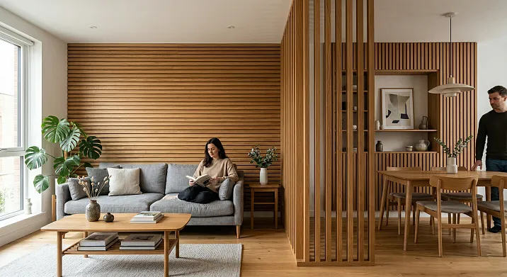
There are things that change a space quietly—without rearranging furniture, without major renovations, without demolition or bloodshed. Wooden slats are exactly that kind of thing. A vertical strip of wood on the wall, repeated in a rhythm—and suddenly the room becomes different. Not 'redone,' but truly different: deeper, warmer, with character.
That's why decorative slats in interiors today are not a designer's whim or a trendy seasonal decoration. They are a tool. Practical, precise, responsive. They work in apartments and offices, in bedrooms and showrooms, in minimalism and neoclassicism. But like any tool, they require understanding: where to apply them, what format to choose, how not to overdo it.
In this article—everything you need to know aboutwooden slats in interior designfor someone who wants to achieve a beautiful, cohesive, long-lasting result. Without designer jargon, without fluff—just the essentials.


What decorative slats bring to an interior
Before discussing selection and application, it's worth answering a fundamental question: why are they even needed? After all, a wall can simply be painted—and that's quite sufficient.
Sufficient—yes. But 'sufficient' and 'good' are different things.


Visual rhythm and living surface
Imagine a wall without texture. Even color, smooth plaster. Beautiful? Perhaps. But flat. The human eye seeks rhythm — repetition, pauses, accents. Battens provide exactly that: vertical layout creates a rhythmic pattern that is perceived as architecture, not decoration. The wall 'comes alive' — not literally, but that's exactly how it feels.
With side or directional lighting, each batten casts a thin shadow. The pattern changes throughout the day — one look in the morning, another in the evening. This is that very 'warmth of natural materials' that is so difficult to put into words.
Our factory also produces:


Accent without overloading the space
There are ways to create an accent zone in a room: a bright wall, a panel, a mirror, a large painting. Battens are a different story. They create an accent not with color, but with volume and rhythm. It's delicate. No 'shouting' solutions, no visual noise. A batten wall works within the same palette as the entire interior — and yet stands out.
Get Consultation
Zoning without partitions
Open floor plans are wonderful and challenging at the same time. The kitchen flows into the living room, the living room into the work area. How to divide the space without losing light and the feeling of spaciousness? Battens are one of the best answers. An accent wall behind the sofa, a batten structure as a 'marker' of a zone — and the readability of the space increases sharply without a single partition.
Working with room proportions
Do the ceilings seem low? Vertical battens draw the eye upward — visually increase the height. Does the room seem narrow and long? Horizontal layout on one wall visually expands it. Battens are working with geometry through the optics of perception. A simple but effective technique.
Where can decorative battens be used in the interior
The question 'where?' is more important than the question 'which ones?'. Because the correct application area determines the format, width, spacing — and ultimately the entire result.
Decorative battens in interior design: how to use wooden battens for walls, zoning, and accent decor
There are things that change a space quietly—without rearranging furniture, without major renovations, without demolition or bloodshed. Wooden slats are exactly that kind of thing. A vertical strip of wood on the wall, repeated in a rhythm—and suddenly the room becomes different. Not 'redone,' but truly different: deeper, warmer, with character.
That's why decorative slats in interiors today are not a designer's whim or a trendy seasonal decoration. They are a tool. Practical, precise, responsive. They work in apartments and offices, in bedrooms and showrooms, in minimalism and neoclassicism. But like any tool, they require understanding: where to apply them, what format to choose, how not to overdo it.
In this article—everything you need to know aboutwooden slats in interior designfor someone who wants to achieve a beautiful, cohesive, long-lasting result. Without designer jargon, without fluff—just the essentials.
What decorative slats bring to an interior
Before discussing selection and application, it's worth answering a fundamental question: why are they even needed? After all, a wall can simply be painted—and that's quite sufficient.
Sufficient—yes. But 'sufficient' and 'good' are different things.
Visual rhythm and living surface
Imagine a wall without texture. Even color, smooth plaster. Beautiful? Perhaps. But flat. The human eye seeks rhythm — repetition, pauses, accents. Battens provide exactly that: vertical layout creates a rhythmic pattern that is perceived as architecture, not decoration. The wall 'comes alive' — not literally, but that's exactly how it feels.
With side or directional lighting, each batten casts a thin shadow. The pattern changes throughout the day — one look in the morning, another in the evening. This is that very 'warmth of natural materials' that is so difficult to put into words.
Our factory also produces:
Accent without overloading the space
There are ways to create an accent zone in a room: a bright wall, a panel, a mirror, a large painting. Battens are a different story. They create an accent not with color, but with volume and rhythm. It's delicate. No 'shouting' solutions, no visual noise. A batten wall works within the same palette as the entire interior — and yet stands out.
Get Consultation
Zoning without partitions
Open floor plans are wonderful and challenging at the same time. The kitchen flows into the living room, the living room into the work area. How to divide the space without losing light and the feeling of spaciousness? Battens are one of the best answers. An accent wall behind the sofa, a batten structure as a 'marker' of a zone — and the readability of the space increases sharply without a single partition.
Working with room proportions
Do the ceilings seem low? Vertical battens draw the eye upward — visually increase the height. Does the room seem narrow and long? Horizontal layout on one wall visually expands it. Battens are working with geometry through the optics of perception. A simple but effective technique.
Where can decorative battens be used in the interior
The question 'where?' is more important than the question 'which ones?'. Because the correct application area determines the format, width, spacing — and ultimately the entire result.
On an accent wall
The classic and most common scenario. One wall—behind the sofa, behind the bed, opposite the entrance—is covered with vertical slats. The other three walls are neutral. Balance is maintained, an accent is created.
An accent wall made of slats works in any room—there are no exceptions. The only question is which format to choose for a specific space.
In the TV area
The TV wall is always the focal point of the living room or bedroom. Slats frame the screen, creating a 'frame' for it and adding depth. With the right color choice, the TV no longer looks like a 'black rectangle on a white wall'—it becomes part of the interior composition.
Important nuance: in the TV area, slats are often mounted with a gap from the wall—for integrating LED lighting. Warm backlighting behind the slats creates a soft glow effect that literally transforms the evening lighting of the room.
In the sofa or bed area
Behind the sofa and behind the headboard, slats serve as a 'background'—structured, warm, alive. It's not an accent that shouts. It's what makes the space behind a person comfortable and complete.
In the hallway
The hallway is the first space a guest sees. And the last thing the owner sees when leaving. It's the 'face' of the apartment, and decorative slats here serve a dual purpose: they create character and protect the lower part of the wall from scratches and impacts. Especially relevant where there are children.
In the study
A study requires atmosphere. Not just a 'comfortable place to work,' but a space that fosters concentration and emphasizes the seriousness of intent. Dark-toned oak slats provide exactly that atmosphere.
In niches, passages, and portals
Niches are one of the most interesting application areas. A niche with slatted interior cladding is no longer just a recess in the wall, but a full-fledged architectural detail. Passages between rooms, portals around doorways, fireplace surrounds — all of these work excellently in combination with slats.
On the ceiling
A slatted ceiling is one of the boldest techniques. Not slats across the entire ceiling, but fragmentarily: above the dining area, in the hallway, in a niche. This creates a sense of 'coveredness' and coziness where there was previously just a white rectangle.
As partitions and screens
A lightweight slatted partition with gaps is a full-fledged design element. It visually divides the space, does not block light, adds texture, and allows the area behind it to be 'read'. Ideal for separating the kitchen and living room, or a work area and a relaxation zone.
Decorative slats in the interiors of different rooms
The same slat in different rooms — completely different tasks and different results. Let's break it down room by room.
Living Room
The living room is the main space of the apartment, and it has the highest requirements. Here, slats can serve several roles simultaneously: creating an accent wall behind the sofa, framing the TV area, forming a niche for decor.
For living rooms with high ceilings (from 2.8 m) — slats 70×7 or 90×10 mm. For standard apartments — 40×5 or 70×7 mm. Fromthe catalog of modern-style wooden moldingsit's easy to choose an option for any scale of living room — from a compact studio to a large hall.
Bedroom
The bedroom is a space of silence. Here, battens should not 'sound' loud. Delicate rhythm, calm tone, moderate step. The best application area is the wall behind the headboard. 24×5 or 40×5 mm battens made of light beech, tonal color. The result is a soft, soothing background that is felt but does not 'shout'.
Entryway
In the hallway, battens pair well with a console and mirror. It is precisely this tripartite technique — battens + console + mirror — that creates a complete 'image' of the hallway. For small hallways, choose light shades and a vertical layout — it visually raises the ceiling.
Kitchen
In the kitchen, battens are more often used in the lower zone, as a dividing element between the kitchen and living room, or in backsplash design (when using water-resistant coating). Material is especially important here: oak with an oil finish is the best option for high-humidity areas.
Office
Dark oak battens combined with woodenmoldings and cornices— this is a study system that creates an atmosphere of solidity. Bookshelves, battens on the wall behind the workspace, cornices around the perimeter — the interior looks cohesive and well-thought-out.
Commercial spaces
For offices, meeting rooms, reception, and waiting areas, decorative wooden battens convey corporate culture through material. Natural wood is not just beautiful; it's a meaningful statement: quality, stability, attention to detail.Interior Rail RK-002and the RK-001 batten — formats that work in both residential and commercial contexts.
Which decorative battens are best to use in interior design
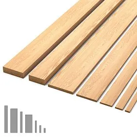
Batten formats are not just sizes. They are different characters, different tasks, different visual results.
Narrow battens: graphics and delicacy
15×5 mm and 24×5 mm slats are the thinnest, 'graphic' format. From a distance of 3 meters, they are perceived almost like lines drawn on the wall. Ideal for small rooms, Scandinavian style, delicate accents in bedrooms, and furniture inserts with dense layouts.
Narrow slats don't feel heavy, don't 'cut' the space, and don't compete with furniture. They create a background — light, airy, almost weightless.
Medium profiles: versatility without compromise
40×5 mm slats are the workhorse. They are equally suitable for walls, furniture fronts, hallways, and living rooms. Visible from any distance, they don't overload the space and work well in both light and dark finishes.
70×7 mm slats are on a larger scale. They are needed when a wall should have weight. When the slat is not a background, but an accent.
Wide and expressive slats: strength and character
90×10 mm is a slat with a statement. With side lighting, it casts a deep shadow and creates a pronounced relief. This format is needed in large spaces, TV zones with backlighting, at reception desks, and in meeting rooms. In a small room — it feels heavy; in a large hall — it works flawlessly.
Flat and volumetric profiles
Flat slats (5–10 mm thick) — texture on the wall, moderate relief. Volumetric profiles 60×23 mm and 80×23 mm — that's architecture. Framing niches, door portals, decorative structures. Not 'decor,' but an 'architectural element.'
Vertical and horizontal solutions
Vertical slats are the most common option. They lift the gaze, enhance the feeling of height, and create a strict, cohesive geometry.
Horizontal slats are a rarer, more interesting technique. They work well in wide, low spaces where you need to add 'width' rather than 'height'. In bathrooms and bedrooms with low ceilings.
How to Choose Material for Decorative Slats in Interior Design
Material is not a technical specification, but an artistic choice. It determines not only durability but also the mood the slats will create in the space.
Natural wood: a living surface
No synthetic analogue creates the sensation that real wood does. This isn't pretentiousness—it's the physics of perception. A wooden surface absorbs and reflects light differently than PVC or MDF. Tactilely—different. Visually—different. That's precisely why wood is perceived as 'warmth', not just as a 'decorative finish'.
Oak: a wood species with character
Oak has an open, large, expressive grain. Golden-brown tones, visible growth rings, a characteristic 'marble' pattern with a radial cut.oak slats— a choice for those who want the wood to 'speak'. For stains, oils, semi-transparent varnishes—oak is ideal. The grain is only enhanced with such finishes.
Oak is also the most durable of the commonly available species. Janka hardness is about 5.5 kN. This means oak slats will last for decades without visible wear—even in commercial spaces with high traffic.
Beech: a wood species for fine work
Beech is homogeneous, fine-grained, almost silky. A neutral creamy-pink tone. Closed fine pores - an ideal base for painting. Enamel applies to beech evenly, without gaps or porosity. That's whyoak planksit's the best choice for white, pastel, gray, lavender, olive, and any other delicate color solutions.
Beech is slightly less resistant to humidity fluctuations than oak. In bathrooms and kitchens, it requires special moisture-resistant finishing.
What to choose for enamel
Beech - without a doubt. Minimal surface preparation, perfectly even coating.
What to choose for tinting
Oak - expressive, vibrant toning with open texture. Beech - neutral toning, 'calm'.
How material affects interior mood
| Species | Mood | Style |
|---|---|---|
| Light oak | Warmth, naturalness | Scandinavian, eco, modern |
| Dark oak | Seriousness, status | Neoclassical, classic, study |
| Beech white enamel | Purity, lightness | Minimalism, modern, Provence |
| Beech pastel tint | Softness, coziness | Scandinavian, bedroom |
How to choose the color of decorative slats in the interior
The color of the slat is not an isolated solution. It is part of the color system of the entire room. And if this connection is broken, neither the most beautiful profile nor perfect installation will help.
To match the floor
The safest and most organic approach is slats in the tone of the floor or slightly lighter. The interior is 'assembled' from bottom to top: the floor and slats form a single tonal line, while the wall remains a neutral background.
Under furniture
If the room has dark furniture, battens can support it. The same tint, a slightly lighter shade. Material unity creates spatial cohesion.
In contrast to the walls
Dark battens on a light wall — a classic and very effective technique. Graphics, clarity, strength. Requires self-confidence — and confidence in the interior. Not for small rooms with low ceilings.
To match the calm finish
Tonal layout — battens 1–2 tones darker or lighter than the wall — is a delicate way to add texture without contrast. The wall appears 'worked out' but not 'accented'.
Light and dark battens: when each works
| Option | When appropriate |
|---|---|
| Light battens | Small rooms, soft accent, Scandinavian style |
| Dark Slats | Large Spaces, TV Zone, Study, Neoclassical |
| Tonal Slats | Bedroom, Background Texture, Delicate Rhythm |
| Contrast Slats | Accent Wall in Living Room, Commercial Interiors |
How to Choose Slat Size and Spacing: Precise Calculation
Size is not a matter of taste. It's a matter of scale compatibility and visual logic.
Slat width and room scale
The rule is simple: the smaller the room, the narrower the slat should be. In a small room (10–14 m²), a slat wider than 50 mm starts to 'feel oppressive'. In a spacious hall (25+ m²), a 24 mm slat gets lost—it simply isn't visible as an accent.
| Room area | Recommended slat width |
|---|---|
| Up to 14 m² | 15–24 mm |
| 14–22 m² | 24–40 mm |
| 22–35 m² | 40–70 mm |
| 35+ m² | 70–90 mm |
Slat thickness and sense of volume
Thickness defines the relief — literally. At 5 mm, the wall looks 'lined'. At 10 mm, volume and shadow appear. At 23 mm, it's already sculptural work with the surface.
For most residential interiors, 5–10 mm is sufficient. 23 mm is for portals, niches, special structures.
Spacing Between Battens: The Rhythm of Space
Spacing is the most influential parameter. It determines the rhythm density, the 'breathability' of the surface, and the overall feel of the wall.
| Step | Effect |
|---|---|
| 15–25 mm | Dense texture |
| 30–50 mm | Classic balanced rhythm |
| 50–80 mm | Airy layout |
| 100+ mm | Light sparse verticals |
The most important rule: the spacing should not be less than the width of the slat. Otherwise, the gaps 'disappear'—and the wall turns into a solid wooden surface without rhythm.
How to avoid overloading the interior
If in doubt—choose a wider spacing. Air in the layout is always better than density. It's easier to overdo it with slats than it seems.
Vertical or horizontal slats in interior design
This is one of the most frequent questions—and one of the most important.
When vertical is better
Vertical slats work in 90% of cases. They lift the gaze, create a sense of height, and give the space elegance and lightness. In almost any room, in any style—vertical layout is organic.
Vertical slats are especially good in hallways and corridors with low ceilings: they literally 'pull' the space upward.
When horizontal is appropriate
Horizontal slats are a bold, unconventional technique. They expand the room horizontally — useful in narrow and tall spaces where ceilings are already high enough, but width 'loses out'.
In bathrooms, small bedrooms with high ceilings, offices with non-standard proportions — horizontal layout can be an ideal solution.
How direction changes the perception of space
| Direction | Visual effect | When to use |
|---|---|---|
| Vertical | Raises the ceiling | Everywhere, especially with low ceilings |
| Horizontal | Expands the space | Narrow high rooms |
| Diagonal | Dynamics, movement | Rare, bold concepts |
How to use decorative battens in different styles
Modern style
Strict lines, uniform rhythm, no ornament. Battens 40×5 or 70×7 mm in white enamel or dark tint. Vertical layout, moderate spacing. For modern style, a batten is an architectural structure, not a decoration.
wooden millwork in a modern stylefrom STAVROS — battens, corners and moldings with clear geometric profiles, created specifically for such application.
Minimalism
Tonal battens — in the color of the wall or a shade lighter. Thin cross-section (15×5 or 24×5 mm), wide spacing. The wall is 'worked on', but does not 'make a statement'. Decoration is present, but it is invisible — that is minimalism in practice.
Neoclassicism
In neoclassicism, battens work within a system. They are framed by moldings, combined with cornices and baseboards. Single wood species, single tint — and a 'panel' system is created without heavy joinery.Moldings and cornicesUsing the same wood species as the slats is a systematic approach that yields a cohesive interior result.
Scandinavian style
Light beech with transparent oil or matte varnish, narrow slats with wide spacing. No color intrusion—only texture and the warmth of natural material. Slats in Scandinavian interiors are the 'honesty of wood' in its purest form.
Eco- and natural interiors
Oak or beech without coating, or with natural oil. A maximally natural look. Slats pair well with linen, wool, jute, and raw stone. This is an interior where every material is honest—and wood fits perfectly in this company.
Eclecticism
Eclecticism loves unexpected solutions. Dark slats in a light interior, or vice versa—light slats in a rich, contrasting space. The main rule: slats must 'converse' with at least one other element in the room—with the floor, furniture, or textiles. Otherwise, eclecticism turns into chaos.
Decorative slats and space zoning
The issue of zoning in open floor plans is one of the key challenges in modern interior design. And slats are one of the most elegant tools for solving it.
Soft room division
An accent wall with slats in the sofa area 'separates' the living room from the kitchen—without walls, without losing light, without reconstruction. It's a visual boundary: the eye 'reads' different zones, even if they are not physically separated.
Slats between the kitchen and living room
Here, slats are often used in the form of a partition or screen—vertical planks with gaps through which light and space are visible. This is a light, openwork division—airy yet functional.
Hallway Zoning
If the hallway is combined with a corridor or transitions into a living area without a clear boundary, slats help 'mark' the beginning of a new space. An accent wall at the entrance or a slatted structure as a 'gate' serves as a visual signal of a zone change.
Slatted Partitions
A partition made of wooden slats is an independent structural element. The planks are attached to the floor and ceiling, with gaps between them. This creates a semi-transparent boundary: it divides but does not block.wooden interior railsin 40×5 mm and 70×7 mm formats are the most suitable choice for such structures.
What to Best Combine Decorative Slats With in Interior Design
Slats are not loners. They come to life when combined with other elements.
With Moldings and Wall Panels
Molding frames the slatted field, creating a 'frame'. The wall is divided into panels, each being an independent decorative unit. This is a classic technique in neoclassical and transitional interiors.Wooden moldings and cornicesSTAVROS are made from the same wood species as the slats, ensuring material unity.
With furniture fronts
Wall battens and furniture battens in the same wood species, in the same tone. The wall and furniture 'speak' the same language. This is the principle that makes an interior effortlessly cohesive.
With lighting
LED strip behind the battens is one of the most spectacular evening techniques. The warm glow from the gaps between the battens and the wall creates a feeling that the wall is 'glowing from within'. Requires planning before installation: the gap must be provided for in advance.
With textiles and upholstered furniture
Wooden battens + linen sofa + wool throw = interior harmony described by the word 'cozy'. Natural materials enhance each other.
With stone and plaster
The contrast of wood and stone is one of the most expressive in modern interiors. Battens on one wall, decorative plaster or stone cladding on another — and the room gains tactile variety that makes it interesting.
When battens decorate an interior, and when they hinder
An honest question that is rarely answered honestly. But it should be.
When battens are appropriate
Battens are appropriate when they have a clear purpose: to create an accent, add texture, zone a space, draw the eye upward. When they are part of a considered concept, not just a 'whim'.
When there are already too many accents
If the room already has patterned wallpaper, a bright carpet, a large panel, and colorful textiles, the battens will become just another 'voice' in an already noisy chorus. The rule of one accent has not been canceled.
When the wrong scale is chosen
Wide battens in a small room are a wall that 'rushes' at you. Narrow battens in a large hall get lost, don't read, don't work. Scale is a critical parameter.
When the interior lacks air
Too frequent spacing + too wide batten = visual noise. The wall seems 'filled' to capacity. Add air — increase the spacing, reduce the width of the batten.
Typical mistakes when using decorative battens
Briefly and honestly — the ten most common mistakes:
-
Battens on all four walls — the interior 'collapses', there is no resting point for the eye
-
Wrong scale — wide batten in a small room or narrow in a large one
-
Too dark a tone for a small space—it feels oppressive and constricting
-
Too frequent spacing—density instead of rhythm
-
No connection with the furniture and floor—the battens 'float' on their own
-
Unclear purpose—neither an accent, nor a background, nor zoning, just 'battens'
-
Overload from adjacent decorative elements—battens + wallpaper + paintings + vases = chaos
-
Wrong direction—vertical battens in an already tall room with low width
-
Lack of thoughtful lighting—battens with lighting require planning, otherwise wires stick out
-
Buying 'based on a picture' without considering actual proportions—someone else's room is different
How to choose decorative battens for your interior: a checklist
Before placing an order—answer six questions:
-
What room and what is its character? — A bedroom requires delicacy, a living room requires scale, a study requires weightiness
-
What is the area and ceiling height? — Determines the width of the slat and the direction of the layout
-
Need an accent or background? — Accent: contrasting dark slats. Background: tonal, neutral
-
What interior style? — Style determines the wood species, color, profile
-
What color already dominates? — Floor, furniture, doors — all are anchor points for the slat tone
-
Where exactly will the slats be? — Wall, niche, furniture facade, ceiling — each zone has its own requirements
Answered all six — the choice is 80% made. The rest is selecting the specific cross-section and wood species.
FAQ: answers to common questions about decorative slats in interiors
Where is it better to use decorative slats in interiors?
Accent wall in the living room behind the sofa — a classic. TV zone — effective. Headboard in the bedroom — delicate. Entryway — functional and beautiful. Each has its own logic — but nowhere is there 'wrong' application with the correct format selection.
Are slats suitable for a small room?
Yes, but with conditions: narrow profile (15–24 mm), light tone, wide spacing, vertical layout. Then slats visually expand and elevate the space, rather than narrowing it.
What's better: light or dark slats?
Depends on the goal. Light ones are softer, airier, for small rooms and delicate accents. Dark ones are more expressive, graphic, for large spaces and strong accents.
Which slats to choose for a TV zone?
70×7 or 90×10 mm, dark tint or contrasting color, vertical layout. The slat field should extend beyond the TV by 35–40 cm on each side. Optionally, a gap for LED backlighting.
Are slats suitable for a bedroom?
Perfectly — in the headboard area. Delicate tonal decor, narrow profile, light or neutral tone. Slats create a 'background' for the bed, adding depth to the wall without excessive noise.
Can slats be used on the ceiling?
Yes. Fragmentarily — above the dining area, in the hallway, in a niche. This is a bold technique that creates a sense of coziness and 'enclosed' space.
How to combine slats with furniture?
A single breed or a single tone. Slats on the wall + slats on furniture made from the same material = integrity of the interior. This is the main rule.
Which slats are best for a modern interior?
Slats 40×5 or 70×7 mm, oak or beech for enamel or tinting, vertical layout. For a modern style — clear geometry and absence of unnecessary details.
When do slats help zone a space?
In open-plan layouts, in studios where the kitchen and living room are one whole. An accent wall with slats visually 'separates' one zone from another without physical partitions.
How not to overload the interior with slats?
Slats — only on one wall. Spacing — not less than the width of the slat. Additional strong decorative accents in the same zone — minimal. And always — air: the space between the slats is more important than the slats themselves.
Conclusion
Decorative slats in the interior are not a tribute to fashion or a temporary fascination of designers. It is a material that solves real problems: creates rhythm, adds warmth, works with proportions, helps with zoning. At the same time, it requires understanding: which cross-section, which spacing, which wood species, which direction.
Properly chosen slats make the interior integral and lively. Incorrect ones — overload it or get lost. The difference between these two results is in the details: in width, in tone, in spacing, in material.
STAVROS is a Russian manufacturer of wooden decorative slats, moldings, cornices, skirting boards, and millwork made from solid oak and beech. The RK-001 slat is available in seven cross-sections (15×5 to 80×23 mm) with a standard length of 2400 mm. The RK-002 interior slat is for more complex decorative tasks. All formats are made from oak and beech, for painting and tinting. Some items are in constant stock, custom production — 5–10 working days. Delivery across Russia via SDEK, pickup in Moscow and St. Petersburg. Full assortment decorative battens and millwork for interiors— on the official website stavros.ru.


