Article Contents:
- Color Revolution in Modern Design
- Philosophy of Color Selection for Wooden Decor
- Warm Shades: Energy and Coziness
- Cool Tones: Freshness and Elegance
- Neutrals with Character
- Technology of Painting Wooden Baseboards in Bright Colors
- Wood Preparation: The Foundation of Success
- Priming: Creating the Ideal Base
- Paint Selection: Acrylic Enamel as the Optimal Solution
- Paint Application Technique: Secrets to Flawless Results
- Painting Mirror Frames: Transformation into an Art Object
- Choosing a Frame Painting Style
- Preparing Wooden Frames for Painting
- Creating Color Unity Between Baseboards and Frames
- Bold Options: Blue, Green, Terracotta in Interior Design
- Blue: From Sky Blue to Indigo
- Green: Nature in the Interior
- Terracotta: Mediterranean Warmth
- Matte and Glossy Finishes: Impact on Color Perception
- Matte Coatings: Elegant Restraint
- Semi-Matte and Satin: The Golden Mean
- Glossy Coatings: Shine and Brightness
- Color Refresh: How to Repaint Boring Decor
- When Complete Repainting is Required
- Repainting Technology: From Dark to Light and Vice Versa
- Local Restoration: Fixing Defects Without Complete Repainting
- Colorful Decor in Various Interior Styles
- Scandinavian Style: Color as a Rare Accent
- Classic Style: Nobility of Restrained Tones
- Loft and Industrial: Color as a Contrast to Brutality
- Eclecticism: Freedom of Colorful Self-Expression
- Practical Recommendations for Caring for Painted Decor
- Frequently Asked Questions About Painting Wooden Decor
- Can You Paint a Baseboard Without Removing It from the Wall?
- How Many Coats of Paint Are Needed for Quality Coverage?
- How to Choose a Baseboard Color to Match an Existing Interior?
- Does a Painted Baseboard Fade in the Sun?
- Can You Paint an MDF Baseboard in a Bright Color?
- Does a Painted Baseboard Need to Be Coated with Varnish?
- What Baseboard Color is Universal and Will Never Go Out of Style?
- How Often Should You Refresh a Painted Baseboard?
- Conclusion: Color as a Tool for Transforming Space

Color is magic, capable of transforming a space beyond recognition. White walls, beige surfaces, gray shades — safe, universal, but boring. Modern design craves boldness, bright accents, and personality. WhenWooden baseboardis painted in deep emerald, terracotta, or rich blue, the interior gains character. Whenframed mirrorof the same shade echoes this melody of color — harmony is born. The days when colorful decor was considered a sign of poor taste are long gone. Today, it is precisely bright solutions that distinguish a thoughtful, authorial interior from a bland, standard finish.


The Color Revolution in Modern Design
Why is color bursting into interiors with such force now, in the mid-2020s? A decade of minimalism and Scandinavian whiteness has left people longing for emotion, vibrancy, and individuality. Psychologists assert that surroundings influence mood, and monochromatic spaces emotionally impoverish life. A bright accent doesn't necessarily mean repainting all the walls — colorful architectural details are enough to make a room play completely differently.
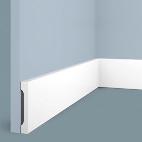
White Wooden Baseboardremains a classic, a flawless solution for neutral interiors. But what if you take that same white baseboard and turn it into an emerald stripe framing the floor? Or a graphite-gray line emphasizing minimalism? Wood painting technology allows any, even the most traditional element, to gain a new resonance. This doesn't require a major renovation, doesn't cost a fortune, but completely changes the atmosphere of the space.
Mirror frames are traditionally associated with natural wood, gilding, and classic shades. Modern trends shatter these stereotypes.Mirror in a white frameis wonderful, but a mirror in a frame of indigo, mustard ochre, or dusty rose — this is no longer just a functional item, but an art object. The frame becomes a canvas for expressing personality, a tool for creating mood, a way to tie disparate interior elements into a single composition.
The most important discovery is that colorful accents work in any style. A Scandinavian interior comes alive with a terracotta baseboard. A classic space gains freshness with moldings in a mint shade. A loft becomes softer thanks to wooden elements painted in warm honey. Even strict minimalism benefits from one or two bright details, creating focal points in an ascetic space.


The Philosophy of Choosing Color for Wooden Decor
Choosing a color is not a spontaneous decision, but a conscious process that takes into account the psychology of perception, the physical characteristics of the room, and the existing palette of finishes. An incorrectly chosen shade can destroy the harmony of even a perfectly planned interior. The right one can transform a mediocre space into a memorable one.
Our factory also produces:


Warm Shades: Energy and Coziness
Terracotta, mustard, brick-red, warm brown — colors that fill a room with warmth and comfort.Wooden baseboard, painted in terracotta, creates a feeling of a Mediterranean home, especially when combined with light walls and natural textiles. This shade is ideal for living rooms, dining rooms, kitchens — spaces where people gather, where an atmosphere of hospitality is important.
Mustard — a complex, noble color that works as both an accent and a background. It is bright enough to attract attention but not aggressive. A mirror frame in a mustard shade pairs beautifully with gray walls, dark wood furniture, and brass light fixtures. This is the choice of people with a developed sense of style, avoiding banality.
Brick-red — the color of strength, energy, passion. In small doses, applied to architectural details, it doesn't overwhelm but rather tones the space. Such a baseboard requires confidence in the decision — half-measures don't work here. But the result is impressive — the interior gains character, becomes memorable, and evokes an emotional response.
Get Consultation
Cool Tones: Freshness and Elegance
Blue in all its manifestations—from sky blue to deep indigo—brings calm, coolness, and visual depth to an interior. A blue baseboard in a white room creates a fresh, maritime atmosphere, perfect for bathrooms, bedrooms, and children's rooms. A dark blue, almost graphite shade suits living rooms and studies, adding nobility and seriousness.
Green—from mint to emerald—is the color of nature, harmony, and balance. A green mirror frame refreshes a space, especially in rooms lacking natural light. An emerald baseboard paired with gold accents creates an atmosphere of luxury. Olive works as a neutral but is more interesting than gray.
Gray is not boring but multifaceted. From light smoky to anthracite, gray highlights architecture, creates a backdrop for bright objects, and adds modernity to classic interiors.moldings and baseboardspainted in a complex gray with a cool or warm undertone, demonstrate refined taste.
Neutrals with Character
White is not just the absence of color but an independent shade with dozens of nuances. Cool white with a blue undertone, warm creamy white, white with a gray tint—each creates its own atmosphere. A white baseboard and white frame are universal solutions, but choosing a specific shade of white requires attention. Mismatched white shades of different elements stand out more than it might seem.
Black is dramatic, graphic, and modern. A black baseboard on a light floor creates a clear boundary that emphasizes the geometry of the space. A black mirror frame is a classic that works in any interior, from minimalism to art deco. The key is not to overdo the amount of black to avoid making the room gloomy.
Beige, cream, ivory—these shades create softness, coziness, and calm. Less contrasting than white, they work as an elegant backdrop. A beige baseboard disappears against beige walls but creates a delicate transition between vertical and horizontal surfaces on white or gray walls.
Technology for painting wooden baseboards in bright colors
The quality of the finish coating is 70% dependent on surface preparation. Skipped steps, rushing, or poor-quality materials result in uneven color, drips, and rapid wear of the coating. A professional approach guarantees a result that will last for years.
Wood Preparation: The Foundation of Success
A new wooden baseboard requires mandatory sanding, even if it seems smooth. Factory processing leaves a micro-fuzz, invisible to the eye but noticeable after paint application. Sandpaper with a grit of P180-P220 removes this fuzz, creates an even surface, and opens the wood pores for better primer adhesion.
Sanding is performed along the wood grain—never across it. Crosswise scratches will appear as dark stripes under the paint, which cannot be fixed without completely removing the coating. A sander speeds up the process, but for baseboards with complex profiles, manual work is necessary—the machine attachment cannot reach recesses and curves.
After sanding, thorough dust removal is essential. Dust left in pores and recesses mixes with the primer, creates roughness, and ruins the smoothness of the finish coating. A vacuum with a brush attachment, followed by wiping with a slightly damp (not wet!) cloth—this sequence ensures surface cleanliness.
Wood defects—knots, resin pockets, cracks—require special treatment. Resin must be removed with a solvent; otherwise, it will seep through the paint as yellow stains. Cracks are filled with wood putty, matched to the color of the finish paint (dark putty for dark paints, light for light paints). After drying, the puttied areas are sanded flush with the main surface.
Priming: creating the ideal base
Primer is not optional but a mandatory step. It solves several critical tasks: it blocks wood tannins (especially in oak, walnut), which can stain light paint a yellowish tint; it evens out the surface's absorbency, ensuring uniform paint application; it increases the adhesion of the finish coating, preventing peeling; and it reduces the consumption of expensive paint, as primer is cheaper.
For painting in bright, saturated colors, a white hiding primer is recommended. It creates a neutral base that does not affect the purity of the final shade. Colored primers (matching the paint color) are used for dark shades—graphite, black, dark blue—they enhance color depth and allow for fewer coats of finish paint.
Primer is applied in a thin, even layer with a brush or spray gun. Thick primer is diluted with water according to the manufacturer's instructions—usually 5-10%. One coat of primer dries in 2-4 hours, after which light intermediate sanding with P320-P400 paper is necessary. This removes raised fuzz and creates a perfectly smooth surface. After sanding the primer, dust removal is mandatory before applying paint.
Paint Selection: Acrylic Enamel as the Optimal Solution
Water-based acrylic enamels are the best choice for painting wooden decor in interiors. They have no strong odor, are safe (no solvents), dry quickly, create a durable, wear-resistant coating, and offer a huge palette of shades. Modern acrylic enamels are not inferior in durability to alkyd ones but surpass them in eco-friendliness and ease of use.
When choosing paint, pay attention to the abrasion resistance class. For baseboards subject to mechanical impact (vacuuming, accidental bumps), enamel of class 1-2 (highest resistance) is necessary. For mirror frames, moldings, and cornices, class 3-4 is suitable—these elements are not subject to abrasion.Painting baseboardsrequires quality materials for a long-lasting result.
Paint tinting is done professionally in-store using RAL or NCS catalogs. DIY tinting at home does not ensure color accuracy—if you need an additional can, you won't be able to replicate the color. Professional tinting guarantees identical shades in any batch. For large projects, order all paint at once—even with factory tinting, slight differences between batches are possible.
The consumption of acrylic enamel is 80-120 ml per square meter per coat. For a baseboard 100 mm high, this is approximately 40-50 ml per linear meter. With two coats, 10 meters of baseboard will require one liter of paint. Always take a 15-20% surplus—actual consumption depends on the wood's absorbency, application method, and the performer's skill.
Paint Application Technique: Secrets to a Flawless Result
Two thin coats are always better than one thick one. This is the golden rule of painting wood. A thick coat dries unevenly, forms drips, and cracks as it dries. Thin coats apply evenly, dry quickly, and create a durable, elastic coating. Allow full drying between coats—usually 4-6 hours for acrylic enamels.
Tool choice affects the quality of the finish coating. A brush with synthetic bristles (for water-based paints) 40-60 mm wide is convenient for baseboards with simple profiles. A narrow brush 15-20 mm is necessary for painting recesses, beads, and carved elements. A microfiber roller speeds up painting on straight sections, providing an even coating without brush marks.
A spray gun is a professional tool that ensures perfect coating quality. It is indispensable for painting large quantities of trim, especially with complex relief profiles. The downside is the need to protect surrounding surfaces from overspray, and paint consumption increases by 15-20% compared to a brush. For one-off jobs, buying a spray gun is not cost-effective—rental or professional services will be cheaper.
Brush technique requires practice. Load paint onto one-third of the bristle length, and wipe off excess on the edge of the can. Apply strokes along the wood grain with even pressure. Don't stretch the paint—it's better to dip the brush again than to try covering a large area with a thin coat. Final strokes are made in one direction without lifting the brush—this creates an even texture for the coating.
Skirting board painting is possible before and after installation. Painting before installation is more convenient - the skirting boards lie horizontally, the paint applies evenly without drips, and all sides including the back can be painted. After installation, only local touch-ups of fastener and joint areas are required. Painting after installation creates a monolithic impression - all joints and corners are painted seamlessly. Carefulness is required, protecting the floor and walls from accidental brush strokes.
Mirror frame painting: transforming into an art object
A mirror frame is an ideal object for color experiments. Unlike a skirting board, it is not subjected to mechanical loads, is at eye level, and attracts attention. A properly chosen frame color can transform a mirror from a functional item into a decorative focal point of the interior.
Choosing a frame painting style
Monochrome painting - the frame is coated evenly with one color. The simplest method, creating a clean, modern look. Suitable for minimalist, Scandinavian, and contemporary interiors. The color can be anything - from pastel shades to saturated bright ones.Choosing a mirror frame colordepends on the overall palette of the room.
Patination - an artificial aging technique that creates an antique effect. The base is painted with a light color (white, cream, light gray), and after drying, a dark patina (brown, black, green) is applied. The patina is wiped off the raised parts, remaining in the recesses of the carving, creating volume and depth. Ideal for classic, vintage, and Provençal interiors.
Two-tone painting emphasizes the complexity of the frame profile. The main field is painted one color, and the carved elements, molding, are painted another. For example, a dark blue base with gold carved overlays. Or a white base with gray protruding details. This technique requires carefulness - painting small elements is done with a fine brush.
Metallic effects turn the frame into a luxurious object. Gold, silver, copper, or bronze paint is applied over a pre-painted base. Metallic works better over a dark base - this reveals the depth and richness of the shade. Using metallic paints requires quality preparation - any surface defects will show through the glossy coating.
Preparing a wooden frame for painting
The process is identical to preparing a skirting board but requires greater thoroughness - the frame is at eye level, any defects are noticeable. Sanding is done in several stages: coarse treatment with P120-P150 to remove factory irregularities, intermediate with P180-P220 for leveling, and finishing with P320 to create perfect smoothness.
Carved frame elements are sanded by hand with sandpaper wrapped around a wooden stick or folded several times. A sander cannot reach deep recesses, leaving untreated areas. It is important not to smooth out the sharp edges of the carving - they create a play of light and shadow, emphasizing the detailing of the ornament.
If the frame is made of MDF, sanding is easier - the material is homogeneous, without knots and resin pockets. A single treatment with P220-P280 is sufficient to remove the factory fuzz. MDF frames are often supplied pre-primed with white primer - in this case, priming is skipped, and only light sanding is performed before applying the final paint.
Creating color unity between skirting board and frame
A skirting board and mirror frame painted the same color create visual unity in the interior, linking the floor and walls, forming an integral composition. This is especially effective in small spaces, where color repetition creates rhythm and organizes the space. In spacious rooms, color unity of decorative elements serves as a background for furniture and textiles.
It is important to use the same paint for the skirting board and frame. Even close shades from different cans will differ - the human eye is sensitive to the slightest color nuances, especially when elements are in the same room. Professional tinting of a large batch of paint guarantees shade identity.
Additional elements of the same color enhance the effect.moldings on wallsDoor casings, cornices, painted in the same tone, create an integral architectural composition. The room looks thoughtful, harmonious, and bespoke. This is the highest level of interior design - when many elements are united by an invisible color thread.
Bold options: blue, green, terracotta in the interior
Bright colors require boldness, but the result is worth it. An interior with colored architectural details is memorable, evokes emotions, and reflects the owner's personality. Let's consider specific shades and their application.
Blue: from sky blue to indigo
Light blue, sky blue shade - a choice for children's rooms, bathrooms, bedrooms. It calms, creates a feeling of freshness, coolness, and purity. A blue skirting board in a white room is a classic combination of nautical style. Complement the interior with white-and-blue striped textiles, natural wood decor, woven baskets - you'll get a fresh, summery space.
Saturated blue, close to royal blue, is a color of confidence, stability, and elegance. Such a skirting board in a living room with gray walls and brass lighting creates a noble atmosphere.A mirror frameof the same shade becomes a focal point, attracts the eye, and sets the tone for the entire room.
Dark blue indigo, almost black - a dramatic, deep, complex color. It works in contrasting interiors - a dark skirting board on a light floor, or vice versa, a dark blue floor with a skirting board of the same tone, creating a monolithic effect. Indigo requires good lighting - in a dark room, it blends with shadows and loses expressiveness.
Green: nature in the interior
Mint, light green - an airy, fresh, youthful shade. Popular in Scandinavian interiors, where it is combined with white, gray, and natural wood. A mint skirting board in a white kitchen adds playfulness, lightness, and makes the space less sterile. In a child's room, it creates a calm but not boring atmosphere.
Emerald, saturated green - a color of luxury, associated with natural wealth. An emerald skirting board against dark gray walls, velvet furniture of a similar shade, gold accents - an interior in modern luxury style. Such a color requires support - textiles, decor, plants should echo the green palette.
Olive, a muted green with a gray undertone, is versatile, calm, and elegant. It works as a neutral but is more interesting than beige or gray. An olive skirting board suits almost any style, from classic to contemporary. It's a safe choice for those who want to move away from white but are afraid of bright colors.
Terracotta: the warmth of the Mediterranean
Terracotta is a warm, earthy, cozy shade in the reddish-brown spectrum. It evokes Mediterranean houses, clay tiles, and sunset. A terracotta skirting board in an interior with white walls, wooden furniture, and natural textiles creates a country house atmosphere. It feels especially organic in kitchens, dining rooms, and living rooms—spaces where the family gathers.
The combination of terracotta and blue is a classic, fail-safe pairing. A terracotta skirting board with a blue mirror frame, blue textiles, or ceramics gives the interior a Mediterranean character. Add live plants, woven elements, and metal with patina to create a space with soul and history.
Terracotta requires warm lighting—cold LEDs kill its beauty, making it look a muddy brown. Warm white light lamps (2700-3000K) reveal the depth of the shade and emphasize its nobility.
Matte and glossy finishes: their influence on color perception
The degree of shine in a finish radically changes color perception. The same shade in matte and glossy versions looks like two different colors. Choosing the finish is an important decision that affects the final result.
Matte finishes: elegant restraint
Matte paint absorbs light, creating a soft, velvety surface. Colors appear more saturated, deep, and complex. A matte finish hides minor surface defects like scratches, unevenness, and sanding marks. It's a practical choice for skirting boards subject to mechanical impact.
Modern interiors gravitate towards matte finishes—they look expensive, noble, and non-trivial. A matte black skirting board creates a graphic contrast without being obtrusive. A matte terracotta mirror frame looks like handmade clay pottery. Matte blue resembles velvet.
The downside of matte finishes is their difficulty to clean. Stains penetrate the micro-pores, making them harder to wash off than from gloss. Matte surfaces cannot be scrubbed with abrasives—this creates shiny spots that ruin the finish's uniformity. For skirting boards in hallways and kitchens, where soiling is likely, a matte finish is not optimal.
Semi-matte and satin: the golden mean
Semi-matte paints (satin, eggshell) combine the advantages of matte and glossy finishes. They provide a slight silky sheen, don't highlight defects, and are easier to clean than matte. The color looks cleaner and fresher than in a matte version but without the aggressive shine of gloss.
A semi-matte finish is a universal choice for most interiors. It suits both classic and contemporary spaces.Painting wooden baseboardPainting with semi-matte paint ensures an optimal balance of aesthetics and practicality.
A satin finish on a mirror frame creates a noble look—the sheen appears at a certain lighting angle, adding dynamism. Compared to matte, satin looks visually lighter and airier. Compared to gloss, it's more restrained and elegant.
Glossy finishes: shine and brightness
Glossy paint reflects light, creating a bright, festive surface. Colors appear more intense, saturated, and luminous. Gloss emphasizes clean lines, sharp profiles, and makes architectural details more expressive.
A glossy skirting board works in classic interiors where shine and formality are important. Glossy white creates a sense of aristocracy, especially combined with moldings, cornices, and portals. A glossy black mirror frame is a dramatic element that draws attention.
The downside of gloss is that it highlights all surface defects. The slightest scratch, unevenness, or dust particle under the paint is clearly visible. Preparation for a glossy finish must be impeccable—multiple sanding passes reducing grit to P400-P600, perfect dust removal, and paint application in a dust-free environment.
Gloss is harder to maintain—fingerprints, water streaks, and dust are visible. In practical rooms (hallways, kitchens), glossy skirting boards require frequent wiping. However, in formal areas (living rooms, dining rooms), gloss creates the desired sense of occasion.
Color refresh: how to repaint tired decor
One of the main advantages of painted wooden decor is the ability to change the color without replacing elements. Interior preferences change, trends
come and go, and what delighted you five years ago may no longer please. Repainting is a simple and budget-friendly way to refresh a space.
When a complete repaint is required
Changing the interior's color scheme is the main reason for repainting decorative elements. Decided to move from cool tones to warm ones? A blue skirting board becomes terracotta. Tired of brightness and want calm? An emerald frame is repainted to a neutral gray. Wood allows for unlimited repaints—each layer of paint adds only 30-50 microns of thickness, not affecting the profile's geometry.
Wear on the finish, even with quality paints, appears after 7-10 years of active use. Matte surfaces wear in areas of frequent contact, colors fade from sunlight, and micro-scratches appear. A complete repaint restores the original look and refreshes the interior.
An error in shade choice is sometimes discovered only after the work is complete—the color didn't suit, looks different than intended, or clashes with other elements. You don't have to live with a bad decision—repainting will fix the situation. It's important to understand what the mistake was to avoid repeating it when choosing a new color.
Repainting technique: from dark to light and vice versa
Repainting to a darker color is a simple task. Lightly sanding the old finish with P240-P320 grit paper creates roughness for the new paint's adhesion. Dust removal, applying 2-3 coats of new paint—and the skirting board has a new color. Dark pigments cover a light base without issues; priming is not required.
Repainting from dark to light is more difficult — the dark base shows through the light paint, especially through white. Intermediate priming with an opaque white primer in 2-3 layers is necessary. The primer blocks the dark color and creates a neutral base. After priming, the final light paint is applied — two coats are usually sufficient for complete coverage.
Transitioning from a bright color to another bright shade (e.g., from blue to terracotta) requires intermediate priming with gray or white primer. Without this, the original bright pigment affects the purity of the new shade — a blue base makes terracotta look muddy with a purple undertone.
white baseboardsWhite bases are universal — they can be easily repainted to any color, and the white base does not affect the purity of the new shade. Therefore, when choosing painted decor, it makes sense to start with white — you can always change your mind by repainting it a bright tone.
Local restoration: eliminating defects without a full repaint
Scratches, chips, and wear in isolated areas do not require a full repaint. Local restoration repairs damaged areas quickly and with minimal cost. The damaged area is sanded with fine sandpaper, dusted, primed (if the damage is deep, down to the wood), and painted with the same paint.
The problem with local restoration is matching the exact shade. If you have a can with leftover paint from the original painting, the task is solved. If not, you have to match the shade by eye, which rarely gives a perfect match. A slight difference in shade is noticeable on a flat surface, so local touch-ups work better on textured, carved elements where the difference is smoothed out by the play of light and shadow.
An alternative to local touch-ups is retouch pencils and markers. They are specially designed to mask minor defects on painted surfaces. A wide palette allows you to find a close shade. Pencil retouching does not replace painting, but masks a scratch so that it becomes unnoticeable from a normal viewing distance.
Colored decor in various interior styles
Each style dictates its own rules for using color. A bright baseboard suitable for eclecticism can ruin minimalism. Understanding stylistic features helps make the right decision.
Scandinavian style: color as a rare accent
Scandinavian interiors are built on white, gray, and natural wood. Color is introduced in doses, as an accent that draws attention and creates mood. A mint or dusty blue baseboard in a white Scandinavian room is that very accent that enlivens the space without destroying its airiness.
Scandinavians prefer muted, dusty shades over pure bright ones. Not blue, but gray-blue. Not green, but olive. Not pink, but dusty rose. Such shades harmonize with natural materials, do not clash with wood, and create calmness.
A mirror frame in a Scandinavian interior can match the color of textiles — pillows, a throw, curtains. This creates a visual connection, uniting elements into a composition. Or it can be the only colored element in a monochrome space — then it becomes a focal point.
Classical style: the nobility of restrained tones
Classicism is conservative in color. Natural wood, white, cream, gold — a traditional palette tested by centuries. However, modern classicism allows cautious color experiments. A dark green baseboard in a library with wooden paneling, a burgundy mirror frame in a dining room with dark furniture — such solutions work if proportions and the nobility of the shades are maintained.
Classicism requires deep, saturated, complex colors. Avoid acidic, neon, childish shades — they destroy the seriousness of the style. Colors with a gray or black undertone are preferable — they look more expensive and noble. Emerald instead of grassy green, burgundy instead of scarlet, indigo instead of cornflower blue.
Glossy finishes are organic in classicism — they create formality and solemnity. Gilding, patination, and multicolor painting techniques emphasize the relief of classical profiles and carved details.
Loft and industrial: color as a contrast to brutality
Loft is built on the contrast of rough textures (brick, concrete, metal) and modern elements. A colored baseboard in a loft is an unexpected element that softens industrial severity. Mustard, terracotta, or dark blue baseboard against a concrete wall creates warmth and makes the space livable.
Loft loves graphite, anthracite, and black shades. They emphasize industrialism and enhance brutality. A black baseboard, a black mirror frame with an iron border, black cornices — all of this fits the style.
Bright colors in a loft work as provocation, as an art object. A bright red baseboard in an industrial space is a bold decision that attracts attention and creates dynamism. But such a technique requires support — red furniture, red accents in the decor, otherwise the baseboard looks random.
Eclecticism: freedom of color self-expression
Eclecticism is a mix of styles, eras, and influences. There are no rules here, only a sense of proportion and compositional thinking. Colored decor in eclecticism is natural — a pink baseboard, a blue mirror frame, and green moldings can coexist in one room if united by a common logic.
Eclecticism allows bold combinations — warm and cool shades side by side, contrasting colors, multicolored elements. It is important that each color is present in at least two or three interior elements — then it is perceived as a conscious decision, not a coincidence.
mirror framesMirrors in eclectic interiors can be multicolored — each mirror in its own shade, creating a personal character. This works if the room is large enough to accommodate such diversity without visual chaos.
Practical recommendations for caring for painted decor
The durability of a painted finish depends not only on the quality of materials and workmanship but also on proper care. Simple rules preserve the freshness of the color for years.
Regular dry cleaning prevents dust buildup. A soft vacuum brush or microfiber cloth is all that's needed for weekly care. Dust rubbed into a damp surface creates hard-to-remove streaks, so dry cleaning is primary.
Wet cleaning is performed as needed. A slightly damp (not wet!) cloth and a neutral cleaning agent (soap solution, diluted dishwashing liquid) are sufficient to remove everyday dirt. After wet treatment, wiping with a dry cloth is mandatory — standing water damages the paint.
Avoid abrasive cleaners, stiff brushes, and solvents. They scratch the finish, compromise its integrity, and create matte spots on gloss or shiny spots on a matte finish. Even melamine sponges (so-called 'magic' ones) are abrasive — they wear away the top layer of paint along with the dirt.
Protection from mechanical damage extends the life of the coating. Rubber pads on furniture legs prevent scratches on the baseboard when rearranging. Carefulness when vacuuming — do not hit the baseboard with the unit's body. Timely restoration of minor defects prevents them from spreading.
Frequently asked questions about painting wooden decor
Can you paint a baseboard without removing it from the wall?
Yes, painting an installed baseboard is possible and often practiced. It is necessary to thoroughly protect the floor with painter's tape and film, and also tape the wall along the top edge of the baseboard. Paint is applied carefully with a brush or roller, avoiding contact with protected surfaces. The drawback is the inability to paint the back side and bottom edge, which is not critical as they are not visible.
How many coats of paint are needed for a quality finish?
Two to three thin coats provide optimal coverage. The first coat is a base, creating an even color. The second is a covering coat, ensuring color density. The third is a finishing coat, necessary for very light or very bright saturated shades. Full drying between coats is mandatory — 4-6 hours for acrylic paints, 12-24 hours for alkyd paints.
How to match the color of a baseboard to an existing interior?
There are several strategies. A baseboard matching the floor color creates a visual expansion of the floor plane, suitable for small rooms. A baseboard matching the wall color makes them appear taller, blurring the floor-wall boundary. A contrasting baseboard (dark on light or vice versa) emphasizes architecture, creating graphic appeal. A colored baseboard repeats the shade of textiles, furniture, decor — tying interior elements together.
Does a painted baseboard fade in the sun?
Quality acrylic paints with UV filters are fade-resistant, but not absolutely. With constant exposure to direct sunlight, bright colors (red, blue, green) may lighten slightly after 5-7 years. Protection — curtains, blinds on south-facing windows, using paints for exterior work (they are more UV-resistant but more expensive than interior paints).
Can MDF baseboard be painted a bright color?
Absolutely. MDF takes paint excellently, has a smooth, uniform surface, and does not require complex preparation.MDF skirting boards for paintingThey are often supplied already primed with white primer — light sanding is enough, and you can apply a topcoat paint of any shade. MDF is more stable than solid wood, does not crack, and paint lasts for decades.
Does a painted baseboard need to be coated with varnish?
Modern acrylic enamels do not require additional varnish coating — they are self-sufficient, creating a durable protective film. Varnish is applied only when using non-durable decorative paints (chalk, tempera) or to create a special effect (glossy varnish over matte paint gives an interesting contrast). An extra layer of varnish can change the shade, add yellowness, so it is not used unnecessarily.
What baseboard color is universal and will never go out of style?
White, gray, black, natural wood — timeless and fashion-proof colors. They work in any style, combine with any finish, and do not become tiresome. If you are afraid of making a mistake with a bright color, start with a neutral one — you can always repaint later when you gain confidence. Among colored options, muted complex shades are universal — gray-blue, olive, dusty rose — they are neutral enough but more interesting than pure neutrals.
How often should a painted baseboard be refreshed?
With quality painting and moderate use, the coating lasts 10-15 years without visible changes. Baseboards in high-traffic areas (hallways, corridors) require refreshing sooner — after 7-10 years. Mirror frames, not subject to mechanical impact, retain their appearance for decades. Refreshing is needed when there is wear, fading, or a desire to change the color.
Conclusion: color as a tool for transforming space
Colored architectural details — a simple, accessible, effective way to transform an interior. No major renovation is needed, no huge budgets are required, but the result exceeds expectations. The space gains individuality, character, and emotional coloring.Wooden baseboard coloredandmirror in a bright frameturn a standard space into a custom interior, reflecting the owner's personality.
The technology of painting wood is accessible to everyone — proper preparation, quality materials, and careful execution yield professional results even without painting experience. Mistakes are correctable, an unsuccessful color can be repainted, experiments do not lead to irreversible consequences. This creates freedom for creativity, the opportunity to try, change, and evolve along with your own space.
Boldness in color choice distinguishes modern design from outdated canons. Blue, green, terracotta, pink — any shade has the right to exist in an interior if applied consciously, with an understanding of context and a sense of proportion. Color does not make a space vulgar — inept use of color does. A professional approach to selecting shades, quality execution, and harmonious combinations create interiors that delight, inspire, and fill life with beauty.
Company STAVROS offers a full range of wooden elements for colored interior design.Baseboards made of solid oak, ash, linden, frames for mirrors made of wood and MDF, Moldings and cornicesof various profiles and sizes — materials perfectly suited for painting in any shades. In-house production ensures high-quality processing, precise geometry, and a perfect surface for painting.
STAVROS offers professional painting services for orders over 150,000 rubles. Experienced colorists will select the exact shade from RAL or NCS catalogs or match a custom sample. Modern painting equipment, high-quality imported paints, and multi-stage quality control guarantee flawless results. Finished painted elements are delivered to the site, requiring only professional installation.
STAVROS specialists provide consultations to help avoid color selection mistakes, suggest optimal combinations, and recommend suitable profiles and sizes. Years of experience working with designers, understanding of modern trends, and knowledge of technical nuances make collaboration with STAVROS comfortable and productive. Create colorful interiors, don't be afraid to experiment, trust quality materials, and your space will transform, gaining uniqueness and style. Color is not a risk but an opportunity to express yourself and create a home that truly reflects your individuality.
STAVROS's wide product range allows for the implementation of any color concept. From compact 60 mm high skirting boards for minimalist spaces to large 180 mm profiles for rooms with high ceilings — every element becomes a canvas for your color vision.decorative cornicesMoldings and trims complement skirting boards and frames, creating a cohesive architectural composition in a unified color scheme.
Flexible pricing makes quality wooden decor accessible to a wide range of customers. STAVROS works with both private clients and professional designers, construction companies, offering wholesale terms for large projects. Discount systems for regular customers, bonus programs, and seasonal promotions make collaboration profitable and long-term.
STAVROS delivers products throughout Russia. Its own logistics service ensures product safety during transportation — each element is individually packaged, protected from moisture and mechanical damage. Delivery to major cities takes 3-7 days; for remote regions, terms are agreed individually. Self-pickup from warehouses in Moscow and St. Petersburg is available to save on transportation costs.
Technical customer support continues even after purchase. Questions about installation? Need painting advice? STAVROS specialists are always available, ready to help with advice, suggest solutions, and recommend trusted contractors. Customer care is not just empty words but the real practice of a company with over 15 years in the interior decor market.
Environmental responsibility is an important part of STAVROS's philosophy. Wood is sourced from trusted suppliers practicing responsible forestry. Production processes are organized with minimal environmental impact. Wood waste is not burned but recycled into fuel briquettes. Paint materials are selected considering environmental standards — priority is given to water-based compositions with minimal volatile organic compound content.
Investments in modern equipment ensure the highest product quality. CNC milling machines reproduce the most complex profiles with millimeter precision. Wood drying chambers with digital humidity control guarantee stable geometry of products. Painting lines with robotic paint application create perfectly even coverage without drips or missed spots.
Partnerships with leading Russian designers and architects allow STAVROS to stay on top of trends. The company's products are used in elite residential complexes, boutique hotels, restaurants, and private residences. The portfolio of completed projects impresses with its diversity of styles — from classic palace interiors to ultra-modern minimalist spaces. Each project is proof of STAVROS product versatility and quality.
Educational activities by the company help clients make informed decisions. The STAVROS website blog publishes articles on design trends, painting technologies, and decor selection rules. Video tutorials demonstrate installation, painting, and product care processes. Regular webinars with designers and technologists are open to all. A knowledgeable client is the best client, and STAVROS invests in raising its audience's competence.
Quality warranty on all STAVROS products is not a formality but real protection of buyer interests. If manufacturing defects (cracks, chips, warping) are found, the product is replaced at the company's expense. Claims are reviewed promptly, with decisions made in the client's favor. Over the years, the return rate has been less than 0.5% — an indicator of consistently high production quality.
The future of interior design lies in personalization, custom solutions, and bold color experiments. The era of bland, standard interiors is fading, giving way to spaces with character and soul. STAVROS provides the tools to create such interiors — quality materials, professional services, expert support. The rest depends on your courage, taste, and readiness for change.
ColorfulWhite Wooden Baseboardskirting board turned emerald or terracotta,framed mirrormirror frame painted sky blue or graphite — these are not just decorative elements, they are a manifesto of individuality. Each color tells a story, creates a mood, influences the perception of space. By choosing color consciously, you create not just a beautiful interior, but an environment that supports, inspires, and reflects your essence.
Don't fear color — fear blandness. Don't avoid experiments — avoid stereotypes. A modern home is not a museum exhibition of traditional taste, but a living space that changes with you. And colored architectural details are a simple, accessible, effective way to make this space truly your own. STAVROS helps realize the boldest ideas, turning design fantasies into the material reality of your home.