


Article Contents:
- Why Polyurethane Conquered Living Rooms in 2026
- The Revolution of Lightness
- Detailing That Rivals Plaster
- Practicality That Traditional Materials Lacked
- How Polyurethane Molding on Living Room Walls Changes the Perception of Space
- Visual Height – An Illusion That Works
- Depth Instead of Flatness
- Zoning without partitions
- Living Room Design Styles: From Palace-Classic to Bold Eclecticism
- Classic Style — Eternal Elegance
- Neoclassicism – A Lightweight Version for Modern Apartments
- Baroque and Rococo – Luxury Without Limits
- Art Nouveau – Nature Frozen in Decoration
- Art Deco – The Geometry of Luxury
- Contemporary Minimalism – Decor That Doesn't Shout
- Eclecticism – The Freedom of Mixing
- Practical Solutions: How to Apply Molding Correctly
- Accent Wall – The Focus of Attention
- Symmetry versus asymmetry
- Placement Height – The Mathematics of Beauty
- Thickness and Width – A Question of Proportions
- Corners and Joints – The Devil in the Details
- Color and Light: How to Make Molding Work
- Monochrome – The Elegance of Nuance
- Contrast – Graphics in Space
- Colored Molding – A Challenge to Tradition
- Lighting – The Ally of Relief
- Installation: Professional Secrets
- Preparation – Half the Success
- Adhesive – What to Choose
- Application technique
- Joining and Trimming
- Maintenance and operation
- Frequently Asked Questions
- Inspiration from Practice: Real Examples
- Small Living Room — Big Possibilities
- Large Living Room — Complete Program
- Eclecticism — Bold Decisions
- Combining Moldings with Other Interior Elements
- Furniture and Molding — Dialogue of Forms
- Textiles and Molding — Softness vs. Hardness
- Lighting and Molding — Play of Shadows
- Wall Art — Framing and Context
- Mistakes to avoid
- Over-Decorating
- Scale disproportion
- Style Mixing Without a Concept
- Poor quality installation
- Ignoring Color
- Trends 2026: Where the World of Decorative Molding is Heading
- Maximalism vs. Minimalism
- Large Formats and Bold Scales
- Color as an Independent Value
- Technology integration
- Ecological and Conscious Design
- Budget Planning: How Much Does It Cost to Transform a Living Room
- Factors Affecting Cost
- Approximate Calculation for a 20-Square-Meter Living Room
- STAVROS: The Gold Standard of Polyurethane Molding
- Conclusion: A Space with Character Begins with the Walls

The living room is the face of the home. It's where guests are welcomed, where the family gathers in the evenings, where important conversations happen and memories are made. And it's precisely here that the walls speak about who you are. Flat, empty surfaces are silent. They are functional but faceless. Walls adorned with thoughtful decor, however, tell a story — about the owner's taste, lifestyle, and understanding of beauty.polyurethane wall molding for the living room— is not just a trendy fad for 2026; it's a way to restore the architectural logic to interiors that standard apartments of recent decades have lost.
Why does the living room become the main focus of decorating efforts? Because it's the only room everyone sees. The bedroom is an intimate space, the kitchen is functional, the hallway is a passageway. The living room, however, is the theater where the family's social life unfolds. And just as a theater needs scenery, a living room needs scenography. Decorative wall molding creates this scenography, transforming a flat box into a three-dimensional, structured, expressive space.


Why Polyurethane Conquered Living Rooms in 2026


The Revolution of Lightness
Recall classic palace interiors — luxurious plaster molding, carved wooden panels, marble pilasters. Beautiful? Absolutely. Accessible for a standard apartment? No. Plaster molding weighs like a ship's anchor, requires wall reinforcement, professional installation by a team of craftsmen, and costs as much as an airplane wing. Wood carving is even more expensive, reacts to humidity, and requires constant maintenance. Marble is simply beyond reality for most.
Polyurethane changed the game. A one-meter polyurethane molding weighs 200-300 grams compared to 15-20 kilograms for a plaster one. You can lift it with one hand, carry it without help, and install it alone over a weekend. No special fasteners, structural reinforcement, or heavy machinery are needed. Just standard mounting adhesive, a utility knife, a miter box — and you create decor that previously required professional craftsmen.
But lightness isn't the only advantage. Polyurethane isn't afraid of moisture. Plaster swells, cracks, and grows mold in damp environments. Polyurethane doesn't care — you can install it in the bathroom or near the kitchen sink. It doesn't absorb water, doesn't warp, and doesn't lose its shape. This means thatpolyurethane molding for wallscan be purchased for any room without reservations.
Our factory also produces:


Detailing that rivals plaster
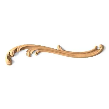
Skeptics said: 'Polyurethane is cheap, it won't capture the delicacy of ornamentation.' They were wrong. Modern injection molding technologies create elements where every vein of an acanthus leaf, every rocaille curl, every facet of a geometric pattern is reproduced with micron precision. The mold is made from a master model, which sculptors create by hand or model in 3D with the highest detail. The casting copies the form absolutely—without loss of detail, without smoothing of corners.
Examine a polyurethane molding with a classic ornament up close. See the depth of the relief? The sharpness of the edges? The smoothness of the transitions? This is not an imitation of carving—it's a full-fledged sculptural work, embodied in a modern material. After painting, even a professional won't be able to tell the difference between plaster and polyurethane. The eye perceives volume, chiaroscuro, texture—the material remains behind the scenes.
Get Consultation
Practicality that traditional materials lacked
Plaster stucco is fragile. An accidental bump—and a chip, crack, or destroyed fragment. Polyurethane is resilient. It absorbs impact, springs back, returns to shape. Did a doorknob hit the molding while moving furniture? With plaster, you'd get a chip. With polyurethane—at most a small scratch that's easy to paint over.
Plaster ages. After 10-15 years, it yellows, develops micro-cracks, loses the sharpness of its relief from repeated painting. Polyurethane doesn't age for decades. It doesn't yellow, crumble, or lose its shape. It's a material that will outlast several renovations, several changes in style preferences, several generations of residents.
Polyurethane can be painted with any paint—acrylic, alkyd, latex, oil. Want white classicism? Please. Want black contrast for a modern interior? No problem. Want gilding for baroque luxury? Easy. The material accepts any coating, holds it firmly, and doesn't require special primers or preparation.
Howpolyurethane stucco on living room wallschanges the perception of space
Visual Height—An Illusion That Works
Typical apartments suffer from low ceilings. 2.5-2.7 meters is the standard for mass housing, creating a feeling of being cramped, especially in small rooms. Physically raising the ceiling is impossible without a major renovation involving the building's structure. But visually—it's easy.
Vertical articulation of walls with moldings creates guiding lines that lead the eye upward. The eye follows the verticals, the space seems taller. A classic technique—pilasters or vertical moldings from the baseboard to the cornice at intervals of 1.5-2 meters around the perimeter of the living room. They don't just decorate the walls—they structure the space, divide it into sections, create rhythm. And this rhythm is read as architectural height.
Dark-colored moldings on light walls enhance the effect. Contrast emphasizes the verticals, makes them graphic, noticeable. The eye catches the contrast and automatically follows along the line. The result—the room seems 20-30 centimeters taller, even though it hasn't changed physically by a millimeter.
Horizontal articulation works differently—it divides the wall into tiers, creating a classic tripartite structure. The lower third (panel) is painted darker, the middle part lighter, the upper (frieze) can be the same color or contrasting. Moldings at the boundaries of these zones become visual shelves that seem to support the upper part of the wall. This creates architectural logic—base, body, crown. The eye reads this logic as a sign of height, even if the actual height is modest.
Depth Instead of a Plane
A flat wall is just a partition between spaces. A wall with decor is an architectural element with volume, texture, character.Polyurethane moldings for wallsprotrude 5-20 millimeters from the surface, creating shadows. Light glides along the wall, encounters an obstacle in the form of a molding, flows around it, creates a shadow behind the protrusion. This play of light and shadow turns a plane into a relief.
The more complex the molding's profile, the richer the play of chiaroscuro. A simple rectangular molding gives one clear shadow. A multi-step profile with protrusions and recesses creates a whole system of shadows of varying intensity—from deep in the recesses to barely noticeable on gentle slopes. An ornamented molding with carving turns the wall into a sculptural relief, where each element of the ornament casts its own micro-shadow.
This three-dimensionality changes the perception of the room's scale. Flat walls visually narrow the space—the eye has nothing to catch on, it slides over the smooth surface and bumps into the opposite wall, realizing the tightness. Relief walls hold the gaze—it wanders over the moldings, studies the details, loses the sense of boundary. The room seems more complex, more interesting, and therefore, more spacious.
Zoning without partitions
Modern layouts strive for openness. Living-dining room, living-kitchen, living-office—combined spaces give a sense of spaciousness but create a problem: how to highlight functional zones without destroying the unity? Physical partitions negate the point of combining. Furniture zones, but not clearly enough.
Stucco solves the task elegantly. A frame of moldings on the wall behind the sofa highlights the seating area. A similar frame on the wall by the dining table denotes the dining zone. Physically, it's one room, but visually—two clearly defined spaces. Each zone receives architectural framing, its own 'portal,' its own frame that says: this happens here, that happens there.
You can go further and paint the highlighted zones different colors. Seating area in deep blue, dining area in warm terracotta—the moldings become boundaries between color planes, clear and graphic. This creates visual richness without overloading the space with extra structures.
Living Room Styling: From Palace-Classic to Daring Eclecticism
Classic Style — Eternal Elegance
Classic never goes out of fashion because it's based on proportions tested over centuries. Symmetry, restrained ornament, clear hierarchy of elements—it's a language understood on a subconscious level. A living room in a classic style with polyurethane stucco recreates the atmosphere of aristocratic salons without an exorbitant budget.
The basis of classic wall decor is panels. The wall is divided by moldings into rectangular sections. The traditional scheme: panel height is 2/3 or 3/4 of the wall height, width is a multiple of the height or follows the golden ratio (aspect ratio 1:1.618). Inside each panel, there can be an additional frame of thinner molding, creating a two-level composition.
The color scheme of classicism is restraint. White moldings on light beige walls, cream on ivory, pale gray on pearl. Contrast is minimal, the effect is built on chiaroscuro, not on color strikes. The inner parts of panels can be covered with damask wallpaper with a classic pattern, creating textural variety while maintaining color harmony.
The corners of the living room are decorated with pilasters—flat vertical projections imitating columns. A pilaster consists of a base (expanded foundation), a shaft (central part, often with vertical flutes), and a capital (upper decorative part). Polyurethane pilasters are so light that they are attached to the wall with the same adhesive as moldings, yet create the impression of massive structural elements.
Above the doorway in a classic living room, a pediment is appropriate—a decorative element imitating a small roof. A triangular pediment-gable refers to ancient temples, a straight one—to Renaissance palazzos. It turns an ordinary door into a portal, an entrance to a significant space.
Neoclassicism—a lighter version for modern apartments
Full classic style, with its richness of detail, requires high ceilings and large spaces. In a standard apartment, it can appear overloaded. Neoclassicism takes principles from the classical style but simplifies their execution. Moldings are simpler, without ornamentation or with minimal decor. Panels are larger and fewer in number. Pilasters are replaced by simple vertical moldings without capitals.
The color palette of neoclassicism is more free. Gray tones, beige-browns, muted greens and blues are allowed. Moldings can be the same tone as the walls, a few shades lighter or darker, creating subtle nuances instead of clear boundaries. This creates an exquisite restraint characteristic of the Scandinavian version of classicism.
A neoclassical living room often uses an accent wall — one of the four walls is decorated more richly than the others. Behind the sofa or behind the TV, a composition of moldings is created — a large central panel, framed by a wide profile molding, with decorative corner elements placed at its corners. The remaining walls remain smooth or with minimal decor in the form of a ceiling cornice and baseboard.
Baroque and Rococo — boundless luxury
If your soul craves opulence, wealth, excess — Baroque and Rococo are at your service. These styles do not know the word 'enough'. The more decoration, the better. The more complex the ornament, the more expressive. The more gold, the more luxurious.
A Baroque living room uses moldings with heavy carved ornamentation — acanthus leaves, plump putti (baby angels), scrolls, shells, fruits, flowers. All of this is applied in dense masses, creating a sense of sculptural excess. The composition is asymmetrical, dynamic — scrolls swirl, putti soar, garlands sag. The static nature of classicism gives way to Baroque movement.
Rococo is even more playful. The ornament is smaller but denser. C-shaped scrolls (rocaille), delicate plant tendrils, birds, butterflies, shells create a lace-like pattern. Symmetry is deliberately broken — the left and right parts of a panel are mirror images but not identical, adding a light playfulness instead of the solemn severity of Baroque.
Color in these styles is a separate topic. The pastel shades of Rococo — soft pink, pale blue, mint, lavender — create a background for white or gilded stucco. Baroque loves rich tones — burgundy, emerald, sapphire, purple — on which gilded stucco shines like a jewel.
Gilding polyurethane stucco is easier than it seems. Acrylic paints with metallic pigments give the effect of real gold leaf when applied correctly. The patination technique — darkening the recesses with dark brown paint after gilding — creates an effect of noble antiquity, as if the stucco has survived centuries.
Art Nouveau — nature frozen in decor
Art Nouveau (Art Nouveau) of the late 19th — early 20th century created its own unique language of stucco, abandoning historical quotations. Art Nouveau lines are fluid, asymmetrical, reminiscent of plant shoots, flowing hair, tongues of flame. The ornament is stylized but recognizable — irises, lilies, poppies, bindweeds, dragonflies, butterflies.
An Art Nouveau living room with polyurethane stucco creates a sense of organicity. A molding frames a doorway not as a strict rectangle, but with a wavy line that flows into a plant ornament at the corners. A wall panel depicts stylized trees with intertwining branches. The ceiling rosette has the shape of a flower with asymmetrical petals.
The color palette of Art Nouveau gravitates towards natural shades — greens, browns, ochres, with accents of bright colors — purple, orange, turquoise. Stucco can be painted in several colors — the base matching the wall, ornamental details in contrast, creating an effect of colored graphics.
Art Deco — the geometry of luxury
The 1920s-1930s gave the world Art Deco — a style that combined modernist love for geometry with a love for luxurious materials. Art Deco uses stucco as an element of graphic composition. Moldings are straight, clear, creating geometric shapes — stepped pyramids (ziggurats), concentric circles, fans, sun rays.
A living room in the Art Deco style uses large symmetrical compositions. The central wall behind the sofa is decorated with a large vertical panel of moldings forming a stepped shape — a wide outer frame, inside which are several narrower ones, creating a visual perspective, a recess. The inner field of the panel can be mirrored, creating an infinity effect.
Art Deco colors are contrasting and saturated — black with gold, dark blue with silver, burgundy with bronze. Stucco is often painted with metallic paints — chrome, brass, copper — creating industrial luxury. The combination of geometric strictness of forms with richness of materials creates the atmosphere of glamorous elegance characteristic of Art Deco.
Contemporary minimalism — decor that doesn't shout
It would seem that minimalism and stucco are incompatible. Minimalism demands clean planes, absence of decor, maximum simplicity. But modern designers have proven the opposite. Stucco in a minimalist interior works as a structural element, not as decoration.
Moldings of simple geometric profiles — rectangular, trapezoidal cross-section without ornament — create clear lines on the wall. One horizontal strip at a height of 90-100 centimeters from the floor divides the wall into two parts, no more. Or vertical moldings spaced 80-120 centimeters apart create rhythmic division. No panels, no frames, no scrolls — only pure geometry.
Color in minimalist stucco plays a key role. Often moldings are painted the same tone as the walls — if the wall is gray, the molding is two tones darker. The contrast is minimal but sufficient to create a visible line. Light, sliding along the wall, creates a shadow from the molding, which enhances the effect. The result is a restrained graphic quality characteristic of Japanese minimalism or Scandinavian design.
An alternative approach is contrasting stucco. Black moldings on white walls create a hard graphic, almost an architectural drawing. This is a solution for bold interiors where minimalism borders on brutalism.
Eclecticism — the freedom of mixing
Eclecticism is not afraid to mix the unmixable. A Baroque cartouche on a minimalist wall, a classical pilaster in a loft, rocaille scrolls next to industrial brickwork — if it works visually, then it's right.
An eclectic living room with polyurethane stucco is a creative playground. One wall is decorated in a classical style with panels and pilasters. The opposite one remains exposed brickwork. The third is painted a bright color and adorned with one large Art Nouveau panel. The fourth contains a geometric composition of moldings in the Art Deco style. Madness? At first glance. But if you choose a unifying element — a single color scheme, a repeating motif, a common scale of details — the disparate elements come together into a cohesive, albeit complex, picture.
The key to successful eclecticism is knowing the rules you are breaking. Ignorance creates chaos. Knowledge creates conscious mixing. Study the styles, understand their logic, and then break them boldly, but not randomly.
Practical solutions: how to apply stucco correctly
Accent wall — focus of attention
There's no need to decorate all four walls the same way. This creates monotony, visual overload. Designate one wall as the main one — usually the wall behind the sofa in the relaxation area or the wall behind the TV if it is the compositional center.
On the accent wall, create a composition of moldings. A classic option is a large central panel approximately 2/3 the width of the wall and 3/4 its height. Frame it with a wide molding (80-120 millimeters wide), create a second frame inside from a thinner molding (40-60 millimeters), leaving a 15-20 centimeter gap. This creates a two-level composition with a pronounced center.
Paint the inner field of the panel in a contrasting color or cover it with wallpaper featuring a bold pattern. The rest of the wall remains the background. Decorate adjacent walls minimally—with a ceiling cornice, baseboard, and possibly one horizontal molding at the level of the upper boundary of the accent panel to create a visual connection.
Symmetry vs. Asymmetry
Classical styles require strict symmetry. If there are three panels on a wall, the central one should be on the room's axis of symmetry, with the side panels being mirror images. If there are pilasters in the corners, they must be identical. The slightest violation of symmetry in a classical interior is perceived as an error.
Modern styles allow for asymmetry. Moreover, it can be a deliberate technique. On the wall behind the sofa, create a composition of moldings shifted to the left of the center. Leave empty space on the right and hang one large piece of art there. Asymmetry creates dynamism, movement, and visual interest.
But asymmetry requires a sense of balance. Shifting the central element to the left needs to be balanced by visual weight on the right—a large art object, a tall floor lamp, a vertical accent. Without balance, asymmetry turns into crookedness.
Placement Height—The Mathematics of Beauty
At what height should horizontal moldings that divide the wall be placed? There is a classical rule of the golden ratio. Divide the wall height in a 1:1.618 proportion from the floor. For a wall 2.7 meters high, this gives 167 centimeters. A molding running at this height creates a harmonious division that is perceived as naturally correct.
An alternative rule is division into thirds. The lower third (approximately 90 centimeters from the floor) is highlighted as a panel, the middle part remains the main field, and the upper third (from 180 centimeters to the ceiling) is the frieze zone. This creates a classic tripartite structure characteristic of order architecture.
For modern interiors, arbitrary heights can be used, but base them on functional reference points. A molding at the height of chair backs (90-100 centimeters) protects the wall from furniture damage and creates a logical boundary. A molding at the level of the top of a door opening (200-210 centimeters) visually connects the doors with the wall decor.
Thickness and Width—A Matter of Proportions
The higher the ceilings, the more massive the moldings should be. In a room with a height of 2.5 meters, a molding 120 millimeters wide will look bulky, consuming space. The optimum is 60-80 millimeters. In a room with ceilings 3.5 meters high, the same 60 millimeters will be lost; 100-150 millimeters or more is needed.
The projection thickness of the molding (how far it protrudes from the wall) is also important. A profile that is too flat won't create expressive shadows. One that protrudes too much will catch on things and people will bump into it. An optimal thickness of 10-25 millimeters for wall moldings is sufficient for light and shadow and safe for use.
Corners and Joints—The Devil is in the Details
Professional installation of moldings differs from amateur work in the quality of joints. Moldings are joined at corners at a 45-degree angle (miter cut in a miter box) or butt-jointed (one element meets the side surface of another end-to-end). Miter cuts work for simple profiles. For complex ornamented ones, it's better to use ready-made corner elements.
Polyurethane corner elements solve the problem of mismatched ornamentation at the joint. These are ready-made parts that cover the corner, have a smooth transition of the ornament, and are often decorated with additional embellishments—a rosette, wreath, or enhanced ornament. Straight sections of molding, cut at a right angle, meet them; the joint is filled with adhesive, sanded after drying, painted—and the transition becomes invisible.
Joints on straight sections (when the wall length exceeds the molding length) should be minimal. Cut moldings so that the joint falls in the least noticeable place—behind furniture, in a panel recess, not at eye level. Cut the ends at an angle, not straight—an angled joint is less noticeable than a straight one.
Color and Light: How to Make Moldings Work
Monochrome—The Elegance of Nuance
White moldings on white walls—a classic that never goes out of style. But 'white' is a relative concept. There are dozens of shades of white—cool bluish, warm creamy, gray pearl, pinkish marshmallow. The choice of shade is critical.
If the walls are painted in a warm white (with a hint of yellow or pink pigment), the moldings should be in the same warm palette but a shade lighter. Cold white moldings on warm walls will look foreign, bluish, unpleasant. The reverse situation—warm moldings on cold walls—appears yellowed, visually aged.
Tonal contrast is more important than color contrast. Moldings half a tone lighter than the walls create a soft, barely noticeable relief. One and a half to two tones lighter—clear but not sharp. Three to four tones lighter—expressive contrast that emphasizes every detail. The choice depends on the desired effect. For restrained interiors—minimal contrast. For expressive ones—maximum.
Contrast—Graphics in Space
Dark moldings on light walls—a radical solution that creates graphic quality, modernity, and boldness. Black or dark gray moldings on white or light gray walls turn a room into an architectural blueprint. This approach is for those unafraid of bold decisions.
Contrasting moldings require flawless installation. The slightest flaws—uneven joints, gaps, chips—will be glaringly noticeable. But when executed correctly, the effect is stunning. The room gains clear structure, expressiveness, and character.
Reverse contrast—light moldings on dark walls—creates drama. Dark blue, emerald, burgundy walls with white or gold moldings look luxurious, palatial, but not overloaded if the decor is restrained in quantity.
Colored Moldings—Challenging Tradition
Who said moldings must be white? In 2026, designers are actively experimenting with color. Pastel shades—soft blue, pale pink, mint, lavender—create a romantic atmosphere. Moldings in the same tone as the walls but several shades more saturated add depth.
Saturated colors—deep blue, emerald, terracotta—turn moldings into color accents. They don't just structure the wall; they become elements of the interior's color composition, echoing textiles, accessories, and furniture.
Gradient painting—a smooth transition from one shade to another along the length of the molding—is an avant-garde solution. The molding starts light blue, smoothly transitions to saturated blue, and ends dark purple. This transforms a utilitarian decorative element into a work of art.
Lighting—The Ally of Relief
Molding depends on light. Flat, diffused light kills relief—shadows don't form, volume disappears, moldings blend into the wall. Directional light at an angle creates dramatic shadows, highlights every detail, and turns the wall into a sculptural relief.
Use local lighting to accentuate decor. LED spotlights on the ceiling, aimed at the wall at a 30-45 degree angle, create grazing light that reveals the relief. Floor lamps and sconces, positioned so that light falls on the wall from the side, enhance the play of light and shadow in the evening.
Hidden lighting behind moldings is a modern technique.Ceiling corniceA special configuration creates a niche between itself and the ceiling, where an LED strip is placed. The light is directed upward, reflects off the ceiling, creates a soft glow, and highlights the profile of the cornice from below. This also works for wall moldings—backlighting creates a light outline that makes the decor almost weightless.
Installation: Professional Secrets
Preparation is Half the Success
Polyurethane molding forgives many surface imperfections, but not all. The wall must be level within 3-5 millimeters over a two-meter length. More than that, and the molding will follow the wall's waves, creating unsightly curves. Check for levelness with a long straightedge or laser level. Fill any discovered unevenness with putty and sand it smooth.
The surface must be clean, degreased, and primed. Dust, grease, and peeling paint reduce adhesive bond. Wipe the wall with a damp cloth, let it dry, and apply acrylic primer. This creates an optimal base for installation.
Marking is a critical stage. Use a laser level or water level with a chalk line to draw horizontal lines. For vertical lines, use a plumb bob or laser level. Do not rely on the floor or ceiling line—they are rarely perfectly level. Rely on the tool, not your eye.
Adhesive—What to Choose
Polyurethane molding is glued with special polymer adhesive or universal construction adhesives like liquid nails. The optimal choice is polyurethane or acrylic construction adhesive in cartridges for a caulking gun.
Polyurethane adhesive sets quickly (5-15 minutes), creates a strong, flexible bond, and is moisture-resistant. Acrylic adhesive sets more slowly (20-40 minutes), allows more time for adjustment, is odorless, but is less moisture-resistant.
For lightweight moldings (up to 300 grams per meter), acrylic adhesive is sufficient. For heavy moldings (over 500 grams), polyurethane is better. For very heavy elements (wide cornices, large panels), combine adhesive with mechanical fasteners—thin anchors screwed through the molding into the wall, which are filled with putty after installation and become invisible.
Application technique
Apply adhesive to the back of the element in a zigzag pattern or dots spaced 5-10 centimeters apart. Do not apply a continuous layer—excess will squeeze out when pressed, causing problems. Do not skimp on adhesive at corners and ends—the bond there is especially critical.
After applying the adhesive, press the element against the wall according to the markings. Press evenly along the entire length, avoiding misalignment. Hold for 30 seconds to 2 minutes depending on the adhesive type. For long elements, use temporary supports—wooden strips propping the molding from below, or painter's tape stretched across the element onto the wall.
Remove any squeezed-out adhesive immediately with a damp sponge (for acrylic) or a cloth with alcohol (for polyurethane). Dried adhesive is removed with a knife, which can damage the element.
Joining and Cutting
To cut moldings at an angle, use a miter box—a device that holds the element at the desired angle. Cut with a fine-toothed saw or miter saw. Rushing causes chips. Cut slowly, without pressure, let the saw teeth do the work.
The ends of joined elements must be perfectly even. Correct minor unevenness with sandpaper wrapped around a block. The joint should be tight, without gaps. Micro-gaps (up to 0.5 millimeters) are filled with acrylic sealant or joint adhesive, which is sanded smooth after drying and becomes invisible.
For patterned moldings, pattern alignment at the joint is important. Adjust the joint position so that the pattern elements match. Sometimes this requires trimming a few millimeters in length to shift the pattern into the correct position.
Care and Maintenance
Polyurethane molding requires minimal maintenance. Dust is removed with a dry cloth or vacuum with a soft brush attachment. Stains are washed off with a damp sponge and mild detergent. Aggressive chemicals and abrasives are unnecessary and can damage the finish.
Damage is easily repaired. A scratch is painted over with the same paint. A chip is filled with acrylic putty, sanded after drying, and painted. A detached fragment is re-glued with the same construction adhesive.
Repainting is possible multiple times. Polyurethane holds paint for decades, but if you want to update the color—simply repaint. The surface requires no special preparation other than dust removal. One or two coats of acrylic paint are sufficient to completely cover the previous color.
Frequently Asked Questions
Can polyurethane stucco be glued to wallpaper?
Theoretically—yes, practically—not recommended. The adhesive holds onto the wallpaper, the wallpaper holds onto the wall. If the wallpaper peels, the molding will fall with it. It's optimal to glue onto a prepared plastered surface. If wallpaper is already up, cut out the wallpaper along the markings where the molding will be installed, glue the element onto the clean wall, and seal the joint between the wallpaper and molding with sealant.
How to calculate material quantity?
Measure the length of all lines where molding is planned. Add 10% for cutting and possible errors. Standard molding length is 2 or 2.4 meters. Divide the total length by the length of one element, round up to the nearest whole number—this gives you the number of elements. For complex compositions, draw a diagram on graph paper or in a graphics editor, precisely calculating each fragment.
Should molding be painted before installation?
You can paint before or after installation—both options work. Painting before installation is convenient—the element can be laid flat, paint applies evenly, and no drips form. But joints and attachment points will need touch-up after installation. Painting after installation provides a seamless finish but requires care to avoid painting the walls.
Can polyurethane moldings be bent for arches?
Standard rigid moldings do not bend—attempting to bend them will cause breakage. For arches and curved surfaces, special flexible moldings made of elastic polyurethane exist. They bend to a radius without deformation. The minimum bending radius is specified by the manufacturer for each profile.
Is polyurethane molding safe for health?
Polyurethane is inert after polymerization, does not emit harmful substances, and is hypoallergenic. The material is certified for use in residential premises, including children's rooms. During installation, some adhesives have an odor, but it completely disappears after drying (24-72 hours). Ventilate the room during installation and for the first 24 hours afterwards — that is sufficient.
What is the service life of polyurethane molding?
With proper installation and use — 30-50 years without loss of appearance or properties. The material does not age, yellow, or crumble. The only thing that may be needed over time is repainting, if you want to refresh the color or touch up minor damage from use.
How does polyurethane molding differ from polystyrene molding?
Foam (polystyrene) is cheaper but significantly worse in all parameters. It breaks easily, crumbles, is afraid of solvents (paints with solvents dissolve it), and has a coarse-grained structure without detail. Polyurethane is strong, elastic, reproduces the finest details of ornamentation, and can be painted with any paints. Saving on material results in a short service life and a shabby appearance.
Can polyurethane molding be used on facades?
Yes, but only special facade molding, which has UV stabilizers and frost-resistant additives. Interior molding on a facade will yellow from the sun and crack from frost within 2-3 years. Facade molding lasts for decades. Check the labeling when purchasing.
Inspiration from Practice: Real Examples
Small Living Room — Big Possibilities
A studio apartment with an area of 35 square meters. The living room occupies 18 meters, with a ceiling height of 2.6 meters. The task was to create a feeling of a spacious, elegant space instead of a cramped box. The solution — minimalist molding as a structural element.
A single composition was created on the wall behind the sofa — a rectangular panel measuring 2.4×1.6 meters, framed by a simple rectangular-profile molding 60 millimeters wide. The inner field of the panel is painted two tones darker than the other walls — if the walls are light gray, the panel is dark gray. The molding is the same dark gray color as the panel.
That is enough. One expressive detail transforms a bland wall into an architectural element. The other walls remain clean — only a white ceiling cornice and white baseboard, which create completeness without overload. The result — a feeling of thoughtfulness, style, elegance with minimal investment.
Large Living Room — Full Program
A private house, living room 45 square meters, ceiling height 3.8 meters. Style — classical with Baroque elements. The budget allows for a full-scale approach. All four walls receive a full decorative system.
The wall with the fireplace is the main one. Pilasters with Corinthian capitals, reaching from floor to cornice, are installed on either side of the fireplace. Above the fireplace portal — a large cartouche with rocaille scrolls. The rest of the wall is divided into three vertical panels by moldings 100 millimeters wide. Inside each panel — a secondary frame made of molding 60 millimeters wide.
The opposite wall with windows is designed more simply, so as not to compete with the fireplace wall. Vertical division by simple moldings, window frames with pediments. The side walls each have two large panels.
The ceiling — a separate work of art. A wide cornice with ornamentation around the perimeter, a large rosette 120 centimeters in diameter under the central chandelier, coffers (recessed panels) between the cornice and the rosette, created by a system of intersecting moldings.
Everything is painted white against walls of ivory color. Only the capitals of the pilasters and the central ceiling rosette are gilded. The result — a classic salon-style interior, worthy of being featured in an architectural magazine.
Eclecticism — Bold Solutions
A city apartment, living room 28 square meters, ceilings 3 meters. The owners — a young designer couple who want a creative space that doesn't fit into any single style. The walls are painted a deep blue. One wall is left with original brickwork, painted white.
On the blue wall behind the sofa — a Baroque cartouche measuring one meter by one and a half, painted gold. Nothing else. The contrast of golden Baroque against a dark blue background — powerful, daring, memorable. No panels, no frames, no systems — one expressive element that becomes the hallmark of the interior.
On the brick wall — a geometric composition of thin moldings 30 millimeters wide, painted black. The moldings form a stepped pyramid in the Art Deco style — strict geometry against Baroque opulence of the golden cartouche. Two opposing styles in one room, united by the boldness of the concept and color balance — blue, gold, white, black work like an expressionist painter's palette.
The ceiling cornice is simple, minimalist, white. The baseboard is wide, classical, also white. They create a neutral frame for the creative chaos unfolding on the walls. The result — a space that provokes, surprises, is memorable. Not for everyone, but perfect for those who understand.
Combining moldings with other interior elements
Furniture and Molding — Dialogue of Forms
Molding does not exist in a vacuum. It interacts with furniture, creating either harmony or conflict. Classic upholstered furniture with curved legs, carved backs, damask-patterned upholstery requires classic molding. Panels, pilasters, ornamented moldings create the appropriate backdrop.
Modern minimalist furniture — straight lines, smooth surfaces, absence of decor — works well with simple geometric molding. Moldings without ornamentation, clear rectangular profiles, a minimal number of elements. Baroque molding with modern furniture will create dissonance, unless it is a conscious eclectic idea.
Color combination is also important. Dark furniture against walls with white molding creates a classic contrast. Light furniture matching the walls with contrasting dark molding — a modern solution. Bright colored furniture requires neutral molding to avoid creating visual cacophony.
Textiles and Molding — Softness vs. Hardness
Curtains, furniture upholstery, rugs — textile elements add softness, warmth, coziness. Molding is hard, structural, architectural. Their combination creates balance — without textiles, an interior with an abundance of molding will be cold, museum-like. Without molding, an interior with textiles will be unstructured, blurry.
A classic technique — repeating textile patterns in the molding. If furniture upholstery has a floral pattern with acanthus leaves, choose moldings with a similar ornament. This creates a visual connection, uniting soft and hard elements into a single composition.
Color harmony between textiles and molding also works towards integrity. If the main color of the curtains is emerald, the moldings can be painted in a muted green or left white, but add emerald accents in other decorative elements. Color echoes create a feeling of thoughtfulness, design integrity.
Lighting and Molding — Play of Shadows
Light fixtures are functional objects that become part of the decorative system. A chandelier in the center of a ceiling rosette is a classic combination, where the rosette frames the light source, and the light accentuates the rosette's relief. Wall sconces between molding panels create a rhythmic composition — panel, sconce, panel, sconce.
A modern solution is hidden lighting behind moldings. A cornice with a special configuration and a niche for an LED strip creates a soft glow directed upwards onto the ceiling or downwards onto the wall. The light seems to seep from behind the molding, creating an effect of levitation, a weightlessness of the decor.
Directional spotlights, illuminating walls with moldings at an angle, enhance the relief. Shadows become deeper, the volume more expressive. Adjusting the brightness and direction of the light allows changing the perception of the decor from soft and unobtrusive (diffused light) to dramatic and expressive (directed).
Art on the walls — framing and context
Paintings, posters, photographs interact with moldings in two ways. Moldings can frame a work of art, creating an architectural frame for it. A molding panel with a painting in the center turns an ordinary image into a gallery-level exhibit.
An alternative approach is art outside the moldings. Panels remain empty (painted the color of the walls or in contrasting colors), and paintings are hung between the panels or above them. This creates layering — an architectural layer (moldings), a pictorial layer (paintings), each with its own logic, but in overall harmony.
The scale of the art must correspond to the scale of the moldings. Large panels require large paintings — a canvas measuring 80×100 centimeters in a 150×200 centimeter panel looks proportionate. A small 30×40 centimeter image in the same panel will get lost. Either use a group of several small works, creating a composition, or increase the size of a single piece.
First mistake - unstructured mixing. A classic chair, loft table, Scandinavian chest, and minimalist cabinet in one room is not eclecticism, but visual chaos. Each item draws attention to itself, not creating cohesion. A system, logic, unifying idea is needed. Choose one dominant style, add a second as an addition, and possibly a third as an accent. But no more than three, and all should have something in common - color, material, era, or functionality.
Over-decorating
The main mistake of molding enthusiasts is the desire to use everything at once. Panels on all walls, pilasters in every corner, rosettes on the ceiling, cartouches above doors, friezes, cornices, baseboards with ornament — the result resembles a museum storage room, not a living space.
Rule: less is more. One or two expressive compositions on key walls are more effective than total decoration of all surfaces. The remaining walls serve as a background — clean or with minimal decor. This creates hierarchy, a focal point, visual rest for the eye.
Disproportion of scales
Large, massive moldings in a small room with low ceilings consume space, feel oppressive, and create claustrophobia. Small, unexpressive moldings in a large room with high ceilings get lost, look like a mistake.
Choose the size of elements proportionate to the room's parameters. For modest apartments — restrained decor with a small cross-section. For spacious rooms — monumental elements corresponding to the volume. This doesn't mean giving up moldings in small living spaces — simply use elements of an adequate size.
Mixing styles without a concept
Eclecticism is the art of mixing, but not chaotic, rather conscious. Randomly combining a Baroque cartouche, a classical pilaster, an Art Nouveau panel, and Art Deco moldings will create visual clutter. Each element conflicts with the others, the eye finds no rest.
If you mix styles, find a unifying principle — a single color palette, a repeating motif, a common scale of details. Or the dominance of one style (80% of elements) with accents of another (20%). This creates integrity while preserving diversity.
Poor quality installation
The most beautiful molding turns into an eyesore with careless installation. Crooked lines, uneven joints, gaps, visible glue marks, mismatched ornament — all this screams unprofessionalism.
If you're not confident in your skills, hire professionals. The cost of installation will be justified by the result. If doing it yourself, don't rush. Careful marking, precise cutting, control at every stage — the key to quality. Better to spend a weekend on one element but do it perfectly, than slap everything together haphazardly in a day.
Ignoring color
White molding on white walls is not the only or always the best option. If surfaces are perfectly smooth, lighting is optimal, the molding profile is expressive — yes, monochrome works. But often a minimal tonal contrast (molding a shade lighter than the walls) or a color solution (contrasting molding or in a nuanced palette) works more effectively.
Don't be afraid to paint moldings. Polyurethane accepts any paint, the color can easily be changed during the next renovation. Experiment with samples — buy a small element, paint it different colors, place it against the wall, evaluate it under different lighting. Testing takes a couple of hours but saves disappointment after large-scale installation.
Trends 2026: where the world of decorative molding is heading
Maximalism versus minimalism
The decade of minimalism is coming to an end. People are tired of sterile white spaces without soul or character. Love for decor, details, and complexity is returning. Moldings become a tool for creating rich, saturated interiors, where every wall tells a story.
But this is not a return to Victorian overload. Modern maximalism is selective — an abundance of details on key surfaces, restraint on the others. Complexity and simplicity alternate, creating rhythm, dynamism, visual variety.
Large formats and bold scales
Small moldings are giving way to monumental ones. Cornices 20-30 centimeters wide, giant rosettes over a meter in diameter, wall-sized panels — decor becomes an architectural statement, not a modest addition.
This requires appropriate spaces — high ceilings, large areas. But for those who have such parameters, large-format moldings create an impression unattainable with small elements.
Color as an independent value
White molding is losing its monopoly. Colored, tinted, gradient — experiments with color turn utilitarian decor into an artistic object. Molding ceases to be just a divider of planes and becomes a color accent, an element of the interior's color composition.
Natural shades are especially popular — terracotta, ochre, olive, deep blue. They create a connection with natural materials, adding warmth and organic feel.
Integration of technologies
Molding is no longer just a decorative element. Built-in lighting, hidden speakers, wiring channels, sensors — technology is penetrating traditional forms. A cornice illuminates the room, molding reproduces music, a panel conceals smart home wiring.
This doesn't destroy aesthetics but expands functionality. The interior remains visually classic or modern but gains 21st-century technological capabilities.
Ecological Awareness and Consciousness
Requirements for material environmental safety are tightening. Buyers study certificates, inquire about composition, and are interested in health impact. Manufacturers respond — polyurethane formulations are becoming cleaner, toxic additives are eliminated, and recycling is being implemented.
polyurethane molding for wallsChoosing today means selecting not only aesthetics but also responsibility for family health and the environment. Certified safe materials are the industry's new standard.
Budget planning: how much does it cost to transform a living room
Factors Affecting Cost
Project price depends on several variables. Decoration area is an obvious factor. Decorating one accent wall will cost several times less than decorating all four walls plus the ceiling.
Element complexity affects price. Simple moldings without ornament are cheaper than carved ones. Standard elements are more affordable than custom manufacturing. Local production is cheaper than imports.
Installation is a separate expense item. DIY installation saves 40-60% of project cost. Professional installation is more expensive but guarantees quality. Composition complexity affects installation cost — simple straight moldings are installed faster than complex multi-element panels.
Approximate calculation for a 20-square-meter living room
Minimum option — one accent wall, simple composition:
-
Moldings for creating a 3×2 meter panel: 12 linear meters, cost 300-500 rubles per meter = 3600-6000 rubles
-
Glue, consumables: 500-1000 rubles
-
Paint for painting moldings: 500-800 rubles
-
Total materials: 4600-7800 rubles
-
Installation (if hiring): 3000-5000 rubles
-
Full cost: 7600-12800 rubles
Medium option — decorating two walls, more complex elements:
-
Moldings for panels, framing: 25 meters, cost 400-700 rubles per meter = 10000-17500 rubles
-
Corner elements, decorative overlays: 2000-4000 rubles
-
Glue, consumables: 1500-2000 rubles
-
Paint: 1000-1500 rubles
-
Total materials: 14500-25000 rubles
-
Installation: 8000-12000 rubles
-
Full cost: 22500-37000 rubles
Full option — decorating all walls, rich elements:
-
Moldings of different profiles: 50 meters, cost 500-900 rubles per meter = 25000-45000 rubles
-
Pilasters, capitals: 8000-15000 rubles
-
Corner elements, decorative overlays, cartouches: 5000-10000 rubles
-
Ceiling cornice: 15 meters, 600-1000 rubles per meter = 9000-15000 rubles
-
Glue, consumables: 3000-4000 rubles
-
Paint: 2000-3000 rubles
-
Total materials: 52000-92000 rubles
-
Installation: 25000-40000 rubles
-
Total cost: 77000-132000 rubles
Figures are approximate, depending on region, specific manufacturers, and complexity of execution. But the price range is clear — decorative molding is accessible for any budget. You can start small, gradually developing the decorative system.
STAVROS: the benchmark for polyurethane molding quality
When it comes to polyurethane molding, the name STAVROS sounds like a synonym for reliability, quality, and professionalism. 23 years on the market, hundreds of completed projects, work with federal-level facilities — these are not just numbers, it's a reputation that cannot be bought but can be earned through decades of impeccable work.
The history of STAVROS began with wood carving. The company's founders, artists Andrey Ragozin and Evgeny Tsapko, created carved interior items by hand. Participation in the restoration of the Konstantinovsky Palace in Strelna became a turning point. Working with historical interiors required an understanding of classical forms, mastery of technique, and the ability to reproduce lost elements with museum precision. These competencies became the foundation of the company.
Today, STAVROS is a full-cycle production facility that creates both traditional wooden carved items and modern polyurethane molding. The range includes thousands of items: moldings of all profiles and sizes, ceiling cornices from modest to monumental, baseboards, pilasters, columns, rosettes, panels, consoles, balusters, furniture decor.
Production capabilities allow for the manufacture of both standard elements in mass quantities and custom items individually. Each element undergoes multi-stage quality control — from raw material inspection to finished product inspection. The result is products without complaints, meeting the expectations of the most demanding clients.
A large stock program ensures immediate shipment of popular items. No need to wait weeks — you order, and the product is with you in a day or two. Delivery is organized throughout Russia, from Kaliningrad to Vladivostok. Courier delivery and pickup are available for Moscow and St. Petersburg.
Professional consulting support helps make the right choice. STAVROS managers are not salespeople but experts who understand the specifics of decor, know the technical characteristics of each element, and can recommend the optimal solution for a specific task. Call, describe your project — get qualified recommendations.
STAVROS's work with cultural heritage sites — the Hermitage, Alexander Palace, Trinity-Izmailovsky Cathedral — confirms: the quality of the company's products meets the highest standards. If museums, palaces, and churches trust STAVROS — you can trust it for your home too.
Conclusion: a space with character begins with the walls
polyurethane wall molding for the living room— is not a tribute to fashion, not a blind copying of others' interiors, not an attempt to impress guests. It is a way to create a space that reflects your individuality, your understanding of beauty, your attitude towards home as something more than just a set of functional rooms.
A living room with well-thought-out decorative molding tells a story. About people with taste living here. About details mattering. About beauty in everyday life being possible and achievable. Every time you enter such a living room, you get aesthetic pleasure. Every time guests feel they've entered a special space where everything is thought out, where nothing is accidental.
Modern materials and technologies have made decorative molding accessible. Polyurethane is twenty times lighter than plaster but matches it in detail. It is moisture-resistant, durable, long-lasting, and easy to install. Price is no longer an obstacle — worthy decoration of one accent wall costs about the same as an average sofa but creates an effect for decades.
Choosing the style, scale of elements, color scheme — is a creative process that requires attention but not special education. Study examples, understand the principles, adapt them to your space and preferences. Start small — one composition on the main wall. Evaluate the result. If you like it — expand the decorative system.
Working with reliable suppliers like STAVROS guarantees material quality and support at all stages. 23 years of experience, thousands of completed projects, work with cultural heritage sites — these are not just accolades, it's a guarantee that you'll get products that will last for decades, preserving their original appearance.
Create spaces that inspire. Turn standard housing into individual interiors. Use polyurethane molding as a tool for architectural expression. Let the walls of your living room speak about who you are — a person who values beauty, understands harmony, creates an environment for a dignified life.